
Elizabeth & Kevin’s Eclectic & Very Narrow Rowhome
Name: Elizabeth & Kevin
Location: Philadelphia, Pennsylvania — Graduate Hospital neighborhood
Size: 1,600 square feet, 3 BR
Years lived in: 1+ years
Philadelphia is an area that is becoming more and more known for its young, hip and eclectic design scene. Elizabeth & Kevin’s Eclectic & Very Narrow Rowhome is a shining example of the fun and youthful direction that traditional row homes are heading!


Elizabeth and Kevin have been living in and transforming this row home for over a year — they were one of the standout entries from Apartment Therapy’s 2008 Color Contest. They’re nestled in the Graduate Hospital neighborhood — a perfect example of a neighborhood that exemplifies the juxtaposition of Philadelphia — an eclectic mix of old, new and what’s to come.
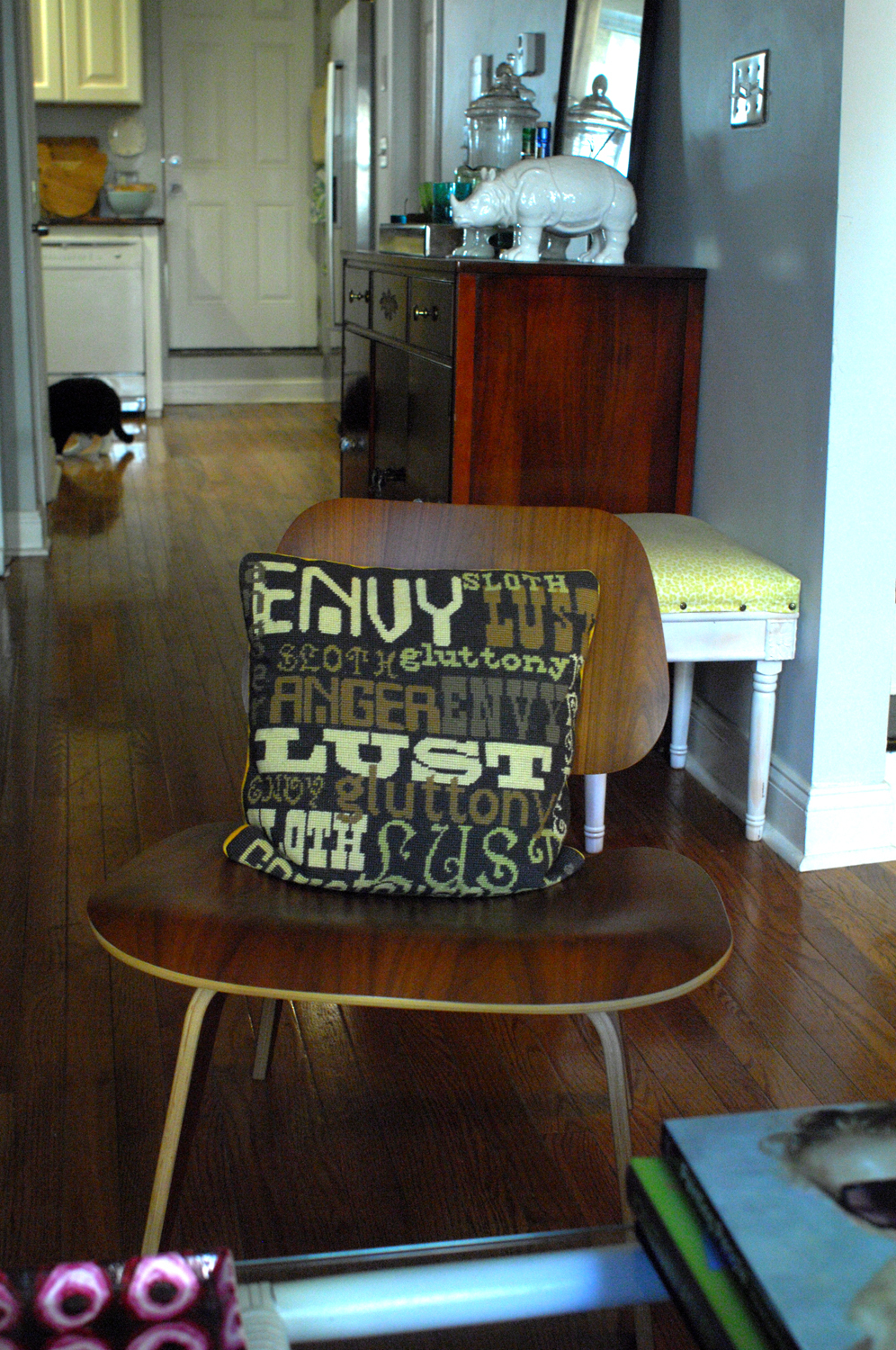
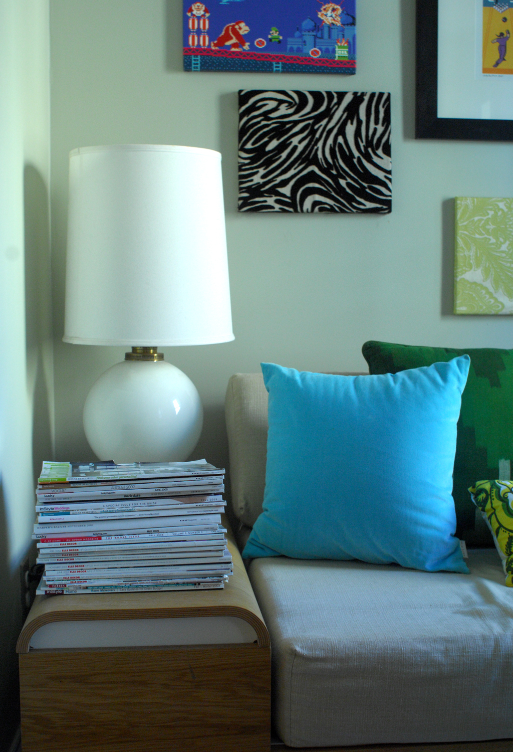
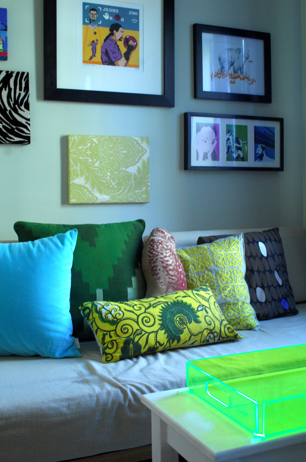
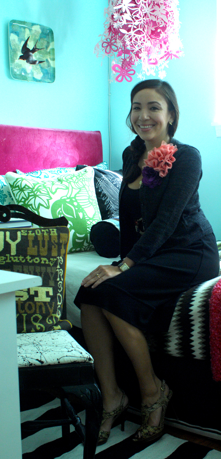
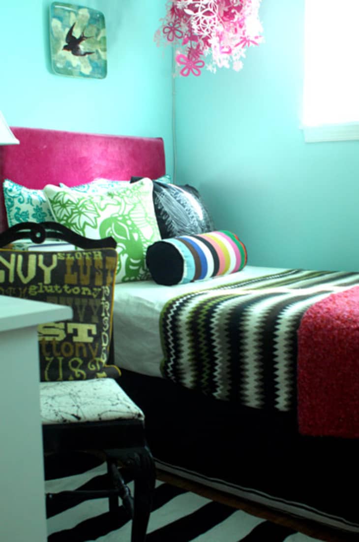
Elizabeth works as a design blogger on her website Peacock Feathers and also runs her own event planning company when she’s not transforming her home. Her busy schedule is apparent in her use of bold prints, bright colors and large accessories throughout the home. Pink is a dominant punch of color in each room — Elizabeth’s favorite color of course!
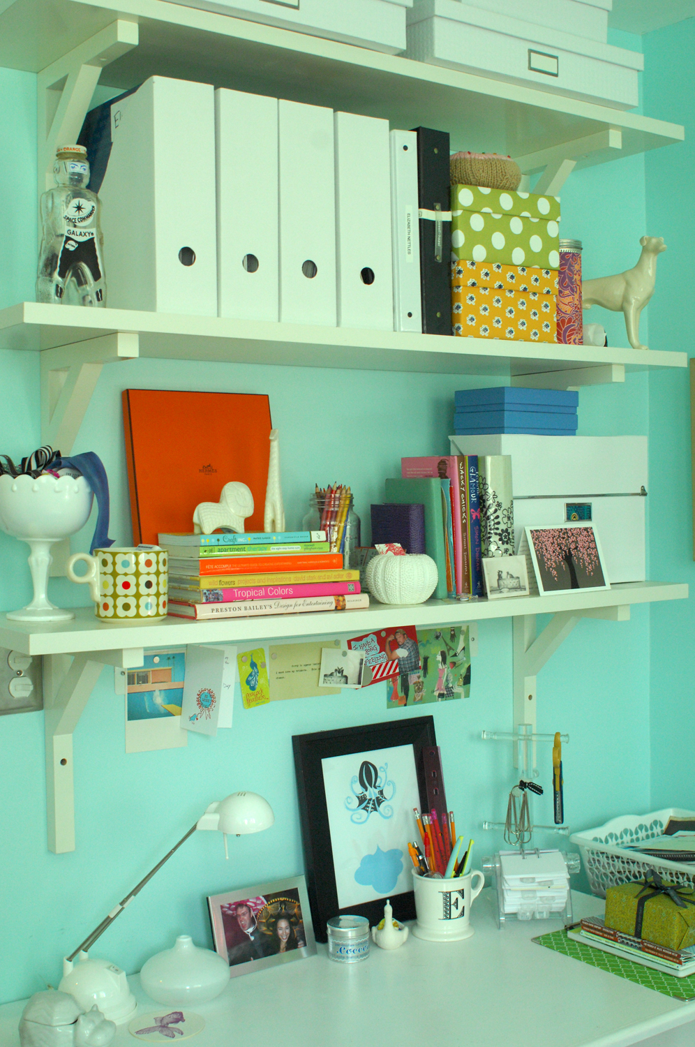
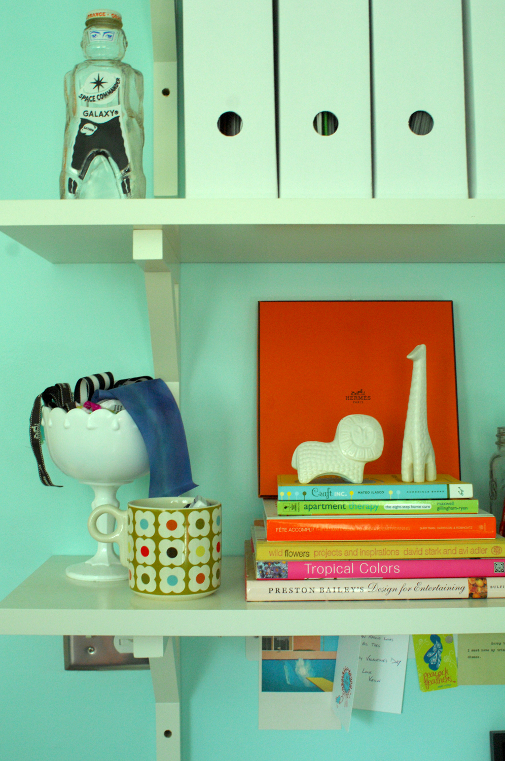
There’s also a great blend of designer purchases, IKEA and thrift store finds in her home. It’s a great reminder that having an inspiring and delightful home doesn’t have to cost a lot.
Apartment Therapy Survey:
My/Our style: Eclectic-vintage, with a touch of glamour and a sense of humor.
Inspiration: Magazines and design blogs.
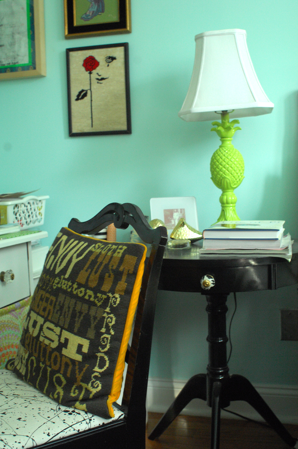
Favorite Element: I love the guest bedroom/office, with its crazy mix of patterns and heavy dose of pink. Meanwhile, Kevin might say our flat roof, which is perfect for a roof deck/garden (someday!)
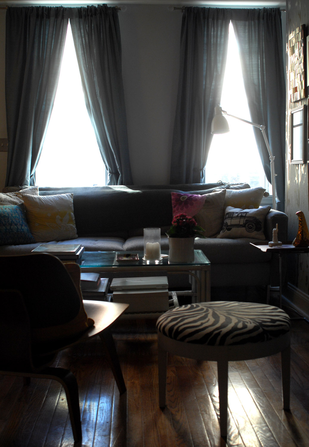
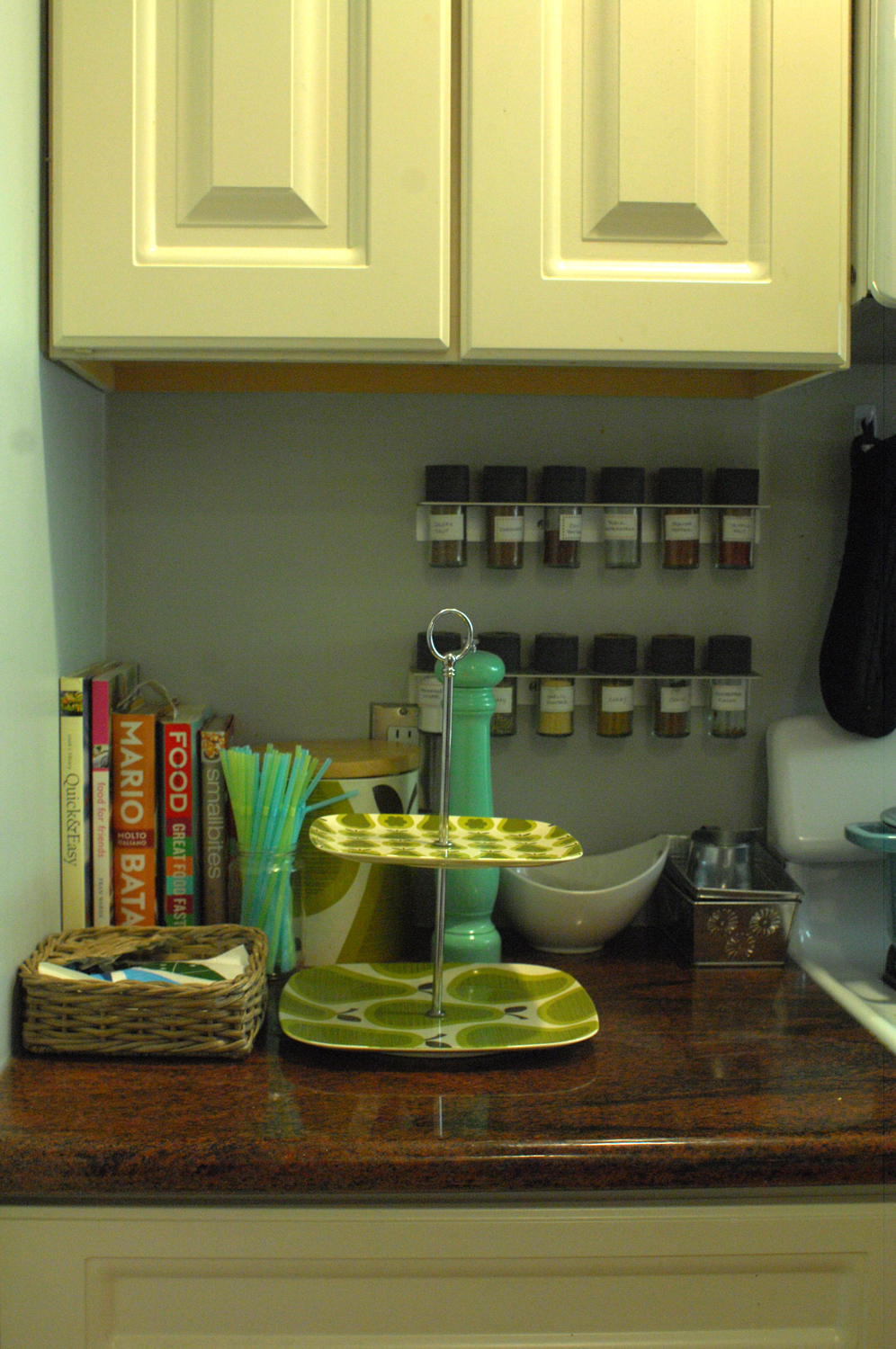
Biggest Challenge: The dimensions of the house — it’s only 12 feet wide! It makes furniture placement in the living room particularly difficult. So far we’ve made it work though.
What Friends Say: I asked a friend and she said, “Fun, quirky, bold, and decisive.” I would also imagine someone saying that there are a lot of things to look at!
Biggest Embarrassment: Because of the size of the first floor, we can only host about eight people comfortably at one time. It makes parties a real challenge.
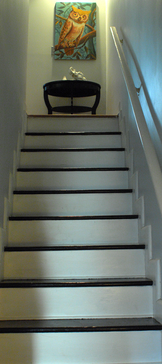
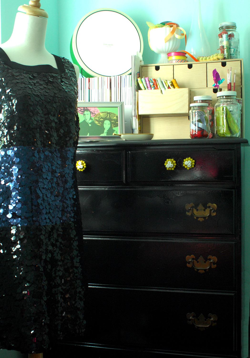
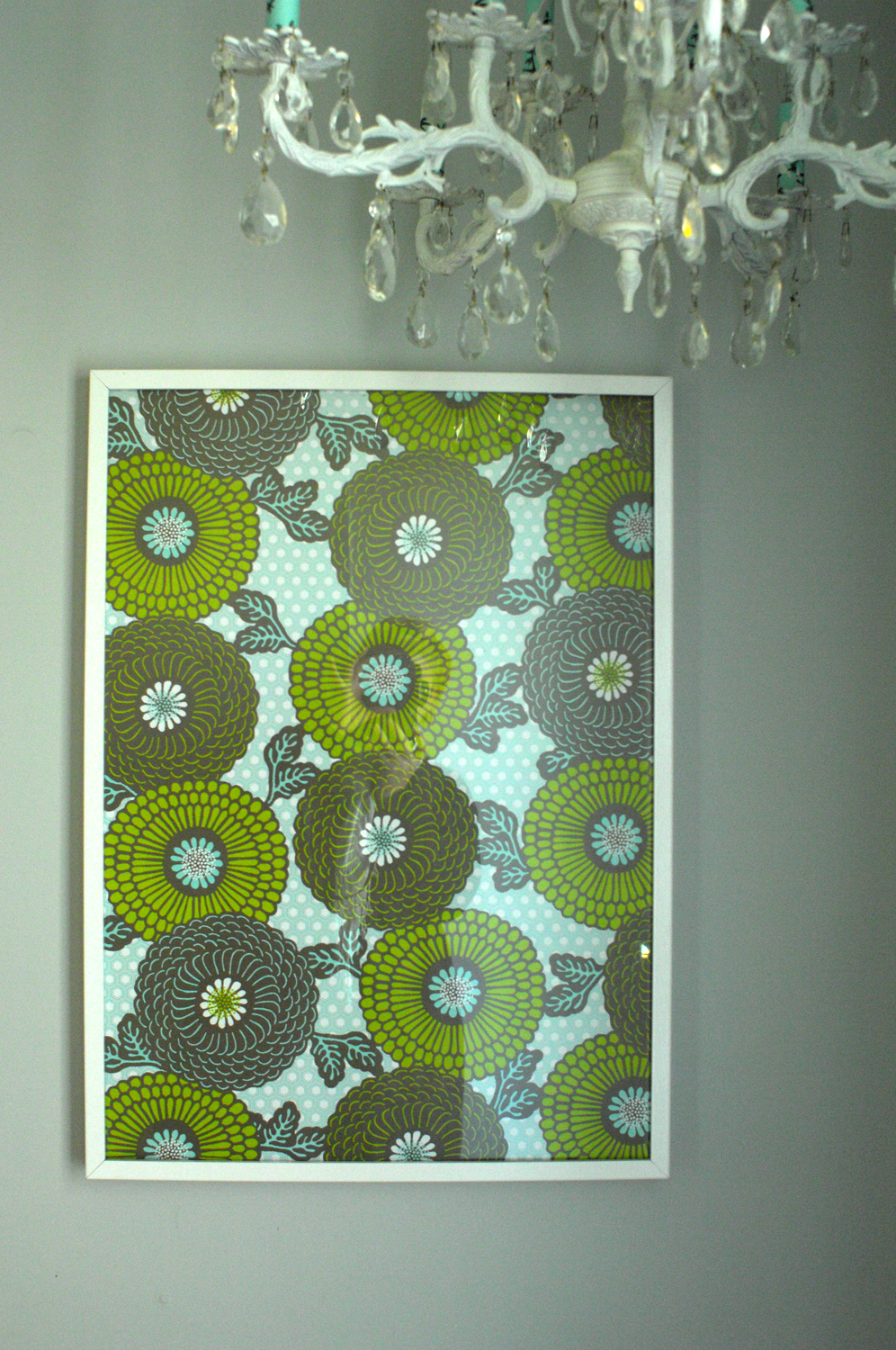
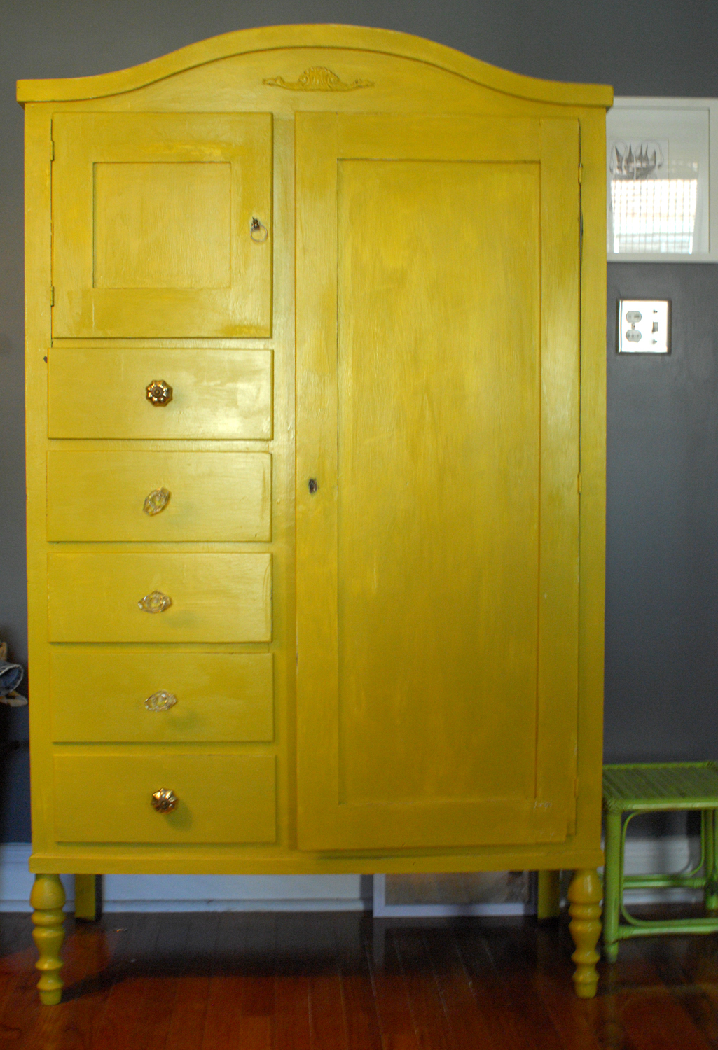
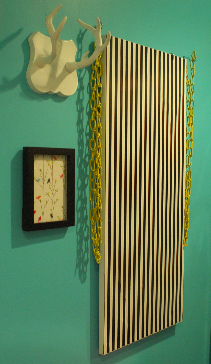
Proudest DIY: The yellow-painted armoire in the bedroom, and the refurbished crystal chandelier that hangs in the hallway.
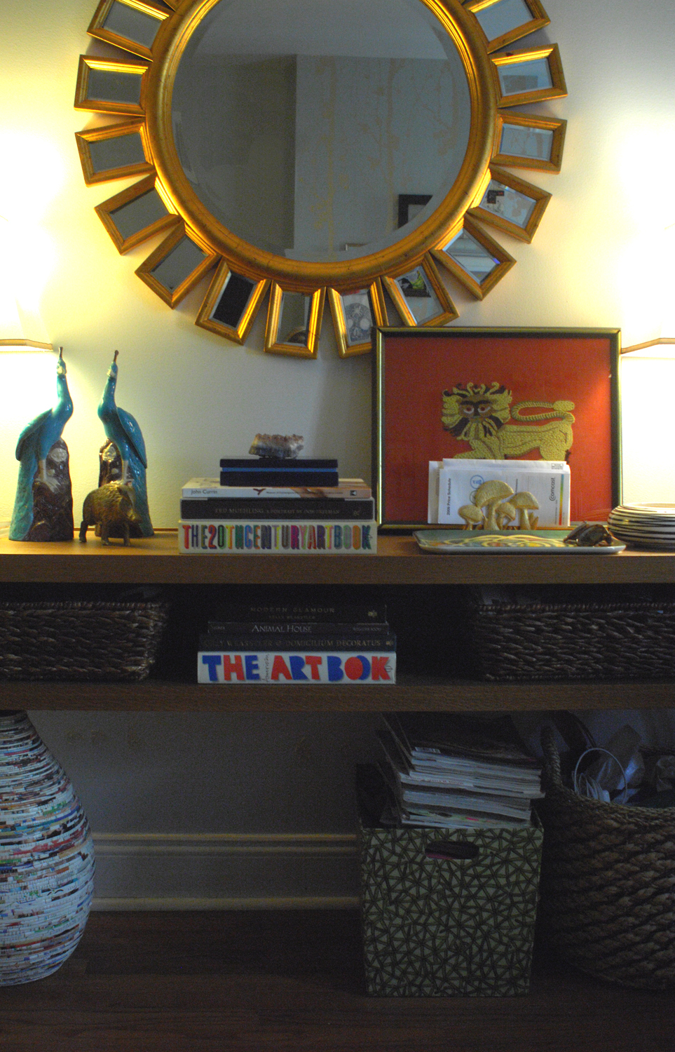
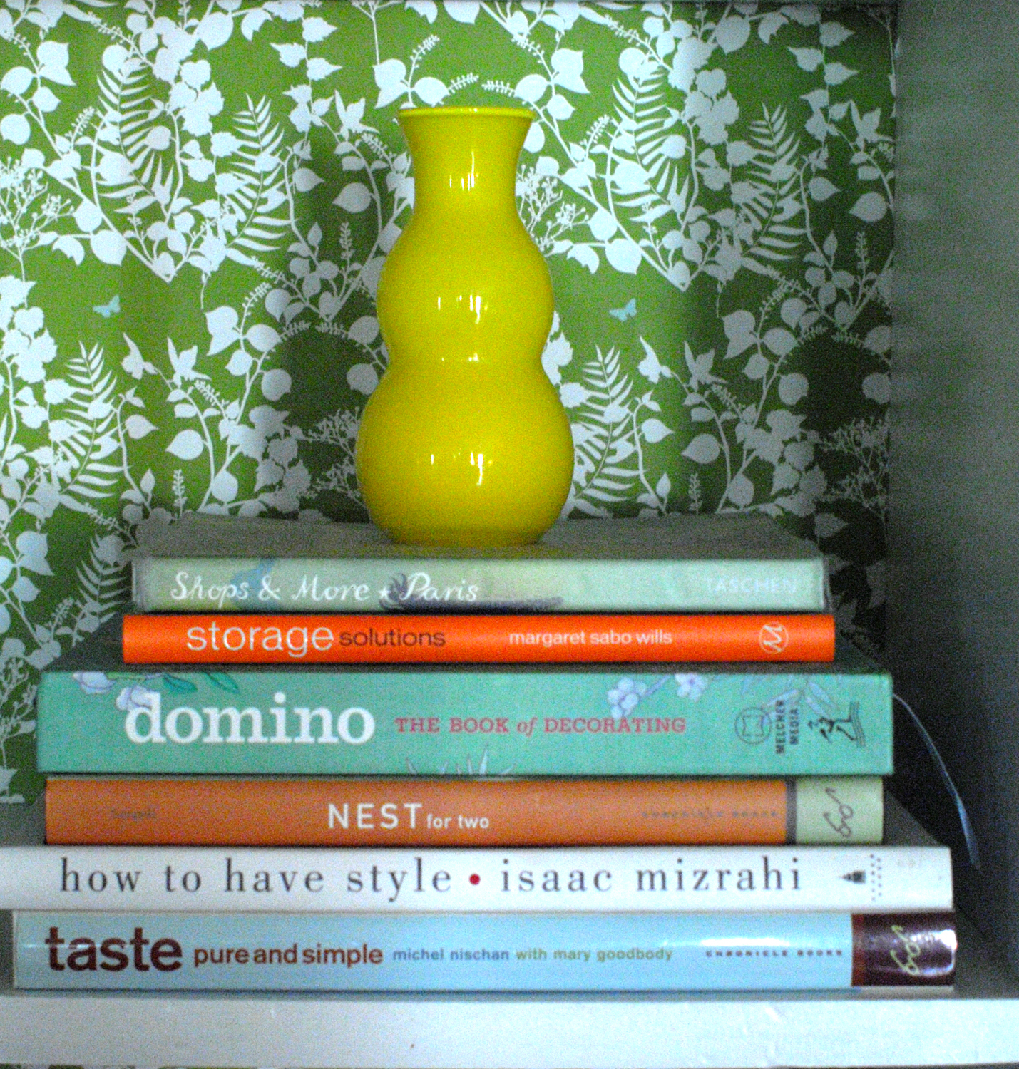
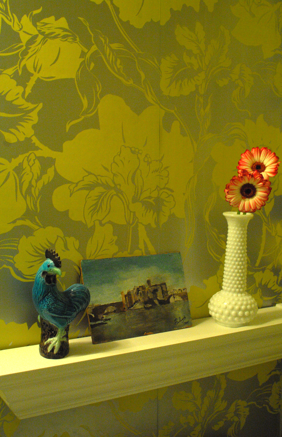
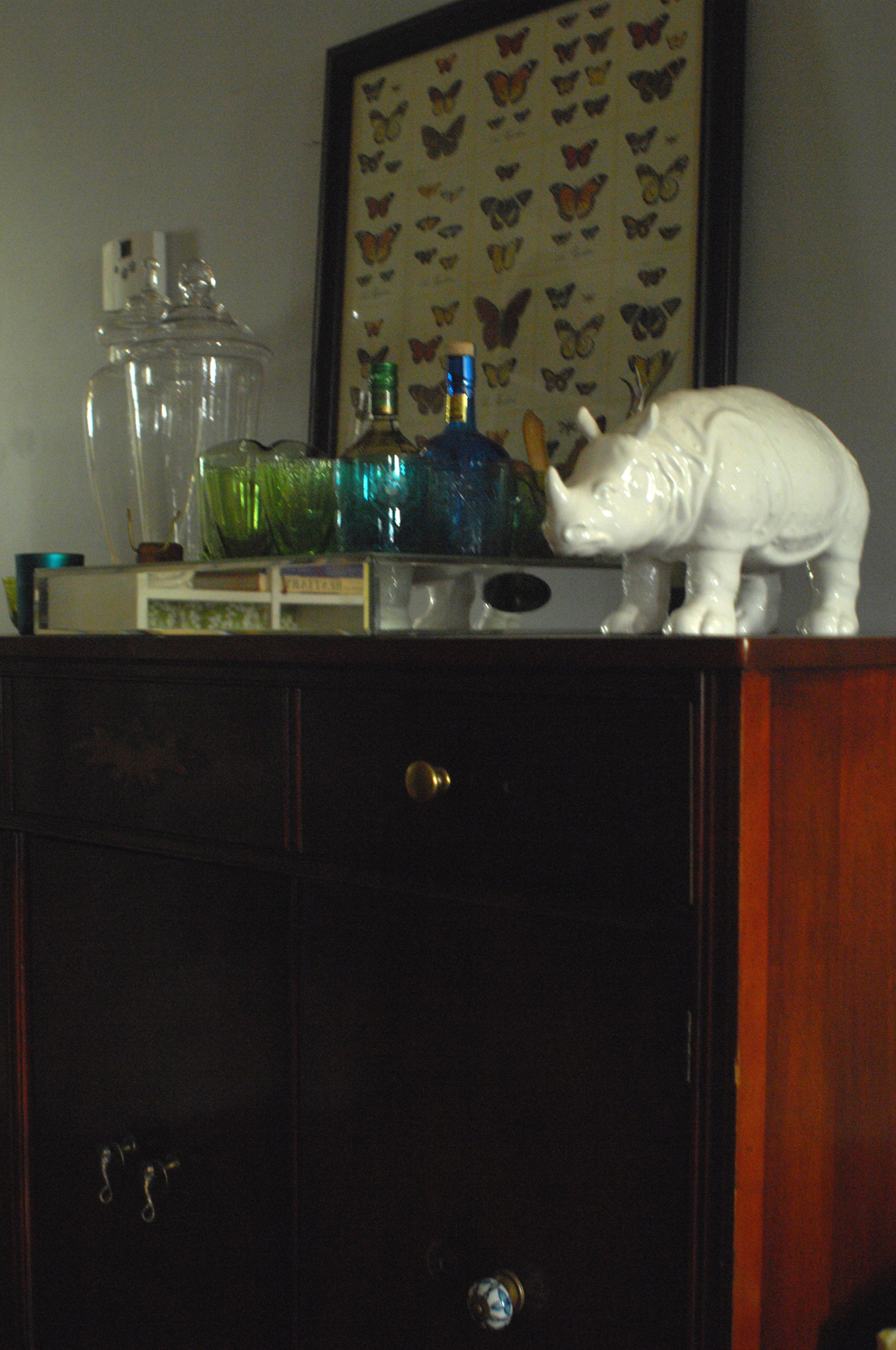
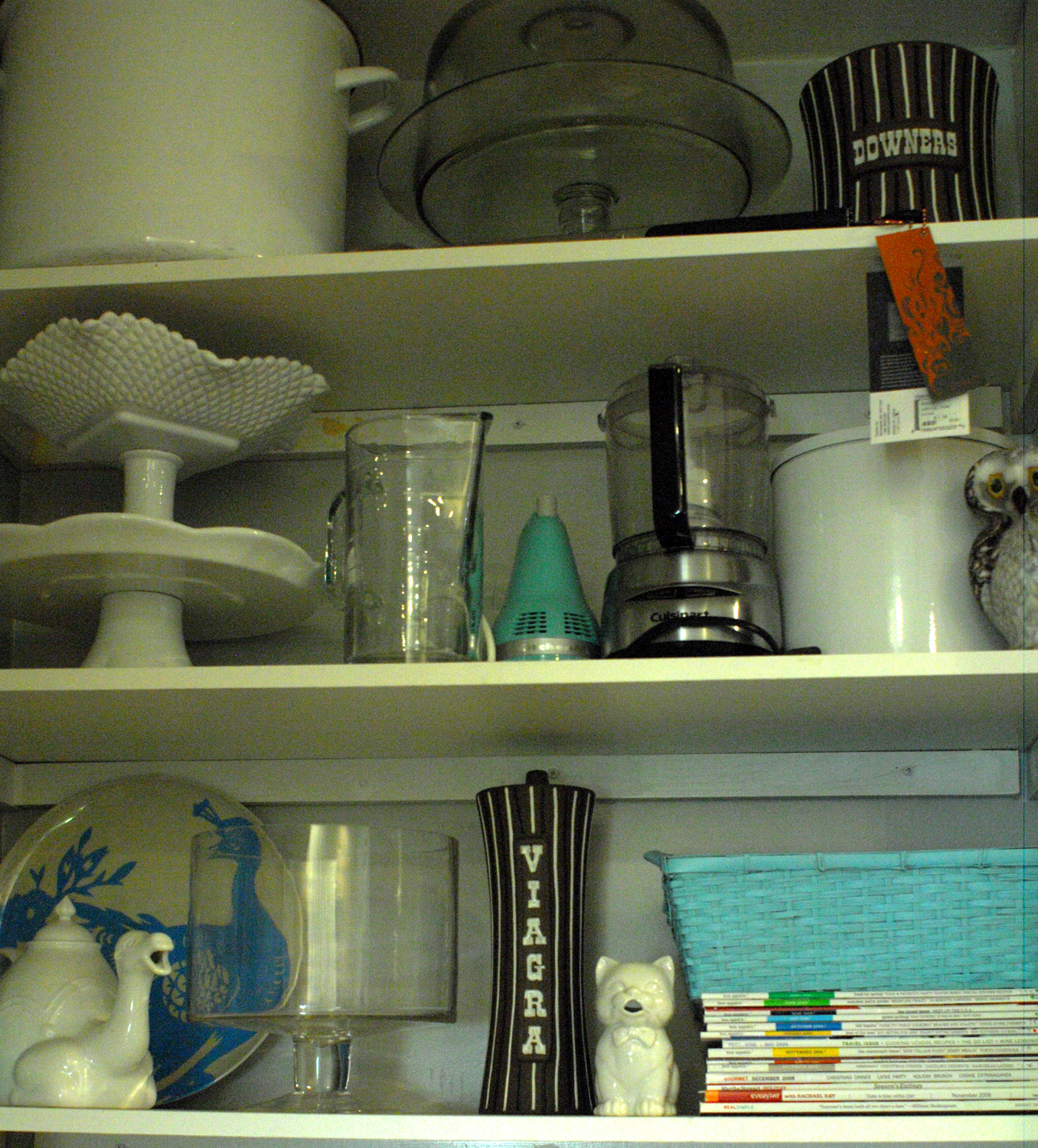
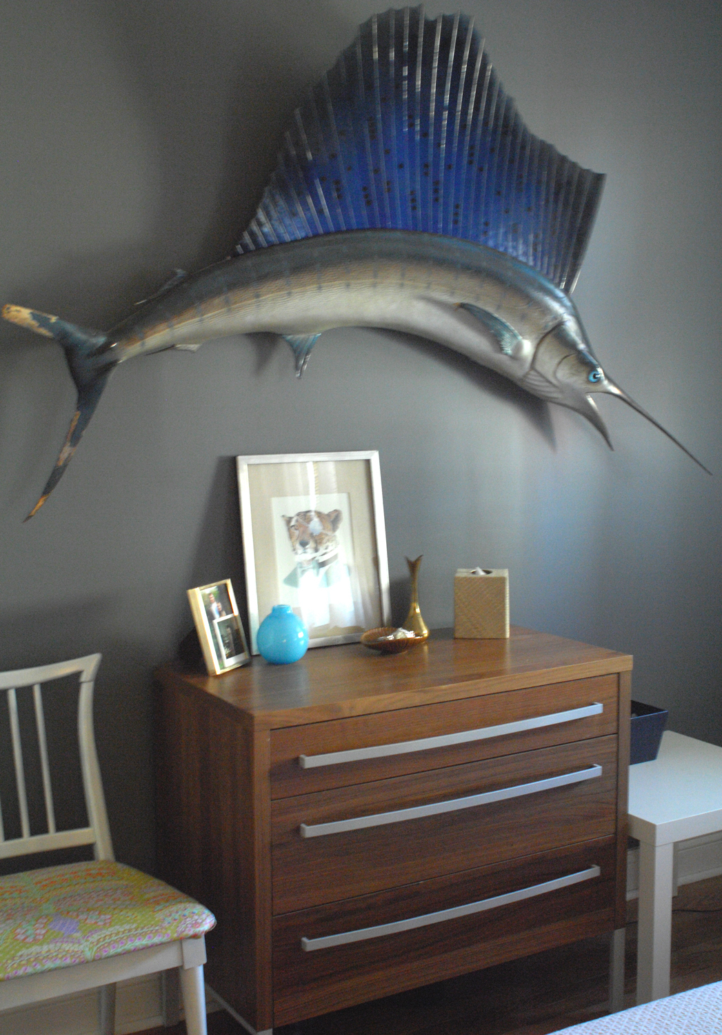
Biggest Indulgence: Lots of animal knickknacks and coffee table books.
Best advice: Have fun with color! Also, don’t deliberate forever before trying something new. Most things can be changed easily if it doesn’t work out.
Dream source: Madeline Weinrib, for her fabulously-patterned pillows and rugs, and 1stDibs for gorgeous antiques

Resources:
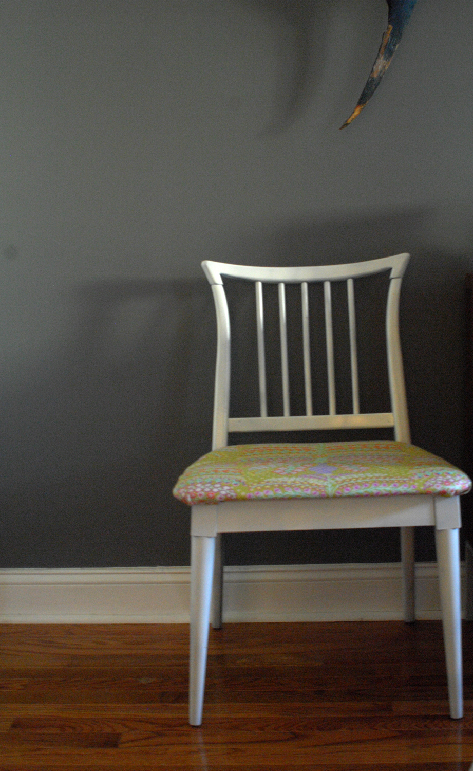
Furniture: IKEA, Dane Decor, Walmart, Craigslist, Design Within Reach,
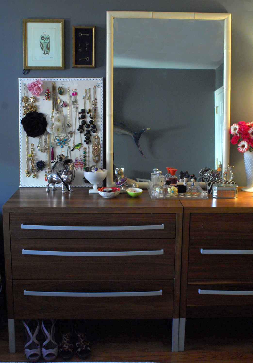
Accessories: Jonathan Adler, John Derian, Anthropologie, vintage, Z Gallerie,
Lighting: Anthropologie, Jonathan Adler, Tord Boontje, Urban Outfitters, Target
Rugs and Carpets: IKEA
Window Treatments: IKEA
Beds: IKEA
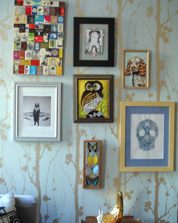
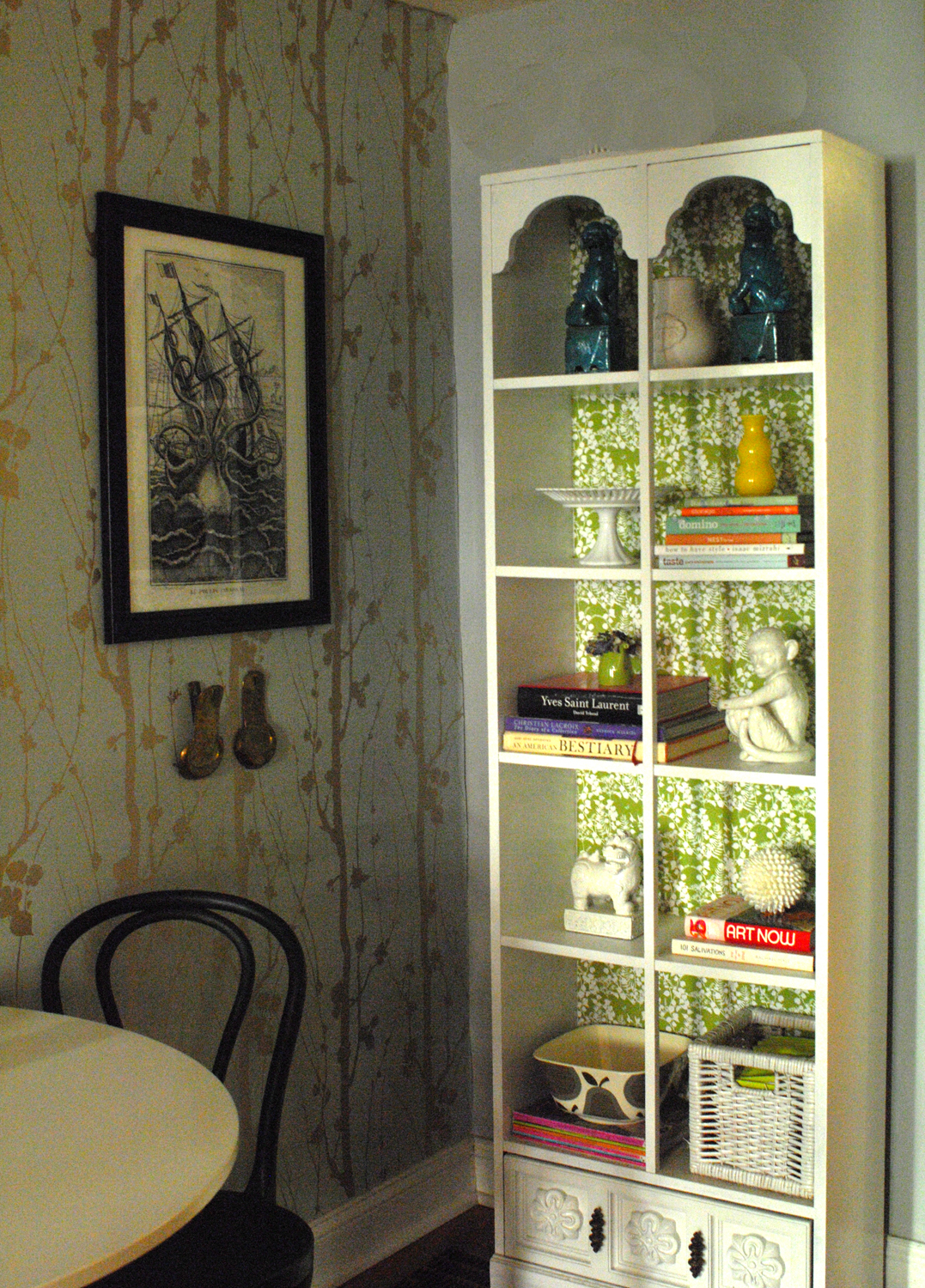
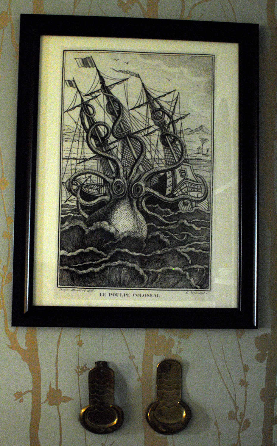
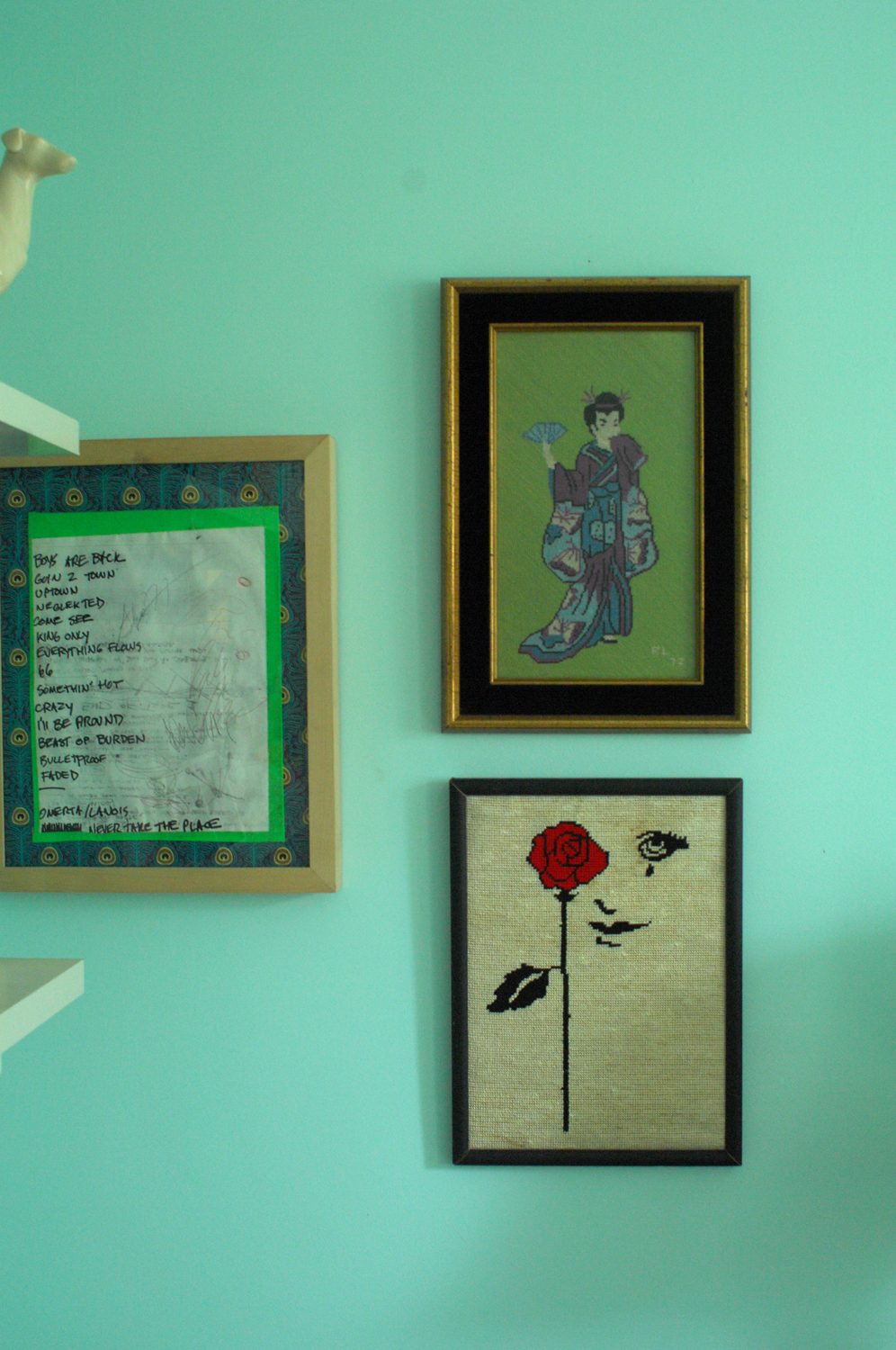
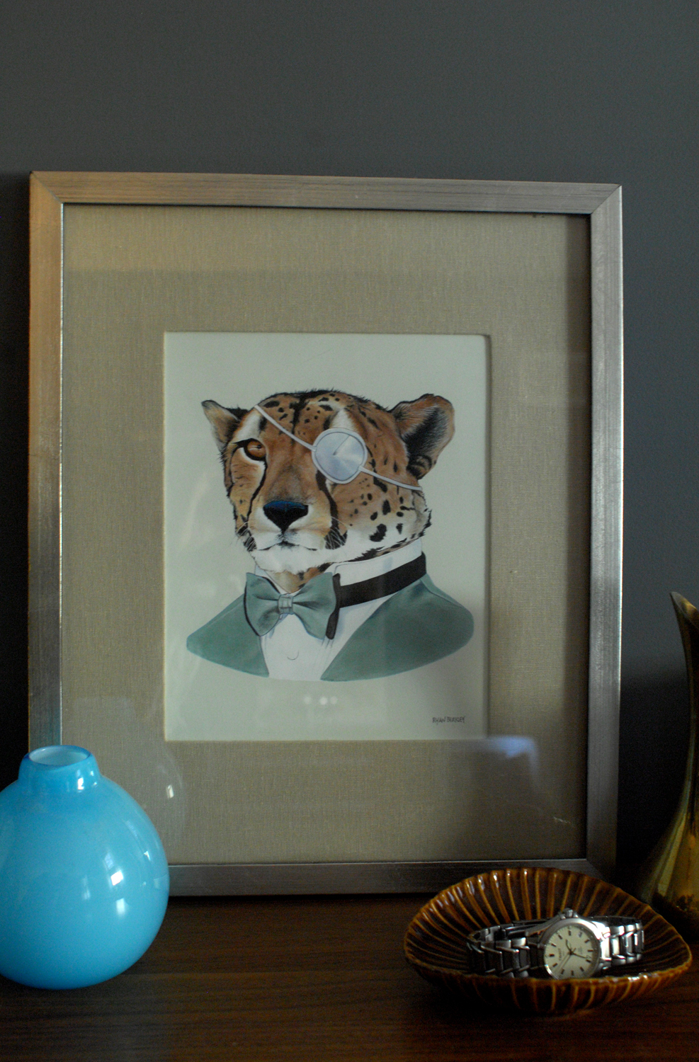
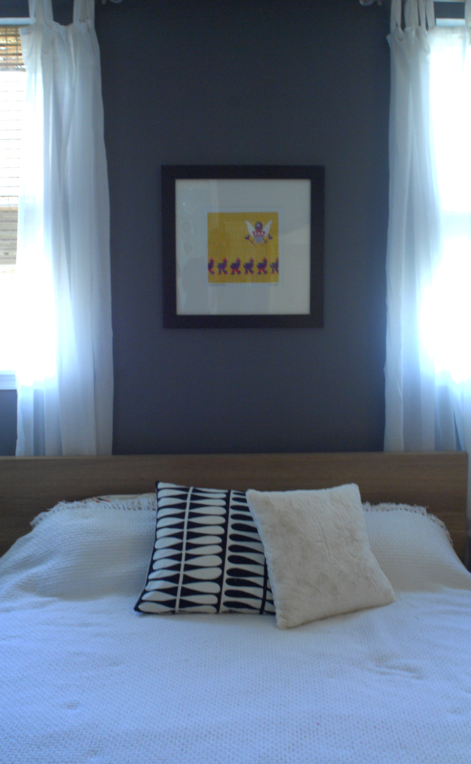
Artwork: Prints by Berkley Illustration, The Cellophanes, Sharon Montrose, Matte Stephens – all via Etsy; 8-bit paintings (in office and master bedroom) by Jude Buffum; Other prints and photography by Sfgirlbybay, Davina Zagury, Sycamore Press, 20×200, and my very talented fiancee Kevin!
Paint: Living room/dining room/kitchen: Valspar Rising Tide, Guest bedroom: Valspar Sea Air, Laundry room: Valspar Bayside Breeze, Master bedroom: Valspar Almost Charcoal.
Thanks, Elizabeth!
Images: Kristen Lubbe
• HOUSE TOUR ARCHIVE Check out past house tours here
• Interested in sharing your home with Apartment Therapy? Contact the editors through our House Tour Submission Form.