
My Pantone Color of the Year Predictions: My (Mainly Green!) Guesses for 2017
Let’s leave aside, for a minute, all discussions of how “color of the year” became a thing that I spend my time thinking about, and focus instead on the wonders of what I’ve come to embrace as Color Season. Benjamin Moore announced recently that Shadow, a deep, rich amethyst, is their color of 2017. Sherwin-Williams went with Poised Taupe, a neutral which perfectly straddles the warm/cool divide. AkzoNobel chose Denim Drift, a dusty blue not too far off from Glidden’s slightly more purple Byzantine Blue.
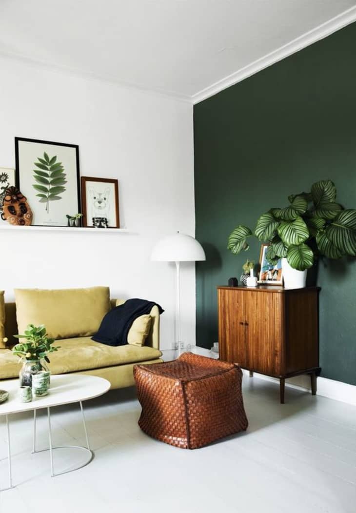
I’m particularly antsy to hear what Pantone’s Color of the Year will be for 2017. Coming up in December, the announcement is sure to spawn a thousand blog posts and much frenzied Pinning, but what could it be? Will hushed pastels take center stage again, or will they lean moody and grown-up like Benjamin Moore? A jewel-like forest green, perhaps, like the accent wall in this post’s lead image, via Bolig Magasinet? Though we’ll all be waiting for a few more weeks, just for fun (and to pass the time), here are my top guesses:

(Not So) Basic Black
When I consider my Pinterest feed in 2016, all I recall is black. The non-color color has been showing up on walls, kitchen cabinets, ironmongery and lighting fixtures all year, and I think the time is ripe for Pantone to go seriously dark with their choice, particularly if they went with a slightly dusky version like the charcoal wall in the above foyer spotted on Fantastic Frank.
Off-Black(s)
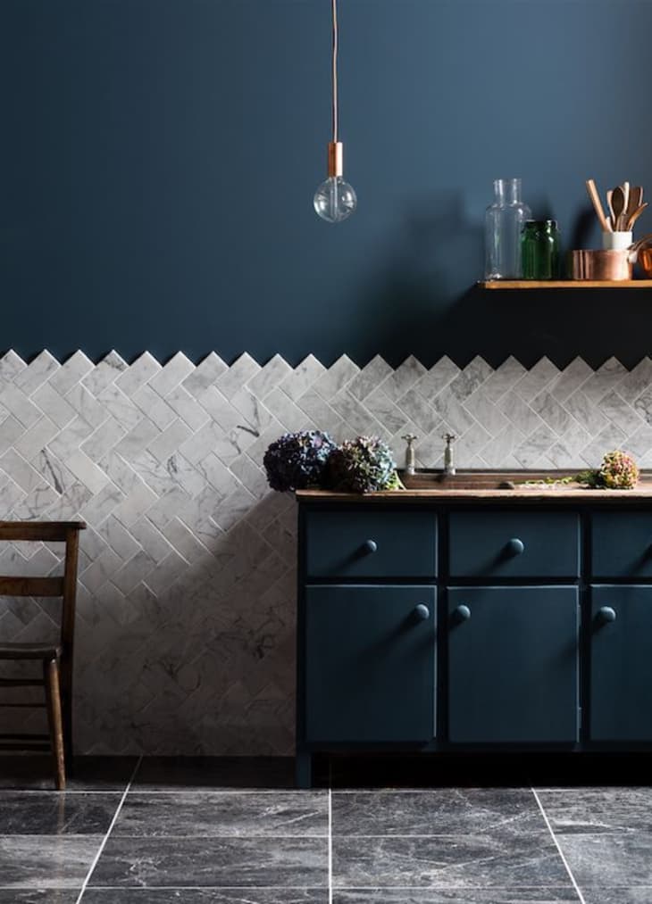
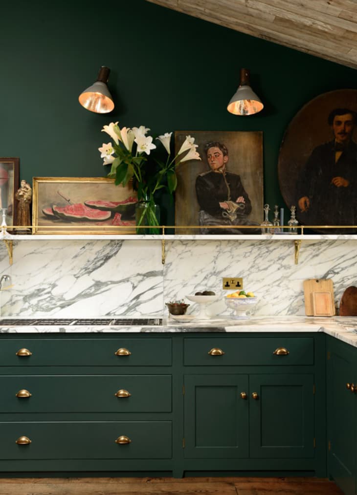
Black might be a bit extreme and well, not colorful enough for Pantone. Luckily deep, dramatic off-blacks have been just as popular this year, and perhaps a bit more exciting, too. I’m split between whether an inky blue like Interior for Life‘s hue (the kitchen color of the last year, it seems) or the dark hunter green spotted on deVOL’s cabinets above would be best. What do you think— midnight sky or a forest at dusk?
A Not-Too Neutral
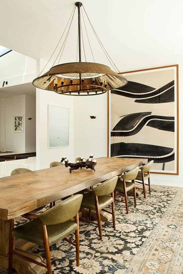
Continuing in the green vein (it’s my favorite color family so you’ll have to forgive me), I wonder if it’s time for my beloved faded khaki to have its day in the sun. I’m seeing it in clothing and interiors (like this dining room seen on Elements of Style) more and more these days, and with good reason. The grey-taupe-green shade is endlessly versatile, flattering and timeless.
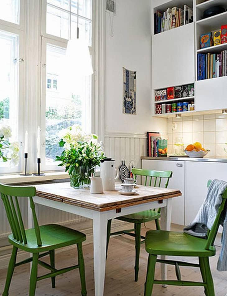
Leafy Green
Although my instinct tells me Pantone will go dark or neutral, they could bless us with a brighter shade for 2017. If so, my gut says a clear, yellow-based green could stand a chance: it’s vibrant and hopeful, exactly what the world needs right now. It would be great as the star of a room or as an accent (like the addition of the shade via the dining chairs in the above breakfast nook from Small House Interiors).
I’ll tell you something: When I began writing this post, I had no idea I was going to choose so many shades in the same family. Clearly I’m feeling green (and black) right now. I’m either onto something or very wrong (and extremely stubborn), but only time will tell!
What are your thoughts on Pantone’s Color of the Year 2017? What color would you love to see more of in home decor?