
According to Pinterest, This Shade is 2018’s New Neutral
2016 was the year of white, and since then, neutrals really have reigned supreme in home design, particularly when it comes to paint colors and large furniture like sofas. This past year belonged to blush—you know, that whisper light, not quite pink or peach or tan hue that was EVERYWHERE, from walls to chairs, even shoes and bags. But looking forward to 2018, Pinterest seems to think there’s a new neutral in town. The color? Sage. Searches for this soft, serene green are up +170%, but it’s no surprise to us really, since our design editor predicted it might be Pantone’s color of the year before Ultra Violet dropped last week.
Sage green is absolutely a step in the direction where color trends in general seems to be going—desaturated, grayed out and almost chalk-like, or matte, in finish. And if you ask any color expert, greens tend to speak to our desire to connect more to the outside world. With its mossy, plant-colored hue, sage definitely references nature in spades. It’s also not crazy bright, so it’s pretty pleasing to the eye. A subtle slide on the color scale over from mint, sage is less jovial, more sophisticated, almost pensive.
And soothing finishes are definitely something people are seeking these days as well. I mean, we can only look at our phones and tablets for so long, right? Let’s take a look at sage in action because you just might want to try this color for yourself in 2018.
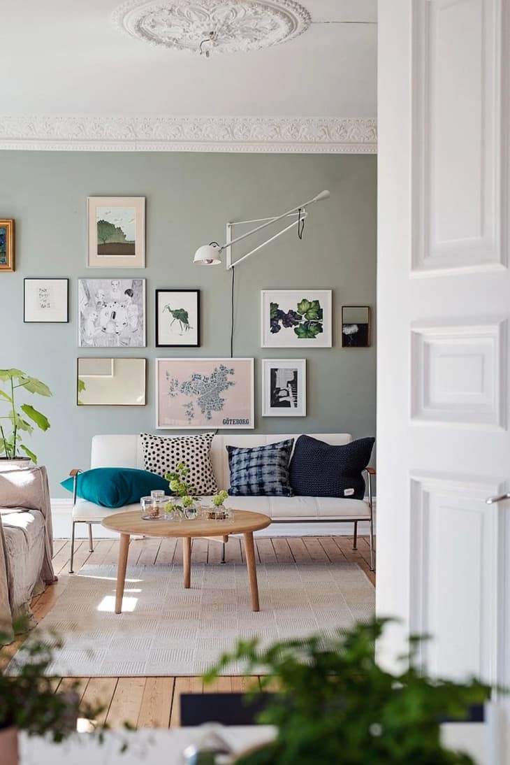
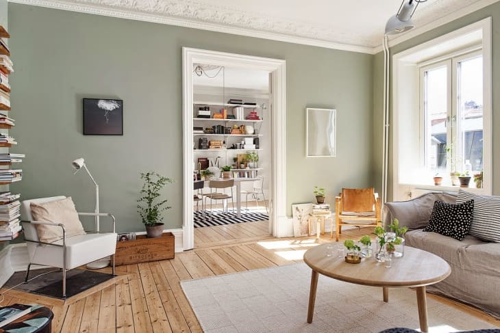
I used to be in the camp of thinking that very colorful gallery walls were only doable on white or super light gray backgrounds, but this Swedish living room (found on SFGirlbyBay, also shown in the lead image of this post) has proved me wrong. And if the Swedes, Danes, Fins or Norwegians are down to do sage, then I think it’s a serious design contender for someone who likes that modern look.
If you were thinking gray cabinets in your next kitchen reno, give sage a chance. It’s kind of like gray’s cooler cousin right now, especially when it comes to built-ins or cupboards.
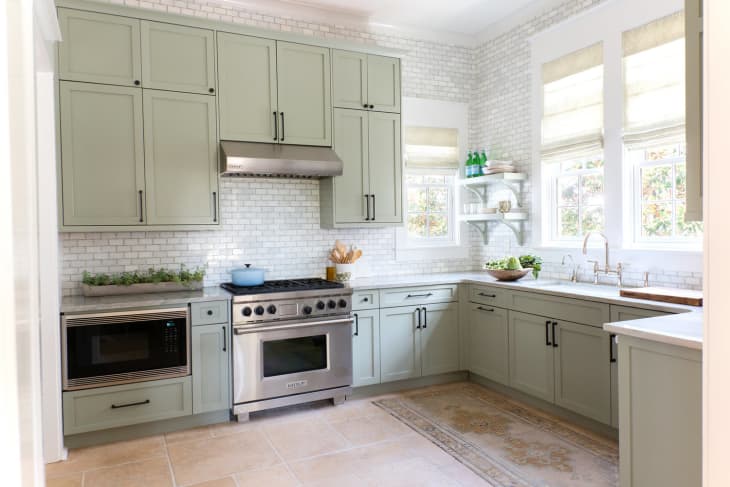
Here’s another sage kitchen in a completely different style from Urban Grace, proof that this soft color can work with just about any aesthetic.
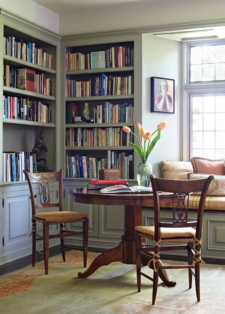
Color experts often call green energizing, so it’s a decent choice for an office or study. And again, the colored spines of books (like art) really play well with the sage green walls in this library by designer Madeline Stuart, found on One Kings Lane. Further proof that sage really is a neutral backdrop that can handle pops of color in furniture and accessories.
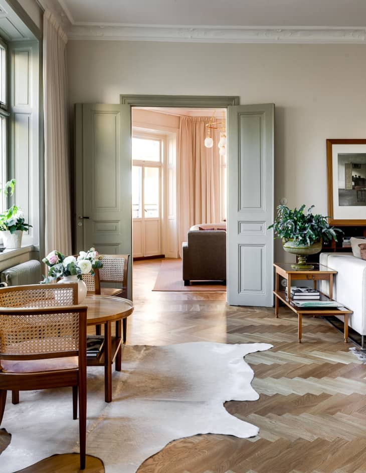
If you’re hesitant to go all out with sage walls, it’s a really modern choice for molding and doors, as seen in this shot from Anna Gillar. Interior window trim or outdoor shutters would look great painted in this hue, too.
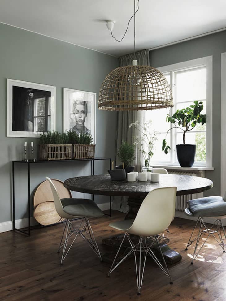
Sage is also a striking color for a dining room. I love the way it pairs here in this space from My Scandinavian Home with black-and-white artwork and natural fiber finishes.
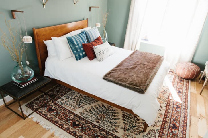
And finally, gray or blue bedrooms have reached peak saturation, so why not try a sage sleep space instead? The right shade will have a calming, soothing feel similar to what gray or blue can do. And it’s pretty gender neutral, too. It would be lovely paired with soft blushy pink, gray and white, or, as shown in this bedroom from Ave Styles, richer tones like burgundy and deep wood tones.
So get after sage. It’s a really rich, versatile color right now. And with the right furniture and accessories, it’ll never look granny or dated.