
This 2020 Color of the Year Is Making Us Blush
If the latter half of the 2010s can be defined by one color, it’s millennial pink. The less sweet version of the rosy hue has dominated headlines, ad campaigns, products, and everything in between for years. And while millennial pink mania has died down in some respects, we’re all a bit more open to exploring our softer sides.
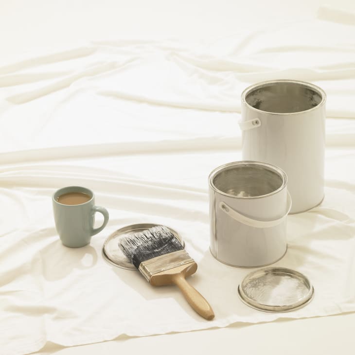
And that’s just what HGTV HOME by Sherwin-Williams is hoping for—their 2020 Color of the Year is Romance, a “soft and dreamy blush hue that evokes serenity while simultaneously making a statement,” says Ashley Banbury, HGTV HOME by Sherwin-Williams Senior Color Designer.
“Color trends are continually evolving and shifting in temperature and tone. Some might think our Color of the Year, Romance (HGSW2067), is reminiscent of Millennial Pink but really it shows how colors become more excepted and evolve with time, as we do,” Banbury told Apartment Therapy over email. “Millennial Pink is a more saturated, bolder hue and Romance is a sophisticated blush tone that can be used in any room throughout your home, a perfect shade to combine with trending colors from the Simply Blissful Color Collection.”
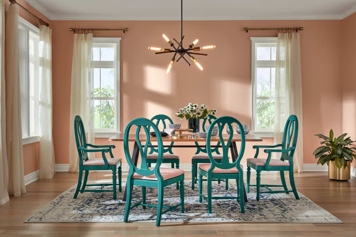
While the term “neutral” is usually reserved for stalwart shades like white and gray, we’ve been seeing a lot more blush pink used in the same way, and Banbury agrees. “Our palette of neutrals has expanded, and we are looking to colors outside of gray and beige. Romance is a beautiful colorful neutral! it is a soft blush tone with a slight apricot influence; it can be used as an all over wall color, a perfect backdrop to highlight your favorite piece of artwork or treasured family heirloom.”
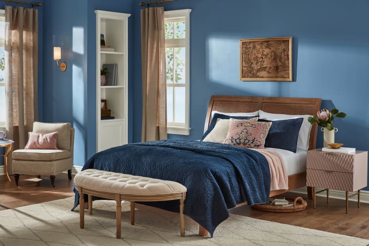
But if you’re looking for complementary shades, Banbury has some suggestions: “I love the glamorous effect it has when paired with a deep jewel tone, like Island Time (HGSW2312). Create an immersive monochromatic look with Coral Reef (HGSW1074), a bolder shade that is vibrant and optimistic. If you’re looking to have a room that is calm and serene, blues are perfect, pair Finian Blue (HGSW2384) and Blue Endeavour (HGSW1451) with Romance for a welcoming retreat from your day!”
Other 2020 colors of the year already announced include Behr’s Back to Nature, a soft yellow-green; PPG’s Chinese Porcelain, a mix of cobalt and inky blue; Sherwin-Williams’ Naval, a deep navy; and Glidden’s anti-COTY Whirlwind, a timeless gray.