
The 10 Living Room Paint Colors Design Pros Swear By
If picking out a paint color was easy, we’d all do it a lot faster. Instead, we agonize over paint chips and swatches, hoping that we don’t make a mistake. Paint may not cost a ton, especially if you’re DIYing the job. But who wants to waste time putting the wrong color up on their walls? That’s why I went straight to the pros to bring you a handful of go-to, no-fail living room colors. Spoiler alert: There are a lot of white and gray shades in the mix. But there’s also a bold, unexpected hue (or two!) thrown in there for those of you who want to shake things up. Here, 11 designer-approved living room paint shades—straight from the designers themselves paired with pictures of rooms where they’ve used them.
“Benjamin Moore’s King Arthur’s Court in a matte finish is such an elegant and earthy backdrop, perfect for creating a mood of calm and airy lightness in a living room,” says designer Caitlin Murray, founder of Black Lacquer Design. “As a more desaturated hue, it’s also great for those who are a bit color shy but still want to add more color into their homes. I used it previously on a feature wall in a living room where I was pulling in a lot of tonal neutral colors and organic textures. I think the King Arthur’s Court really worked to anchor it all whilst still providing a little pop of color.”
“One of the best colors for a living room is Campfire Ash from Behr,” says designer Linda Hayslett of LH. Designs. “It’s a great easy, soft color that can blend with any style and space. It’s casual and comfy all at the same time since it’s a greige color.”
“Sherwin-Williams’ Pure White is my go-to paint color for living room spaces,” says designer Abbe Fenimore, founder of Studio Ten 25. “I love the fresh feel of white walls and how it creates the perfect backdrop for any color palette. Many people are not a fan of white walls because they show every scuff, but keeping a Mr. Clean Magic Eraser around easily solves that problem.”
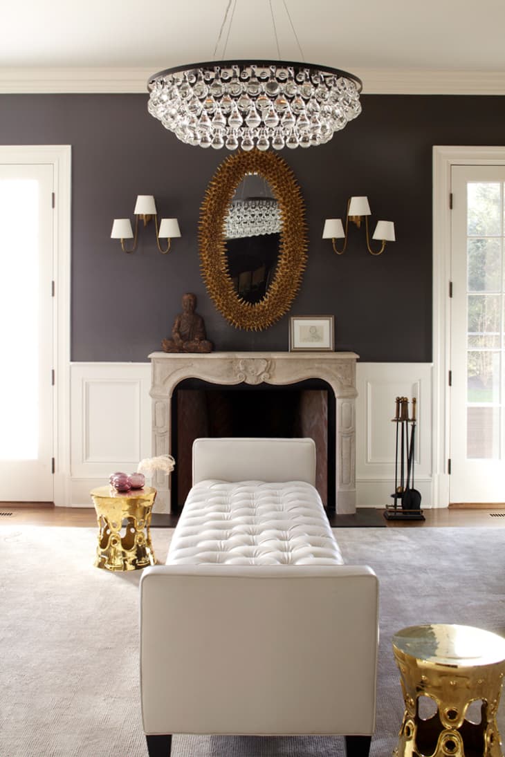
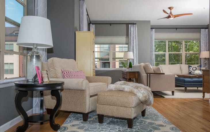
“When we want to go bold, our go-to living room paint color is Benjamin Moore’s Graphite,” says Jess Blumberg of Dale Blumberg Interiors. “It’s the perfect warm charcoal, so it works with just about any other neutral or color scheme.”
“Lately, I’m focusing even less on color and more on the texture like Venetian Plaster,” says designer Ana Claudia Schultz of Ana Claudia Design. “First, you select your base, Grey Owl from Benjamin Moore is my go-to, then add white plaster to it (the process is more complicated than it sounds so I suggest you hire a professional). Once completed, your space will still be light and bright but full of depth and texture.”
“One of my favorite whites is called Misty Gray by Benjamin Moore,” says designer Jennifer Wallenstein of September Workshop. “It’s bright and crisp without feeling stark and works beautifully with warm and cool tones. But I am also a fan of a bold wall, and Slate Teal by Benjamin Moore is an amazing shade of blue that comes alive in sunlight and feels perfectly moody at night. I used both of them in this Santa Monica condo project, and I love the way they play off of each other.”
“Behr’s Bit of Sugar, a fan favorite, is a trustworthy white with minimal undertones,” says Atlanta-based interior designer and blogger Kevin O’ Gara. “I specified a high gloss finish for extra shine, adding a bit more luminosity to the living room and maximizing the natural light we get in the space.”
“We love to use a deep tone like Benjamin Moore’s Chelsea Gray in a living room with so much natural light,” says designers Cynthia Stafford and Lindi Bolinger of TruDesign Colorado. “Using a deeper color in an area more prone to the use of artificial light has a tendency to make the space feel smaller.” But when natural light is present, the opposite is true. “It can really open up your living room and allows you to play with more color when it comes to furniture, draperies and accessories,” says Stafford and Bolinger.
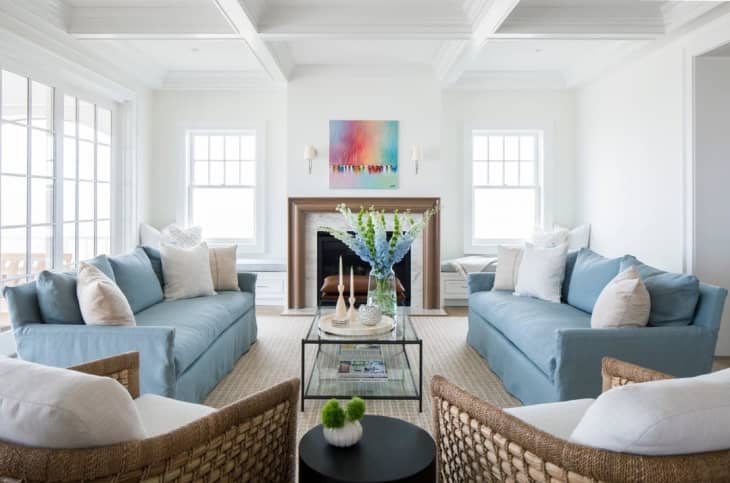
“Simply White is a softer warmer white that allows for a perfect canvas as we design a living room,” say the designers at Hudson + Bloum. “We have used in our coastal projects and also our mountain project—it’s always clean and fresh.”
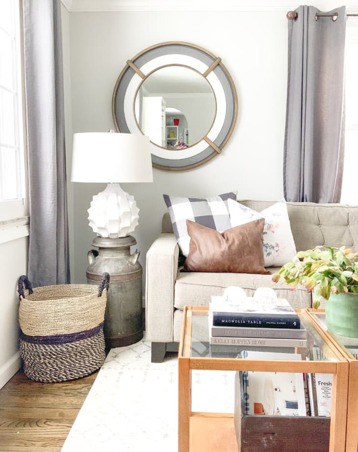
“Behr’s Seagull Gray is the perfect gray that is not too cool and not too warm,” says designer Gail Wright of Gail Wright At Home. “It is just a subtle touch of color for your walls that goes well with any other color you want to incorporate into the room.”