
7 Beautiful Wintry Color Palettes We Can’t Get Enough Of
I love color and really think any shades can work year-round in your home if you’re a big enough fan of them. And sure, colors are seasonal—white feels like summer, pastels read as springy, and darker shades are always going to be more autumnal or appropriate for winter. But the magic is really in the mix. Most shades can go either way, depending on what you pair them with. So if you’re looking for a little palette inspo for a 2019 makeover or renovation, take a peek at these rooms. They’ve all channeled winter vibes but aren’t sparse, cold, or off putting in the slightest bit. Here’s why they work so well, for winter and beyond.
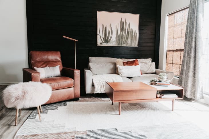
1. Brown, White, and Black
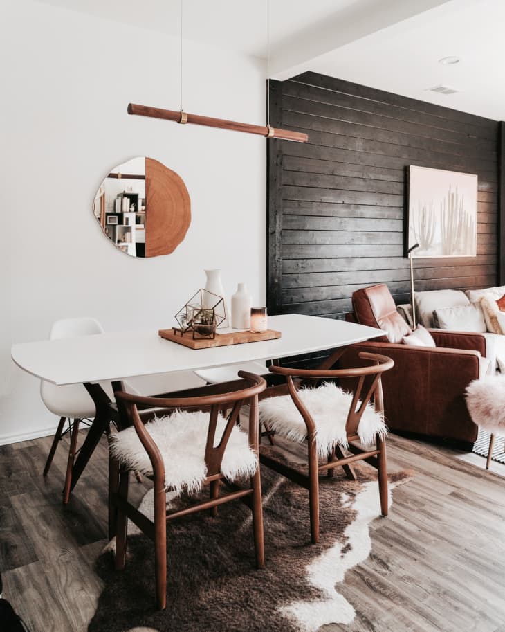
This color combo sounds straight out of the Southwest. But it can also read Scandi modern, as it does in this dining area. If there’s anything the Danes, Swedes, and Norwegians know, it’s how to do winter. A lot of times Scandinavian design is all about using bright colors to offset all that darkness they experience during the winter. But when they embrace the moodiness, there’s no stopping the winter vibes that their neutrals can create. The fuzzy seat covers and hides certainly don’t hurt the cozy factor either.
2. Teal, Charcoal, and Cranberry
I’m living for this tranquil, wintry bedroom mix. I mean, I’d definitely like to curl up there. Your sleep space is a great place to explore color because you can layer several shades on your bed with a cozy throw, decorative pillows, and even your shams and sheets or duvet. And it won’t feel too try-hard or color crazy if you show a little restraint in your selections. This deep teal half wall is a great design element. Not only is it a beautiful, rich background for the white bedding so many of us prefer these days, but it also plays well with low-key gray textiles and that pop of cranberry in the lumbar pillow. The half wall also somehow incorporates a tiny ledge, which makes over-the-bed styling that much easier—you just have to put cute stuff on top of this perch.
3. Steel Blue, Chambray, and Pink
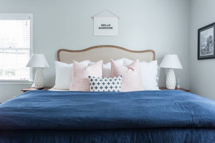
Winter blues indeed! Here, pairing light blue walls and pink accents with a mid-tone blue duvet gives a little edge to what might otherwise feel like a springy pastel palette. The more grayed out the blues you use are, the better, especially if you’re going for a wintry mix. I’d also consider adding black accents here to round out the drama.
4. Camel, Cream, and Silver
Okay, so the Christmas tree totally sells the wintry vibes here, but the rest of the room is kind of a sophisticated, snowy white out—texture on texture with fuzzy sheepskins, a nubby rug, and even some silvery velvet throw pillows. But man does the camel hang here too! I’d normally think a warmer color like this shade of tan would make a space feel summery and not jive with an otherwise cool-toned space, but that’s so not the case. This room is the equivalent of wearing a chunky cream turtleneck with faux suede camel leggings and an ivory faux shearling coat, and what could be more appropriate for chalet-all-day vibes? Lesson learned. Don’t be afraid to take one of your favorite wintry outfits and use that as color palette inspo.
5. Plum, Tan, and Woodsy Brown
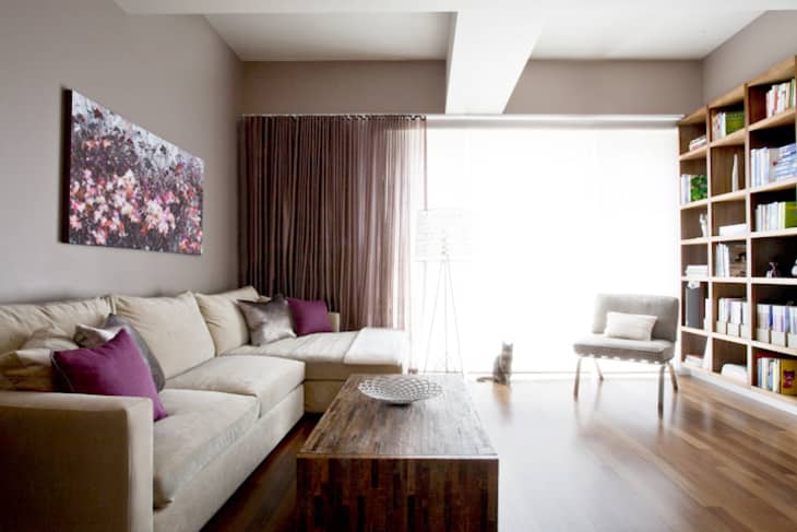
Plum—lavender’s deeper, darker cousin—definitely skews feminine and has a decided warmth about it. But there’s something cool about this shade too, at least when you see it used alongside an oatmeal colored sofa and darker wood floors. Maybe it’s that sweet floral artwork and the diffuse light coming through the window sheers talking, but it’s all visions of sugarplums dancing in my head when I look at this living space.
6. Charcoal, Wheat, and Blush
Millennial pink, if we’re still calling it that, is another shade that feels inherently feminine, floral, and summery. But when you pair it with a darker, moodier shade like charcoal or graphite, it’s starts to cool off, as this cute, vintage, English cottage-inspired bedroom proves. The key is using pink as the accent shade and keeping the rest of the furnishings, from the bedding to the rug and even the wallpaper, relatively neutral in terms of color.
7. Forest Green, White, and Black
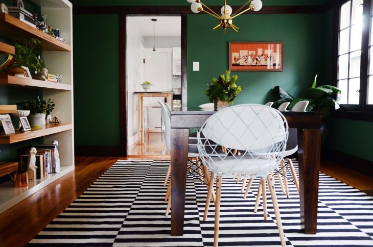
Classic white-and-black decor is truly season-less, but what you choose to team it up with makes all the difference. Yellow would be summery, and orange would feel like fall. But forest green, at least in this dining room, is lush, but not in a springy way. I’d say it’s closer to wintry myself. Again, the dark trim is crucial here. I don’t think this room would feel the same way without it.
Would you use one of these wintry palettes, or would you worry that it might look drab throughout the rest of the year?