
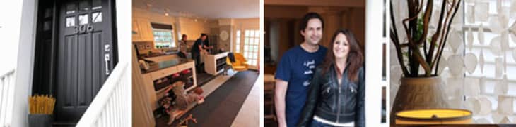
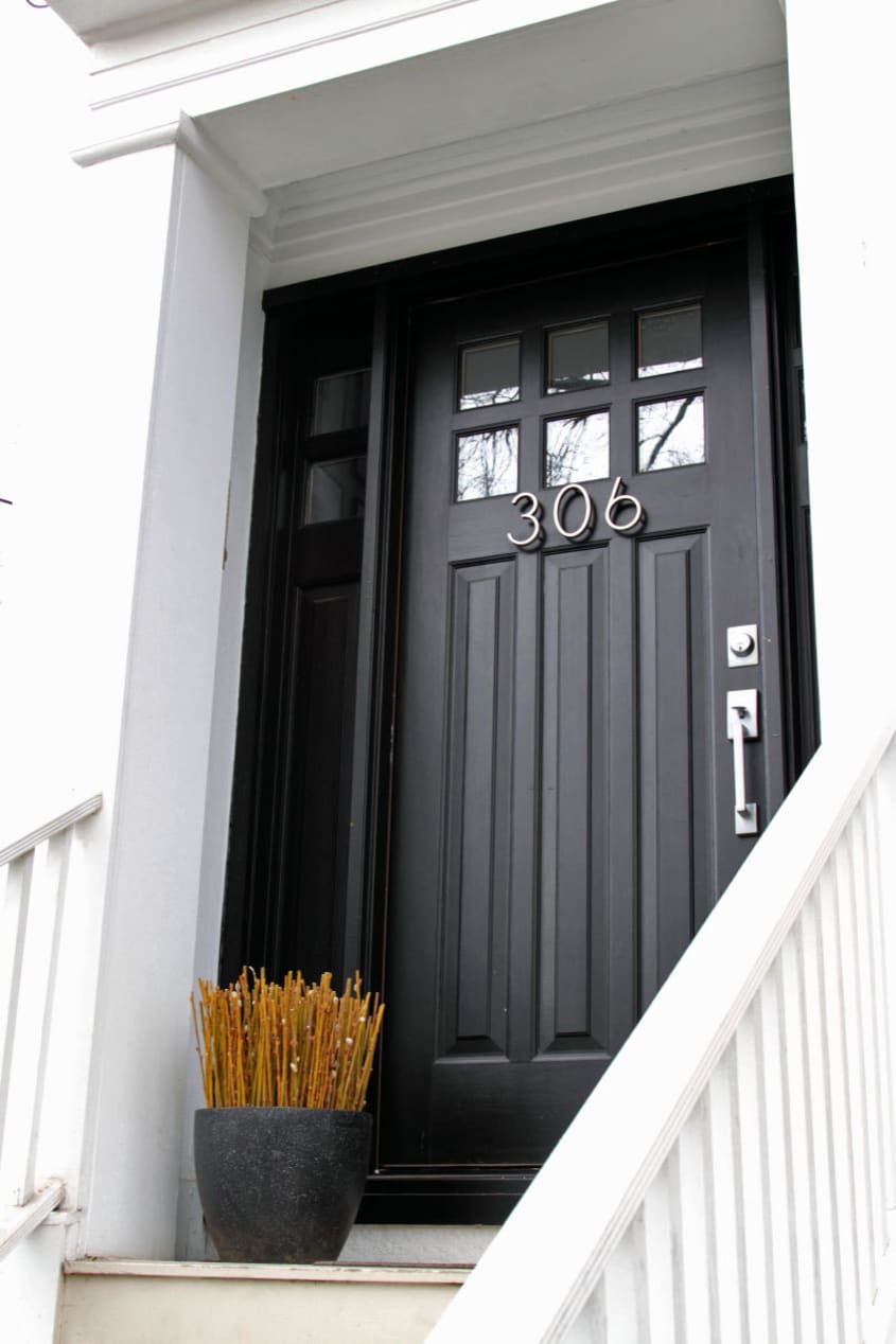
Alex & Debra’s Modernized 1850’s Greek Revival
Name: Alex & Debra
Location: Cambridge, Massachusetts
Size: 1,406 square feet
Years lived in: 4½
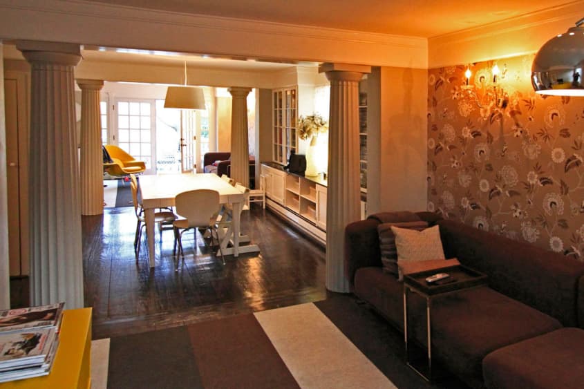
Living on the East Coast offers residents a choice in housing stock of homes built before the 1900s. Finding fluted columns on the exterior of a Greek revival home is commonplace, but finding the columns on the inside of the house was a surprise for Alex and Debra. They painted the columns white and grew to love the character they provided and the purpose they served to separate the space while maintaining an open floor plan.


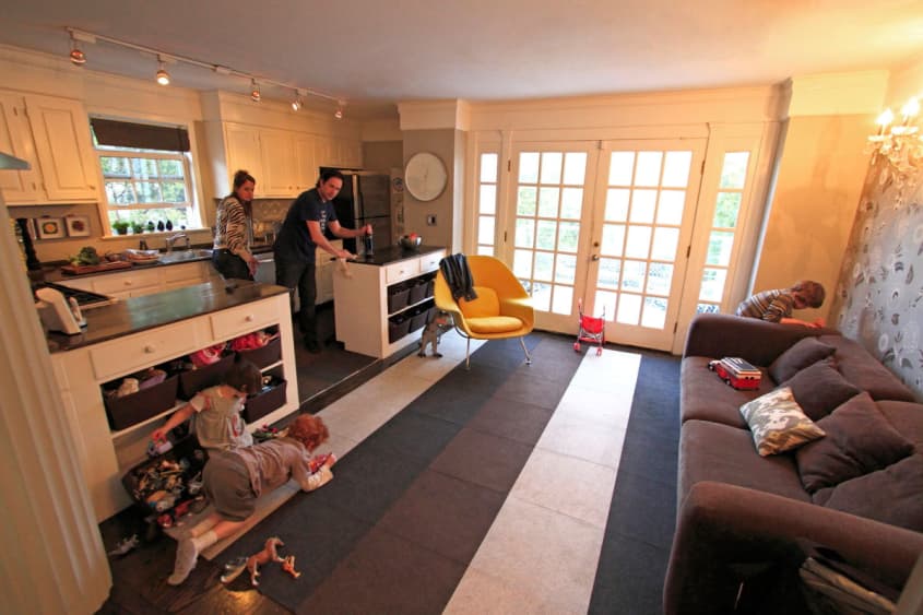
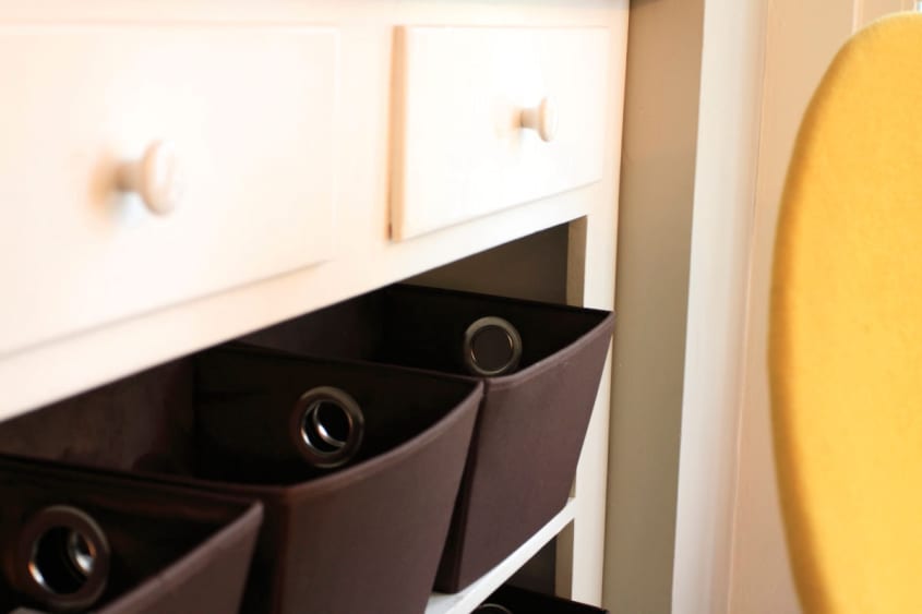
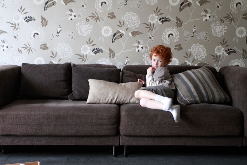
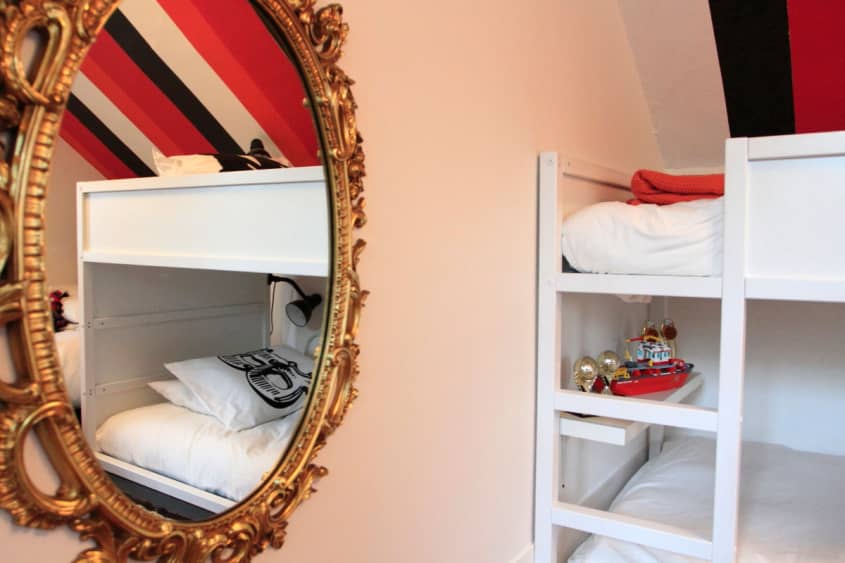
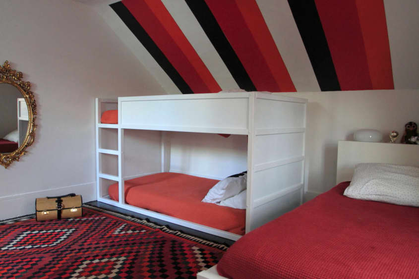

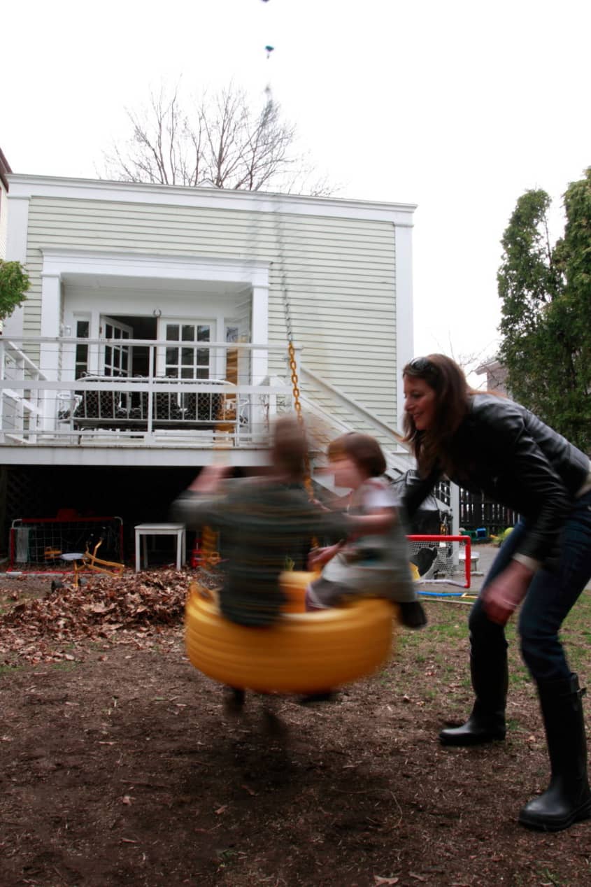
If you have scrolled down a bit, you saw the adorable picture of their red-haired cutie. With three young children, Debra is always looking for ways to hide/store toys. One side of the kitchen cabinets holds baskets for loose toys. Having one of the living areas opposite from the kitchen keeps the whole family connected. Currently all three kids are sharing a bedroom with one extra bedroom in the basement for guests. With only one bathroom on the upper level, Alex and Debra had to remodel the space to accommodate a family of five.

Apartment Therapy Survey:
Our Style: Classically Modern
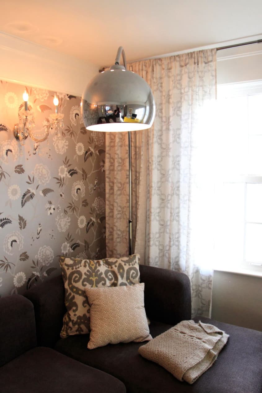
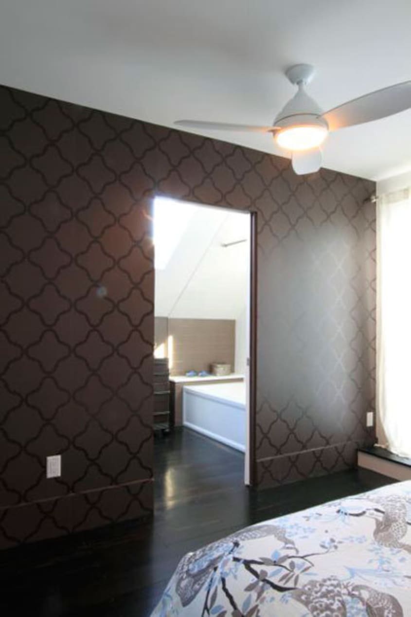
Inspiration: Our living room wallpaper. Once I found it everything else fell into place. Wall color, sofa style, pillow fabric, and contrasting elements like crystal chandeliers and geometric prints.
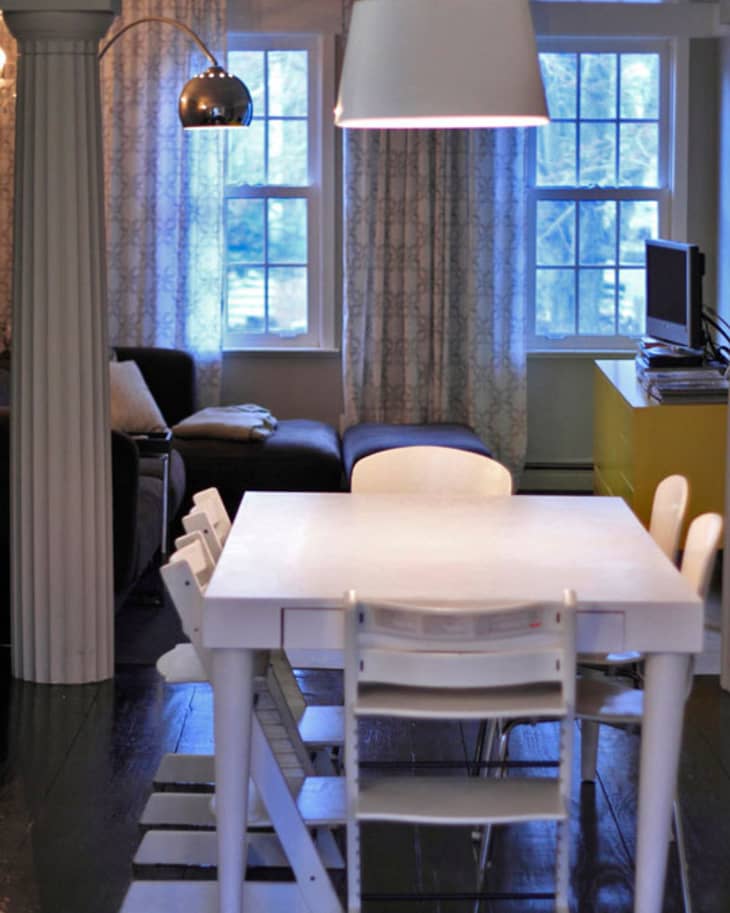
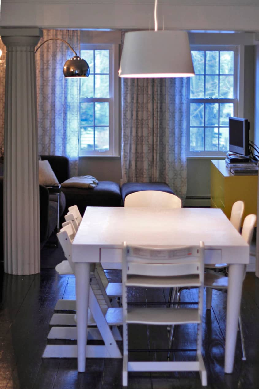
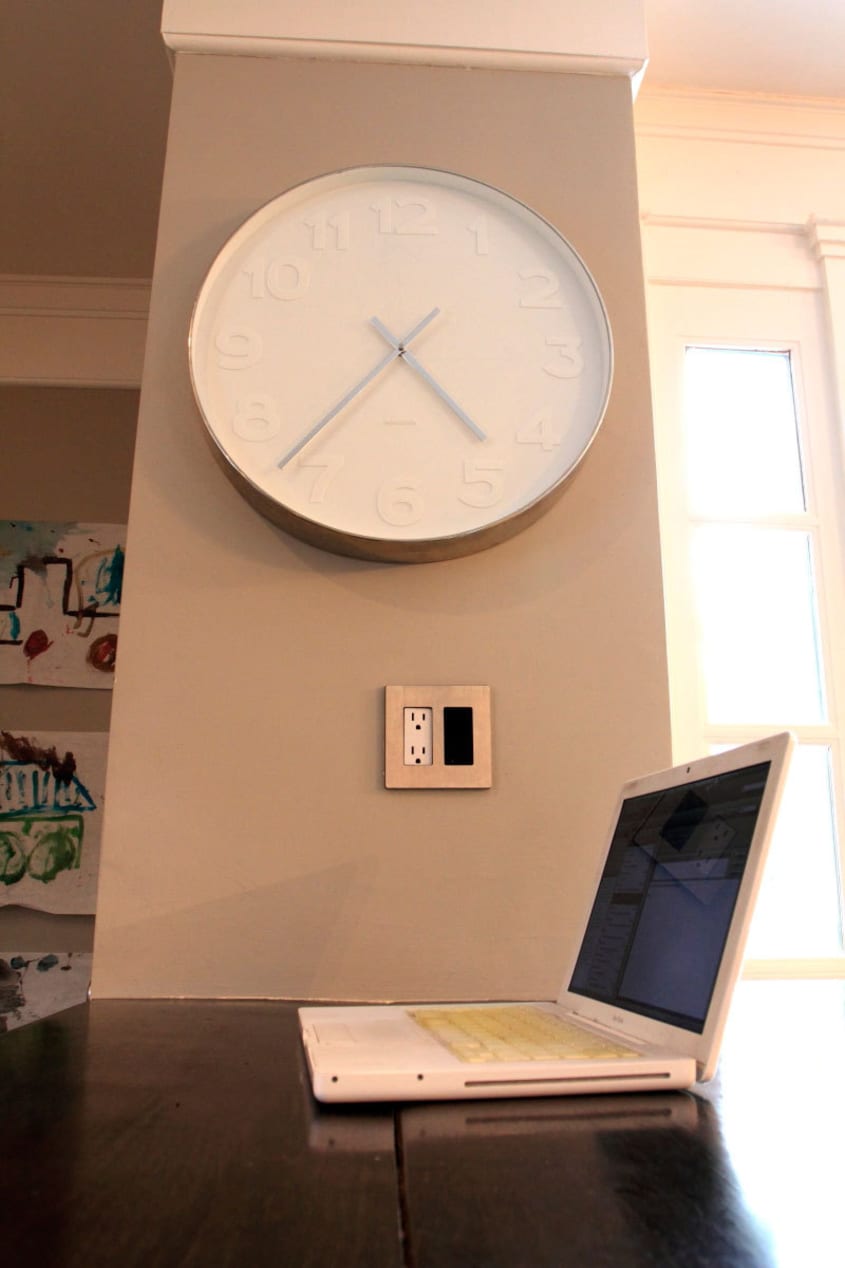
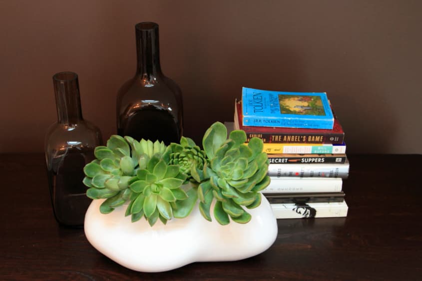
Favorite Element: The four pillars that frame the center dining room. Our initial thought was to remove them and open the space even more, but once they were painted the same color as the walls they became less dominant and more decorative. Now they help define separate living areas while maintaining an essentially open floor plan. Also, our ebony stained floors and wood countertops. I love the rich depth of color and the contrast they provide to the light walls and detailed wallpaper.
Biggest Challenge: Utilizing every inch of our 1,400 square footage to meet the needs of a family of five. From storage, traffic flow and playtime perspectives, everything and every place has a purpose and a function.
What Friends Say: Actually, it’s more what they don’t say: “It’s time to go.” We entertain a lot and often times need to politely remind our guests to leave or offer to let them spend the night.
Biggest Embarrassment: Easy — the closets. Besides the fact they’re really old and never renovated, they tend to get quite messy.
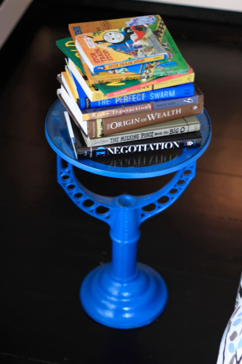
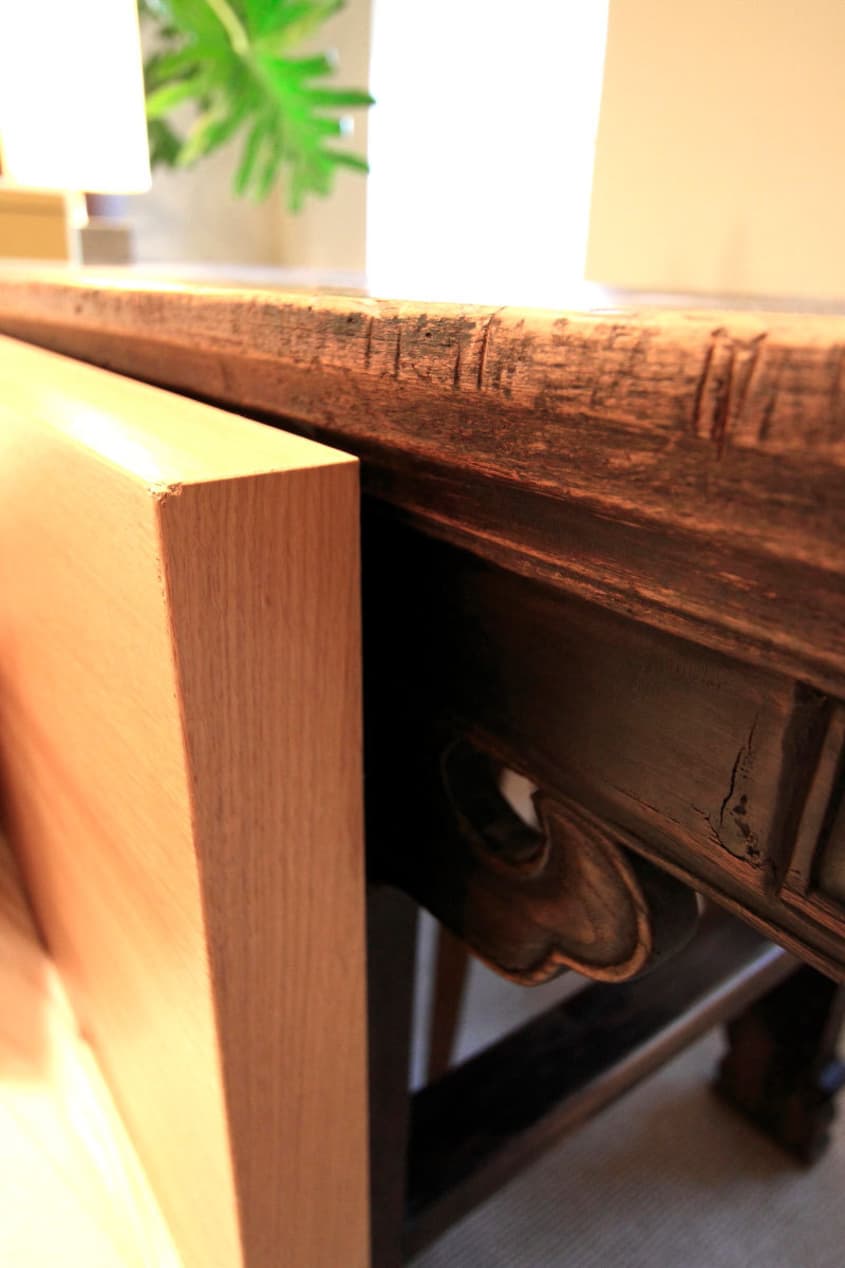
Proudest DIY: Our bedside tables. Antique cistern holders we picked up at a barn in Maine that we converted into bedside tables with a can of spray paint and custom cut glass tops.
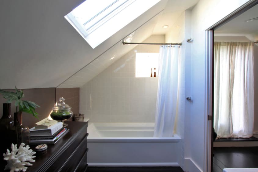
Biggest Indulgence: Radiant heat for the first floor bathroom. We considered it also for the second floor renovation, but opted to save the wide wood plank floors so that the entire level would have a uniform look. And, of course, our vintage yellow Saarinen chair. Not only for its color and comfort factor, but because all three of our kids can snuggle in it together.
Best Advice: Given: Pops of color and whimsy add character and excitement to your home. Received: Remove the chimney for the second floor renovation. We gained so much space by doing it.
Dream Source: ABC Carpet & Home for new, repurposed, and vintage pieces.

Resources of Note:
LIVING ROOM
- Wallpaper: En Vogue: Steve’s Blinds and Wallpaper
- Paint: Entire First Floor: Walls – Benjamin Moore’s Aura Color Thunder, Trim BM Atrium White
- Sideboard: IKEA Trollsta
- Sofa: IKEA Karlstad
- Carpet: Fedora FLOR Tiles
- Lighting: Faux Arco Lamp:CB2 & Chandelier Sconces: Brocade Home
- Art: 1959 Watercolor by J. Oeschger
- Occasional Seating: Vintage Saarinen Womb Chair @ Reside
- Curtains: Carved Circle Window Panels from West Elm
DINING ROOM
- Repurposed Table: Painted Benjamin Moore Atrium White
- Vases: Cocoon Home Design
- Chairs: Crate & Barrel
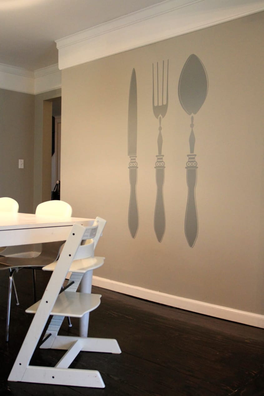
- Kids Chairs: Tripp Trapp – Stokke
- Light: IKEA
- Wall Decals: Dezign With a Z
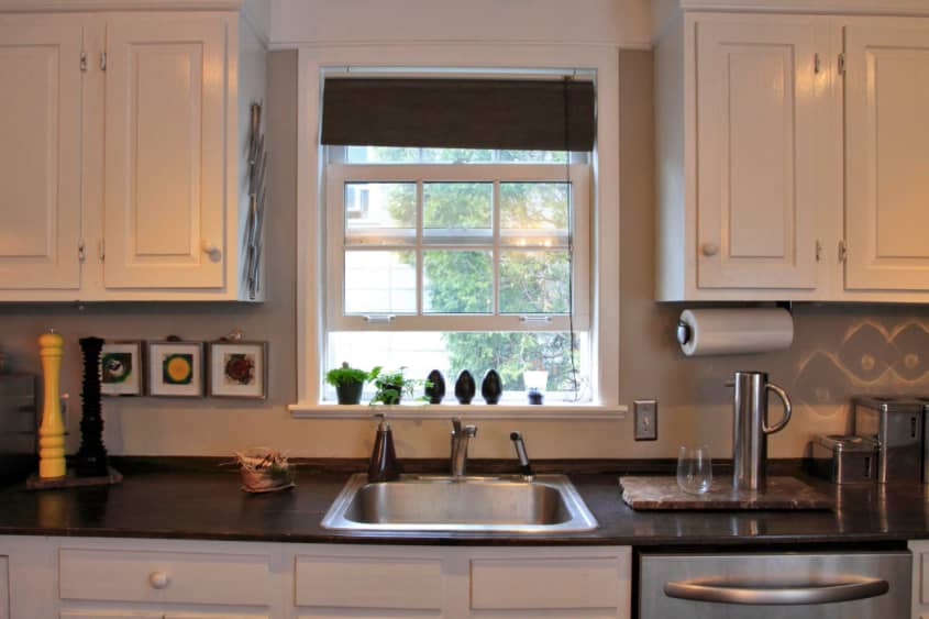
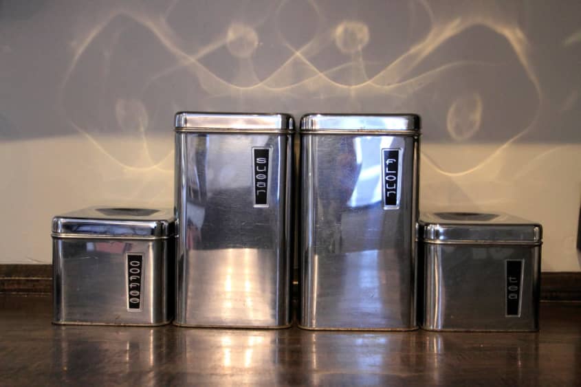
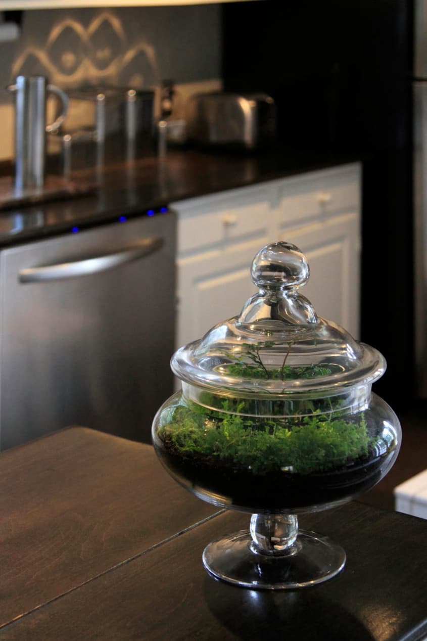
KITCHEN
- Counters: Ebony Stained Wood
- Appliances: KitchenAid
- Flooring: Fedora FLOR Tiles
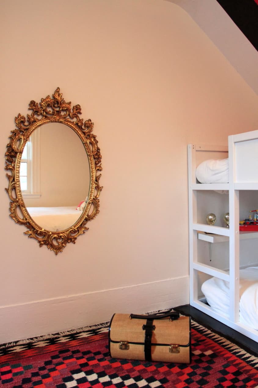
KIDS ROOM
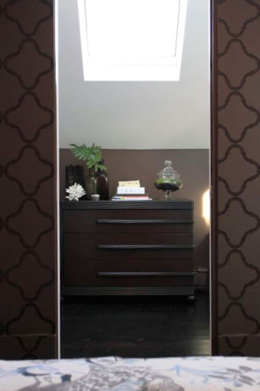
MASTER BEDROOM
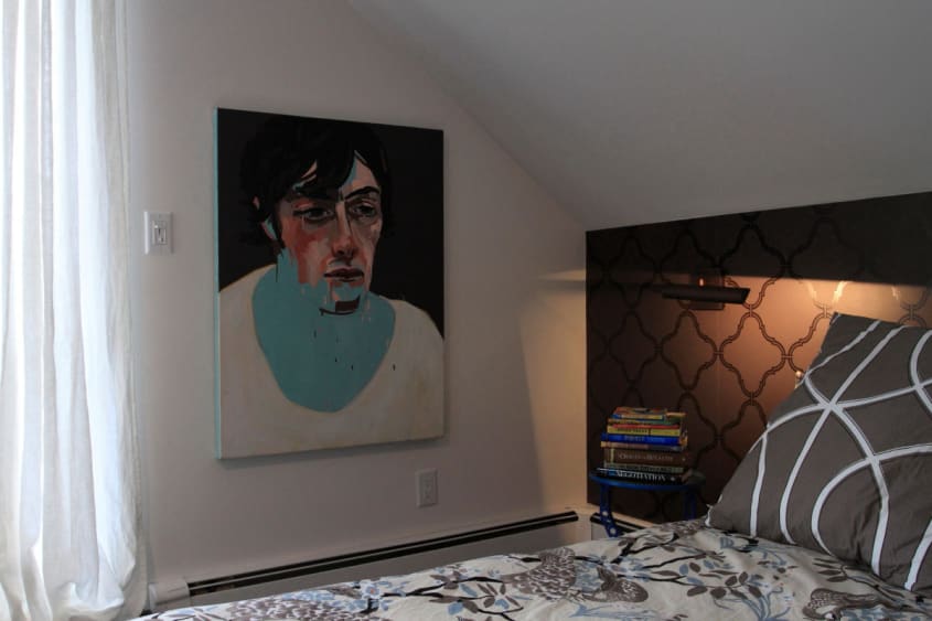
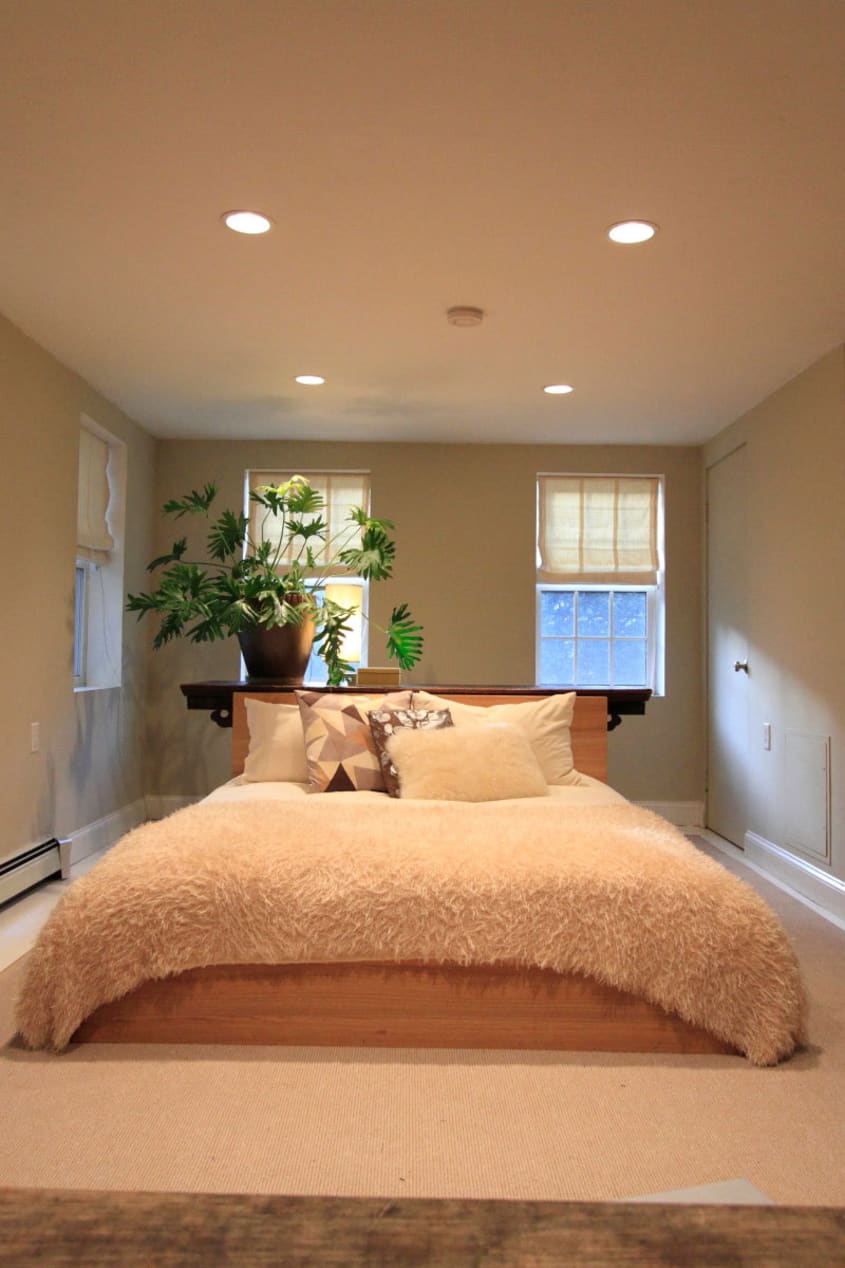
- Bed Frame: West Elm Low Chunky Frame
- Bedding: Dwell Studio Peacock
- Bedside Tables: Antique Shop in Maine
- Bedside Light: LED Swing Arm Yale Appliances
- Paint: Atrium White
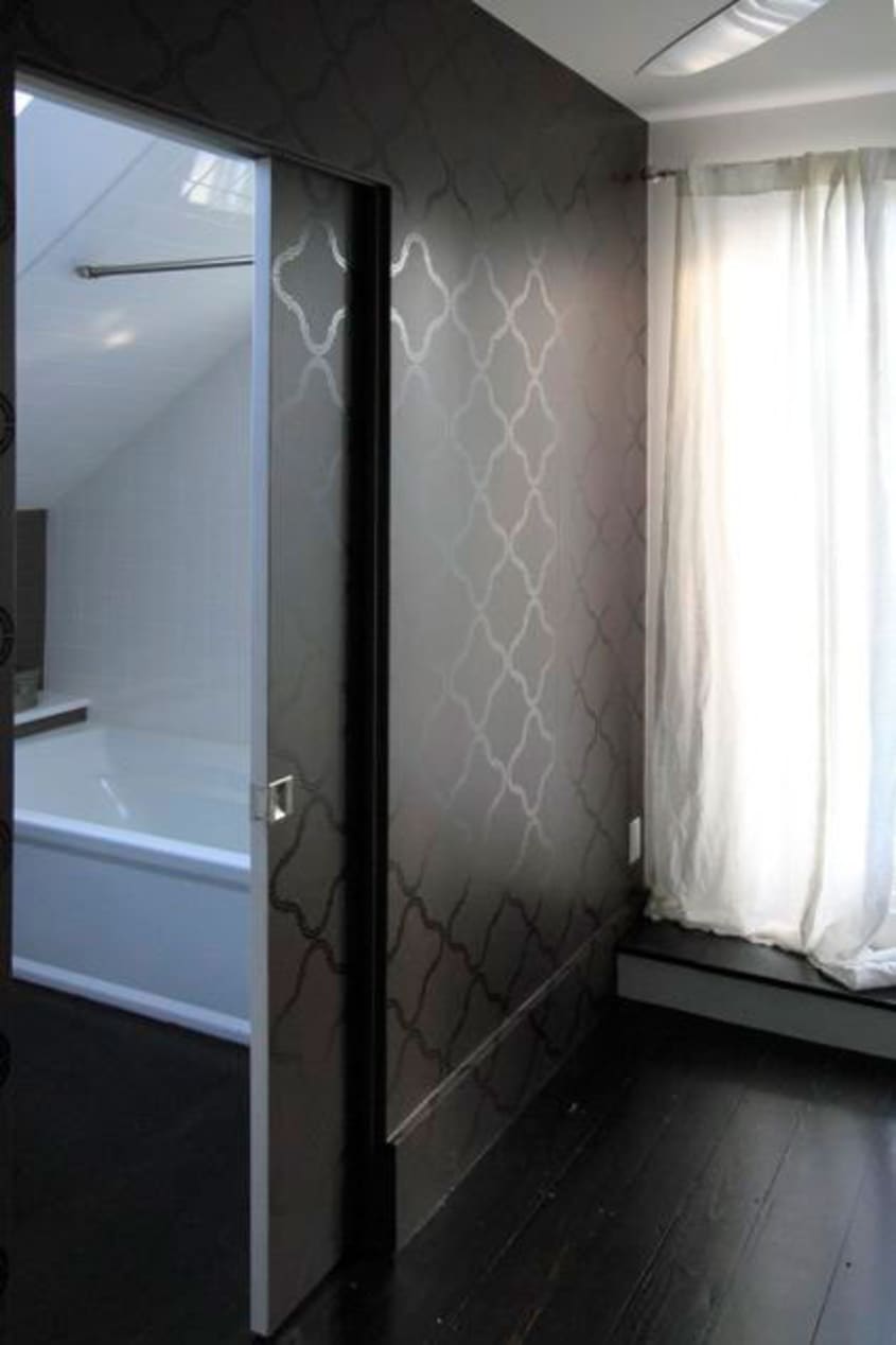
- Wallpaper: Steve’s Blinds and Wallpaper
- Art: Jamie by Tess Jenkins
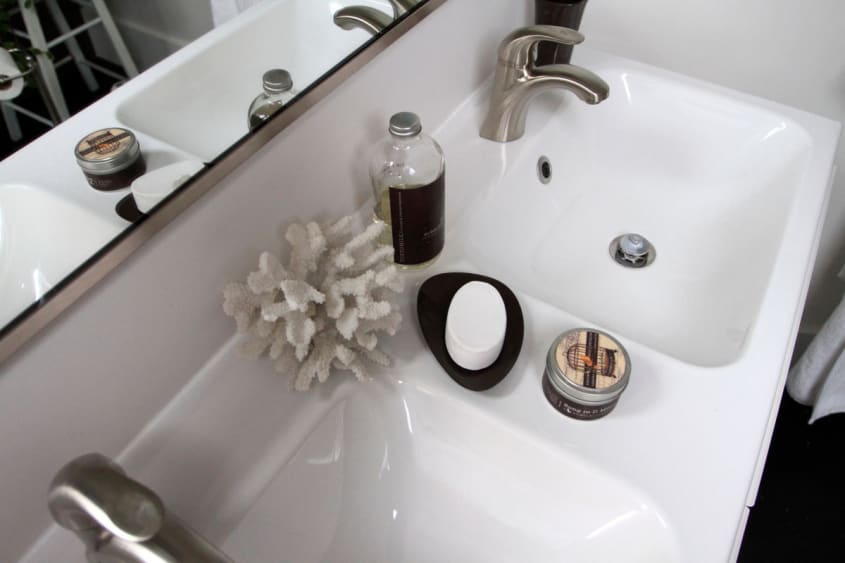
MASTER BATHROOM
- Sink: IKEA
- Tub: Kohler Archer Home Depot
- Floors: Wood
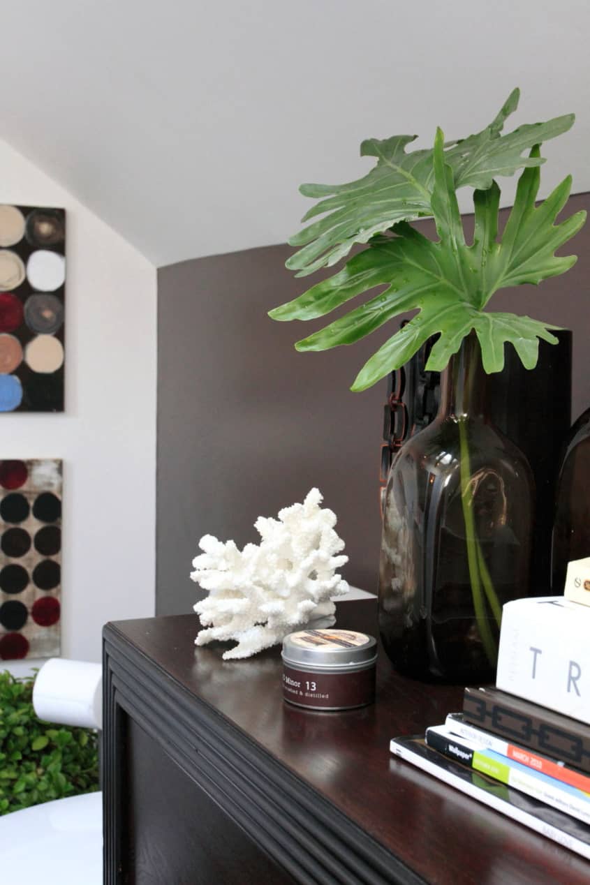
- Dresser: Mid Century from Reside
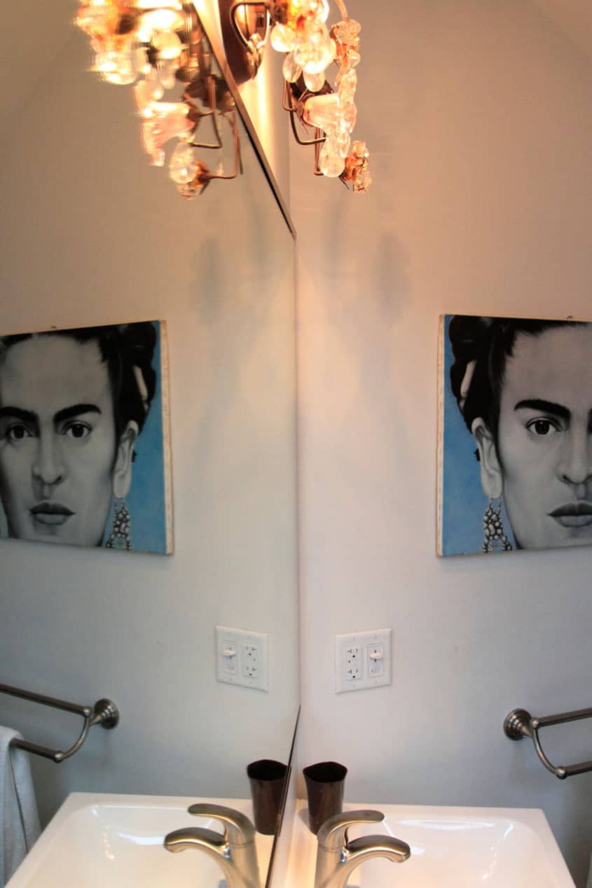
- Art: Frida Kahlo Painting The Town Dump in Arizona

Thanks Alex & Debra!
Images: Jonas Kahn
• HOUSE TOUR ARCHIVE Check out past house tours here
• Interested in sharing your home with Apartment Therapy? Contact the editors through our House Tour Submission Form.
• Are you a designer/architect/decorator interested in sharing a residential project with Apartment Therapy readers? Contact the editors through our Professional Submission Form.