Name: Annie and Paul
Location: Upper West Side — New York, New York
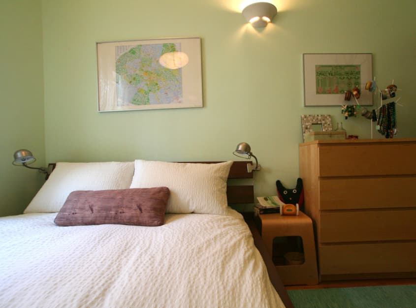
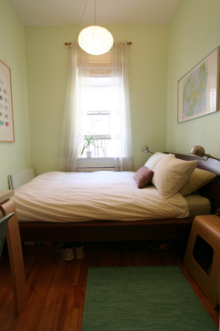
Size: 390 square feet — 1 bedroom
Years lived in: 2½ — rented
"We both roll with the same taste," explain Annie and Paul when I ask if it was hard to design their first home together. Architects who met while learning their trade, Annie and Paul had each lived, previously, with roommates whose priorities diverged from home making.
So it was "a welcome change" to combine their minimal belongings, fill in a few missing pieces with Craigslist buys, and figure out how to arrange it all in an apartment with great bones but limited space.
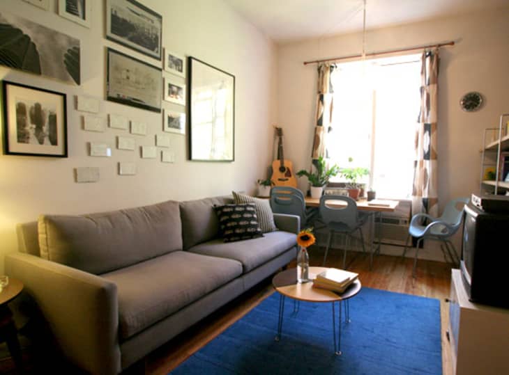
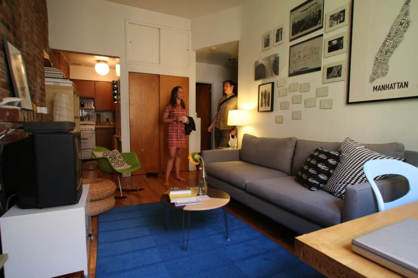
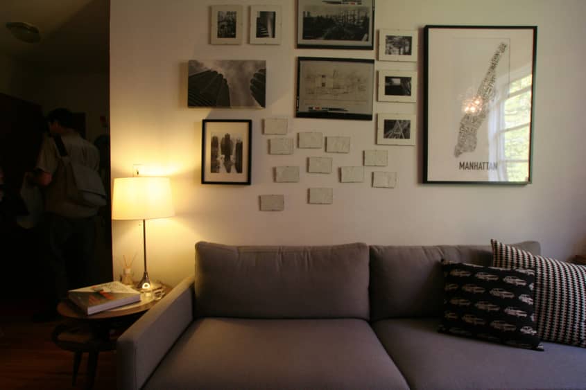
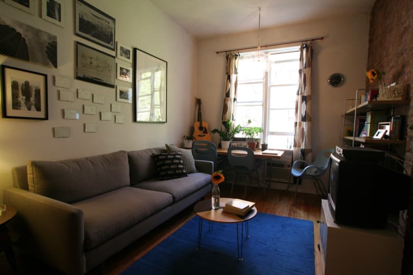
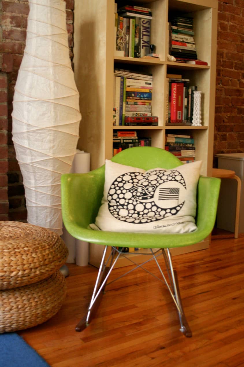
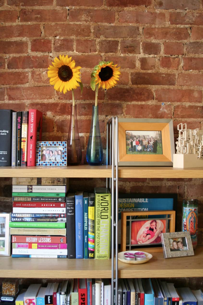
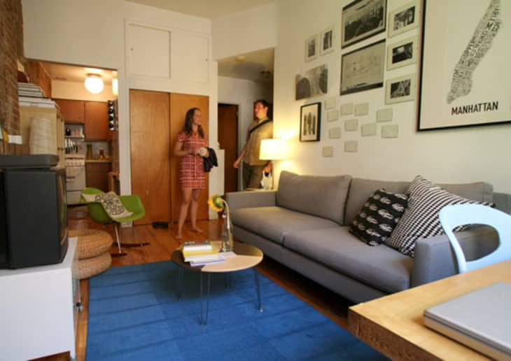
Configuring the space was not controversial since Annie and Paul knew they wanted to design around their prized exposed brick wall. After that, the options were pretty limited and they just followed the shape of the living room, working with what they had.
The only thing Annie and Paul had trouble agreeing on was a new couch. While standing in Room & Board, debating between their top two choices, Ed Norton walked in and sat on Annie's favorite. The decision was made.
Both Annie and Paul work on residential design all day for architectural firms, so putting together a beautiful and comfortable home was a pretty straightforward exercise. Plentiful sunlight and a pre-existing cool art collection only made their job that much easier.
Apartment Therapy Survey
Style:: Modern and contemporary but a little funky and kitschy too.
Inspiration: Scandinavian and California modernism, travel, the work we do and see every day as architects, Dwell, ArchDaily, Remodelista, Design Sponge, Emma's Design Blog and of course, Apartment Therapy
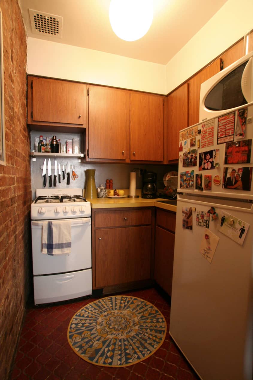
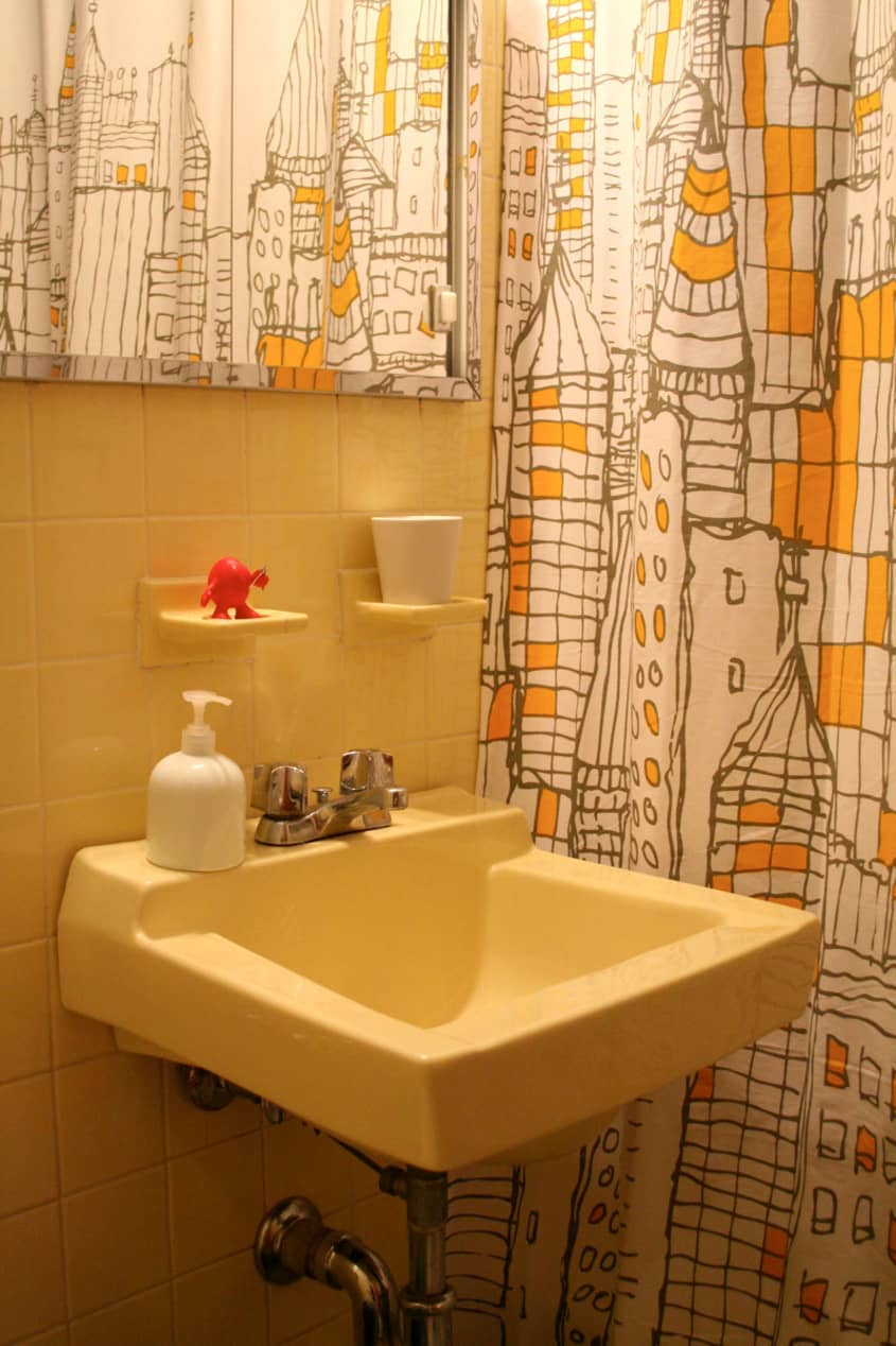
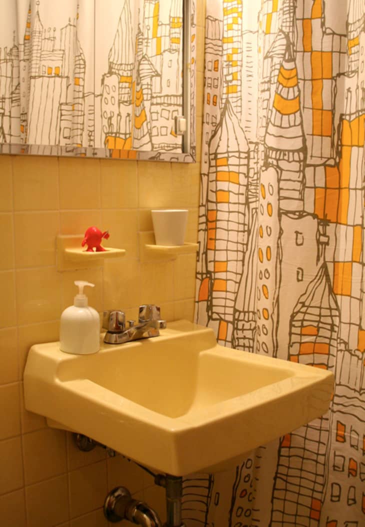
Favorite Element: Annie: our retro yellow kitchen and bathroom. Paul: Flyers Blanket!
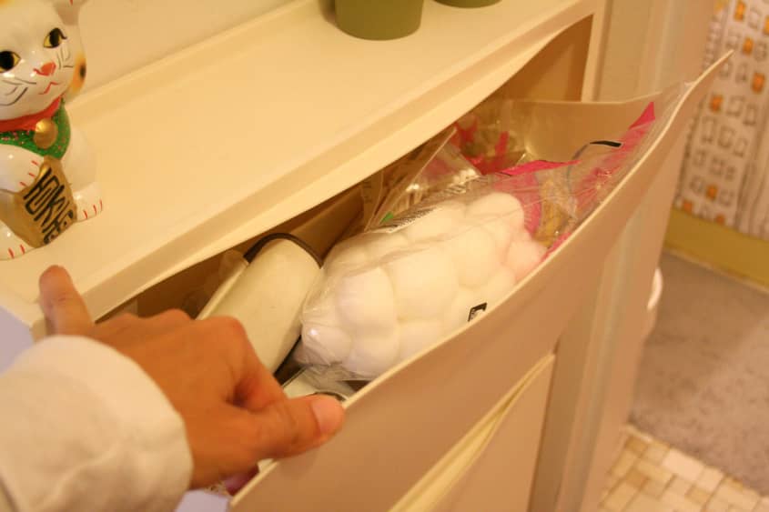
Biggest Challenge: lack of money and space; being on the 5th floor of a walk-up.
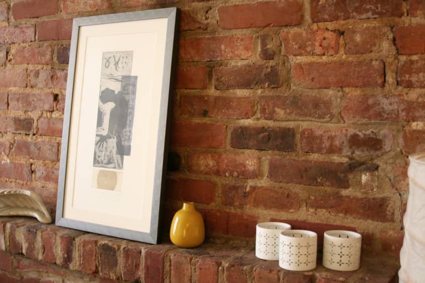
What Friends Say: "Nice brick wall!"
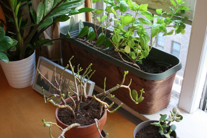
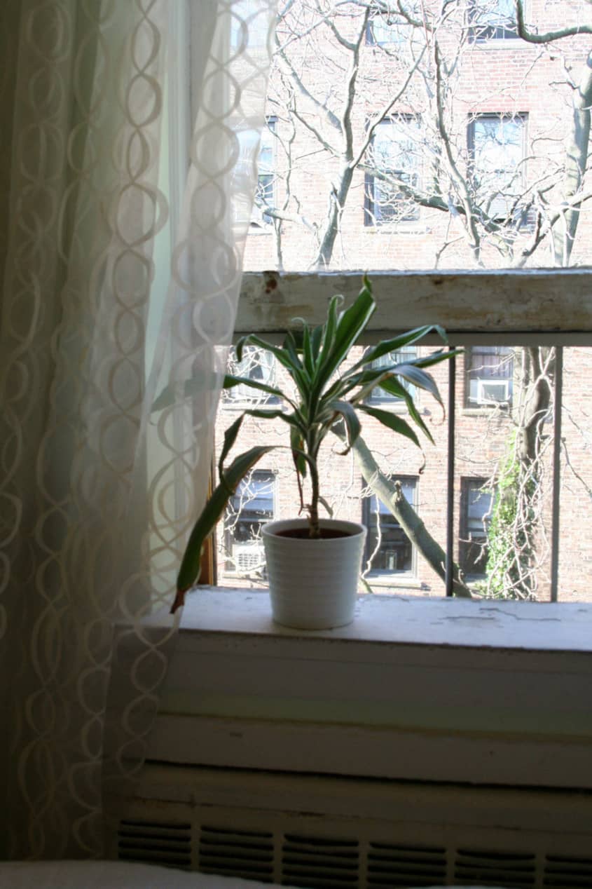
Biggest Embarrassment: Our landlord is a bit laid back, shall we say, with maintenance. Some of our plants are not doing too well at the moment as well.
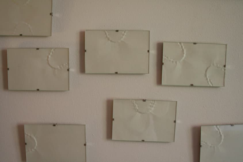
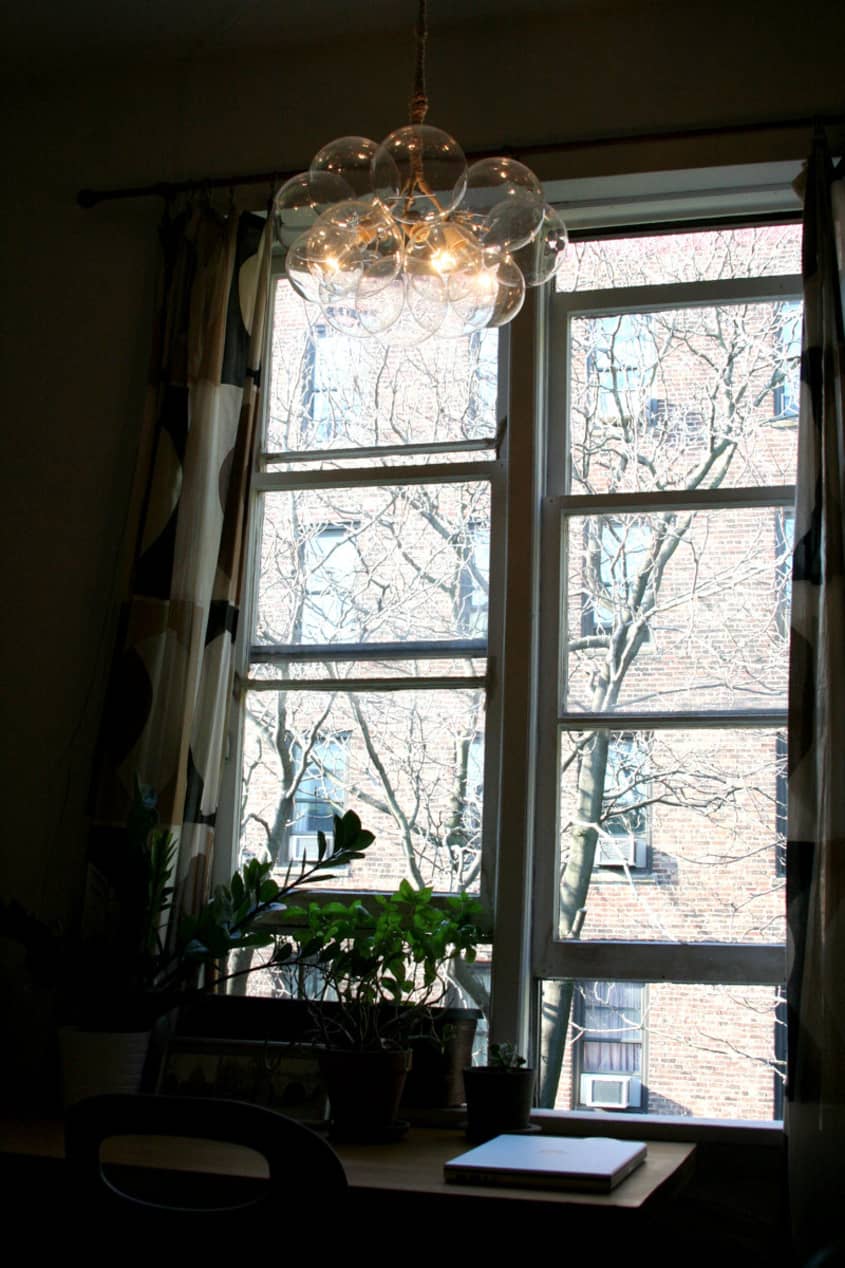
Proudest DIY: The bubble chandelier!
Biggest Indulgence: Our new sofa — Jasper, but we won most of the money to purchase it by placing first in an architecture competition.
Best Advice: Hire an architect.
Dream Source: Hivemodern and similar — Knoll, Herman Miller, Vitra, Artek, Ligne Roset, the Rug Company, ABC Carpet, Moss, Artemide, Fritz Hansen, Heath Ceramics, Duravit, Vola, our own custom millwork shop…

Resources:
ENTRY
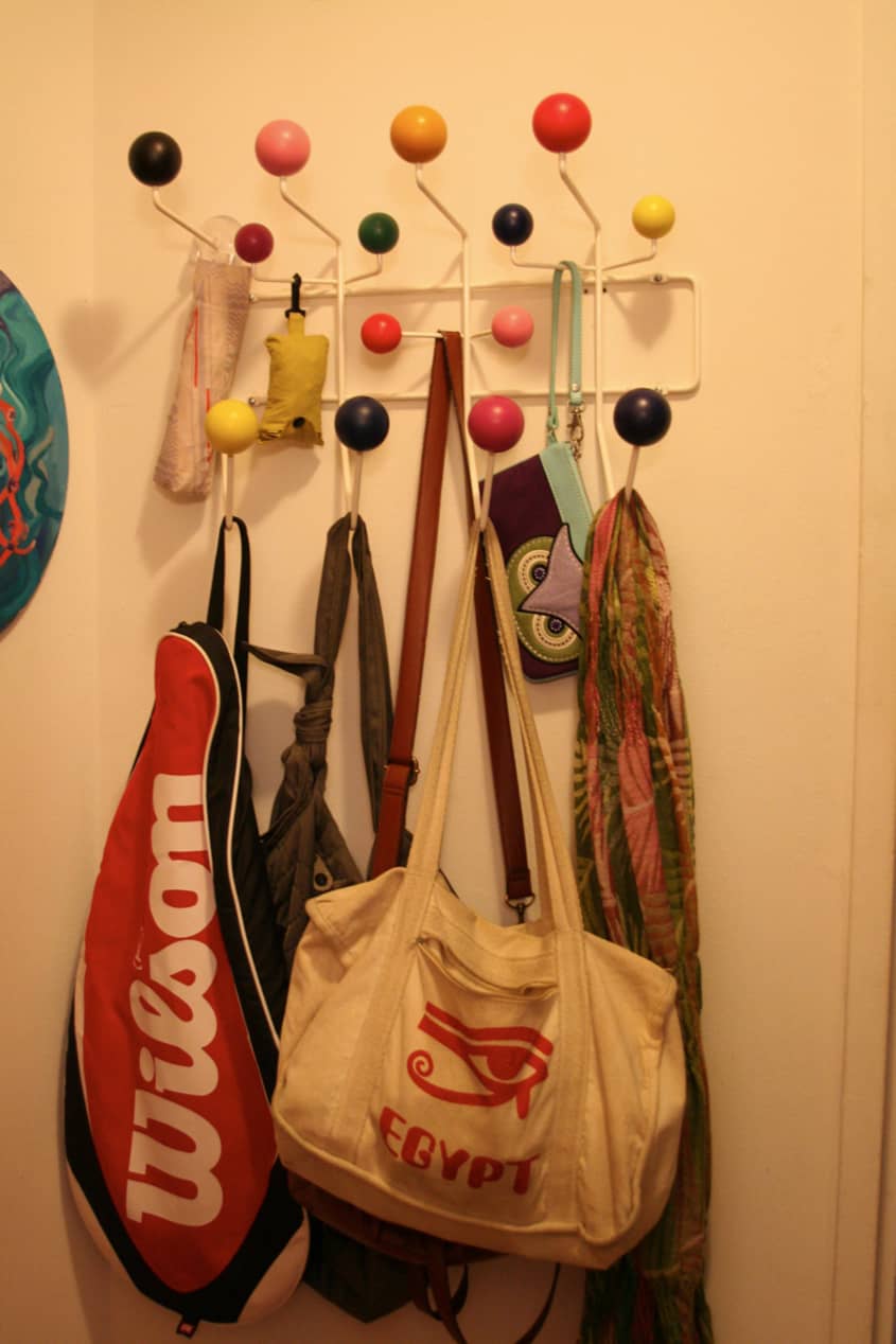
- • Eames Hang-it-all: Herman Miller
• Keith Haring wall decal: Blik
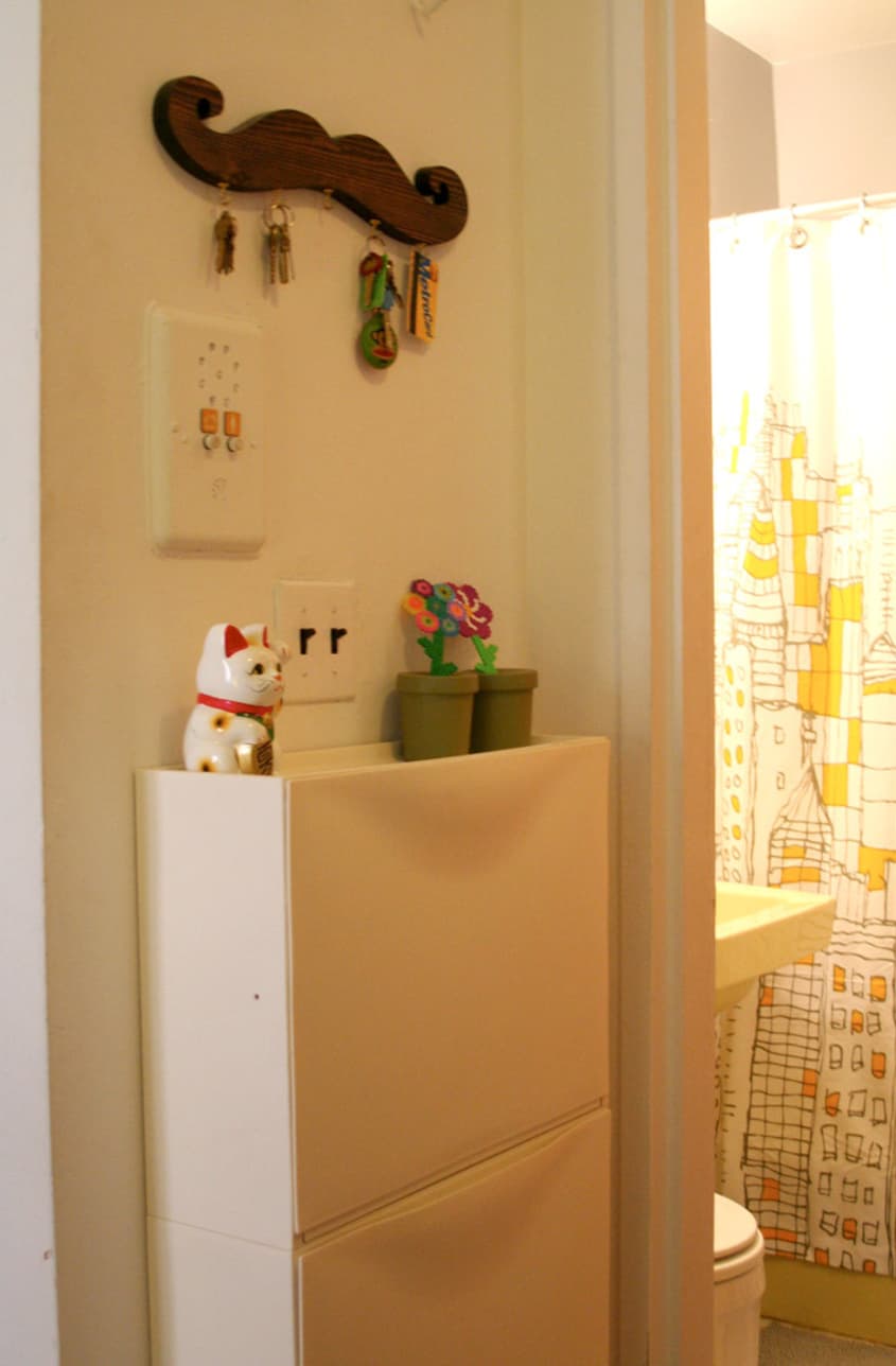
• Shoe cabinet and rug: IKEA
• Moustache key rack: Etsy shop suddenly, it's real!
• Jellyfish painting: my sister Becky (she sells custom birth announcement prints on her Etsy site: Pinto Bean Press)
LIVING ROOM
- • Sofa: Room & Board
• Bookshelves, rug, floor lamp and media locker: IKEA
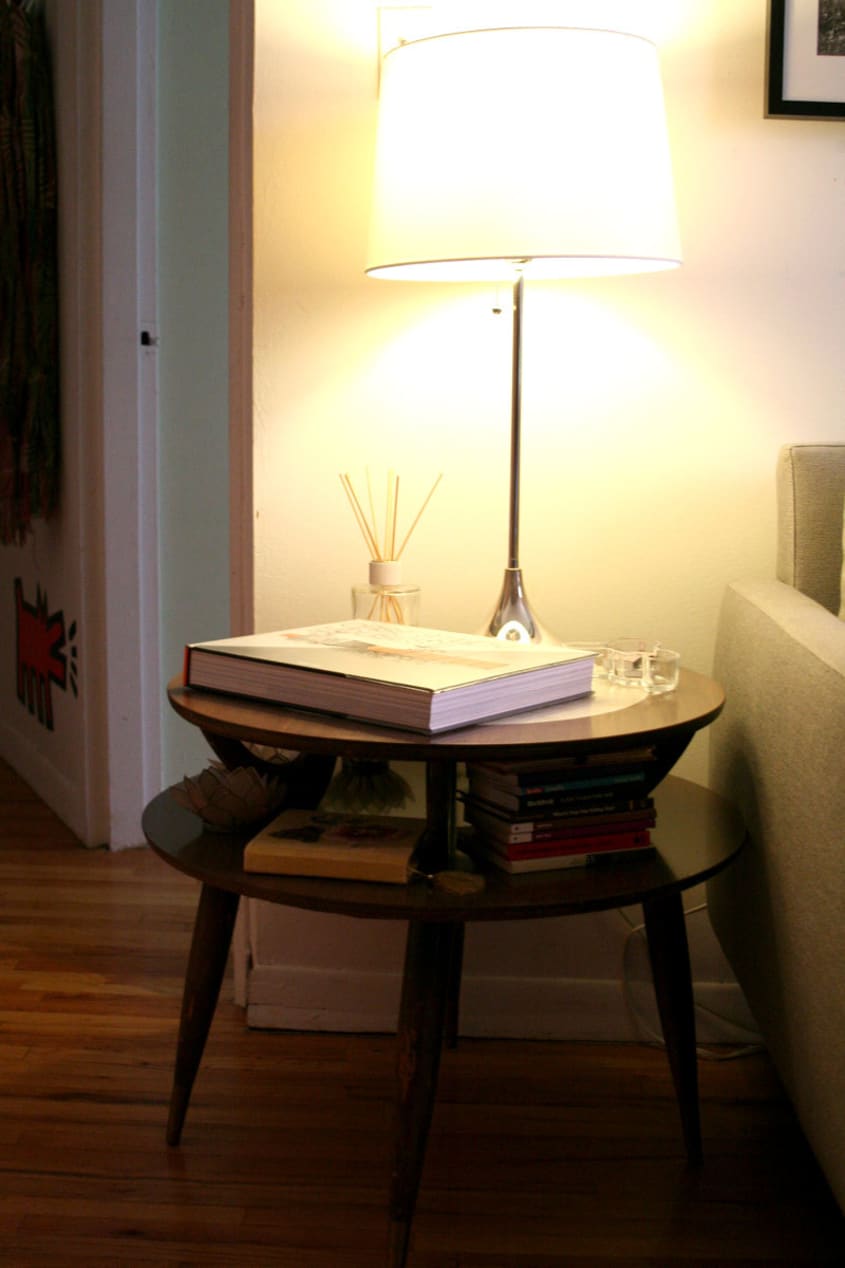
• Oh Chairs and vintage side table: craigslist
• Table is a leftover solid wood door from a project Paul worked on (the legs are from a friend's old architecture firm)
• Coffee table: old Todd Oldham for Target (circa 2000)
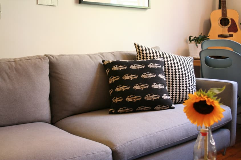
• Alexander Girard pillow & curtains: Urban Outfitters
• Table lamp: West Elm
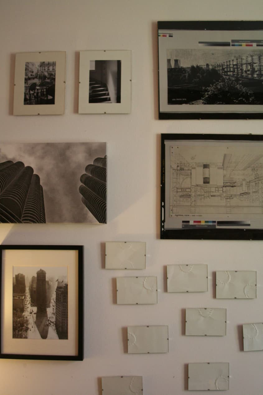
• Manhattan poster: Ork Posters
• Canvas print of Marina City photo: epingo.com
• Car fabric on pillow: Purl Patchwork
• Woven ottomans: IKEA (left by the former tenant — he also left us bottles of vodka and ketchup!)
KITCHEN
- • Rug: Urban Outfitters
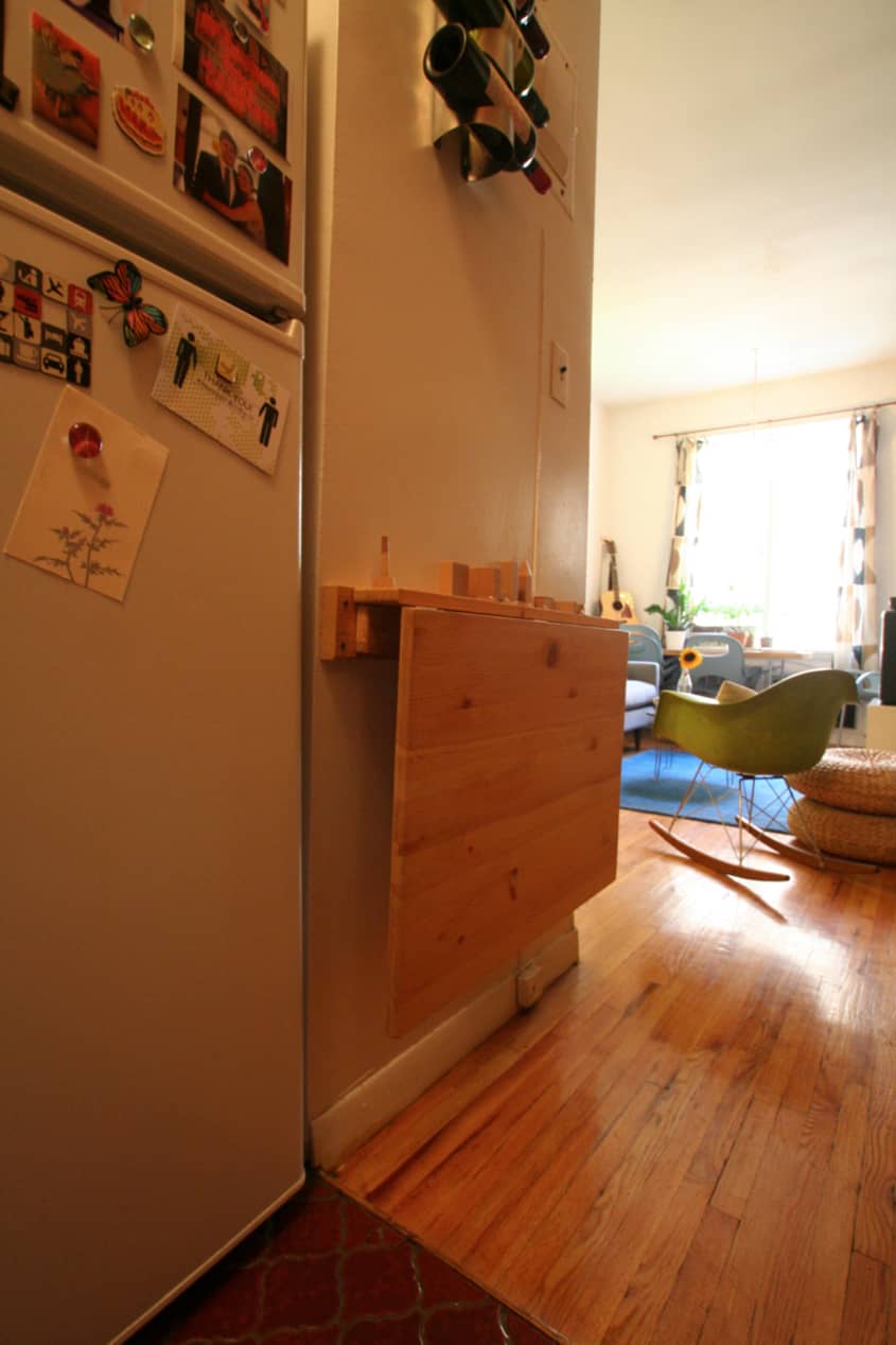
• Wine rack, shelf, canisters: IKEA
• Stool: Target
• Trash can: Muji
• Philadelphia poster: Ork Posters
• Lantern: Pearl River Mart
BATHROOM
- • Floss dispenser: Alessi
• Shower curtain: CB2
BEDROOM
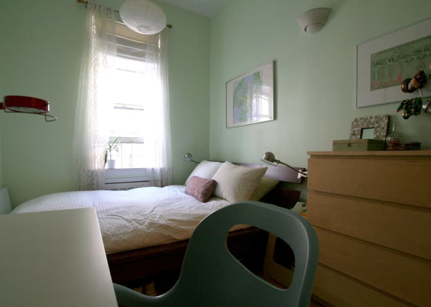
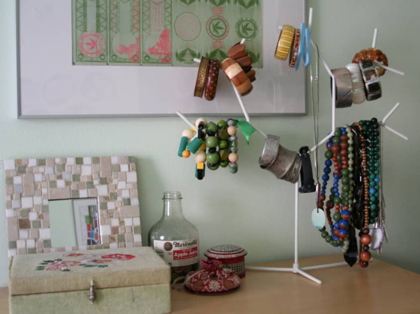
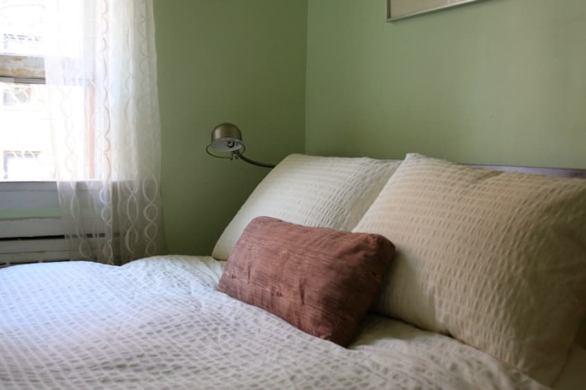
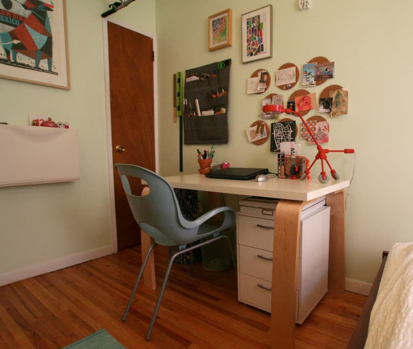
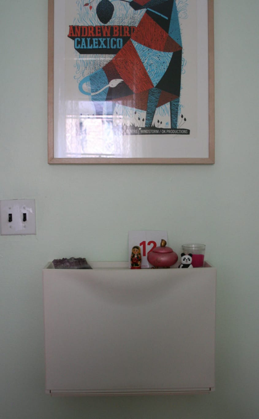
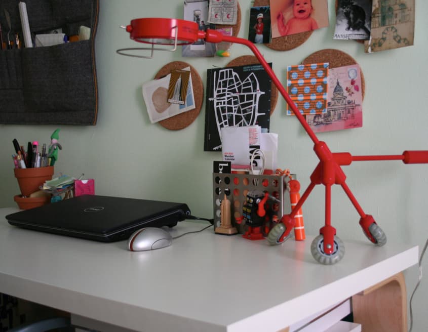
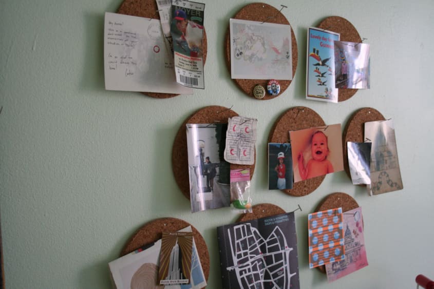
- • Bed, dresser, nightstand/stool, desk, red lamp, shoe cabinet, duvet, cork trivets as bulletin board: IKEA
• Rug: Crate & Barrel
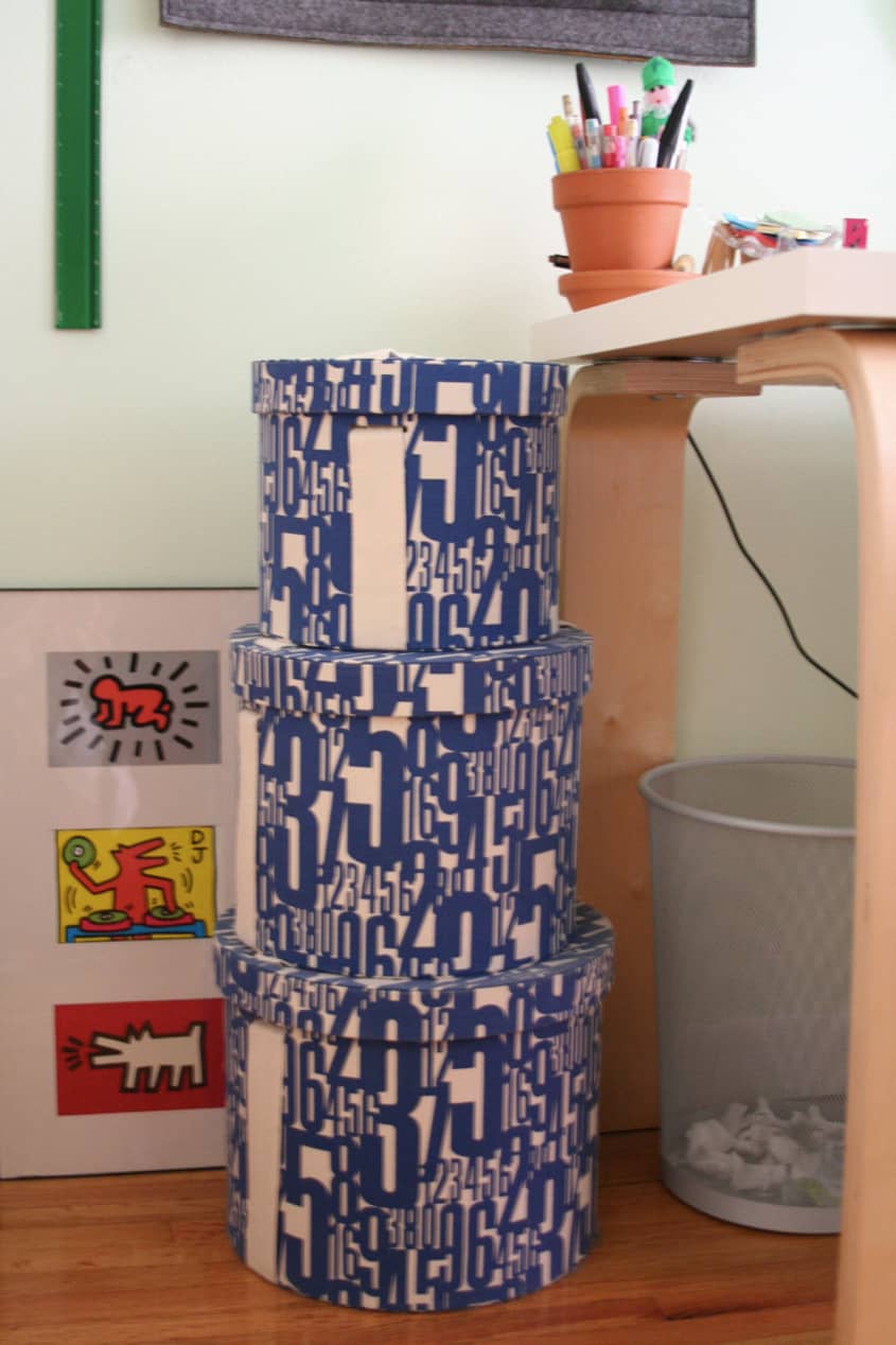
• Round storage boxes: West Elm
• Bedside lamps: Pottery Barn Teen
• Lantern: Pier 1 Imports
• Andrew Bird poster: Methane Studios
• Stamps poster: Tiny Showcase
• Wood grain fabric on plank pillow: Purl Patchwork
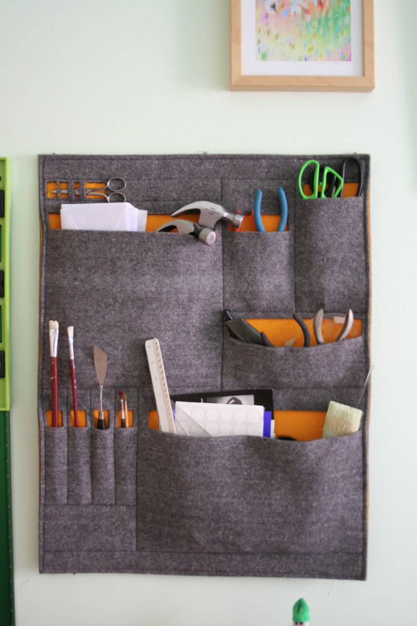
• Felt organizer: 3rliving.com
To see details of Paul and Annie's kitchen, check out Annie & Paul Groove on the Retro on the theKitchn.com
Images: Jill Slater
• HOUSE TOUR ARCHIVE Check out past house tours here
• Interested in sharing your home with Apartment Therapy? Contact the editors through our House Tour Submission Form.
• Are you a designer/architect/decorator interested in sharing a residential project with Apartment Therapy readers? Contact the editors through our Professional Submission Form.


White Enamel Flatwa...
I wish Ed Norton could help me with my design decisions, sigh.
Nice job lil’ sis!
Hey! Where did you get that cute wood block cityscape? Love it.
Thanks!
Arminda - the city blocks are from Muji:
http://www.muji.us/store/city-in-a-bag-new-york.html
I like the dental impression art pieces in the living room.
How do you keep your sofa looking so nice? I have the same one and it's very tired looking. I suspect yours is either brand new or never gets used.
Love the use of the Ikea cork trivets as a bulletin board -- very clever! Nice twist on a standard element -- and we know it was economical to do.
where's the flyer's blanket?
I love the fold-up table in the kitchen! Would like to know where to purchase one.
Love that red lamp on the desk. Nice and quirky
also love that table that folds out of the wall when you need it, and hangs flat when you don't
I think you have just enough stuff in there. Minimal enough, but not sterile.
I'm just starting to realize that when it comes to homes, our needs are more minimal than years of advertising have led us to believe.
We need a place to: sleep, eat, sit (for TV, reading, visiting), cook, bathe (etc) and put a computer.
the rest is gravy
This is really 390 square feet??!!! In that case, my Manhattan 1 bedroom apartment must have been around 25 square feet.
I couldn't even open the bedroom door without the door hitting the bed.
Either way... very cute place and nice utilization of such a small space.
Great place. Colorful without overwhelming. I agree that it looks spacious and comfy.
Question: Are those framed pieces of paper (in the living room above the sofa) bite imprints on a piece of paper?
love it! probably one of the closest home tours to my own...and the one i could most relate to.
lots of ikea furnishings.
highlights:
felt wall pocket organizer
multi-bulb light fixture
all the chairs
ikea trivets as wall corkboards
question though...were the white frames things in the living room just pieces of paper that you both bit down on?
if that's right, i win a million bucks, cause that's the first thing i thought of =)
@arminda: City in a Bag: http://www.muji.us/store/city-in-a-bag-new-york.html (maybe)
I keep seeing that jewelry stand around here--anyone know where it's from?
Duckster, I think the jewelry stand is from Ikea.
I like this place. I think I must just dislike minimalism, because nothing in this apartment seems superfluous. I especially love the cute little kitchen.
Ha-I wonder if we are neighbors! The inside our apartment is similar to yours, but the layout is a little different. Love your apartment. We are definitely kindred design spirits!
Very nice modern style apartment, I'm not crazy about the wall hung sink, too commercial, maybe would have gone to a pedestal or petite cabinet, looks like you might have storage problems.http://www.dimensionbuildlv.com
Sofa too big.
No need for TV in front of it.
Looks as if students live here.
(I just expected more from how they describe themselves and their style.)
I relate! I like that it's unpretentious and practical.
I'm suspicious about the sq footage. It feels larger. As for "cluttered and busy," a sub-400sf home shared by a couple who obviously have work spaces at home isn't going to be sterile.
I don't quite get the teeth art, but whatever works for you :)
i love it!! its so cozy!!
loving the red desk lamp on "monster truck" wheels, the felt pocket wall hanging thingy and the bubble light fixture (nice job on that!)
Bite mark art is creepy to me, but I do have a thing about teeth and saliva...
Styleless
I agree that this cannot be a mere 390 sq. ft.
Lots to love (especially the bedroom), but feels like it needs a bit of an edit. The vibe here is just too modern (and minimalist) for this much "stuff." The possessions seem to be getting in the way of the overall design.
I love the place, but I'm fixated on an irrelevant question: what season were these photos taken in? I ask because there are sunflowers everywhere and the apartment dwellers are in summer clothes, but strangely, the tree outside has no leaves on it. Is it dead? (I should be a detective.)
Very cool! Love the green bedroom!
Looks neat and tidy and I like that but the sight of all that ikea plywood furniture against that great brick wall kind of gives me the heebie jeebies. Poor bricks.
That bubble chandelier is off the hook! I think we need another post on how you did it!
I believe the 390 sq footage... I live in 294 sq ft (nearby) and it feels about the same size sans the bedroom. I actually would love that much kitchen... I have a galley kitchen in my entry hall.
I think for two people to live in such a space and have workspaces within the home is a real challenge. I see that there is a sense of style, but I would like to see it pulled together in a more cohesive way. It feels a bit disjointed... That said, I also understand limitations of budget... After your monthly outlay for a Manhattan apartment, there isn't much left. I am sure over time, small improvements will make for a lovely home.
thanks everyone for the positive feedback!
trust me, it is 390 sf- i'm an architect. i know how to use a tape measure.
the bites were something paul did for a project while in school.
the city blocks are from muji, the jewelry tree is from ikea, and yes, sshutterbug, the tree is unfortunately dead.
suzy8track- i got instructions from readymade magazine for the bubble chandelier- not sure if they can be found online anymore though
For such a small space they did fabulous. Love the placement of all the furniture. Good job well done!
I'm so Jealous/In Love with this! I have a 375 square foot home on the Upper East Side. We need to have a double date series and go through each others' apartments. Our little apt. was on home tour: http://www.apartmenttherapy.com/ny/house-tours/julies-historic-cherokee-apartment-house-call-119315?utm_source=feedburner&utm_medium=feed&utm_campaign=Feed%3A+apartmenttherapy%2Fny+%28New+York%29
I am going to STUDY this home tour all afternoon. I love it so much and the smallness is similar.
this place should win an award for the most serenity per smallest square footage. kudos!
I think you guys did great! I love it, very nice, simple, and creative. I really love that red lamp with the wheels, wherever you got that from? I felt I could truly relate to you from looking at your place (the "these are my peeps feeling"). I love the CB2 shower curtain too, and that cool plant pot :).
I love the bites! 'vv'
What's the picture that's hanging above the trivets?
Thanks!
haha, thanks jphardee, you made my day!
for those who were wondering- the red lamp on wheels was also from ikea, but i don't think they sell it anymore.
timshel- the picture above the trivet-corkboard is a sort of inadvertent collage i made in college.
Great job with the space you have:) Annie love the bathroom on & kitchen too:)
Very, very boring. I also expected much more from the way they describe their style. Travel? Well, all I see is Manhattan maps in there. Maybe they just meant travelling inside the city they already live in!
And then there is IKEA stuff everywhere... and clutter! Every tiny space seems to be filled up. I can understand you may need a desk or table in your living room, but get rid of the humongous couch or be more creative!! For example, by giving things more than one use.
Their advise about hiring an architect? If this is what you get: I don't think so!
Ok, I could go on and on about why I really dislike this, but I believe you get the picture. Many things are wrong here.
Love the shower curtain.
I do not see how there's an issue with using things from IKEA. That isn't what should be judged on when looking at a room.
Nice place, I like most of it except the creepy teeth pics
A ton of great small spaces ideas! The fold down table, all the cool storage on the wall by the desk. Also your "nightstand" which is also a desk that can be placed on the bed. I love the wooden city, green chair, cork board circles and your desk. Well done...
There are so many things I love about what they've done, but I also have some reservations, too. I love the sleeping area of the bedroom, the kitchen, the mounted fold-down table, and they've done a great job of making the most of their bathroom (as they're renters). However, the use of so many patterns, colors, and oppressive pieces of furniture in the living area and work area in the bedroom makes it feel a little claustrophobic. I think changing out the throw cushions and curtains in the living area to something solid would even make a huge difference. A little editing and you've got yourself an amazing space and you've worked miracles with the space you have been given.
I like this, it's attainable and full of personality. I love the bathroom and the brick wall in the kitchen (which, btw, is darling). Nice job.
Thank you for preserving that great kitchen and bathroom! You will be design heroes over the next 20 years for leaving alone and tweaking instead of making everything white . . .
Congratulations.
I can see this being 390 sq ft. There is almost no kitchen and the bedroom is tiny. However that does leave a huge living room area. I'm looking at a 400 sqft place that has a large/normal kitchen and bedroom, but a tiny living room.
It is a nice place, I love your kitchen table/workspace by the fridge.