
Before & After: 70s Drab to Industrial Chic Fab Kitchen
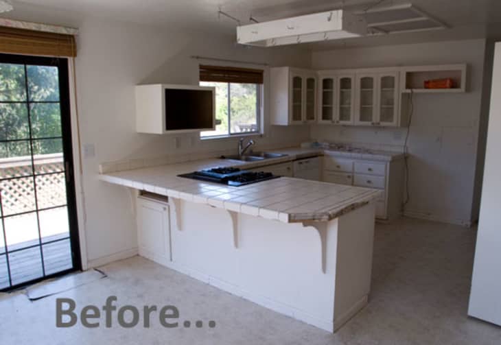
This month on Apartment Therapy we’re looking at some of the biggest projects we take on when designing our homes, kitchen and bath renovations. Deciding on all the new features can be daunting, but sometimes the choice of a single element literally makes the project click, instantly transforming the space and practically guaranteeing the success of the makeover. That was the case with Rebecca’s kitchen…
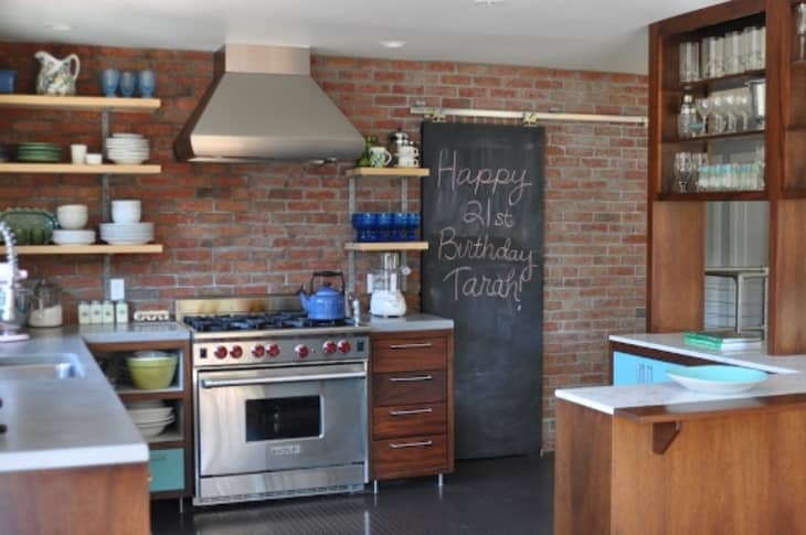
… when she decided to install a “thin brick” wall. The addition of this wall treatment was the perfect touch to give the space a very in-vogue industrial chic look, especially in combination with the stainless steel appliances, rubber flooring, darker wood cabinetry and open shelving.
Here is the scoop on the project in general and the thin brick specifically, in Rebecca’s own words:
My home was a hot mess when I purchased it two years ago. It didn’t have great “bones” and needed something to take it from 70s drab to 2K fab. We put in rubber flooring in the kitchen and warehouse flooring (with radiant heat) in the rest of the house, used thin brick for a couple of walls and furnished it with as many found and repurposed items as I could get my hands on. Just wanted to suggest ‘Thin Brick’ as an alternative to tile, paint and wallpaper. I used this on a couple of walls in my 1970’s walk out and I absolutely love it!
The company that I used is called McNear and the color I used is called ‘Balmoral’, I also like Vintage Brick Veneer, but there are many thin brick manufacturers to choose from. It’s real brick sliced very thin, so it’s light enough to install on any wall, internal or external. The cost for the brick I received from McNear was about $.83 per brick. It’s easy to install directly onto your wall with mortar, grout and trowel. Here’s a video showing how’s it’s done. They don’t use spacers in this video, but if you want to be more precise, use spacers.
Thanks, Rebecca!
Images: Rebecca/Scout Design Consulting
Have a kitchen or bath project you’d like to share with the Apartment Therapy community? Let us know – we’d love to hear from you.