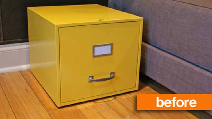
It was a little over a year ago that this little file box came home with me and received its first makeover, going from a dull gray to a vibrant yellow. A lot of things have changed in my apartment over the past year, so it's time for the file box to get another makeover…
When I painted this file box last year, yellow was the perfect color. It suited the room where it lived, and I've always been partial to the color of the sun. Since then, the file box has changed locations and with that change, the color had to go.
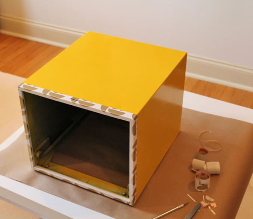
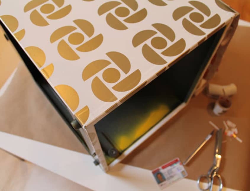
Making use of contact paper from an old project, I set out to transform the file box once again. I started by removing the contents of the box (beloved magazines) and thoroughly wiping it down with a soapy cloth to remove all dust and kitty fur. Once it was clean and dry, I started by applying the contact paper to the front edge of the box. My thinking was that it would be easier to apply the paper to the sides of the box without wrapping it around the front edge - an assumption that proved correct.
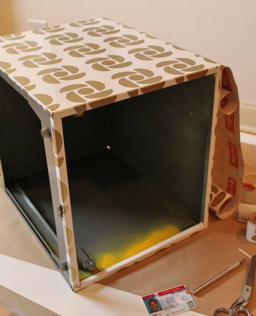
Once the front edges were covered, I applied the paper to the sides of the box. By measuring the depth of the box, I cut one large piece of contact paper that I was able to apply to the sides of the box in one big piece. I started at the bottom of the left side, slowly going up to the top, using my driver's license to smooth out air bubbles. With one side finished, I flipped the box back onto its base and smoothed the paper onto the top, being careful to keep it straight as I wrapped it around from the side.
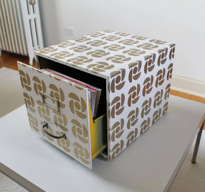
After covering the box, I removed the handle and file marker from the drawer face and applied the contact paper. I wrapped the excess paper around the back of the drawer to create a seamless look and to be sure the paper wouldn't loosen up with repeated opening and closing.
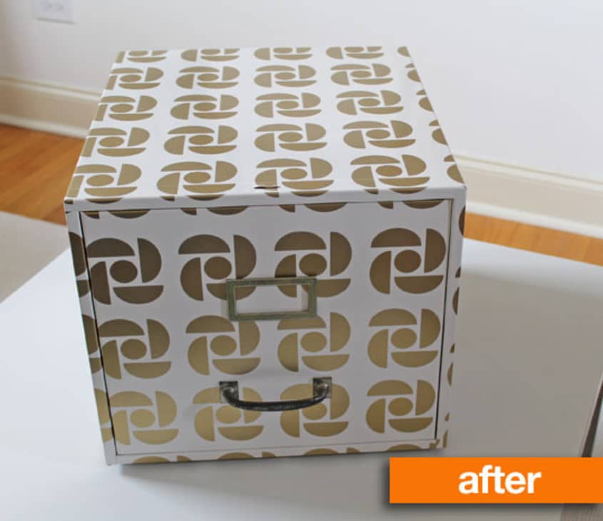
All told, the project took less than an hour and I'm quite pleased with the result. The white and gold pattern has completely transformed the look of the file box and I was able to use leftover paper from an old project — now I just need to find a new home for it in my apartment.
(Images: Jason Loper)


Sprout Side Table
brilliant
Too much make up.
I like it morning with out make up yellow. The handle and tag give it away that there's been an attempt to hide the wrinkles. My suggestion would of been to not reinstall the tag holder and handle. Instead drill a small hole in the rear where once can push the drawer slightly open to then completely open from front.
I used black leather look contact paper to cover an old IKEA PS locker looking cabinet. I love it and have been surprised by how well it has stood up. Definitely a quick/inexpensive DIY.
Abel De la Torre=HUH???
I second SHOPPINGSOPHIE: Brilliant. Truly nicely done.
I don't think those are wrinkles rather than shadows. The contact paper isn't my taste but it's a neat idea as long as it holds up. I would have spray painted the hardware brefore reinstalling it.
Fantastic!
I'm not a huge fan of the pattern, either. I liked the pop of yellow, especially against the gray couch/chair.
What bothers me is the fact that the pattern doesn't line up on the different surfaces. It's like an inexpensive shirt where the patterns don't line up at the seams.
But ultimately, if you love it, that's all that really matters.
(BTW: Kudos for wrangling the contact paper though — it's not an easy thing to work with.)
I think it needs wheels to raise it off the floor. Or legs or bun feet. Something to lift it off the floor. Maybe set it on a little plywood or mdf platform with wheels/ feet on it.
It's fun to have pieces like this that you can play around with. Next iteration, try leaving off the label holder and install some kind of fancy new handle.
Love it! Nice Job.
where did you get that cute little filing box to begin with?
LYONSTILL=QUE???
Not all = English first language. Be nice.
cbc!
I don't think Lyonstill was saying "HUH" about the language.
I too was confused by the actual suggestion made by Abel de la Torre. I'm really thinking about it -- Abel, do you mean you'd be willing to give up the functionality of one motion to open the drawer? Its "before" picture shows it up against a wall -- if that's where it will be used, your suggestion makes it very hard to open the drawer. If it's being used out in the open as a table, it still means two motions to open.
By the way, thank you for the phrase "morning without makeup yellow" -- I had a kitchen that color once, and now I know how to describe it.
Personally not a fan of the pattern, but why contact paper? Seems it would be so easy to tear/peel/shred/crack.
I am also confused by Abel's suggestion. I'm not a fan of the pattern either but if it suits the new location better and the owner likes then thumbs up! Good job, I don't think mine would look as good lol.
I'm curious what the file box is made of?
I love the paper, I have a roll and used it to line the drawers in a pair of vintage nightstands (high gloss cream with brass accents). The pattern is a great detail when I open the drawers, I wouldn't use it for an exterior but it may make sense in the context of the room (would like to see a wider shot in it's natural habitat). Nice example of a drastic transformation for minimal dollars and time. For a little extra impact, you might try painting the interior drawer, I see a bit of the previous yellow, might look cool to introduce an accent color (I vote royal or navy blue) visible only when the drawer is open.
Abel probably wrote that on his phone and it auto corrected it weird.
@baba yaga... calm down, you completely missed the point of @lyonstill saying "Huh".......
Why would you drill a hole in the back of a filing cabinet?? How annoying every time you want to open it, and I can't imagine what a safety hazard that would be, sticking your finger in to poke at a metal mechanism?? Sorry, @abel de la torre, but that's crazy!
Good work contacting this little cabinet. I just re-did my kitchen shelves and it almost drove me insane! Sad to see the yellow go, but I'm sure this cabinet will have many more reincarnations.... I do agree that it's odd that the pattern isn't continuous. It would look a lot better if it had all been lined up!
Just no.
The symbol on reminds me of the logo from a Canadian national news service. CBC.
I expected to see it repainted in another color and was pleasantly surprised to see pattern--and more surprised to read that it was contact paper. That stuff can be tricky to work with, especially when trying to match up pattern. I tried that once and the stuff had stretched in manufacturing so that the pattern wasn't exactly precise and could not be matched up perfectly.
Nice job!
I love it. Love the pattern. Didn't notice anything not lining up.
Agreed, it's totally the CBC logo!!! Canada's news source. I don't like it b/c of that, reminds me of 80s newscasts...but that's just b/c of the similarity, love the idea. I also like the suggestion to lift it up with wheels or something and spraying the hardware...guess it never ends! Well done!
Yay CBC! My first thought when I saw it, too. Why do I suddenly have an urge to watch This Hour Has 22 Minutes?...
I knew someone or two would have to say they liked it better before! You guys are so predictable.
well done! I can understand why some prefer the cheery yellow box but I like both.