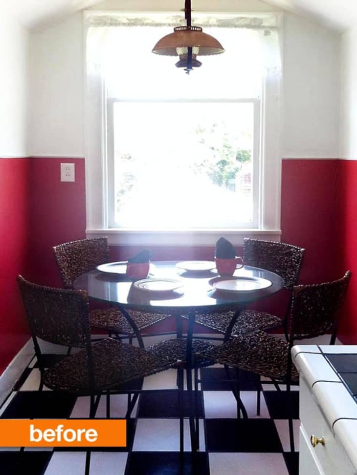
When we first moved into our 1919 Craftsman one of the first things I had my mind set on fixing was the kitchen. I decided to begin with the outdated breakfast nook (oh and btw, the 'before' image is the styling from the realtor at the open house). Follow me after the jump to see where it ended up…

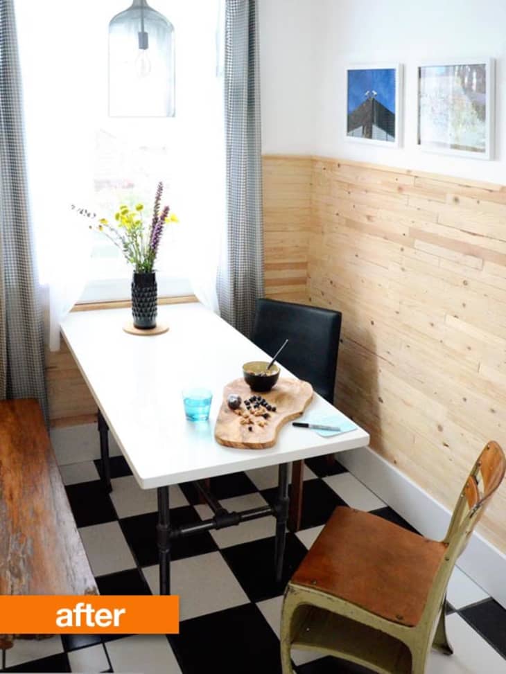
First things first — the red paint was actually lead paint from way back when painted over layers and layers of warped wallpaper. So, I decided to plank the walls and create a cozy modern farmhouse feel instead of ripping it down and starting over.
Next, I decided how I wanted to configure the table to get the most out of the space without feeling cramped. Since I also have a formal dining room I wanted this space to be casual and functional. I wanted be able to spread out food, bake on it, play games on it, and use it for projects. The solution was to make a custom table to fit in the area. I bought a quartz slab from a quarry and had it cut to size and then designed a sturdy base out of plumbing pipes. I then made a bench to match the table size and style for ample seating.
On to the lighting — the nook never had a light switch (you had to turn a knob on the light fixture for it to work), so after I bought my pendant I had to wait forever to get my electrician over to put it up and create a switch (the waiting was definitely the hardest part). An old home with knob and tube lighting makes things a bit more difficult to get done.
To end it all I gathered a few more chairs, sewed some curtains and hung some art, and I finally had the industrial farmhouse nook I had been envisioning all along. It was a bit of work, but worth every minute of it.
More on this project at Old House New Tricks.
(Images: alysha findley)


White Enamel Flatwa...
I love, love that bench and wood-meets-industrial of the entire space. What a great transformation and use of space. Out of curiosity, do you have any long-term floor plans or will you stick with the black and white check?
Wow I absolutely love it! The space feels so much lighter. How expensive was the quartz? I'm looking to customize a table for my studio and never thought of quartz as an option.
Love the bench, love the pipe table base -- great! And I feel ya on the knob and tube: I *hate* that on your behalf! We're slowly updating all of ours.
@cicero I have no plans to change the floors for no. I really like the classic look of them. I also used them as a base for the rest of the kitchen renovation which I will reveal later.
@el70229 The Quartz is 26" x 53" and it was $140. One thing to note is that is does get cold if you live in a colder climate. I have a small space heater under my table for the winter and it warms it up really well.
I LOVE the pendant light you chose. It's updated but still appropriate to the house. What a nice space!
love this! The pendant and the table especially.
Although I feel that a round table is best for this space, I really love how bright it feels now! I also adore that glass fixture and the bench aint to shabby either. Well done :)
Wao! good for you, it's was really ugly before...Love it now!
I don't think 'before' was that ugly but the 'after' is amazing. =)
I like the industrial looking table and the pendant. But the design of this room isn't really reading "farmhouse" or "cozy." Maybe its antique desk seat along with the black chair? There's very nice things about it, but its muddled. I do think the round table shape worked better.
I liked the table and chairs before but the color and decore of the walls in the after better.
I feel the after has a bit too many pieces of furniture.
loving it , great job!
Knob and tube! Heavens, that is so out of code. And kind of dangerous, depending.
My family spent 11 years pulling out knob and tube, lead paint, flaky asbestos and everything else bad for you out of our 1895 house before anything was really improved on the looks.
As cute as this is, and I like it very much, shouldn't electrical and plumbing considerations be dealt with before any decorating is done in an old house?
I really like the styling, but the round table made the space look so much bigger.
I think this is a great transformation. And a good solution to the lead paint problem. Goodness, sometimes folks really don't read the intros clearly. Alysha wrote she wanted added workspace, so a round table and chairs wasn't doing what she needed the space to do. The rectangle table with bench is a great solution, and great looking. It's hard to tell, though: is the wood on the wall stained or protected? (I'd be nervous about flying project goo, mucky fingers and scuffs. I'm currently considering a corner nook in my dining area. It has a round table, but then, it's just for eating and socializing. It's the wall I'm worried about.)
I'm intrigued how the b&w tile matches the counter, judging by the first photo. I like the mix of industrial, wood and retro. But then I'm a fan of eclectic/retro styles. Looking forward to seeing what the whole kitchen looks like.
I think I'd like the planked walls if they were stained/waxed/finished to a warm color matching the bench/chair
I love the new light.
I love it. I love the contrast of textures, the use of space, and that you did it without a lot of fuss and bother (construction-wise). Great job!
Love it! (I am SO tired of red).
Love the pendant light! Did I miss the source on that? Please share!
As someone who is currently house hunting, I can definitely say I feel you on being tired of red. Almost every house has a badly painted red room with a bunch of eggplant or dark brown throw pillows. Gross.
Also I really like what you've done here, but with the ultra super busy flooring going on, I think this definitely needs a matching set of chairs on the side opposite the bench!
@ barlowgirl. It's the Carlyle Chandelier from Z Gallerie
You say the table gets cold? Then it's a great place to roll pie crusts! It does look a whole lot better than the red walled before photo.
Love this! I'd love to hear more about the bench you built, too. We're thinking of a similar approach in our 1919 Craftsman.
I'd do a mashup. Keep the cool red walls from Before & the industrial table, chairs, bench & lamp from After.
@c-beth Thanx! The bench is a simple DIY. I wrote a tutorial about it here: http://oldhousenewtricks.com/home/industrialschoolhousebench.
Fabulous! Thanks.
Love the crispness of the black and white mixed with the different wood tones, and the overall contrast of textures. Endless possibilities... I also think it's wonderful that you sewed your own curtains - who does that anymore? Nice. Thanks
Love the table and bench, would use matching black chairs on the other side, but have to confess, I'm not a big fan of the wall treatment -- maybe I'd like it better if it were stained and sealed...
I have a smallish dining room with a round table. It fits the space and looks fine when not in use, but we find that it fills the room enough that it's hard to get around everything to the chairs on the back side -- I suspect that was true here, before changing, as well. (You can feel a bit trapped when all the chairs are in use and pulled back a bit...)
I really like your ingenuity in building your own table and bench!
Cre8ivecharly.wordpress.com
I really like the new space. To me, it reads more Scandinavian than anything. I like the way the curtain pattern ties in with the floors and counters, and the rustic feel of the walls playing off the more industrial table. NIce job!
We used to live in a house built in 1886. Still had knob and tube in places in 2000! Sometimes your budget only allows you to update room by room, rather than the entire house.
Love your floors! So glad you are keeping them. While I'm one of those horrible red-wall-loving people, your new choices do make sense for projects and games, and covering lead paint. I also adore the new light fixture.getting the electrician do do that part right was worth it... (Oddly enough, we don't actually have any read walls. Instead, we have a variety of neutral shades. Wondering what some AT readers think is the greater sin.)
This now looks like a space that will get a ton of use, like it could be the hub of your home. My hope is that the new table looks funkier and more interesting in person. I thought it was one of those folding banquet tables with metal legs that you can buy at costco!
It looks 1000 percent better,but Im not loving those walls either.Maybe stained,but to me it just looks...unfinished.Love the table and bench.
Since that is a work table as well as an eating space, I would have been SO tempted to put large, lockable casters on the legs so I could move it around as needed. It might make it too much of a cliche, but still so tempting.
I love it, the only thing I miss is seeing the gorgeous trim around the window, but that's easy to address by moving the curtains a bit (as in - nudging them open, not moving any hardware).
"Depending" is the key word here--knob and tube isn't dangerous if it's well-maintained and not been spliced into, and it's pretty common in houses of this era, at least on the West Coast. (It's also not out of code per se; while it's not current code, existing wiring is grandfathered in for most cities unless it's a life safety hazard, which well-maintained k&t isn't.) It can be very expensive to rewire an entire house all at once out here, so a lot of people (our family included) do it piecemeal as we go through projects and rooms.
Love the curtains, lighting, white color of the table and bright feel.
To my eyes, however, the space looks more confined than before.
While I like the funky-retro-1950s diner vibe of the Before picture (I adore the B&W floor!), I love how clean the After looks. I also think the Before looks bigger, but I guess it's due to the different angles in which the two pictures were taken. Finally, the After arrangement makes much, much better use of the space with the long table and the bench. Well done! :)
Also, is that an antique school chair in the forefront?