
Before & After: Ashley & Greg’s Kitchen Remodel
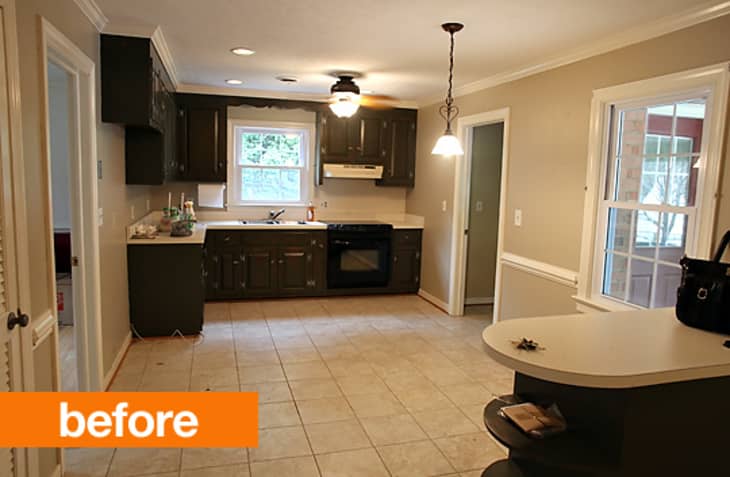
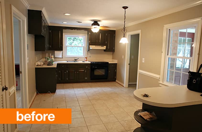
When Ashley and Greg purchased their home they knew that a kitchen remodel was in their future. The existing space was poorly designed, with dated appliances, unattractive cabinetry, and a fair amount of plumbing and electrical issues. Starting from scratch, they designed and built a beautiful, modern, and functional space that makes you wonder – is this even the same house?!
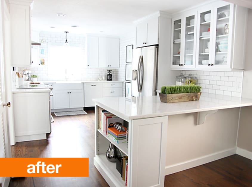
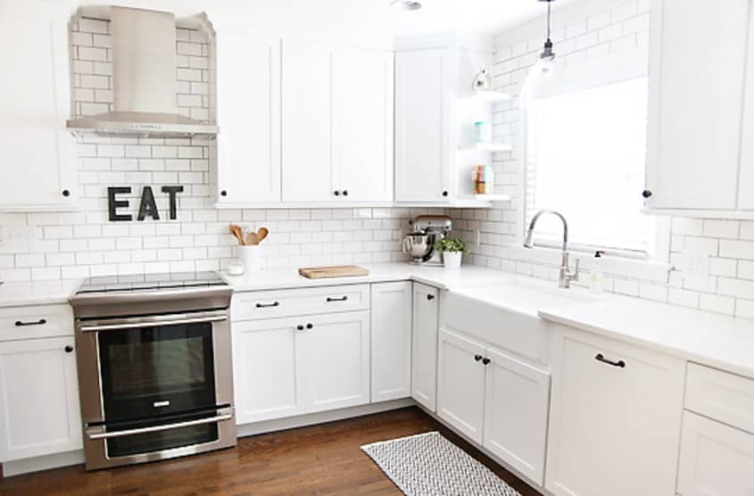
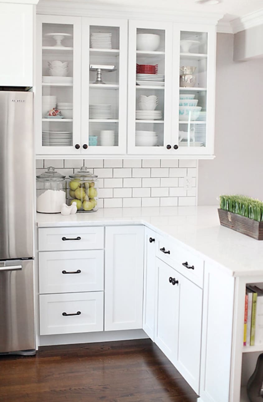
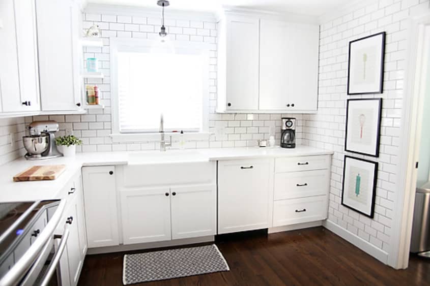
Not afraid to get their hands dirty, the couple did what they could on their own. This included demolition and drywall patching, design and finish selections, electrical work (by Ashley’s father, an electrician), and installation of finishing elements – floating shelves and light fixtures. The entire remodel came in somewhere in the neighborhood of 25-28K, a labor of love worth every penny.
Check out Ashley and Greg’s blog, 7th House on the Left, where they document their remodel projects and more! Find posts specific to their kitchen here.
Thanks, Ashley and Greg!
(Images: Ashley Brown)