
Before & After: Jenna’s Living Room Makeover
comments
We independently select these products—if you buy from one of our links, we may earn a commission. All prices were accurate at the time of publishing.
(Image credit: Apartment Therapy)
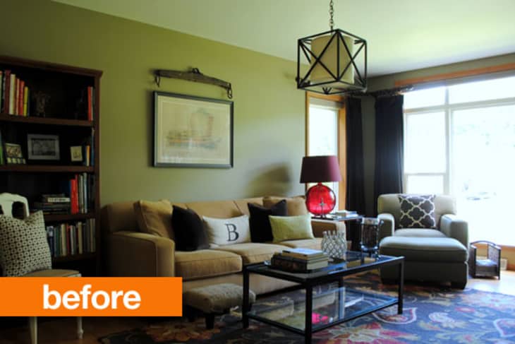
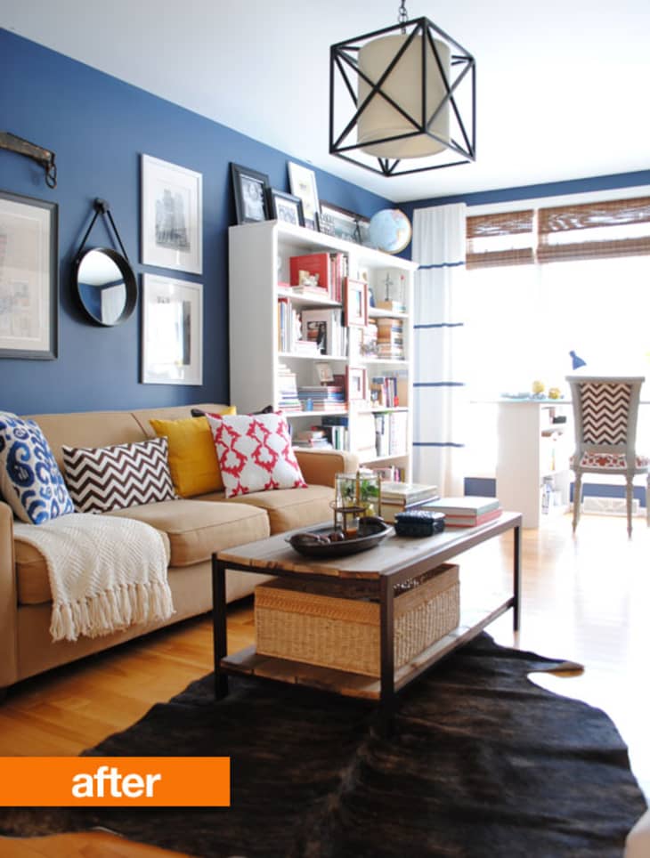
Jenna’s living room was filled with furniture that she loved, but that wasn’t working in her new home. Here’s how she transformed the space by letting go and bringing in some new color and pieces:
(Image credit: Apartment Therapy)

From Jenna:
Over the past 3 years since moving into my home, this space has been forever in transition. Much of the room was filled with furniture that was meaningful to us, but just didn’t fit. Many of the pieces were difficult to part with because they were first purchases from our wedding 10 years ago. The room itself is also awkward with very little wall space, resulting in a space that has taken awhile to fully pull together.
After rearranging the furniture and actually putting a bookcase in front of a window, the room started coming together. Last summer, I decided to paint the walls a deep navy hue and the room started to take shape. Upon moving out our forever-loved furniture, and replacing them with pieces that actually work for the space, the room now makes sense. It not only feels larger but doubles as a home office. The one large wall (which actually has a window on it but is hidden by a bookcase) is filled with a large sofa and 6′ of shelving space for styled books and accessories. Additionally, I have one wall dedicated to a GIANT inspiration board. Color, texture, and strategic styling have really made this room complete.
For a space that I dreaded walking into before, now I can’t leave. I feel inspired and happy in my new home office / family room.
For more photos and details, check out Jenna’s blog, SAS Interiors.
Thanks, Jenna!
Have your own Before & After project you’d like to share with the editors? Submit it here.
(Images: SAS Interiors)