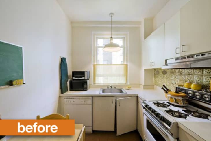
This NYC apartment kitchen got the job done. But there were a few things about it that irked — the L-shaped layout blocked part of the window, and there wasn't a lot of storage space. The appliances were outdated, and the laminate cabinets had seen better days. Plus, the whole room just felt, well… little. What to do?
Can you believe it's the same room? Architect Nalina Moses removed the sink cabinet that was blocking access to the lower part of the window. Now the entire window is visible, which instantly makes the room seem larger. She changed the configuration of the kitchen from an L shape to a galley setup, which allows for many more upper and lower cabinets. On the cosmetic front, the cabinets, countertops and floors were replaced. Appliances got a modern update. (And is that an undercounter washer I see in the foreground? We're all jealous.)
The final touch? The mirrored backsplashes. I know some people love to hate these, but nothing is quite as effective at opening up a small space. Plus, it's easy to check your hair while you're cooking.
To see more details of this project, visit the project page on The Sweeten.
(Images: Jeffrey Kilmer)

Stanley Console by ...
The mirror fooled me- I first thought they knocked the left wall down.
Hmm. I like the cabinets, but I think there are way too many. The new configuration makes the room seem tiny and would be too tight for two people. I would have kept the L configuration and added a small island.
It's beautiful, but a little tight I think. Good thing you'd never have need to open the dishwasher and oven at the same time - because I don't think it would be possible - at the very least dangerous. And is that a washing machine next to the dishwasher. This must be a very tiny place. Since they did such a great job with this tiny kitchen, I'd like to see the rest of this tiny place.
I think the makeover is stellar. Although I laughed at the kitchen being called diminutive—by NYC standards, it's roomy. And the window is pure luxury. The mirrored backsplash does open things up visually, and because it's not on the stove side of the kitchen, should be reasonably easy to keep clean. Well done!
Didn't notice the dishwasher/oven configuration until I read LANative's comment...and it's about right. But I think the space 'looks' bigger but it is now a 1 butt kitchen for sure.
Great job though.
Love this kitchen! Removing that original sink section totally opened up the space and made the kitchen seem longer.It looks like a real window now, not an afterthought. The window's reflection in the mirrored backsplash (really like the way they used this) had me doing a double take, thinking that they had put in a pass through. The cabinets make the kitchen (all that storage would be greatly appreciated), especially the glass front cabinets at eye level.
Well done!
Looks great! Wish there were more photos of the redo.
@mei-ling, there are a few more photos here:
http://blog.thesweeten.com/2010/03/01/my-sweetened-kitchen-the-very-first-meal/
Looks *much better*, though actually looks a little smaller to me (the open space has shrunk). I think the use of the mirror was clever.
i was dissapointed when I looked at the AFTER picture, it's too dark and too narrow for me.
I think the kitchen went from light and airy but dated to really closed in and claustrophobic.
Photography can be misleading-the pix on the blog make the kitchen look wider than it does here. Based on the floor tiles, it looks like there is four feet of space between the counters, which is definitely enough room for more than one butt!
@cilla, you can't have too many cabinets. They are key for keeping your counters under control.
By NYC standards, this kitchen is massive!
I think the make-over is beautiful, and a great use of the space. This kind of kitchen in a New York City apartment is a dream; I should know, I live here. If only my kitchen looked like this!
A wonderful transformation. A galley kitchen is the best kitchen I ever had. And as for too many cabinets -- no such thing. It might be difficult for two people to be in there together, but a huge percentage of Americans live alone. I've cooked up some good times (with a boyfriend) in close quarters in my galley kitchen. The bad design of the "before" kitchen was because someone thought you had to have a window over a kitchen sink. Break rules!
Well, I have to say I am one that loves a window over my kitchen. Maybe that is because I've spent a lot of time looking out one while doing dishes, as I have never had a dishwasher. I personally like the look of vintage kitchens and think they get an overall bad rap, when in fact, less costly updates (paint, open shelving, portable islands) can make huge differences but keep the charm.
The new kitchen looks okay, don't get me wrong, but it is rather generic and reminds me of an Ikea display.
Would have done white cabinets, but otherwise looks great.
Totally agree... at least a light grey or something. Otherwise, a beautiful re-do!!
I would have gone with a more modern looking flat grey cabinet, but otherwise it's a quite pretty remodel. To my eye, fewer cabinets would have shrunk the new look by chopping up the wall. I think it's a design imperative that they span the length of the room. And there is no such thing as too much storage---I hate cluttered counter tops! Also, having grown up in London, this is a reasonable size kitchen to me, and two could definitely navigate cooking at the same time! Love it!
Love this transformation! The Sweeten's blog photos really gives a better sense of the width of the space. The work triangle is a bit wonky, but this a great use of the limited space. I wish I had all that cabinetry!
holy smokes, so many "it's okay, BUT...." comments on what looks to me to be a perfectly lovely kitchen reno. I definitely favour the after over the before - enjoy!
holy crap! Amazing!!!
I think it looks lovely. And it's true that you can never have enough cabinets. I finished a major renovation in June and I never thought I would fill all of them up but I have. I love my kitchen. I'm in there all of the time. thehouseofy.blogspot.com
Very nice renovation. I like a sink under a window, though whenever I say that I wonder why. I'm working at the sink and not looking out the window! Have a washer (and I suspect this is a w/d combo) inside an apmt in NYC is a big deal--good for them in finding the space. And good for them in creating more storage. The only thing I'd hate would be not having an island. I don't like standing at a counter and staring at cabinets or a wall, but when living in a small space something has to give.
That's a great use of space and nice finishes, but I immediately notice the radiator which must have been inside the sink cabinet before the redo. That's weird.
I think people are missing the point on this. What was lost was a tiny portion of floor space in the back corner in front of the dishwasher, though this was probably fairly dead space anyway. Could you argue it is smaller now? Sure! But for that negative you have gained AN ENTIRE WALL OF CABINETS and counter space. This was never going to be a kitchen that a group of people threw dishes around, singing songs, while they wiped them dry with Bill Murray! Come on. Also, the perception that it is much smaller is simply because the after photo is taken a few steps back from the before photo (notice how the window appears narrower). People be silly, yo! But i do agree that there isn't anything particularly pioneering about the redesign.
I ASSUME YOU OWN THIS APARTMENT! LOL! WOW, THE DIFFERENCE IS AWESOME.
Gorgeous! It must be such a joy now to have room for everything. I love the mirrored back splash- I think that is the most clever idea ever!
I love love love a galley kitchen. Great redo!
An absolute WOW!!! Fabulous job!!!
I agree that the oven and dishwasher facing each other is a bit of a problem, but I cant think of a single time in my life that I need both open at once!! Its a small kitchen, you have to make sacrifices if you want perks like dishwashers and such. I think this layout is a much better use of space and I love the high cabinets!
I love it. And heck, the mirror fooled me, too. Beautiful job.
The mirror fooled me too and when you look at the actual blog, it doesn't feel quite so closed in. I think you did a lovely job.
I like white walls and cabinets. I like a window over the sink. I like a kitchen table. So I liked the before. The after looks dark and cramped. However, it has way more cabinet storage and counter space, which is nice, and clearly the owner prefers the dark cabinets or she wouldn't have chosen them.
I don't see the negatives. The first pic had a lot of wasted space in a dull and dated room and now there's an elegant kitchen with more counter space, better appliances and a definite improvement in property value.
Sensational! As others have said, for an NYC kitchen this is enormous -- and there's no such thing as "too many cabinets" or too much storage in tight city spaces. Looks fantastic.
I was initially going to write: "the 'after' looks like it will be someone's 'before' picture in a couple years" then I noticed the link above and discovered it's already a two-year-old kitchen. It also looks twice as large in the other photos.
Nevertheless, it's a tad too dark and crammed for my taste, and lacking in personality. Moreover, there doesn't seem to be much creative use of space here, considering it was done by an architect/designer. It rather looks like something a non-professional could have come up with. But it is a 'brand new kitchen', so coveted in our gotta-have world.
Odd question but: did they lower the ceiling? In the before, there's a drywall corner along the ceiling, and quite a bit of space between the window and the ceiling line. In the after, no extra angles and the window's right by the ceiling.
I like the contrast of the dark floor and wood cabinets on the white walls. I think it looks really cozy and sophisticated. Not everyone wants a white kitchen. Wood is coming back.
i find the new kitchen to be very serene and relaxing. love the floor tiles. good job! i'm finding it hard to believe that 2 butts wouldn't fit in there at one time - what size butts are talking about? :)
I like it! Clean, modern and functional kitchen in a tiny space.
The mirror was a masterstroke. Fantastic redo.
Wouldn't the radiator be in the way from opening the base cabinets?
Courtney, I think you're right; that's what it is: the ceiling's been lowered. Why on earth would someone lower a ceiling? By what looks like 6 inches! I'd give anything to raise my kitchen ceiling. Ah, well. To each her own.
Love the new layout of the makeover but the cabinets are too dark for my personal preference. Add me to the list of people the mirror fooled!
To everyone who came here to complain about this absolutely gorgeous kitchen being "claustrophobic" and "too narrow," maybe take a look at the link AT attached, even better: this pic.
Love your "1 butt kitchen" comment. We have a small kitchen too, and at Thanksgiving as my mother and I cooked together, she said, "You know, this really isn't a two butt kitchen."
I agree w/a lot of the comments...as a native NYer this is a BIG kitchen, especially for what looks like a post-war apt
I don't get the negative comments about your redo, I love it...
This is fantastic. It looks to be about the same size and layout as my NYC kitchen and it IS large by NYC standards! They've done a fantastic job in creating more counter and storage space. Question - where did they move the table? No room for it anymore!
When you consider that a lot of apartments in older buildings have these L-shaped kitchens facing a blank wall, this is a fantastic upgrade. Many designers would probably just update the existing cabinets and appliances -- but this design effectively DOUBLES the kitchen's usable storage space and adds more appliances and a larger work area on the counters. That is quite an accomplishment.
I think the ceiling was lowered so that the cabinets would reach all the way to the ceiling. It seems like a good idea and makes the space look bigger.
Some people may complain about the decor, but I think it is a very good use of materials and will show well when the unit needs to sell. The mirrors are a nice touch, but a reflective back splash would also look fine.
I find this very well done, even if I'm not a fan of this tone of wood. For this space, I would have used white or a lighter color.
And it's true that it looks like they lowered the ceiling when you look at the window...
This is almost exactly like my apt's galley kitchen except for the sink and oven/fridge walls on opposite sides - and there are some wonderful ideas in there that I will be incorporating in my reno. The space is not small by NYC standards and it is possible to whip up large dinner parties. It can be tight, but I've had more than 2 people in mine simultaneously.
My eyes are totally rolling, reading the "tiny" comments.
I love the redo but I too would have picked either white or lighter colors like sage gray.
I would love to have all the cabinets in the after photo, nice job btw.
Great use of space, but horrible colors! I would have chosen a much lighter color, and made the upper cabinets all glass fronts. That would open up things and make it more airy. You could showcase your china and serveware that way, and keep the "ugly stuff" in the lower cabinets. Storing bulk items in mason jars is another way of dressing up glass front cabinets, and looks lovely and homey.
Right now, it's just dark and oppressive feeling, even with the bigger window.
Great work Nalina!
Love the idea of the mirror back splash.
Has anyone ever hung cupboards above existing wall cupboards, so you have closed storage all the way up to the ceiling like in this after shot? I assume these are custom built. I want to close the space above my cupboards because I don't want to see the stuff I want to stash there, nor do I want it to get full of dust, but I've been told it isn't possible because you fix attachments to the wall then slide the cupboards onto them and to do that, you come at it from above. Help, anyone? I can't afford custom cupboards.
The other picture that was linked above shows that the galley is not as narrow as the AT picture suggests. I thought the new kitchen was a bit claustrophobic until I looked at the other picture.
I think this looks great, even though my kitchen style leans much more "white and vintage" than "dark and modern". It looks super functional, stylish, and pleasant.
Weird how the apparent size of the kitchen changes between photos. Oh well. Obviously the space between the counters after should be the width of the sink cab/two cabinet doors, which oughtn't be too tiny.
Where do you eat your breakfast?
OOOH Paperstone, yum. Lots of nice choices in this kitchen
However, I would hate to keep that mirror backsplash clean.
OOOPS I guess they are granite... not so yum
LOVE this renovation. The before was wasted space. Real cooks want abundant counter space and cabinet space and the before kitchen had neither. I think the new style is gorgeous. For people who think it has no personality...well, your personality comes through in decor, accessories, meals you make, and the memories you have with people you invite into your kitchen. It doesn't have to come from your cabinetry.
I think they did an amazing job and the galley style option gives them the most storage and work surface for the space. I like that the lines are clean and spare, and the colors are too. It keeps the kitchen from becoming busy or cluttered despite it's small size. The mirror backsplash it totally working too. For my personal taste I probably would have gone with a light painted cabinet, but the wood looks pretty, and it's not my apartment. Great job.
Wow. That's all I can say really. Fantastic job.
Looks fantastic! And yes,this isnt a good picture,the others show the true scale and its more than roomy.BUT,I have to agree with several other posters that the cabinets are a tad dark for my taste,and I really wouldnt have lowered the ceiling either.All in all,well done indeed!
The mirror is a great idea!! It totally makes the room look bigger!!
Looking at the Before pic and gauging the width of the dishwasher at 24", the sink unit at 36", and the depth of the side cabinets at 25", the width of the kitchen is a slim 7+ feet, give or take. The other, wider-looking photo might have been taken with a wide-angle lens that "stretched" the width (look at the scale of the window). So I think they did a remarkable job of fitting so much storage and counter space in, with several prep zones. NYC kitchens are challenging! Though my personal aesthetic choice might have been to use more glass-front cabinets or to mix up the cabinet materials more and break up the monolithic effect, this is a kitchen I'm sure I'd love to cook in. Great job!
I agree that the doors are too dark for the small space. Choosing light coloured cabinet doors would have made the small space appear bigger. Sand blasted or etched glass would have worked nicely on the overhead cabinet doors. This would have given an airy feeling to the space. Otherwise I think the space is much better utilised now.
The before reminds me of what I currently live in.
Fantastic! I'm not really getting all the negative comments, here.
I love that you recovered part of the window and the mirrored backsplash looks very convincing.
Love it! The old space was ghastly and as I have a teeny galley kitchen with almost no storage space, I'd kill for this kitchen. Even the window is larger and the light is further reflected in the mirrored backsplash. And look at all the extra counter/prep space!
I don't see how you could stand in front of the oven or dishwasher and fully open either one.
I think all small kitchens should have the microwave above the stove. It's made a big difference at our house.
A friend of mine did that in the 1960s--she had a knock-down, drag-out with the contractor, who was horrified. Hers are lightweight plywood boxes, made with sliding doors, stained to match the existing cupboards, bolted thru the backs into the studs. Works fine. The sliding doors--1/4 in ply--were much cheaper than regular doors, & were easy to make.
Wow, what a sad and boring kitchen transformation. It would make me feel claustrophobic. It is very bland and builder grade. It seems much smaller!
There is also absolutely no personality or color!
waaaaaay better. love it.
Beautiful transformation, except I do not understand why they went for such a blah light fixture.
If this is a little kitchen, mine is microscopic.
Much better layout. I've had two galley kitchens with a window at the end, and they were my favorite kitchens to cook in, despite the fact that both were about 2 feet more narrow than this one (yes, in one, I could only open the refrigerator door 45 degrees, couldn't use one of the crisper drawers as a result - when my old fridge died, landlords too cheap to replace it with a double door model.) There is something really nice about having counter space on both sides, and a nice sunny (in my cases, at least) window on the end. You don't want a galley kitchen much wider than this, or you have to make to many steps. This is fits multiple cooks just fine. (My galleys only fit two if we are at least good friends.) In my kitchens, you didn't stand in front of a DW or oven when you opened it, you'd stand next to it, as it took up all the room across the opening, and you know what, that works just fine. This here is actually much wider than that was.
I'd add a radiator cover to keep from burning myself, and to add a seat that isn't too hot. Can't believe they buried that radiator under the old cabinets!
What I'd have done differently: NOT lowered the ceiling, but just used one taller upper cabinet that did not go all the way to the ceiling. I like the lighter look of having the cabinets not go all the way to the ceiling and putting little artsy things and some storage items up there. Lighter look - but wow, how nice it would be to never have to clean off the dust from the top of cupboards (and the stuff on to of it) again! Perhaps I'd do exactly this, only with lighter colored cupboards and more glass doors - this is all too dark for me, the cupboard, counter and floor - I think these rooms look bigger when lighter in color, and reflect the sunlight more, which I need to see to cook - but to each their own. Layout definitely a big win here!
I agree with other posters . . . cabinets on both sides make the kitchen look like a really THIN galley. I don't think much of the window was covered in the "before" picture. I prefer the L-configuration as I really do not like radiators. Also, I much prefer white cabinets and white appliances. So . . . this old gal actually is not enamored of the "after" photo.
Absolutely gorgeous. And now you have a full window view! I couldn't believe it was the same kitchen. I love the brown cabinets.
An excellent transformation. I am amazed at the rude and negative comments! I thought my large Kitchen with an Island was great until I worked in a small galley kitchen designed by my mother in a house built more than 200 years ago..(. 2 foot thick walls mean no extension was reasonable. ) It was so efficient and often 2 or 3 people worked there in harmony. It is hard to explain how much less tiring it is to work in such a narrow space until you have made major meals in one. The mirrors more than make up for the darker cabinets.... no doubt there is under-counter lighting too. I would hire this architect anytime... great job!
Though I normally prefer white or light cabinets, this looks gorgeous, a nice balance of earthy materials with simple, elegant lines . The white wall and ceiling, window, and mirrored backsplash keep it from feeling too dark. I like the repetition of the stone on the countertops and floors. As others said, at first it appears as though the wall was removed, but after looking closely, I see it wasn't. I think the upper cabinets on the sink side are quite shallow, to fit the space better.
I love it! Beautiful work :-)
@ayjohnson, me too!
My architect friend had installed IKEA cabinets on top of his existing cabinets (small square ones with glass doors). And I don't know who told you you had to slide in cupboards but usually, you can screw them in the joists and onto the bottom cupboards (make sure the screws are long enough for the wall and small enough not to go through the existing cabinets). They basically sit on your existing cupboards. But it might be hard finding ones that will close off your space completely if they are not custom made... You might have to put some type of moulding or lower the ceiling to close off completely... Or you could put some lights on top like in this kitchen : http://pangaea-id.com/wp-content/uploads/2010/06/contemporary-kitchen-322.jpg . Good luck !
Brilliant! I love the mirror backsplash, i was fooled as well until I read the comments. Definitely is the smartest thing to do in a narrow kitchen like that.
Tripling the counter space and storage in a NYC kitchen is never a bad thing. My taste runs more toward white or light cabinets, but this probably goes bettter with a flow into a living space. I agree with the person who said that the before had tons of wasted space. I think this is an efficient and enviable re-model.
Love this! Beautiful details. Thanks for sharing.
Look at the ceiling above the windows in both photos. Why would they have lowered the ceiling in the renovation? Possibly to straighten it out for the cabinets (NYC apts are known for not having proper right angles). But still. That's a lot of effort to lose 2-3 inches. Also, that new light looks like it's on an angle. Waste of labor and money for that detail. Other than that, it's a great improvement.
Wow! Lots of great comments. I am a friend of this kitchen's chef and I have cooked in both the before and after spaces. I prefer the after kitchen. Two people can work together comfortably and everything is in arms reach. The window provides good natural light and fresh air ventilation. The dark wood and granite counter top don't show dirt the way my all white kitchen does. Also, food looks delicious when lit from the lights under the upper cabinets. The retro style lives on in the vintage dishes in colors of avocado, lemon and orange. I am always happy to visit this kitchen.
the choices made in this remodel have increased the value of this apartment substantially by returning to a functional layout w/ excellent storage (we do not have pics, but there is a pantry, too) and classic lines, and it is nice to see walls kept to separate service space from entertainment space. those inspired by this post, if they are lucky enough to have such a large kitchen, should check w/ house rules before installing a washer/dryer, as those often are banned due to overload on the sewage line.
Very nice. One can never have too many kitchen cabinets!
I think you accomplished your desire for more cabinets well but am puzzled why you choose such dark finishes in all ready small room. dark floors, dark counter and pretty dark cabinets. If you had just done lighter uppers, a lighter counter and maybe some mirror or wavy glass door inserts the room wouldn't seem nearly so narrow or cramped. A galley kitchen is really great when you have a real chef who like an efficient work space. Clearly the space before was more for eating and hanging out in and you have eliminated the ability to do that so I assume the living areas much be large enough for that.
"Although I laughed at the kitchen being called diminutive—by NYC standards, it's roomy. And the window is pure luxury."
Why do you say that? Most New Yorkers do not live in an overpriced closet of an apartment.
It's beautiful because it's big because it's LONG + all the additional cupboards make it bigger. It's a galley kitchen, so it isn't going to be a people gathering place save for maybe a few near the radiator. Light or dark wood will never go completely out of style whereas grey etc. could look dated tomorrow.Seems the ceiling fixture is a little too minimal; a small thing compared to the overall transformation. This did have to cost more than a few tens of thousands of dollars. Would also like to know/see the status of the rest of the place.
AH-MAZING After!!! The mirror fooled me for a minute.
@Colourfiend - I agree that white cabinets (at least white upper cabinets) would have given it the appearance of being brighter, but the kitchen isn't very dark as it is with the dark wood, so I don't see the issue. The room might already be small, but it isn't a cramped kitchen at all. Did you see the photos in the flickr stream? The kitchen is actually a lot roomier than the one photo on AT suggests.
That's the classic NYC galley kitchen, which makes much better use of the space. (I'm chuckling at the concern over the dishwasher and the oven.) The cabinets and counters are not my taste, but it's a vast improvement.
I have this galley kitchen. It is a pain in the arse - seriously. If you have anyone over 120 lbs, 5'2, and small boned, it is hard to cook. It becomes an exhaustive and anxious prone dance of hazards. I have lived with this type of kitchen for 23 years and 4 kids. Yes, we have had fun in the kitchen but more often than not, it has been difficult and almost daily, I yearn for an eat in kitchen. Even the little table that was there in the "before" photo. Having a place to sit down and eat in a kitchen as the before picture showed is worth way, way more than the too many cabinets and narrowed space the "after" renovation created. The kitchen is always the heart of the home, and it is a nice place for kids of all ages to sit and chat with you while you cook exposing their minds and bodies to cooking and it's attendant lessons of taste, measuring, joy of creation.
It would be a nice place to just sit with my husband when he makes his breakfast, when I have a friend over and we don't want the formality of the living room. I think it was a big mistake to configure this kitchen to a slick modern and what essentially is, a one person kitchen. It is a show piece. I would have rather to have seen an architect perserve the space as an eat in kitchen and upgraded accordingly with less typical choices.
I cry when I see that table in the before and the narrow, functionality of the "after".
I wished I had the "before"- It looked like a warm hearted kitchen and an upgrade could have incorporated this sensibility with design and functionality.
I am telling you, I have the "after" kitchen and it sucks.
I love the redo, love all the cabinet space and the better layout. It looks so efficient.
I would have picked different color cabinets - not because they are too dark but because I just don't like the color, but that is just personal taste :-)
I prefer not having an eat-in kitchen, I want to sit down to a nice dinner and not look at the mess I just made in the kitchen......
Why was an architect needed for this kitchen redo? They took out the old furniture & appliances and put in new ones. When you shop for kitchens the manufacturers or shop owners help with the layout. Is some creativity involved here that I don't get?
You call that tiny? Come over to my apt. I'll show you tiny!!!!
Just from looking at the two photos, they moved the sink and dishwasher (relocated plumbing) and also enlarged a window (not necessarily an easy task in an urban apartment building). Those things alone may have required some assistance from an architect (if only to comply with building codes).
millix- You generally cannot move plumbing and electrical without an architect.
I think it would be interesting to have an AT post on whether people prefer eat in kitchens or "cooking only" kitchens and open kitchens or closed kitchens. I'm a "cooking only" kitchen and open kitchen kind of person. A table in my kitchen would only get used for prep or just go unused.
@Cilla, I think an island would have been more impractical. This way, two people can definitely stand in the middle of the space, turning back and forth to the work surfaces/stove when they need it rather than negotiating around an island or walking over to one that's against the wall.
I think the cabinets are a bit claustrophobic because they're darker in color. (Personally, I'd have had the same amount, but in a different color and maybe with a few open spaces or glass doors along the top to break it up. But there's nothing like having a space for all your stuff!
By NYC standards this kitchen isn't small and the width of the floor in the galley is pretty standard. Some of these commenters may not understand the complexities of working in New York City buildings - architects are often required by co-op and condo boards.
Yes, I agree. The kitchen is very nice, but better in a larger space. I would have painted the original cabinets and kept the wall space clear. New flooring, etc. I'm guessing that they need the small breakfast table, unless they plan to eat in the dining room or living room.
I need a place to sit in order to keep an eye on my stove while cooking. I sit at my kitchen table, reading or watching a small TV, or viewing my laptop. I do believe that keeping the kitchen table would have been more handy, in order to watch the stove and to give a stir to various foods being cooked. Not much fun standing the entire time. But, truly a wonderful kitchen for a larger space.
Was the ceiling lowered? In the before picture there seems to be more space between the top of the window to the ceiling where in the after picture there isn't. I love the transformation, all of it. You want to see a small kitchen come see mine, it's probably 8x8.
Modern
I really like the kitchen. The mid tone cabinets that go all the way to the ceiling, not leaving that annoying gap, won't turn yellow like some white cabinets. The dark countertops mean you won't constantly be cleaning them for every speck. This is a working kitchen not a hang out kitchen. I like it all except for the use of double cabinets why not just have a taller upper cabinet built instill of two small cabinets installed. I also don't like the microwave above the stove. Otherwise beautiful.
Okay, that is a MUCH better shot of the kitchen and its space. Well done.
I have to laugh at those who thought this kitchen, one of the most efficient layouts ever, the double galley as being small and cramped.
I have a double galley myself, though it could stand to be a bit longer for more counter space but as it is, it's very much efficient and I love how I don't have to do much walking, unless I need to get something from the pantry, or to use the microwave, as it is also in the panty, and that's on the other side of the fridge from the stove/prep area.
Just about everything else is within a half step in most directions from my prep spot, a small counter between the stove and fridge, with the pull out cutting board, I have all the prep space I need. The sink side has to adequate sized counters, one for drying, cutting boards and the knife block, the other for staging stuff during the prep work, houses the food processor and the coffee pot, works fantastic. I just keep 3 crocks, one large, one tall but narrow, and a small one with various utensils in them next to the stove, also keep the olive oil and balsamic vinegar in cruets by the stove as well. I keep tasting spoons in a drawer next to the stove along with pot holders and I'm all set.
As for this kitchen reno, the before looked like it was half assed done with cheap laminate cabinets and low grade appliances, and done some 30+ years ago is my guess.
The after while it does look a touch heavy with all the dark wood and the black counter tops and gray flooring, it works none the less, though the light fixtures look a tad too generic, but probably give plenty of overall light to the space.
As for having more than 1 person in a space like this, it can be done quite easily, just have to coordinate and communicate when things like the oven door is being opened, ditto the dishwasher.
I know for personal experience as my late Mom's old place was similar in layout as this, the dishwasher and stove were almost exactly across from each other so you just had to say, don't back up, I'm opening the oven etc and Mom and I worked very well in the kitchen at the same time. The difference was hers was a bit longer than mine, so she had more useable counter space for actual cooking/prepping. We both had the very same layout, that is, sink opposite the stove, fridge to the stove's left but the counter across from her fridge was a great space for prepping since she had a dishwasher and could free up that space. I don't have a dishwasher, so that bit of counter that's to my sink's left has to be my drying space, the counter to its right is prep/staging area, again, it all works fine.
I grew up in an eat in kitchen (for more casual dinners, breakfast and lunch meals), when the whole family ate together, which was most nights of the week, we at in the dining room, so an eat in kitchen, or a breakfast nook nearby is OK by me, or simply THE dining area, if there is no formal dining area.
I also don't mind it if the kitchen is open to the main room, at least partially so people can gather at the counter and chat with the cook.
Overall, this is a great reno, though I'd have chosen a bit lighter wood or finish for the cabinets so it's not quite so heavy feeling but overall, a great reno in my book.
Why are so many people hating on this renovated kitchen? Personally, I think it looks sleek and inviting and super-functional. Look how much more storage it has than the old kitchen - wow!
My condo has a galley kitchen, and I like the layout, but the (white) cabinets are old and drive me insane, as does the Before photo here, yikes. The After, with the updated cabinets, countertops and appliances, is a VAST improvement, in my book.
I've been in my place for 6 years and haven't found any serious space problems with the galley kitchen. I have a breakfast space right outside the kitchen, where I keep a Moroccan mosaic table, 2 chairs, a console with extra kitchen things and part of my ceramic collection, plus a sound system on a tower, flanked by 2 bookcases with cookbooks. (At the other end of the living area, I've put a dining table, so it can be against the glass patio doors, with candles on the inside and lights on the outside.) With all that going on, I definitely don't miss the idea of an eat-in kitchen. The breakfast nook is just a couple feet away, and I can easily have a conversation with someone there when I'm in the kitchen.
I love this! By London standards this kitchen is huge - cupboards on BOTH sides of the galley? Shutup!! Beautiful.
Lovely! I agree with those who suggested lighter cabinets though. Would have looked even more airy and spacious. But the dark wood does give it a depth and richness. Guess it depends on what you are going for! :)
I love a white kitchen. But as someone who cooks, given a choice between those two kitchens, I'd take the remodeled one any day. More counter space, more cabinet space, a full window, the radiator isn't blocked--what's not to love? Massive improvement in function and in looks.
I'm not sure if you were looking at a particular manufacturer that required that particular installation, but not all cabinets do. My husband built custom cabinets and would sometimes install prefab if that was what the client wanted and I have never seen what you are describing. Usually they are just hung from the studs if it is a framed wall or hung with the appropriate fasteners if it is not.
Wow what a remarkable difference. Very nice kitchen. House Cleaning South Florida
I was so surprised to see the after picture because I just didn't think the space could change that dramatically. I absolutely love it, and just keep scrolling back and forth between the two pictures!
I love some of the comments here and on the Sweeten site....too many cabinets and too many things (a fridge and stove? you so fancy). It looks fantastic and the owner must be over the moon every time she uses it.
Seriously great makeover. Looks amazing and way more spacious.
well I love it. It has addressed so many needs. And the mirror is a great touch, and not too hard to keep clean
The "before" layout was inefficient, as are a lot of New York kitchens. You can get extra $$ in the sales price if an apartment has an "eat-in kitchen." But it's a big waste of potential storage space in a city where people stash sweaters and shoes in their ovens.
It'd be tough for me, too, as I open the dishwasher and oven simultaneously on a daily basis.
Oh love it! My NYC kitchen looks similar to the before photo. I wish I owed it so I could do a major renovation. Great work.
i totally dig the before. galley kitchens are just sad...they're lonely one man only utilitarian spaces. the before is more social and has character and feels more open. of course, change the finishes, but the layout works for me.
I would have chosen smaller appliances (I have a 24-inch fridge and 18-inch dishwasher in my house--they are great) and gone lighter too. But maybe the traditional look goes with the rest of the apartment.
Love It!
I really love the mirror idea.Nice one
amazing.
I would also change the cabinet color just a bit lighter. Otherwise I would really love to have this kitchen. My kitchen is about the same size (if not a bit smaller.) Unfortunately, everything in my kitchen is on 1 side, I do have a window and wouldn't mind having my sink under it but, in order for anything to change I would have to have "Major", reno's done. I rent and have made many changes in my apartment on my dime, but can't see or do I have 10 to 15 thousand dollars for a kitchen makeover. I would like to know how much this 1 cost?
Thanks as always for the great ideas and comments!