
Before & After: Matthew Patrick Smyth at Designer Visions
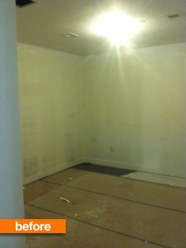
On the floorplan, it’s listed as “Auxiliary Room,” a vague definition that falls far short of inspiration. What to do with this space, with no windows, no definition, and to be honest, no saving grace? Not to worry. Enter gentleman designer Matthew Patrick Smyth, who manages to turn slightly vague into totally specific. Through the lens of the talented Mr. Smyth, it’s part Kasbah but pure Kismet. And it stole the show at Hearst’s Designer Visions.

In Manhattan and many other places, you can’t technically designate a room without windows as a bedroom. So this windowless room just off the entrance of a model apartment at the highbrow 250 West Street, while big enough to be a bedroom, just couldn’t be called one.
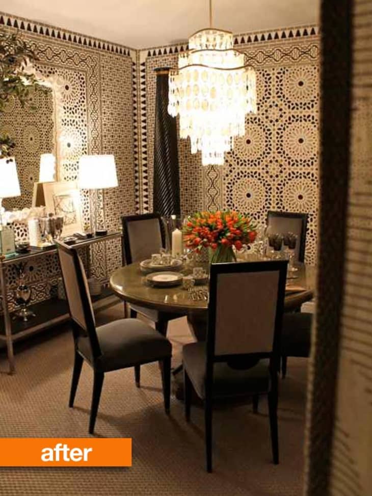
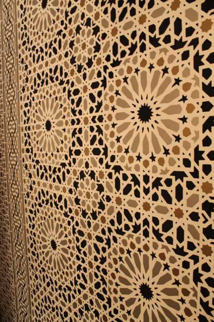
While most would use it as a home office, or a cozy media room, Matthew Patrick Smyth had other designs on the space. The designs of a wallpaper, to be precise: Schumacher’s Nasrid Palace Mosaic, in Mica. He took the paper, and its full suite of borders and trim pieces, and ran with them, concealing doors, light switches, and the room’s lackluster beginnings in the process. Suddenly, you’re dining in a secluded Moroccan garden. Midnight at the oasis indeed.
The dazzling graphic gives the room architecture, mystique, and makes it into a real “jewel box,” to borrow that oft-overused term, without the usual cliché of jeweltones (it’s an ode to black and white and warm and cool grays) or a tented ceiling.
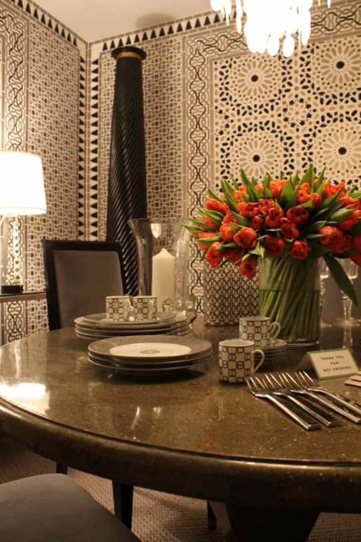
The beauty of giving the paper such a starring role is that the room is then finished off with just the bare minimum of pieces: small console, chandelier, pedestal table and reupholstered vintage dining chairs. Add crystal column lamps, and a pair of ebonized columns spinning toward the ceiling, and done.
With some of these remaining pieces, Smyth employs the typical designer tricks of adding sparkle, shine and crystal to bounce light where there’s little to start with, but that just adds to the surprising glamour of a room that’s, if you’ll pardon the pun, tres sheik.
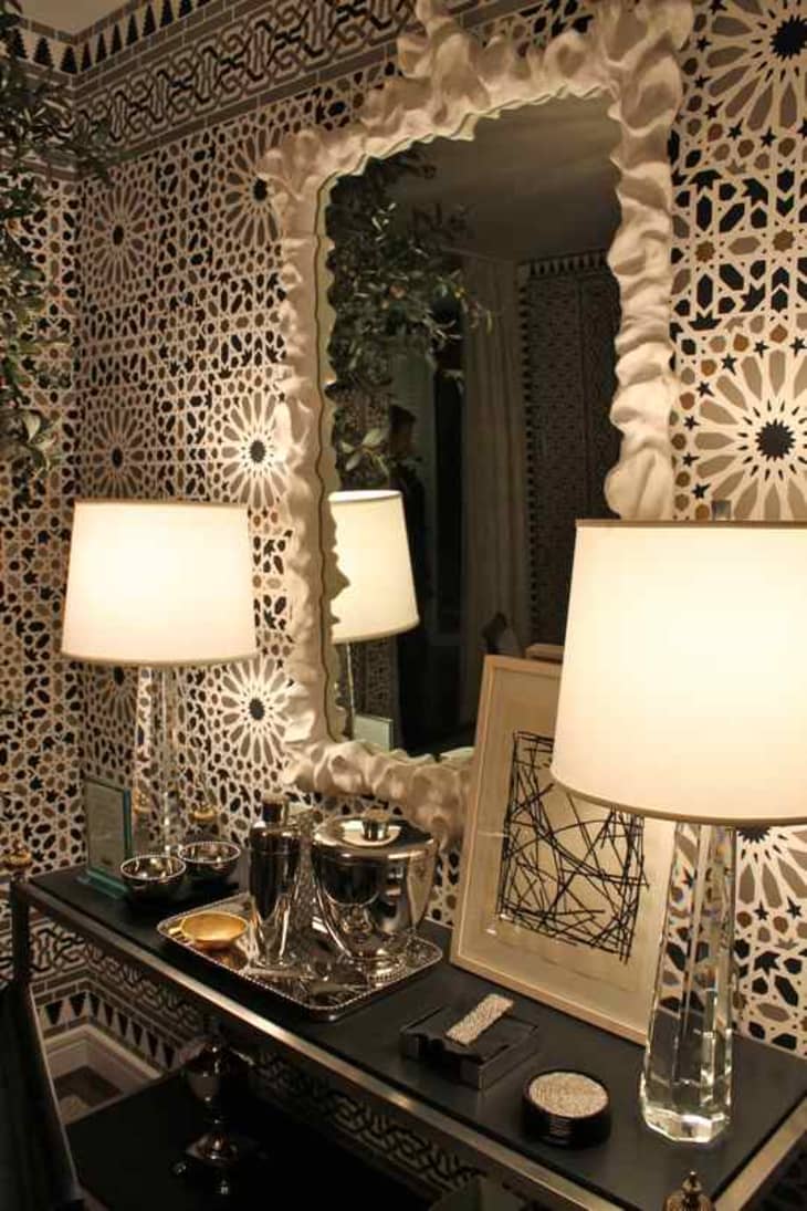
He’s also (here and elsewhere in the unit) employed a growing trend: white as a specific color choice, in furnishings and accessories (here, a mirror from Oly), a spin-off of the plaster trend from a few months back.
Matthew’s apartment design, and the apartments designed by David Rockwell and Anthony Todd, were assembled for Hearst’s Designer Visions showhouse to launch the sales of this new residence conversion at Manhattan’s southern end. See more of Matthew’s space on ELLE Décor and over on AskPatrick.
(Images: Patrick J. Hamilton)