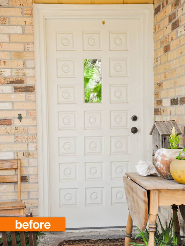
Cream brick, neutral concrete, a white door — this little entryway was cute and welcoming, but it lacked a certain liveliness. With a little bit of turquoise paint, some new lighting, and more substantial hardware, this porch gained a generous dose of personality!

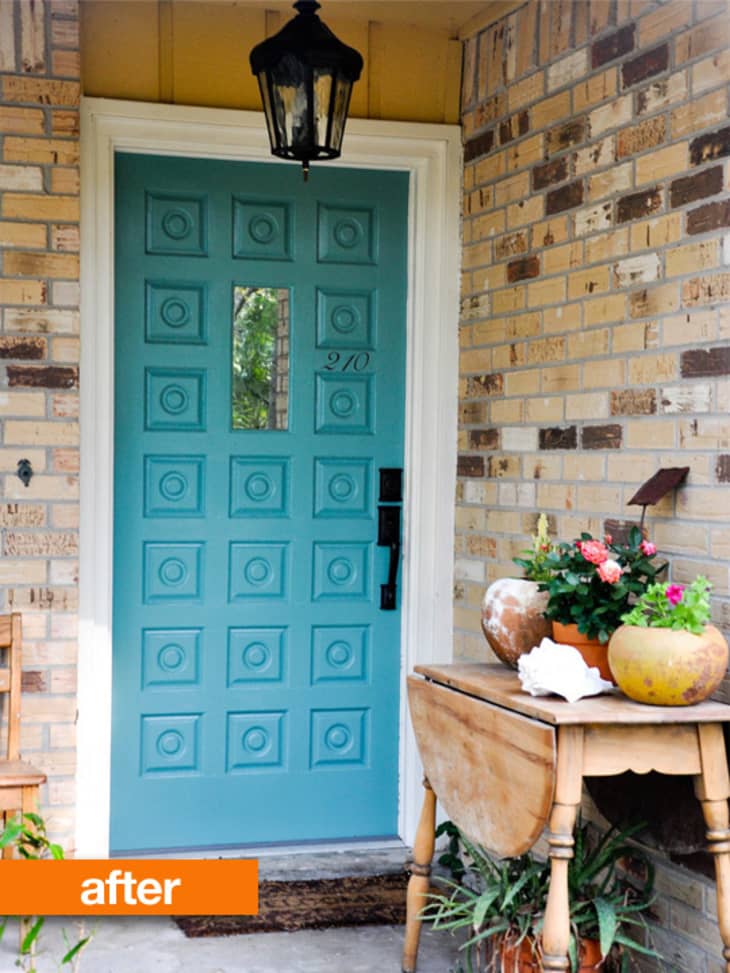
Erin from In Between Laundry tackled this little exterior makeover to cheer up her front stoop; she shows how a few simple changes can make a big difference! Plus, the new color really highlights the architectural interest of the door itself.
Check out the door makeover post on her blog to hear more about the transformation, and find a very helpful tip on how to let your door paint cure without having to leave it open for three days straight!
MORE FRONT DOOR BEFORE & AFTERS ON APARTMENT THERAPY:
• Before & After: An Entry Door Gets a Sexy Color Makeover
• Before & After: Painting the Front Door
• Before & After: Brightly Painted Porch & Front Door Color
(Images: In Between Laundry)


White Enamel Flatwa...
The new color looks great, but I think the location of the house number is awkward and too small.
I like the idea and a great job was done,but I don't like the color. I think a darker blue would look better.probably because I love blue and painted my front door and house trim dark blue
Pretty, but the house numbers look crooked.
I agree with the commenter above. Love the colour and fab idea idea, but the number is barely noticeable. As the door is already very detailed I would add the number to the wall next to it, perhaps in black metal (to coordinate with the door hardware). Great project though!
Like the color & door handle but agree on the house numbers; doesn't work. Also, the table needs to go - away from the door.
Love the color. Hope there id a number on the curb for emergency vehicles.
Oh this is just the nicest door! I love turquoise and it looks PERFECT. I like the numbers on the door. Probably can't see them from the street but I still love it.
yep - crooked house numbers spoil the whole redo for me......
love it!
Love the door color, love the new light...don't like the door number or the table placement. The thing I hate the most is having to dodge something just to get to the front door.
Love it! I would've been hesitant to pick that color but you have a good eye, it looks great!
Yes, color is great, table is a visual distraction, house number reads odd.
I can't wait until I have a house so I can paint the front door turquoise. Or orange. By the time I buy a house I will have decided : )
I like the door colour. I would change the number to something more noticeable since I get frustrsated when I can't see it immediately.
I love the brick colours in the first photo, but not so much in the second. Which is more accurate to real life?
Love the color and the new door handle/deadbolt but have to agree about the house numbers not working. A lot of municipalities require a minimum size for numbers so that police etc. can easily find the house. These wouldn't meet the standard.
Love the color it really compliments the brick and brings out the darker richer tones.
Yeah, the house number needs to go. It needs to be bigger and bolder and not on the door.
Love the blue you chose! It really does jump out with all the neutrals.
Love the color and the hardware! But the numbers don't go with the hardware plus they're too small in comparison.
Bolder numbers vertically to the left of the door could visually enlarge the space. I love the door color!
I was never that person who liked the before. Until now. I like the color, I guess? But I would have gone with an orange or warmer color. The coolness of that blue really doesn't do much for the brick, and it kind of dates it rather than modernizes it, but that's just my opinion (as is everyone's here!)
Orange color, just like the "before" and "after" labels of the photos would be better.
Wow!
Door color is great. However as many others stated before, house numbers are too small and should be on the wall not the door itself in order to see more clearly.
I'm with surfjack on the color choice. I'm with those who think the house numbers don't work. I'm with those who ask that the table be moved.
Also, I have a question. What's going on above the door? In the second photo, it's especially noticeable that there's some section of wood or some other material -- not brick -- and it seems to be painted chrome yellow. It didn't work in the first picture and it doesn't work in the second picture. Is it meant to be some kind of crown over the door? Could the homeowner enlighten us?
Agree...the numbers need to be bolder/ bigger.
What a bad choice of color ... Very tacky
I like this! I wish it were mine...Good Job!
This has totally been on my Pinterest for months! I don't understand how someone can think that a door color is "tacky" when the rest of the house is neutral. It's not like she painted it with a Rainbow Brite mural and dusted it with glitter.