apartment therapy changing the world, one room at a time


CHI House Tour: Jessica & Alex's Simple Modern On a Budget

2008-04-03-1livingroom.jpg

Name: Jessica, a graphic designer and Alex, a packaging engineer
Location: Evanston
Size: 1920's 3 Bedroom Condo - (Don't know the square footage; too lazy to measure)
Years lived in: 2

>> Enter Slideshow

2-23-housetourlogo.jpg
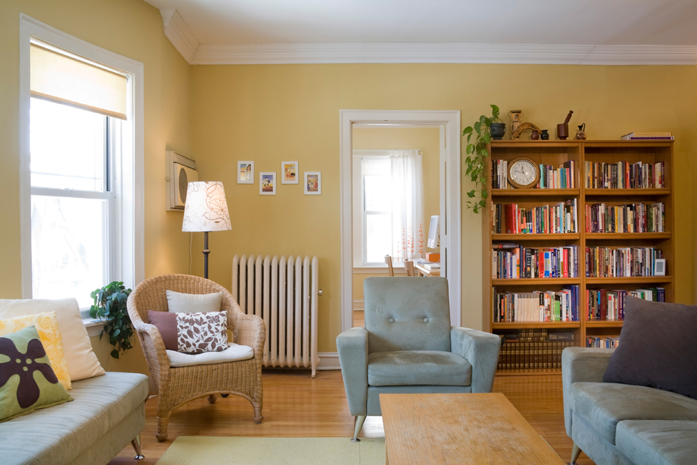
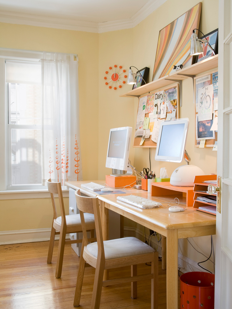
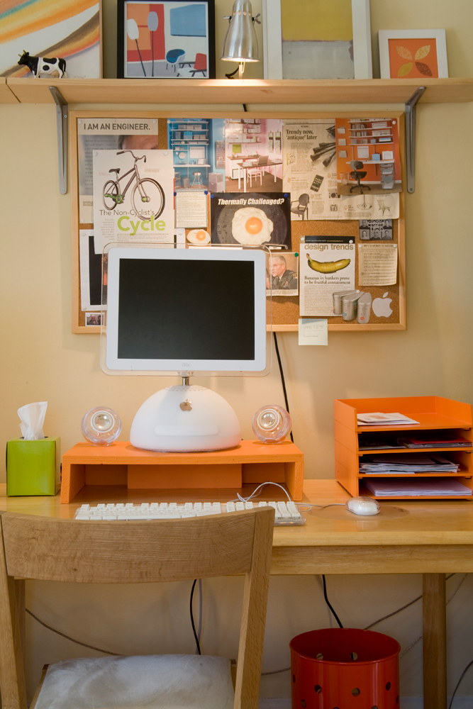
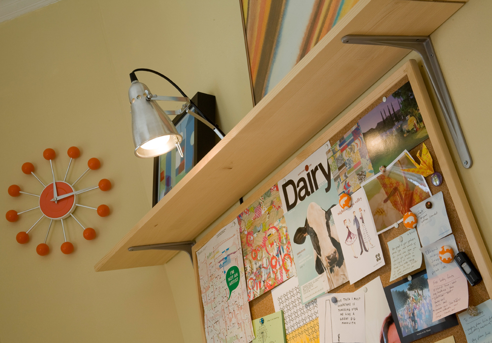
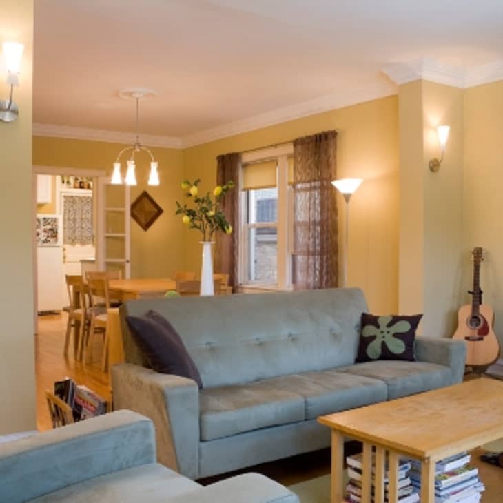
Though we have yet to meet in person, we feel like we know Jessica a bit - we "discovered" her colorful Chicago home through her blog and sent her an email asking if she'd be up for sharing it with the Apartment Therapy community, and happily she agreed. She and Alex both work in visual fields, so it comes as no surprise that their home is vibrant, attractive and full of nicely composed areas. Their workspace is one of the most cheerful and well organized we've seen...

2008-04-03-jessicaalexthu.jpg


2008-04-03-3workspace.jpg

...making it easier to understand how Jessica manages to keep up her blog as well as her busy graphic and fabric design businesses.
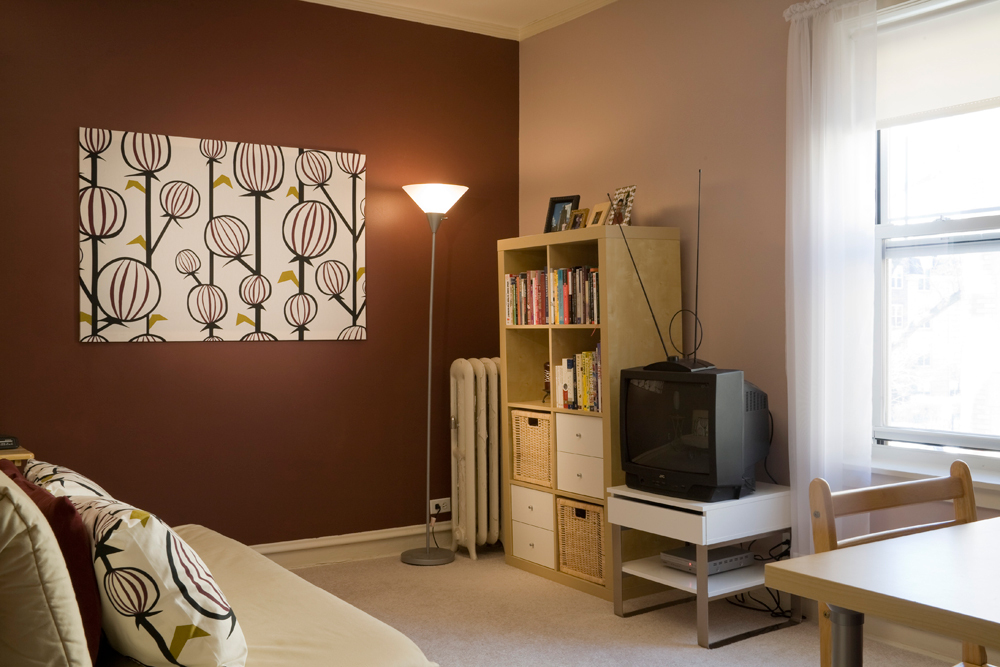
Taking a look at Jessica and Alex's resource list, we see that they meant it when they said their style was "simple and modern on a budget" - the stores listed are known for their wallet-friendly pricepoints. Combining these store bought pieces with lots of original artwork and diy projects makes Jessica and Alex's place feel far from cookie cutter. The lesson here is that the budget is not the most important factor in designing a great looking, comfortable and happy home, creativity is.

>> Enter Slideshow


AT Survey:

My/Our style: Simple and modern on a budget

Inspiration: Cheerful colors and clean lines. Hmm, that’s vague, isn’t it?

Favorite Element: Big windows that let in lots of light

What Friends Say: “Did you paint that?”

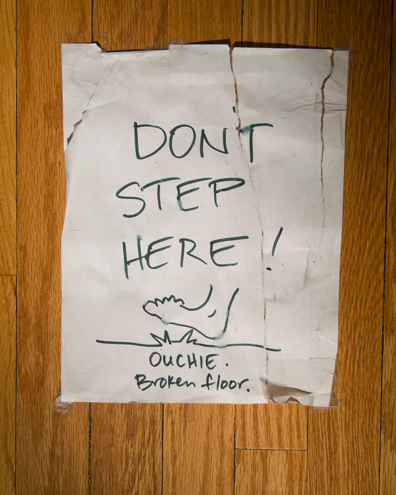
Biggest Embarrassment: It’s a toss-up between the mold in the shower or the splintered floorboard in the hallway that we keep covered with a “Don’t Step Here” sign. One of these days we might get around to fixing it.

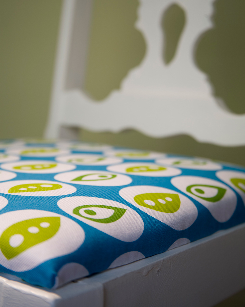
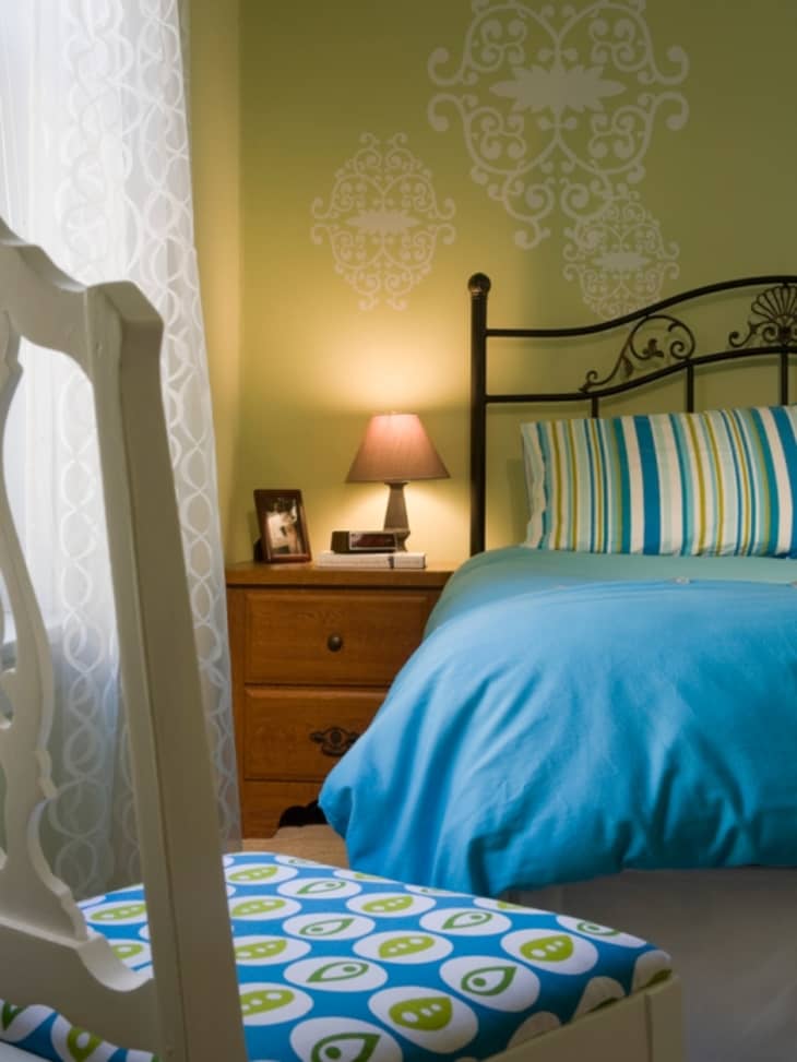
Proudest DIY: The little chair in our bedroom. We bought it at the local Salvation Army; then I painted it and recovered the seat with fabric I designed myself.

Biggest Indulgence: Books. Lots of them.

Best advice: Don’t be afraid of color, people!

Dream source: Scandinavian Design (locations in Evanston, Skokie, and Chicago)


2008-04-03-9bedroom.jpg

>> Enter Slideshow


Resources:

All paintings on canvas: by Jessica
Couch and matching chairs: Dania
Wicker chairs: Pier 1
Coffee table: Target
Living room carpet tiles: Flor
Living room roller shades: Smith and Noble, Bamboo Shoots/Golden 3138
Dining table and sideboard: Ikea
Dining room curtains: Pier 1
Chandelier and sconces: Home Depot
White cabinets: Lowes
Office curtains: Target, painted on by Jessica
Office rug: Target
Bedroom wall decals: Blik
Bedding: Target
Living room paint: Behr Expedition Khaki 340F-4
Office paint: Behr Bavarian Cream 340E-3
Guestroom paint: Behr Japanese Maple 120F-6 and French Taupe 120E-2
Bedroom paint: Glidden Sassafras Tea 90YY 77/201

2008-04-03-jessicaalex.jpg


(Thanks, Jessica and Alex!)

>> Enter Slideshow

Photos by Evan Thomas

Tags

House Tours

Related Links

Share

Comments (60)

What a warm, friendly looking home lived in by warm, friendly looking people!

posted by JR in Sweden on April 3rd 2008 at 8:15am
view JR in Sweden's profile

What a cheerful place! I love the colors.

posted by Lori on April 3rd 2008 at 8:22am
view Lori's profile

I love the soothing pale blue and butter yellow living room. So tranquil and relaxing.

posted by ElleBee on April 3rd 2008 at 8:24am
view ElleBee's profile

OK, so this is a great-looking home inhabited by great-looking people.
But maybe I'm just grumpy today, but I'm put off by "too lazy to measure". Square footage matters to AT readers. And it's one of the actual rules for contests, and is a normal protocol for tours.
They have obviously put tremendous effort into making their home beautiful, but couldn't be bothered with a little effort to make their contribution here complete.
So I found the whole tour a bit sour. It seems like a commercial for her design business.
Sorry if I'm off base. I'm just responding from the gut.

posted by wannabe minimalist on April 3rd 2008 at 8:25am
view wannabe minimalist's profile

Very inviting! I like the colors.

posted by kerri on April 3rd 2008 at 8:33am
view kerri's profile

It's very well put together, but overall it's just... meh. There is not one thing about it that is rather interesting or novel. It's very safe, very "accessible," and very, very neutral.

posted by hejiranyc on April 3rd 2008 at 8:36am
view hejiranyc's profile

Love that salvation army chair!!! And happy to see another owner of that great Hold Everything wastebin (mine's in my office too!) Man, I miss that store ;-(

posted by ridge_van_winkle on April 3rd 2008 at 8:40am
view ridge_van_winkle's profile

Looks very open and inviting, I'm really charmed. Not the colors that I'd personally go with, but they look nice all the same.

I especially like the desk areas. All throughout the house I get the sense that it must be easy to get things done, whether it's reading a book or putting something together for work. Overall just feels very versatile and comfortable.

posted by Ajax's on April 3rd 2008 at 8:47am
view Ajax's's profile

the living room color is dreamy.. i.heart.it. just lovely

posted by animalhouze on April 3rd 2008 at 8:50am
view animalhouze's profile

Very nice. And I don't care about the square footage. Thanks for sharing.

posted by Joan A. on April 3rd 2008 at 9:17am
view Joan A.'s profile

that is an insanely gorgeous place!!!!. one of my all time favorites i think.

posted by terka27 on April 3rd 2008 at 9:18am
view terka27's profile

I don't think the square footage is crucial unless it's a Small Cool entry. It's very nicely done. I don't usually like yellow walls, but these work for me. I really like the office set-up.

posted by jooly on April 3rd 2008 at 9:19am
view jooly's profile

Hmm, I thought the tree painting on the wall with all the mini canvases hung on it was interesting and novel. As are all the cool fabrics, especially given that Jessica designed some of them herself.

Very pretty home.

posted by tequila red on April 3rd 2008 at 9:19am
view tequila red's profile

Honestly, after we cleaned for the photo shoot, we were too tired to run around with a tape measure doing math. I didn't realize it was important, and the real estate listing when we bought the place only included the number of bedrooms, not the square footage.

AT, thanks for asking to do a home tour of our place. We were very honored (though we did have a moment of panic, wondering if we could quickly move into a better house to photograph?!). And we love Evan the photographer. It was great fun.

posted by how about orange on April 3rd 2008 at 9:50am
view how about orange's profile

It's a great space, but it leads me to my usual quandry when I see the homes of design-y people. Is it so trendy because they were setting the trends that have now caught on, or are they just following trends? It shouldn't make a difference -- the place is lovely -- but somehow it does.

posted by Lisa (Montreal) on April 3rd 2008 at 9:50am
view Lisa (Montreal)'s profile

How about orange is one of the blogs I visit. Fun to see a few more pics of their place, thanks!

posted by K on April 3rd 2008 at 9:59am
view K's profile

LOVE LOVE your baby blue sofa!! I love how the back of the sofa is high and tufted. Where did you buy it?

posted by Good is Green on April 3rd 2008 at 10:22am
view Good is Green's profile

Good is Green - found the sofa while browsing the Dania site:

http://www.daniafurniture.com/?page=shop/flypage&page_back=shop/category_items&offset=0&product_id=1022&category_id=a10b5d1d7c7745585411b442dc5aa934

posted by suziegoombs on April 3rd 2008 at 10:32am
view suziegoombs's profile

I would never have picked any of the wall colors out myself, especially the peach in the office, and yet I love how cheerful they are! I'm inspired to try something new!

For the record, I couldn't care less about square footage. Why does it matter, unless you're planning to buy the place?

posted by shayshay213 on April 3rd 2008 at 10:37am
view shayshay213's profile

How I can vote ???

posted by ziiip on April 3rd 2008 at 11:19am
view ziiip's profile

thanks suziegoombs! should have noticed it listed under "resources".

posted by Good is Green on April 3rd 2008 at 11:41am
view Good is Green's profile

It's a house tour, not an entry in some contest! There's no voting. I was surprised that AT sent a photographer.

posted by Palmetto on April 3rd 2008 at 11:53am
view Palmetto's profile

Square footage matters because we like to know how much space we are actually seeing. Scale is an improtant consideration in design--and it helps to put the space into perspective, that's all. I'd like House Tours to include floor plans, but then, I'm a floor plan junkie.

You have a lovely home. Thanks for sharing it with us.

posted by Alana in Canada on April 3rd 2008 at 1:29pm
view Alana in Canada's profile

I really like the color choices and combos. I'm not sure I'd call most of this "modern" though really.

posted by bordjon on April 3rd 2008 at 3:46pm
view bordjon's profile

What color paint is the wonderful orange used for the computer monitor bases?
Thanks!

posted by JG on April 3rd 2008 at 4:06pm
view JG's profile

I'm a big fan of How about Orange, so I enjoyed seeing this tour. I think it's a very livable space, although I was expecting a little more quirkiness, a little more individuality. And more orange! Love the living room set, love the wall colors, love all the blond wood. In fact, it looks a lot like our place, just without the mess and no Heywood Wakefield. They did a fantastic job with a limited budget.

BTW, I was surprised to see the living room paint was "khaki," when it comes across as a neutral, sophisticated yellow on my screen. Is it more beige or khaki-brownish in person, or more yellow? I like yellow a lot and want to use it in our new home, I'm just afraid of painting a room and feeling like I'm living in an Easter egg.

posted by Pencils on April 3rd 2008 at 5:09pm
view Pencils's profile

I like the whole place, and the couple looks adorable. Literally everything looks great. But I think there's something about the home office that I really find ultra-fantastic, which is strange for me, because it's kind of a lot of stuff to have out in the open, and yet they've managed to make it all work together so beautifully that I can't remember ever seeing a nicer one.

posted by Curtis on April 3rd 2008 at 8:20pm
view Curtis's profile

I really like your home... fun, bright and welcoming... no pretension. I would love to sit on your couch with a cup of tea and chat. Thanks for sharing. :)

posted by peekay on April 4th 2008 at 3:57am
view peekay's profile

I love her blog and so happy to see her apartment. She always shows bits and pieces of her place but this tour is awesome..

thanks for sharing your beautiful home.

posted by New York Muhtari on April 4th 2008 at 4:07am
view New York Muhtari's profile

I love seeing the homes of bloggers whom I admire! What a happy, comfortable place.

But again, AT, I notice no photos of the kitchen & bathrooms. I want to see how these creative folks handle those difficult spaces!

posted by Nougat on April 4th 2008 at 4:56am
view Nougat's profile

Hi Jessica, I think you have a very good sense of where every single thing looks best and ultimately should be placed. Could you please tell me where you bought the white vase that's on top of your sideboard?

thank you for sharing your home!

posted by tchoup on April 4th 2008 at 4:57am
view tchoup's profile

I love the casual simplicity of every room, but it's certainly not boring. I think adding personal touches to plain curtains or walls is a great way to add a bit of color without spending a lot of money or going too crazy. The office reminds me of an orange creamsicle.

posted by first5times on April 4th 2008 at 7:51am
view first5times's profile

The white vase is from Ikea. And the living room walls don't look khaki at all, even though that's the paint name, but more of a tannish mustard. The orange paint on the computer stands is Behr, but I didn't save the paint chip, sorry!

posted by how about orange on April 4th 2008 at 10:15am
view how about orange's profile

what a lovely, warm house! love the work station.

posted by olya on April 4th 2008 at 12:26pm
view olya's profile

GREAT house tour! It looks like a fun, vibrant home, and one really well suited to its occupants. I like everything about the apartment.

It's so nice to see a house tour that isn't some million dollar loft with high ceilings and skyliner views that's tastefully decorated in a neutral palette with pricey iconic designer pieces, high-end lighting, and big "important" art. I see enough design porn in shelter mags. More tours like this, please.

posted by Enrique on April 4th 2008 at 1:12pm
view Enrique's profile

It's overall a lovely, light space. Not surprising, considering the professions of the owners. Great use of color. My favorite is the office space, that has some extra liveliness to it. I was happy to see the Apple Pro Speakers, the cutest computer speakers ever designed. Be warned, if you upgrade to a new computer, the speakers won't be compatible! I'm also wondering where you got the little stand that lifts the iMac off the desk, as I'm looking for something similar to use on my desk.

Very cute fabric on the chair!

posted by greer on April 5th 2008 at 10:59am
view greer's profile

Cheerful colors and clean lines does describe it perfectly! The wall art is absolutely fantastic, well done.

posted by jessiann on April 6th 2008 at 10:18am
view jessiann's profile

too me it's kind of a funky pottery barn photo shoot.

i guess i want more interesting choices in color and furnishings from someone who designs such interesting fabrics. and your blog on the photographers search for knickknacks is telling. this place seems staged (as in real estate, not artifice).

i'd agree that your office is the highlight as it is uniquely you and has detail. cover one of your couches in one of your fabrics please.

posted by healthyhome on April 6th 2008 at 10:25am
view healthyhome's profile

Obviously this is a tasteful and well thought out apartment. However, it looks a bit like every "store of the moment" puked in there...boooring! The art is good, although rather decorative. I hate to criticize art.

posted by fleadell on April 6th 2008 at 1:12pm
view fleadell's profile

What a great space! I feel inspired to clean my office area. And paint it!

posted by PhillyLass on April 6th 2008 at 4:07pm
view PhillyLass's profile

Greer, we built the orange stands out of scrap wood from Home Depot and painted them orange.

posted by how about orange on April 6th 2008 at 8:27pm
view how about orange's profile

Where did you get the desks from? We're looking for something simple like that for our place.

posted by wdplyr on April 7th 2008 at 4:06am
view wdplyr's profile

Nice impression created when you enter this space.
The subtle, yet odd color palette really works too.

The bedroom photo bugs me:
wall art looks so lonely compared to all the stuff crammed together on the adjacent wall.
Why not pull the TV set-up out from the wall and nestle it under, and to the right of the wall art?
You left so much space under it anyways.
Plus, moving things out, 'floating' them really does make your space look bigger as more wall space is revealed. It won't make it look like you just moved in or don't know where to store things.

'Lisa H' commented about following or setting trends:
I think everyone is on a different part of the 'design journey'; an evolution, to be sure.
But overall it might be that it's a mass-conscious movement where some are just in different 'places' than others.
Just go with it.

posted by paulmuscat on April 8th 2008 at 12:31pm
view paulmuscat's profile

Love the idea of painting on the target curtains...great job!

posted by vickic on April 8th 2008 at 2:51pm
view vickic's profile

The yellow walls are fantastic!

Where did you get the piece of furniture you've used as a TV stand in your bedroom?

posted by JMBnewsgirl on April 14th 2008 at 12:08pm
view JMBnewsgirl's profile

The office desks are actually small dining tables. They're mismatched—one used to be our dining table in our old apartment and came from a furniture store in Madison, WI (forgot the name). The other is from good ol' Ikea, as is the TV stand.

paulmuscat, thanks for the tips. That room is 10'x13' (some info I do happen to remember that should make the square footage people happy), so it's quite cozy. We had tried the TV there, but we were afraid the radiator would cook it, and also we'd have to turn our heads sideways to watch it from the futon. But we welcome ideas! I'm not too great at figuring out where to put furniture.

posted by how about orange on April 16th 2008 at 2:15pm
view how about orange's profile

so nice,i like this room very much !!!

posted by piccolomini5 on June 5th 2008 at 5:16am
view piccolomini5's profile

Fantastic color schemes all the way through. Kudos!!

Visit Stylish Living Room Ideas

posted by TheToddMan on June 7th 2008 at 9:35am
view TheToddMan's profile

Hello Jessica and Alex!
I enjoyed your simplicity and the colour choices. Very perky! Question- is the 2x4 cube bookshelf in the guest room(?)/TV room from Target? I have been eyeing a bookshelf that looks exactly like that one, only in white, at target for my studio/office. If it is not, would you kindly share your source? Are you happy with it and its quality? Thanks! :)

posted by art_brutale on July 26th 2008 at 8:02pm
view art_brutale's profile

...or is it Ikea Expedit??

posted by art_brutale on July 26th 2008 at 8:04pm
view art_brutale's profile

I don't know which canvas art she is referring to as being her own paintings, but one piece shown is actually fabric from Ikea and the abstracted tree canvas is, I believe, Urban Outfitters.

posted by amiencc on August 6th 2008 at 7:02pm
view amiencc's profile

This is very lovely and warm!

posted by amelie de lune on November 8th 2008 at 11:47pm
view amelie de lune 's profile

Wonderful place. Cute couple. Thanks for sharing.

posted by midge123 on November 19th 2008 at 12:27pm
view midge123's profile

I enjoy this overall; it seems inviting. I would go for something dramatic for the windows, without hiding their size and natural lighting abilities. The sofa/chair selection is iffy in the living room, too: too much of the same thing. Variety and complementing items/colors works wonders.

posted by zuke on November 19th 2008 at 1:13pm
view zuke's profile

Love the strong colors and wall art design in the bedroom. Great job.

posted by StyleEstate on December 28th 2008 at 4:26am
view StyleEstate's profile

I love all the wall colors, awesome job. The one thing i would change is the matchy matchy living room furniture - the 3 pieces that are the same. I love your custom made fabrics, lots of color and very vibrant.

posted by lviox on March 6th 2009 at 3:30pm
view lviox's profile

I love your orange desk organizers...did you make them?
If not, where are they from!? :)

posted by Even on May 20th 2009 at 11:20am
view Even's profile

LOVE IT!!! What is the wood flooring?

posted by NewYorker on July 1st 2009 at 12:16pm
view NewYorker's profile

Totally awesome!!

posted by teapotrose on July 1st 2009 at 8:30pm
view teapotrose's profile

I love the organized office area! Where are the moniter bases from? I'm actually looking for some for my office right now!

posted by abdesign on October 15th 2009 at 5:44pm
view abdesign's profile

Feeds

RSS icon Chicago

+ City Feeds