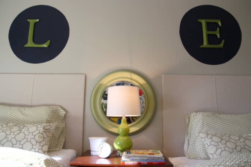
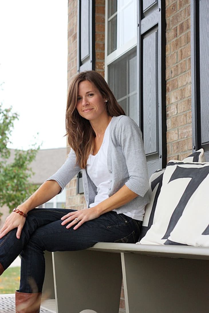
Name: Dana & Steve Miller along with sons Layne & Everett
Location: Cincinnati, Ohio
Size: 2500 sq ft – 4 bedroom, 2.5 bath home
Years lived in: 2.5 — owned
When Dana and her husband Steve bought their new construction home a few years ago, they were certain they could bring their own casual style to this boring builder's home. And have they ever succeeded! With a limited budget but style for miles, Dana and her handy husband have transformed their home into a modern casual masterpiece.
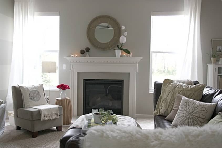
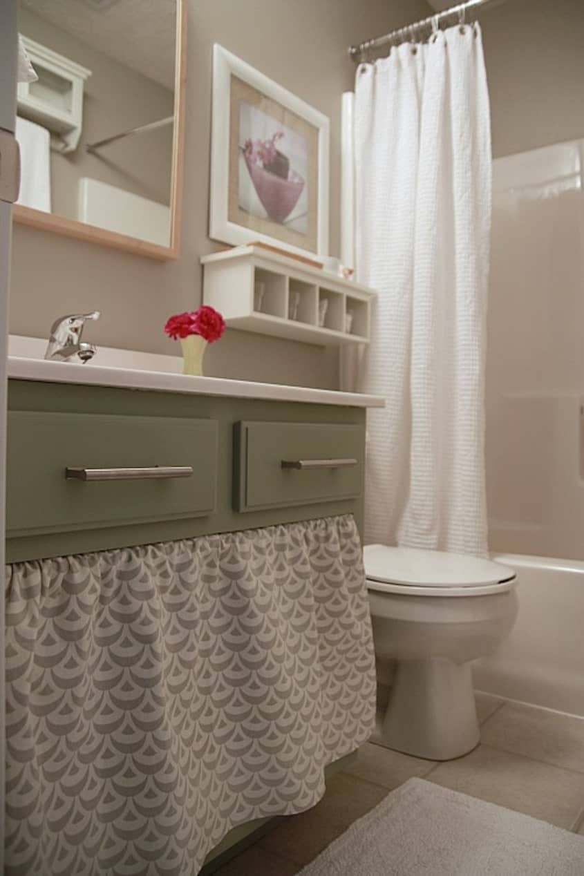
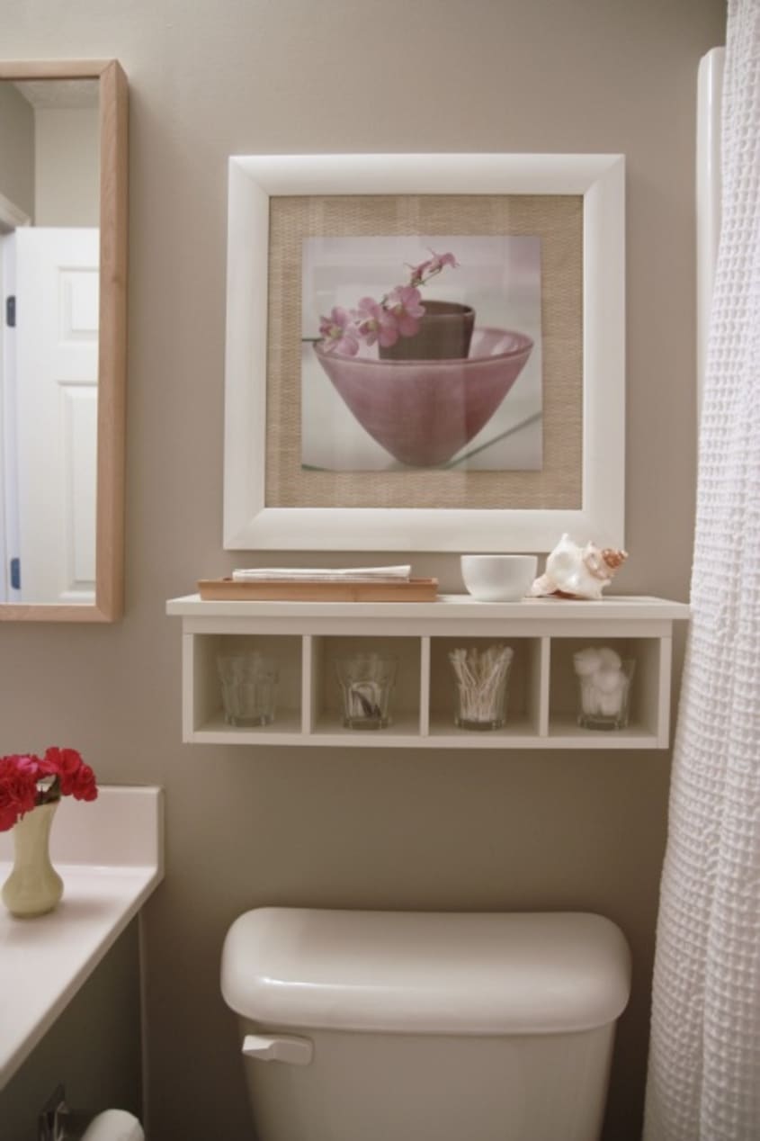
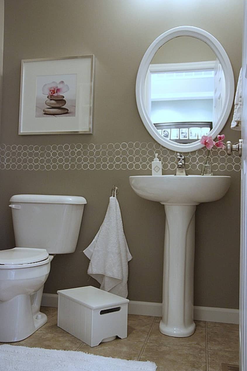
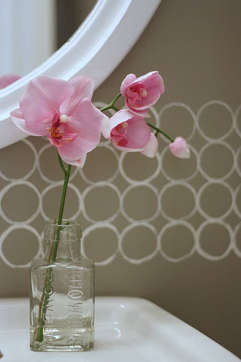
I've been reading Dana's blog for awhile now and I am absolutely smitten with her easy, casual style. In addition to her formidable sense of style, Dana also possesses mad DIY skills. Put the two together and you have the makings for a gorgeous yet simple home. I mean, just look at the border in her guest bathroom - created with a little paint and a toilet paper roll! The effect is gorgeous and it was completed on a limited budget.
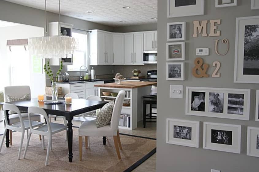
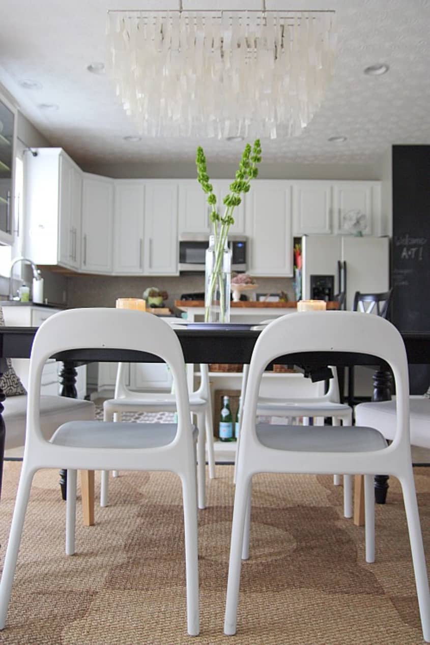
Dana subscribes to many of the same home design tenets as myself. For example, I agree with Dana's advice that just because it's new doesn't mean you can't paint it. I can't even imagine the cabinets in Dana's kitchen being anything but white and yet they were only painted that color after she and her husband moved in. The builder had installed "orangey" oak cabinets that would have seemed completely out of place among Dana's color palette. And even though those around her were shocked that she would want to paint something that was only just installed, Dana stuck to her guns - and with gorgeous results!
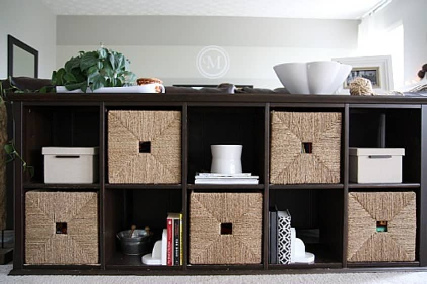
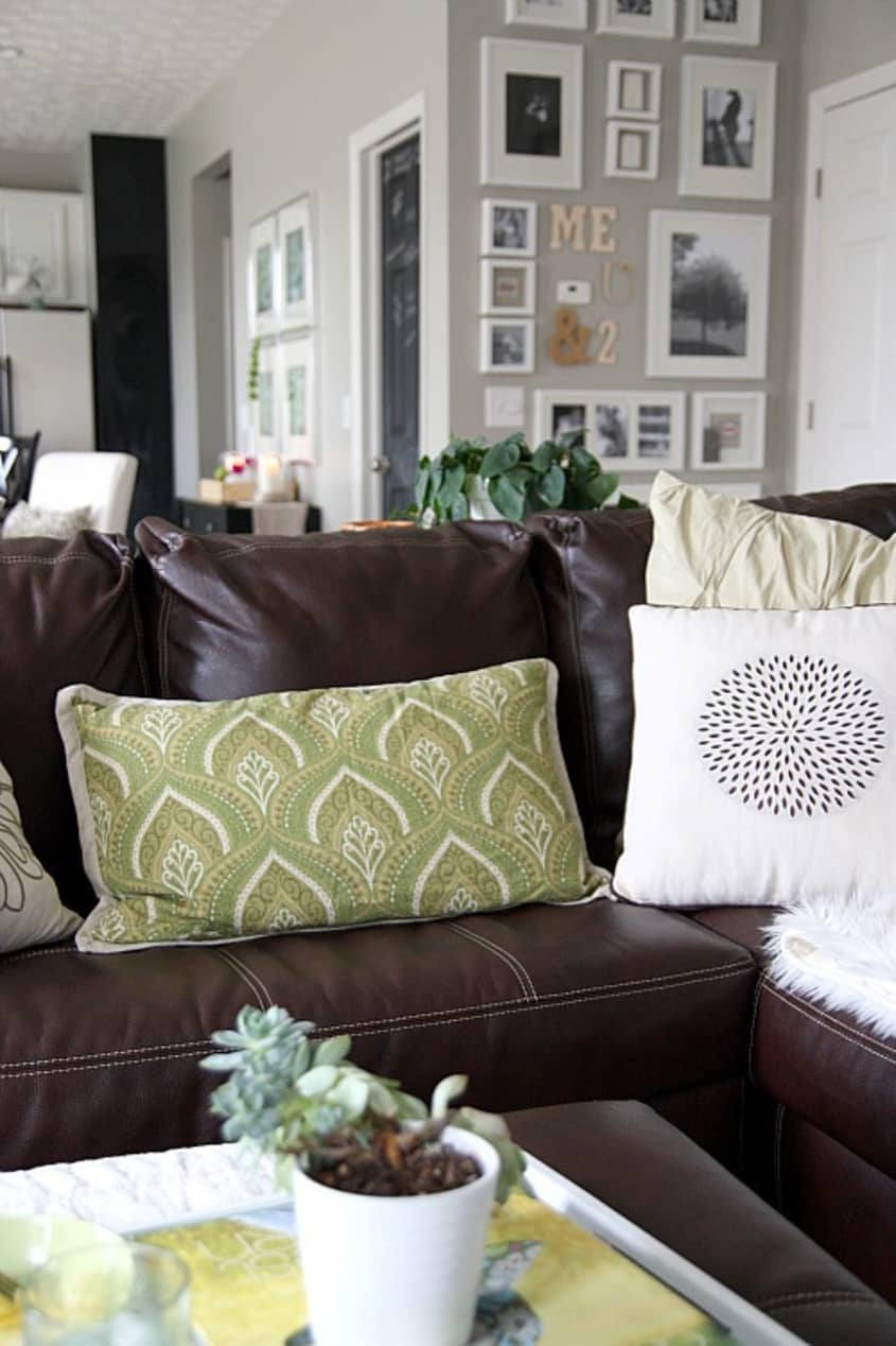
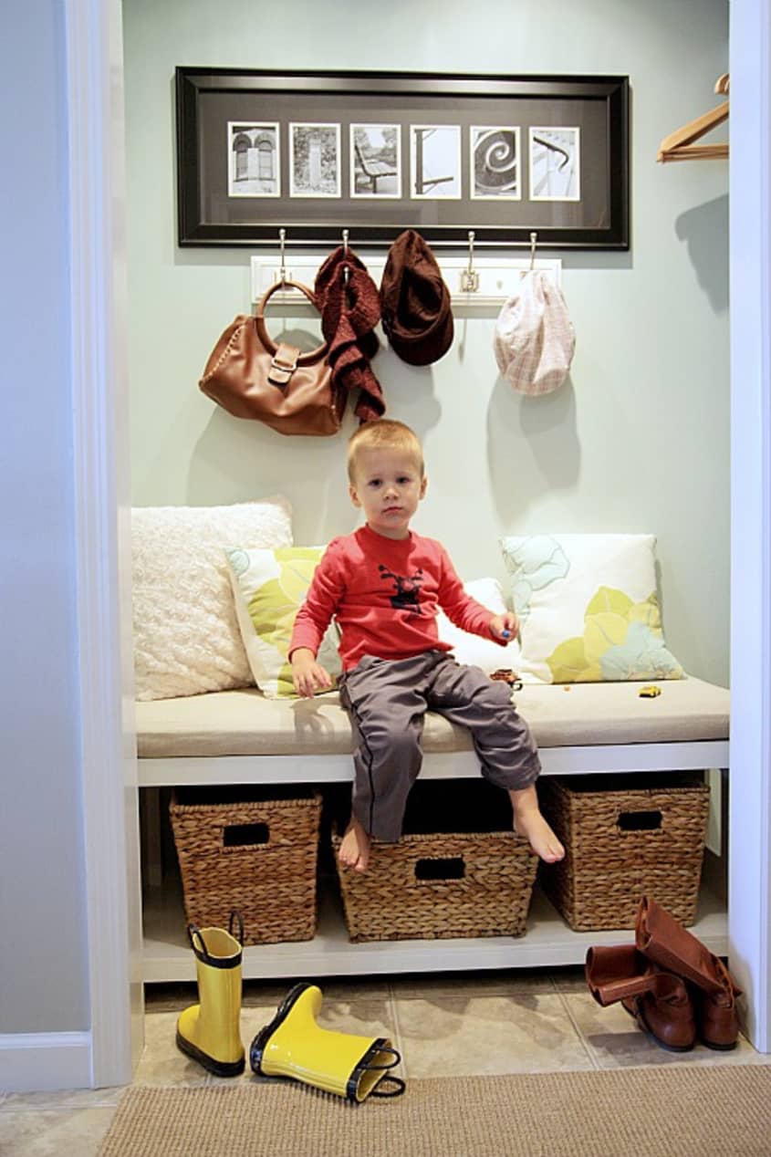
The other handy tip to take away from this house tour is that, even with two small children running around, Dana's house remains clean and uncluttered. Much of this can be owed to the many baskets Dana uses in her décor. And that's the trick - the easiest way to keep clutter at bay is that have places to stow necessary items.
Apartment Therapy Survey:
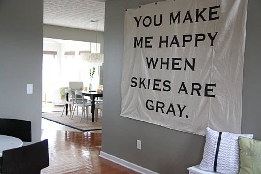
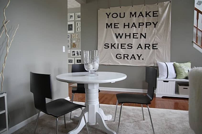
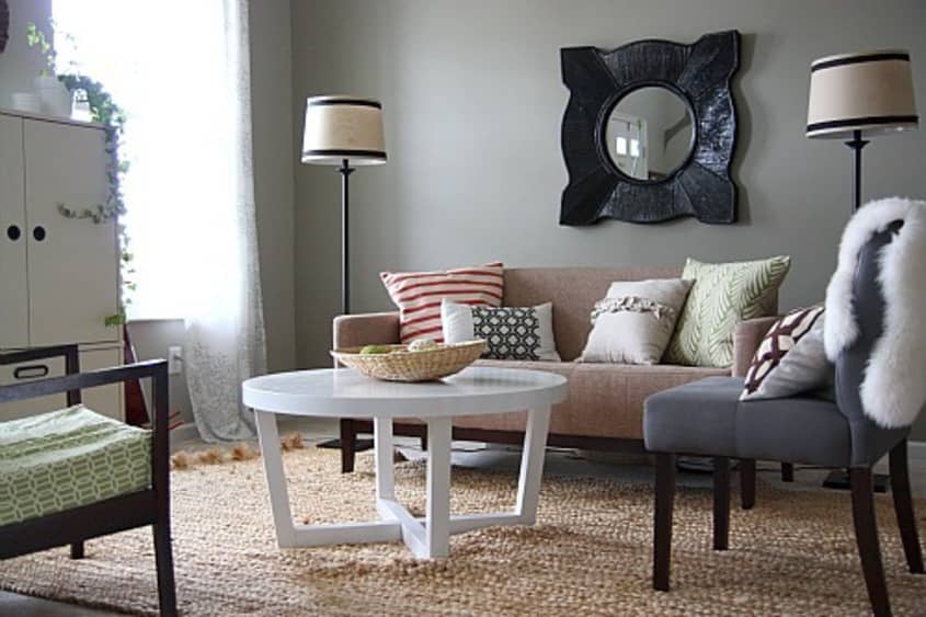
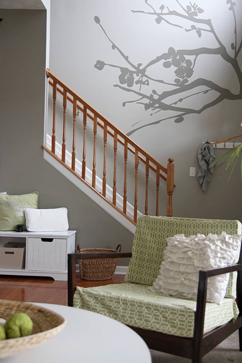
Our Style: Casual modern with a nod to nature
Inspiration: Nature, geometric prints, Canadian House & Home, linen, Young House Love, Yvonne Claveloux, Bonnee Sharp's Studio Bon Textiles, imperfect perfection, typography
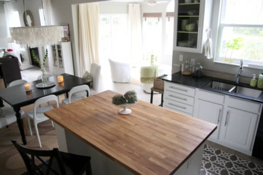
Favorite Element: The high ceilings and open floor plan
Biggest Challenge: De-builderizing EVERYTHING! We bought this house for the price, location and space but it was a spec home. We figured we could change all the boring finishes and make it more personal over time on a real budget.
What Friends Say: "Where are all the toys?" and "When can you start on our house?"
Biggest Embarrassment: The builder flooring and oak banister that we haven't quite found the funds or time for yet. They're on the to-do list. Also, it's probably evident that we live less than 15 minutes from our local IKEA.
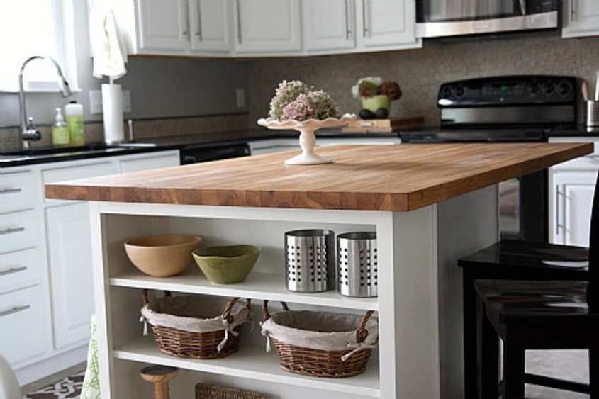
Proudest DIY: For less than $30, we designed, built and installed an open shelf kitchen island extension. We topped it off with an IKEA butcher block countertop and it makes a world of difference.
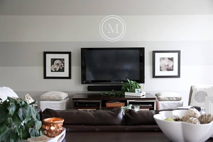
Biggest Indulgence: HIS: flatscreen plasma TV HERS: granite countertops
Best Advice: Don't be afraid to change something just because it's new and others tell you it's fine just the way it is. {Case in point: We caught a lot of grief when we told people we planned on painting the orangey oak kitchen cabinets white but we are 100% satisfied with the results.}
Dream Sources: Any furniture/home decor outlet. We buy a lot of scratch-and-dent pieces because with 2 young boys in the house, most things are bound to get scratched and dented anyway.
Resources of Note:
PAINT & COLORS
- • Valspar-Bonsai & Dry Riverbed {main living space, living room}
• Glidden-Gentle Tide {mini mudroom}
• Sherwin Williams-Greek Villa {kitchen cabinets}
FURNITURE
- • Target
• IKEA
• JCPenney
• Craigslist
Thanks, Dana!
Images: Dana Miller
To see more of Dana's DIY projects, visit her blog: House*Teaking
• HOUSE TOUR ARCHIVE Check out past house tours here
• Interested in sharing your home with Apartment Therapy? Contact the editors through our House Tour Submission Form.
• Are you a designer/architect/decorator interested in sharing a residential project with Apartment Therapy readers? Contact the editors through our Professional Submission Form.


Z2 iPod Dock and Wi...
How awesome to spot a fellow Cincinnatian's home on AT! Congratulations to the home owners, and I think I've just found another awesome decor blog through this home tour.
HOLYCOWHOLYCOWHOLYCOW! Great!!!! Good for you for sticking to your guns and painting those kitchen cabinets! Had a similar confrontation years ago getting painters to paint over boring wood doors and paneling - had three little kids at the time and having everything scrubbable white was wonderful (and I loved the way it looked). The rest of your house is great! Yes, I can see the IKEA (don't you know you'll hear that) but everything is done with such a personal and deft hand, that it comes out looking like YOU and not a catalogue shoot. Will be saving and borrowing and adapting ideas. I especially like your "You Make Me Happy When Skies Are Gray" (used to sing that to my little ones) sign/artwork and the overall happy, lived in, loved feel of your house!
The home is absolutely gorgeous!! Flawless, even. I love the textures.
All the gray and white makes me a little sad, but it is beautiful to look at.
I LOVE this house tour! I don't comment often, and I love many a house tour on AT, but I rarely like anything without vivid color. This is a HUGE exception! Dana, your place is fantastic!
This has been my favorite house tour ever!
Where did you acquire/how did you make your "You Make Me Happy..." sign? I love it.
Nice house; looks very comfortable and relaxed.
Love the white and green, especially when there's black or dark gray to give it structure. Excellent color choices everywhere.
I'm also thankful for Wipeout
@nycagnes - what you're missing is the fact that people cleaned the whole house before the photos were taken. With two kids, I bet on an average day, that house is covered in toys, strewn jackets, and mismatched socks.
I love the grey and white throughout - well done! Warm and inviting, yet sophisticated!
And the kitchen looks fantastic!
beautiful.... simply beautiful!!!
@RMF325 - I actually DIY'd the "You Make Me Happy..." sign. My blog readers voted on the phrase. I used a projector to display the quote onto a fabric wall hanging made from a canvas drop cloth.
@Pi - Thank you for realizing that my two rowdy boys supply all the personality one home needs. The house is just a backdrop.
This is the prettiest gray house I've ever seen! Do you mind sharing where you got your cute shower curtain?
@RMF325 - I guess I should mention that I hand painted each letter with a foam brush. Sorry, I got a little side tracked by a potty-training toddler.
@chelojeo - I think I bought the basketweave shower curtain at Target a few years back. The more I wash it, the more texture it gets. It's great.
I'd love to know where you got the bench in the "mudroom" and the bench underneath your "when skies are grey" art! Your house is lovely.
I'm stealing that sign... or-"using it as inspiration". Thanks!
It's a little too bland for me. I need more color. I like the gray, just not everywhere.
I've been following Dana's blog for a while now, and it's my favorite! We also live in a boring new-build in Ohio and are looking to do minor tweaking to make everything not look so standard. Right now, I'm stuck on how to work with a semi-open floor plan downstairs with a wide open wall I hate and a big ugly sliding glass door I hate more. I wish there were more new-build design blogs to give me inspiration!
I've been obsessing over Dana's blog for the last week and get excited every time there is a new post. I love her design style! Thank you for sharing your talent and creativity.
Love the lime green knight. I also really enjoy neutrals for a soothing space and the neutral palette is really well done. It's just a really homey space to me.
@withtwopugs - The mudroom bench is from homedecoratorsoutlet.com - it was originally black with a black leather seat cushion {which wasn't exactly what I was looking for} but the size and price was right. I painted it white and covered the top with linen. The bench under the "You Make Me Happy..." sign was a thrift find full of water marks and scratches. I sanded it down and painted it white as well.
What a stunner! I am inspired and love the cohesiveness of it all. The personal touches are really great, too! I love the vinyl tree on the stairway.
Love it! I'm doing my interior gray right now and I am loving how clean and soothing it is. Your house will be my new inspiration!
If I lived here I'd have "You Are My Sunshine" stuck in my head everyday. No thanks!
@tgdesigns - The stairwell tree is actually hand painted {and free!} using a projector.
@engineergirl - Aw, I've sung that song to our younger son every night since the day he was born. So, I have it stuck in my head all the time anyway. To me, it's more than just wall art.
yay, so excited to see this here! congrats, you've done a nice job of making your home look fresh and lovely, yet completely liveable and lively enough for a young family.
This is more traditional than I (thought) I liked but it's gorgeous and I may be moving in soon. Beautiful!
kudos to a great home in cincinnati! i enjoyed this house tour :)
In love.
A little too Crate&Barrel/Pottery Barn looking for my taste...
Some clever ideas and definitely an improvement over a regular spec house. But there's something about this overall aesthetic that's becoming very commonplace.
well, what a pretty house. i love the island and of course the hand painted details! you know, i think the rails look great as they are. they contrast and warm up your cool and neutral palette. lovely job.
I REALLY like this!! Well done! I will be adding your blog to my list.
Did you buy or DIY the light fixture over your table?
I love the "you make me happy when skies are grey" ... actually, I love everything about the place - especially the living room stripes :)
@lesova - I stalked that dining light fixture {from West Elm} for months until it went on sale a year or two ago. I placed an order right away and, even then, it was backordered for several months but totally worth the wait.
Thanks AT readers for all the feedback. This was a blast!
Holy IKEA, Batman... But, I love it! We just trucked it out to Ohio from Chicago; we have more than doubled our square footage, and now I have a wonderful inspiration for filling up all the empty rooms with furniture... Thank you!
I think it looks great, nice mix of modern and a unifying gray theme. I'm liking that sisal rug in the dining area too. For me what makes it look cookie cutter is some of the artwork, a little too matchy matchy, looks like it was purchased at CB2 or Ikea. I think a few framed pieces of the kids' art or maybe just a few more funky pieces would make it look a lot homier. But overall, I am impressed that a family with kids can keep things looking this good.
I love this house so much it's insane. Looooove.
Absolutely gorgeous! And so is the house. :)
it really boils down to good taste. buying expensive items does not really guarantee the house looking marvelous..... you have impeccable taste!!!!!! i love your place. Hurray to IKEA!!!!!
the whites and greys are so soft and classic, while the personal touches (the chalkboard door, framed photos) give it a cozy, relaxed, lived-in (but still impeccably put together) feel. LOVE THIS!
http://www.thelateafternoon.com/
You make grey/gray LOL Look amazing!!!
Extremely tasteful!!!!!!!!!!!! Lovely!!!!!!!!!
I found Dana's blog a few weeks ago and I love it! Great to see her home featured on AT!
your home is ridiculously beautiful. AMAZING!!!
I am so drooling over this home. I love every everything about it! ♥
Bravo, Dana, for the energy and inspiration you have put into creating this home for your family. (I second Charlene Oden on the warmth and rightness of your stair rail.)
Great job with this home! So much personality...very inviting!
Wow, that is the absolute perfect shade of grey. All of em!
And YOU are gorgeous! (Adding the blog immediately) :)
I really love this place. Not everyone gets to live in a 100 year old brownstone or a bauhaus single family-- some of us regular folks buy contractor houses. They can be modern, tasteful, and stylish too. And THIS is the perfect example. It's nice to see that there's a home decor heaven after kids! I'm always a little worried about that, but this house is a great marriage of style, function, and reality. Kudos!
Fresh and utterly charming. As a fellow owner of a cookie-cutter home, yours in inspiring.
Beautiful!
not only the house is beautiful :-) *blush
It's put together beautifully, but much of the framed artwork seems very generic to me. Not much personality there.
I think it's wonderful. Well done. I really love the graphic, you make me happy when skies are grey canvas. I sing that to my daughters too. We have a similar picture that states, everything will be allright.
Good job. :)
@smellykelly - You're comment means so much to me! While I'd looooove to live in an older home with more innate character, we bought this home for schools, location and price...and low maintenance. Our first home was a 1950's cape cod with verrrry limited space and all kinds of problems {anywhere water could get in, it did}. After 7 years of major projects {think tearing down & rebuilding a leaning garage, installing a dewatering system, adding a bathroom to the basement...}, we were really ready for an 'easier' home, if that makes sense. Our budget didn't allow for an older & UPDATED home, so we chose this one. Who knows? Maybe when our kids are a little older and more independent, we'll have the time to devote to an older home and its needs.
This is probably my favorite house tour ever. So beautiful and so practical - I really, really love it. Great job, Dana!
@smellykelly and like thinkers. It takes a whole lot more talent to make something out of a house with less pizazz to start with -- and housetweaking done that in the most marvellous way! In the world of post-divorce downward mobility, I've worked with popcorn ceilings, ugly-can't replace-em vertical blinds, nasty carpets -- model apartments look "THIS WAY" and your apartment hasn't been renovated yet and looks "THAT WAY" -- but, is in the right school district, location and price - and more crazy real estate tales of woe than you can imagine. This post is where it's at for most people: you take what you have and make it rock! If IKEA, Target, Craigslist, swapmeets, garage sales, thrift stores and bargain outlets are your sources, make what you get work for you. The fact is, when your kids get older, they'll need cars, college tuition and more -- and you'll want to save money so you don't have to work until you collapse (so start saving). End of sermon.
Haha, citipearl, it sounds like you are describing my apartment-- popcorn ceiling and vertical blinds! The formerly white box boring contractor apartment I live in is several things: (1) a great price; (2) it works, ie it is built for function; (3) it was boring but with some hard thinking and working, it is pretty great now.
I'm proud of us!
LOVE, LOVE, LOVE. Your home is so inspiring, warm and cozy. Your colors are fantastic. It truly looks like your escape from the rest of world. I LOVE IT! A breath of fresh air.
I also live in a contractor build. You want to talk creativity? TRY adding great character to a 5-year old cookie-cutter McMansion. Adding character to a character home is just too easy.
It feels a little too catalogue-y to me, also. Bathrooms excepted -- those are very cute and original.
Sigh...Oh the kitchen..the kitchen ...THE KITCHEN!!!!
beautifully done!
I love the blue striped curtain you have in one of the bedrooms... would you mind sharing where you got it from? I envy your home, it looks finished and beautiful throughout.
@liony Azali - The striped curtains are actually 2 canvas drop cloths {from Lowe's} that I sewed curtain rod pockets into and painted myself. I knew I wanted horizontal striped curtains in that bedroom but couldn't find any that I liked... in my price range. So, I did what I normally do in those situations and came up with a way to DIY it. The final price of the 2 panels was $30. I blogged about it here if you care to see more...
http://www.housetweaking.com/2010/06/26/the-ugly-duckling-part-2/
This house may not be my style but it's beautifully done. I'm in the process of buying a house and am thinking of doing a gray bedroom - this gives me some great inspiration!
@ jennyp: What a completely weird thing to say...how could you possibly know that the art on the walls doesn't show her personality?
Absolutely gorgeous!
Love. That sums it up. What paint did you use in the bathroom? And, maybe you wrote this but what are the white circles made out of? Is that paint or some kind of textures/objects?
Great job! I really enjoyed the house and got some inspiration here!
Whoops, I just read your blog and see how you did the border with a tp roll end! Very cool.
What is the paint color/brand/name of the shade that you use for the entire bathroom (not the border) ?
Thanks!
Wow, wow, wow. This is a really nice house. Even though it is perfect (and perfectly done), it still seems warm and inviting and even like people really live here. Dana has a great sense of style for the home and all of her decorating flourishes work wonderfully. Love it ... Love it.
@jennyp & @misscorrine - Ever since I did a report on Georgia O'Keefe in middle school, I've been in love with orchids. That's why a lot of the art prints {albeit mass-produced bc that's what I can afford} are of orchids.
@qtcrondesign - The powder room wall color is Valspar {Lowe's} Magic Spell #345-3 in eggshell.
I think the art is wonderful, and obviously meaningful to you - who cares if it's mass produced or not! Not many people can afford original works of art.
I follow her blog, too. It's nice to be able to see her whole house at once. Nice job, Dana!
Thank you Dana, I'll be following your blog!
Oh wow...I happen to be in the middle of painting our own "orangey" kitchen cabinets white also. And while most everyone is politely not yelling "OMG!"...I am getting a lot of silent "looks", and maybe a meaningful "oh, but didn't you just have then installed a couple of years ago?" Yes, I installed solid maple, cabinets in a "honey" stain with the brown line accentuating the trim. However, the orange/"honey" color began to look out of place, and kind of tacky, so I decided to paint them a nice eggshell white. it is soooo much work, and I hope it doesn't chip off, but I know I will love it better than the color before.
I am also very inspired looking at your home. I love your paint colors, the conversation seating area, the small boy in the entrance area, I love the sentiment on the giant wall hanging on the gray walls...oh and now that I had a closer look at your painted kitchen, I am amazed to see that they are the exact same kitchen cabinets that I have, and which I am presently also painting white. So now I can see how good they will look!!
it's beautiful, the placement of everything is gorgeous, it's calming and cohesive, very well-curated, and just plain pretty.
that said, there's something too restrained or controlled about this space for my tastes. when i realized "wipeout" was my favourite element, i looked again and realized it made me feel cold, and as awful as it sounds, the only personalized elements came off looking precious and insincere, even though i'm sure they aren't.
This home is amazing. So calming and casual.
..sure others have said it twenty times over but i still wanna say - LOVE LOVE LOVE the "skies are grey" canvas - WOW. REALLY. power.
Dana, are you into photography? Art prints are definitely affordable but I think if you played around with taking pictures of orchids yourself you could probably create something that would blow those art prints away! The rest of your home shows a real vibrant creativity so go with it! :)
..i may sound like a scary-stalker (But im not!!) i LOVE the pict wiv the little boy.. just looks like a very nice pict =p=) Ladykiller you have one, there, he'll grow up to be.. =p=)
@jennyp - I just recently got into photography {meaning I got a new DSLR and have taken a short & sweet class on photo styling} so I think your idea of creating my own artwork is great! Now if I could just find the time....
It's Gorgeous!
Love Love the dining room lamp & the Green knight.
Yep, my taste. Looks like my house in so many ways. Fabulous:)
I love the curtain hung with the saying on it. I am also from Cincinnati. What suburb are you in? BTW Congrats lovely home!
Sacha - That green knight has been passed down through my hubby's family as a sort of joke...it was my father-in-law's then my hubby's and now my son's. Originally, it was black and silver. I spray painted it green and now it's not so much of a joke! We tell our boys that he guards their room at night.
The photos of this house feel inviting. Great job.
i love it....i just painted my interior grey as well and i am so thrilled with it. you have wonderful taste.
I love your warm, calm, & modern take on casual! Have you ever considered painting the stairwell banister as you did your kitchen cabinets? We werent able to "spend" on new banister (builder grade oak) so I painted it black! I get compliments often & share a similar color palette thru my house as yours. Beautiful HOME!
I love the home, but I don't like the trend AT is embracing. "Resources of Note"? Can we have near-complete lists instead?
I love this house. Thanks for sharing. Will subscribe to Dana's blog immediately!
I'm an avid AT lurker and I don't post much, but I just had to with this one. What an absolute gorgeous home you have! This definitely ranks in my favorite top-five AT tours of all time!
Chic.
One of the best homes featured on AT. It's truly inspiring to see how a run-of-the-mill suburban house can be transformed into a stunning and stylish home, on a budget!
Fantasic! It's cool, yet cozy! You can tell you really thought long and hard about every space and made it all apear as one complete thought. Excellent work! Your very taleneted.
LOVELOVELOVE. I usually love more (subtle) splashes of color, but the neutral palette is still so warm, inviting and cozy! So chic! Well done, well done.
Your home is incredible. I love the subtle paint colors and the modern touches without being "cold".
Thanks for sharing!
I love everything about this home! Love the blackboard door and color scheme!
@ Caron - Yes! Painting the banister is on our to-do list!
Not my style, but ... absolutely gorgeous! So personal, chic and natural. And DIY... Dana, I´m going to your blog inmediately.
It always amazes me how many people seems not being able to go beyond their own aesthetical boundaries. Come on, open your minds and appreciate other points of view, you can recognize good work even when it´s not on your side of the street.
Really pretty and yet still liveable. I tend to go with warmer colors but the grey here is really sharp looking. And can I please look as good as you after 2 kids! =>
Apparently my style is casual modern with a nod to nature too! I have many of the same furniture and color schemes. :) Love it of course! Very calming and crisp and clean.
Is it too late to post an apology to smellykelly? I totally got her positive comment turned around and took it as negative! What was I thinking? I am SO sorry!
I am totally stealing the idea for a "You Are My Sunshine" banner.
painting the oak bannisters white would be an easy temporary fix. it wouldn't stick out so much that way.
by the way, did you stencil the bathroom with the circles and how did you do it? love it!
When I first saw the "You Make Me Happy When Skies Are Gray" wall hanging...I thought...OMG, I must do this! I used to sing that song to both my kids as small babies/small children! Thanks for bringing back that memory:)