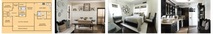
apartment therapy changing the world, one room at a time


Layla & Kevin's Country Coastal Cottage
House Tour

living-room---3.gif

Name: Layla and Kevin Palmer
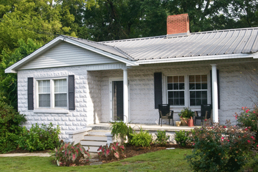
Location: Prattville, Alabama
Size: 1,910 square feet
Years lived in: 2 years

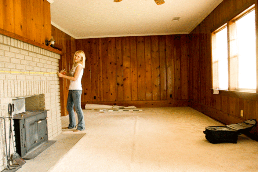
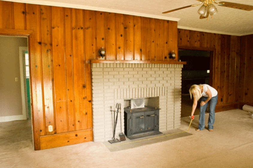
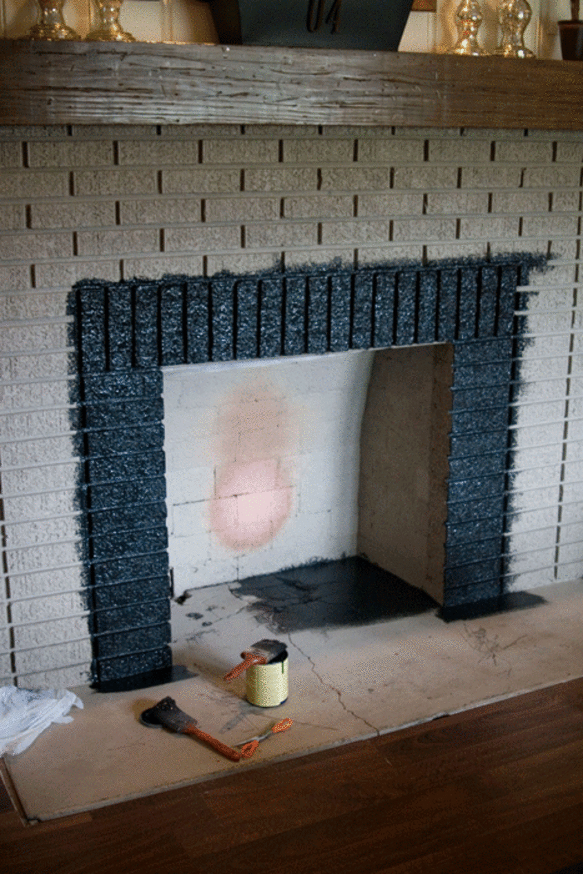
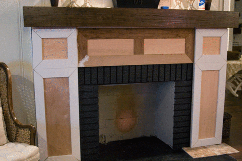
Documenting their journey of home renovation, Layla and Kevin Palmer have set out on a mission to create a beautiful, functional, comfortable and inspiring home. Located in Prattville, Alabama this home perfectly blends antique/flea market finds with a subtle nautical style all under a neutral color palette.

TLC.gif


kitchen---4.gif

Apartment Therapy Survey:

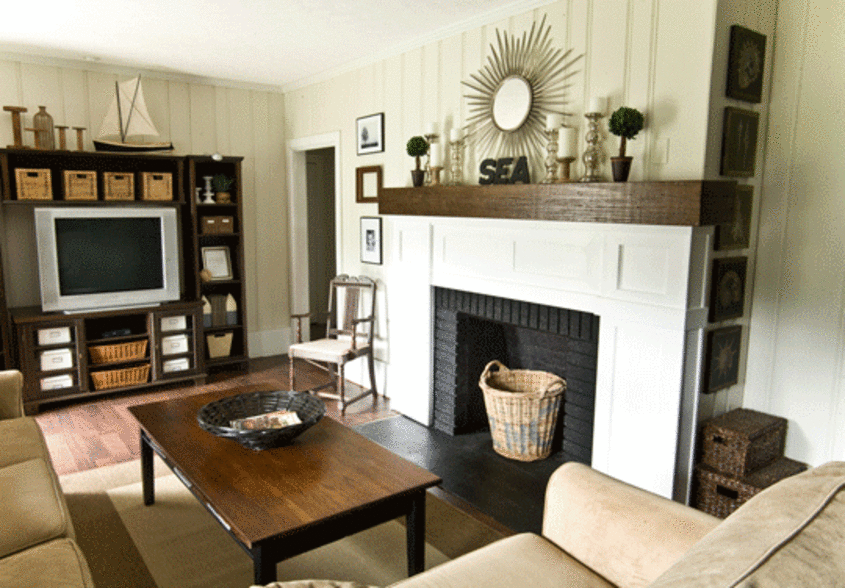
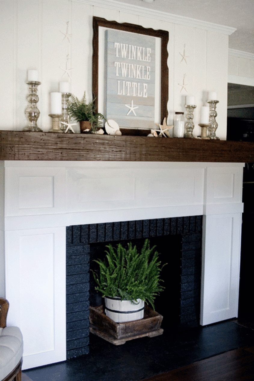
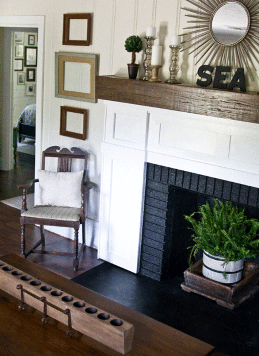
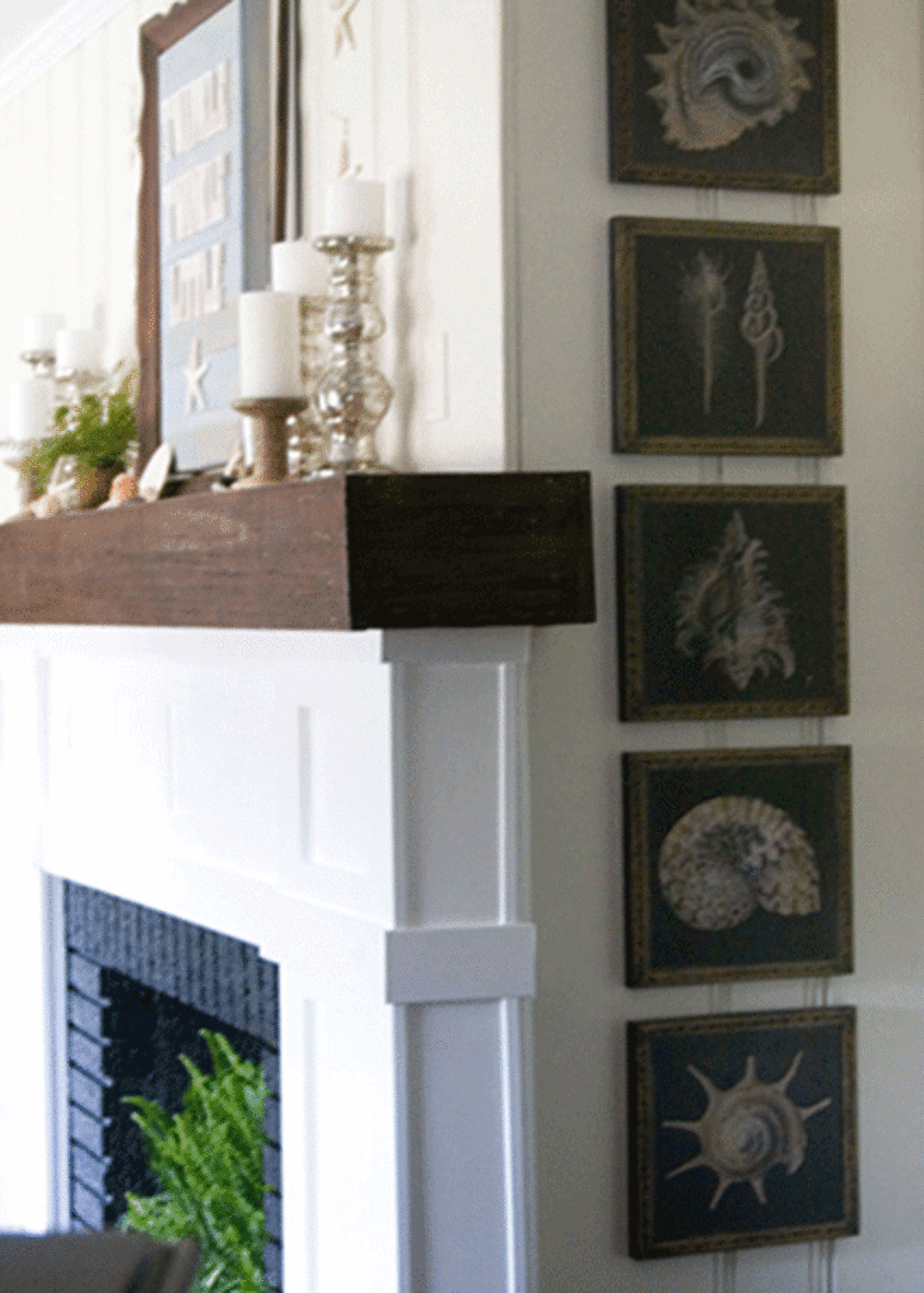
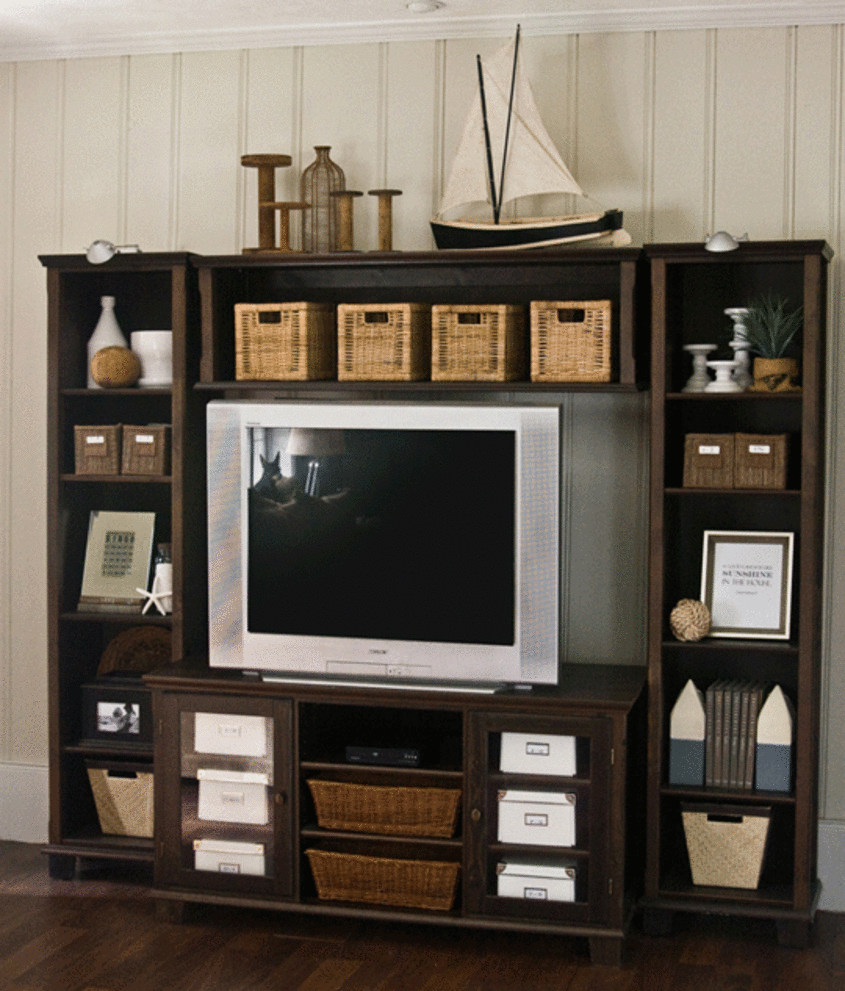
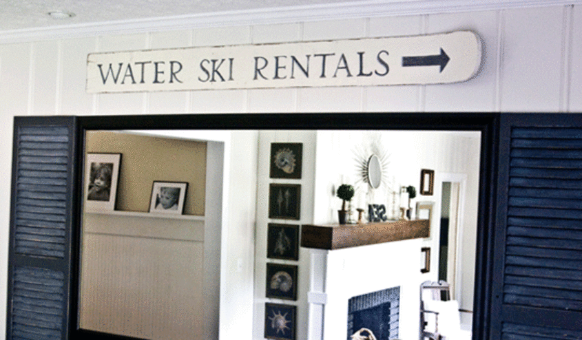
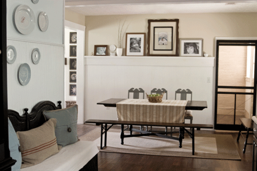
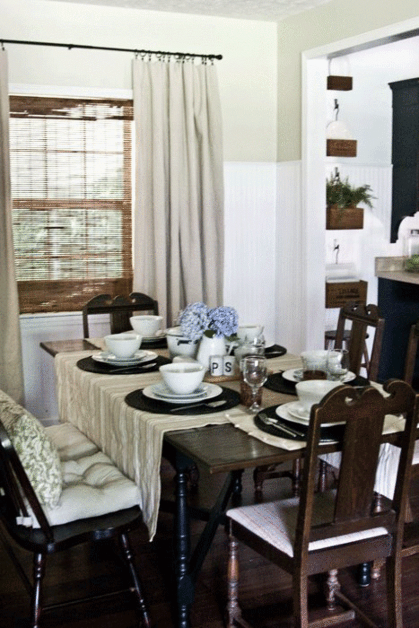
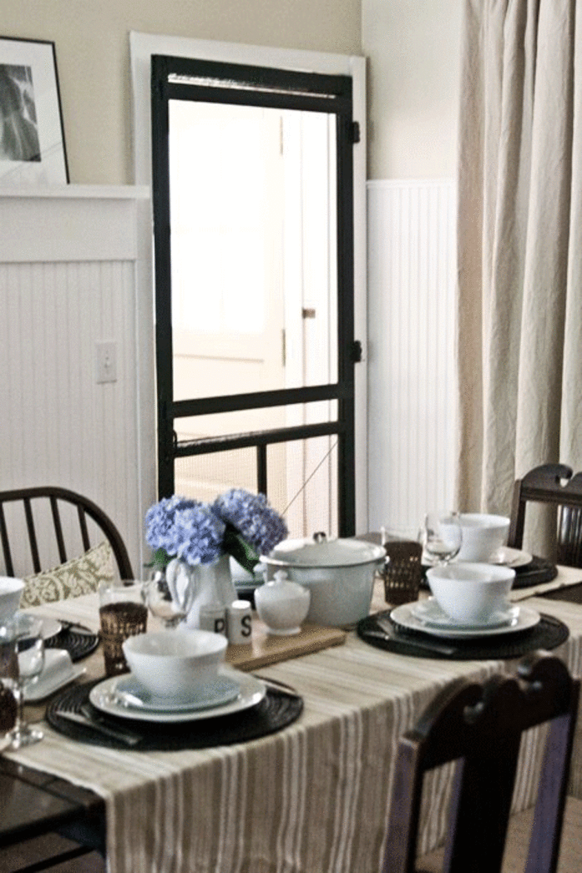
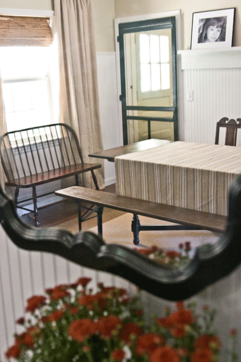
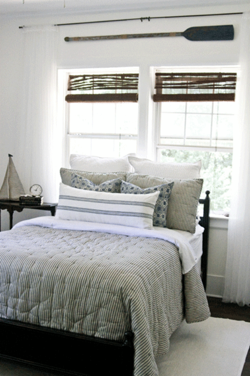
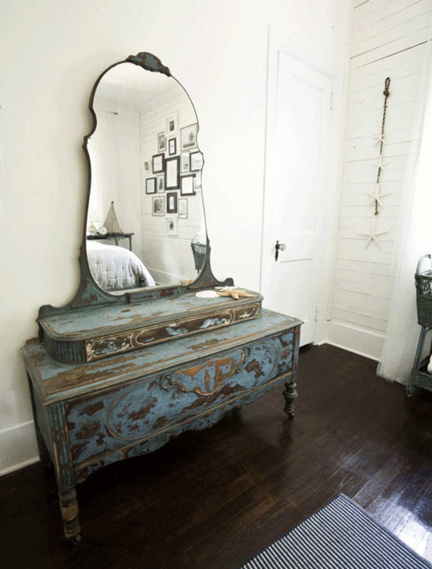
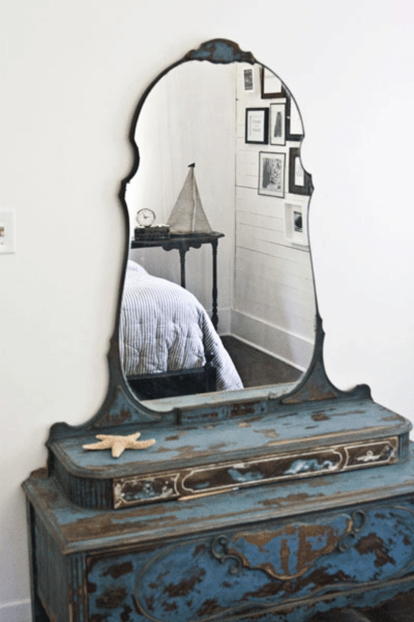
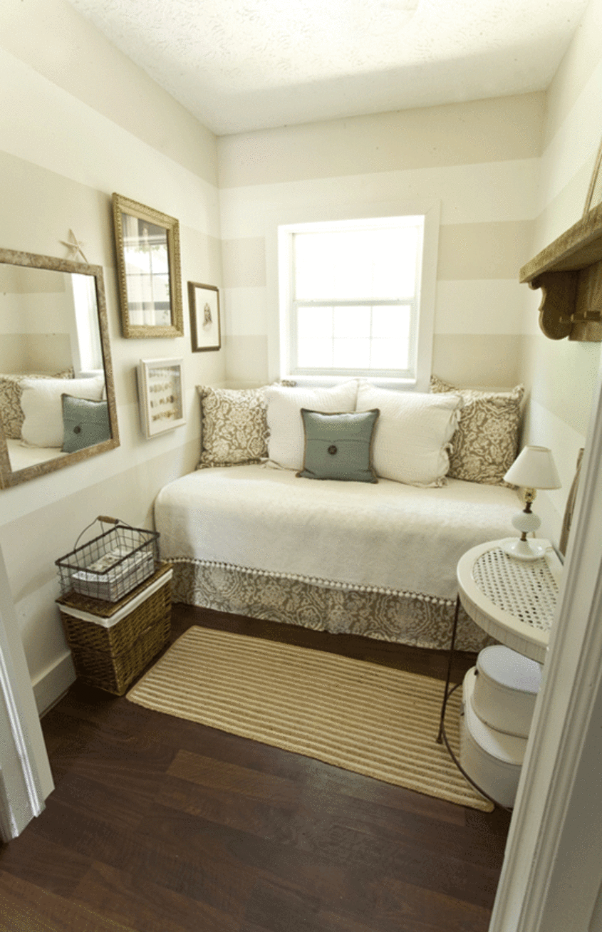
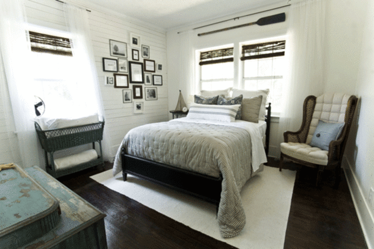
Our style: Classic Cottage, with Country and Coastal touches throughout.

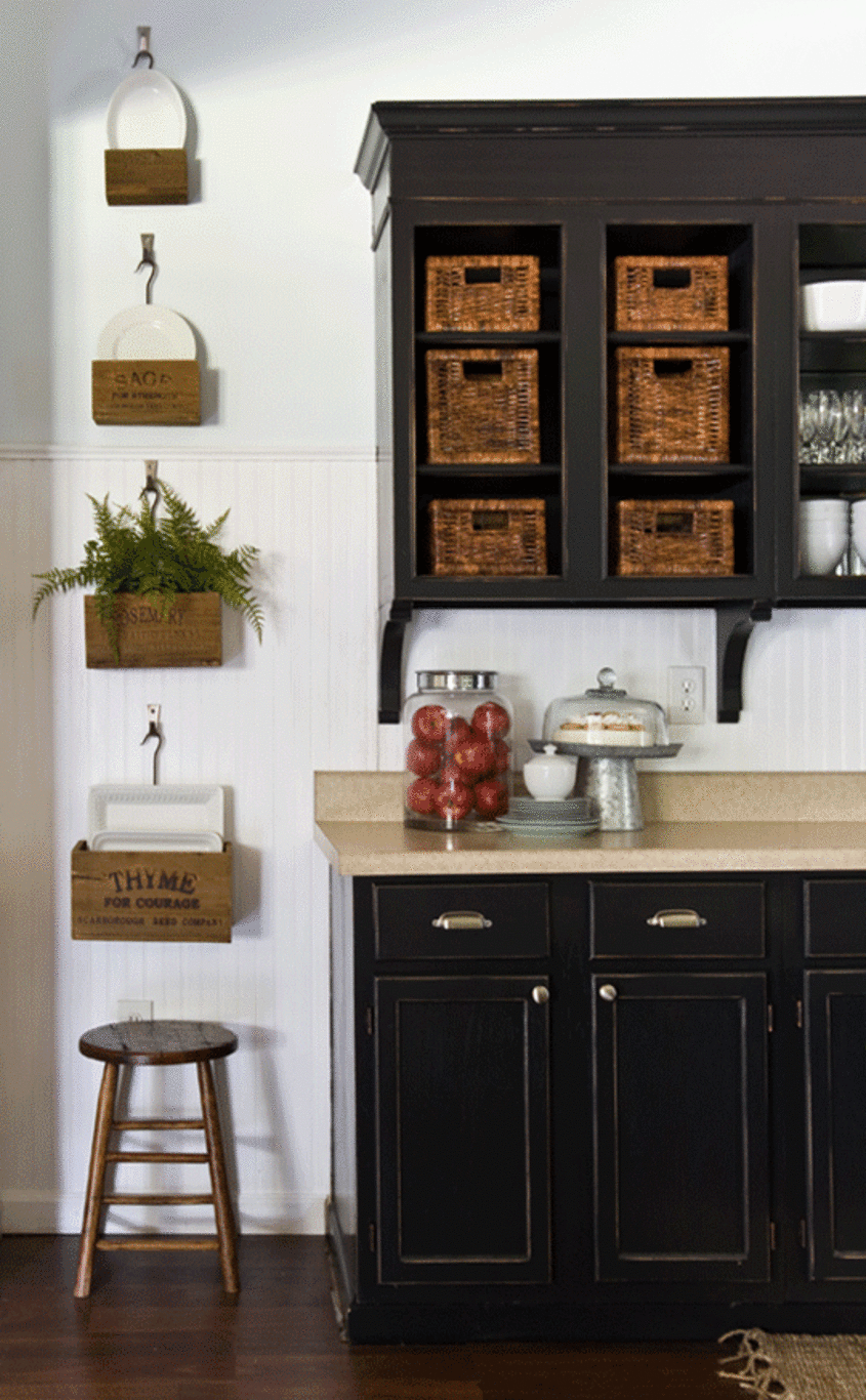
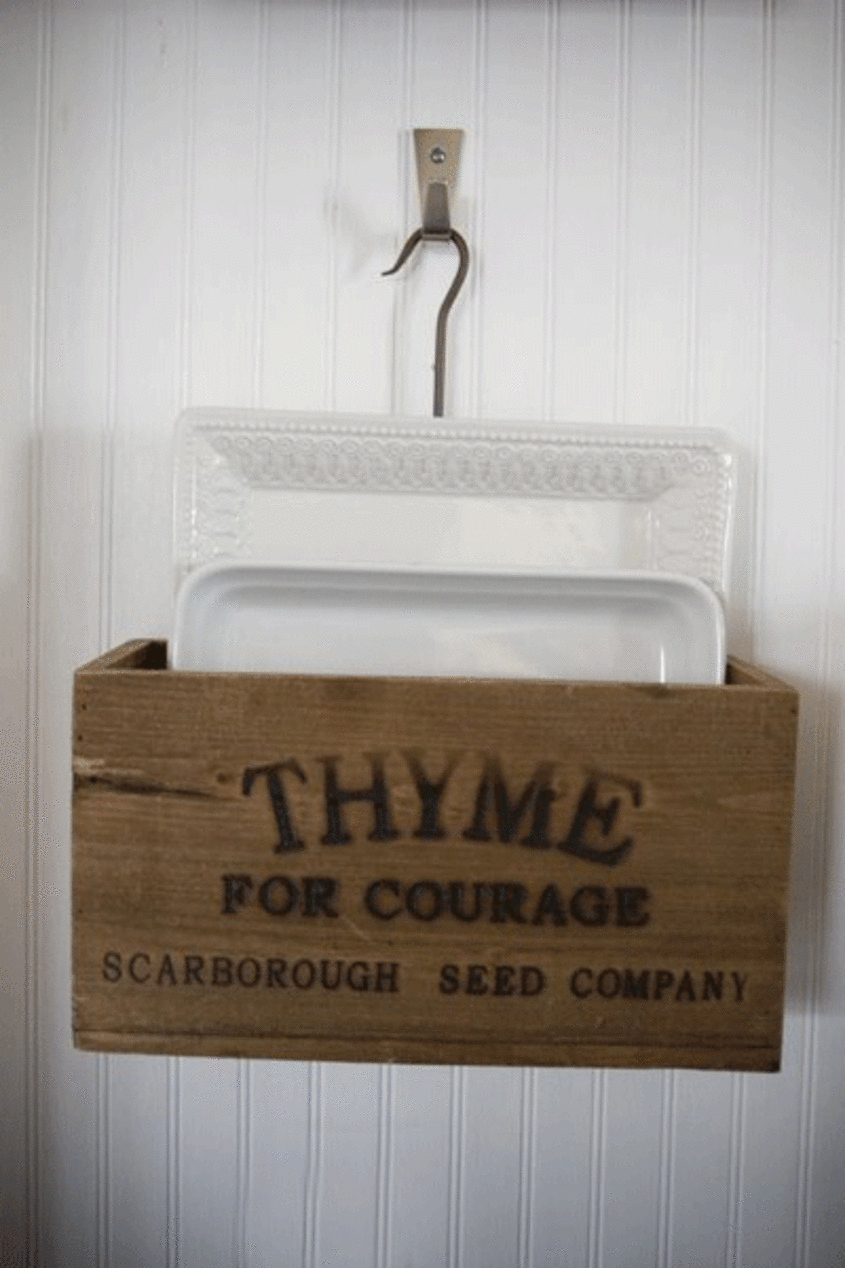
Inspiration: Father Time and Mother Nature. Antique furniture and accessories, and vintage linens in various shades of green, blue, white, black and brown make our pulses quicken every time!

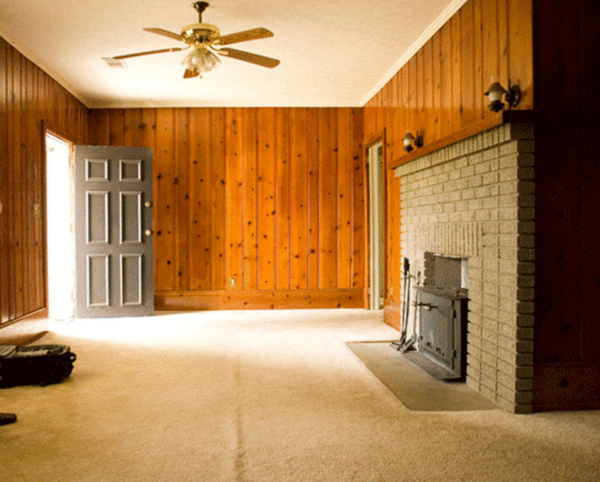
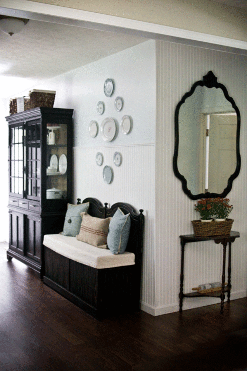
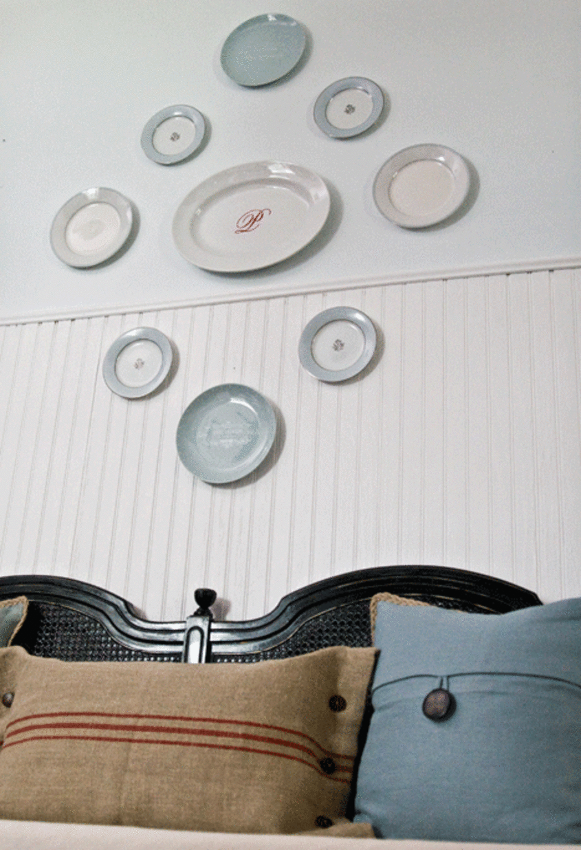
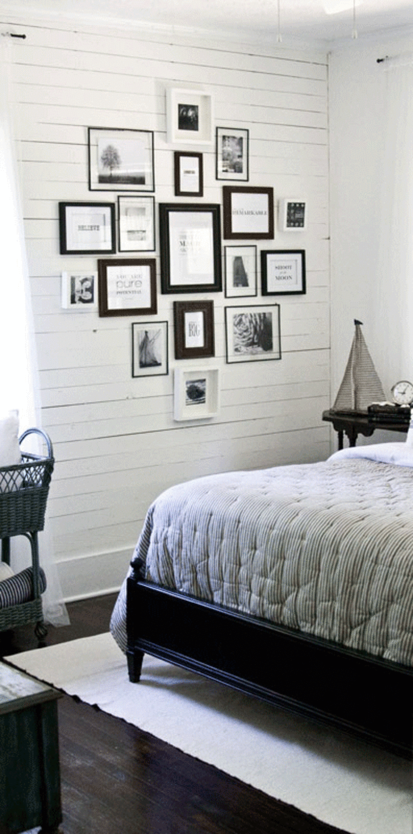
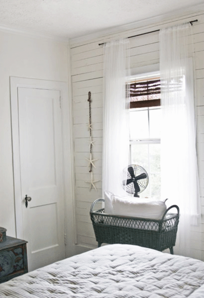
Favorite Element: The planks of wood that cover the walls in the older part of our home.

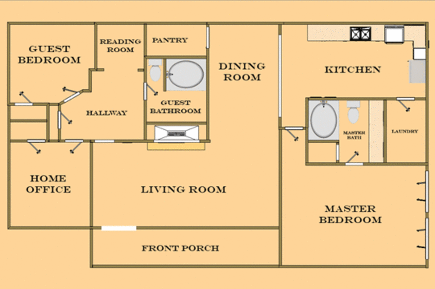
Biggest Challenge: Trying to get all the floors to match and be the same height!
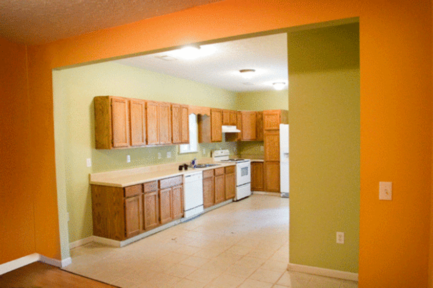
What Friends Say: They couldn't believe we bought the place. When we first walked in, it reeked of the previous owners dog and every room was painted a different shade of neon. Now, instead of running from it with their noses plugged, they actually use the word "pretty" to describe it!

Biggest Embarrassment: We unknowingly removed a load bearing wall and had to call on a professional to help us put it back together. Oops. <:-)
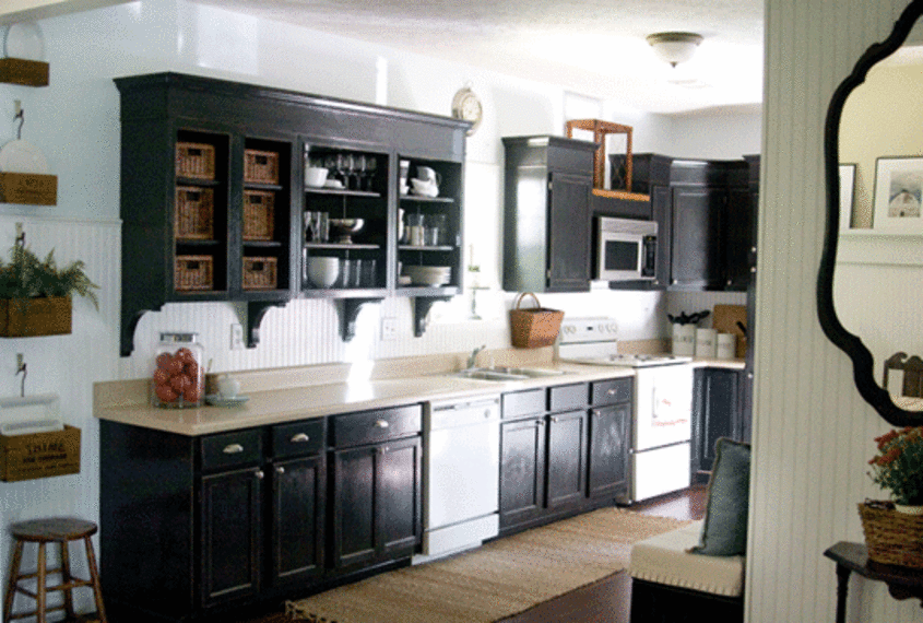
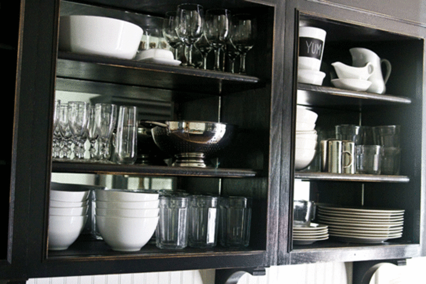
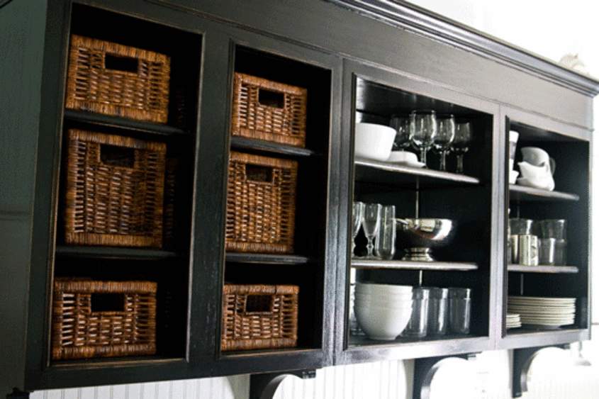
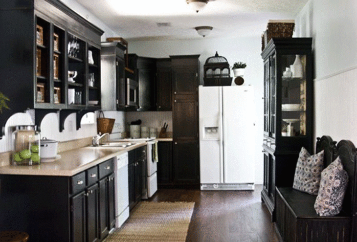
Proudest DIY: We're most proud of the facelift we gave our basic builder-grade wood cabinets in our Kitchen. Total cost: $200. Their new look: Priceless.

Biggest Indulgence: We are definitely not afraid to drop a little extra money on our antique furniture pieces. Even though they do usually cost less than those you'd find in a retail furniture store, because we live on a budget, it's a pretty big deal everytime we bring home another piece.

Best advice: Shop at thrift stores, estate sales, antique stores, eBay and flea markets! You can often find the exact same pieces you're looking for at retail stores in these places for much, much less.

kitchen---6.gif


Resources of Note:

Furniture: Flea Markets, Estate Sales, Antique Stores
Kitchen Hardware: eBay
Accessories: Flea Markets, TJ Maxx, HomeGoods, Antique Stores
Lighting: eBay, Flea Markets, Antique Stores
Paint: Sherwin Williams and Behr
Rugs and Carpets: Ikea
Window Treatments: Lowes, Bed, Bath & Beyond, Ikea and some are made by me

For more details on the resources used visit: http://www.theletteredcottage.net/


guest-room---6.gif

Thanks, Layla!

(Images: Layla Palmer)

• HOUSE TOUR ARCHIVE Check out past house tours here
• Interested in sharing your home with Apartment Therapy? Contact the editors through our House Tour Submission Form.

Tags

House Tours, antiques, neutral, flea market, cottage, nautical, Alabama

Related Links

Share

Comments (92)

Very impressive renovation! I kept waiting for some color, though. That a whole lotta black, brown and beige.

posted by oakland on September 11th 2009 at 11:10am
view oakland's profile

Country cottage isn't my natural style but I'd live here in a heartbeat. Gorgeous! Really well done, thanks for sharing.

posted by bali2 on September 11th 2009 at 11:25am
view bali2's profile

Wow - nothing short of miraculous. Might be a little too themed for some, but I think you went right up to the edge without going over. Your kitchen update looks amazing. I like the lack of color - it's something you could always change with just a few key pieces if you wanted.

posted by asinner on September 11th 2009 at 11:30am
view asinner's profile

I'm so excited to see a house tour from Alabama! I lived in Birmingham my entire life until a year ago and moved to South Florida.

I incorporated a lot of the country cottage look in my home in Birmingham in keeping with the integrity of the home.

I absolutely adore the dresser in the guest room. It's gorgeous!

posted by puttinbuttin on September 11th 2009 at 11:38am
view puttinbuttin's profile

I agree with oakland about possibly adding a pop of color here and there (perhaps a yellow or bold and bright blue)...BUT, that said... gorgeous remodel! Classic nautical and neutral decor. Love what you did to the fireplace... just love it! And where did you get the ticking bedspread/comforter?

posted by KimberM on September 11th 2009 at 11:39am
view KimberM's profile

I'm impressed. I'm originally from New England. I can see this on Cape Cod. It truly looks professionally done, and still homey and warm. I love the colors you've used, so calm. Great use of black for contrast. What you've done to those kitchen cabinets! I honestly thought they were custom before I read the article. Kudos, enjoy!

posted by stt64 on September 11th 2009 at 11:40am
view stt64's profile

I think it looks great but it looks like a catalogue shoot to me - as in no soul, no life just a staged home.

posted by alexis on September 11th 2009 at 11:55am
view alexis's profile

I genuinely can't believe those are the same cabinets! For only $200? That's amazing. Way to go--you guys should be really proud.

posted by BlackFrancine on September 11th 2009 at 11:57am
view BlackFrancine's profile

Fabulous remodel! Excellent job on a wonderful, cozy cottage. Congratulations!

posted by junklover on September 11th 2009 at 12:05pm
view junklover's profile

hey in one picture the apples are green. in the next they are red.

posted by kahlil19107 on September 11th 2009 at 12:05pm
view kahlil19107's profile

I'm so impressed - particularly with the fireplace and the distressed finish on the kitchen cabinets!

Would love to read more about how you went about accomplishing these.

posted by bepsf on September 11th 2009 at 12:09pm
view bepsf's profile

I'm also very happy to see the 'Bama representation as I just moved into the area! I'd love to know what are some of your favorite local flea markets and thrift stores!

posted by mrb2001 on September 11th 2009 at 12:24pm
view mrb2001's profile

I'm 100% with bepsf. Please please please! Enlighten us with your techniques for your updates, especially those kitchen cabinets. Beautiful place!

posted by Limeliteshines on September 11th 2009 at 12:32pm
view Limeliteshines's profile

good job on the remodel! i do find it way too nautical-themed and seriously lacking colour, but these are issues easily changed if needed. overall, the house looks great, especially the kitchen.

posted by the polish chick on September 11th 2009 at 12:36pm
view the polish chick's profile

Wow what a make over! I love the kitchen, its gorgeous!!

Those dark cabinets way to go. My friend is re doing her kitchen and I am sending this to her.

The antiques are really charming, I especially love the vanity in the guest bedroom, did it come that way in distressed blue or did you refinish it? Lovely.

The floors are amazing too!

The only thing that bugs me is the TV unit, it does look like a contrived pictured from a catalog. But hey as long as you love it.

This is a great house tour, thanks for sharing you must be proud.

posted by LoriSF on September 11th 2009 at 12:38pm
view LoriSF's profile

Most of the pictures around the house, especially on the ledge, are of family members. That said, I don't see how it resembles a catalogue shoot, other than it is has been cleaned. If she showed her home messy with the toilet seat up, we'd complain about that, too.

I think this is absolutely superb. Not my style, but superb nonetheless. Layla--are you still thinking of using glass tiles around the fireplace surround?

But the kitchen. Oh my. Yes, the kitchen is a masterpiece. Other suggestions for the upper cabinets would be to replace the doors with glass inserts, rather than removing the doors altogether.

Fantastic job. Just breathtaking. And I love the herb boxes!

posted by enmnm on September 11th 2009 at 12:49pm
view enmnm's profile

another bama girl over here! and puttinbuttin i lived in south florida all my life and now i live in birmingham lol

posted by lnp838 on September 11th 2009 at 12:52pm
view lnp838's profile

It looks absolutely fabulous! The only criticism I have is that it doesn't look like anyone actually lives in your house. I'm sure that was just for the photo shoot, though. It really is gorgeous and well done, especially the kitchen.

posted by thistlefinch on September 11th 2009 at 12:59pm
view thistlefinch's profile

I am in love this house. Each room is carefully decorated with taste. Nicely done!

posted by pier723 on September 11th 2009 at 1:10pm
view pier723's profile

I love that stripes on that room! Please tell us what the paint colours are!!!

posted by Borboleta on September 11th 2009 at 1:13pm
view Borboleta's profile

This is great! I think what impresses so many of us is that you guys did the job yourselves with fantastic results. I too would love to know how you did the kitchen cabinets.

posted by labchick on September 11th 2009 at 1:20pm
view labchick's profile

It's amazing what's been done to the house. The kitchen, fireplace and floors especially! Feels beachy, light and airy. Beautiful home!

posted by fabchykny on September 11th 2009 at 1:20pm
view fabchykny's profile

Admission: I am a superfan of Layla at the Lettered Cottage. Her blog is the bomb-diggidy. Her work is astonishing, and her videos are cute and a little spazzy in a very funny way. In fact, she presents such a natural and pleasant persona that I felt a strong urge to drag my hubs and kids to go say, HE-EY! when we drove down I-65 this summer. (But didn't.) I'll settle for buying some herb boxes if they don't sell out after this AT feature.

I truly hope she ends up on next season's HGTV Design Star. Glad to add to the love-fest, from another Alabama-mama.

posted by Splomo on September 11th 2009 at 1:32pm
view Splomo's profile

Cabinet and paint q & as: http://www.theletteredcottage.net/2009/04/lettered-cottage-faqs.html

There are a posts on her blog that detail the fireplace.

posted by enmnm on September 11th 2009 at 1:49pm
view enmnm's profile

holy mackerel, I love this transformation! And I think the absence of color totally works in your space with all the natural light and added architectural details. I would take this serene palette over the colorful, disjointed "before" house any day. Thanks for much for sharing with us!

posted by LeahDC on September 11th 2009 at 2:08pm
view LeahDC's profile

i absolutely love this.

posted by duckumu on September 11th 2009 at 2:55pm
view duckumu's profile

A little too 'Pottery Barn' for my taste... but I totally want a reading room like that.

posted by iphigenia on September 11th 2009 at 3:15pm
view iphigenia's profile

Nice and neat, but I have to agree with those who feel it looks too contrived. It lacks the soul and individuality you get from hand-me-downs and from art and souveniers purchased over time, and with personal meaning. It looks like the owners made a trip to Pottery Barn or some similar store and bought whatever they found that fit their theme.

posted by Torgny on September 11th 2009 at 4:49pm
view Torgny's profile

It's awesome to see Alabama representing on AT!!!

This home is stylish, mature and cohesive (which I find to be very difficult in getting my antique pieces to vibe throughout the home). I love how you said Father Time and Mother Nature were your inspiration, I completely see it, your colors are soothing and accentuate the furniture and accessories. The Living Room is a tad themey and there's a lot of baskets but that's really the only criticism.

You've done an amazing job on the house for a small budget, so HUGE kudos to the both of you. I love your cabinets and that they're open, so you can just reach in, how convenient! It's refreshing to see a redone kitchen that wasn't gutted and installed with granite countertops and stainless steel furniture.

And your taste in furniture is fab, I love your pieces, especially in the kitchen and bedroom. So jealous.

posted by sarrazak on September 11th 2009 at 5:27pm
view sarrazak's profile

Lastly, thank you, thank you, thank you for showing shots of the room and then close-ups, as well as, the before shots - room by room.

posted by sarrazak on September 11th 2009 at 5:29pm
view sarrazak's profile

One of my fave AT house tours EVER. Awesome.

posted by lizchasse on September 11th 2009 at 7:49pm
view lizchasse's profile

wow. if only i could live here. i am deeply in love with your living room!

posted by youenjoymyself on September 11th 2009 at 8:55pm
view youenjoymyself's profile

Totally not my style but I'm loving this place!

posted by wild-er on September 11th 2009 at 11:24pm
view wild-er's profile

gorgeous and yet so inviting. I understand the "catalog" comments, but this simply looks like a well-kept home, not astringently staged.

and I actually like the neutral color palette as well. I wouldn't say pops of color are necessary because of the nice use of layering and textures. Just my humble opinion.

posted by howaboutcookie on September 11th 2009 at 11:57pm
view howaboutcookie's profile

Good job. I'm for white kitchens but I love your choice.

posted by hrhprincessfiona on September 12th 2009 at 2:10am
view hrhprincessfiona's profile

I had the same reaction as Alexis and Torgny -- catalog-y and cliche. The lack of color is oppressive. The exception is the gorgeous wabi-sabi blue dresser in the guest room.

posted by mirandabee on September 12th 2009 at 6:50am
view mirandabee's profile

I find the use of black and the ubiquitous baskets deeply repellent.

posted by monarda on September 12th 2009 at 8:04am
view monarda's profile

I love the neutral color palette and the use of black - I think it works particularly well in the bedrooms. They look so calm and serene - I want to invite myself over just to take a nap there. And that blue dresser - divine!

I also really like the way the photos were arranged, starting with the floorplan, and including the "before" shots for each room. It makes the Tour so much more fun and informative! And boy, the previous owners had hideous taste in paint!

The thing that didn't work for me was the white appliances in the kitchen. Perhaps black would have been too much with all of the black millwork as well, but to me the white stood out too much. I would have chosen black at least for the dishwasher and oven.

I'm with the others who said that overall it's too Pottery Barn (at least it is for my taste), but I have to admire that the homeowners executed their vision so completely and so successfully. Kudos!

AT - I'd like to see a separate post about the use of benches instead of dining chairs (as shown here). We considered it for our new dining table, as I think it looks great and it would have been helpful for the layout of our space - but we decided against it for reasons of comfort. My brother has benches at his dining table and I'm never very comfortable sitting there...

posted by Emily the Cat on September 12th 2009 at 10:01am
view Emily the Cat's profile

Your home looks like such a peaceful retreat. I can tell that every space was well-planned and there is such a connection between all of them. Your style stands out in each room. A lovely home!

posted by renovprof on September 12th 2009 at 10:18am
view renovprof's profile

I'm having mixed feelings about this - I absolutely love the renovation and I'm not afraid of the neutral palette; on the other hand, it's "magazine" perfect - I prefer a more lived-in look. But the cabinets! I'm taking notes on those...Thanks for sharing this one!

posted by westroc on September 12th 2009 at 10:24am
view westroc's profile

While I love the outside of the house - I love it when one walks into a house and enters an unexpected environment - I think you achieved this superbly!

I think your renovation is a beautiful example of how a ho-hum suburban house can be transformed into a wonderful and comfortable HOME. Bravo!

posted by edgardo60 on September 12th 2009 at 11:04am
view edgardo60's profile

The renovation is impressive but the furnishings themselves seem a little bit too staid, serious and neutral. A little more whimsy and pattern would probably go a long way. Two beige couches and a beige rug are pretty boring, even if you are going for serenity. That being said, the owners have done a really great job at getting a certain look.

posted by PaminBoston on September 12th 2009 at 11:33am
view PaminBoston's profile

Congrats, Layla on your feature here! Wow, this is a tough crowd. I'm a Southern girl too (also in Birmingham) & very proud to call Layla a friend. I think she and Kevin have done an outstanding job on making this little house their home. It takes a lot of work and effort to accomplish a project like this & I applaud you both for a job well done. While we have different styles, I sure can appreciate a well thought out plan and I love, love the look you have created. I think Layla is a fantastic designer!

posted by SouthernHospitality on September 12th 2009 at 3:56pm
view SouthernHospitality's profile

Nicely done.

Black, gray, white, brown, tan, off-white.

I'm a fan of those color collections, and love how you just can't go wrong by using them.

I'm not at all crazy about bright color trends for entire homes that quickly become last year's fad.

Using the classic neutrals makes any color addition take the forefront, and allows those accents to be changed out when no longer in fashion (without a major redo).

Very restful to the eye, a calming home.

posted by #9 on September 12th 2009 at 4:12pm
view #9's profile

I think it looks gorgeous, but more like an upmarket holiday rental than somewhere someone actually lives.

I like the kitchen but the upper cabinets are too dark for me. I would have painted them to match either the wall colour or the benchtop so they weren't so obtrusive. And gone for stainless steel appliances, not everything in the house needs to look antique.

posted by AussieBird on September 12th 2009 at 4:42pm
view AussieBird's profile

I absolutely Love Layla and Kevins cottage. I love their very creative decorating secrets they share, I love the comfortable and welcoming and peaceful effect of their furnishings, the way they can do a home so beautifully on a budget, and their color choices. I especially love that it does look like a "photo styled" pic. I love cleaning my house everyday, and having a place for everything, and having great pride in my home. (not out and messied up).
Some people don't and thats fine, but let's be clear about sterile looking, boring, contrived, and just catalog decorated; aren't words that can even be in the same sentence to describe the talents of Layla and Kevin's home.
You do inspire us, and we get to share in your renovations and joy for your home everyday. Yea for you!

posted by White on Rice on September 12th 2009 at 5:45pm
view White on Rice's profile

I think this is a beautiful home. Very well thought out and very well executed. I absolutely love the blue dresser in the guest room. Gorgeous!

posted by RachelQ on September 12th 2009 at 5:46pm
view RachelQ's profile

it is impressive that you did the renovations yourself, and found all the furnitures and interiors from other places besides retail stores. that takes hard work, dedication, patience and a great deal of time! it is cool that you showed the before and after pics. the kitchen cabinets look custom made - wow. my heart skipped a beat when i saw the blue-ish vanity/dresser. i like modern/minimilist style personally but it is very easy to appreciate other styles. some people mentioned there were too many baskets/not enough color. i don't know about that - the place looks fine to me/very relaxing but i am not a professional interior designer. i just LOVE interior design/furniture/interiors

good job!
jlb

posted by judylisabrenner on September 12th 2009 at 6:21pm
view judylisabrenner's profile

Gorgeous.

posted by 1001petals on September 12th 2009 at 9:35pm
view 1001petals's profile

Pretty and really nice work. Unfortunately, it looks exactly like a Pottery Barn spread, especially with the heavy-handed seaside touches like the "Twinkle Twinkle Little Star(fish)", the model boats, the word "Sea", etc. Consider pushing the theme back a bit.

posted by luckypeach on September 13th 2009 at 6:19am
view luckypeach's profile

This is a really nice renovation, but I am a little confused by a "coastal" cottage in Prattville, Alabama. Prattville is nowhere near the coast. It would be too theme-y for my taste even if it were a beach house, but since it's not, the starfish and sea shells just seem odd.

posted by misspix on September 13th 2009 at 1:40pm
view misspix's profile

I always tell my husband that I would live in a pottery barn catalog if I could...and that's just what this house looks like! In a good way. LOVE the door in the dining room. Did you do the outside of the house too? It just looks so different from the inside.

posted by msmezzo on September 13th 2009 at 4:32pm
view msmezzo's profile

The colors I LOVE, the theme I don't like. I love what you have done to the kitchen and the fireplace and the guess room. While I pretty much dislike most things country and antique. I have to say this is one of the best tours so far on AT that showcases really great work without spening huge amounts of money at any trendy shop or using some well known designer.

You both rock!!

posted by Botany on September 13th 2009 at 5:35pm
view Botany's profile

One of my favorite house tours of all time, amazing job. Love the colors (or lack thereof).

posted by ...Brittany on September 13th 2009 at 5:43pm
view ...Brittany's profile

Love the breakdown on the fireplace surround, you've resolved my problem, that may well become my new fireplace surround as well!

And are the herb boxes antique or a reproduction?

TIA.

posted by Rucy on September 13th 2009 at 9:32pm
view Rucy's profile

Pretty much the same reaction as Mirandabee, Torgny and Alexis -- sorry, but this is too contrived, and looks more like a catalog shoot than a home. I particularly dislike those hanging wooden boxes in the kitchen with the platters -- just too twee. In fact, the whole house is just too twee.

That said, the bureau in the guest bedroom really is a great piece. And I quite like the restrained use of colour -- just got back from a long weekend in Belgium, and everything is shades of grey and brown (including sand, beige...). However, Belgians design is very restrained and stripped down to the barest essentials; it is very honest and uncontrived. It would have been interesting to see the Belgian design aesthetic incorporated here instead of just the Belgian colour palette.

posted by mschatelaine on September 14th 2009 at 8:35am
view mschatelaine's profile

Well-done, but it feels like I'm looking at a Pottery Barn catalog.

posted by slowdown on September 14th 2009 at 10:17am
view slowdown's profile

I can see how some might think the home is too staged, but as a southerner turned city-girl, I think I must mention that southern homes tend to be a bit showy, as though always waiting for a guest. That said, my only comment is that based on the floorplan (thanks for including it!) I think it would've made more sense to turn the guest room, hallway and reading room into the master suite and have the master, which is a tad awkwardly attached to the kitchen, be the guest room. To me the "reading room," while cute, seems like wasted space (ha, that's the city-girl in me!).

posted by Alyssa with a Y on September 14th 2009 at 11:04am
view Alyssa with a Y's profile

I usually am most impressed by colorful houses, and look down on color-less houses - they just seem boring and unimaginative - or severe and too-urban.

But this is absolutely gorgeous! So calm and comfy. I don't think the nautical theme is over-the-top, but then again I grew up on the western shore of the Chesapeake, so that sort of thing doesn't rub me the wrong way.

Although I now live in a city, I have the jars of seashells and prints of skipjacks and watermen tonging for oysters. Having a nautical theme in a landlocked place isn't wrong - it's the same thing as having an Asian-inspired decor in a Chicago apartment. It's your house, you get to pick stuff that makes you smile.

posted by RuthieatCommunityForklift on September 14th 2009 at 12:15pm
view RuthieatCommunityForklift's profile

I love colour but a place like this is simple, classic and inviting. I love it!

posted by meech on September 14th 2009 at 12:36pm
view meech's profile

I'm impressed at your ability to take such a busy theme through your whole house. I do vote for a pop of color. Perhaps a piece of pottery or a throw pillow. Just something to wake up the senses.

posted by RachelM on September 14th 2009 at 1:17pm
view RachelM's profile

A floorplan! At the front of the tour!! Yay!!!

Love the reading room and the guest bedroom. But what about the rest of the house!?

Great job on the reno'd bits of the living/dining/kitchen, even though it's kinda not my taste. Especially that fireplace! (I suspect if it was photgraphed as lived-in I'd like it better.)

posted by kushkush on September 14th 2009 at 1:23pm
view kushkush's profile

I find the subtle color palette relaxing (not boring)... there is plenty to look at in all of the art, details, pillows, unusual furniture pieces to satisfy me. I'm in NYC, so am definitely "coastal" in theory, however, this decor is not so theme-y as to be a turnoff (wouldn't feel I like I had to say "Yar! Hey Matey" as I walked through the door). I have some similar elements in my place already; now, after seeing your place, I'm going to pirate some of your ideas! (Couldn't help myself!). Love it!

posted by citipearl on September 14th 2009 at 1:34pm
view citipearl's profile

The term lived-in is subjective. For me the lack of order is chaos. How much

posted by ah2Bthee on September 14th 2009 at 2:06pm
view ah2Bthee's profile

Simple, Rustic, Charming.
Lovely to see your use of patina as shades of well-worn color and texture. Who needs forced "pops of color" when there's already a richness of color inherent in the materials and surfaces.

Great editorial eye, great remodel.

posted by reb on September 14th 2009 at 2:09pm
view reb's profile

(sorry hit the wrong key)
...how much order/disorder a person can live with is up to the individual.
I love this home and do not find it contrived. The color palette is soothing and restful. It is a well-balanced and beautifully designed space that seems to be functional as well.

posted by ah2Bthee on September 14th 2009 at 2:11pm
view ah2Bthee's profile

I love it - it's beautiful, tasteful and simple but classy. It's soothing and I could see me staying here and loving it!

posted by tenbar on September 14th 2009 at 2:30pm
view tenbar's profile

I think it's as close to perfect as it can be, as is. Hang those who grouse about more color.

posted by 39520expat on September 14th 2009 at 3:30pm
view 39520expat's profile

I think it is a little themed out... but gorgeously finished. I love small houses! This is very inspirational. And I love the inclusion of the floor plan, it helps put everything in perspective. That guest room is filled with wonderful pieces. That caned wing-back chair is hot... But I have one more teeny tiny issue- love the 'reading' room, but where are all the books??

Good job!

http://tangiedecor.blogspot.com

posted by LTangie on September 14th 2009 at 3:46pm
view LTangie's profile

I love the house - not all of it is my style (some definitely is), but I love it. I also love their blog, especially seeing the transformation of their house and the things Layla collects at flee markets. Simply wonderful, and very inspirational for transforming my own apartment.

posted by everythingistaken on September 14th 2009 at 4:16pm
view everythingistaken's profile

I definitely saved some of the pictures for inspiration. I want to do a guest room like the bedroom pictured. It just looks so peaceful.

posted by Lizzykewl on September 14th 2009 at 4:35pm
view Lizzykewl's profile

I couldn't love this house more. I amazed at the people criticizing it for being too clean. I know people live here and I don't need to see someone's things tossed all around the place to prove it. I prefer to see it in its clean form.

I am with the poster who noted that the modern colors are out after a year, and then it's on to the next color combo that's "in". I am over pops of color and am going this route in my own house. Classic, soothing colors. I went with the modern colors in my new home 5 years ago and have tired of it all.

I am definitely going for this beautiful, soothing, color scheme of tans, creams, grays, black, etc. in different textures in my own home. This is a Barbara Barry-inspired color palatte but in an achievable way. I look at her rooms and it's all too $$ therefore feeling way out of reach.

A on this one. I love, love, love it.

posted by allyg on September 14th 2009 at 4:52pm
view allyg's profile

Yay for resisting "pops" of color. I think this decor requires restraint and careful consideration- but the result is a home that is truly soothing and calm.

The kitchen is the highlight for me- it's elegant but completely practical.

I can't believe I haven't been following your blog. Off to go peruse your archives for hours...

posted by shockthebourgeois on September 14th 2009 at 4:56pm
view shockthebourgeois's profile

Too twee? Puhleeze. They have no obligation to please you with their personal style!

posted by Rucy on September 14th 2009 at 8:03pm
view Rucy's profile

Layla & Kevin, found it on your site, these are definitely going by the potting table in my garage:

http://letteredcottagehome.com/Lettered_Cottage_Home/Kitchen.html

posted by Rucy on September 14th 2009 at 8:03pm
view Rucy's profile

Wow - some harsh opinions. I think you have done a great job especially considering your budget and that you have not been there very long. I do not think it is too "themed" at all - has anyone ever read Coastal Living. For those who have a love of the beach - it does not matter if you live ocean front or are land locked! I appreciate your subtle beach inspired touches. In regards to the "catalog shoot" look, it photographed really well and I am sure as this young couple grows in their home, they will fill it with awesome treasures and memories! Great job and stay inspired!

posted by beach girl 24 on September 14th 2009 at 10:32pm
view beach girl 24's profile

I felt that it looked like something out of 19th Century novel, and that's a good thing as far as I am concerned.

Color use is a personal choice. I am sure that when someone sets down a bouquet of flowers, they are really luminous; and I am sure that the place is fully of vibrant personalities.

I personally liked the way some of the white bake ware was stored and displayed in the kitchen. I looked at it and thought "how original."

posted by AustinSarah on September 14th 2009 at 11:27pm
view AustinSarah's profile

I am in love! Beautiful. Can't wait to check out your blog.

posted by Allie5556 on September 15th 2009 at 8:56am
view Allie5556's profile

what's fun about the home tours is that each home dweller has his/her own style.

vive la difference!

you've done a fantastic -- no make that unbelievable -- job on your home (which, while not my personal bent, is inspiring in its creativity, hard work and vision -- not to mention your generosity in the sharing of details). only "add color" or "mess up your bed so we think it looks casually lived-in" if you feel like it!

thanks for letting us peek and enjoy

posted by ocha on September 15th 2009 at 12:35pm
view ocha's profile

I love the seaside feel of your home and the fantastic kitchen renovation is truly inspiring!

posted by michpc on September 15th 2009 at 3:50pm
view michpc's profile

Just love Layla & her style!!! so beautiful & effortless!!! awesome

posted by Pure Style Home on September 16th 2009 at 10:05pm
view Pure Style Home's profile

Now I just read through all of the comments and have to say I'm pretty new to Apartment Therapy but am SHOCKED at what some people said. This home is beautiful & personally I LOVE the textured neutral palette & coastal feel, but if you are someone who doesn't, you need to realize that we all have different styles/ opinions/ aesthetics. There's no right or wrong here and i just don't understand insulting a person's home. It's something they've worked really hard on & they've gone out an a big limb to share it with all of us. The least we can do is to be courteous.

I think it's amazing what Layla & Kevin did - it's inspiring & beautiful & just so relaxed & comfortable.

I just wish we could all be a bit more mindful of others on here.

posted by Pure Style Home on September 16th 2009 at 10:29pm
view Pure Style Home's profile

This is honestly absolutely beautiful, but you cannot deny that it looks like something straight out of a Pottery Barn or Crate and Barrel catalogue. That's not a bad thing at all, it's just not what we're used to seeing here. It is gorgeous, and there was obviously a lot of hard work done and money spent, they should be proud of their accomplishment!

posted by cassielynn on September 17th 2009 at 10:55pm
view cassielynn's profile

I love everything about this home. The before and after shots are amazing, you can barely tell it is the same house. The color choices for each room are very good and flow throughout the house. I love the fireplace, the white and black says look at me I'm brand new. The colors on the wall are genious, the bedroom is one of my favorite rooms.

posted by ohiomom87 on September 25th 2009 at 8:57am
view ohiomom87's profile

This home is both serene and lovely. They did a nice job of making antiques look fresh and modern. Love the striped wall!

posted by a.shaw on October 13th 2009 at 3:02pm
view a.shaw's profile

Hi there - You have done a beautiful job and that kitchen is Absolutely Fabulous. Congrats. So peaceful and contented looking. Love it

posted by Betty14 on October 14th 2009 at 10:29pm
view Betty14's profile

I am continuously returning to this post for some great inspiration! You've done a fabulous job, and have certainly come across some fabulous finds!

posted by vicsiris on October 16th 2009 at 10:37am
view vicsiris's profile

Fabulous job!!! Kudos for the floor plan, by the way!

Colour palette and decorational elements are a personal choice, and so is the concept of "clean" and "tidy". It's not very inspirational to read one barf after another, and critique appeals to me only if it's written with respect, not forgetting the constructive angle. "It looks like a catalogue" is plain silly and rude; I know many people who like an organized home, myself included.

And to question the theme of a home is unbelievable to me! What about the couple who has African elements in their home in Brooklyn; do they hear that they are totally ridiculous? Thought so. I grew up by the sea and if it's not around the corner, then I bring some of it with me.

No matter what AT has published before, currently or will do in the future, each house is someone's home. In my opinion, this forum is about evaluating whether a home has a red thread or not, and even better if I like that thread, but respect all the same if I don't. Please remain constructive and save your acid for yourself!

posted by luftskibet on October 27th 2009 at 12:12pm
view luftskibet's profile

Oh goodness, it's really fabulous... Lol.

posted by luftskibet on October 27th 2009 at 12:13pm
view luftskibet's profile

I happen to love these subtle colors. A very original take on coastal. Not at all contrived or cliche. Usually in the coastal style you see a lot of blues and sea greens or very Americana red white and blue. This is New England done right!

posted by jessroo on November 5th 2009 at 10:54am
view jessroo's profile

so well done!

posted by Geezees Canvas on November 5th 2009 at 9:07pm
view Geezees Canvas's profile

The remodels are impressive - especially the kitchen - and it's great to see style on a budget, but like a lot of the commenters above have said... these people seem to have no discernable personalities. I don't get the 'coastal' theme when it's not a beach house, and it seems so beige and sterile that it's downright creepy.

posted by Kris0218 on November 20th 2009 at 9:47am
view Kris0218's profile

Feeds

RSS icon DC

+ City Feeds