
Amy & Stephane’s Minimalism Meets Hoarding
(Welcome to Abby from Toronto, one of the bloggers trying out for a place on the Apartment Therapy editorial team as a House Tour Contributor. Enjoy her work – comments welcome!)
Name: Amy, Stéphane, and their dog Henry
Location: Toronto
Size: 1800 square feet
Years lived in: 1/5 years
From the outside of their Victorian era semi-detached home that lies wedged between the slightly scruffy Parkdale and the über-hip, artist-filled West Queen West neighborhoods of Toronto, one would never guess what sort of curious surprises, beautiful vignettes, and inspired surroundings await visitors the moment they enter Amy and Stephane’s otherwise humble abode.
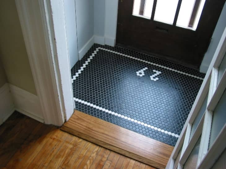


From the tiny vestibule where the hex tiles announce their house number, to the carefully arranged industrial tables and plaster dog, the attention to detail belies the haphazard scavenger approach this actress and graphic designer take in creating their home.
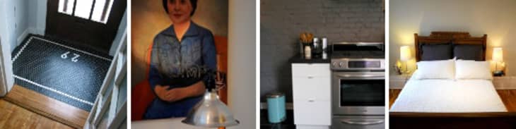
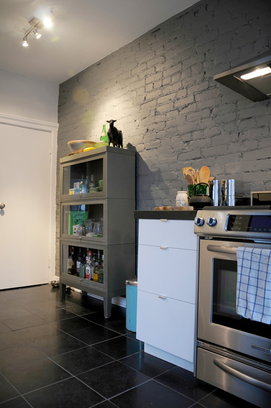
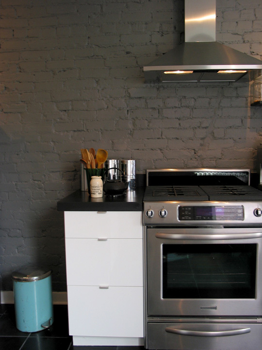
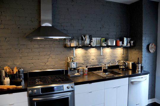
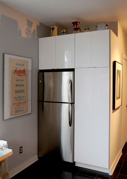
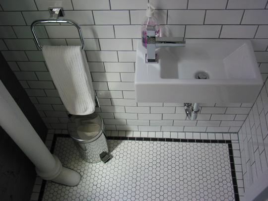
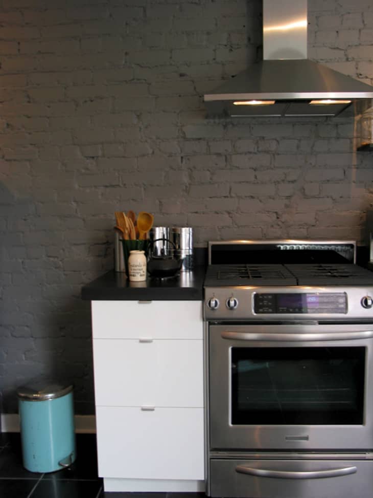
Part well-curated oddities shop, part clean-lined, vintage modern inspiration, Amy and Stéphane’s home is perfectly suited for the performance and design oriented duo. When they bought less than two years ago, the kitchen and bathrooms required major rehauling, but care was taken to retain the integrity of the space. While open concept renovations are au courant, these two knew that preserving the original layout worked better in the space. In the kitchen, modern Ikea cabinets and stainless steel appliances mix with aged exposed brick and vintage accessories like the aqua blue garbage bin and antique sugar bags, while in the bathroom hex and subway tiles live next to sleek new fixtures.
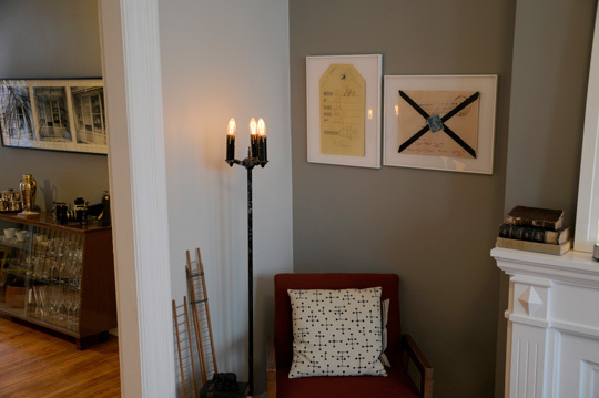
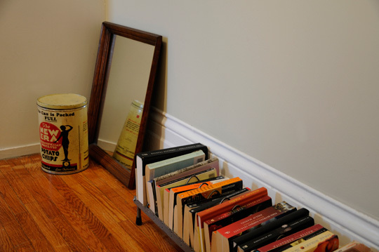
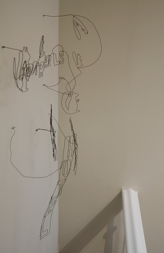
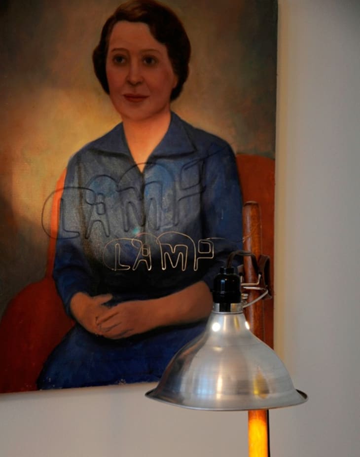
This mix of old and new reigns throughout the house, where antique pieces found, purchased, or gifted merge with Stéphane’s own cheeky wire sculptures. Cozy and comfy couches and chairs and colorful textiles punctuate this mix, adding textural interest to it all (as does their curly-haired pooch). Some of their treasures were found amidst dinginess and dust, but placed on top of an industrial metal shelf, polished wooden cabinet, or minimalist glass and chrome table, these objects bring fresh air and whimsy to their happy home.
Apartment Therapy Survey:
My/Our style: Minimalism meets hoarding
Inspiration: My grandmother’s cousins’ house in Montreal that was always full of cool objects and collections on display. It was my favourite place to explore as a kid. They also had squirrels that they had trained to come into the kitchen from outside to be fed – we decided not to be inspired by that part.
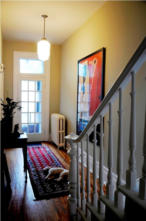
Favorite Element: The character of the house. It hasn’t been gutted like most of the houses in our neighbourhood. We still have the original hardwood floors and separate spaces for the living and dining rooms, which we prefer.
Biggest Challenge: The kitchen renovation was a long, drawn out ordeal. Our first contractors were incompetent, wasting our time and money. They also didn’t install the floor tiles properly, so they are uneven. We’ve learned to overlook (and in some cases enjoy) the quirks of the house.
What Friends Say: “You guys collect a lot of junk.”
Biggest Embarrassment: Our basement. It’s full of renovation left-overs, boxes, bikes, old clothes. It’s hard to find a path to walk down there. Only a select few have ever been invited down.
Proudest DIY: The “29” design in hex tiles in the front vestibule… Designed at scale in Adobe Illustrator!
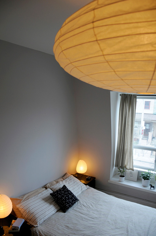
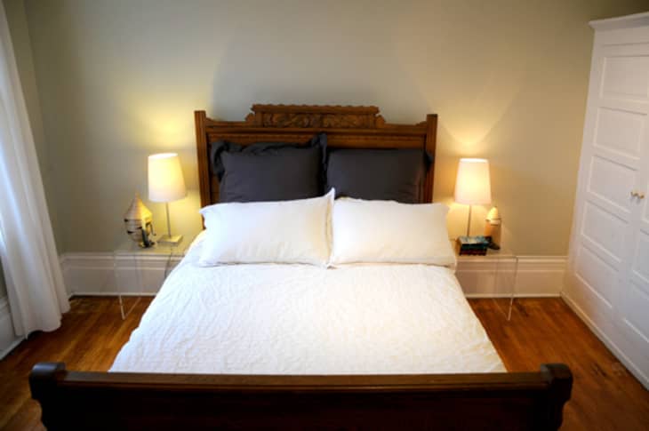
Biggest Indulgence: The hanging Noguchi ceiling lamp in our bedroom
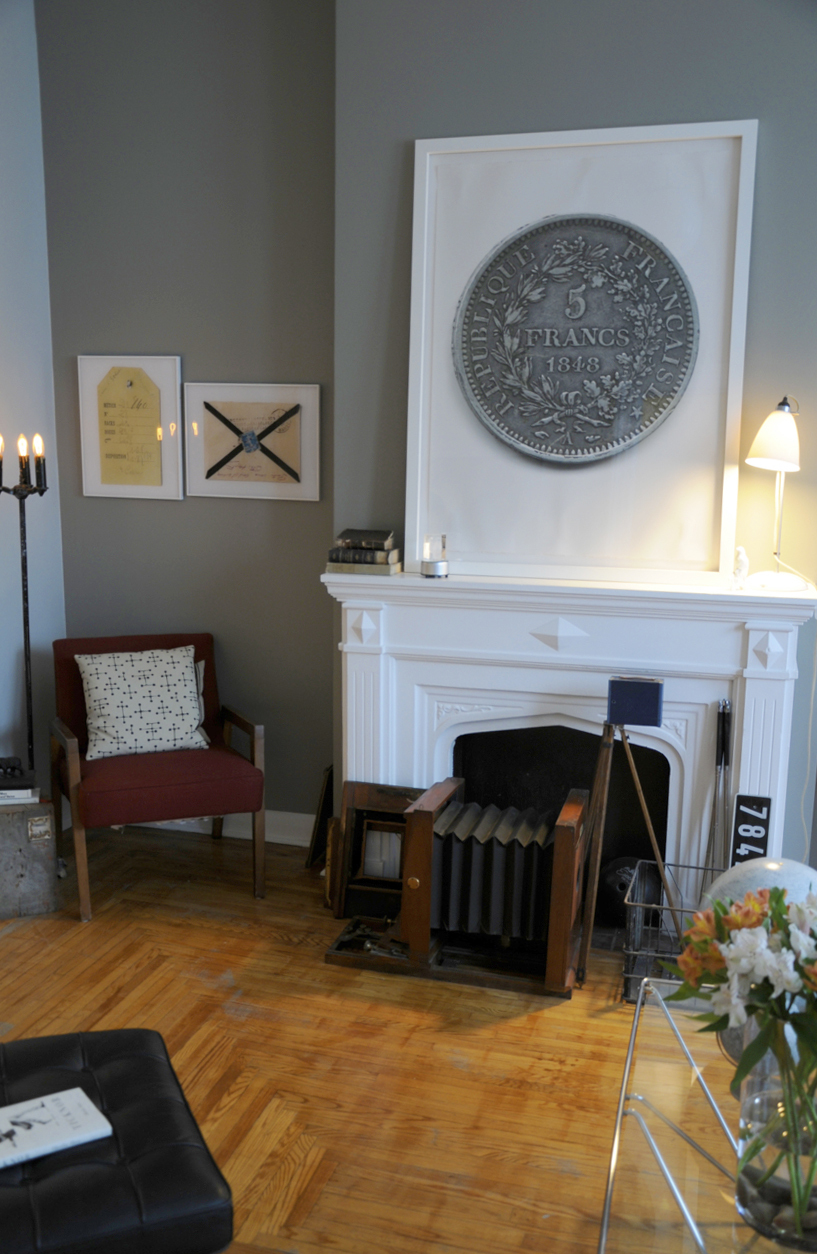
Best advice: Go out for a walk the night before garbage day – you’re sure to find cool stuff. A lot of our furniture and many objects (including the 100+ year old wooden camera in our living room) were found at the curb.
Dream source: Queen West Antiques, Toronto
Resources:
VESTIBULE:
hex tiles from Ciot – www.ciot.com
FRONT HALL:
Large Basquiat subway poster: 5 euros at the Musée Maillol, Paris. Framing was not 5 euros.
Small table: found in the garbage
Art deco ceiling lamp: Sam the Chandelier Man, Toronto
KITCHEN:
appliances: Kitchen Aid and GE
Cupboards, range hood: Ikea
Barrister’s bookcase, chairs: Queen West Antiques
Countertop and floors: Honed black slate (NOTE: never buy a honed slate countertop. It chips and stains far too easily and requires regular oiling)
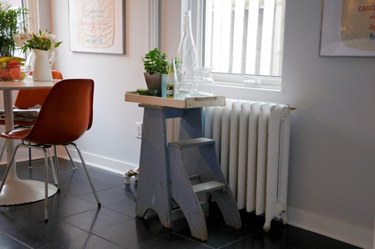
Lamp, step ladder, Garbage can: found in the garbage
Redpath sugar bags: $5 each at an antique store
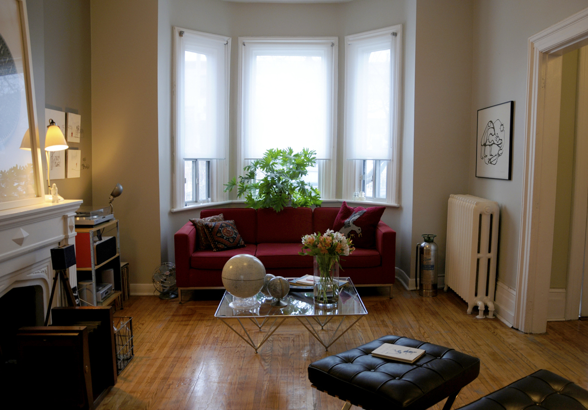
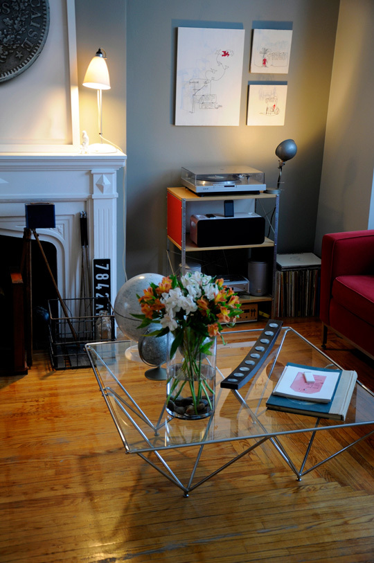
LIVING ROOM:
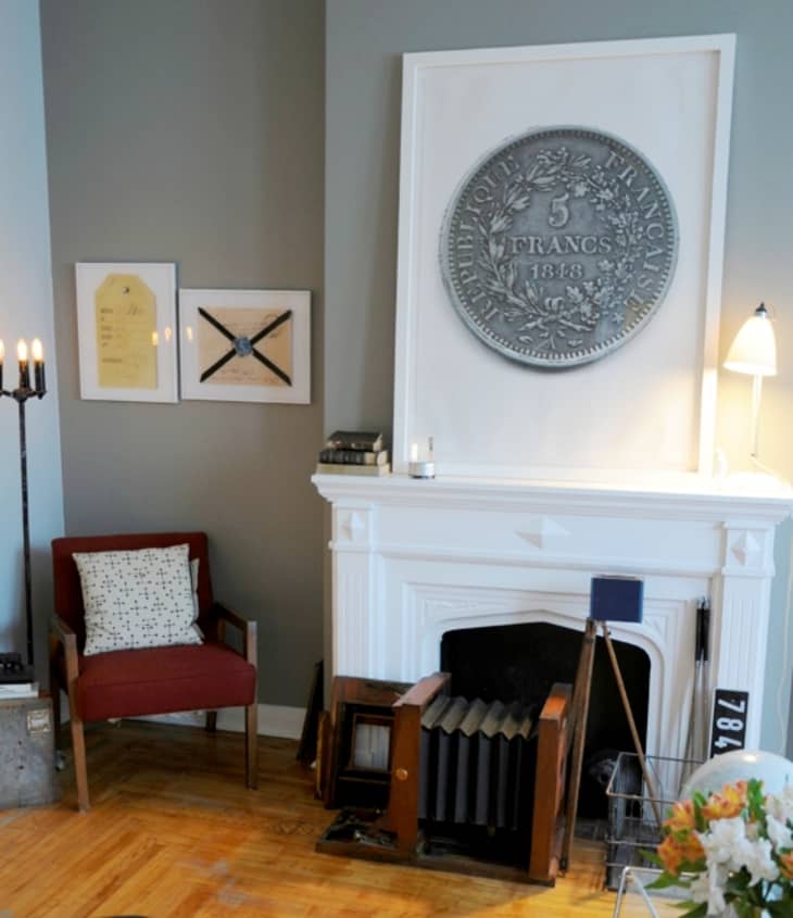
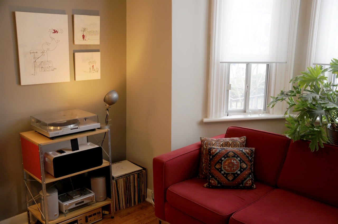
Sofa: Club Sofa from Style Garage – www.stylegarage.com
Red armchair: found on Harbord street in 2004
Coffee table: from Caban (now defunct)
Cameras: Put out on the curb by our former landlords when we lived above the Art Photo Studio on Queen Street W.
French license plate: A gift from my Parisian cousin.
Large coin print: An enlargement of one of the coins in my grandfather’s collection. I scanned it at a super high resolution and my ex-boss had several printed.
Arnaud Maggs prints: gifts from my uncle.
Moon globes: bought off Craigslist
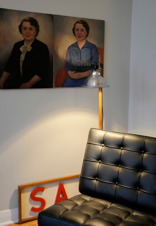
Two semi-creepy portraits: bought for $5 at an estate sale.
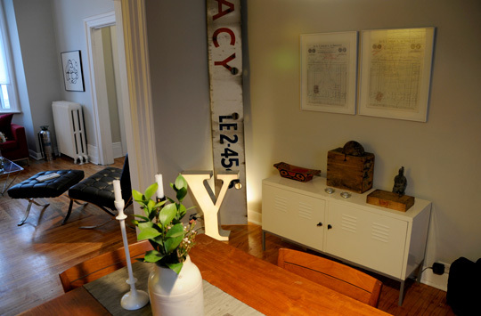
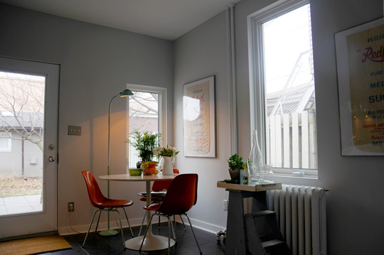
DINING ROOM:
White storage unit: Ikea – doesn’t everyone have one of these?
“Y” letter: found the garbage pile of a neon sign company in Montreal
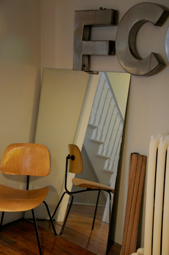
“…MACY” sign and “FCO” letters: Half of the bottom portion of the Factor’s Pharmacy sign and some letters from the main part of the sign. I noticed the old shop had closed and the amazing sign was gone, so I went to the alley behind the building and found some of the large stainless steel letters and half of the base of the sign.
Table and chairs: Swedish teak from the 70s. It was my grandmother’s table.
Candle sticks, runner: from Habitat – www.habitat.fr
ceiling lamp: Ikea
Eames chair: Found Design, Ottawa – www.founddesign.ca
POWDER ROOM:
tiles: Ciot – www.ciot.com
towel ring and toilet paper holder: Restoration Hardware
Toilet: Toto
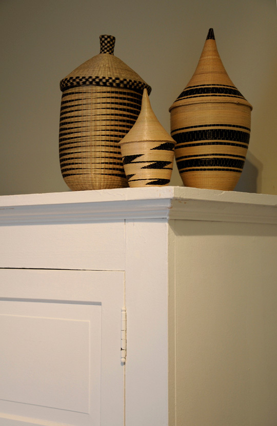
GUEST ROOM:
Hand-woven baskets: Bought on our recent trip to Rwanda
Wood bed: A gift from my aunt
Pillows and duvet cover (which are wrinkled, I know): King and Queens, Toronto – www.kingsandqueens.ca
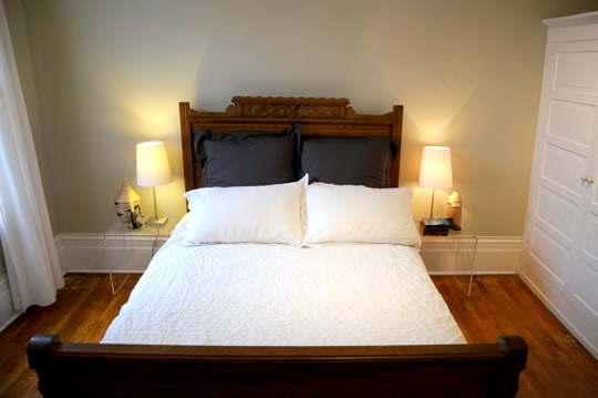
BEDROOM:
Noguchi Akari ceiling lamp: Quasio Modo, www.quasimodomodern.com
Noguchi table lamps: MoMA, New York
(Thanks, Amy & Stephane!)
Images: Abby Cook