
Full disclosure: I think Kate is soooooo much cooler than Andy Spade (and, yes, I'm a guy). Hilary (woman) may lose, but Kate (woman) has won. Her style seems so much more grown up, fun and exciting than his little confused downtown boy club around the corner from her SoHo store. Okay, that's harsh, but it's true (his bags are nice, but that's it). And even though I have NO USE for anything in HER store (bags, glasses, etc), I still go in there and I like it. I know, metrosexual, wierd...

This is the starting picture - the keystone - everything hangs off of it. Look how nothing maintains the horizontal line. Every pic "steps" down.

In this view, I wanted to show how all the pictures "weep" or "slope" down from that center picture.
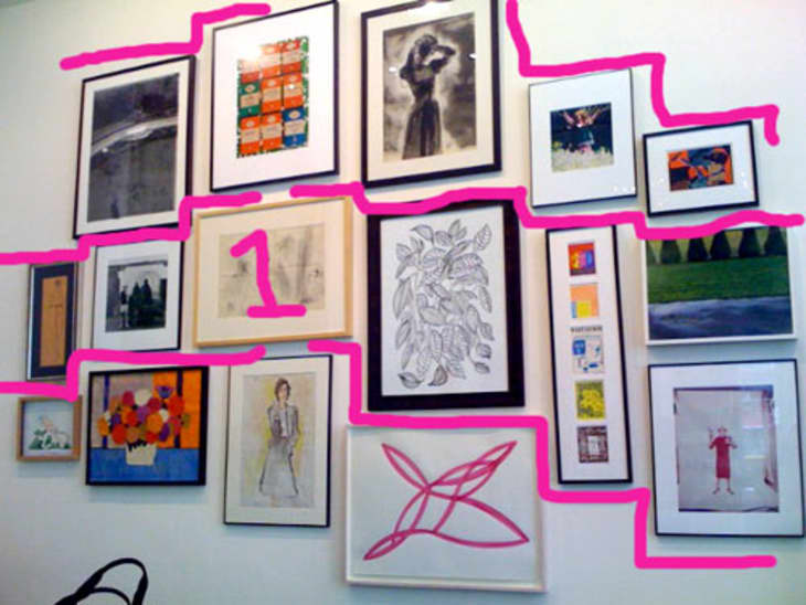
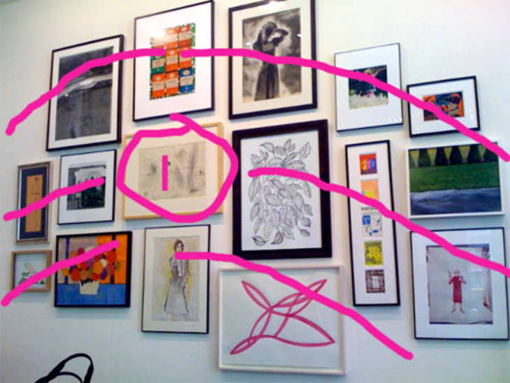
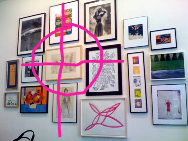
Martha hangs pictures on horizontal lines, Kate does not. The pictures in this assembly seem - to me - to center around one picture and then "cascade" down on both sides. The genius of this is that when you have dissimilar pictures you never get into a rut trying to make them all match up. If everything is slightly off, slightly off is perfect. Take a look at my markups.

In this picture look at the keystone picture and how there is an X and Y axis to the whole thing. Outside of pic #1, these four pictures anchor the whole assemblage.
To do this sort of thing, you want to start on the floor with all the pics you have available:
• Choose your center pic - it doesn't need to be the biggest, but it does need to have some size.
• The center pic should be precious and needn't attract the most attention on its own.
• Move - generally - from large to small as you move to the perimeter.
• Always allow for more weight or mass on the left (it's just a rule of optics).
• "Weight" means either darkness, size or thickness (this assembly has more pics on the right, but the center pic is moved to the left of your vision so the weight is there)
• When you have your assembly set on the floor, hang from the center pic outward.
• Enjoy. Try it at home.

White Enamel Flatwa...
I have one bedroom apartment and 29 original paintings. I definetly can use this idea to create a gallery style .
Thanks Maxwell.
I love hanging art this way. It's so eclectic and free--it puts the emphasis on the owner's broad range of art/photos/mementos instead of a rigid grid or pattern.
I really like this set up. I will be garage-saleing this summer to find picture frames and finaly get all my photographs up. Hurray!
These diagrams are great! But I'm a little confused about the "Hilary {which is misspelled, if you're referring to Clinton} (woman)" and "Kate (woman)" thing. Was there a point to putting that in this post? So odd.
Well you see, kat98, it's because it's still so novel that Hillary is a *woman* and actually wanted to run for the big ol office of president. I hear there was more to her platform than being a woman, but I dunno.
Oh, hoorah, for the return of the personal pronoun "I" in an opinon entry. The editorial "we" makes me think of a corporate mission statement.
I'm afraid of Kate Spade's bags with the open tops that let your stuff spill out, or thieves' hands creep in. What was she thinking? Easy access for all?
I second Ter's opinion. "We" is okay sometimes, but it just doesn't work in every context. Thank you for realizing that! Also, love the tips. I would never have figured any of that out myself, and I'm sure if I had tried to replicate it based on just the photo, it would have looked "off" to me.
It's worth noting that this method of hanging art works best when the frames themselves are, as above, of different weights/thicknesses and colors/tones. The same goes for the mats (or lack thereof). And the art itself, for that matter.
(And I totally agree that the Hillary/woman comment was way weird.)
That whole first paragraph is really just confusing me.
The rest however, is very helpful as I've been trying to figure out how to fix my own art wall thing, and I think these guidelines/ideas are just what I needed.
Also, Kate Spade's advertising and website are genius. (Um, although they don't actually make me want to buy anything, so maybe they aren't.) But they're definitely well designed.
I love Kate too. But, give me the tried and trusty grid any day! It is a repeatedly proven component of great design.
This is very helpful to me--thanks!
a.meyer, I must have forgotten that when talking about Hillary Clinton, one must always use her first name and point out that she's female. (and maybe that was the reason for bringing her in to a discussion about handbags and decorating, too!) Although I don't know how that's possible, because I'm an architect, and so I'm reminded EVERY DAY how unusual it is to be a woman and successful. Mostly by the mail and email I get that's addressed to "Dear Sir" or "Gentlemen" or some other greeting that reminds me that I'm an anomaly. Or by the people who assume I'm the secretary and will get them coffee.
I like my collages more organized then sporadic...so for those of you who are more like me here is a different way of doing it:
http://designformula.blogspot.com/2008/01/making-picture-wall-collage.html
I have always used the more organic method of hanging art, but my way is simpler (although potentially more dangerous!)
I hang something at a relatively nice eye level. Usually the biggest thing. Usually somewhere in the center of the space I'm decorating. But not always!
Then I just hang the next thing nearby, never aligned top and or bottom with the first thing. I try to leave at least two inches and not more than about six inches between things. Keep the exterior outline of the arrangement irregular.
And so on!
I NEVER arrange things on the floor, and only once in a while do I pound my picture hook in a location a bit too close to something else and have to pull it out again and move it.
I like to mix something three dimensional and/or not rectangular (round plate, floral plaque, fancy mirror, candle sconce...) in every once in a while, too. Not too many and not too near each other.
Just did a big collection of mostly small things in a stairway, and it looks great if I do say so myself. (I do have an art background and a good eye for this sort of stuff. It might not work for everybody.)
But if you use picture hooks, it's easy to change and fix and very free form -- you can add or remove things at will...
I say be bold! (Unless you have real plaster or your landlord gets really cranky about nail holes...)
who knew hanging pictures could be so complex?!
What's the 57 rule?
Yes, what's the 57" rule?
I've been trying to figure this out! thanks!
There are so many different ways to hang art. I have to try this method.
I'm doing gallery style at home, so this will help out alot! Thanks!
57" rule:
http://www.apartmenttherapy.com/ny/how-to/how-to-hang-your-artwork-and-not-screw-it-up-006174
this is a great idea explained meticulously.. and I am going to try it. (I don't like the individual pieces that are displayed but i like the idea).
Is it just me or does anyone else think that the arrangement used to illustrate this story actually doesn't work very well? It would be so much better and stronger if there were *something* tying all these pictures together - colour, theme, style, something! - other than the fact they're all hung as a group.