
Kevin Sharkey’s High Over the Hudson
Name: Kevin Sharkey, decorating editorial director of Martha Stewart Living
Location: Far West Village — New York, New York
Size: 2,500 square feet
Years lived in: 2
After 18 months of renovations, Kevin Sharkey was so pleased to have his apartment complete for the September issue of Martha Stewart Living that he invited Apartment Therapy editors for a private tour! The contemporary space is high over the Hudson in one of the Richard Meier towers on the West Side Highway. With natural light flooding the space, Kevin took extra care to keep colors calm and neutral.


The renovation process was dutifully logged in Kevin’s Home Makeover Diary at MarthaStewart.com — you can follow Kevin’s decision making process on a number of big projects (like bleaching the wenge floors and integrating technology) to many smaller ones like choosing bathroom tile and outdoor furniture.
Resources of Note:
PAINT & COLORS
-
• dining room, living room, entry, library and bedroom: —
Martha Stewart Living Paint: Heath MSL212
• bathrooms — Martha Stewart Living Paint: Popcorn MSL254
• Kevin Sharkey’s Painting Pointers
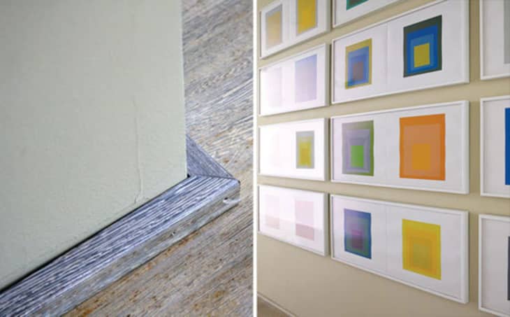
ENTRY
-
• Soft Edge-Hard Edge series by Josef Albers: prints were a gift from Martha
• Martha Stewart Living Paint: Heath MSL212

LIVING ROOM
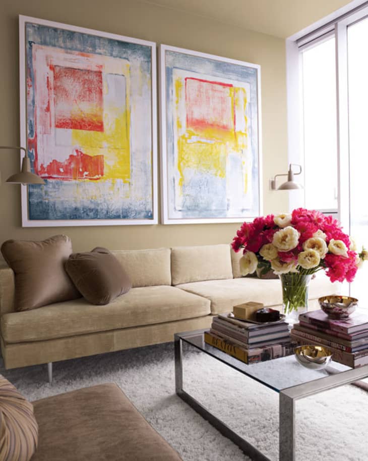
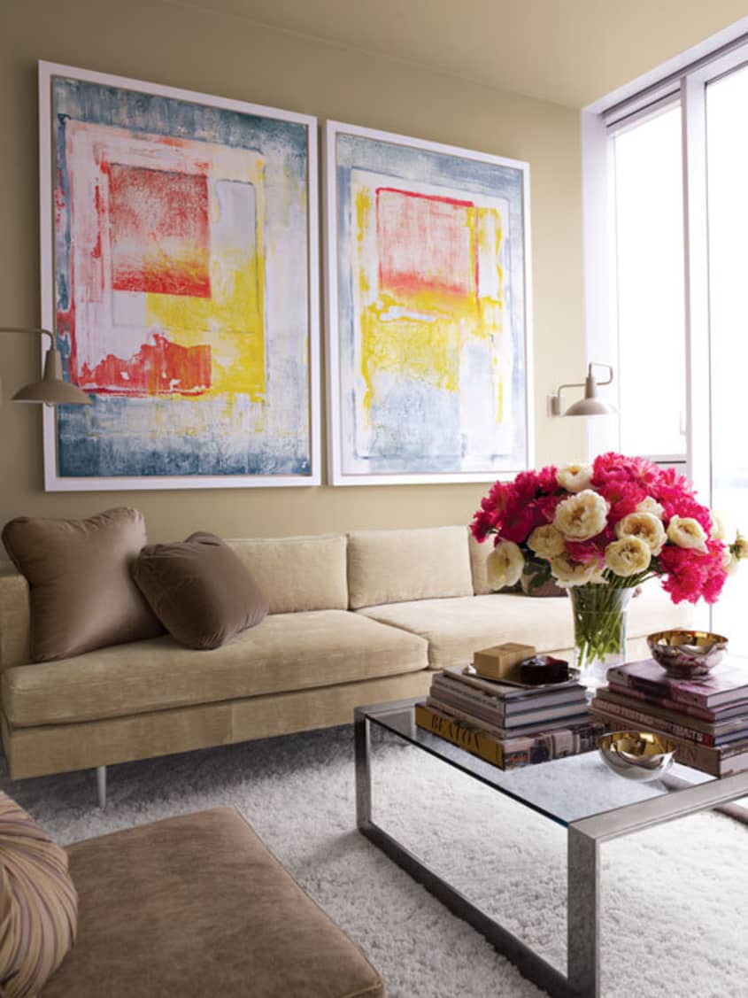
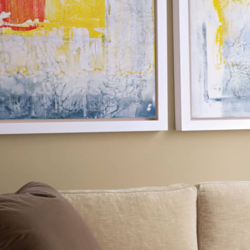
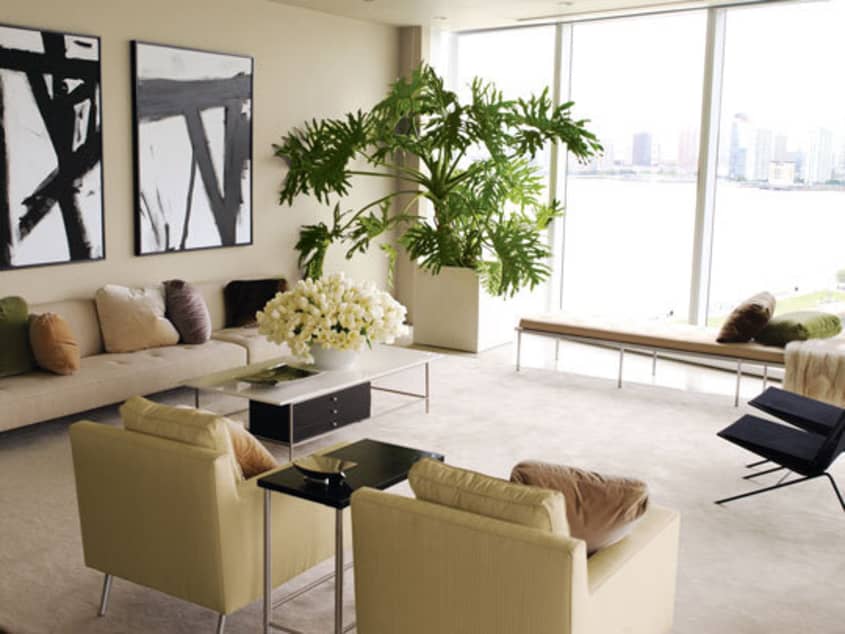
The massive living room has two walls of windows overlooking the Hudson River. You can see Kevin’s penchant for pairs throughout the apartment but it is most noticeable here — the pair of paintings, pair of armchairs, pair of lamps, pair of black string chairs, etc.
-
• pair of commissioned paintings in the style of Franz Kline by
Eric Beare framed in Larson Juhl floater frame
• long vintage couch from MondoCane reupholstered in Dedar Flirt
• pair of armchairs: Dunbar upholstered in Reflection/Great Plains from Holly Hunt by Luther Quintana
• mirrors: Desiron
• floating sideboard
• bench: vintage, reupholstered in linen
• extra-large (supported by fishing line strung to the ceiling) Monstera deliciosa plant
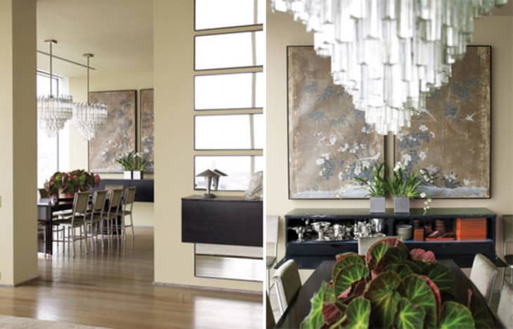
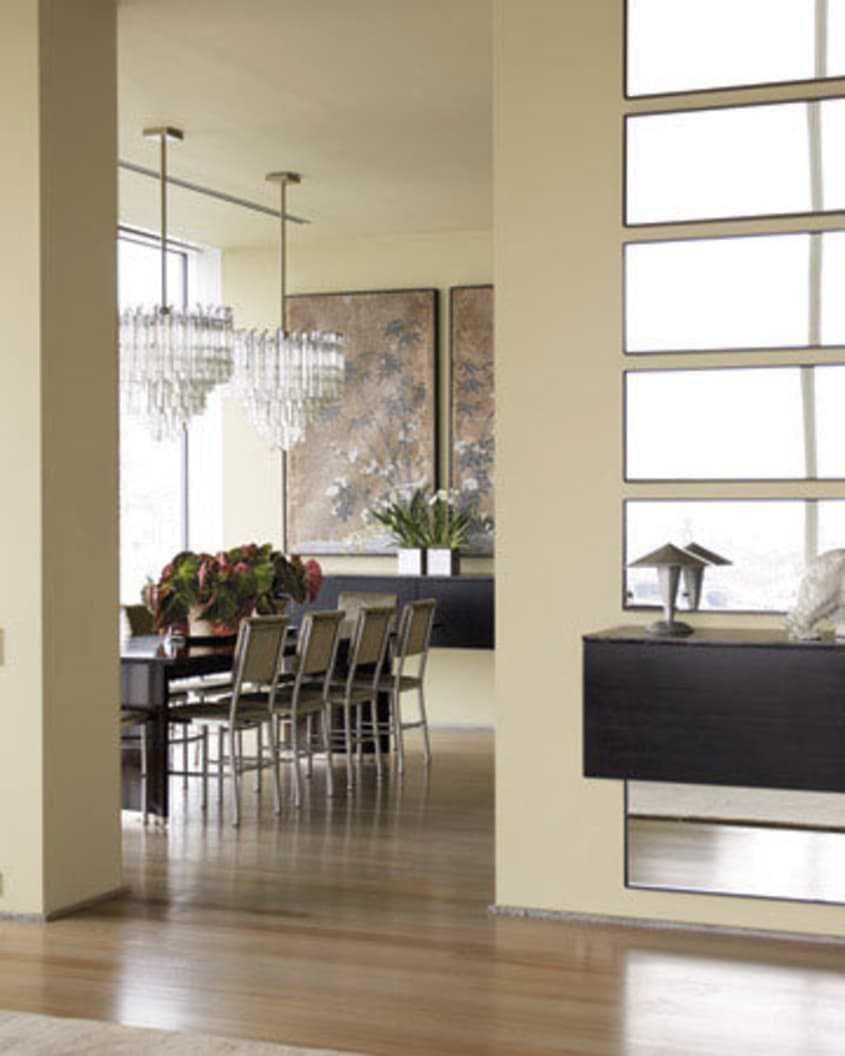
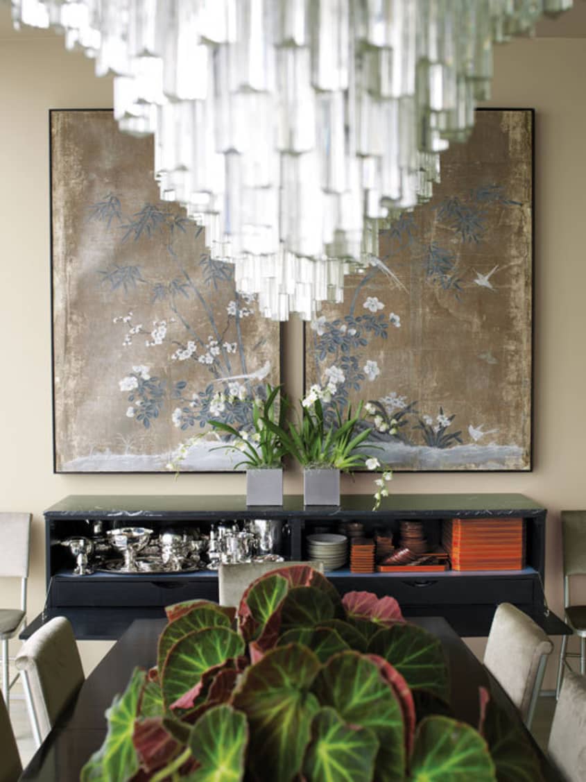
DINING ROOM
The dining room is ideal for entertaining and the dark and glossy table, mirrors and chandeliers are perfect for bouncing and reflecting light around the room. Martha even has a favorite seat at the table — the one where the Empire State Building is reflected in the full length mirror.
-
• oak table with an espresso stain and five coats of oil for a highly polished finish
• Chandeliers from the Palm Beach Antique & Design Center
• a pair of Chinese paper panels came with Kevin from his previous apartment
• floating sideboard
• mirrors: Desiron
• Japanese lacquerware was purchased on trips to Kyoto
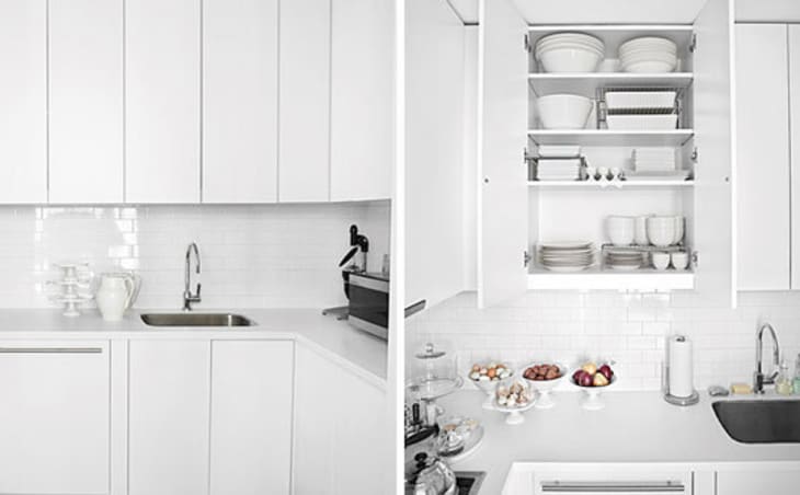
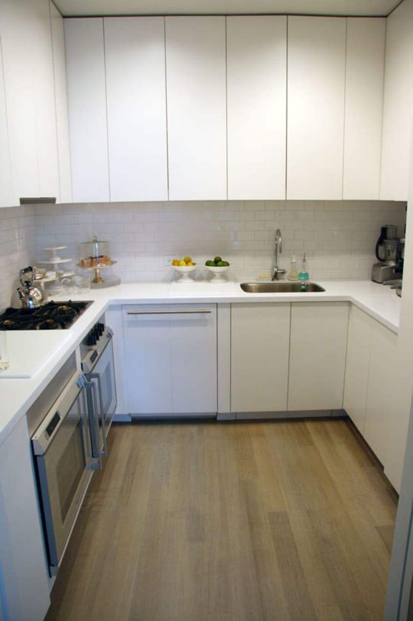
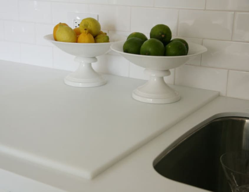
KITCHEN
Though he’s not a cook, working for Martha means Kevin’s 9½’ x 8′ gleaming white kitchen is ready for entertaining at the flip of a switch. Adding to the perfectly stocked and organized cupboards, a pocket door, two ovens and massive restaurant cutting boards allow for plenty of room for prep — for Kevin, his friends or caterers.
-
• countertop:
Corian
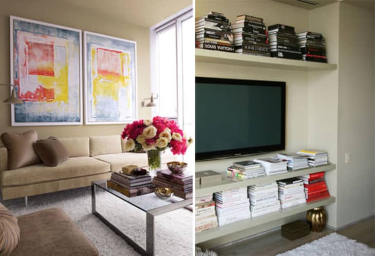
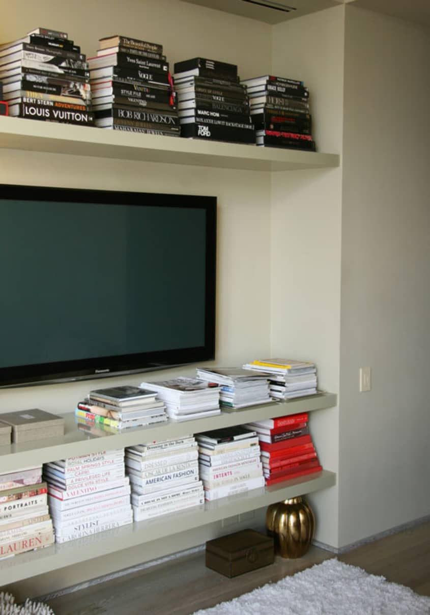
LIBRARY
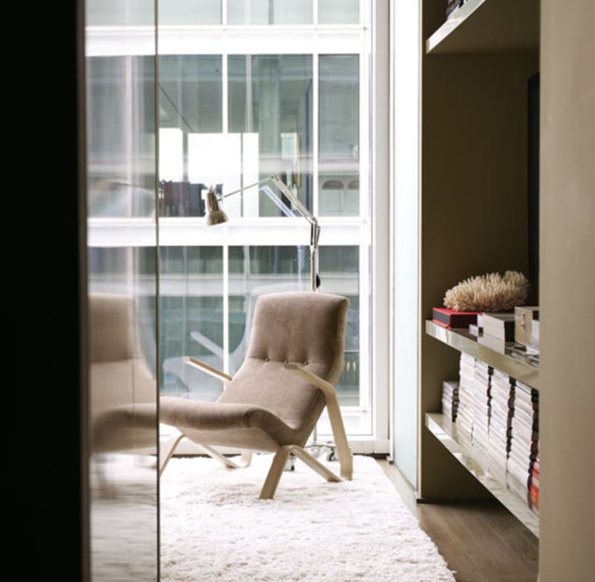
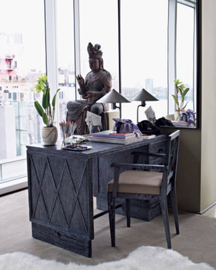
The library is a small escape in the large apartment. Here, Kevin has seating for a small group — the perfect place to watch a movie on TV or read a book. Kevin keeps the majority of his book collection at his office at Martha Stewart. At home, he has displayed his art and fashion books on the custom floating shelves. Kevin is already planning to add additional shelves to this tiny room.
-
• chair: Eero Saarinen Grasshopper chair purchased at auction, refinished and reupholstered in Great Plans/Now and Zen from
Holly Hunt
• pair of oil paintings, done in the style of Mark Rothko by Eric Beare framed in Larson Juhl floater frame by Brentrano’s
• custom floating shelves finished in a high-gloss lacquer
• Martha Stewart | Tech Support
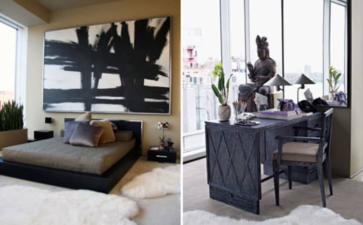
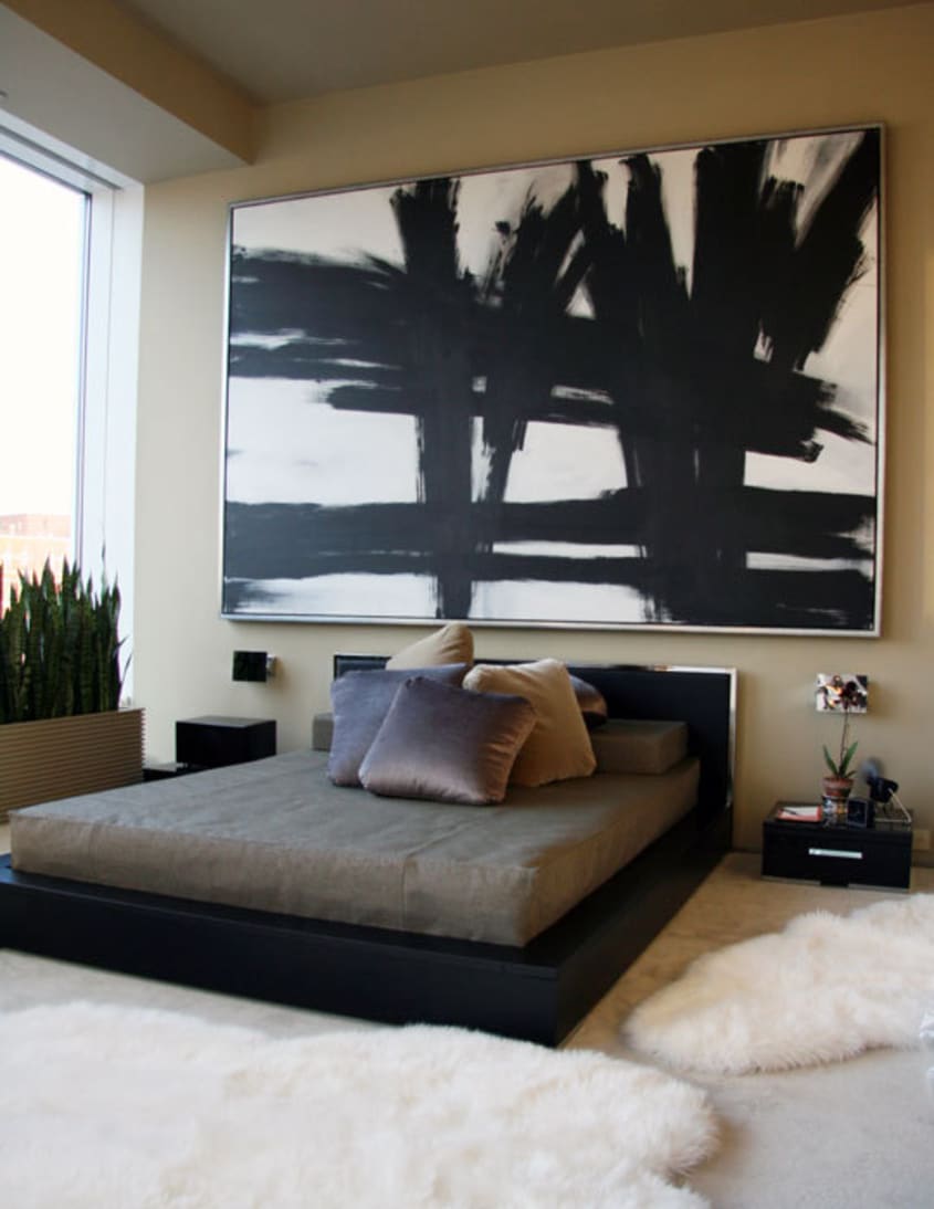
BEDROOM
The furniture in Kevin’s bedroom is very low and pays homage to Japanese design. The simple coverlet is tailored perfectly to fit the low-profile mattress — no fussy duvets for Kevin.
-
• giant painting commisioned in the style of Franz Kline by
Eric Beare framed in
Larson Juhl floater frame. The painting is so large it was painted on location — it wouldn’t fit in the elevator!
• bed: BoConcept• nightstands: BoConcept — customized hardware and marble tops
• desk: oak with ceruse finish
• armoire retrofitted as a media center with ceruse finish
• sheepskin rugs
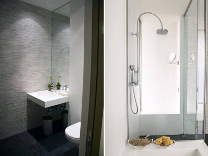
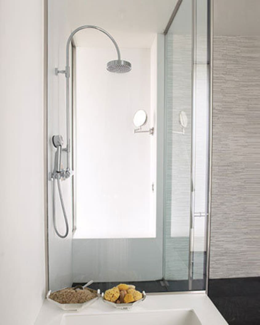
BATHROOM
Kevin’s apartment has 2½ baths and Kevin customized each with an accent wall in thinly sliced marble tile.
-
• tile: Tatami marble strips from
Waterworks

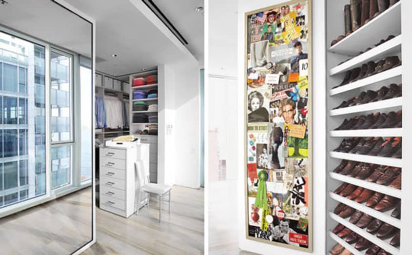
CLOSET
The meticulously organized massive closet is an extension of the hallway to the bedroom.
-
• custom by
California Closets
• drawers pulls from Restoration Hardware
• the interior of Kevin’s shoe closet door is where he keeps his collection of inspiring ephemera
• Martha Stewart | A Dream Closet Makeover
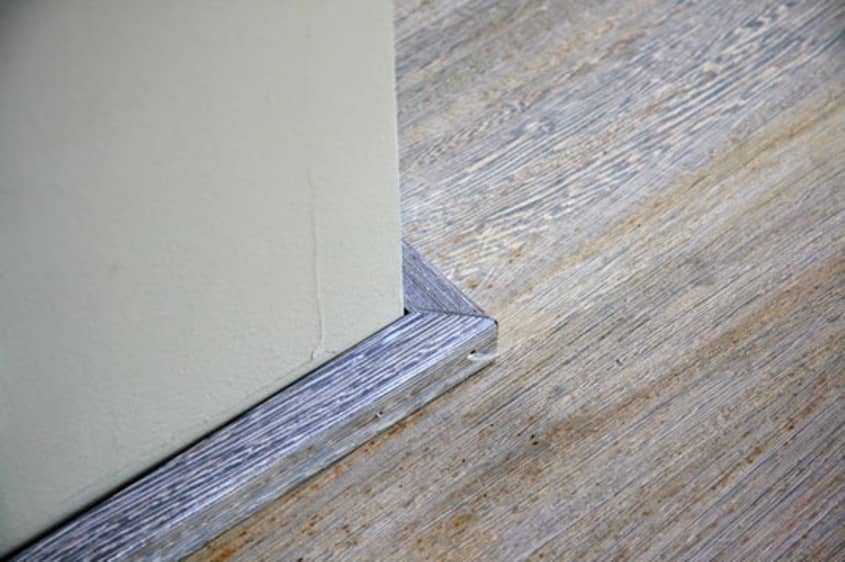
FLOORING
-
• whitewashed wenge by
Haywood Berk — Kevin wanted the floors lighter. With all the natural light in the apartment, dark floors drew attention to any dust on the floors.
• rugs: Safavieh

For even more resources, lists, tips, tricks and photographs of Kevin’s apartment and his renovation process see:
Kevin’s New Apartment and Kevin’s Before & Afters at MarthaStewart.com.
Thanks, Kevin!
• HOUSE TOUR ARCHIVE Check out past house tours here
• Interested in sharing your home with Apartment Therapy? Contact the editors through our House Tour Submission Form.
• Are you a designer/architect/decorator interested in sharing a residential project with Apartment Therapy readers? Contact the editors through our Professional Submission Form.