apartment therapy changing the world, one room at a time


LA House Tour: Lindsey's Perfected Sophistication

atla-061308-LDa.jpg

Name: Lindsey Dann
Location: Los Angeles, CA
Size: 1620 sq/ft
Years lived in: 4, OWNED

>> Enter Slideshow
>> View All Thumbnails At Once

2-23-housetourlogo.jpg
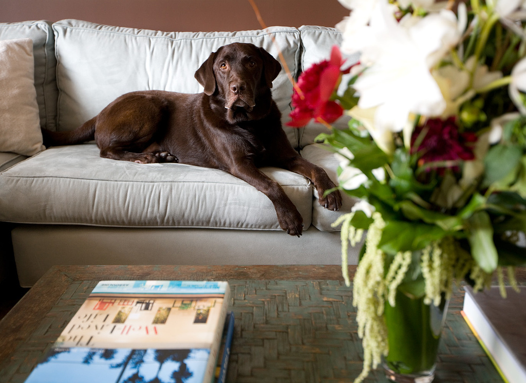
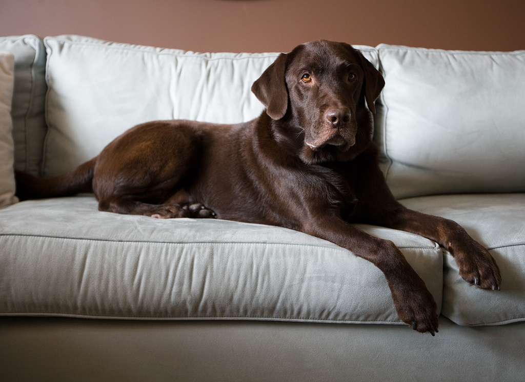
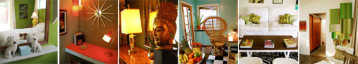
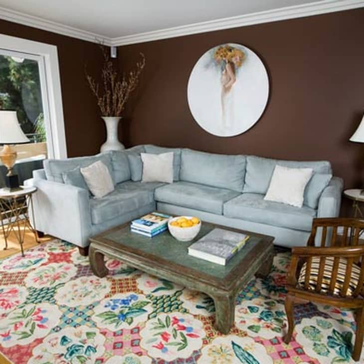
We met Lindsey Dann via a coffee table we were both coveting. Although it turned out that the table wasn't for sale, we knew we'd found a kindred spirit. When she emailed us the pictures she'd had taken of her own home, we asked if she'd mind sharing them with our readers at AT. What struck us most was her impressive attention to the details which support a home that is elegant and sophisticated while being comfortable enough for her active dogs to enjoy or to support an impromptu karaoke party. It's that ease that underlines the motto, "You Purchase It, We Perfect It," that is at the heart of Lindsey Dann, LLC, her recently launched company.

atla-061308-LDf.jpg


atla-061308-LDb.jpg

>> Enter Slideshow

As an interior designer, Lindsey's home is her lab, and she's constantly tweaking it. As one of her recent clients, the actress Eliza Dushku, pointed out, "it seemed like she absorbed everything I said and would come back to me with a different selection that was even more creative and beautiful than the last one." We understood what Eliza was talking about when we exclaimed over Lindsey's bathroom and she immediately pointed out the flaws. When we went to her apartment, she'd begun renovating it! We can't wait to see the results.

atla-061308-LDc.jpg

AT Survey:

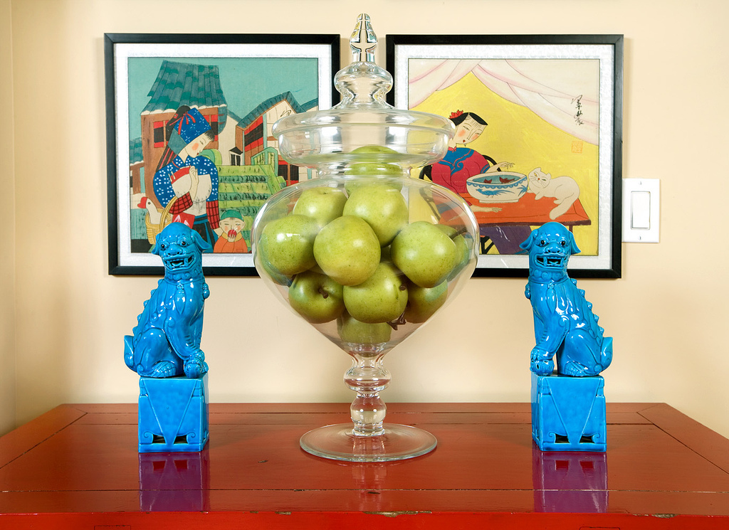
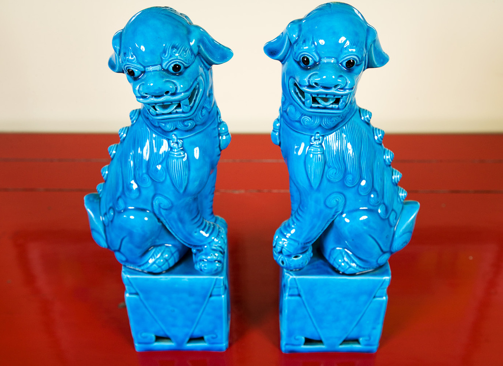
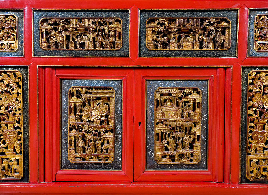
My/Our style: Eclectic. There are influences from the East Coast and the West Coast with a little Asian twist.

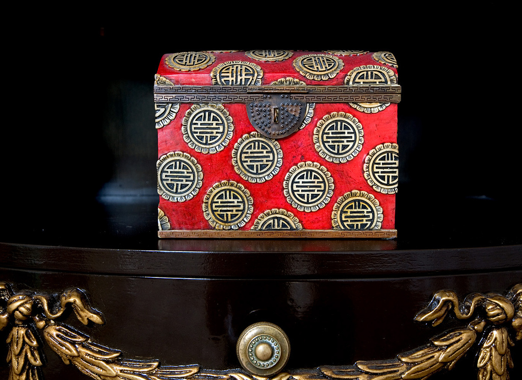
Inspiration: Shopping is my biggest inspiration! Additionally, I grew up in Boston and I have a lot of memories of my grandmother's traditionally styled home with tons of different fabrics and trims on every sofa and pillow. She had a flair for design with animal prints and a zebra rug, as well as an obsession with Asian culture and design. Then, when I moved to California, I developed an appreciation for a more minimalist approach to design. Throw into that mix the great vintage stores here in LA and the amazing architecture. I'm constantly inspired!

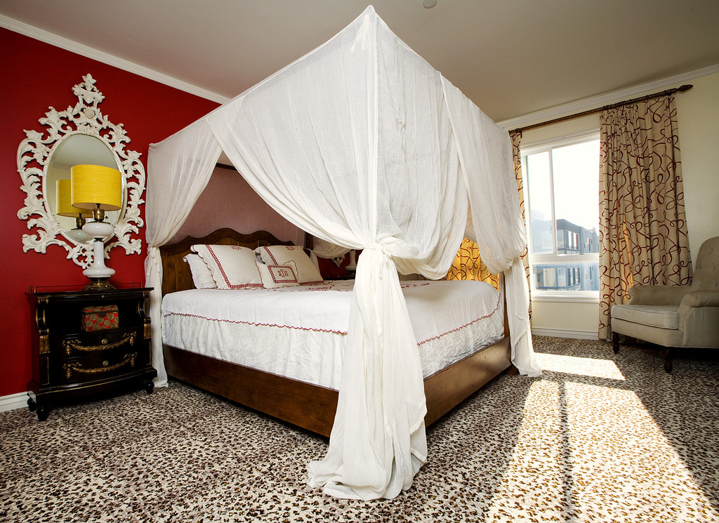
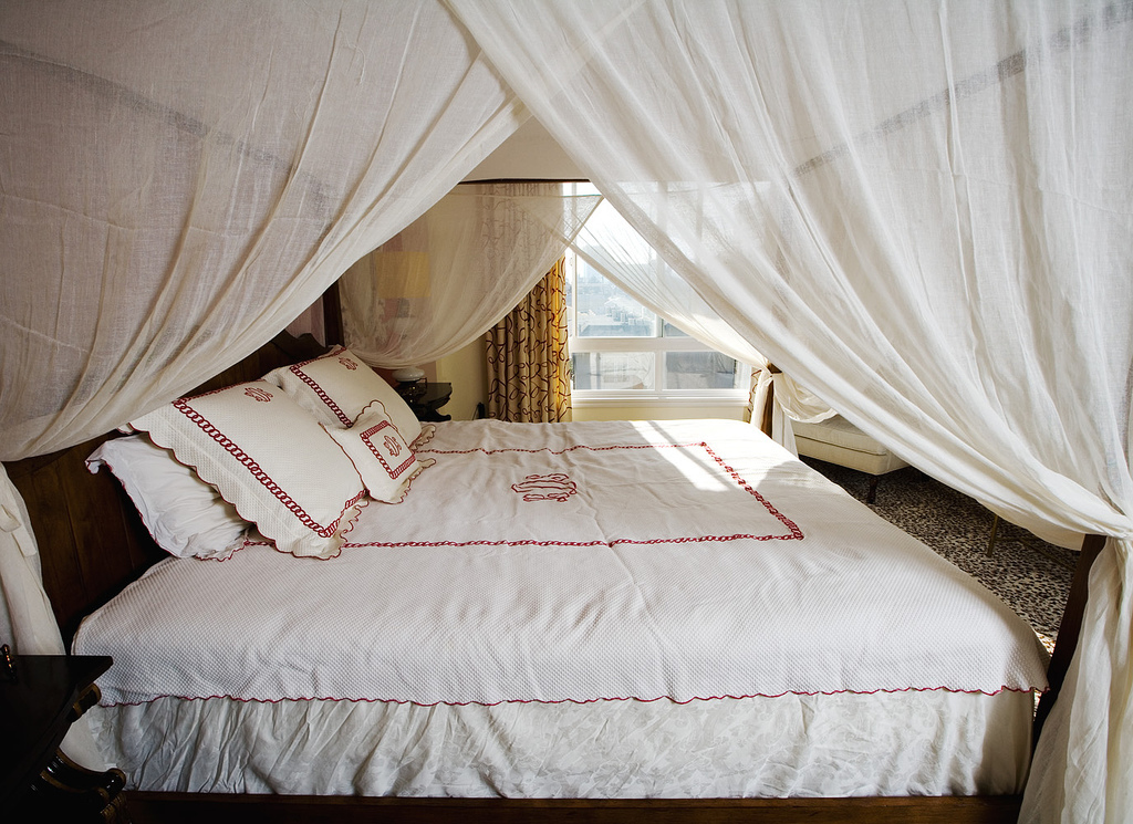
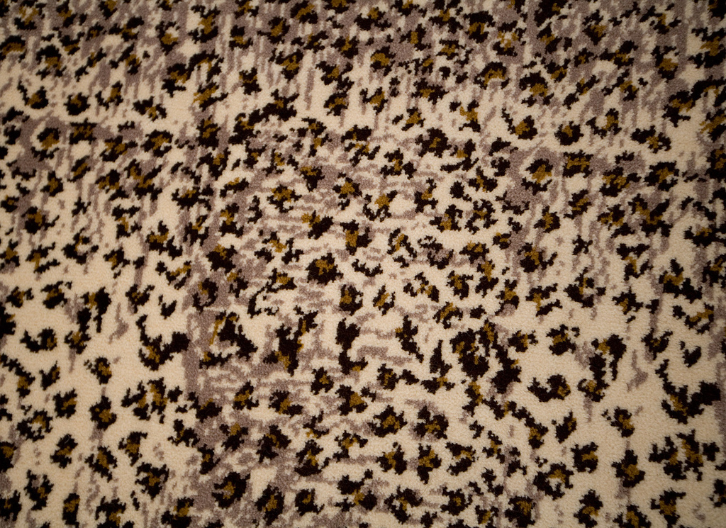
Favorite Element: The cheetah print rug in the bedroom. I get a lot of comments on how cool and how bold it is.

Biggest Challenge: Deciding on which pieces to use. As an interior designer, I'm exposed to many different elements of design so it was really hard for me to pick one direction and run with it. I love so many styles and pieces that I overwhelm myself!

What Friends Say: That it's sophisticated and comfortable and fun all at the same time and it has lots of character.

Biggest Embarrassment: The white drywall near the front door. The arm of the door came loose a few years ago and slammed into the wall, creating a hole. I had a guy come and fix it and he put up drywall to patch it up. Somehow I never got the wall repainted so it's beige with a big white spot. I think it gives my entry a little character.

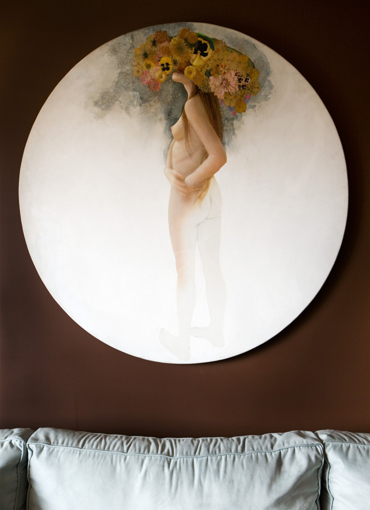
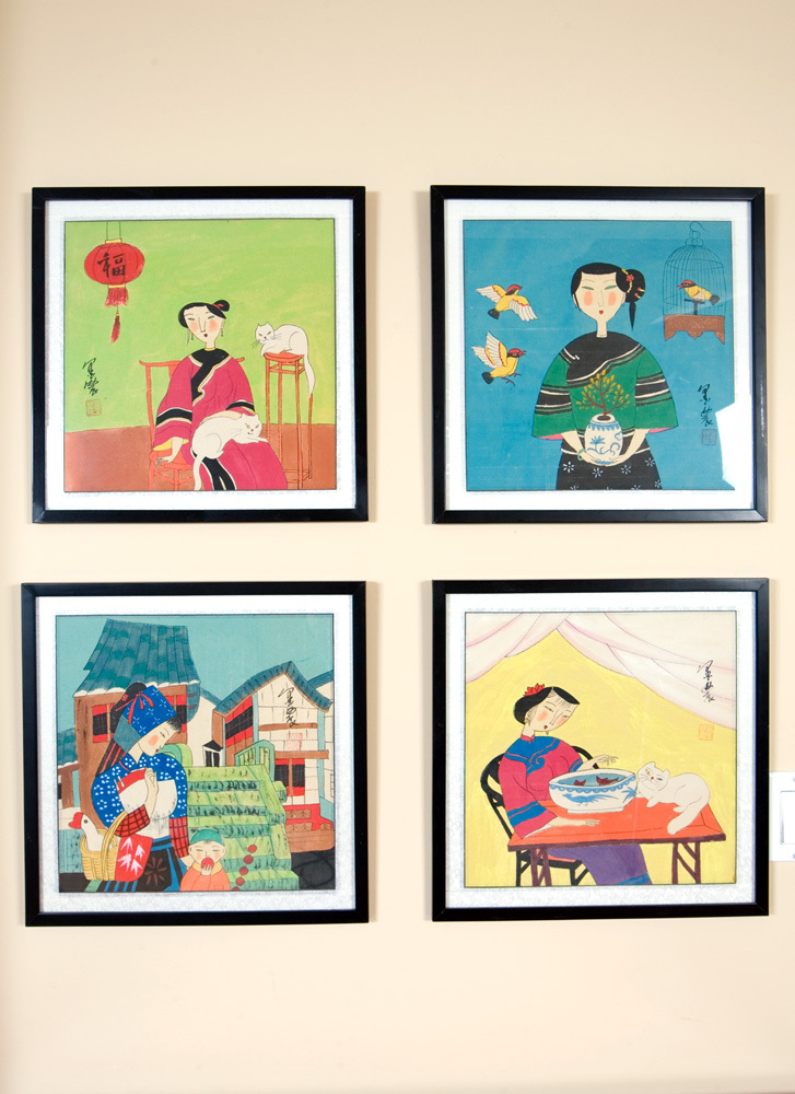
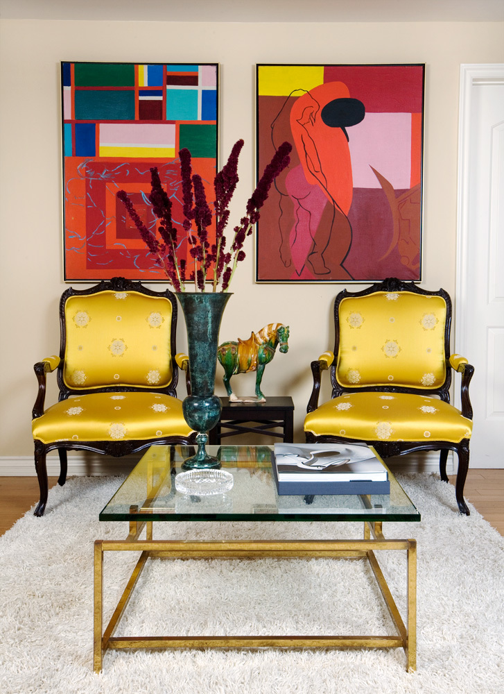
Proudest DIY: Hanging all of my art myself with my tool kit and power drill.
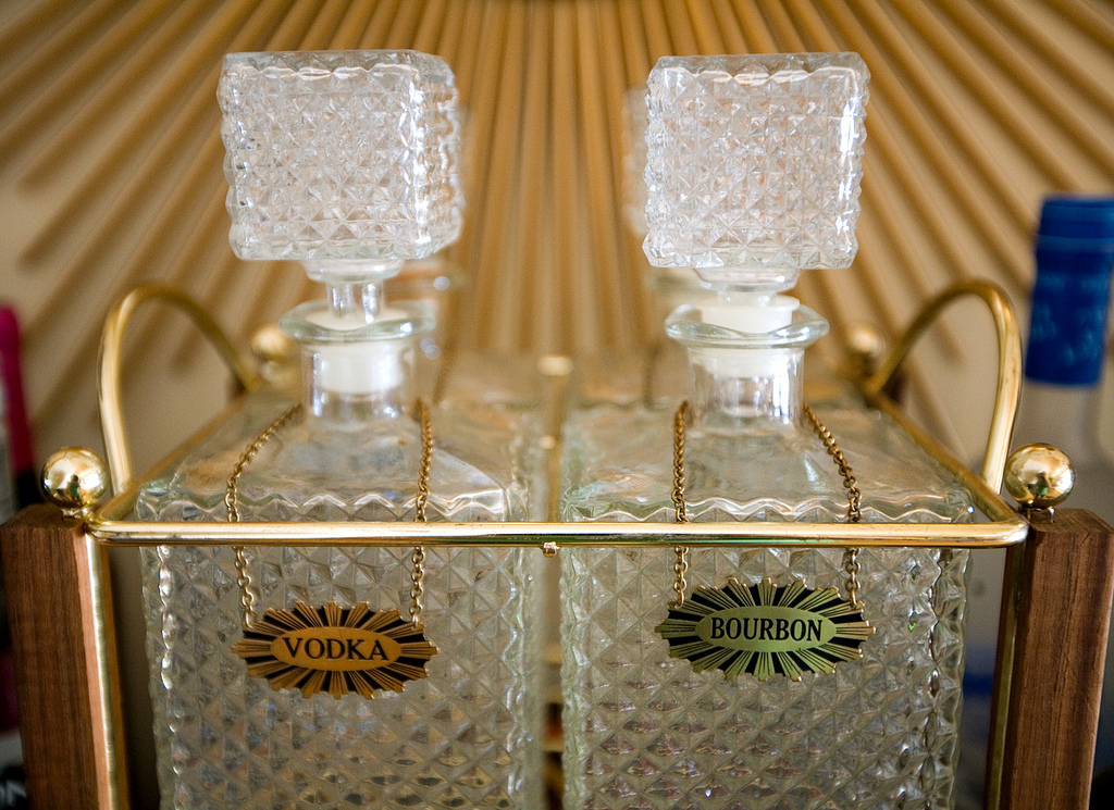
Biggest Indulgence: Kitchenware. I can't buy enough plates, platters or glasses.

Best advice: Live in a place for at least 6 months before you do anything to it.

Dream source: Besides my grandmother's furniture, my favorites soures in LA are Alie Waldman Home Couture on Beverly Boulevard and Mecox Gardens on La Cienega. They always have something I want to buy.

>> Enter Slideshow

atla-061308-LDd.jpg

Resources:

Appliances: Fridge, microwave, oven and dishwasher are all Jenn-Air.


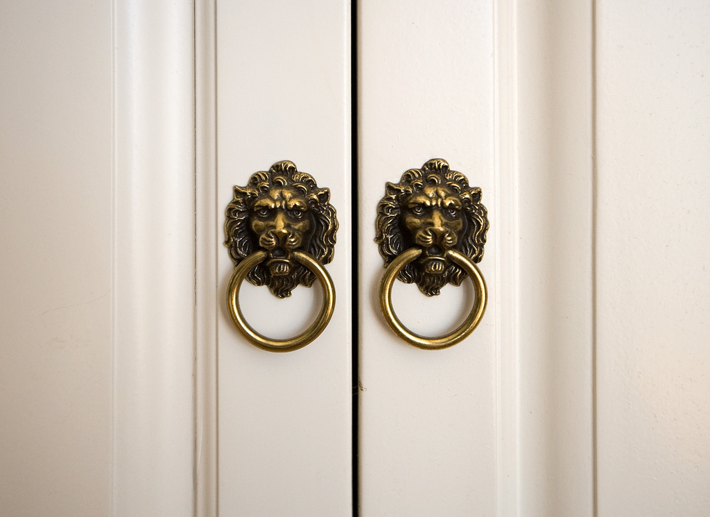
Hardware: The lion pulls are from Koontz Hardware


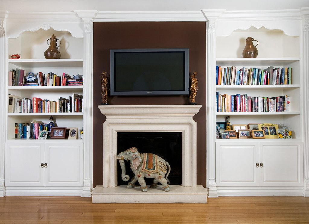
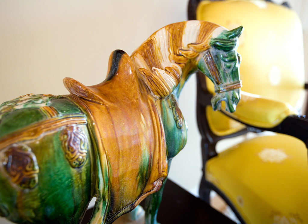
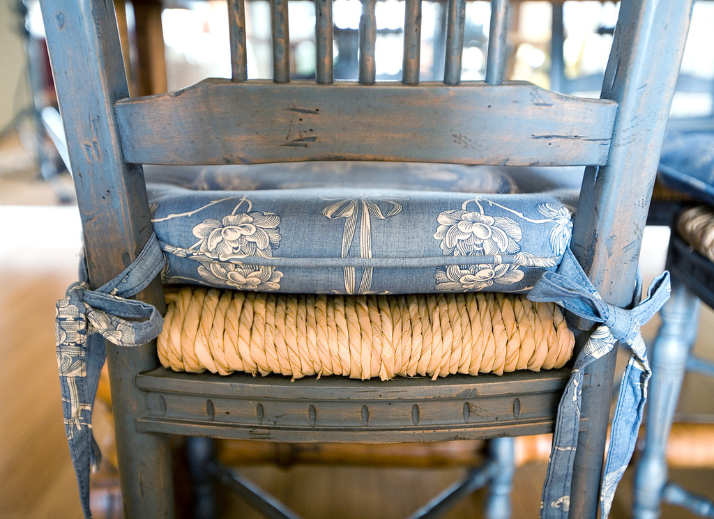
Furniture: Hand-me-downs (refinished by me), Pom Pom on Melrose, Alie Waldman Home Couture, Orange, Mecox Gardens and The Open Door.
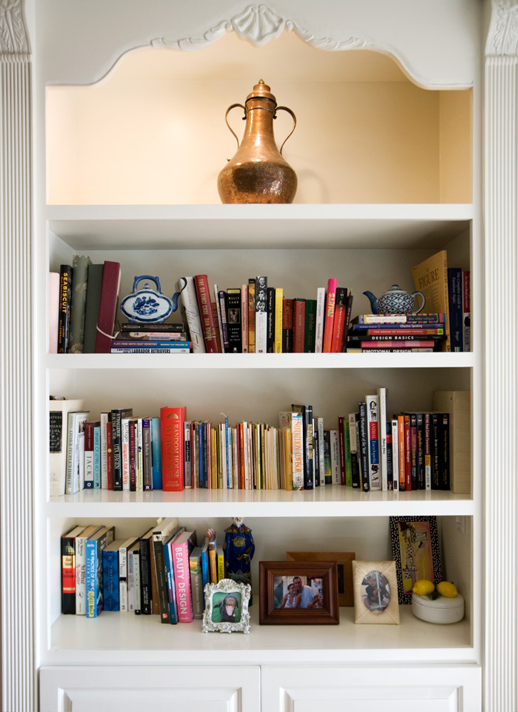
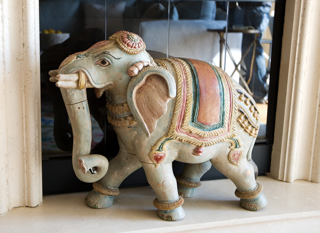

Accessories: From all over. I've spent years collecting accessories from Hawaii to Cape Cod. You name it, I'll shop there.


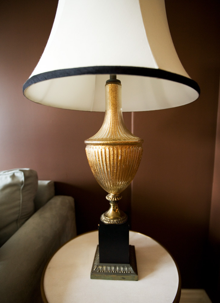
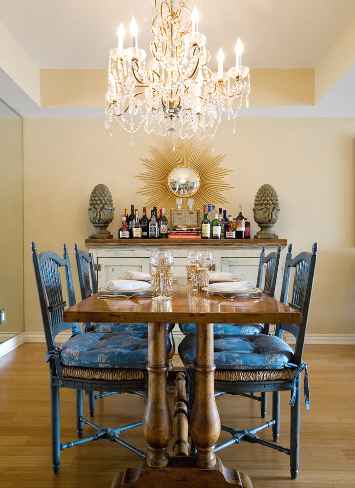
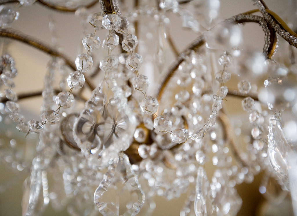
Lighting: Lamps are from The Open Door on Melrose and my dining room chandelier is from Pom Pom.


Rugs and Carpets: Designer Floor Coverings


Tiles and Stone: Crema Marfil Marble


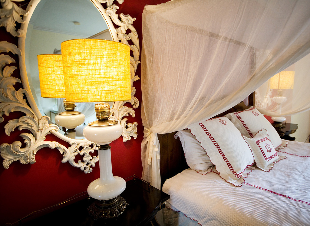
Window Treatments: Dedar fabric in master bedroom and Osbourne and Little fabric in the office.


Beds: Custom-made by Cloverdales (to the trade only).
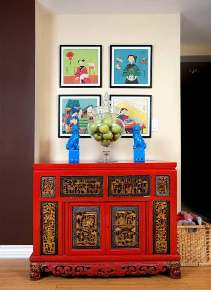

Artwork: Don't know the name of the gallery but I found every piece in a store on Dixie Boulevard in Palm Beach and had it crated here.


Paint: All Ralph Lauren paint. It would take some serious research on my part to find the exact colour names.


Flooring: Prefabricated bamboo.

(Thanks, Lindsey!)

>> Enter Slideshow

atlafavhousetours08.jpg

Tags

House Tours

Related Links

Share

Comments (39)

Wow
I want a cheetah rug now

posted by bepsf on June 13th 2008 at 10:14am
view bepsf's profile

I don't know what I love more... the chocolate paint on the walls or the chocolat lab!

posted by MelissaLeigh on June 13th 2008 at 10:18am
view MelissaLeigh's profile

Slide show doesn't work. I have yet to get a single slide show to work on AT since they changed the format. I wonder if they know that these slide shows don't work. Many of us have posted that we're having trouble with them. HELLO?!

posted by anne on June 13th 2008 at 10:19am
view anne's profile

I hate that living room rug but everything else looks awesome!

posted by Laura on June 13th 2008 at 10:20am
view Laura's profile

While I understand that the slideshows don't work and agree they should be fixed, are people incapable of just CLICKING? Really, just click the picture and it goes to the next one.

Love your chocolate lab! He looks so regal in those photos.

posted by suziegoombs on June 13th 2008 at 10:25am
view suziegoombs's profile

I'm not having trouble with the slideshows at all. Although, I have to say that this whole site is buggy as hell and very slow loading. As an interactive designer it drives me insane!

posted by theblt on June 13th 2008 at 10:38am
view theblt's profile

I love this place. It has soo much character. I think that this is a great example of making your home your own.

posted by rhianna on June 13th 2008 at 10:53am
view rhianna's profile

I totally agree with Laura, I think the living room rug throws the whole room off. It looks all sophisticated and then there's a rug that looks like it belongs in a kid's room.

I pretty much love everything else, though.

posted by -haley- on June 13th 2008 at 11:09am
view -haley-'s profile

Looks lovely, but I would have preferred more shots of overall room composition as opposed to the arts-fartsy close-ups of chandelier crystals and chinoiserie details.

Also - I always think the wall-o-booze looks tacky. Much better to put it inside the bar or in a closet.

posted by Tobermory on June 13th 2008 at 11:15am
view Tobermory's profile

Cool place. Looove that cheetah rug and those yellow chairs are to die for.

posted by danze on June 13th 2008 at 11:26am
view danze's profile

Great place, you did a really nice job. Love the chocolate lab too. Its nice to see larger breed dogs (I have a samoyed) on here as opposed to the little frou frou dogs you usually encounter on this site.

posted by suzy8track on June 13th 2008 at 11:35am
view suzy8track's profile

Gosh, that rug is awful. Everything else is lovely though. Happy dog!

posted by jennifer p. on June 13th 2008 at 12:01pm
view jennifer p.'s profile

I like the rug and dislike the couch. Why do I have such bad taste?

posted by Tailypo on June 13th 2008 at 12:57pm
view Tailypo's profile

I would normally not permit myself to say this, but since the owner is a professional designer, I will: Very derivative of Kelly Wearstler, which could be a great thing if you pulled it off, but I don't think you did. The fu dogs, the chinoiserie, the Ming horse statues, the starburst mirrors, the Oriental wallpaper are all nice elements, but the way it's put together lacks artistry. The look is not layered the way this over-the-top Hollywood Regency look is meant to be...it just looks like a bunch of freshly and expensively purchased trendy items. I'm sorry, besides the gorgeous paint color the living room is downright outdated and unattractive.

posted by aweekinparis on June 13th 2008 at 1:24pm
view aweekinparis's profile

My reaction to this is mixed, I love the bedroom rug, the wallpaper (though agreed, more room shots would have helped) and the yellow chairs, but like the above commenter, it feels a little too contrived for me. Then there are some strange things and I can't understand why they've been chosen, like the much mentioned living room rug, and that picture over the sofa. I don't get that. Also, the curtained bed and bedding looks stuffy and formal in contrast to the carpet and other furnishings. Just my opinion, overall, I think I really like it but I'm not sure.

posted by sherry2 on June 13th 2008 at 2:36pm
view sherry2's profile

So very many things.

posted by Thad on June 13th 2008 at 5:14pm
view Thad's profile

Cute!

posted by quiltmaster on June 13th 2008 at 5:19pm
view quiltmaster's profile

I think the bedroom, dining room and the two yellow chairs are nice.

I don't care for the living room.

Is there a couch on the porch?

posted by Slim on June 13th 2008 at 5:40pm
view Slim's profile

This is a really personal living space, but its as though there are several styles fighting with each other - and so much stuff.

There are things that I really like: the yellow chairs, the blue dogs, the red armoire - striking pieces that stand on their own - but there's so much going on. Like Tallypo, I really like the living room rug. I just think its in the wrong room with the wrong furniture. It would look more at home in an airy, light-filled simple room, maybe with that sofa. The wall colour is great, in itself, but it just fights with the rug and sofa, as does the other rather stuffy furniture.

There's also a lot that says tacky to me - the leopard rug, the living room coffee table, and that picture above the sofa - seems like the sort of thing that goes with dusty rose fake flower arrangements.

The dog, however, is beyond perfect!

posted by catspajamas on June 13th 2008 at 5:46pm
view catspajamas's profile

I love the round picture above the sofa beyond all reason.

posted by Trilobyte on June 13th 2008 at 6:24pm
view Trilobyte's profile

Some I like, some I don't. The dining room looks great. I also like the yellow chairs and and the wallpaper. It's nice to see classic accessories. But put some booze in those decanters!

posted by Valerie on June 13th 2008 at 6:25pm
view Valerie's profile

Agree completely with the following:

living room rug is awful
Kelly Wearstler she is not
overall, it just doesn't work
BUT (major points) the dog is adorable

AND would like to add...(please, for the love of God) NO FLAT SCREEN TVs OVER A MANTLE. EVER!

posted by madsarah on June 13th 2008 at 6:50pm
view madsarah's profile

Like others, I had a mixed response. I also didn't find the living room rug appealing and the Chinese elements felt a bit "cheesy" (for lack of a more gracious word). I love the round picture over the sofa, the elephant in front of the fireplaces, the coffee table and the living room chairs. However, I also agree about not putting the T.V. over the mantle. This always feels like someone chose form over function. Great design should not shoehorn function into form.

On the whole though, the whole place has personality and charm and you have to give the designer credit for being bold and making interesting choices.

posted by Orchid64 on June 13th 2008 at 7:19pm
view Orchid64's profile

Nothing really works for me in this home. I love mixing and matching different styles, but I think this still lacks cohesiveness and refinement. There are interesting pieces and I commend her for sharing it with us. It's always hard critiquing something so personal. I think I had more of a problem with the narcissistic nature of the name. If I were to label it "perfected" it better be mind-blowingly...well...perfect.

posted by InTheDetails on June 13th 2008 at 7:35pm
view InTheDetails's profile

Laura this right, the rug does throw off the room, but at the same time, it's nice contrast that gives it a homey feeling, rather than just a store display. I really can't wait until I have a place of my own to decorate.


For the most beautiful Blue Sapphires, Pink Sapphires, White Sapphires, Sapphire Rings (or any other kind of Sapphire Jewelry), check out http://www.TheNaturalSapphireCompany.com

posted by mari. on June 14th 2008 at 1:04am
view mari.'s profile

A bit too 'designed' for me I'm not old enough for that style yet.

posted by hrhprincessfiona on June 14th 2008 at 4:34am
view hrhprincessfiona's profile

This seems like an old lady house. Not enough light and air -- weird mish-mash of styles and objects. Some of the accessories seem stagey and oddly impersonal. but i LOVE the linens in the bedroom. No doubt, design is hard!

posted by pugluv on June 14th 2008 at 7:44am
view pugluv's profile

That looks like my grandma's living room circa 1988.

But I love, love, love the Japanese prints and the dramatic bed canopy.

posted by ehat on June 14th 2008 at 9:08am
view ehat's profile

a different couch would improve the living room immeasurably. even though it's a sectional, it looks too small and everything else feels stuffed around it in the corner. two regular sized couches facing each other centered around the rug would be a better choice.

the accessories don't bother me. the rug is cool and different.

i think all of the other rooms are interesting and bold.

posted by jerseyfresh on June 14th 2008 at 9:18am
view jerseyfresh's profile

Other than a handful of things (the couch, the chocolate walls, and the GORGEOUS dog), I really am not a fan, either. We've seen so many more amazing places here, and by non-pros to boot.

I also liked the place less after I read the survey ... being able to hang a picture yourself is hardly DIY prowess, especially by the standards of some of the marvels of self ingenuity we've seen here already.

posted by ridge_van_winkle on June 14th 2008 at 10:27am
view ridge_van_winkle's profile

(Incidentally ... if the AT techies are reading this ... if I'm always signed in on the same browser, why do I get two different accounts every time I come back here??? Sorry to add that here, but I just noticed it again above and AT never responds to emails)

posted by ridge_van_winkle on June 14th 2008 at 10:29am
view ridge_van_winkle's profile

Overall, very interesting and personally designed, but I hate to be critical but it's not all that...uh...cute.

Perhaps if there were less detail shots we would have a better sense of the space and how you utilized it. But the amount of detail shots were a bit silly. Most of us are interested in how you as a designer were able to take a blank space and lay it out in a way that works for you, not pictures of lamps, dragons, elephants, boxes and dogs. I mean 2 dog pictures?

But like I said the impression could have been better if we saw wider shots, and not vignettes.

posted by AMBERYVETTE on June 14th 2008 at 9:22pm
view AMBERYVETTE's profile

I had to look up Kelly Wearstler to see what aweekinparis meant:
http://www.kellywearstler.com/

And, yes, I can see the Kelly Wearstler inspiration in the images, like the Sunset Plaza Bungalow. The use of brights with neutrals.

I do like red and animal print, as shown in Lindsey's bedroom. Much like the British Colonial craze awhile back.

There is something about both this place and the Wearstler places that bothered me, and it took me awhile to figure it out...

They both remind me of a Horchow catalog. hahaha

http://www.horchow.com

Groups of stuff and then close-ups of some of the stuff.

That MONKEY in the Wearstler black bathroom of Sunset Plaza Bungalow is CREEPY. And there are HEADS lying on the counter in the yellow bathroom. And what are those THINGS hanging from the roof in the dining area? And why didn't they put them everywhere, because they missed a spot? And why do the walls look all psychedelic in that same room? Too many giant white ceramic things all over the place.

I'm not so sure I would be using the Wearstler person as an inspiration.

But the colors are nice, the blue sofa with the brown wall in this post or the blue sofa with the brown floor and yellow chairs at Wearstler's. The yellow of the tulips and seats against the brown side of the stairs.

Yet, who would sit at those seats, there is no space to DO anything at that little table. There's a giant white ceramic vase with the tulips. Giant white ceramic birds. And a bunch of white books (ceramic?). So that whole area is just "decoration".

What good is the coffee table when it has...wait for it...giant white ceramic objects blocking access? Can't put coffee on the table. And there's a man on a horse on the table too.

I'm not seeing anyplace for my feet. :::giggles:::

But seriously, there's a whole lot of "decoration" going on, and not a whole lot of usefulness. We all have our priorities, and I really love seeing what is done during the Small Cool contest. That's when there is a whole lot of usefulness, and decoration ONLY if it doesn't interfere with the usefulness.

posted by #9 on June 14th 2008 at 11:23pm
view #9's profile

Well this is definitely not my style ;-) And why do we see so many vignettes? I´d rather see all these things in a bigger context actually.

posted by Lillian on June 15th 2008 at 10:50am
view Lillian's profile

If you read her website, which is a little OTT, she worked with Felicia Bushman, who got booted from Bravo's Top Design early on and interned for Kelly! Think she might be on Top Design at some point? Hmmm.

I think the space looks okay and if she was an amateur, I'd think it was amazing. Since she's allegedly a pro, it's just okay. On the other hand, it's probably all her stuff and not out on memo for the shoot.

posted by Palmetto on June 16th 2008 at 9:07am
view Palmetto's profile

I read the website too.. Honestly, I was a little nauseated by the self praise. A list designers? Really?

posted by Laura on June 16th 2008 at 10:13am
view Laura's profile

I really liked this place. I LOVE the red asian buffet/chest. And I am always impressed by a lovely shoe collection.

I could see what the people who were talking about it not "working" mean though. It's as if someone was just taking pics of their friend's house. And usually when you see interiors like this, they are perfectly lit and the stylist has perfected every tiny detail of the mise en scène.

As is, this is just someone's house. A lovely house. I really like it! But I think a more professional shelter-mag-type photo shoot would garner it much more praise.

Hey, even super models get airbrushed :-)

posted by typicalguineapig on June 18th 2008 at 9:26pm
view typicalguineapig's profile

Eeeek! Did not like this one at all. Love the doggie though. That's about it.

posted by Bohemian Vintage on June 21st 2008 at 4:00am
view Bohemian Vintage's profile

If the intent was galmour and opulence, then the result is meek. I'm confused by the country elements.

posted by sunan on January 28th 2009 at 12:17pm
view sunan's profile

Feeds

RSS icon Los Angeles

+ City Feeds