apartment therapy changing the world, one room at a time


House Tour: Nina's Elegant Modern Pre-War
New York

ninalg1.JPG

Name: Nina
Location: West Village
Size: 450 square feet sublet
Years lived in: 1.5 years

>> Enter Nina's Gallery!

tour2009.jpg Nina's last apartment was very frilly and pink. This apartment is much more on the opposite end of the stereotypically gendered design spectrum. And Nina loves it that way and feels at home. In addition to being an interior designer, Nina writes a design blog and is about to launch a small design store in NoLita! None of this, however, has stopped Nina from turning her studio sublet into an oasis of comfort and beauty...


ninahousetouram1.JPG ninahousetoursm4.JPG ninahousetoursm3.JPG ninahousetoursm2.JPG


ninahousetourlg2.JPG

>> Enter Nina's Gallery!

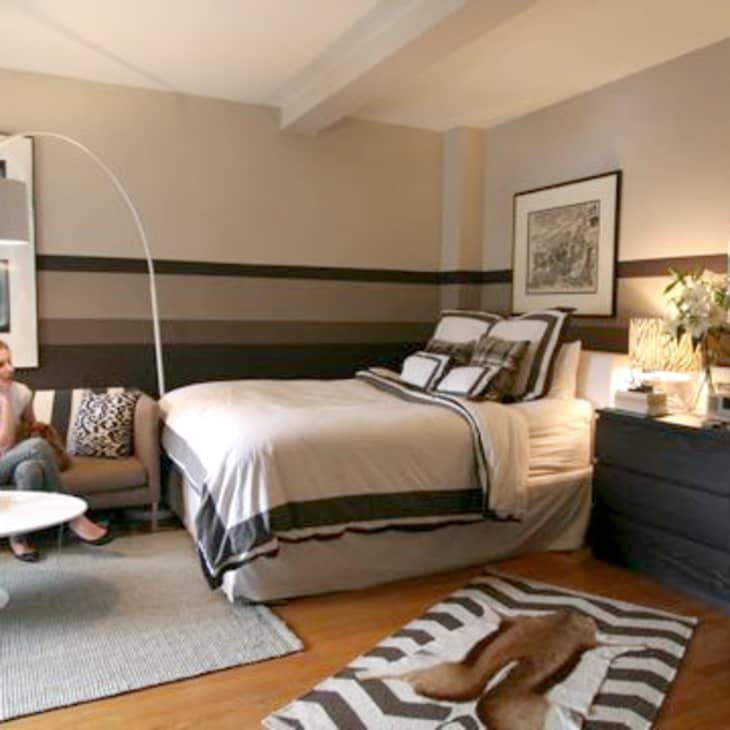
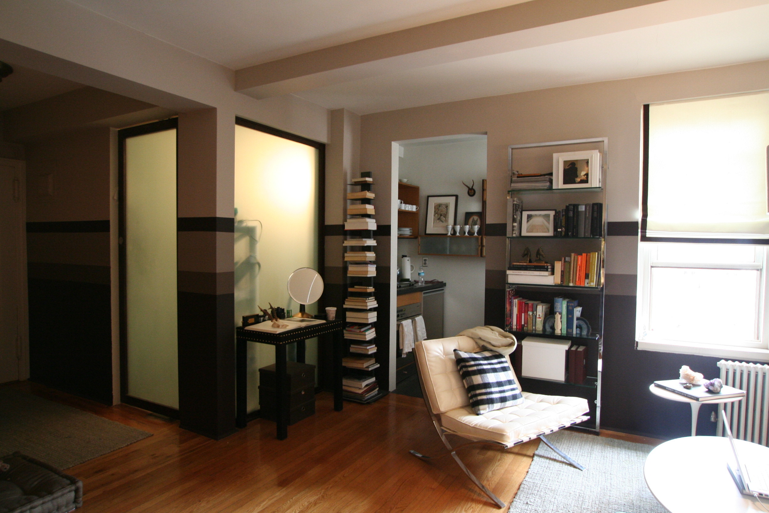
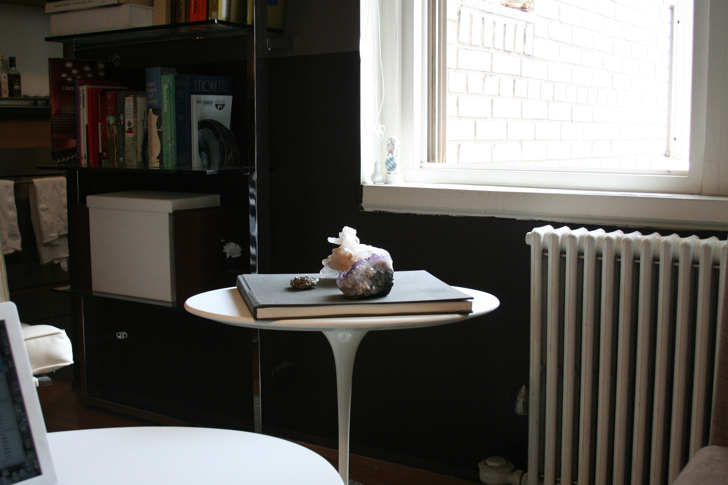
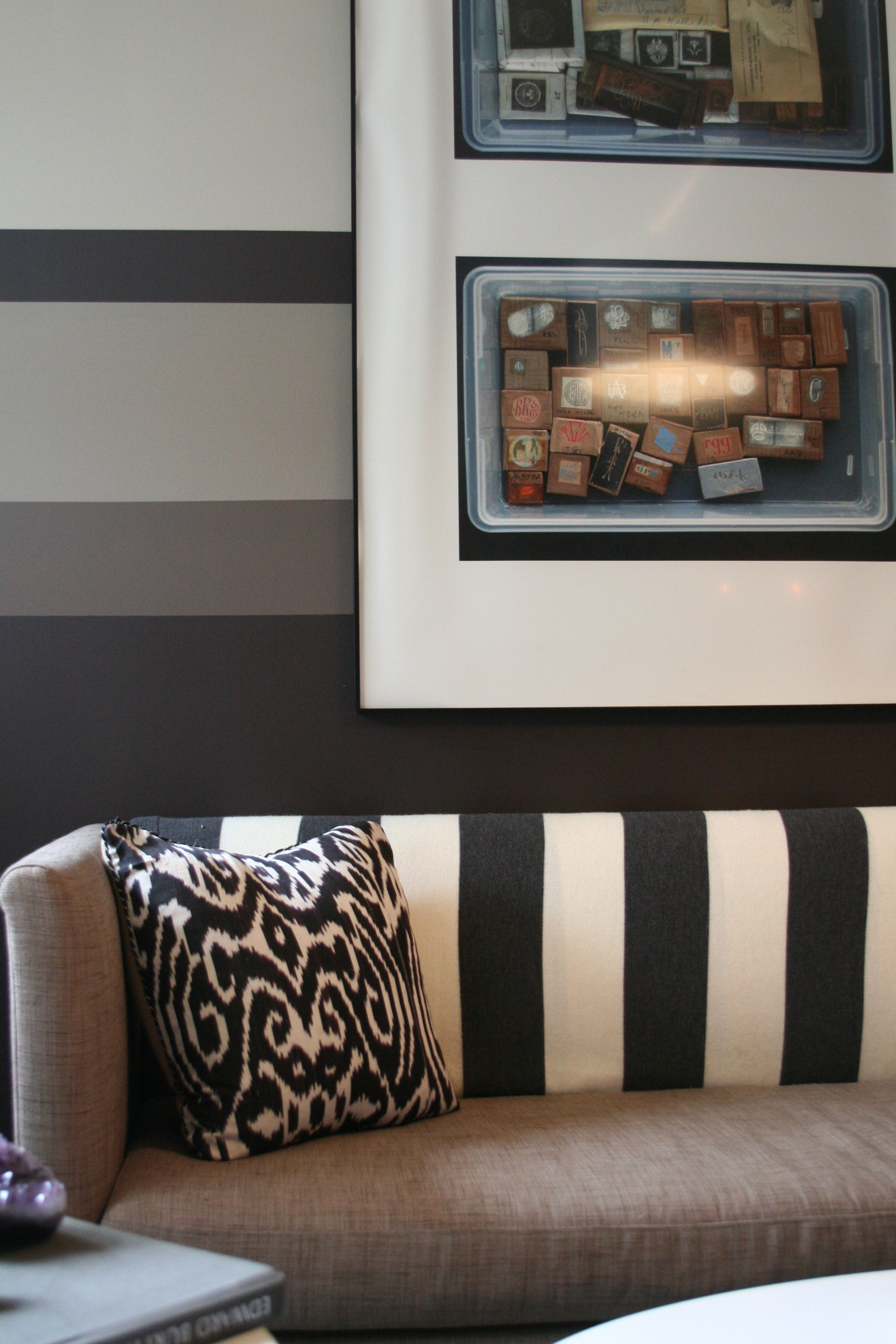
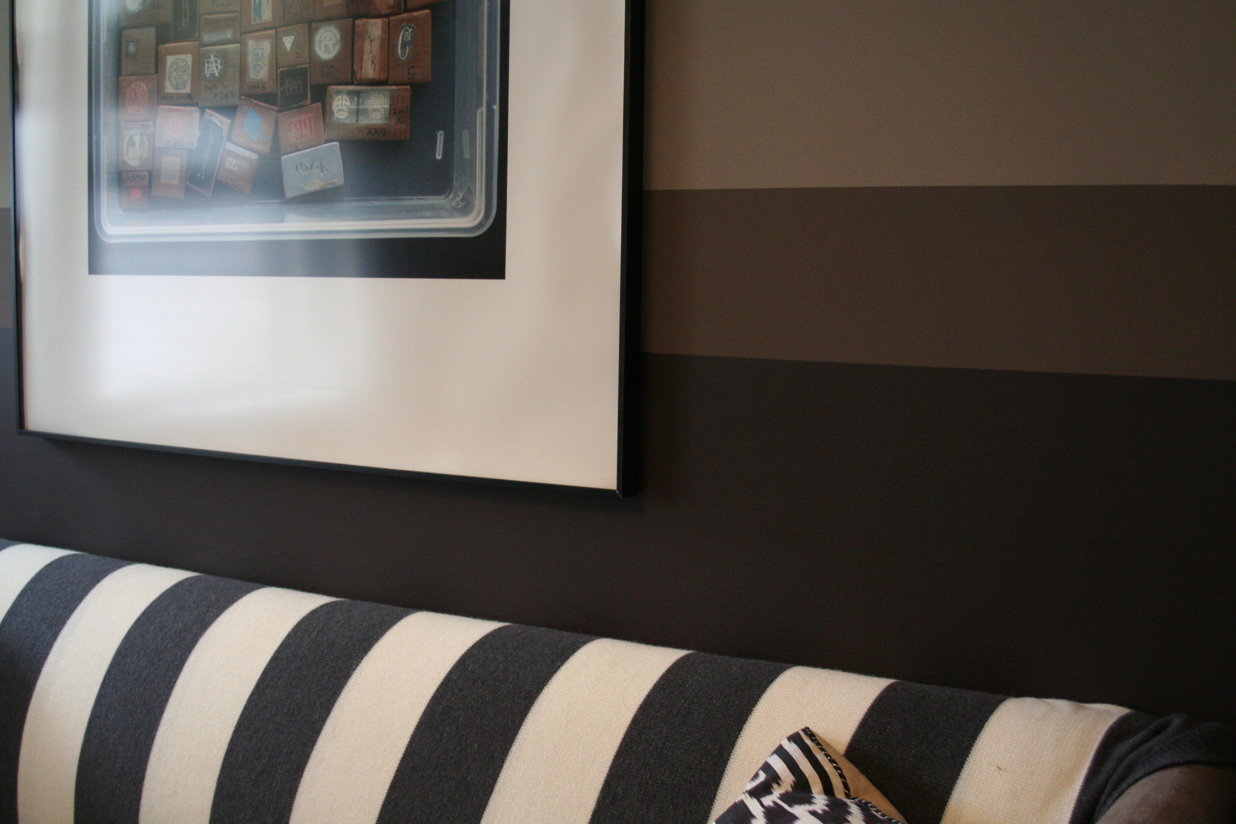
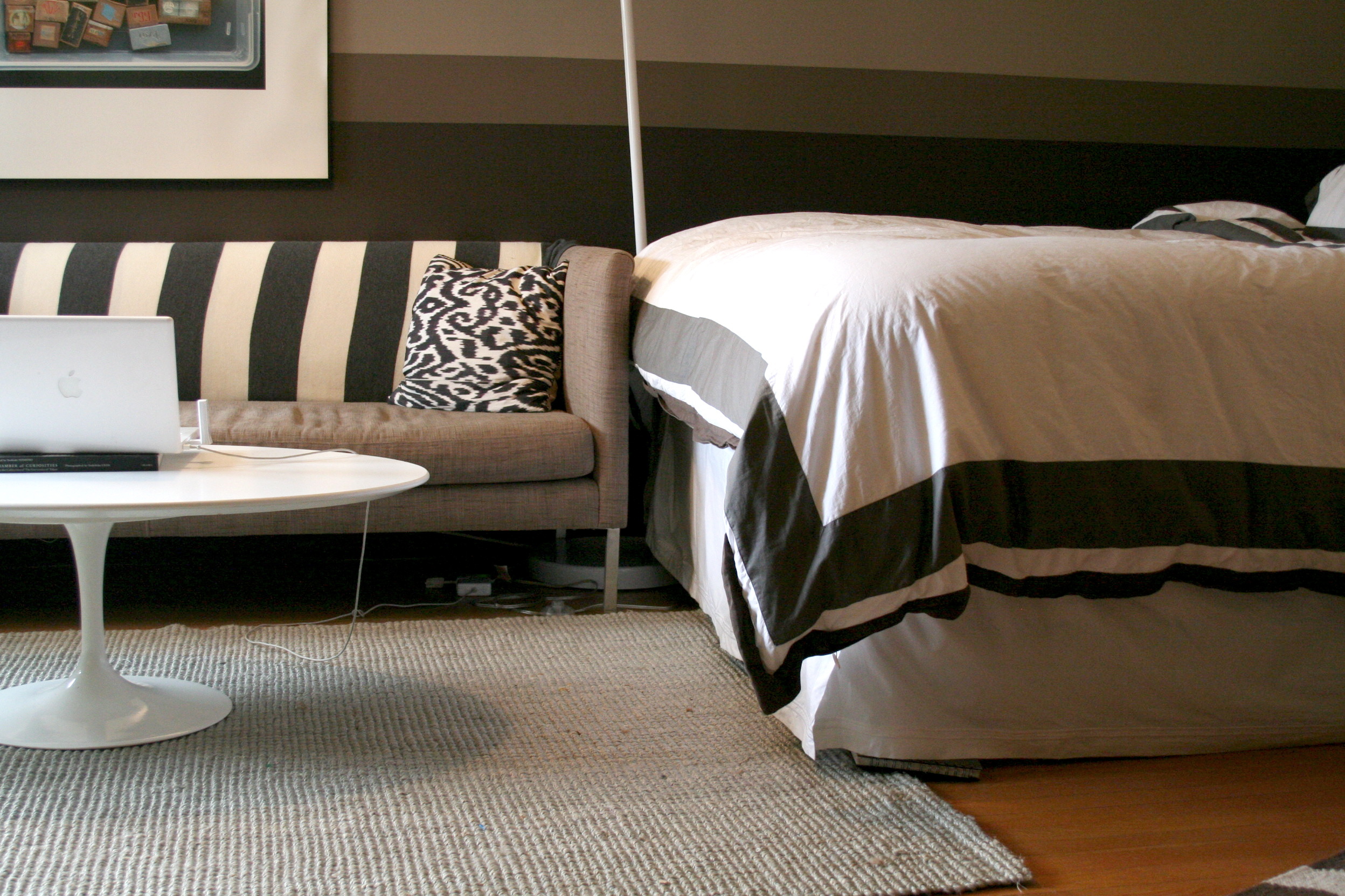
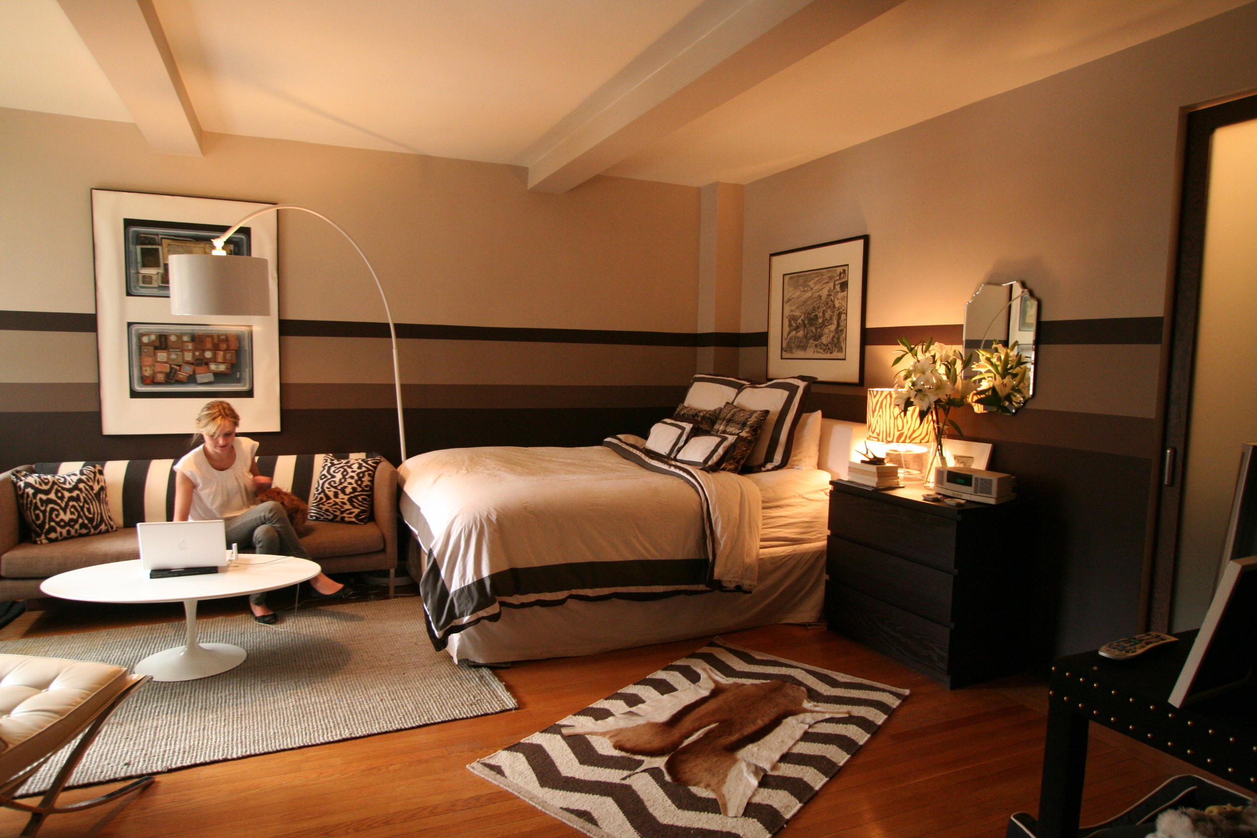
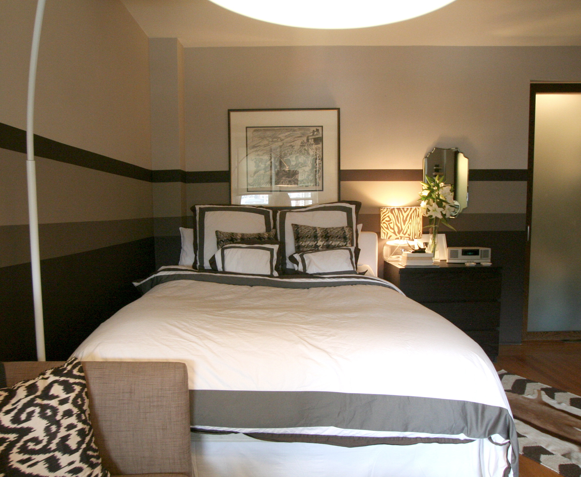
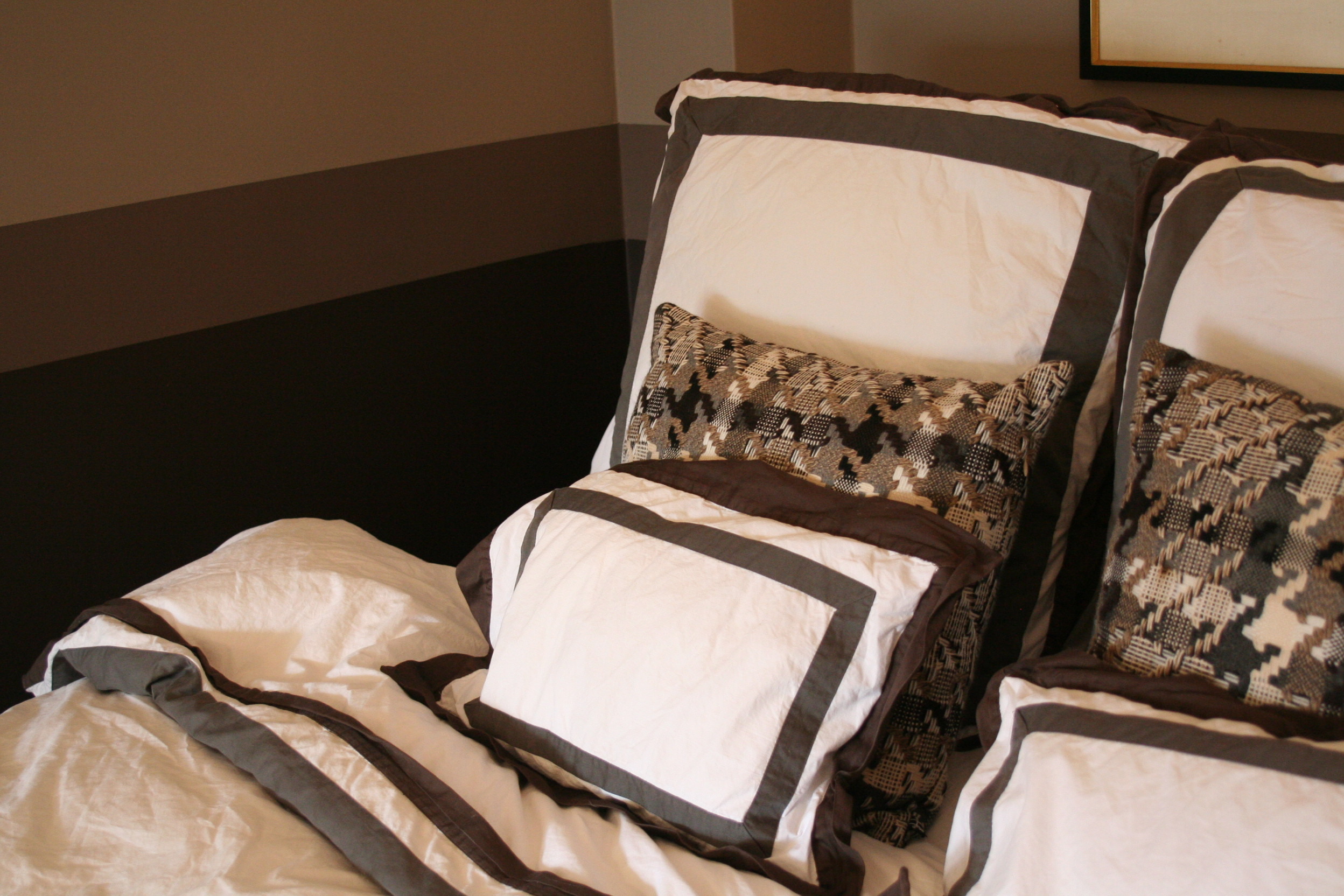
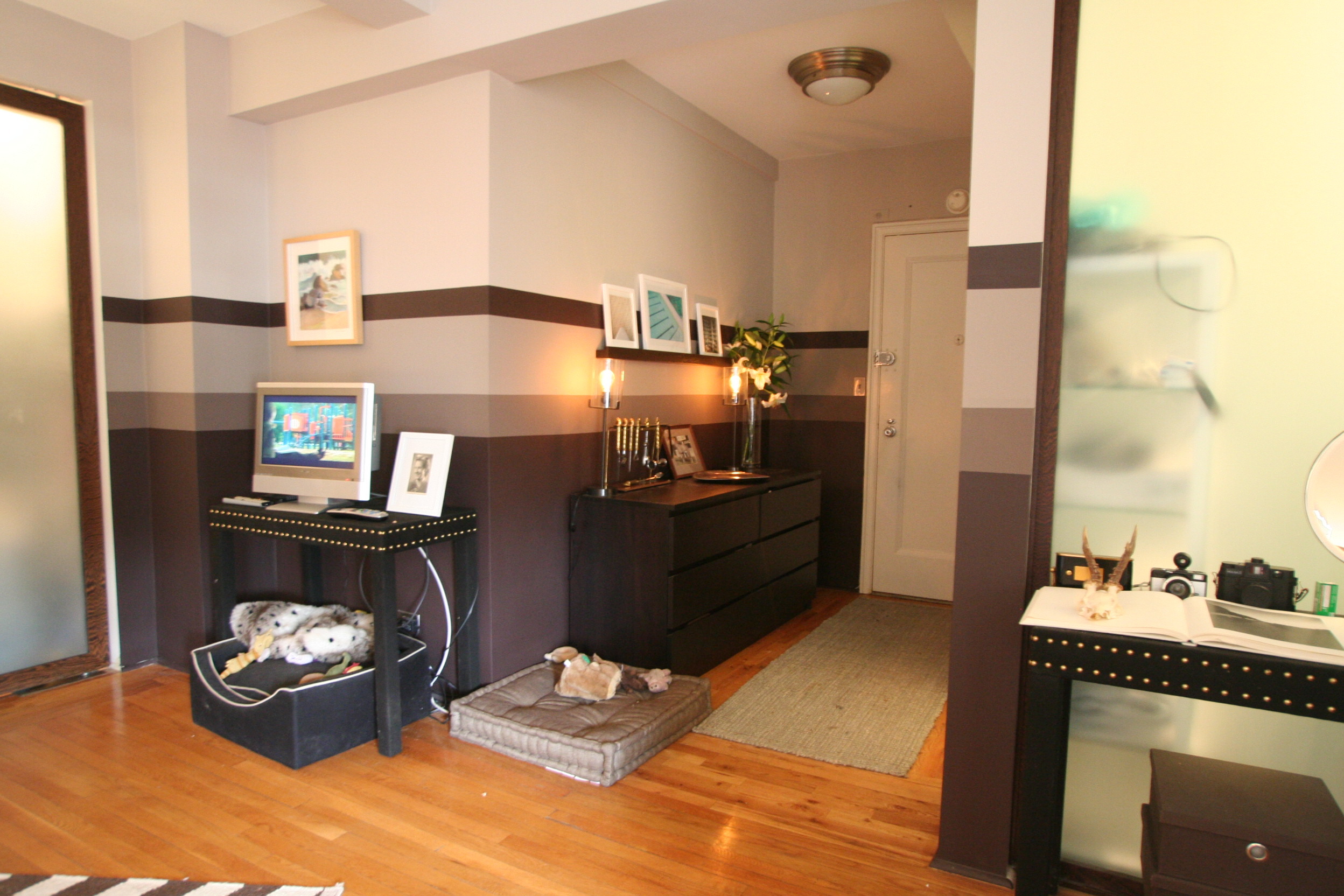
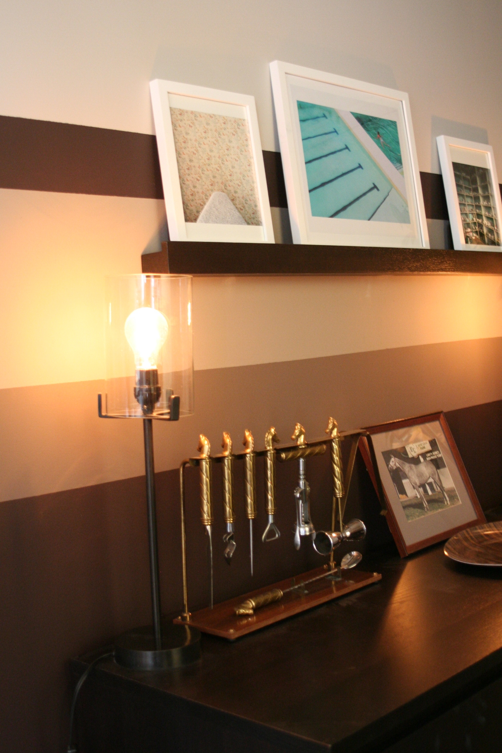
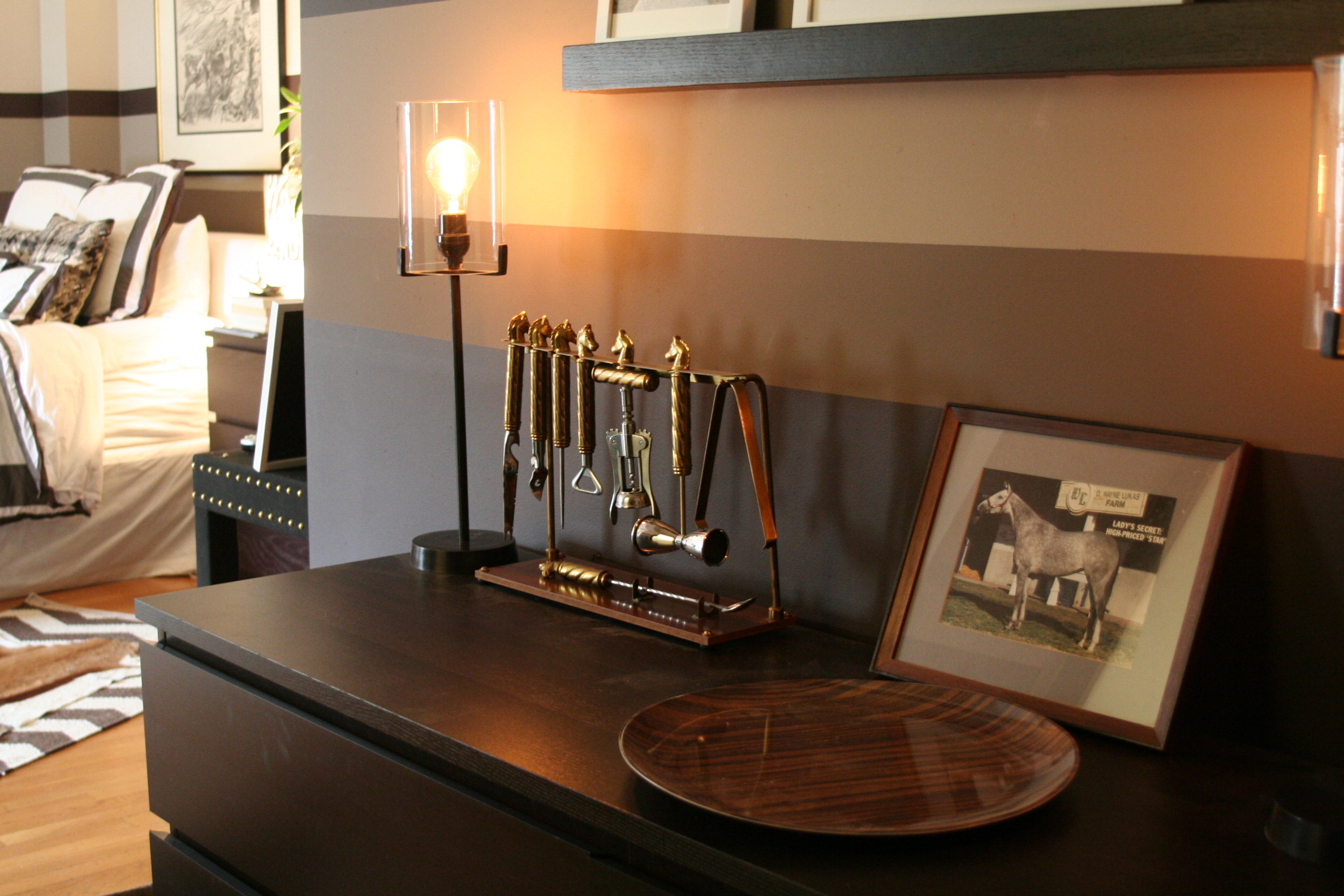
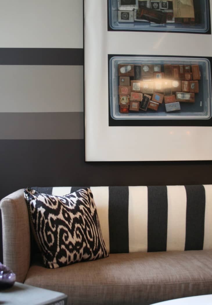
The owner/architect of the apartment took Nina's pre-war unit and stripped it of much of its pre-war features before Nina moved in. To replicate some of the impact lost in the renovation, Nina had stripes painted in place of where there once would have been a 'faux chair rail.' The effect is dramatic. Nina says the pattern is "decorative like wallpaper, but easier to remove." She knew when she started designing the room, that one hue would not be enough. The colors she used were inspired entirely by her bedding and are all the flattest paint that Farrow and Ball sells. Nina's bed is one of few pieces that survived her transition between styles.

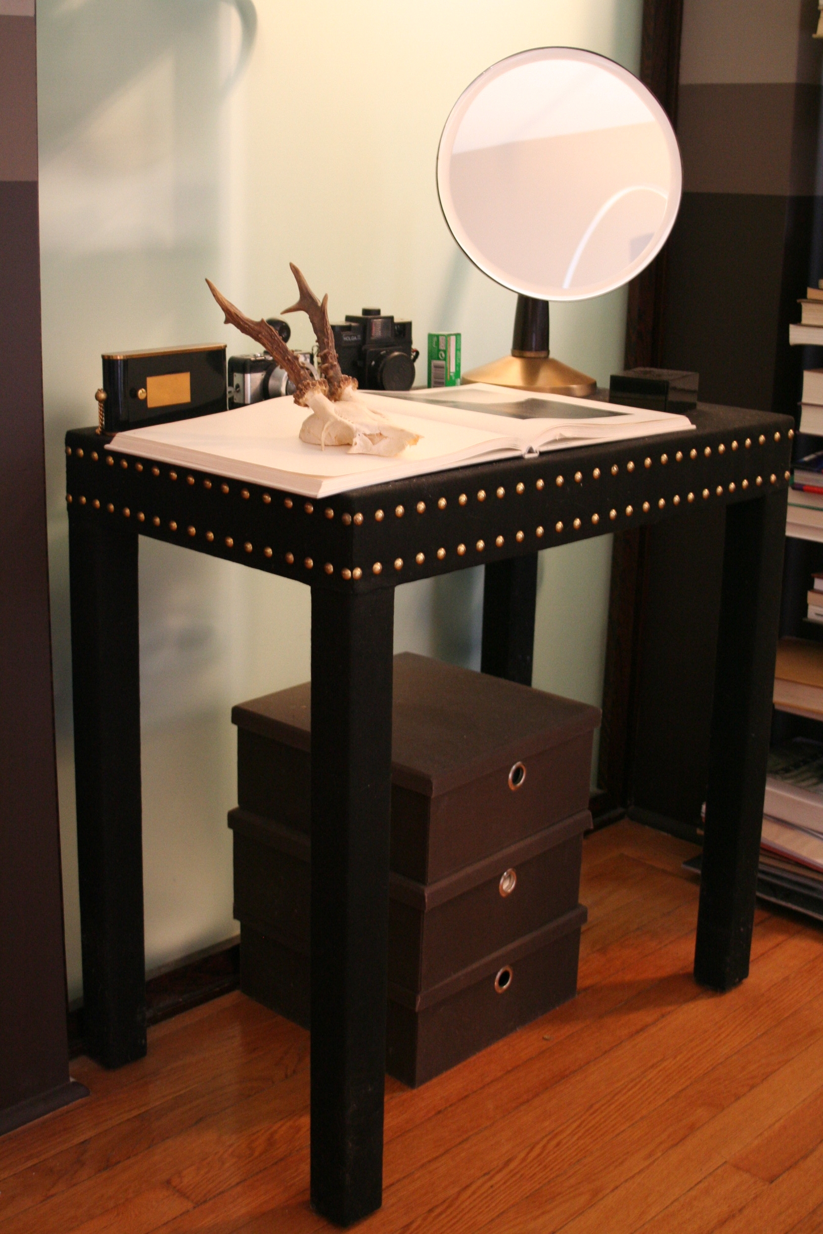
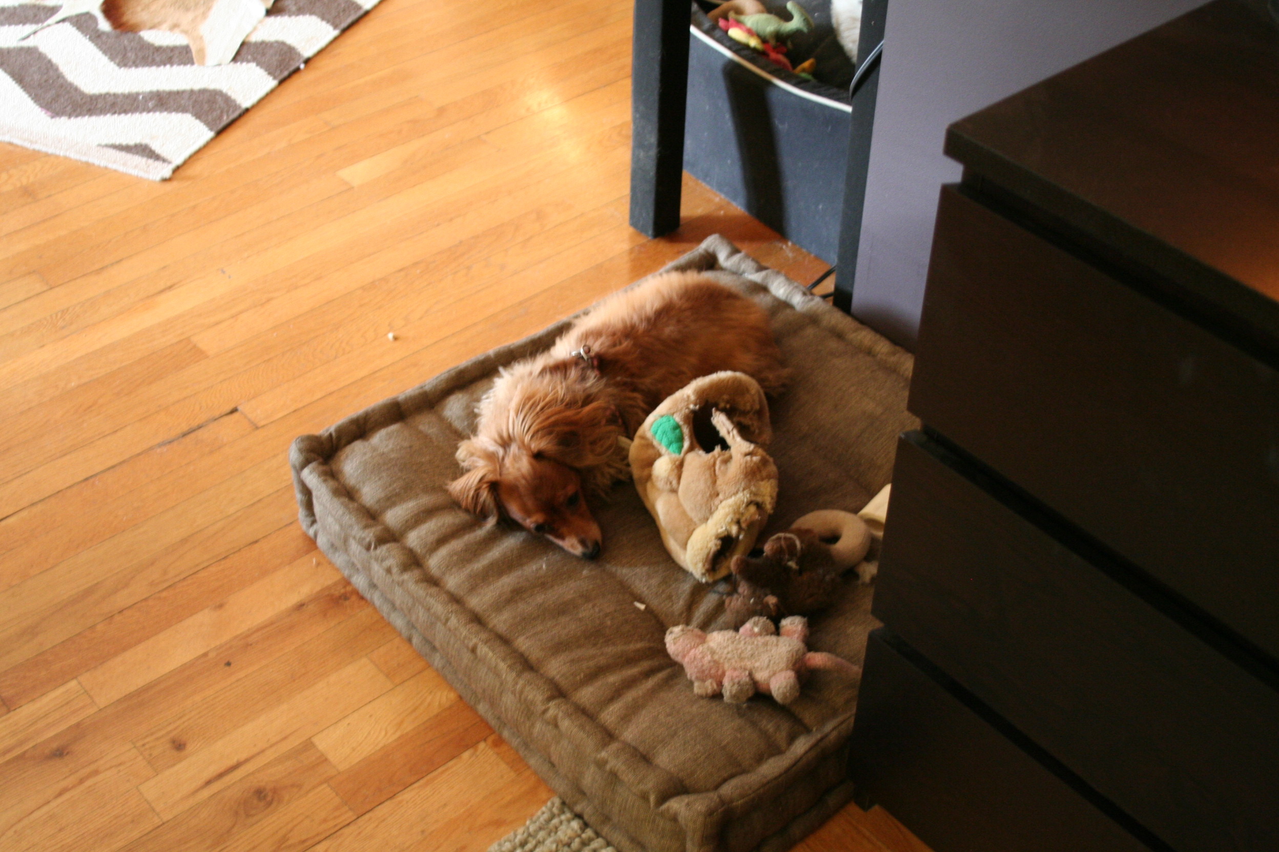
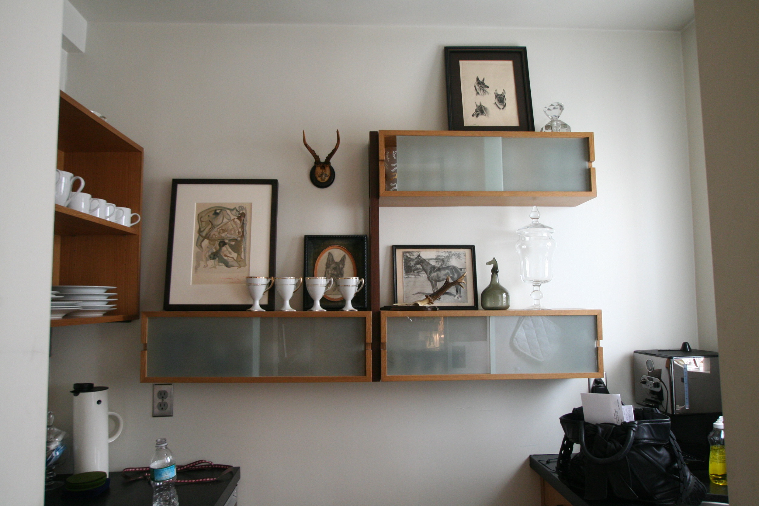
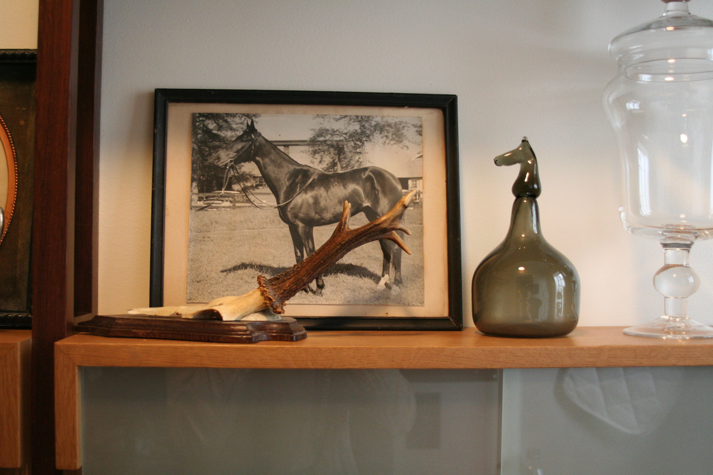
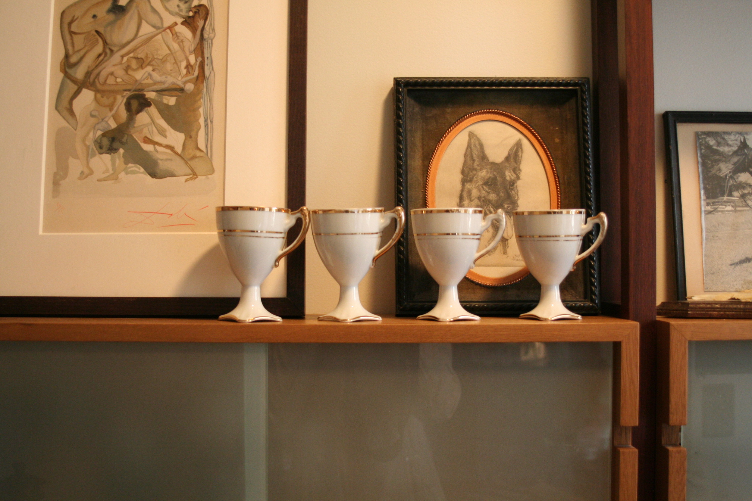
Nina has a lot of things that she loves and is not afraid to combine different patterns and genres, but, as a designer is very conscious of what fits in her particular vision and what does not. "I love vintage drawings/prints of dogs – specifically German Shephards!" She also loves horses. While she is knowledgable about, and reveres, high-end furniture, Nina is not afraid to admit that she is a fan of CB2 for their quality and adventurousness.

On a limited budget, Nina's approach has been to take relatively inexpensive items out of their banal origins and put them in a context in which they are dressed up and make a better impression. The proper mix camouflages cheaper pieces. And yet, Nina still plans to upgrade some pieces when she gets the chance!

AT Survey
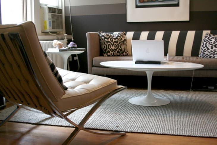
Style: I would say “masculine modern” with the use of all browns, dark grays, almost no pattern and absolutely zero frills.
Inspiration: A modern “gentleman’s study” – a place to work and to have a simple cocktail.
Favorite Element:: The horizontal stripes – this was an absolute experiment, but I feel surprisingly calmed by them. The former white box felt cold and without an identity.
Biggest Challenge: Storage space for my wardrobe... It forced me to give away pieces I wasn’t wearing and to keep the pieces I love all in the walk-in.
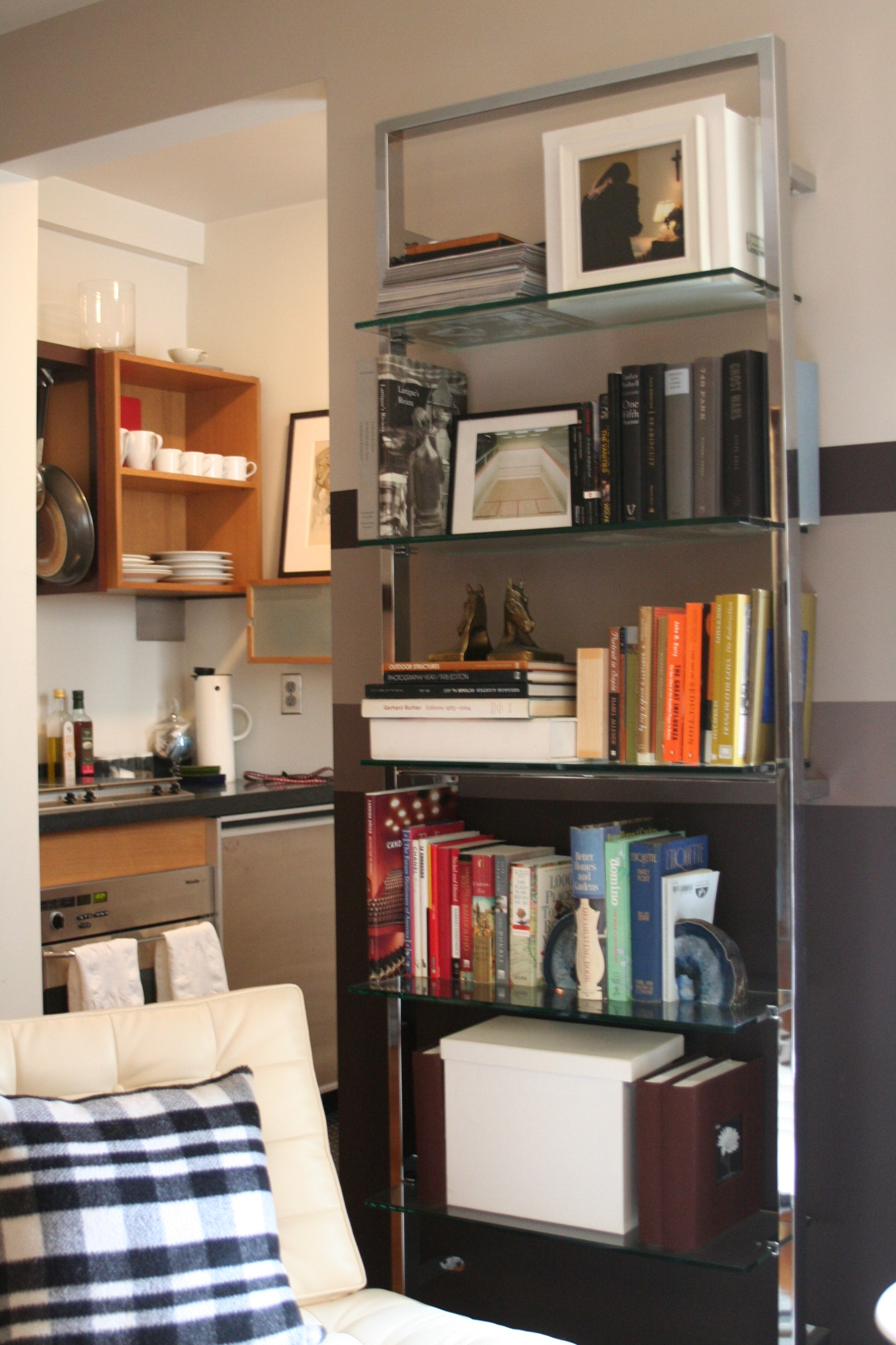
What Friends Say: Nothing, really! I think it’s pretty straight forward, but every once and a while I hear, “what a great idea, sort your books by color!” It’s a simple and fast fix to any library.
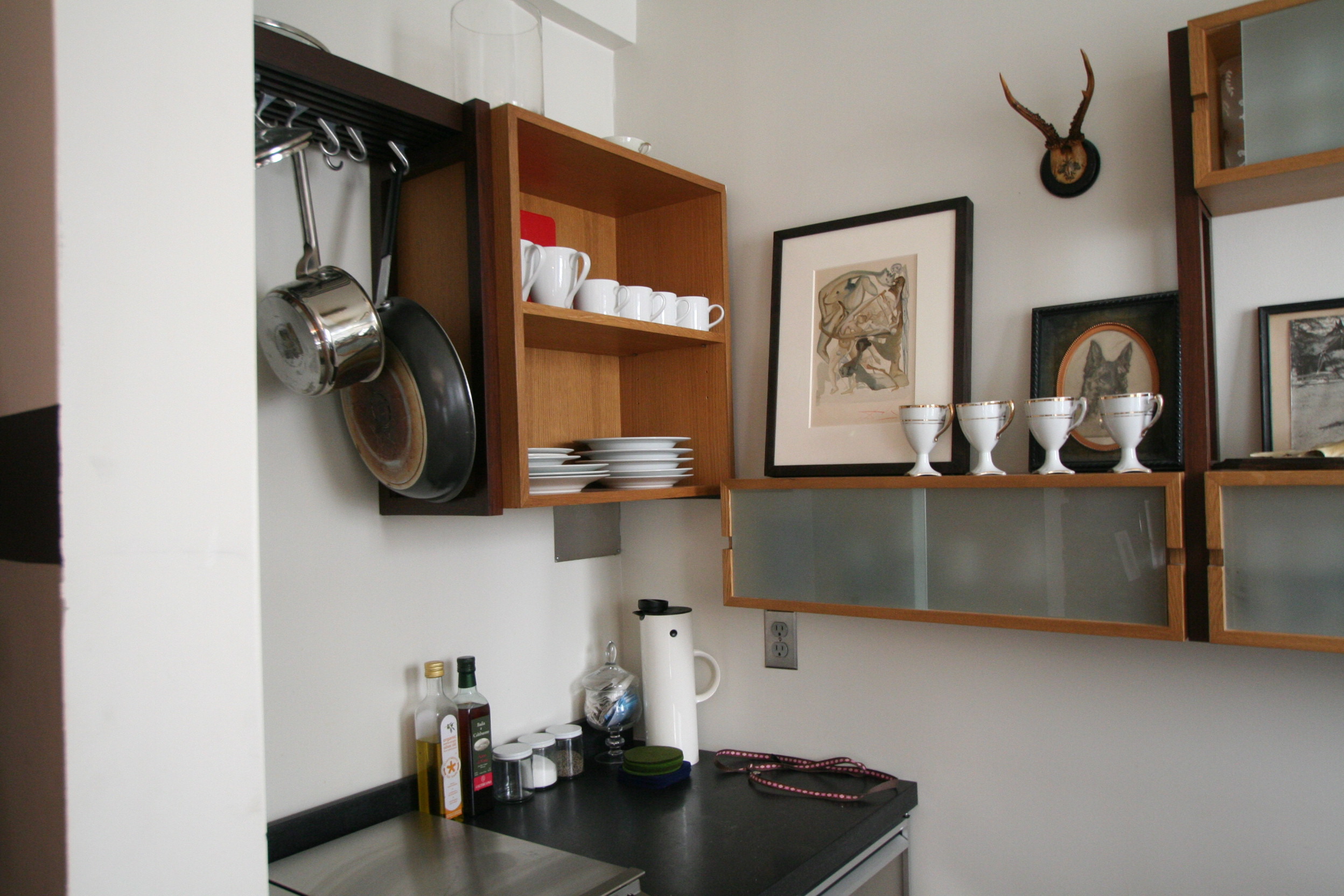
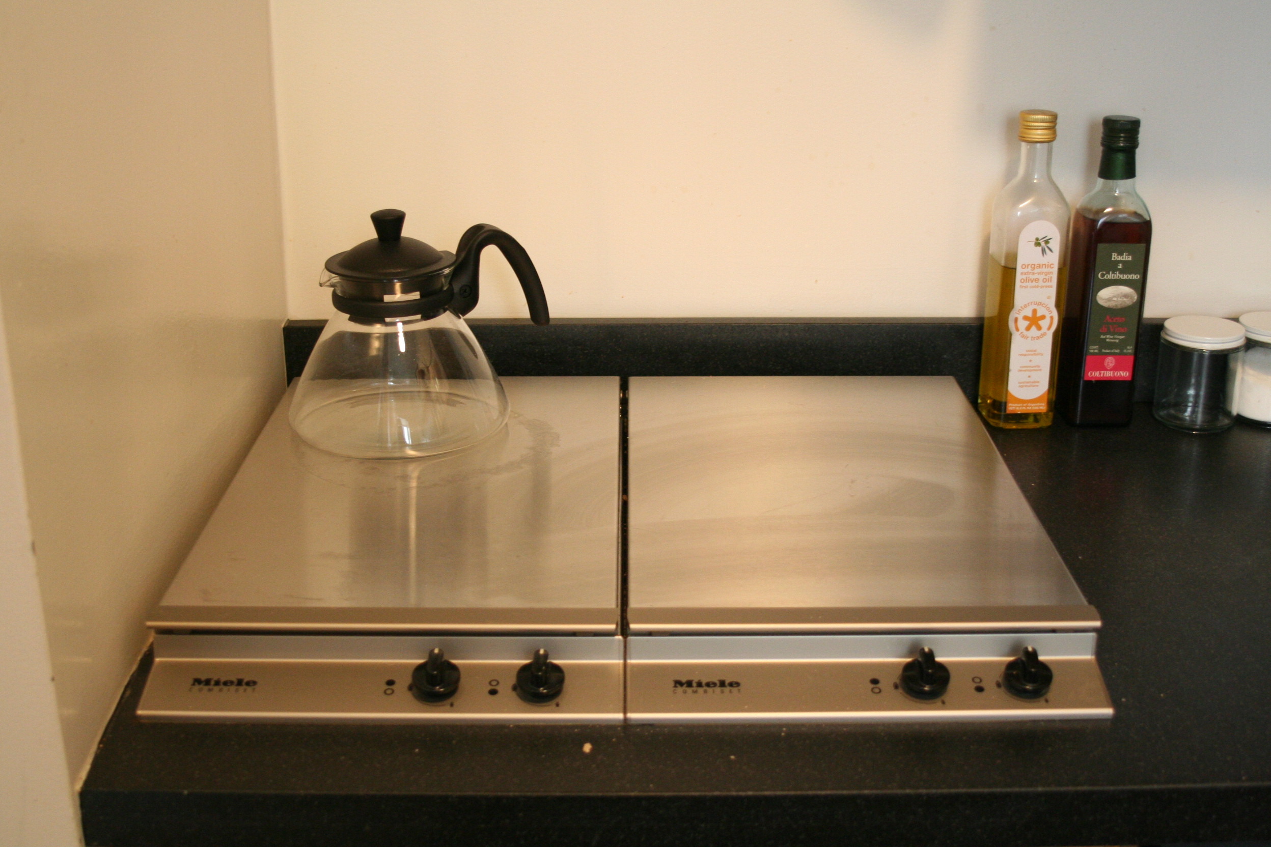
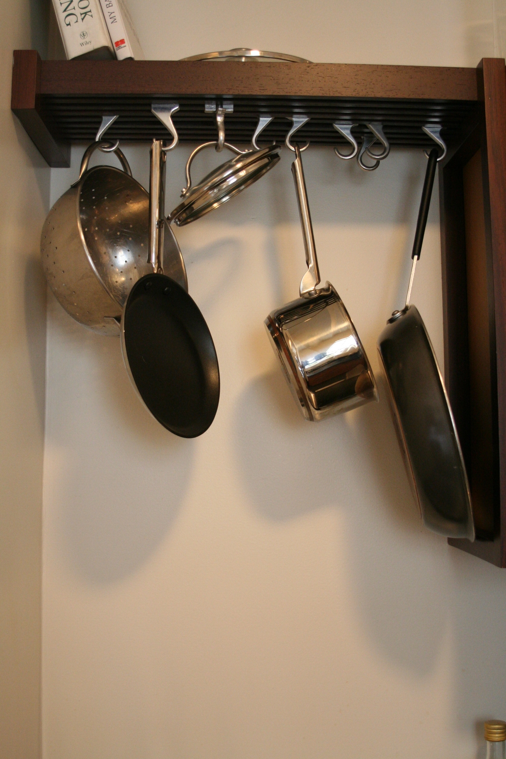
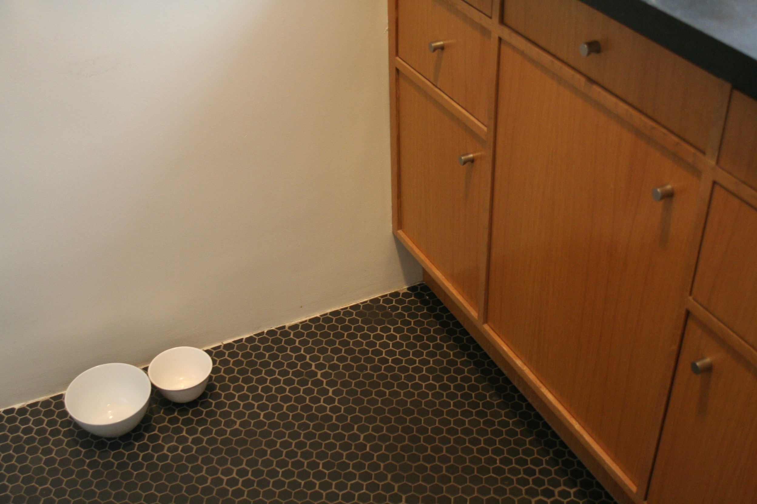
Biggest Embarrassment: Maybe that my architecturally clean and minimalist kitchen makes it very apparent that I don’t cook, or even try!
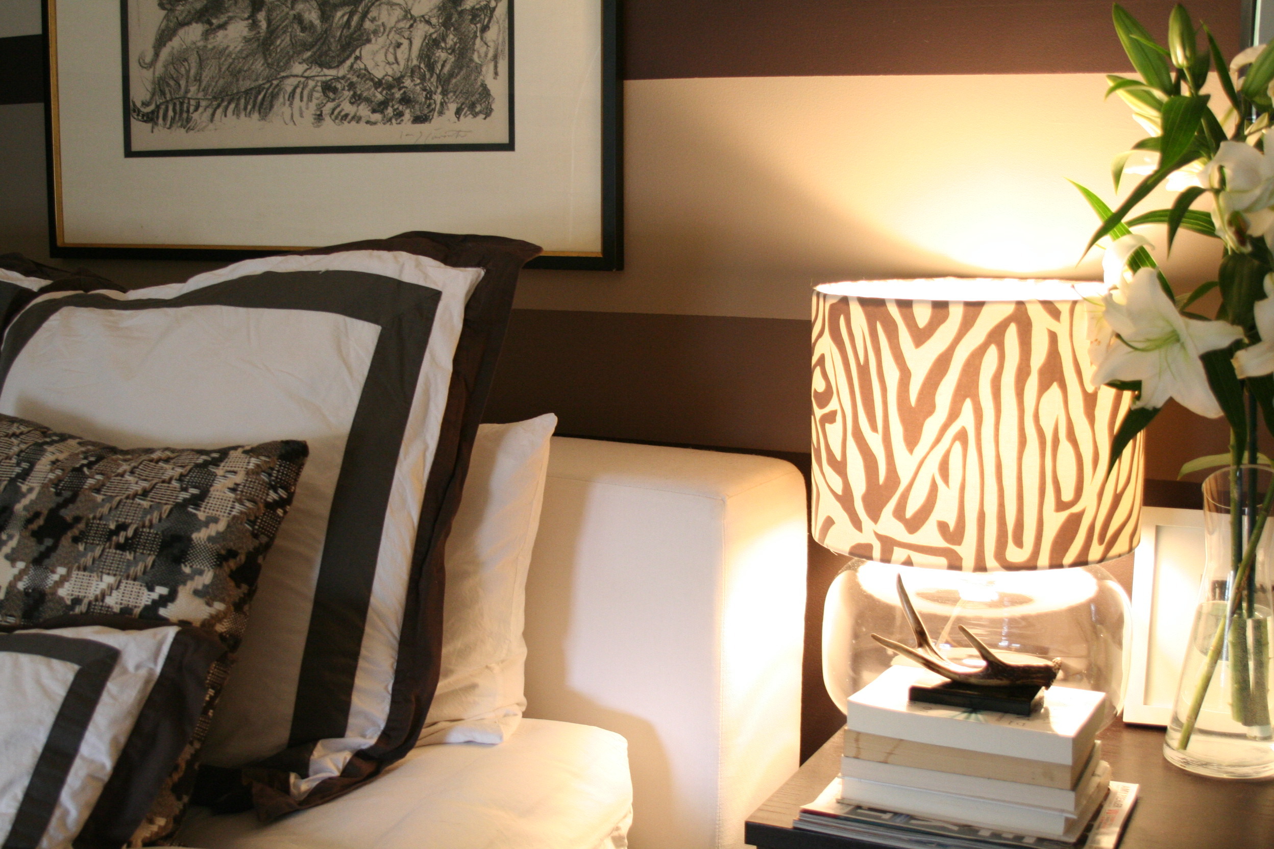
Proudest DIY: Most likely my bedside lampshade, which I made using quilting fabric from Purl to disguise the CB2 lamp.
Biggest Indulgence: Artwork. The Louis Corinth original lithograph over my bed is an original by one of the first impressionists in Germany (of whom my parents are big collectors). Also, the small Goya watercolor I have leaning on the shelf in my kitchen and the large photo by renowned NYC stationaire/artist Nancy Sharon Collins above my sofa.
Best Advice:: Take it slow – it took me 6 months to decorate, but I don’t regret any piece. It’s all about figuring out the pieces you can live with. Don’t buy “temporary” pieces – they will end up staying in your home longer then you think and you still won’t love them.
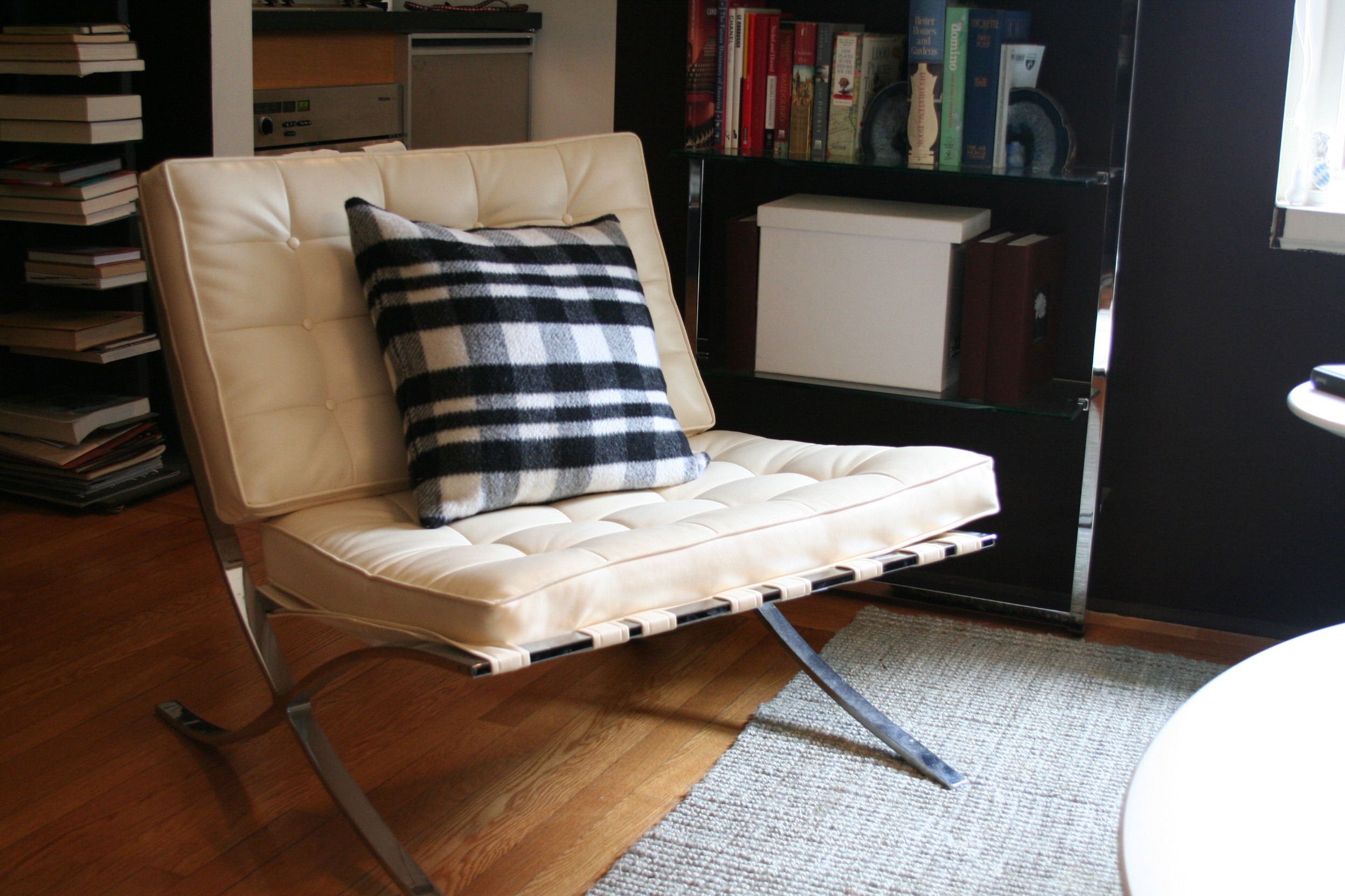
Dream Source: I love my Saarinen coffee table and my Mies chair, so I’m going with Knoll.

ninahousetourlg3.JPG

>> Enter Nina's Gallery!

We've had an amazing response to our Apartment Therapy House Tour Submission Form. While we will work with homeowners of our favorite homes to feature full tours, we will also share the best as House Calls — short, quick tours of readers' homes. Submit your home here.

Tags

House Tours

Related Links

Share

Comments (61)

very nice! tasteful, elegant. the stripes make it feel very cozy and yet the space feels fairly open. it looks like the color scheme makes it easy to think there.

posted by Lady J on April 22nd 2009 at 11:09am
view Lady J's profile

Oh so tasteful.

posted by bepsf on April 22nd 2009 at 11:10am
view bepsf's profile

Lovely. Just lovely.

posted by jessimarie33 on April 22nd 2009 at 11:26am
view jessimarie33's profile

Love it! I really like the striped cloth (rug?) draped on the sofa. Very nice!

posted by PhillyLass on April 22nd 2009 at 11:37am
view PhillyLass's profile

"Frilly and pink" make me gag just thinking of them; this is a lovely 180 degree turn from that. I usually prefer something more minimal, but you've done a great job here. Love the geodes (hate the antlers) and color palette. I really like your furniture and the arrangement of it. Very well done; should have entered the "smallest, coolest" contest.

posted by Sydney on April 22nd 2009 at 11:41am
view Sydney's profile

Nina, you have done a GREAT job. The elements are chosen very carefully. The only question I have is: Where you going for a monochromatic environment? There is no color and you might try to add one accent colour to create movement in the space. If you like one colour whatever that might be, try buying a few pillows in that colour (small ones) and throw them all over the apartment. You will see that it will change the apartment for the better I hope. If you get tired of the accent colour - you can always change the few pillows... Job well done. (oh and try to tie the wires under the tiny desk with a matching fabirc to the wall - they won't be as visible as they are)

posted by Anusha73 on April 22nd 2009 at 11:53am
view Anusha73's profile

Your space is wonderful! I love your rug and shades -- where are they from?

Thanks for sharing!

posted by carrefour_ny on April 22nd 2009 at 11:59am
view carrefour_ny's profile

This apartment is perfect in every detail. Love the rug. Can you tell me more about it. Thanks.

posted by wild-er on April 22nd 2009 at 12:02pm
view wild-er's profile

A very nice space indeed. Love how you used the space to good effect w/ the furniture placement.

Had to do a second look, but is that a miniature long haired Dachshund on the dog bed? If so, very cute.

posted by ciddyguy on April 22nd 2009 at 12:16pm
view ciddyguy's profile

Lovely apartment. The only thing I would add is a big green plant by the window to add some life and a pop of color.

posted by Nina79 on April 22nd 2009 at 12:17pm
view Nina79's profile

Nina, Words are worthless *sigh* Thank you for sharing with so many pictures. I wish I owned, I would love to paint my walls like yours! I am in envy!

posted by sfteri on April 22nd 2009 at 12:19pm
view sfteri's profile

What an adorable dog! Can you tell me what kind of dog bed s/he's snoozing on? It's really lovely, and I've found it so difficult to find sophisiticated and functional ped beds!

posted by Amrey on April 22nd 2009 at 12:22pm
view Amrey's profile

I think it's a pity that you have a gorgeous springbox skin on the floor - if you put it over the back of the chair you'll see the "mohawk" for which they are famous pop up.

posted by Harpy on April 22nd 2009 at 12:31pm
view Harpy's profile

Sorry.... Springbok, not springbox!!

posted by Harpy on April 22nd 2009 at 12:32pm
view Harpy's profile

I love this space, I love the colors, I love everything about it. What are the paint colors you used?

posted by jacksonlalonde on April 22nd 2009 at 12:54pm
view jacksonlalonde's profile

the space looks beautiful. although it does seem a touch too carefully selected for my taste - perhaps lacking character. but, you use the space very well. maybe some personal items, and less hip items like the antlers, would make it feel more homey and less curated.

posted by amt230 on April 22nd 2009 at 1:05pm
view amt230's profile

Love it. Your home is simply gorgeous!

posted by Seaside on April 22nd 2009 at 1:07pm
view Seaside's profile

Is that rug real?! ugh.

posted by kabradbury on April 22nd 2009 at 1:20pm
view kabradbury's profile

sehr nett.

posted by 212gretchen on April 22nd 2009 at 2:52pm
view 212gretchen's profile

Thank you for all of your comments and ideas! I just wanted to get back to you with some of your questions!

1. The dog bed is from West Elm - it's actually one of their "floor cushions" - much better looking then the ones from the pet store!

2. The colors are all Farrow and Ball - estate emulsion, and used Mahagony, Elephant's Breath, and Shaded White.

3. The Zig Zag rug is also from West Elm, and the lamp is from CB2 - although I recovered the shade on my own.

4. And yes, Sophie is a minature long haired dachshund!

posted by nf12280 on April 22nd 2009 at 3:16pm
view nf12280's profile

I am another commenter for whom words fail to express my admiration.

This apartment achieves a balance between a bedroom studio and a living room studio. Too often a bed is somewhere in a corner divided off by a bookshelf. Here the bed is part of the room, without dominating it. This is just elegant. I know I would do it differently, but I know I would not do it as well. Beautiful.

posted by Usbek de Perse on April 22nd 2009 at 3:17pm
view Usbek de Perse's profile

very nicely done. love the kitchen and the bath

posted by ss622 on April 22nd 2009 at 3:33pm
view ss622's profile

Are you 100% the piece to the left of the Horse on the ledge is a Goya? I ask because it actually looks like a Salvador Dali. I grew up with something very similar which was a Dali and part of the Divine Comedy series. Here is a link to a piece titled "In Dark Limbo"

http://www.lockportstreetgallery.com/Dalis/dc/dcinferno/i11.jpg

posted by BillyRes on April 22nd 2009 at 7:48pm
view BillyRes's profile

Can I ask where you got your bedding? Beautiful home!

posted by Gigi818 on April 22nd 2009 at 10:53pm
view Gigi818's profile

The dramatic effect does look good on the sofa back. and the bed looks gorgeous too.


Jeanne

posted by jeanne211 on April 23rd 2009 at 12:27am
view jeanne211's profile

i love the color palette and looove the ikat pillows! source of the pillows anyone??

http://pearlsandgreentea.blogspot.com/

posted by mrslee on April 23rd 2009 at 1:11am
view mrslee's profile

Love Nina's blog: Cultivated Home. All very inspiring.

posted by wild-er on April 23rd 2009 at 1:57am
view wild-er's profile

This space is nicely put together and quite pretty but it is a cliche of trends and for me comes off a bit boring and predictable. Sorry, it is very nice just nothing new.

posted by peachpie on April 23rd 2009 at 2:06am
view peachpie's profile

Oh, funny. I sort of worked with Nina on a small, headachey corporate office design. Good times. Anyway, on to the praise. Well done with the element of drama I personally look for in professionally designed home. I'm pleasantly surprised at the accessibility of many of the items.

Just two things...

I am sure tiny pelt rug feels gorgeous underfoot but it is so very disturbing. Consider changing it. Even to flokati (and that's saying something).

And also, the addition of a contrasting color would really do wonders to humanize the space and add that last bit of punch. Brown does love pink. Maybe just a touch of it as an homage to the living space that once was?

posted by 1GH on April 23rd 2009 at 2:17am
view 1GH's profile

does anyone know what kinda of Miele cooktop that is? electric or gas? Im intrigued.

posted by jlear on April 23rd 2009 at 9:19am
view jlear's profile

Bravo!

posted by Selavy Rose on April 23rd 2009 at 9:40am
view Selavy Rose's profile

Time Out New York already did this ... last month.
http://newyork.timeout.com/articles/real-estate/72003/easy-does-it

posted by lucythegorilla1 on April 23rd 2009 at 11:20am
view lucythegorilla1's profile

Sorry, all that brown is depressing to me.
I covet the Barcelona chair tho.

posted by jennywren03 on April 23rd 2009 at 11:32am
view jennywren03's profile

I love this place - although it has a very masculine feel. For me to live there I would add fresh flowers and a contrasting color. I think soft pink or a lime green would work great with the greys and browns. Love your dog. Growing up my grandparents had one just like that.

posted by maedchenstyle on April 23rd 2009 at 11:34am
view maedchenstyle's profile

she should have entered it in smallest coolest. she would have won. btw, how is this a sublet? i mean, it looks like she added massive numbers of custom touches. Or was the bathroom and kitchen that cool to begin with?

posted by Gene on April 23rd 2009 at 12:05pm
view Gene's profile

Ahh, i should learn to read more carefully... the owner did many renovations. Awesome place.

posted by Gene on April 23rd 2009 at 12:05pm
view Gene's profile

Nina, very beautiful! I always look at the pictures first, then read the article. I could tell by the pictures that your are a Designer. It shows in your attention to details.
I have to say I disagree with adding any color pillows are what-nots. (reference picture 10) The balance in the room is occurring by the geometric shapes. The large picture over the sofa rising above the horizontal stripes of the wall. Followed by the slightly smaller picture above the bed, then the smaller mirror above the chest of drawers, then to the pillows on the bed. See how your eyes flow around the room? If Nina had not place the pictures where they rise above the horizontal line or had each element dropping to a different level, it would have been boring and every item would have been pressed below the horizontal stripes. That's how you make movement and balance in a monochromatic room. Well done Nina.

posted by English Accent on April 23rd 2009 at 12:42pm
view English Accent's profile

Nina-

I wholeheartedly agree with English Accent.

As I'm SURE you know, your place is fantastic!

This comment is really directed to the few that feel there is a lack of color, movement, and personalization in the space...people please!!

posted by alstonz on April 23rd 2009 at 1:04pm
view alstonz's profile

What a lovely apartment. Thanks Nina for proving that in even in NYC, one doesn't need to sacrifice style or their firstborn to have a fabulous place! Truly an inspiration!

posted by dianey35 on April 23rd 2009 at 2:49pm
view dianey35's profile

Thank you for all of your amazing comments! I did want to respond to a few questions about sourcing:

1. Sheets are from Restoration Hardware, they always have a great selection.

2. The pillows on the sofa are Madeline Weinrib pillows, I love all of her work.

3. So right! The painting in the kitchen is a Salvador Dali, but there is a Goya also in the ktichen.

4. The miele cooktop is gas

Thank you again!!

posted by nf12280 on April 23rd 2009 at 4:39pm
view nf12280's profile

Good pick for the wall paper - nice earth tone, cool stripes. Those framed pictures, however, look odd with it . They 'go against the grain', them being vertical.

Perhaps you can consider panoramic pictures on canvas, instead. Don't frame, else you'd defeat that sleek look of your decor.

posted by Ianny on April 24th 2009 at 2:51am
view Ianny's profile

Hey can someone tell me who the designer of the narrow vertical book rack is?

posted by pet08 on April 24th 2009 at 3:36am
view pet08's profile

Pet08, I thought I saw the book cases in CB2's catalog. Check their website catalog.

posted by English Accent on April 24th 2009 at 11:54am
view English Accent's profile

I absolutely love this! Great use of browns! Thanks also for the Madeline Weinrib tip - just went to her site, and her stuff is awesome!

posted by Pigletliver on April 25th 2009 at 3:32pm
view Pigletliver's profile

Also, can you mention the source for your shades?

posted by Pigletliver on April 25th 2009 at 3:39pm
view Pigletliver's profile

Hi! The shade was a standard CB2 shade, and I just went to Purl Soho in NYC, which has light-weight quilting fabric. With a hot glue gun, it's a piece of cake!

posted by nf12280 on April 26th 2009 at 1:12pm
view nf12280's profile

springbok anteloupe? a beautiful animal. pity.

posted by IslandSavvy on April 29th 2009 at 9:26am
view IslandSavvy's profile

Dachshunds... The ultimate accessory.

posted by Virginia_Melb on April 30th 2009 at 11:40pm
view Virginia_Melb's profile

Poor animal. He looks so sad.

posted by EAM on June 12th 2009 at 11:14am
view EAM's profile

Nina...such a beautiful apartment! I cant help but notice that you have 4 paint colors on your wall, but only listed 3. What is the fourth color? Thanks!!

posted by jnr99 on June 18th 2009 at 12:18pm
view jnr99's profile

lovely! was wondering on where your kitchen cabinets are from?

posted by deetreehouse on June 22nd 2009 at 6:04pm
view deetreehouse's profile

Is that a wide striped throw on the back of the couch? anyone know where I can find a similar one? i love the black and white accents

posted by handmadegreen on July 15th 2009 at 2:30pm
view handmadegreen's profile

Love the paint colors! Can you share the color names?

posted by Loma on July 15th 2009 at 6:01pm
view Loma's profile

Love it!!!

Also, if you like mid-century modern, check out my recent article on DUX's Folke Ohlsson Estate Sale:

http://simplifiedbee.blogspot.com/2009/07/blue-moon-duxs-folke-ohlsson-estate.html

xo,
cristin

posted by Cristin at Simplified Bee on July 15th 2009 at 9:18pm
view Cristin at Simplified Bee's profile

i love it when someone is able to take a simple, almost monochrome color palette and make it work, rather than look uninspired and boring. brilliant.

but i gotta say, not a fan of all the animal art.

posted by claire_quilty on July 16th 2009 at 9:40am
view claire_quilty's profile

All of my favorite colors. Lovely.

posted by ah2Bthee on July 16th 2009 at 2:23pm
view ah2Bthee's profile

This is so gorgeous and serene, you've got guts painting those giant stripes over the walls- it really paid off!

posted by sdnyc on July 17th 2009 at 10:52am
view sdnyc's profile

I love the carpet in the living room area-can you tell me where you found something like this?

posted by corts on July 18th 2009 at 12:54pm
view corts's profile

Not sure I love the idea of color-coding books.

posted by cizinka31000 on July 20th 2009 at 2:29pm
view cizinka31000's profile

It is all so designed and so planned and well thought out and follows the clear rules set out (albeit unusual and innovative rules.)
The overall concept is a suprise, but still... uhm... I wanna see a chipped floral mug that was inherited from a college room mate, stuck up with those soldiers on the kitchen shelf.

Color coding books? A bit anal retentive.

posted by Nani on July 20th 2009 at 11:37pm
view Nani's profile

This is one very sophisticated apartment. It's a simple design yet daring at the same time. I'd never think to mix those stripes with the other geometries.

posted by ronlbrenner on October 10th 2009 at 6:09am
view ronlbrenner's profile

Feeds

RSS icon New York

+ City Feeds