
House Tour: Lisa’s Beachy Regency Modern Mix
Name: Lisa Joss
Location: Mill Valley
Size: 1,850 sq. ft.
Years lived in: 2

Do you have an idea for a house tour? Let us know! tips (at) sf (dot) apartmenttherapy (dot) com
Our style: We came from the City where we remodeled two homes; one down to the studs and we re-did it totally modern, and the other we remodeled 50% and did it totally modern. But in Mill Valley we couldn’t go as modern as we want since this is an interim home. I had to compromise in order to maintain the resale value, in this more trad-loving community. Our goal is to eventually either tear down and go totally modern or buy a modern again.
The inspiration for our home: Modern but kind of a cross between beachy and regency modern. Yes, I know it sounds weird.
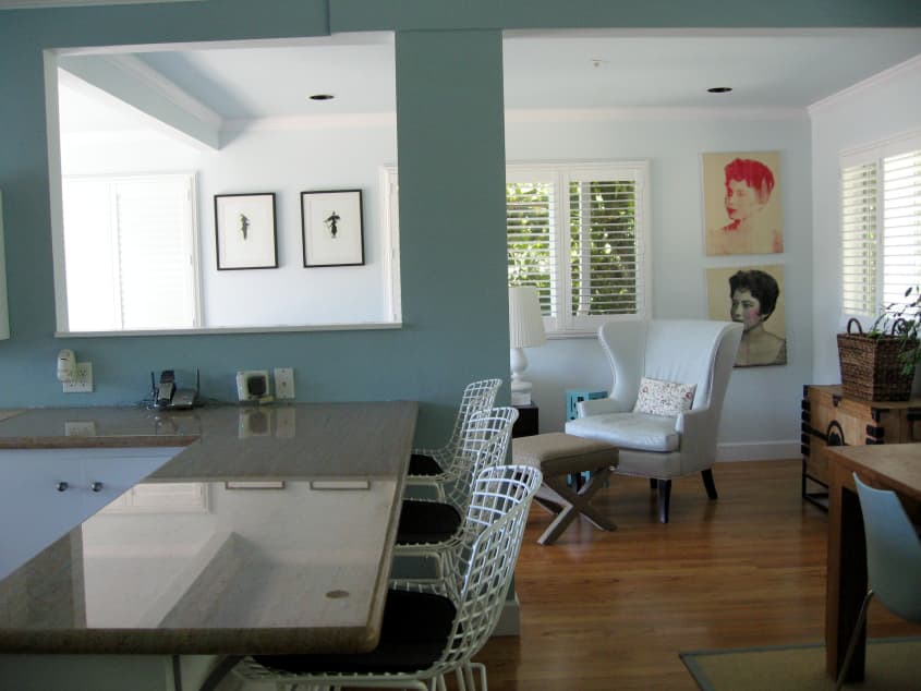
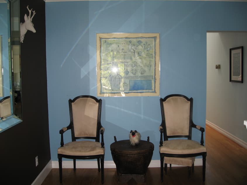
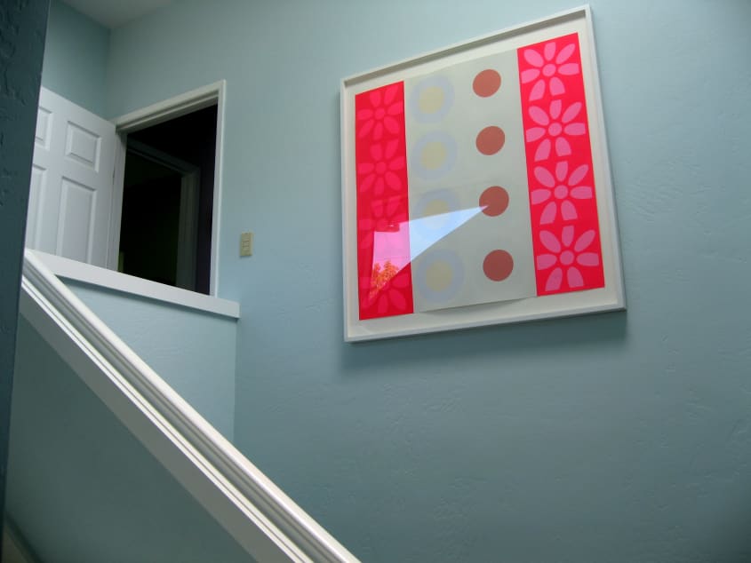
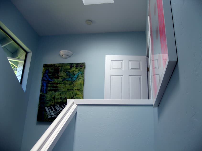
Favorite element: The color; we did all of the common spaces in varying shades of pale blue.
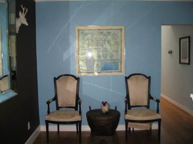
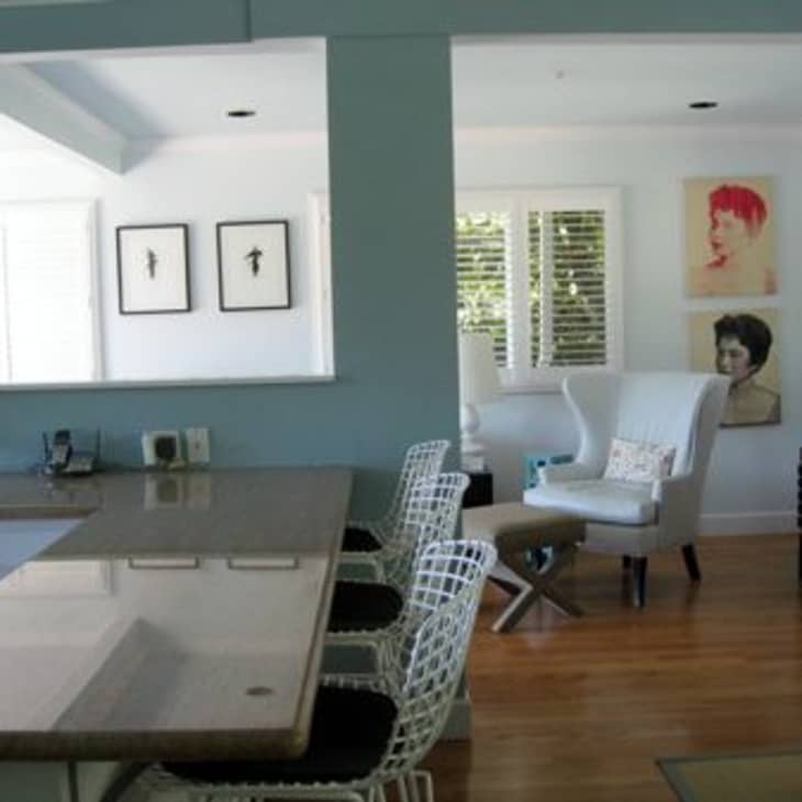
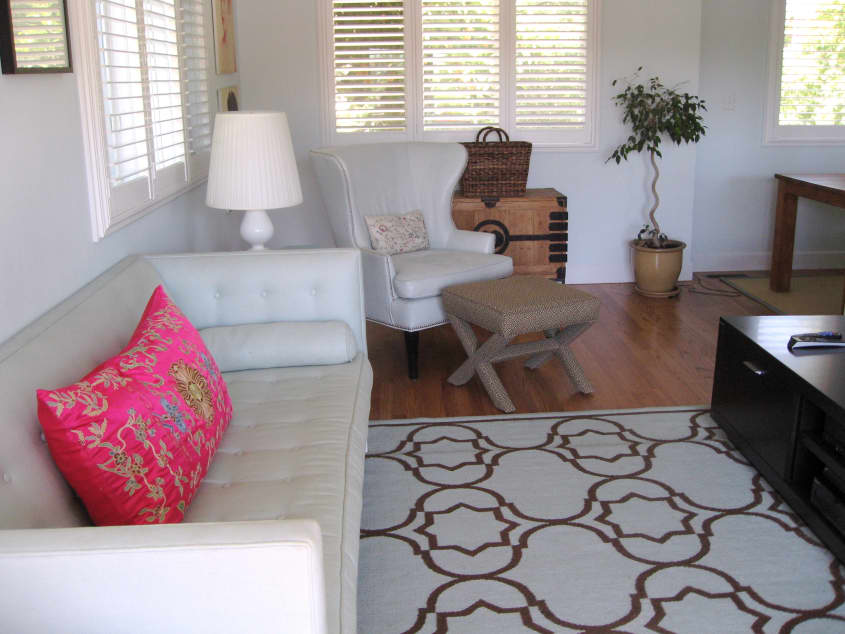
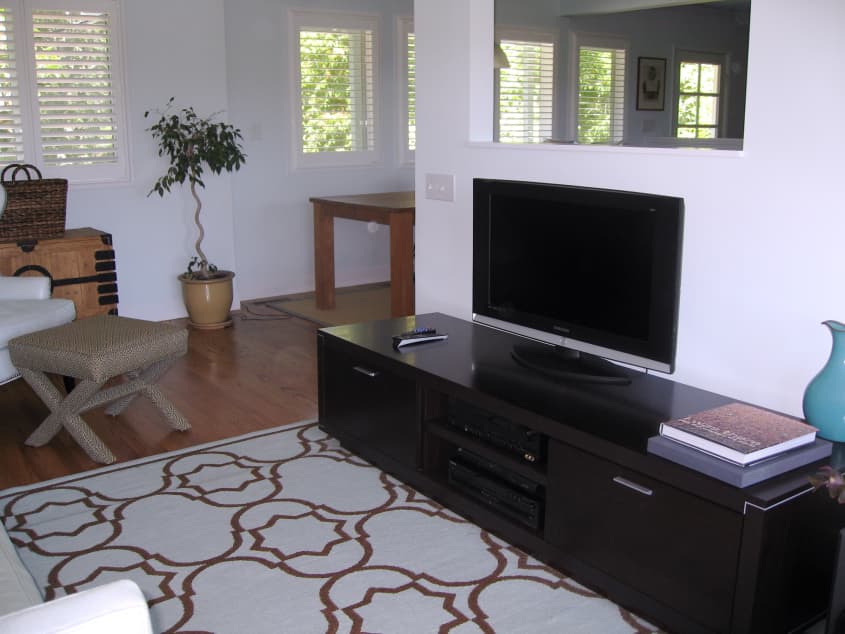
Biggest challenge in designing our home: The biggest challenge is the layout. It is multi-level with no more than one room per level. We are dying to redefine the main floor that is the kitchen and living room. We want it to be a larger, comprehensive great-room but had to compromise due to the permit process. Instead it is split into two small rooms. But the real challenge was in unifying the house so it didn’t look like a habit-trail of rooms off a central stairwell. The only real solution on a budget was color. Hence, the blue because it is moody enough to give the public spaces real presence even though they could easily look like a 70’s condo — nothing!
What friends say: They either call it elegant or modern. I am always surprised when they say it is elegant. I hope they mean elegant modern. Elegant is not our style. We are super casual people.
Biggest embarrassment: The tiny tiny living room, that looks more like a hallway than a room.

Proudest DIY: I couldn’t find a dresser that I liked, so I bought one (black) brand new at Crate and Barrel and re-painted it (white) myself and then bought new white coral drawer pulls. It looks more beachy, which is perfect.
Biggest indulgence with respect to our home: Buying light blue furniture to match the walls in the living room. I did this so that the space would look larger, and it does. But normally I would not spend the money on this furniture in such a non-classic color (light blue sofa from Jonathan Adler and light blue leather wing back from William Sonoma Home). The rug, reversible light blue and chocolate, is also from Jonathan Adler but a special order rug.
Best advice: The only real advice I got was to keep it craftsman-style. But I just couldn’t. The only thing craftsman about this house are the plantation shutters because they happen to also look both beach and slightly modern. We did this when I could no longer bear the mini-blinds it came with.
Dream source for stuff: If I could I would buy everything from Limn, DZINE and DWR when it comes to furniture, and for kitchens I would go directly to La Vita e Bella.
Resources:
Appliances:
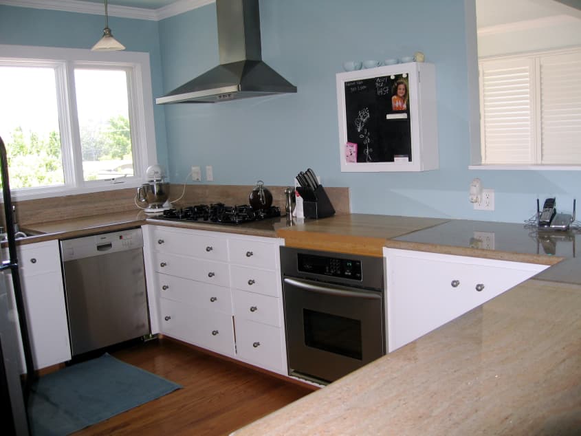
Bosch dishwasher because it is the quietest and it really cleans!
Kitchen Aid fridge and oven
The range and microwave are both GE Profile
The washer and dryer are Frigidaire
Hardware:
I used Schlage egg knobs for all door hardware
Furniture:
Bertoia bar stools from DWR
Bright pink occasional chairs vintage through an estate sale. I then had them recovered in magenta mohair from the Discount Fabric Warehouse
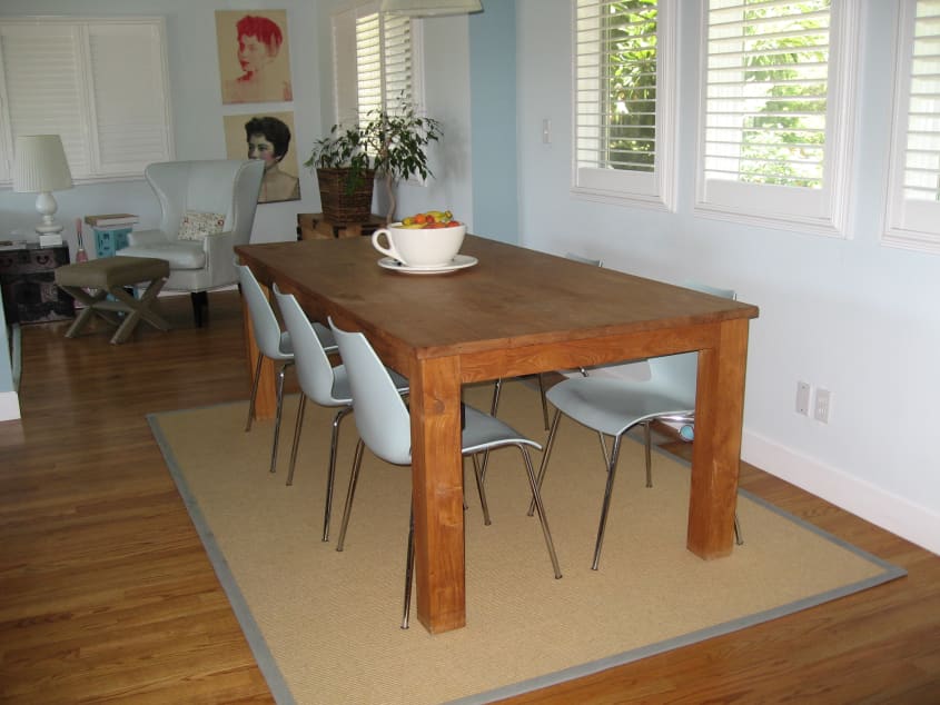
Dining table from De La Espada
Dining chairs from DWR (light blue again!)
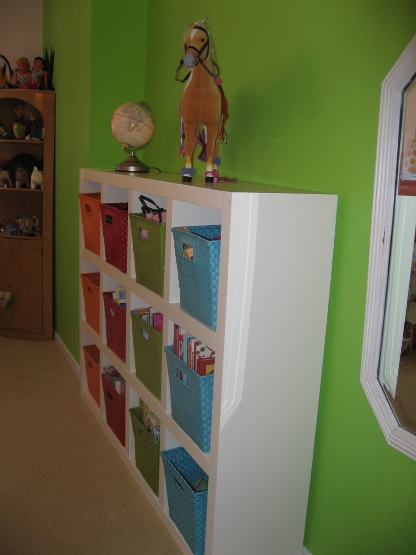
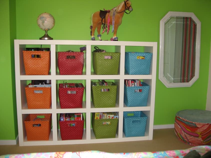
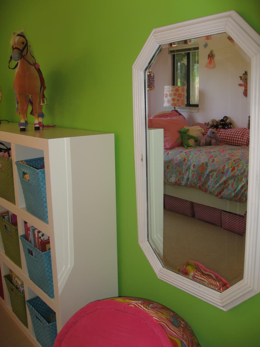
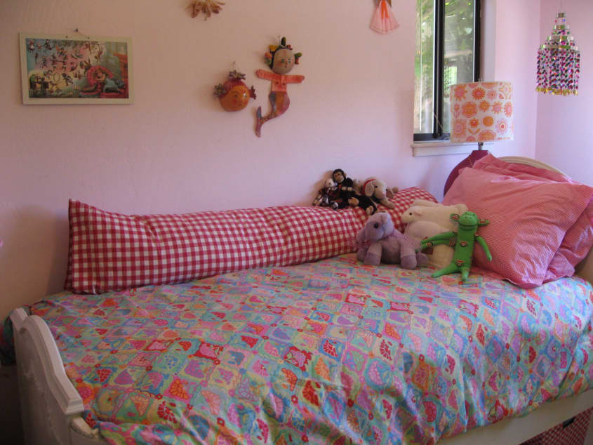
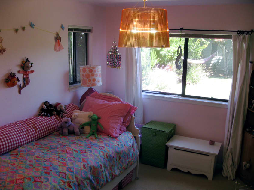
Daughter’s bedroom:
Bed from the Alameda Flea Market and two coats of paint
Dressers from IKEA
Shelf unit from West Elm
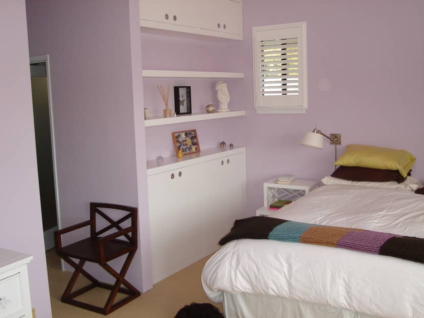
Master bedroom:
Bedside tables from William Sonoma Home
Writing table from West Elm
Dresser from Crate and Barrel
Living room:
As described above
Lighting:
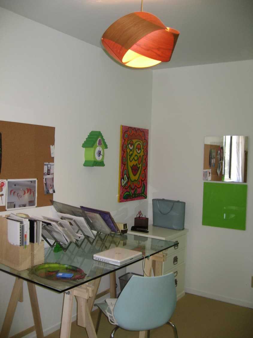
In office: Nut pendant, DWR
Daughter’s room: Kartell (called pink, really orange)
Master: Pottery Barn
Paint:
All Benjamin Moore:
Kitchen and half-bath: Soft Chinchilla
Hallways, Living room and ceiling: Summer Showers and Patriotic White (NOT white, is pale blue)
Master: Beach Plum (looks pink in pix but is more purplish in person. My husband is a creative director so he shared my vision!
Flooring:
Hardwood in public areas (came with it)
Rugs and Carpets:
Fabrica brand sisal-style carpet in all other rooms (for continuity)
Area rugs are from Jonathan Adler or Restoration Hardware (for sisals)
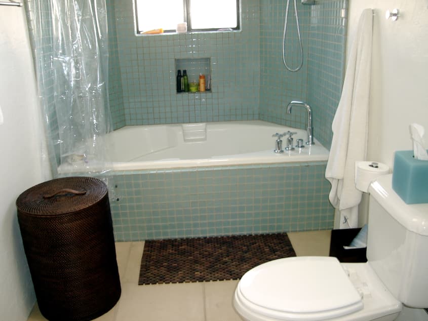
Tiles and Stone:
Half bath is river stones. They come on mesh tiles at any tile store
The master bath is large format concrete tiles in sand color
Daughter’s is faux stone ceramic tile from the previous owner
Window Treatments:
All except daughter’s room are plantation blinds without center rods
Beds:
Stearns and Foster or Sealy Posturpedic. I met a woman who did design for W Hotels’ famous home-like bedrooms and she recommended the Sealy. She described a process where 16 of them sampled beds in all of the world’s finest hotels by sleeping in them over the course of a year. But frankly, I LOVE the Stearns and Foster that I used to sleep in more. Stearns and Foster is the perfect firm bed
Artwork:
Pink screen printed “targets” is by Peter Gee (contemporary of Andy Warhol in NY during 60s)
Screen prints of woman’s portrait in living room were done by me
Silhouttes above couch were bought at Swallowtail on Polk Street
Photograph above bed is by Robert Arnold
“Harmony” is by Miripolsky
Prints by Jeremy Fisch
Green Oil Painting in stairwell by Chris Pugh
Thanks, Lisa!