
Sonja’s Salon de Silver Lake
Name: Sonja Teri
Location: Silver Lake, Los Angeles, CA
Size: 700 square feet
Years lived in: 1.5 years
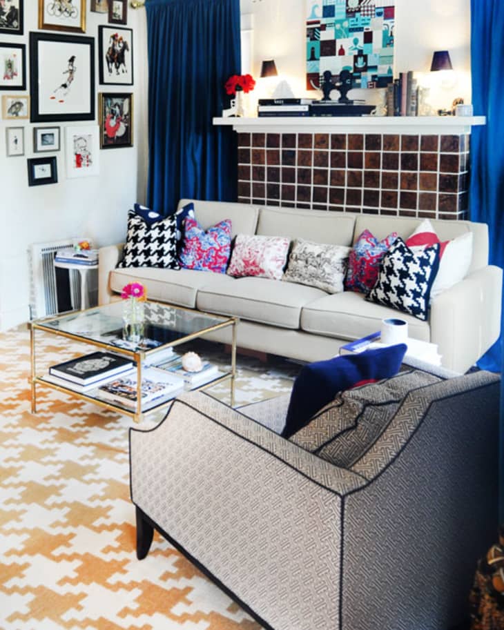
Last week we previewed Sonja’s Silver Lake apartment’s home office and studio over at Unplggd, and now we’re back with the rest of her stylish apartment for a full tour. Filled with a colorful and harmonious assortment of artwork, prints, sculptures and photographs, the quintessential Silver Lake apartment is a glamorous extension of Sonja’s love of the arts.

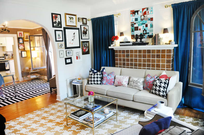
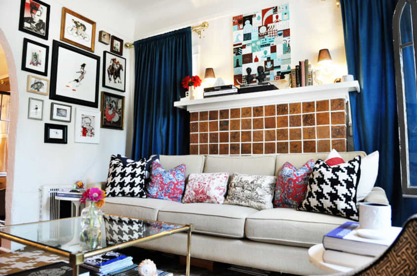
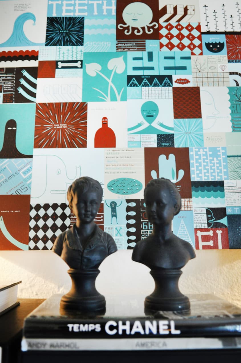
With personal keepsakes from her grandmother mixed in with tchotckes collected over the years strewn throughout, it wasn’t a surprise we left inspired to get back to decorating our own space with more art and objects to warm up our own home in similar spirit!

Apartment Therapy Survey:
My Style: “Colorful, Cozy, Chic” with a touch of savvy sophistication
Inspiration: As far as style, my taste is truly a product of my upbringing. I see many elements in my space that are a combination of both my parent’s sensibilities. I grew up in a split household and had two completely different habitats; my moms apartment was warm and eclectic and my dad’s leaned toward modern minimalist. And growing up in Washington D.C. I got a taste for some traditional aspects as well.
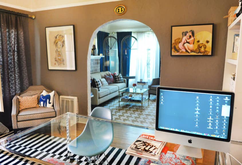
My approach for utilizing the space came about because I work from home doing freelance PR and Marketing, while also running my online art gallery, Poster Child Prints (PCP). The challenge was creating balance between a workspace and living space, while separating the two. It was very important to me that it felt like a home and not an office, but at the same time I needed the environment to be completely functional. I like having definitive space separations and enjoy giving each room their own identity; a loft space wouldn’t have worked for me.
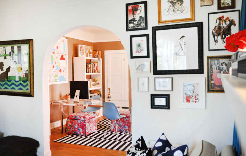
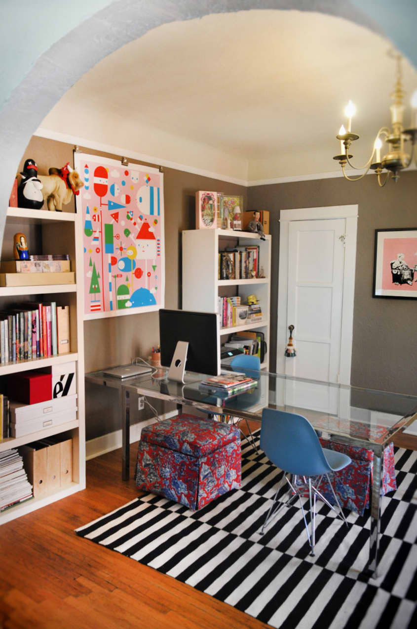
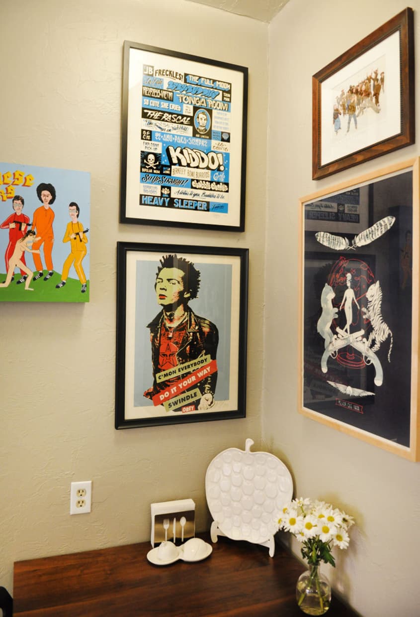
I found inspiration for each room first by choosing a single piece of (my favorite) artwork and using it as a launching point for the entire room. For example; in the dining room/office I knew the Banksy print needed prime wall space, so I started with that. I started pulling other elements I already owned that were pink – it happened very organically. The gray wall color was chosen prior to the theme being set, but gray pretty much goes with everything and that’s why it’s such a great room color.
Favorite Element: The element that puts a smile on my face when I walk through the door is all the artwork; much of which are original pieces from my artist roster on PCP. I also really enjoy my dark walls. It gives me a feeling of warmth and comfort, which is extremely important to me.
Biggest Challenge: The first challenge was living in a rental where there are “rules” and you can’t do everything you would do as if you owned the space. Some people think I am nuts to have spent this much time and energy into something that I may not be in for a very long period of time but even if I was here for 6 months, I would have to make the space special. I didn’t let the fact that it is a rental determine my aesthetic. I did what I could within the restraints of the property but yes, if I owned the apartment I would do much more!
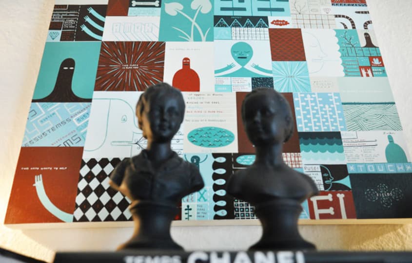
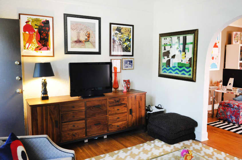
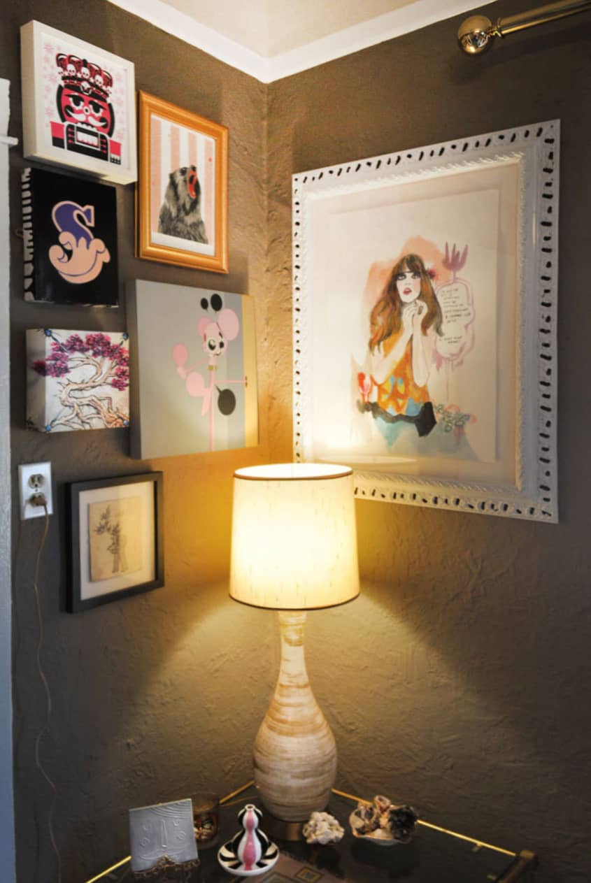
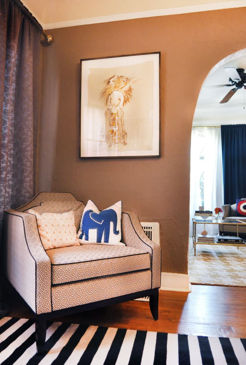
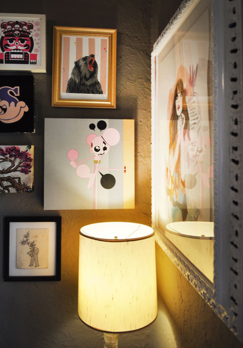
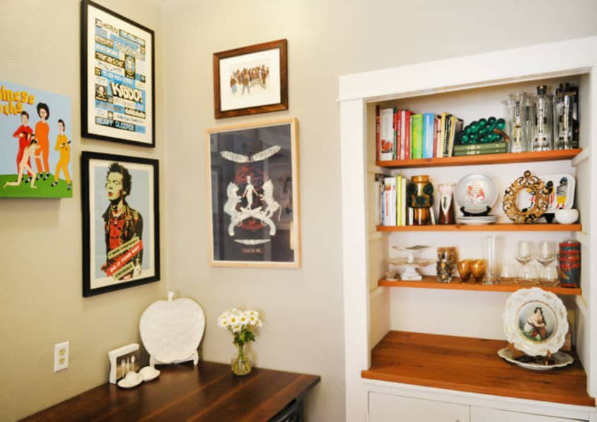
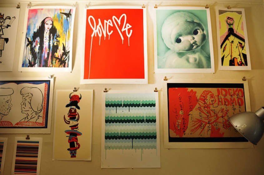
Hanging artwork or artwork organization as I call it, was another huge challenge because I wanted the ability to continue adding to the walls over time. I knew I would be updating, adding and moving artwork around so I decided to go a “salon style” picture hanging method that easily allowed for this. Starting with a key focal point piece, I basically created clusters based on color and size. Many of the smaller pieces are hung together and larger pieces stand-alone. I think you can easily create an intriguing wall with some strong pieces and the rest you can have fun with and do it inexpensively, like framing black and white pictures or get some cool vintage artwork from flea markets.
What Friends Say: When I have guests over at nighttime, they comment on the warmth and cozy aspect; the dim lighting and candles help that effect. When guests come over during the daytime, they comment on all of the artwork and eclectic tchotchkes.
Biggest Embarrassment: I think my biggest embarrassment is also one of my favorite features. I am always apologizing for the amount of “stuff” I have. I get embarrassed because I feel like I have so much stuff everywhere. It’s my worst nightmare to feel like I have a cluttered home. As long as I can keep it to organized clutter…I think I’m ok.
Proudest DIY: I designed the entire space myself so that would have to be my most proud project.
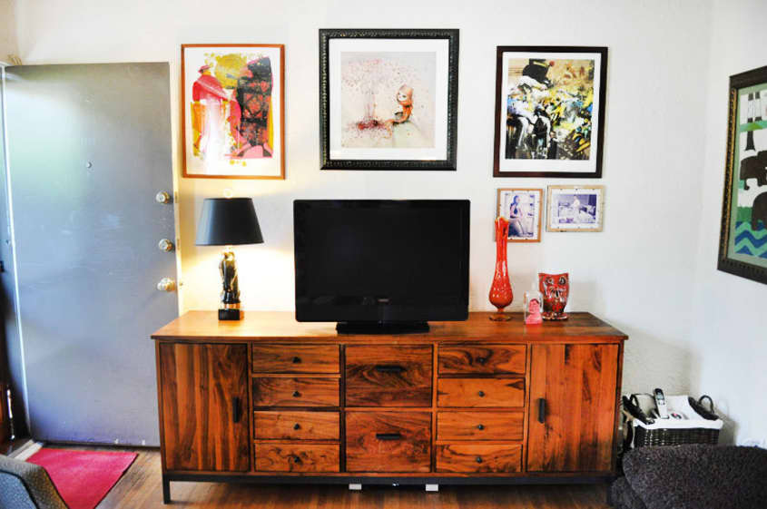
Biggest Indulgence: All of my Jonathan Adler furnishings were an indulgence and my TV Credenza from Room & Board too! I bought them knowing that these pieces would be with me for some time.
Best advice: Back when I worked for Swindle Magazine in 2007 I interviewed Jonathan Adler for our Icons Issue. He doled out this advice: “My basic philosophy is that you should walk in your front door and feel happy. The whole point is to make your home a place you want to be.” That simple statement really hit home for me and I have totally taken it to heart in my design aesthetic.
Advice I’d share: Everyone should put a little more effort into incorporating artwork into their living space! It’s a shame when I notice the same artwork on walls because there are so many other options available now and you can purchase really cool artwork inexpensively. Every aspect of adding more limited run or unique art into the home is beneficial; you won’t have the same artwork as millions of other people, you will be supporting artists directly, and you will have a collector’s piece that is worth more.
I’m not saying you have to spend a lot of money either. On my website for example, you can get limited edition screen prints for as low as $25 and they even come signed and numbered by the artist! That’s why I started PCP actually, the website makes art accessible to collectors of all stripes from novice art enthusiasts to established connoisseurs. It’s a win-win situation, so go by your self some art!
Dream source: A coast-to-coast Estate Sale Tour. From Palm Springs for some mid-century modern to Miami for some vintage glamour, up to New England for some traditional classics and ending the tour in Midwest for some inexpensive flea market finds. That would be a dream road trip.

Resources:
Furniture:
Living Room
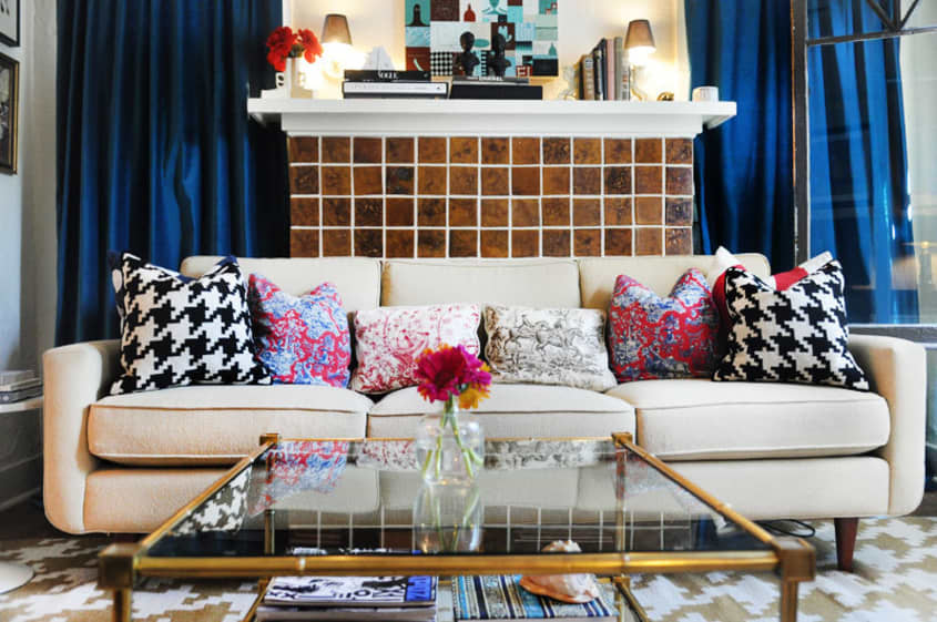
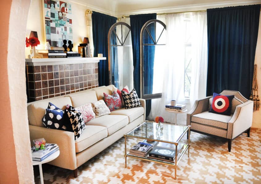
- 3-Cushion Couch is from Room & Board (it has memory foam which is worth the splurge)
- Black and White Pattern Chair is custom from Jonathan Adler
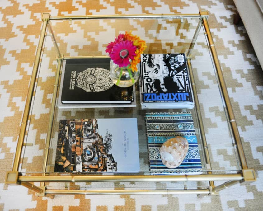
- Meurice 2-Tier Brass/Glass Low Table from Jonathan Adler
- Walnut Wood TV Credenza is custom Linear Series from Room & Board
- White Saarinen inspired side tables are a DIY project
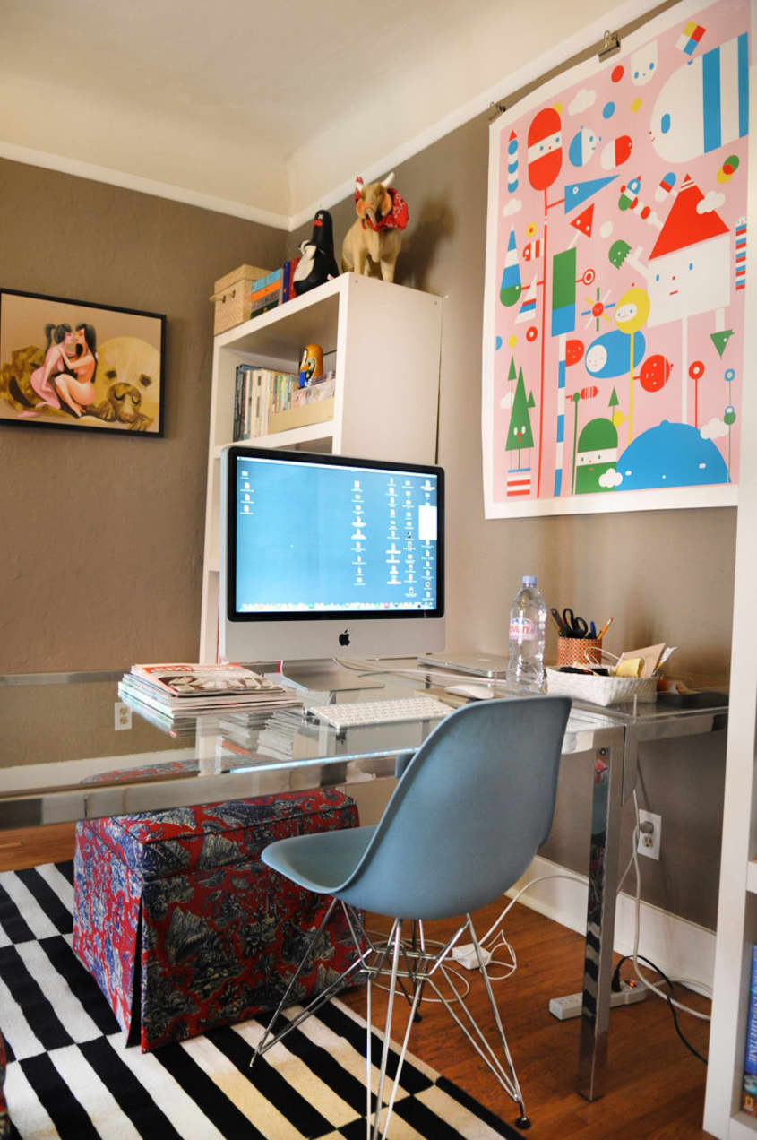
Dining Room/Office
- Large Glass table is from Hernandez Brothers (a great vintage furniture find in Los Angeles)
- Light Blue Eames Molded Chairs from DWR
- Black and White Pattern Chair is custom from Jonathan Adler
- Meurice 2-Tier Brass/Glass Low Table from Jonathan Adler
- Red Toile Square Ottomans are a DIY project with fabric by Duralee
- White Bookshelves are from IKEA
Kitchen
- Table is custom Parsons Series from Room & Board
- Black Folding Chairs are IKEA
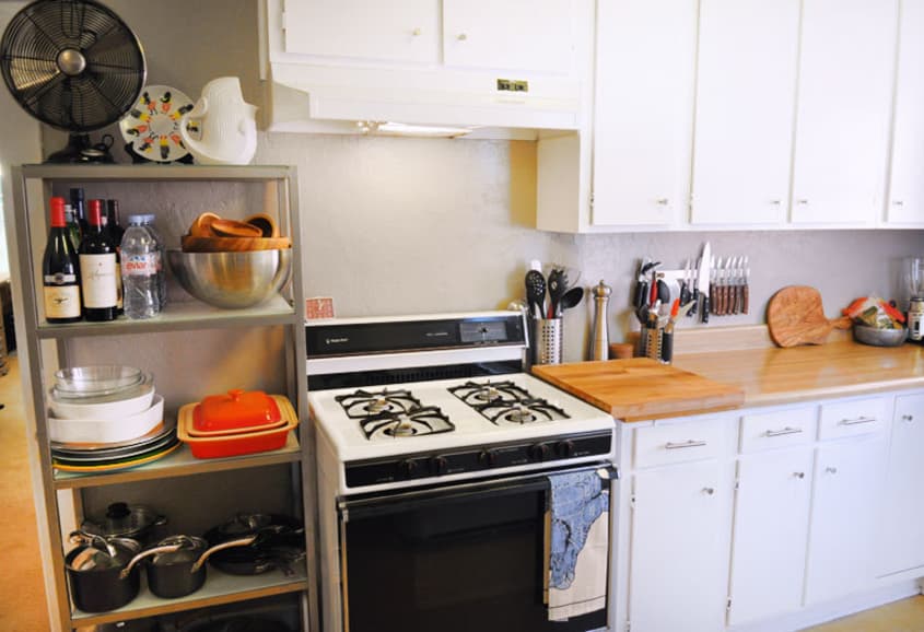
- Dwight 5-Shelf bookcase is CB2
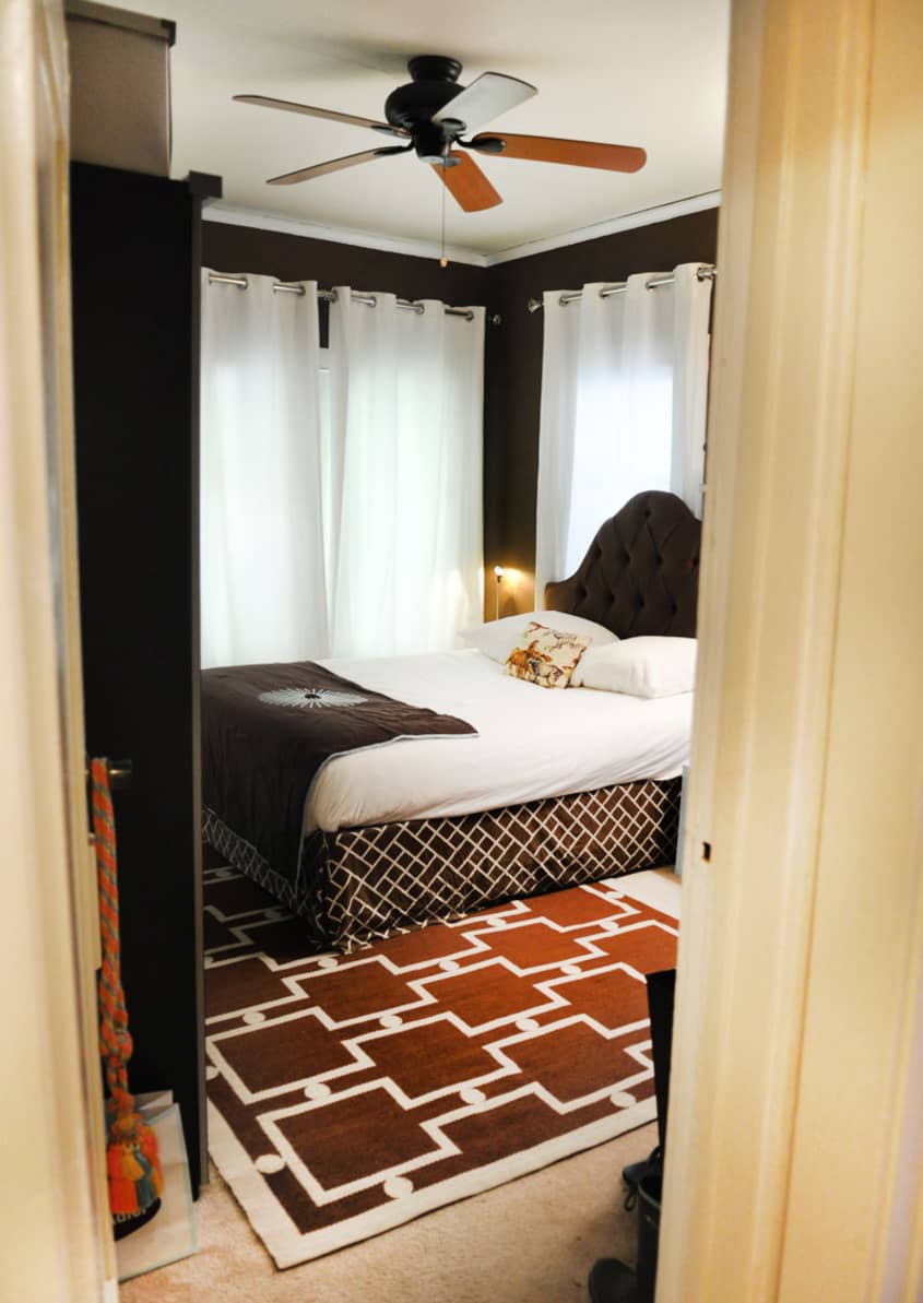
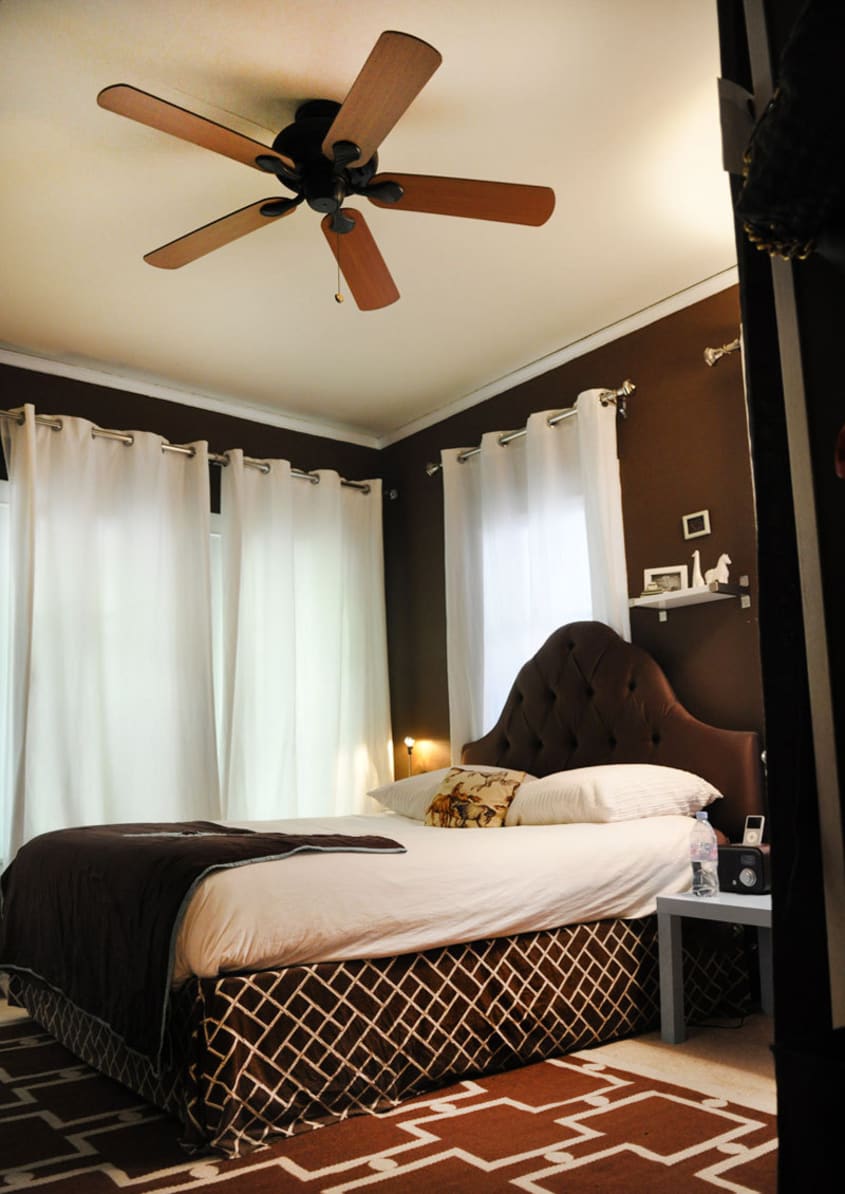
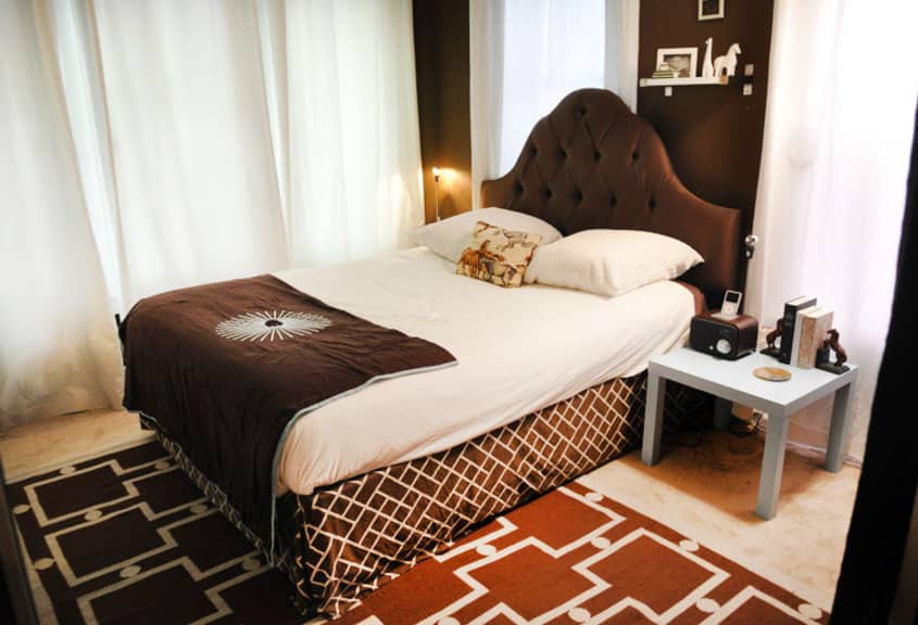
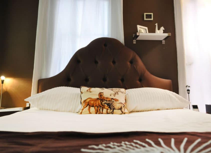
Bedroom
- Sliding Door Waredrobe is the Elga Series from IKEA
- Light Blue Table is from Ikea
Living Room
- Pillows on couch are a mix of Jonathan Adler and Pottery Barn and Custom Upholstery by Duralee
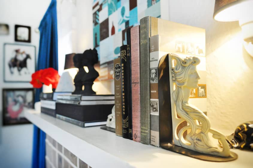
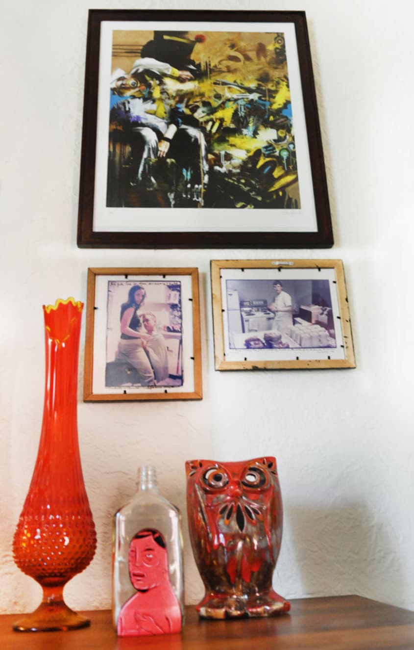
- Items on the credenza are Portland vintage store finds
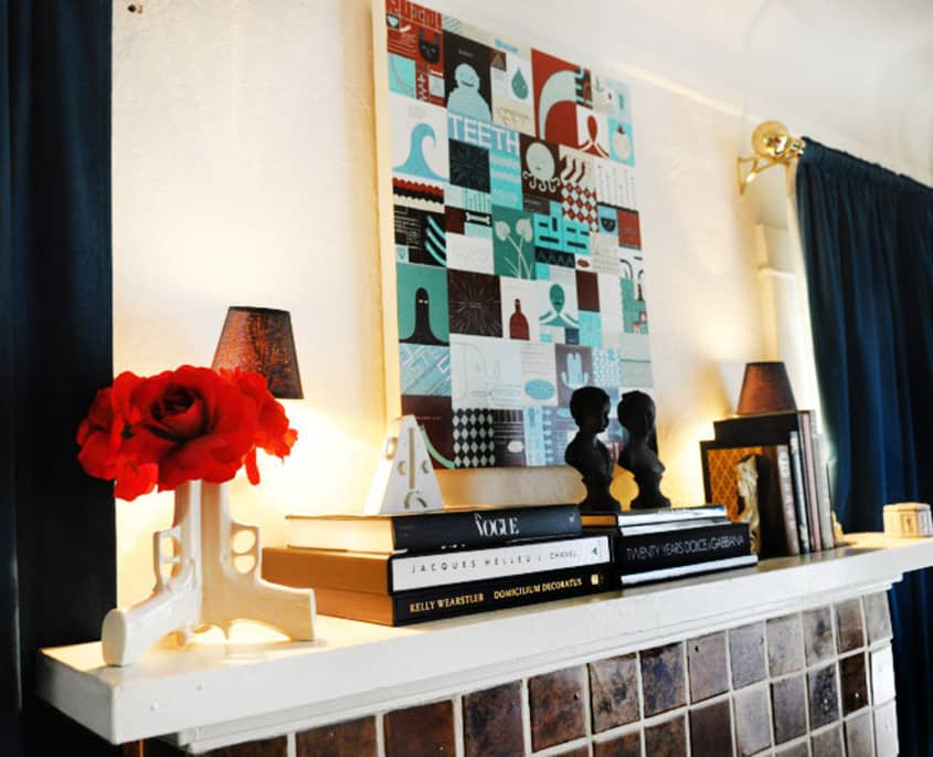
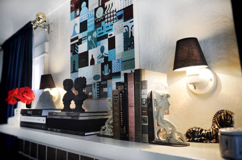
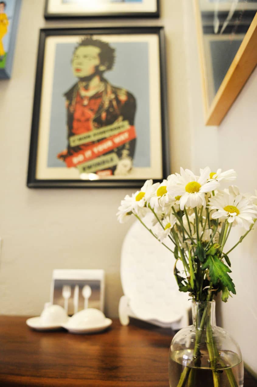
- Most tchotchkes above the fireplace are from my grandmother’s apartment in Miami
- White Triangular face vase is handmade by Michelle Valigura Pottery Collection
- Brown Oversized Floor Pillows are from World Market
- Jonathan Adler Hashish Candle (which I cannot live without!)
Dining Room-Office
- Besides all of the books, the tschotkes are my grandmothers, Jonathan Adler, Michelle Valigura Pottery Collection, FriendsWithYou Malfi toy and Tarina Tarantino Barbie Doll, Vintage Peewee Herman
Bedroom
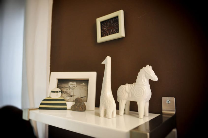
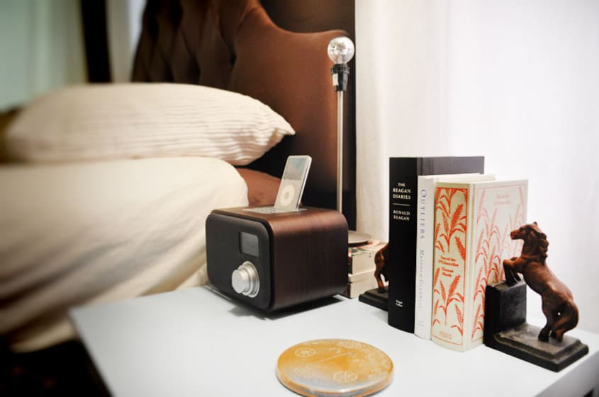
- Jonathan Adler animal figures
- Horse Bookends from High Street Design Studio in Cincinnati
- Jim Houser small artwork
Kitchen
- Apple Plate and Whale Pitcher is Jonathan Adler
- Salt and Pepper set are from Fitzsu Society in Los Angeles
- Fan is from Target
- Graphic tray and plate are by Maija Louekari for Marimekko
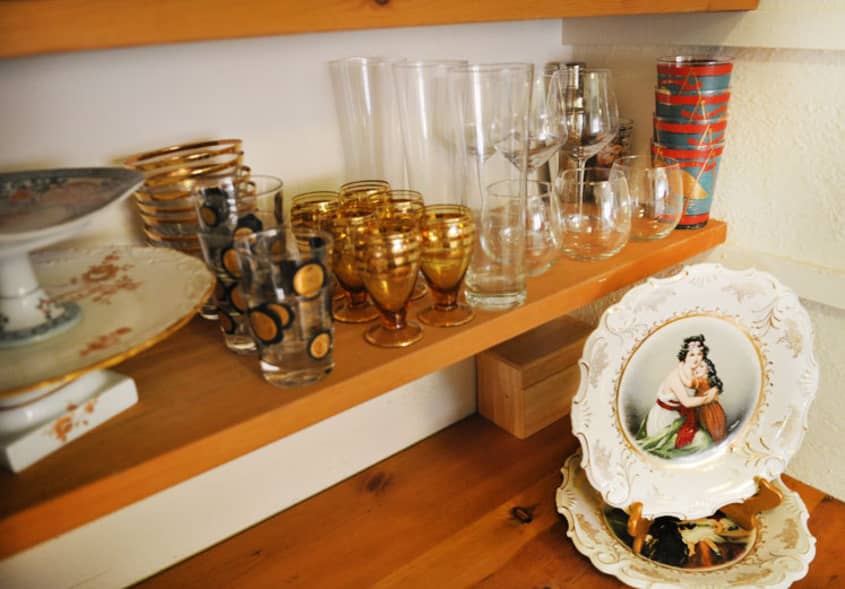
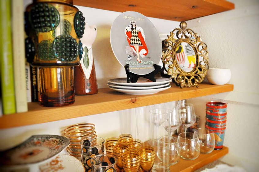
- Most accessories on the built-in are my grandmothers and Flea Market Finds (I sorta have a problem collecting barware sets…there’s more in storage downstairs!)
Lighting:
- Horse Light in living room was a great find on eBay and I bought the gold and black lampshade separately to match
- Other lighting fixtures were part of the apartment and were there when I moved in but I embellished them with new shades and interesting light bulbs from specialty light bulb stores.
Paint:
- Kitchen- Dutchboy Colonial Cobblestone
- Dining Room/Office- Dutchboy Family Tree Flat
- Bedroom- Dutchboy Bronze Sculpture
- Bathroom- Dutchboy Ballpoint Blue
Rugs and Carpets:
- Living Room- Houndstooth Rug is Custom from Jonathan Adler
- Dining Room-Office- Black & White Rug is from IKEA
- Bedroom- Brown Circle and Dot Custom Rug from Jonathan Adler
Window Treatments:
- All window treatments are from IKEA
- All Hardware is from JCPenny
Beds:
Upholstered bed frame is custom (can’t remember from where)
Artwork:
Living room
- Artwork above credenza is: David Weidman, Miss Van, Conor Harrington, Barry McGee and Ed Templeton
- Other artwork includes: Caroline Hwang, Shepard Fairey, Richard Colman, Kevin Taylor, Choncey Langford, Nicholas Bowers, Mike Giant, Day 19, Mel Kadel
- Above Fireplace, Jim Houser
Dining Room-Office
- Banksy, Kime Buzzelli, Richard Colman, Btoy, Eine, Saber, Amanda Visell, Dalek, Matt Goldman, Deedee Cheriel (all Poster Child Prints artists)
- Large pink print is over the desk is FriendsWithYou
Kitchen
- Chris Lindig, Shepard Fairey, Mike Giant, Kid Acne, Bill Colman
Print Storage Room
- All prints on the wall are exclusive limited-edition prints from Poster Child Prints

(Thanks, Sonja!)
Images: Gregory Han