
Vince’s Flower District Home
Name: Vince Stroop
Location: Flower District — New York, New York
Size: 700 square feet
Years lived in: 4 years — rented
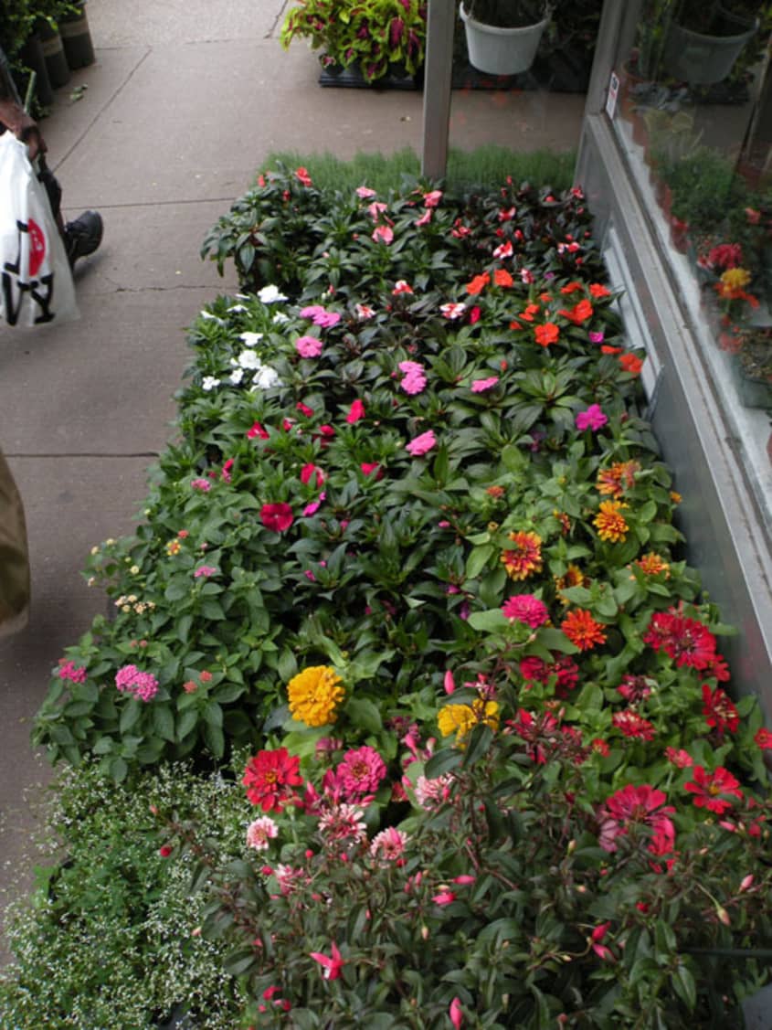
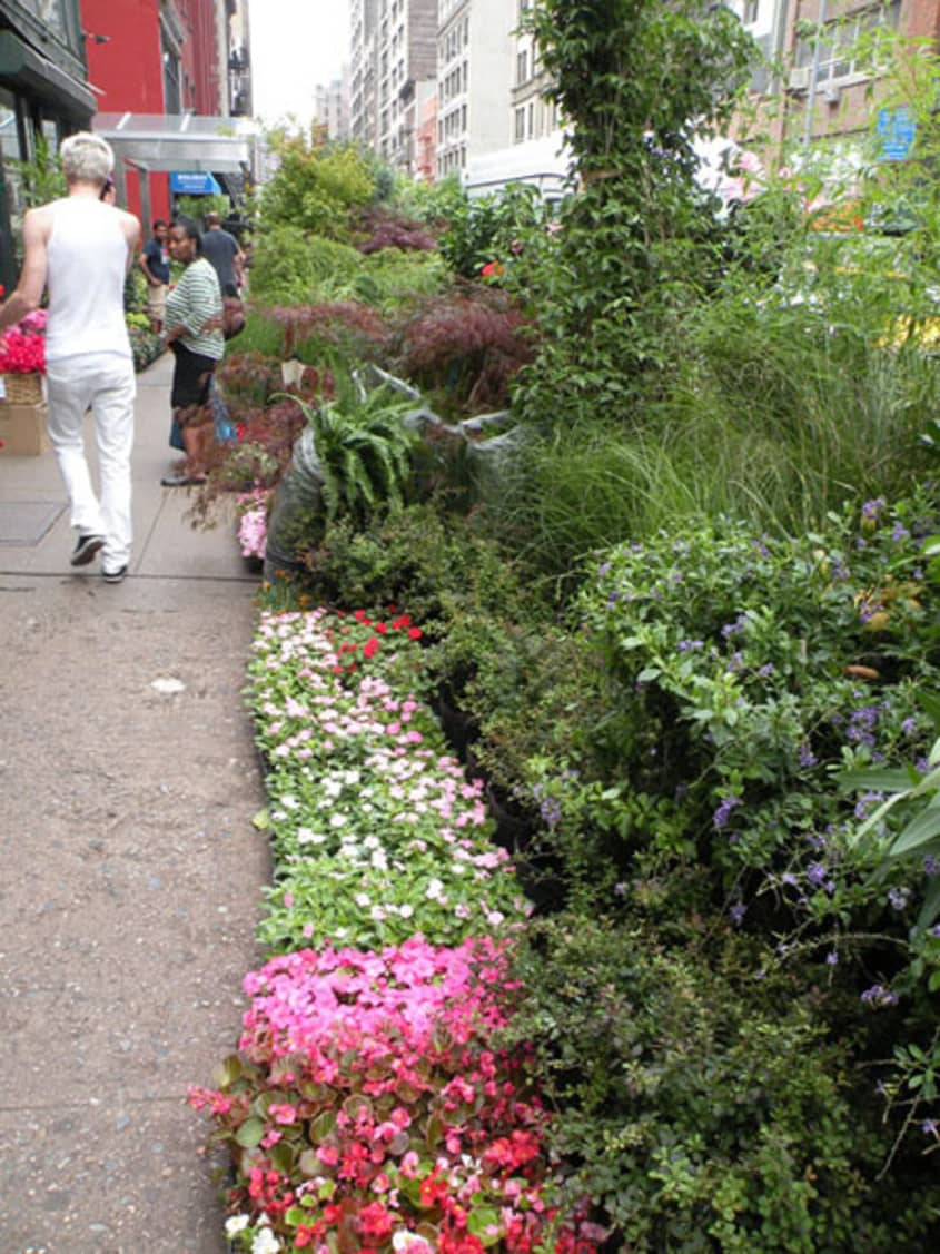
There is a magical place that exists amongst the grit and hustle of New York City where the scenery demands you take a breath and stop to smell the roses. It is sweet, fresh, and totally unexpected. Walking down 28th street you find yourself strolling straight into New York’s garden district. It is one full block of street gardens where greenery and flowers eschew from storefronts and flowers lace the sidewalk. This is the doorstep and daily dose of green for Vince who, in my opinion, maybe one of the luckiest people in Manhattan.
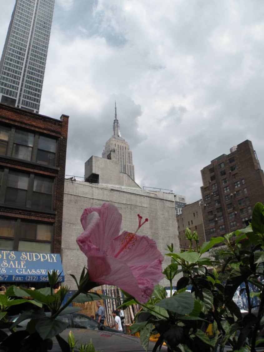
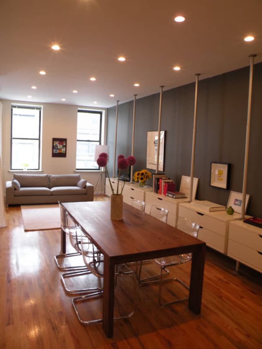
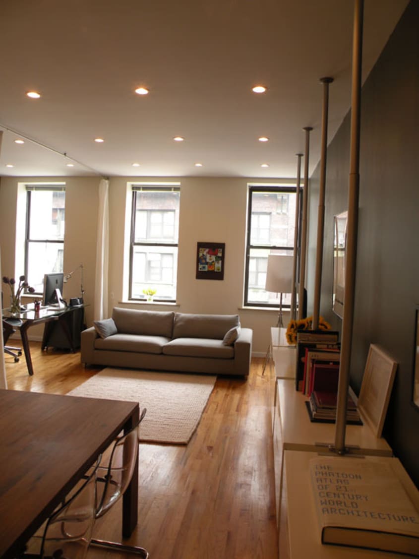
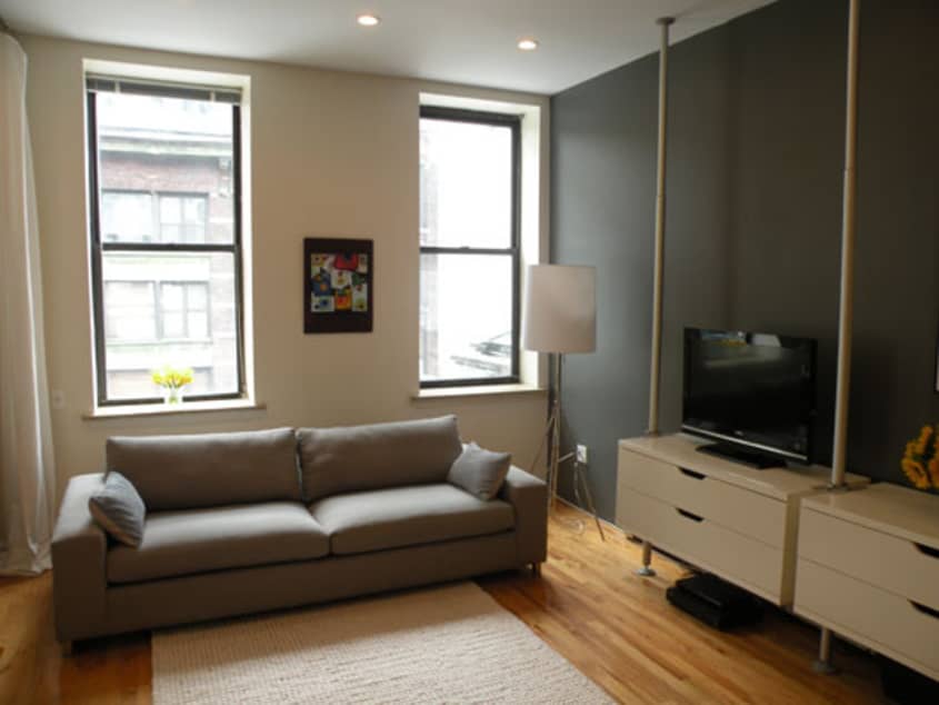
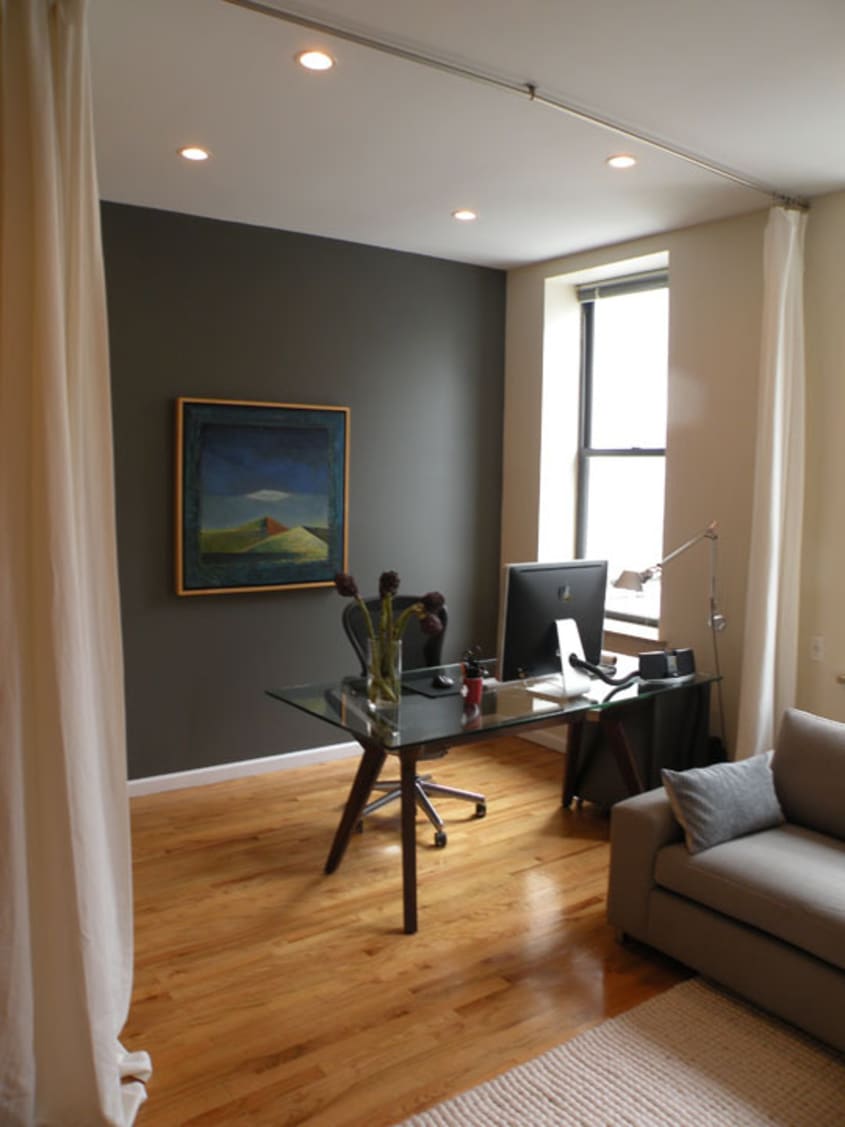
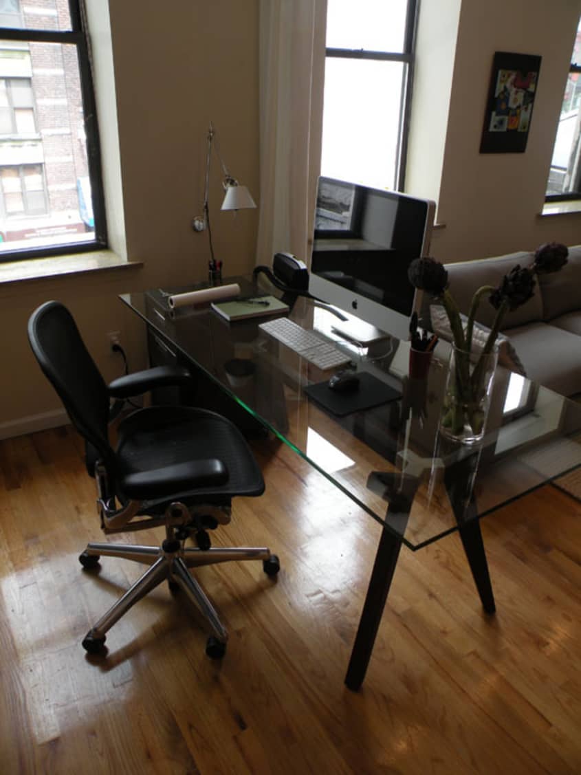

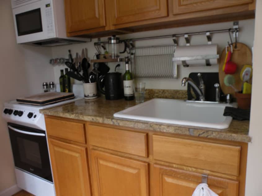
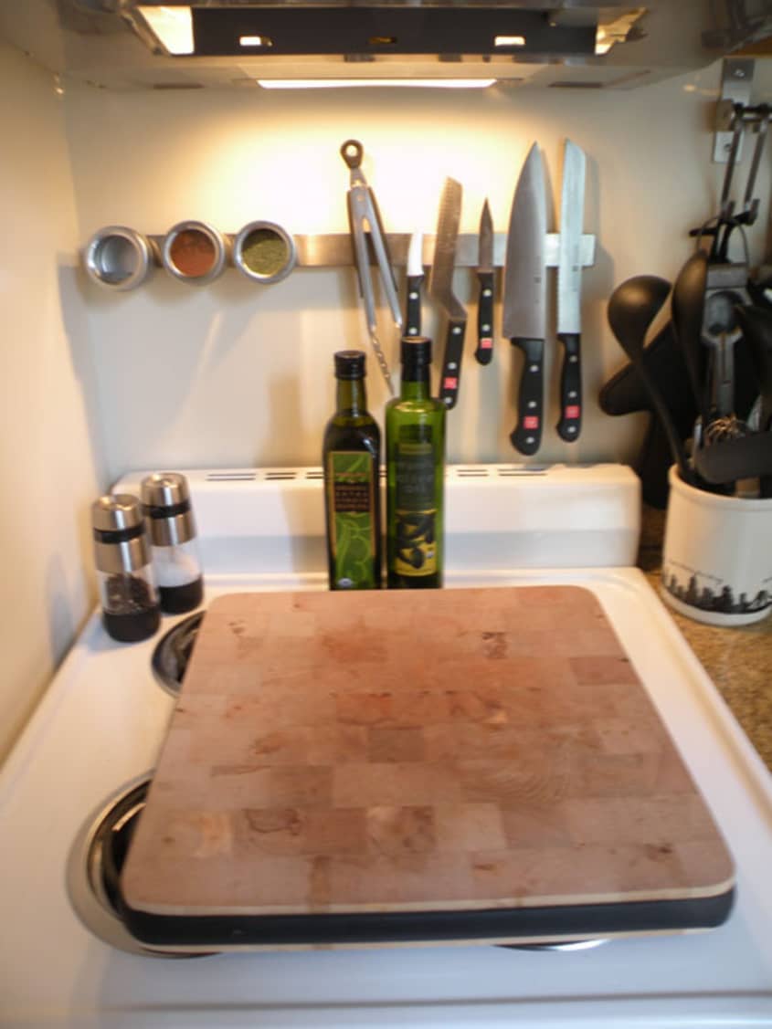
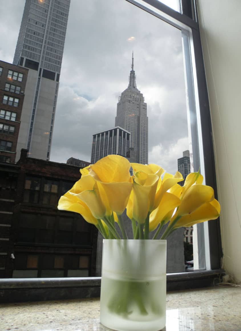
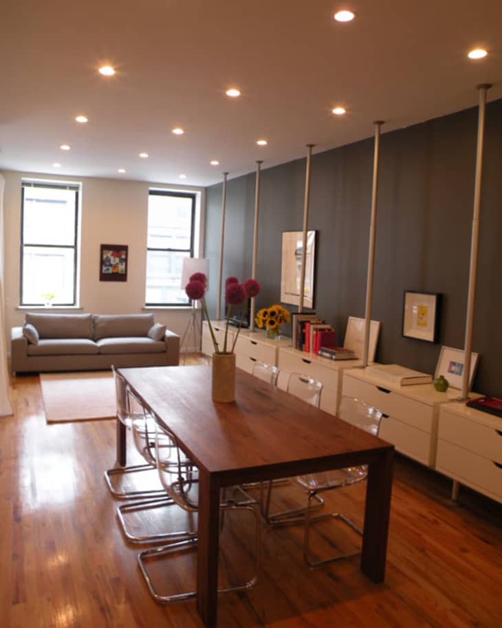
Vince is an architect at A2 Studios-art+architecture. So, we all know how much space along with a functional and beautiful environment matters to him. He may be the luckiest person in the city because he gets what everyone else wants; a continually updated and tended garden (for free), central location, great clean space, and of course all this with a view to the empire state building. Can you say heaven? Upon getting the lease to this apartment from a friend he didn’t have too much to update. It was an open floor plan with great light and generous proportions.
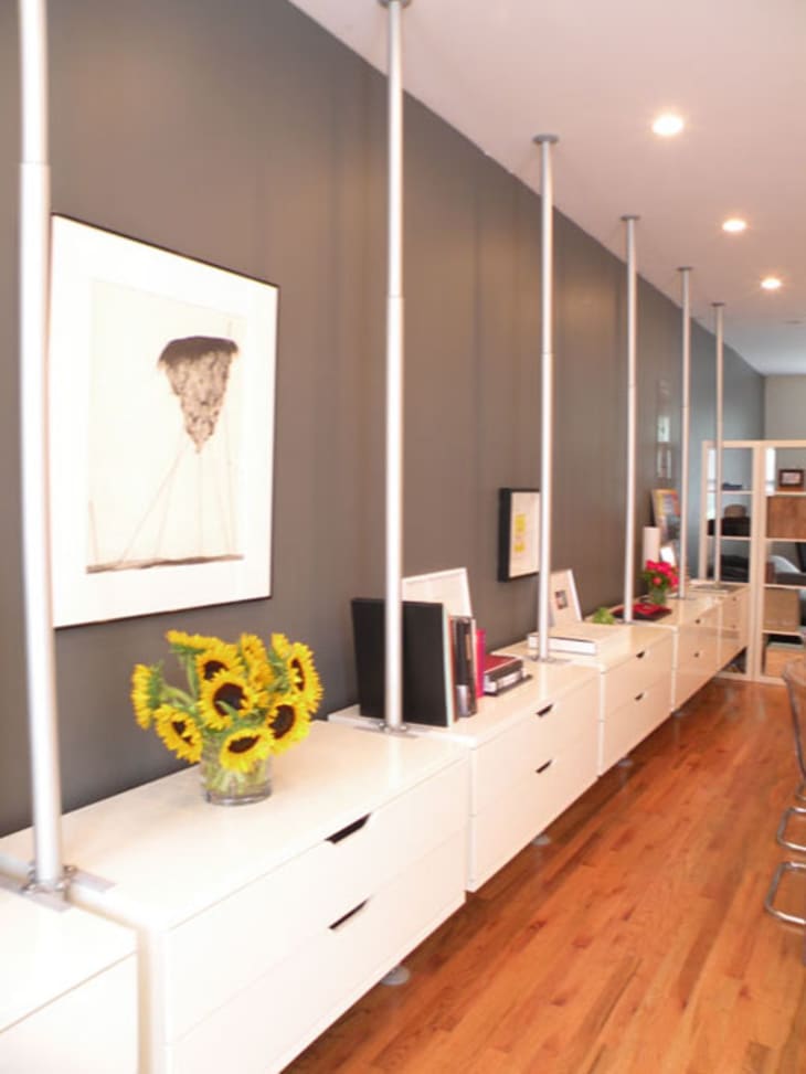
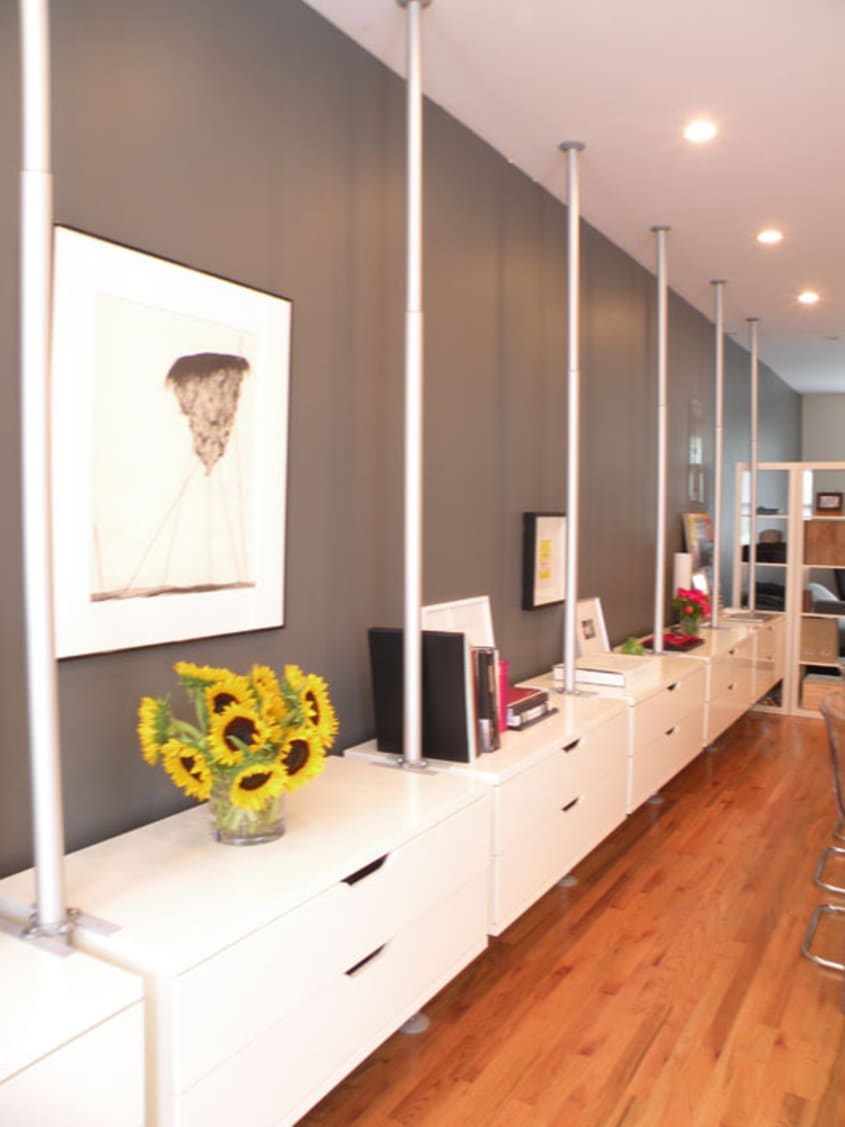
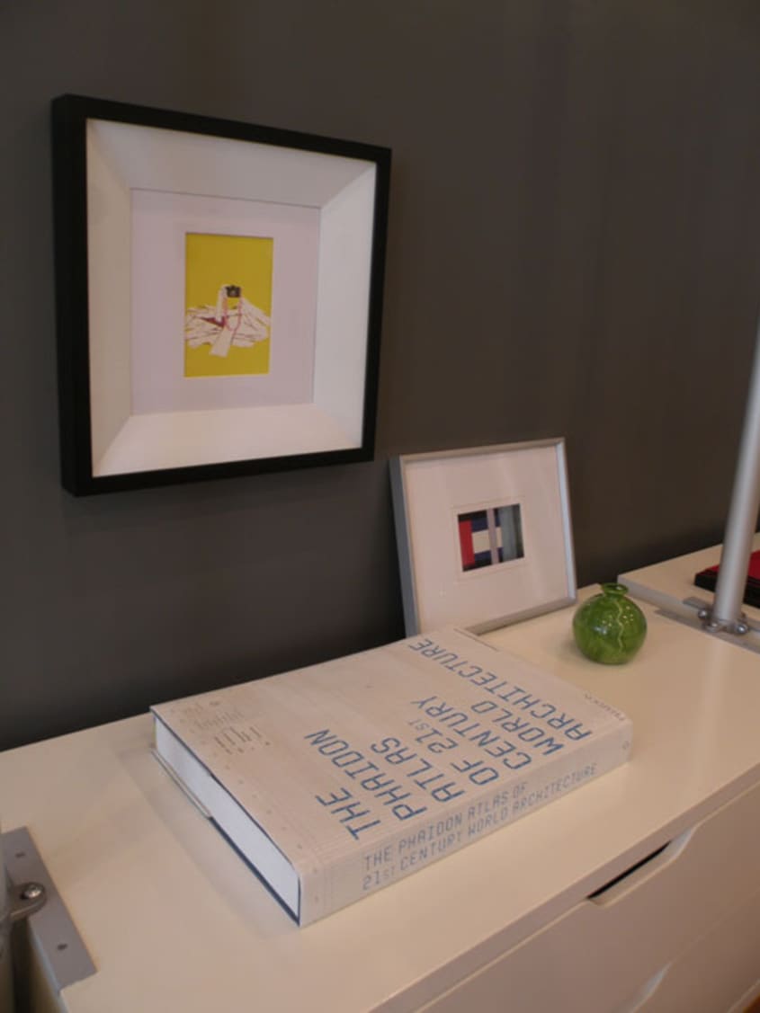
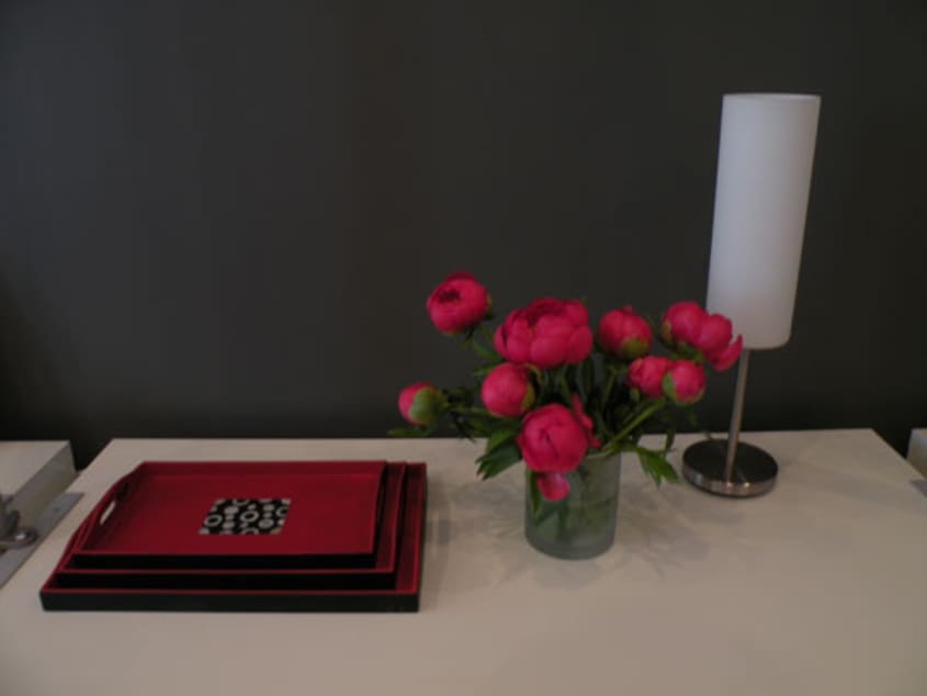
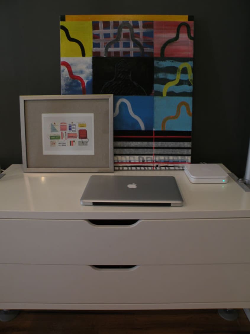
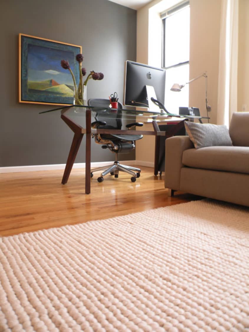
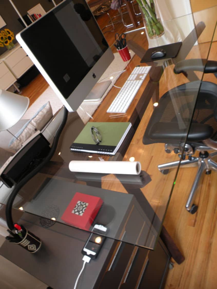
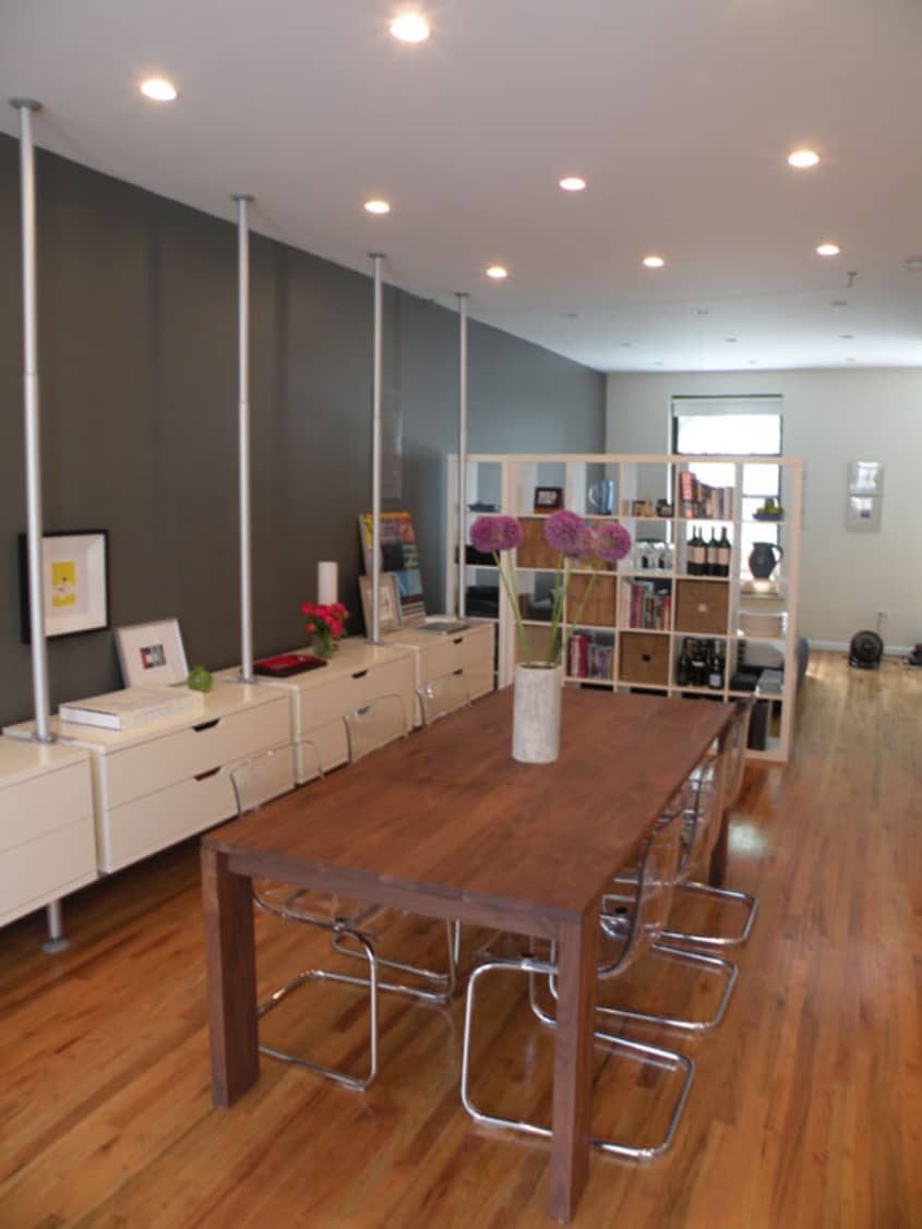
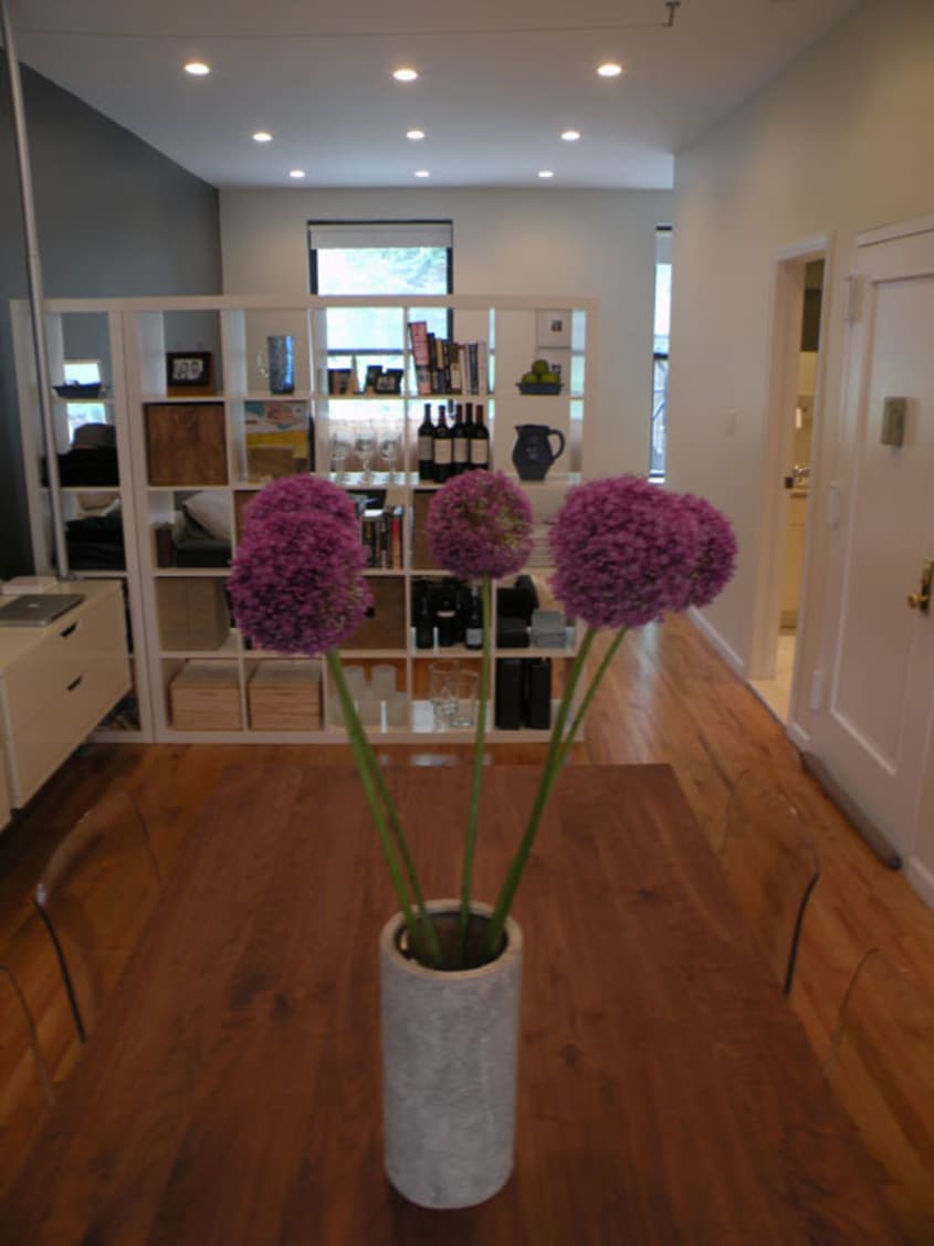
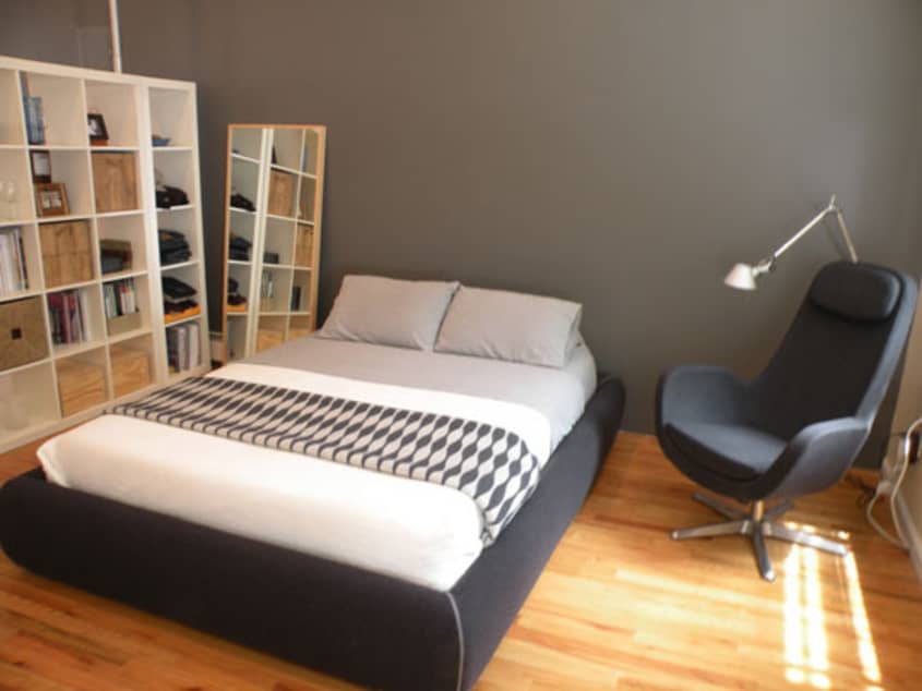
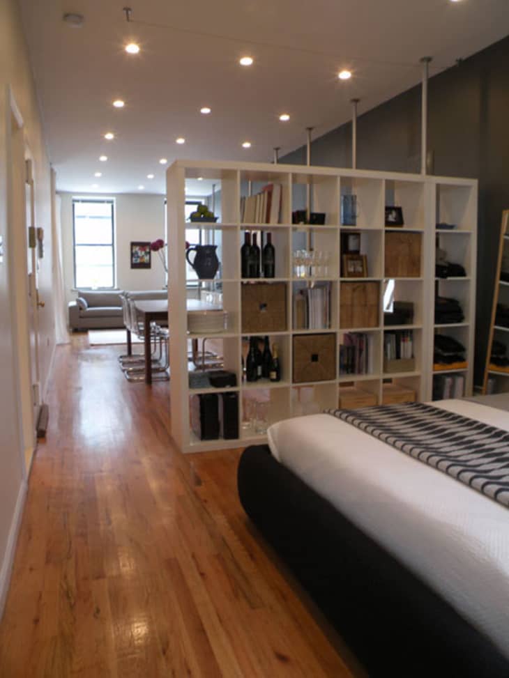
He was able to spend most of his energies on furnishings and expressing his style. One word to describe Vince’s style is Clean. When I visited his space I couldn’t wrap my head around where he kept his things. It was so open and uncluttered. Sure, there is a mile of dressers running through his living room but seeing how much it made sense in his space it was hard to see it as anything but an architectural statement. He also knows the value of good design and how to make pieces work for him. Like his firm’s motto says Vince understands cost effective impact. He is invigorated by the notion that the basic fundamentals of function and cost can be translated into sophisticated spaces, elegant details and environmental sustainability. Gosh, that’s music to my ears! No matter if they are from Design Within Reach or Ikea his curation is fluid and cohesive.

Apartment Therapy Survey:
My Style: Eclectic minimalism – modern & simple.
Inspiration: Ideas inspired by travel and the “city”.
Favorite Element: Wall storage system.
Biggest Challenge: Creating privacy in an open environment.
What Friends Say: WOW, beautiful or sophisticated.
Biggest Embarrassment: Spilling charcoal paint all over a white shag rug.
Proudest DIY: Creating and installing wall storage system by myself.
Biggest Indulgence: Dining table.
Best Advice: Live in it for a while, collect images of things you have seen or like
and then try to find things that make you feel good.
Dream Sources: Hudson Furniture, Design within Reach or Piet Boon
Resources of Note:
Furniture
Accesories
-
• Similar to furniture, I look around for simple things or bring things back that are part of a travel experience…however being a minimalist I don’t have a lot of “stuff” around.
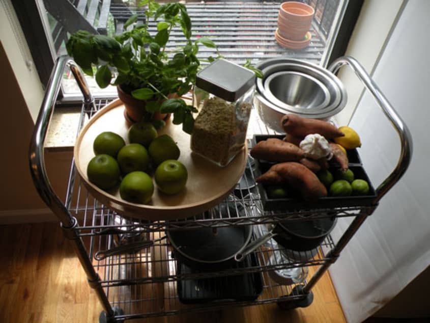
KITCHEN
-
• Wine opener + wine glasses.
LIGHTING
-
• This is very similar to furniture and accessories. I like architectural lighting.
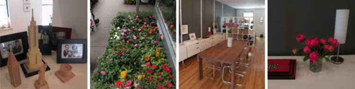
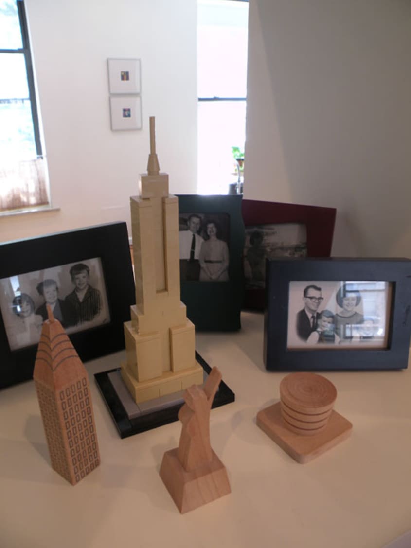
ARTWORK
-
• I love oversized graphics, modern imagery and pieces that have been done by up and comers. I like to hit events in the city that feature young artists as part of a charity event, or to rummage through flea market piles and then re-frame them in simple modern frames. Photography is also another great way to mix
things up.

Thanks, Vince!
Images: Gregory Sparks
• HOUSE TOUR ARCHIVE Check out past house tours here
• Interested in sharing your home with Apartment Therapy? Contact the editors through our House Tour Submission Form.
• Are you a designer/architect/decorator interested in sharing a residential project with Apartment Therapy readers? Contact the editors through our Professional Submission Form.