
High Contrast: A Design Trick That Makes Small Spaces Seem Larger
This is the conventional wisdom: for a small space, light colors. Dark colors can make a space feel heavy and oppressive, and they tend to soak up light, which is usually at a premium in a smaller space. But one of our house tour homeowners, who lived in a very small space indeed, alerted me to a neat trick. Dark colors can actually make a small space seem larger—it just all depends on how you use them.
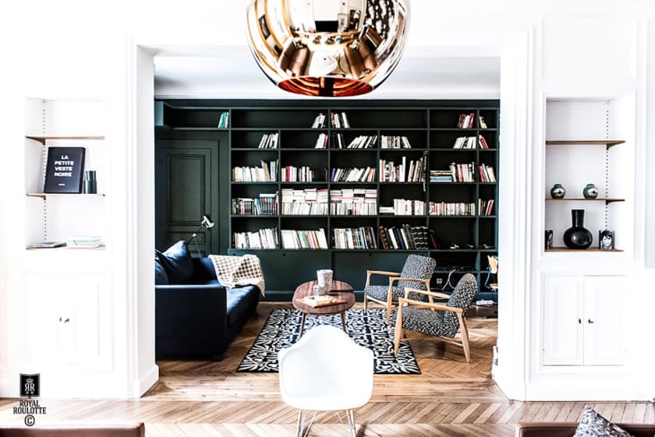
The key is, instead of painting the entire space in a dark color, to just paint one wall (or a single element like a bookcase), as seen in the image above from Royal Roulotte. Dark colors read as receding from the viewer, so the accent wall visually enlarges the space (and sets up a nice contrast that can make the rest of the space seem brighter by comparison). Let’s check out a few examples.
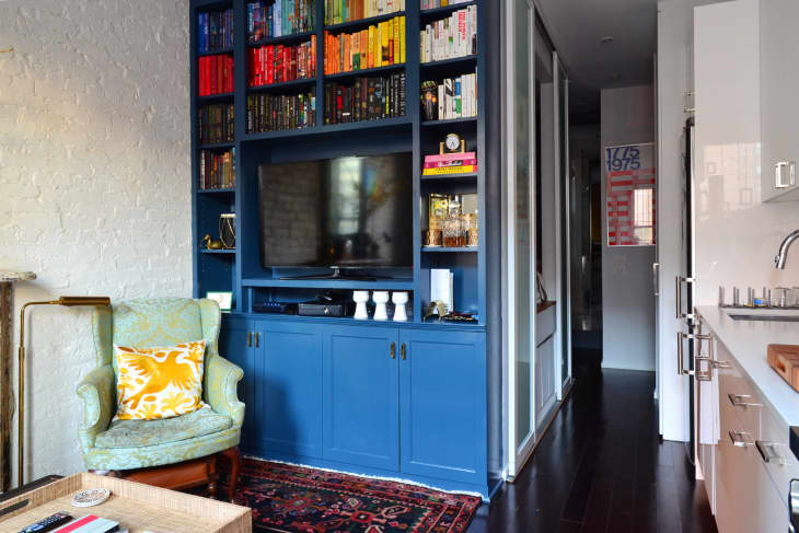
Natasha Habermann, the designer who first introduced me to this idea, put it to work in her 350-square-foot Manhattan apartment. The wall of shelves surrounding the TV (you can see it on the far right in the top photo) is painted a deep blue, which adds depth to her tiny living room.
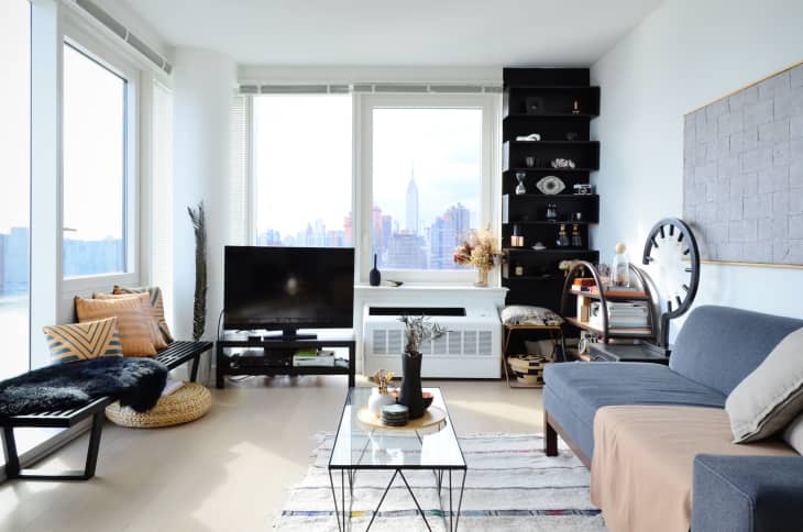
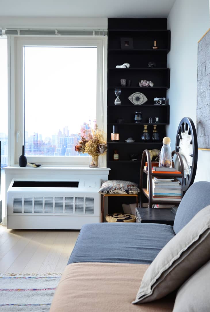
See also: Tanika and Brian’s New York apartment, notable for its clever use of color, but especially notable, in this case, is the black-painted bookcase in the living room, which adds depth and interest to a little corner of the living room.