
Ann’s East Village Aerie
Can't-Miss House Tours Straight to Your Inbox
Keep up with our latest house tours each weekday with our House Tour of the Day newsletter
Name: Ann Mack
Designer: Christina Love
Location: East Village — New York, New York
Size: 500 square feet
Years lived in: 7 — rented
Call it the six-ish year itch. After as many years in one place, Ann wanted a clean slate, to banish the shadows and let in the light. She looked to favorite places for inspiration, to a professional for guidance, and in the process, strengthened a friendship and rediscovered the love she once had for her home, all while preserving and polishing the best of a studio in a vibrant New York neighborhood. That’s a nice way to start a new chapter.


Ann was ready to chuck it all to do exactly that. Well, almost all. The sofa, and the studio itself (with ample closets, lovely period detail and dedicated entry) were givens. But heavy woods and dark greens cast a shadow over the mood of the residence and, in some ways, the resident. “It was feeling very weighty,” she sighs. “I really wanted a ‘refresh’ to make it feel new.” Ann was ready to shake that weight away, like dust off the sheets in a long-forgotten summer share. But change, even when you’re ready, doesn’t always come easy. “I actually needed to bring a change agent in to do it, otherwise it would have been a very slow slog to get it done.”
Enter Change Agent Love: Ann’s friend Christina Love, of Love Design. That preexisting friendship made Ann a fan of Christina’s interiors. “I had seen Christina’s work, and I was like, ‘Wow! I want that!'”
A Saturday afternoon over magazine clippings proved early on that client and designer were on the same page about where they wanted to head: to a mix of modern and vintage, to more light, more air, and, at Ann’s urging, to the beach. Says Ann, “I absolutely love my time at the beach and I wanted to bring a little bit of that to the city.”
Ann promised to jump in to the transformation in a way every designer dreams: “I was willing to get rid of almost everything in my apartment.” Responds Christina, “I thought, ‘Hallelujah!’ But I didn’t really believe her!!” Ann made good on her promise, and Christina quickly witnessed a steady parade of bags and boxes to the curb, and sometimes, to the building’s lucky super.
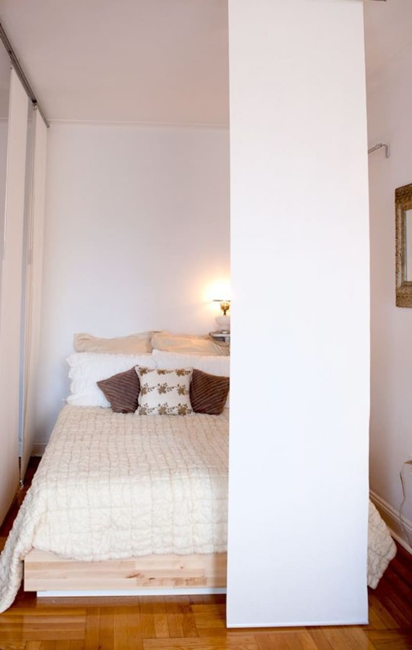
The hardest sell, but the studio’s biggest transformation, was switching the seating and sleeping areas. When Ann moved in, she did what most would do: plunk the bed farthest from the front door. That put it near the window, so during the day, it pushed Ann deeper into the apartment’s darker corners. Like many designers, Christina had already mentally rearranged the space, even before she got the commission. “I just kept saying, ‘You can flip this around!'” trying to coax Ann to swap Sleep and Live on the floor plan. “I would even say, when I was over there… ‘Can we just try this?‘” So when a new mattress was delivered, it went in its new spot. Ann was sold. “She twisted my arm,” chuckles Ann, “and it really worked out well.”
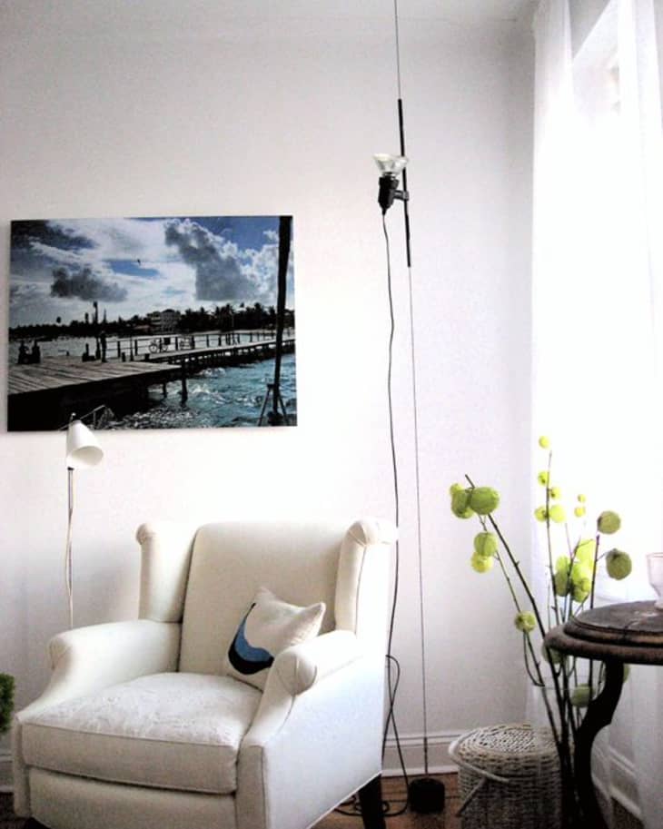
Part of the success of that reposition rides on the rails of the hanging panels Christina devised, a fresh take on bed curtains, to give the bed a subtle sense of enclosure and separation from the adjacent foyer. Like many pieces in the apartment, those panels respond to even the slightest movement. Gauzy linen at the windows, a suspended Parentesi lamp, and the art installation of tiny birds over the sofa all do the same, giving the space animation and life. It all also helps evoke those sea breezes they had hoped to stir up.
That avian art piece is just one of the intriguing decisions that made the space decidedly art-driven. They ended up with a modern mix of drawing and photo, works on paper, and—those birds!—delightfully 3-D. “I was feeling like we had enough two-dimensional pieces, and I wanted to do something three-dimensional,” says Christina. But it was practicality, not put-a-bird-on-it trend that lead her to Ann’s new feathered friends: Faced with a big blank wall and a photographer on the way, Christina made a dash to the flower district and crafted up a surprisingly chic installation, dollar store in origin but high-end gallery in appearance. The birds are hung and strung at various heights and distances from the wall, where they perch and dangle, casting animated shadows and catching the slightest breath of air.
Joining Ann’s own travel shot from Belize and rounding out the art pieces chosen for the reworked space was “Raging Girl” by Gina Magid. It seemed appropriate to Christina for its portrayal of the full-throttle feminine energy she admires in her friend. “The way she attacks things… whether in her personal and professional life… she’s pretty full on!” says Christina with a smile. It’s also a great tip on art shopping: while Magid’s paintings were out of budgetary range for this project, a smaller work on paper proved handily within reach.
Perhaps the space’s biggest style return on investment: the coffee table, a Cinderella story where a castoff ends up the belle of the ball. But it was stainless steel legs, not a glass slipper, which proved the elusive footing. Christina had envisioned pairing the window frame with metal legs from IKEA, in what was supposed to be a quick and easy merge of old and new enlisted successfully throughout the rest of the project. No such luck, since the legs were discontinued. A global search on eBay yielded nothing but frustration, and when a last-resort set of candlestick legs brought the table top too high, Christina did what any good designer does: improvise. “I just wanted to see what this window would look like at the right height, so I took a bunch of her books off the shelf, and I started stacking them one by one to see.”
The solution proved perfect, for height and homeowner: in Ann’s job as Director of Trendspotting for JWT, she’s explored the concept of “objectifying objects.” She explains: “As things become digitized, from photo albums to money to (music) albums to books… we’ll start to ‘fetishize’ the physical object.” Looking back, Christina thinks the journey may have been more strategy than serendipity. “I think she had planted the seed! She kind of joked (about books): ‘Are they going to end up the legs of a coffee table?’ And they did!” Says Ann, “It’s just a beautiful piece of art, but also functional art. And it leverages one of the trends I’ve been spotting.” A trip to the Strand, with books picked by title and size, and coercing the contractor out of drilling a rod though the books ended up with a literally novel table. There’s even a replacement stack nearby, to slide in when the desire to thumb through a favorite title takes over.
Why would a professional trendspotter who takes such care with art and object even need a designer? Says Ann, “It was fantastic to enlist someone I trusted to get what I wanted done, done. Ultimately it came down to time… it would have been nice if I could do it all on my own, but I’m realistic.”
But as much about time, it was also about distance: how far the project could go. Ann cites as one example, a hall mirror custom made of reclaimed wood: “I would have never thought to hire someone to make that mirror just in the way I wanted to, or be able to find the person to make that mirror. She broadened my horizons quite a bit!”
But how about that age-old adage that friends should never enter into a business venture?
“I had never worked for such a close friend before, and I was not ready to lose her as a friend,” Christina declares. Ann concurs: “If anything, it’s made our friendship stronger,” and, Ann adds, “I’m definitely using the space differently.”
“I trained her well!” laughs Christina, breezily, as a good friend does, sitting comfortably in the light of the window.
Listen to the conversation with both Ann and Christina here.
Apartment Therapy Survey:
My Style: Contemporary / Vintage-Bohemian / Eclectic
Inspiration: World travel, love of maritime elements and pop culture.
The feeling was, after living there for over six years, Ann’s apartment no longer even came close to reflecting who she was, the success she’s achieved and the quality of life her environment should provide her. We wanted to transform it into a sophisticated, bright, happy space – one that’s representative of the person she is today.
Favorite Element: 1. The Parentisi floor lamp from Conran, designed by Achille Castiglioni and Pio Manzu. This ceiling-mount fixture hangs from a steel cable with a circular weight attached to the bottom, suspended about a half inch above the floor. The tension created by this weight allows the light to move vertically from floor to ceiling and rotate 360 degrees, via a steel tube that slides up, down and around the cable. (No wonder its in MoMA’s permanent design collection).
2. An antique lavender Venetian glass lamp with a ship etched in the side of it.
Biggest Challenge: 1. Flip-flopping the original layout of the sleeping and living areas, then customizing hanging divider panels to work in a pre-war building, where nothing is even or level.
2. Figuring out how to resize the new “vintage floor board” floor mats to cover the whole kitchen using only three 4′ x 8′ sections.
What Friends Say: It looks so much bigger and brighter!
Biggest Embarrassment: After we added casters to the kitchen counters, someone leaned on them the counter legs splintered to bits! They had to be taken back to the contractor’s workshop, have brand new legs made, and match the original wood stain. Now they are indestructible.
Proudest DIY: 1. Designing a coffee table with its top made from an antique window and the legs made of from stacks of books.
2. Creating the art installation (called “A Quiet Night in Florida”), made from decorative birds, air ferns and moss suspended above the sofa.
Biggest Indulgence: “Raging Girl” painting by Gina Magid
Best Advice: Buy quality.
Dream Sources: ABC Home, B & B Italia, Paris Flea Market (!)
Resources of Note:
PAINT & COLORS
-
• Benjamin Moore:
Decorators White CC-20 (throughout)
ENTRY
-
• Metal bench: Totally Bruce vintage and industrial furniture, Red Hook
• Bird fabric: Schumacher
• Wooden bench: ABC Carpet & Home
• Green antique gas canister, round Victorian ceramic and velvet wall hanging, nautical ship print: Meeker Avenue Vintage and Antiques
• Photo of Ann at Café Table: “Ha!” by Christina Love; framing by M&H Art & Framing
• Barn painting: Flea Market Antiques & Collectibles
• Custom Floor Mirror: Amish woodworker, PA
LIVING ROOM
-
• Caye Caulker, Belize Dock photograph: Ann Mack; enlargement and mounting – Art Addiction
• Parentesi suspended cable lamp, Hector floor lamp: The Conran Shop at ABC Carpet & Home
• White linen drapes: Crate & Barrel
• Custom wing chair: TCS Design, Hickory, NC; fabric: Schumacher
• Needlepoint Banana pillow: Jonathan Adler
• Antique wooden table between windows: Meeker Ave Vintage and Antiques
• Coffee table: vintage window from “Build it Green,” Astoria; books: the Strand
• Acrylic laptop table: CB2
• Striped throw blanket: The Conran Shop at ABC
• Sofa Pillow: coffee bag from Williamsburg Flea Market custom made into pillow by Solomonic Couture for the Home
• Installation above sofa: “A Quiet Night in Florida” (named after a Diego Garcia song); Artist: Christina Love; birds from Sprout Home; additional birds and plants from Jamali
• White lacquer book shelf: Props for Today
• Capri Paiting above keyboard : painting on antique tin ceiling tile by Mladen ‘Gino’ Novak
• All decorative glass: Jeff Mack
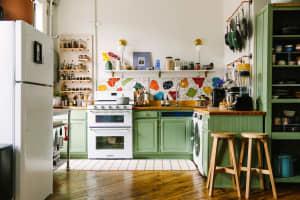
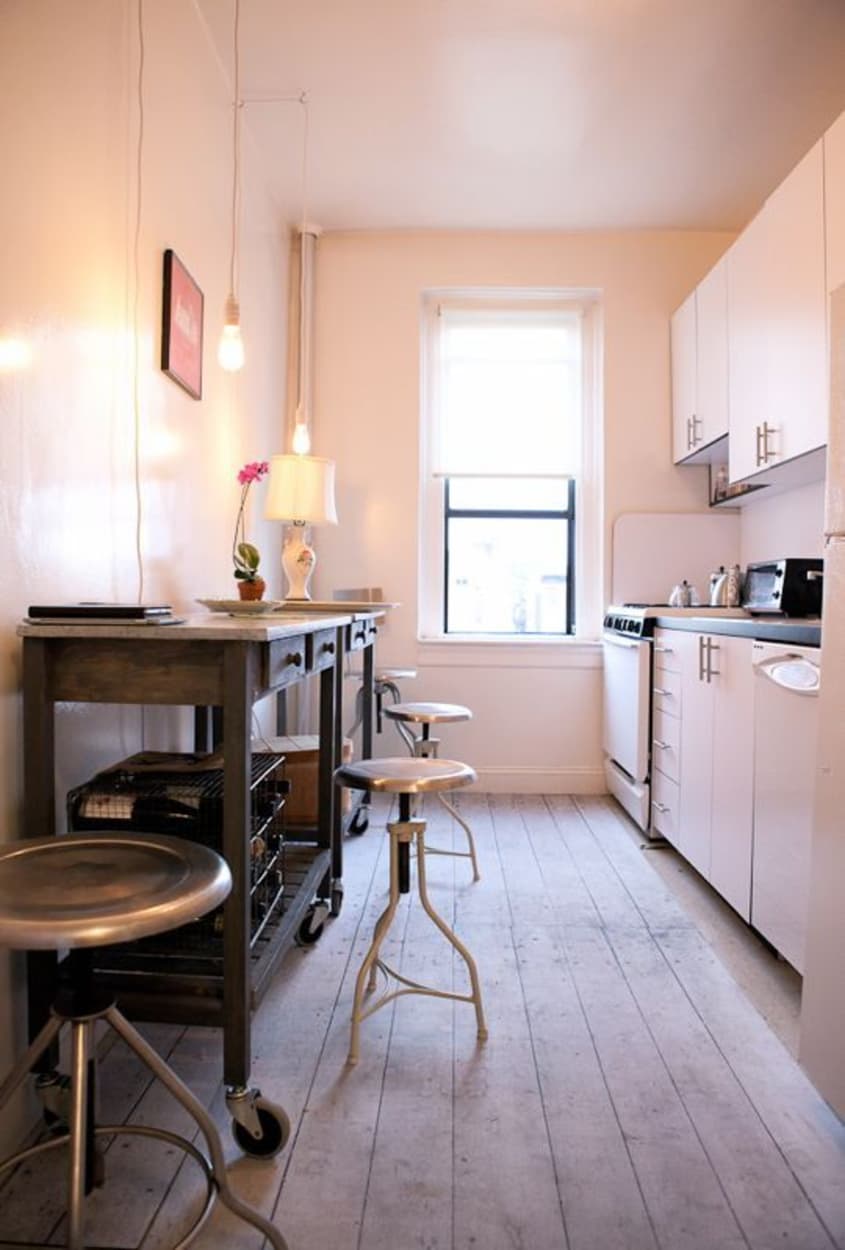
KITCHEN
-
• Counters:
Wisteria; industrial casters from CWIH
• Pale pink vintage cabinet: Gristies Bucks County, PA
• Vintage porcelain flower lamp, wooden box: Meeker Ave Vintage and Antiques
• Sky plane art: “Meet Me At Macky’s” by Christina Love
• Message board, cord kit lamps, whitewashed floor mats: Urban Outfitters
• Pair of smaller barstools : Sundance
• Larger barstool: Cosmo, Williamsburg
• Backed stool:Totally Bruce, Red Hook
• Wire wine rack: Moon River Chattel, Williamsburg
• Stainless cabinet handles: The Home Depot
• Spice Bottles : Williamsburg Flea Market
BEDROOM
-
• Bed and hanging panels/system: IKEA
• Silk quilt : ABC Carpet & Home
• Shams: DKNY
• Wall shelf: Salvage Goods, Easton, PA
• Bedside lamp: Meeker Avenue Vintage and Antiques
• Oil and charcoal drawing: “Raging Girl,” Gina Magid
• Vintage dresser, Raging Girl frame, turquoise foot stool: Antique Haven, Easton PA
• Lavender etched Venetian glass lamp: Cosmo, Williamsburg; lampshade: Just Shades
BATHROOM
-
• Shower curtain, trash can: Urban Outfitters
• Candelabra, koi bath mat: Anthropologie
• Hand towels: ABC
• 3-tier shelf: Antique Haven, Easton PA
Thanks, Ann (and Christina)!
– Re-edited from a tour originally published 3.19.2012 – CM
Images:
• HOUSE TOUR ARCHIVE Check out past house tours here
• Interested in sharing your home with Apartment Therapy? Contact the editors through our House Tour Submission Form.
• Are you a designer/architect/decorator interested in sharing a residential project with Apartment Therapy readers? Contact the editors through our Professional Submission Form.