This 80's kitchen was in need of updated appliances, cabinetry, and an overall space adjustment. By taking extra space from adjacent rooms, the kitchen was opened up into a light and bright gourmet chef's workplace. Check out the difference after the jump...
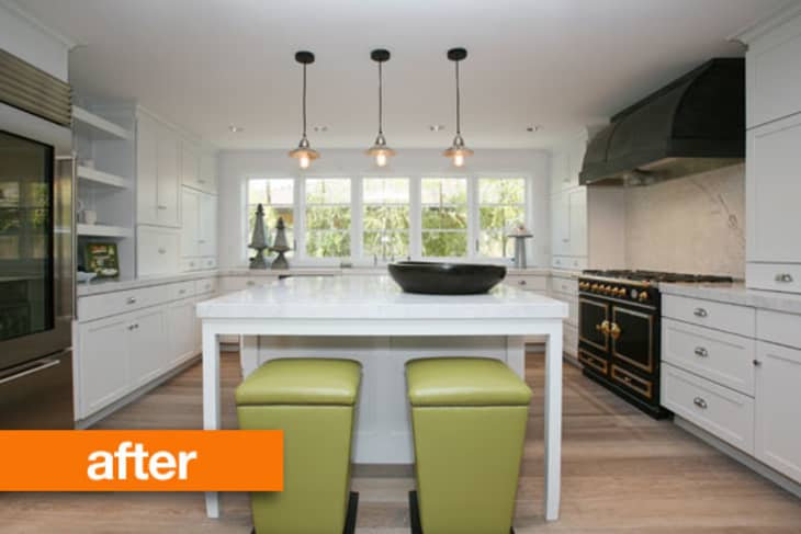
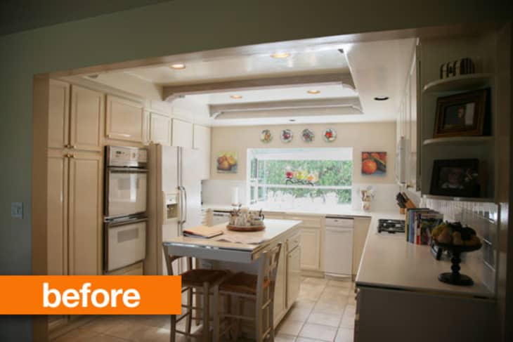
Although it may not look like it from the before photo, this kitchen was very dark and narrow. There was extra space in the bedrooms on both sides of the kitchen that allowed for the walls to be pushed out in order to add some extra square footage to the width of the kitchen. The additional space allowed for larger appliances, extra storage, and seating at the center island to be installed in this kitchen.

The pendant lights were one of the biggest headaches of the project. It started with 3 simple clear glass pendants, which were all broken by a very clumsy electrician. With a deadline and the replacement glass pendant covers six weeks out, new mercury glass pendants were selected from Anthropologie.
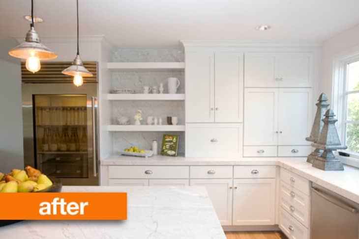
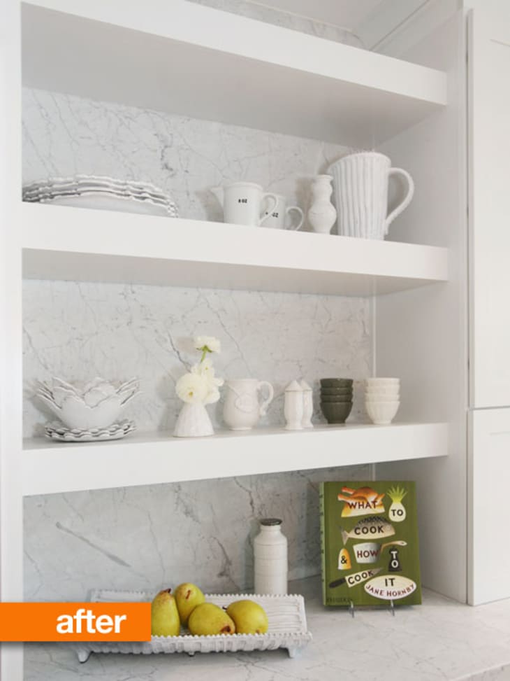
Open shelving is very trendy and often it makes up too much of the storage space in kitchens these days. While it is nice to display some of your best dishes and accessories, the average homeowner wants lots of storage to hide ugly kitchen appliances. This kitchen added in a nook of open shelving for only the best kitchenware, while still leaving plenty of covered storage for even the most prolific chef.

Sources:
Cabinetry: Kraftmaid
Countertop: Carrara Marble
Refrigerator: Sub Zero
Cooktop and Oven: La Cornue
Bar Stools: Lee Industries
Pendant Lights: Anthropologie
(Images: Claire Bock)

Z2 iPod Dock and Wi...
I'd feel lucky just to have the space of that first kitchen - but you can't argue with the results. So much more natural light and that island is amazing.
"Very dark and narrow" LIES. It's wide enough for an island. Come on now. Have you never cooked in an apartment kitchen?
That said, the after is beautiful and appears to be very well worth the effort.
While I covet that range, I find the giant black range hood jarring. The open shelving area is charming, though.
I didn't see anything wrong with the before. I really liked it. But the after is still amazing. Very classy. Nice job!
wow, how big of a kitchen does a family need?!?! but yeah its beautiful. i guess if you have the space and money! i'd have been happy with the 'before' kitchen too!
:)
Nothing in that first photo looks outdated or in need of updating or like it is from the eighties. The after is gorgeous obviously and no date something most would prefer but writing the post as if the "before" was an eyesore screaming for an update I feel is a little disingenerous.
I may be in the minority but I think the before was cozier. And I find it ironic to read it was narrow after a ton of small kitchens we saw on the Small Cool Contest :)))
Put me on the list of those who liked the kitchen before. The after is no doubt beautiful but I agree, there was nothing wrong with the 1st one.
It's all in perferrence and the how much you utilize the kitchen.
Agree with the others - how big a kitchen do you need? The 'before' had space for an island, two ovens, a big fridge, and tons of counters/cabinets.
To me this post goes against what AT is (was?) about, which is 1) making the most of small/unusual spaces and 2) great design.
At some point are houses just going to be giant kitchens and bathrooms with a couple of bedrooms attached?
I agree with the previous comments. Although the after is even nicer and bigger, the before already was nice and big.
You have to look closely at the "before" photo to really understand what was so outdated about this room. The angle and lighting of the photo make it look nicer than I think it really was. If we had a few more close-ups from before I think more people would agree that the kitchen needed updating...perhaps not this much updating, but the end result IS gorgeous! The old cabinets appear to have been that ashy, almost "pickled" look that was popular in the 90's....So the cabinets along with the white appliances and the boring tile all blended together into a beigy/off white/blah look.
And the new windows are awesome too!
I think there's enough space now to tuck away those two large urns on the counter.
I think it's funny how the write-up says the decision to have only a small nook of open shelving is because people want closed storage (which, true enough, fine), but then the refrigerator has a transparent front. Which is all well and good when it's stocked with an army of smartly lined up champagne bottles, but in normal use I'd say I'd want the contents of my refrigerator on display less than stacks of plates that might go on open shelving.
Okay, people-- yes the "before" was just fine and fully functional. (Though for what I'm assuming is a family with kids, that dishwasher ain't cutting it.) But considering this is a design blog, after all, I think this is a great post on how something that is merely cozy (not everybody wants cozy) has transformed into something truly beautiful and more than just functional. You can't hate on a family with money for using it, especially when it's for our viewing pleasure.
The black range looks like somebody parked a locomotive in the kitchen. It's big enough to fit one after all. Other than that, the new kitchen is gorgeous.
I actually like the size of the before better. It looks like the perfect combination of the efficiency you get from a smaller kitchen and the storage you get from a larger kitchen.
That being said, I think the layout is awkward with the ovens right next to the fridge and the cabinets are dated so I would have update it too - just in the same footprint.
Can someone with a white kitchen who cooks regularly tell me: are white kitchens hard to keep clean? Wouldn't the cabinets get stained over time from cooking and dirty from kids' fingerprints?
And by someone who cooks regularly, I mean someone who actually makes a regular meal from scratch at least once a day using things like blueberries and strawberries and green peppers and carrots and turmeric -- things that might stain -- and makes pizza dough from scratch, and opens and closes drawers and cabinets and cooks things that boil over sometimes, and even more: someone who does all of that with children in the house.
Is there anyone around here like that who could tell me how a white kitchen is holding up?
@WittyCassieHere - I think that's a trash compactor. The dishwasher is full size and hidden behind the island to the left of the sink.
I don't think the room is any brighter, I think It's all camera exposure.
can anyone say where those stools are from?
I agree with the others, I think the kitchen is too big now. I like being about to turn around and have what I need right there, instead of walking back and forth while cooking. I love to cook a lot, but I find that a huge kitchen isn't necessary. I would've just replaced the cabinets, updated the lighting and appliances and moved the oven layout. But I guess is you have the kind of square footage and money to pull this off it does look nice.
Beyond fabulous - an amazing transformation and an incredible before and after!!
Very pretty, luxurious, very high-end remodel. While the old kitchen does look functional and well maintained, I can see why someone would want to rip it out. It was extremely dated. Does AT ever reveal the budget for these jobs? That stove alone Is about $50k, without the hood. The fridge, ditto. I'm sorry, but I've done so much kitchen and bath remodeling my brain automatically puts price tags on all the elements!
What's funny to me is that with all that expenditure, they kept the original layout with very little tweaking. I ended up doing that with my last kitchen remodel, but it was in large part a money saving move. The one tweak they did do is questionable as far as functionality is concerned -- they moved the fridge too far away from the rest of "the triangle."
Also, given the classic styling, I am puzzled by the choice of those green leather stools. They don't look like they belong, and they look uncomfortable to me.
I do like the clean look overall, though. No fake "old world" junk. No extra millwork just for show-off effect. Nice and restrained.
@ADONUTS - I have a white kitchen, I cook everyday and it's fine. If you think about it, darker kitchen cabinets and counters aren't getting less dirty - they are just hiding the dirt. So I wipe down my cabinets when there are fingerprints on them - but I'd wipe down my cabinets even if I didn't see fingerprints. Things get dirty. You have to clean them. Just because you can't see the dirt, doesn't mean it isn't there.
@ADonuts - I've lived with a white kitchen for three years, and it's no big deal. Like Emily said, you actually see the junk on the cabinets, which forces you to clean them, which leads to a cleaner kitchen most of the time. Personally, I love having white cabinets.
I liked the before kitchen better. However, I would like to see how the remodel goes with the rest of the house.
@ADONUTS I was just about to say almost exactly what @EMILYRYZ said! I have white cabinet doors, white counter tops, white fridge, white sink etc. The kitchen is 8 years old and was a DIY project built by my son (not professional installers). All the materials were from Home Depot due to budget so it's hardly the very top quality. It has pops of red and quite a lot of black so it's not as sterile as it sounds.
I cook from scratch every day - lunch and dinner. (And I mean proper scratch - if I make pizza I make the dough, if I make pies I make the pastry). After eight years, there are no stains and it looks as good as new. As @EMILYRYZ said, if there's dirt there I'd rather be able to see it and clean it.
Note though that there are only two of us and there are no kids or pets in the household. The only potential problem is red wine. If that gets onto the counter top and not wiped up right away it takes a lot of shifting. However, we've trained ourselves to use coasters - that's easier than training ourselves to drink white wine instead!
So I went to the designer's web site and saw that it wasn't just a kitchen reno. The whole house was redone. That old kitchen would not have worked with the renovation. I think they did a good job.
http://www.clairebock.com
Oh, it's the Nautilus project.
I see that it was a total gut job. Strange that wasn't mentioned here. For anyone who thinks a glass-doomed fridge is too revealing, you should see the clear-glass-doored pantry (?) in the dining area. Very odd choice.
The after is absolutely stunning. I love that AT features such great projects of all scales, large, small, professional and DIY. I'd love it even more if financials would be worked in somehow (price tag of the total project, or perhaps just price range categories, or the every-helpful reference of $, $$ or $$$ from travel guidebooks) to give a more well-rounded view of reality.
The only thing I don't understand is stealing space from bedrooms to add to the kitchen. But oh well, not my house!
Regardless of what people think (I thought the first kitchen was fine; just needed some lighting) it isn't my kitchen and the owners did not ask me to pay for it; so I don't feel it is any of my business why they did it; that they should donate that money to causes;or any other negative comments. Maybe they want to sell their house and a new kitchen can raise the appriciation of the home; or maybe it was a couple who raised a family and had saved for years so they could have a new kitchen. The question was did we (the viewers) like the new kitchen; not asking us to judge why it was upgraded.
Ok, I can see I might wanted to have replaced those cabinet doors. And move the refrigerator so it wasn't right next to the ovens...bad placement, that. And you really do get more light from that wall of windows than you do from what looks like one of those bump out terrarium windows. And yeah, replace those fake beams and recessed lights (though they still have recessed lights.) An yeah, if you are doing a kitchen remodel, even get new appliances. Though I like a smaller cooking triangle, as it makes for more efficient cooking, so I probably would not have increased the size of the room. What I don't get is if you want the big, big kitchen (it seems to be a status thing these days, along with the massive range and hood, and fancy fridge...yes, I like fairly basic, simple appliances), why not use good kitchen design in doing it? Yes, that fridge should be closer to the sink, with cupboards further away, for a more efficient triangle. If you are going to supersize your kitchen, make one side for cooking and the other for eating. Just goes to show that spending a lot doesn't necessarily get you good design.
There is no question that the new kitchen is bright and beautiful. And yet...the first kitchen had so much more warmth and personality. In my opinion. :-)
I really dislike the black range. It looks like a steam engine pulled into the kitchen station.
I agree with HHRI, the appaliace to the right of the sink is a trash compactor. They were more of a 70's thing. You can just barely see the dishwasher to the left of the sink. The remodel seems to have increased the distance between the sink, fridge and the stove, making it a less effecient place to cook.
I am glad to see I am not the only who thinks there was nothing wrong with the Before. I could not quite figure out the ceiling but other than that, I thought the kitchen had charisma. The After is lovely but just another modern kitchen that one can find anywhere.
I, too, my own kitchen was the size of the Before kitchen.
"Aw Mom, champagne and pears for dinner again!?"
"It's all we've got. Shut up and drink your dinner."
I also like to imagine that those giant nickel things are the world's largest salt and pepper shakers.
What at those strange Easter island -esque things on the bench? What is their function?
Does the designer work for AT as well? I noticed a few photos in her portfolio that have all been featured here as before and afters and when I searched her name in the database loads of articles come up. Interesting.
Oh and, the kitchen is beautiful by the way, most of her work resonates with my taste.
@Adonuts-
I've lived with a cream kitchen for the last three years, and I haaaaaate it every day! There are always coffee splatters, and random food, and smudges of all sorts all over everything. I do clean, I promise, but I just don't have it in me to do a full soaping & scrub down of every cabinet every day, and so it always looks vaguely unkempt. Definitely going darker when I have control of my kitchen design!
This renovation is really beautiful (and looks expensive enough that the family can probably hire out the cleaning, so, go white!)
It never ceases to amaze me how negative people are on this DESIGN site. This kitchen remodel is beautiful & who's to say it's too big? I think the root of most of these negative comments here & on other remodel projects on the site is pure jealousy.
What's amazing to me is that we see these renovations where they HAVE to gut the kitchen because it looks "outdated," then they replace everything with whatever is the fad of the moment. Nobody ever considers--as far as I can tell--that the fad of the moment is going to look "outdated" in a few years and perfectly functional appliances are going to HAVE to be ripped out and discarded again. In two years, AT will be featuring kitchen renovations where the homeowners are horrified by their "outdated" stainless steel appliances.
You know, we don't all have to follow this cycle of fads and things being "in" and "out." Wouldn't it be better to use classic looks and stick with them for a while?
Like someone above said, I would feel lucky if my kitchen had as much light, space, and storage as the "before" picture. It's a nice kitchen that could probably work great for the average family with a few updates (replacing the floor would be first on my list, then maybe some new hardware, new appliances, a range hood over the stove, etc.). However, the "after" is amazing. And gorgeous. And I LOVE the new stove/hood. It is beautiful and adds some needed contrast and some great details.
I think the kitchen renovation is beautiful. As far as the size goes, the camera angle makes it look bigger than it is. I think they were right to want a bigger island that a family can sit around. We have an island in our kitchen as well as a large table and chairs and 90 % of our meals are eaten around the island.
The style of the kitchen is a slightly updated version of a Victorian kitchen. The range reminds of the old hearth that was discovered in that hidden kitchen in Wales. So I think it is pretty classic. The marble is beautiful.
The two pillars are a bit much. But that's just decoration. You can see the kitchen that the designer was inspired by on her pinterest account and it includes objects like this and also the stools which I prefer in the inspiration kitchen. I also think that the pendants are a little small but pretty nonetheless.
I believe the designer is a regular contributor to AT and has had a number of her own designs featured including the granny office that was so pilloried and the recent bathroom remodel with the pink faucet. I think this is a good way to get her designs out there, but boy she must have very thick skin. Personally I love her designs.
They had to compromise on the choice of pendants because of a deadline? What is this deadline of which you speak? Had the engraved invitations already gone out for the "show off our kitchen" party? Nothing wrong with the pendants they chose, but if they preferred other ones, why not wait the six weeks.
The After is a great improvement. There needs to be a minimum amount of space around an island, and it looks as if that was not the case before. It's better to not have an island at all than to have one that hinders efficiency. Personally, I would remove some of the upper cabinet doors as I find doorless cupboards the most practical type of kitchen storage.
@Eliz - I think that is the wine cellar!
It looks gorgeous and right at home in the pages of glossy magazine, but I prefer cooking in a smaller kitchen with everything at most a step out of reach. Also, my preference would be to add some plants/flowers to make it feel warmer, and lose the huge chess pieces and giant.. mushroom. (Am being nice here, was thinking something else). I adore the wine cellar though. I'd take that. And the wines.
OK , I'm sitting here with my glass of champagne and a pear and feel compelled to respond to some of these amazing (a nice way of putting it) comments. Claire was our fabulous designer and this is indeed our kitchen. I'm going to assume most of these comments were made out of ignorance and forgive their nasty nature. So let me clear some things up. When we bought the home, the kitchen was about 10 feet wide and the extra bedrooms on either side were 15 feet, so by taking a few feet from each room, the house feels more proportional. The old cabinetry was totally water sogged from plumbing leaks. You couldn't even open the drawers. Habitat wouldn't take our kitchen parts. Let me just say, the before kitchen looked WAY better in the photos. It truly way not functional. Claire took my wish list and checked it off beautifully. I'd always wanted a black (not stainless) LaCornue. Price tag? Not the $50,000 that the experienced Rural and Rueful would tell you, but $8600. (which, is still a lot to pay!) I'd always wanted a glass front sub zero. When the lights are off, you don't see what's inside. Plus, we have a Big Chill in the garage. And Rural and Rueful? Again, not a $50,000 fridge but $10,000. Maybe you should get another supplier for your next kitchen. I wanted a zinc hood so Claire had one fabricated and I glazed it myself. It's not black, but a grey in person. The bank of windows really brought in tons of light (Claire's idea) and the green leather stools (again Claire's idea) are SO comfortable that guests always want them for their kitchen. So tell me that you hate the accessories, hate the style, but maybe keep the ignorant and mean comments to yourself. Claire is so amazing to work with and maybe she should only share her completed projects with a more appreciative audience.
PS. Our entire kitchen budget was $50,000 and while it's big, we needed room for our adult disabled son to maneuver around.
Oh, and Bee for Brian, as a matter of fact the "engraved invitations " actually had gone out for our daughter's engagement party. Could we have just had cords hanging there? Absolutely, but lights are certainly nicer.
Well I like it. I especially like the black stove, it really adds something interesting to the room, and the after is heaps nicer than the before, despite the mean comments from people. Yes it's heaps bigger than my kitchen, but that's not really a factor in whether it looks nice, is it?!
@sphynxmom I'm sorry sharing your beautiful kitchen reno here turned out to be such a negative experience. While I appreciate that AT doesn't require all comments to be positive (like some other sites) the nastiness and judgement that comes through sometimes can be hard to stomach. I am with the many other commenters who thought it was an amazing improvement, and that stove is killer!
Hey, Sphynxmom, nice repartee about the champagne and pear! Nice kitchen on an amazingly small budget (for the scale and luxuriousness of the project). I think you can drink a toast to yourself and your designer.
As for the question about white kitchens, I have to say my cream-colored one has not worked out for me. I didn't really choose it; it came with our house that I otherwise love. I am with Lemonadefish on this one -- I do clean my kitchen daily, yet there are always more splatters and drips. The room looks frumpy.
Why was this kitchen "in need" of updated appliances? Were the other ones not working? I have a 1980s kitchen and I *need* a new dishwasher because mine just died after 25 years. I *want* a new oven but I certainly don't need one because it works fine. There is a difference so let's not lose our perspective here.
Lovely reno though.
can someone explain the ceiling in the before photo?
I just stumbled across this site this evening, and now I'm confused about it's subject matter. I thought it was about functionality and design in small, apartment-sized spaces. Is this a condo?
more white. YUCK. the before was great. the after is booooooring. the only thing i like about the after is the stoves and windows!