
Before & After: Drab Basement to Airy Playroom
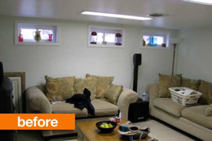
There’s a reason basements often become cluttered dumping grounds, they’re usually dark, uninviting and an excuse to hide your mess away. If you have an underused or unappealing basement, take some cues from designer Frances Herrera who transformed this one into a bright, welcoming playroom.

What was your goal for this space – what did your clients ask for?
My clients needed an inspiring place for their 5-year-old daughter to play, craft, and entertain her friends. It also needed to serve as an extra space for sleepovers. Storage was a key requirement as there were tons of toys running amok in the space.
Tell us about some of the projects you did here to make the space more functional and feel less like a basement.
To maximize the space, I designed the bench to serve as seating and accessible storage for toys. The bench is narrower than a sofa so it kept the space feeling open and airy. The sleeper does not take up space when open, also keeping the space fluid. The wall color is a soft grayish blue which makes it feel crisp and bright.
The short windows were lengthened by mounting the roman shades to the ceiling also giving the illusion that the ceilings are higher. The custom area rug, warmed up the otherwise cold tile and makes it comfy when kids spread out on the floor. The storage unit behind the sleeper, provide tons of storage and was a smart use of vertical space also giving the illusion the ceilings are taller.

What do your clients think of their new space?
My clients love the space, they love the airiness, playfulness and functionality. It’s fun for kids and chic for adults to hang out in, too.
Do you have any general tips you could give about making a basement space more inviting?
The key to making a basement space inviting is using airy colors on the walls to give the illusion of natural light. Layering textures through fabrics and rugs will soften the space making it inviting. Windows in basements need not be ignored. This is a great opportunity to make a space feel finished and sophisticated. Lastly, basements usually turn into dumping grounds. By incorporating storage systems, you make the space functional and give it a purpose.
Thanks Frances!
See more of Frances’s work: Interiors by Francesca
(Images: Frances Herrera)