We love it when readers send us their projects to be featured. Kelly emailed us about her fabulous kitchen makeover, taking it from the dark and dated room you see above to the bright and updated space you can see after the jump…

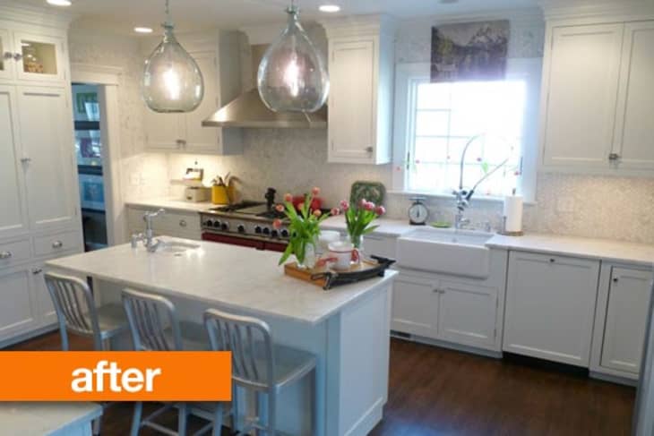
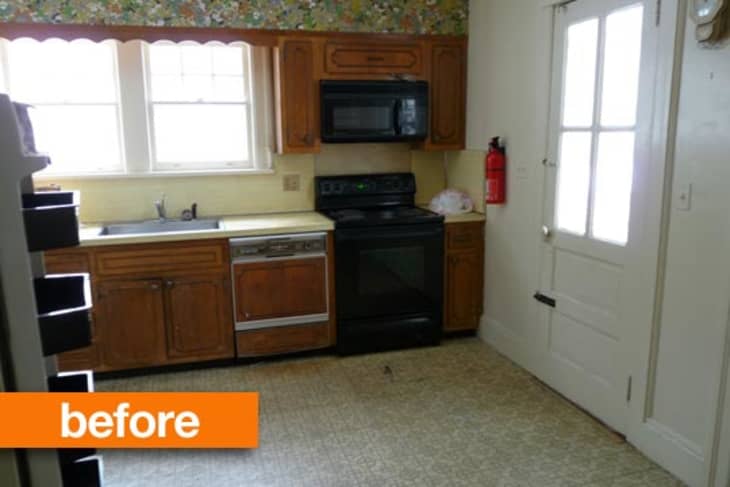
When Kelly and her husband bought their 100-year-old house that needed renovating, she was thrilled to get the chance to design her dream kitchen. And a dream kitchen it is! Kelly had the old kitchen torn out and started fresh. Of course, removing those old dark cabinets was a vast improvement. In their place, Kelly installed white cabinetry, with upper cabinets that reach all the way to the ceiling. The carerra marble tile backsplash also extends up the ceiling in the kitchen, producing a dramatic look that visually extends the height of the room. Kelly's favorite feature, however, is the lighting — and I think I'd have to agree:

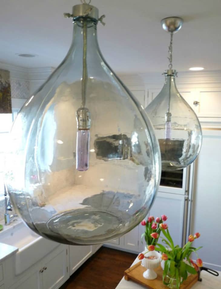
These wine jug lights have a dramatic impact hovering over the island without appearing fussy or overwhelming.
Check out all the details, along with more photos of the kitchen, on Kelly's blog — Eclectically Vintage.
(Images: Eclectically Vintage)


Ercol Bar Stool
Ummmm let me guess...light and bright means white cabinets....yep I was right.
Ahhh beautiful, Kelly!! You did a great job! Love how bright, white, and crisp it is and I love, love, love the lights!!!
Beautiful! Wish that was my kitchen :-)
This kitchen is stunning!! My kitchen is currently like the before and my plans are very similar to the after... You did a fantastic job, enjoy!
To lose a window is just sad - or is this a different angle? It is a beautiful kitchen, but for me, I'd opt for more natural light and less white.
It's a great remodel and I'm sure Kelly's happy...but I have to agree with Star Princess, I knew there would be white cabinets before I even looked at the after photo! I can imagine ten years (or less) from now all the posts will be "boring white kitchens" updated with wood tones & color.....
I love it! The light fixtures are beautiful. The whole design is both modern and timeless. Enjoy!
inspiring. i've been looking at houses for sale with dated kitchens like this. linoleum and dated cabinets are so depressing. but it can all be fixed!
It's carrara marble. Not "carerra".
I love this kitchen. And yes, the all-white-cottage-look will probably be outdated in 20 years. So what? She's going to love it until then. And who knows what's going to be in style in the future...you can only design for the present. No such thing as 'timeless'.
I die for those wine jug pendants. I. Die.
not really my style, but it is a job well done.
I love it! Are those halogen lights? I'm surprised people are so down on white cabinets. I'm not sure any style is completely timeless, but this seems pretty classic to me--certainly more so than the zebra-striped wood grain cabinets we see here so often, and the oak cabinets of the 80's didn't exactly fare well in the long run either. If you like white, I think they're a great choice! If you don't like white, maybe just don't use them in your own house and leave it at that.
Lovely!
I also thought removing a window was a bad idea but I followed the link and the room opens into a dining/living space with two sets of French doors, so light doesn't seem to be an issue. I think the red stove saves the room from white-out -- and vintage red metal stools would add even more colour -- but even though it's not really my style (I love white, but this is a bit too insubstantial for me) her eye for detail is so spot-on it's crazy.
Love the lights, nice counters and tile, and I like a white farmhouse/cottage kitchen. But the one narrow upper cabinet between the exhaust and the window is baffling me. It really closes in the space. I would have gone with a bigger window and left off that lonely single upper unit.
Those lights are awesome, though changing the lightbulbs could prove a tad harrowing.
WOW what a difference a little TLC can do for a room! It looks wonderful and I agree the lighting is great!
This seriously makes me wish I could go nuts with a paintbrush in my rental kitchen. Sigh. One day.
Nice work!
pretty!
try it! white cabinets aren't for everyone, these look nice tho! we tried it with ours and although I wasn't crazy about the idea, I did like the after! you can see how it turned out here: http://twosixe.blogspot.com/2011/01/house-tour-first-floor.html if you want. :)
Hmmm, so many improvements, but less windows? I could never give up a window. And I keep getting stuck on that painting that overlaps the molding. It looks like an attempt at a kind of funky laid back look, but it doesn't fit with such a sleek traditional kitchen.
OMG! I love it and the lights are to die....Good Job!!!
I never knew I wanted a red stove until now. But I want one bad. And this inspires me to keep holding out until we find the right lights for our kitchen. Thanks so much for sharing Kelly.
I think she was willing to lose the light so she could move the stove closer to the next room. I imagine people hang out in the dining/living area while she cooks and she chose social opportunity over perfect design symmetry.
My kind of girl.
Very nice! Much improved.
However, I have one question. The art (?) above the window caught my attention. What's going on there? If it is art l think it might not be the right proportions for that space. Is it covering something up? Is it a window treatment of some kind?
Lovely, lovely, lovely! It's a wonderful makeover to be proud of.
Are these two different kicthens or did they wall over their back door? In the before, there's a door to the right of the sink. In the after, there are only cabinets (see close-up pendant picture, facing the direction where the back door should be).
Beautiful! Stunning! Amazing!
Love the white cabinets and the lights...but are those scraped off stickers on the bottom of the wine jug lights or is it just bad lighting?
Really nice, but why do we rarely see apartments on Apartment Therapy?
Hi all - happy to be on AT and hope I can answer some of your questions.
It is the same kitchen - just tore down the wall with the door to add more space from the small screened in area that was behind the door
Replaced 2 small windows with one much wider one - moved it over a bit to fit everything I wanted along that wall
Reflection - not scraped off stickers on the lights
I LOVE it. So many beautiful details. Aweome upgrade!! :)
Actually, I disagree with the sentiment expressed here that white kitchens will go out of style. I believe there are always people who appreciate white in a kitchen. Food looks amazing against a white background and it's pretty neutral. You can change stuff around and add color anywhere but the cabinets and counter and still come out with a big change, so I see it as a pretty decade-proof design for a kitchen.
As for this particular one, it's really well done and looks lovely and clean. Love this!
Those light fixtures are really nice!
I totally love your kitchen!! Awesome job! Can you tell me pls where you got the wine jug lighting? Thank you!!
Edin - Wine jug lights are from Bobo Intriguing Objects. I bought them online - google them for shops that sell and thanks!
I love the herringbone marble wall tiles - stylish, design-y and luxe without overshadowing the classic country style of the rest of the kitchen . I imagine that they're probably quite affordable compared to larger marble tiles. Not to mention easier to work with.
The 1st 'after' picture of this kitchen reminds me of HOUSEography kitchen shown at this site
http://www.houseography.net/2012/02/kitchen-decluttering.html
Even the angle of the picture taken was the same one.
Awesome 4 u 4 getting the Apartment Therapy link up and link back on your sidebar!
Fabulous Kitchen Kelly!!!! i love every aspect of your design and i am hopelessly in love with your farm sink! oh i just LOVE IT!!!!!! and i absolutely ADORE white kitchens...a happy place for happy times! KUDOS and HUGS!!!
I'm in love with this kitchen, it's a timeless beauty! The stove is perfect! Great makeover, love the light fixtures!
Nicely done. But I have to say that all these all white kitchens are starting to look boring indeed. I call it the pottery barn catalogue syndrome.
I think for European (Dutch) standards this kitchen is rather outdated except for the Emeco stool reproductions. But it I have to agree some good work is done here. Except for the painting that is hanging above and over the window, that's just stupid and distracting.
But a make over of the kitchen in the other picture? No way!
Window? Door disappeared behind some cabinets? And the room is a lot wider than before.
Anyone can make a great kitchen given enough money. I like to see the makeover where people use their existing cabinets and what not.
Lovely kitchen and I adore the lighting but what exactly is that above the window? I think it looks weird.
The pendant lighting's a nice touch, especially for a wine loving household. Technically, these are not precisely "wine jugs," but instead are a wine aging vessel called a demijohn, or "bonbonne" in French. A winemaker might use these if she wishes to avoid oak effects, as with delicate white wines or reds in which she wants to keep the flavor focused on the fruit. The reduced-oxygen (reductive) élevage brought about by aging in glass also introduces interesting flavor components to the resulting wine.
This kitchen is gorgeous and amazingly well done! A word to fellow AT commenters here... although this may not be your style and you are entitled to your opinion, there is no need to refer to anything here as "Stupid" (nicoletgroen), that is just rude and not constructive.
Way to go on your lovely kitchen, Kelly!
Now I need to find out what makes Dutch kitchens so fab if this is outdated.
This kitchen contains many aspects of what I intend on bringing into my kitchen after I finally take sledge hammer in hand. Simple cabinets (maybe white, maybe pale wood) and marble countertops, with a great backsplash. sigh. someday....
I realize that this is about me, not the kitchen. Unless it is an illusion or camera angle limitation, the sink is not centered under the window. I could not have done this - it upsets some deep seated symetry issues within me.
I love the marble tiles - it breaks the "whiteness" just enough. I'd also add a bit of colour in the island (red stools as noire suggested), but I like the light cabinetry with the darker wood floor. We have beech cabinets with a chocolate tile on the floor, same idea.
Maybe a longer, skinnier painting would have looked better over the window, but since it's temporary, please put the finished product up too, when it's done :).
It truly is beautiful but I'm over everything going white.
Boring? What do you people want? It's a kitchen. The fact is that after having to use a kitchen like the before, I understand that she wants all white~darkness can be absolutely claustrophobic in kitchens. In time, who knows, maybe she will paint a wall a bright color because that's the beauty of paint, you can paint it every week if you want. I think the choice is classic, and she will not get bored of it. The light fixtures are simple yet beautifully done. As for the covering over of the window, there is a huge range with a hood that had to go somewhere, along with a huge double refrigerator that also has to go somewhere. Has no one ever heard of moving entryways? Sometimes it has to be done, when it comes to practicality. I say good for you, I'd love to do what you have done! Great work!+
I'm over everything going white but I must admit that this really came out beautifully and if you love the end results, then rock on.
white & bright, not a problem. 1920's kitchens done that way to be sanitary & that fits. removing windows & doors in favor of blind corners & a too-big fridge does not. mediocre execution of good idea.
wow. i am just blown away by how anonymous posters can be so snarky. kudos to Kelly for having the guts to post photos of her pretty kitchen. i'm in the middle of a giant kitchen reno myself (yup - white perimeter cabs with a dark island) but i am not brave enough to even consider sharing here - though I am happy to troll for great ideas and inspiration from those who are! thanks for inviting us into your home. looks great to me and more importantly, bet Kelly likes it too.
I know from experience how hard it can be to design around the oodles of doors and windows in older houses. Our kitchen boasts four doors and two windows. We painted some ugly old veneer cabinets white and put in a new floor, and it has been working for us for the past 7 years, but I want a change. I'm struggling with how to arrange a small kitchen for our family in our oddly shaped space!
The only problem I have with white is how quickly it shows dirt and dust, but I suppose there is no getting around that with any color.
I might have to post my kitchen here on "good questions."
And I actually want a SMALLER fridge in my kitchen, but I'm afraid to design the kitchen around one because of potential resale or future rental issues.
i waaaaant those lights!