
Before & After: Fresh Starts at the 2011 DC Design House
How do you revive a dark and dated room without completely eliminating its original character? I gleaned quite a few ideas from the 2011 DC Design House where some of my favorite DC designers brought fresh sophistication to their spaces by simplifying and lightening — perfect inspiration for spring!

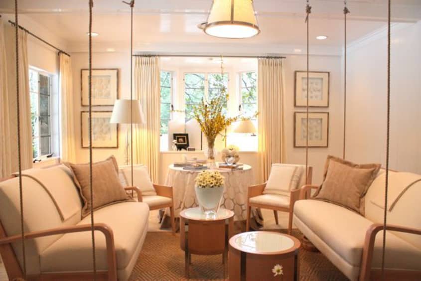
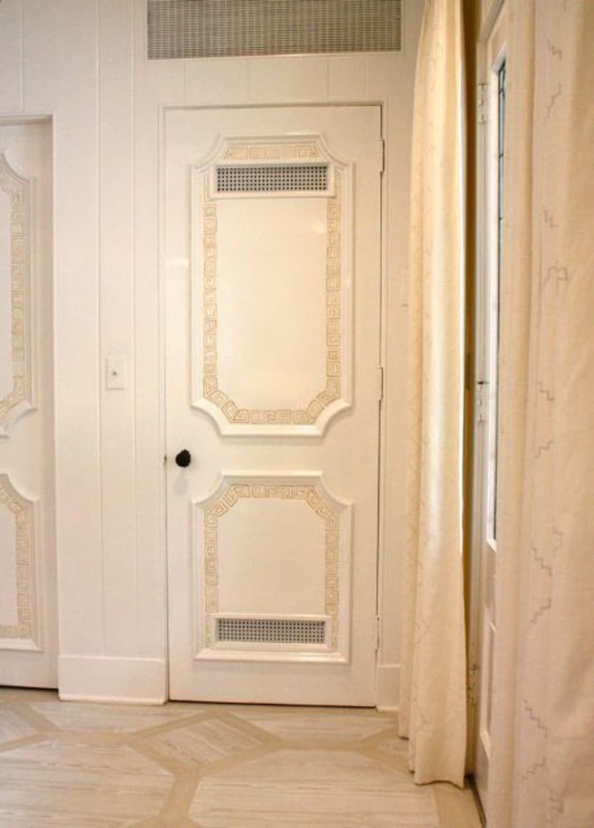


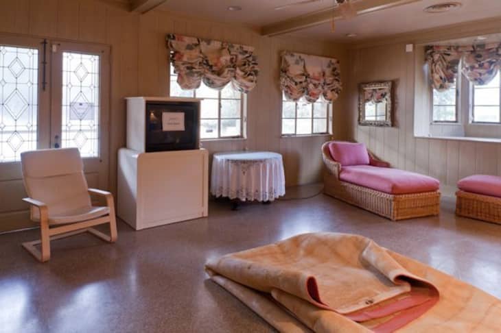
• 1-3: The Pool Room: Erin Paige Pitts Erin was charged with the task of making the rather gloomy pool room into a functional and inspiring retreat. Since the home lacks an outdoor porch, Erin wanted to create an environment that bridged the gap between the beautiful outdoor pool and gardens and the grand interior. Inspired by her love of the coast, Erin chose breezy furnishings and tone-on-tone patterns to provide a laid back and airy sophistication. She gave the room a light and fresh color palette with Farrow & Ball’s All White, Stony Ground and Mouse’s Back. The upholstered porchswing-esque benches add a playful tone, while grownup touches such as the painted greek key motif winding its way around the the door moldings and the beautiful painted floor by Twin Diamonds Studio (picture 3) lend the room adult elegance.
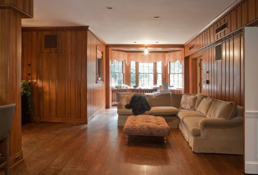
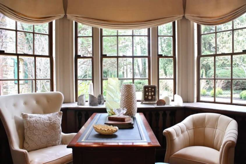
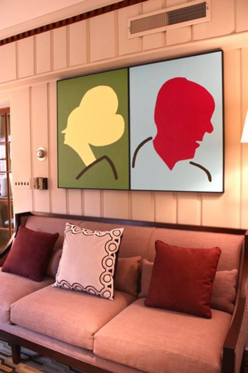
• 4-7: The Family Room: Barbara Franceski Barbara took on the rather daunting challenge of creating a fresh and multifunctional space out of the long and choppy wood paneled family room. While I know plenty of people, ahem, my husband, who would rather die than paint over wood paneling, I’m usually in the the light and fresh camp, so I was especially interested in seeing what Barbara would do to the heavy space. To retain some of the sturdy masculine character of the room, Barbara left the stained wood of the window casings, dental molding, bar area, and radiator cover untouched. However, she lightened the room by painting the main expanses of paneling in Farrow & Ball’s Oxford Stone with a creamy ceiling in Dimity, letting the touches of untouched dark wood act as modern accents. One of Barbara’s specialties is letting unique artwork set the tone for her spaces, and this room was no exception. She commissioned Dave Peterson of BrandDave to create a playful take on classical “ancestor of note” portraits (picture 6) which lend the sophisticated room a light tone.
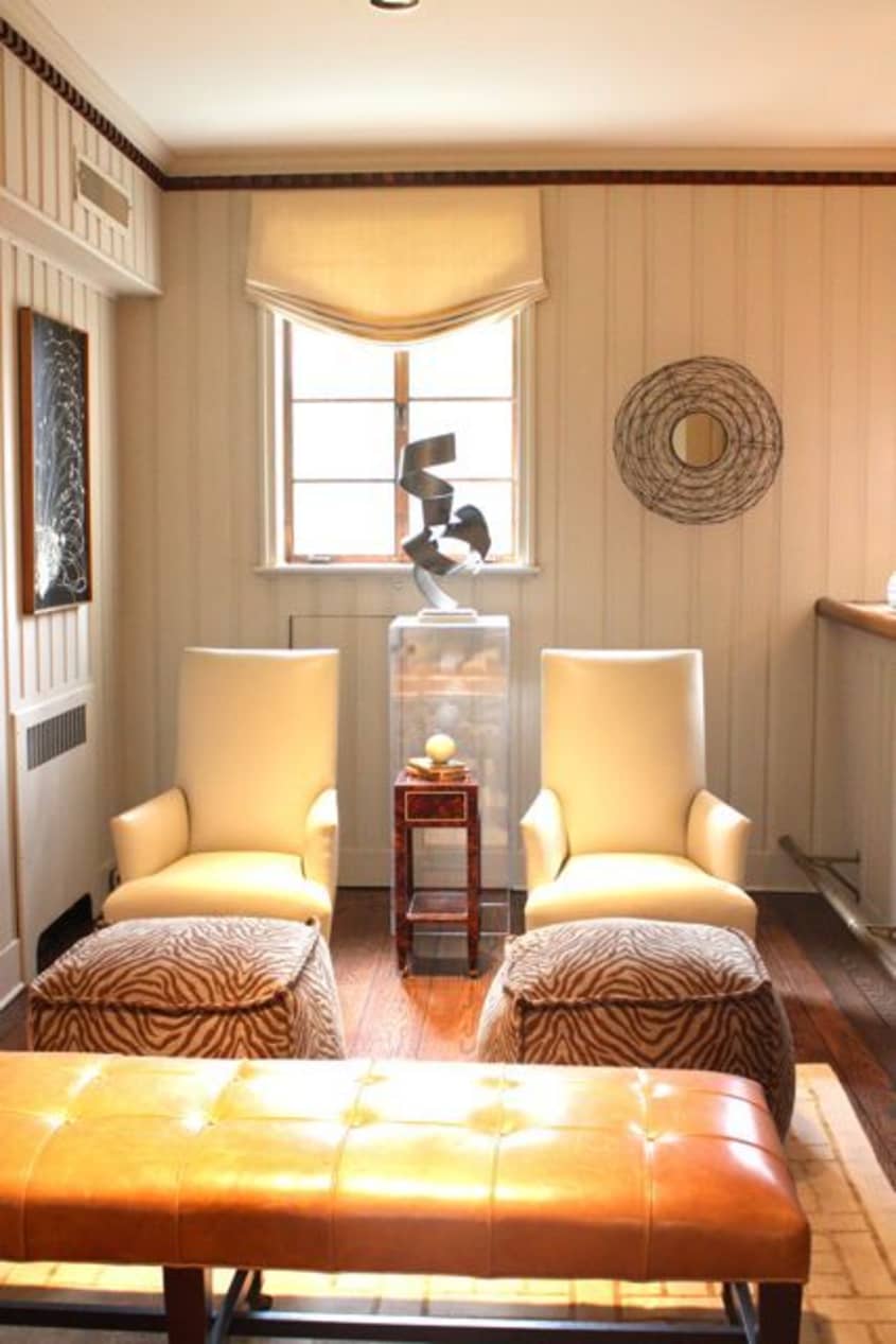
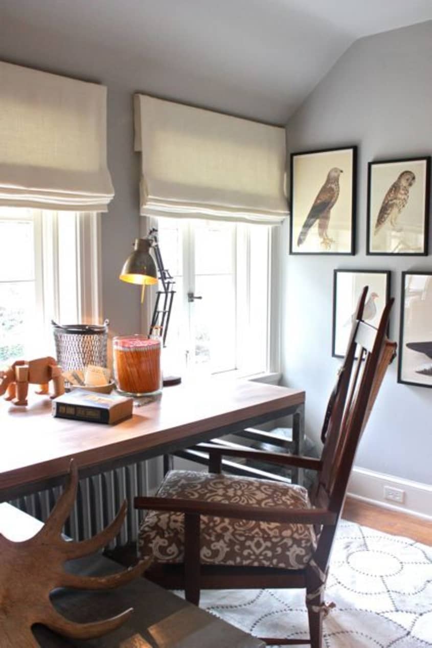
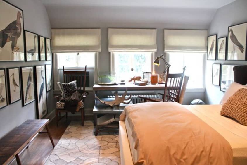
• 8-10: Guy’s Bedroom: David Mitchell Feeling that a masculine note is often missing from show houses, David sought to create a “one for the guys” retreat in one of the upstairs bedrooms. Rather than relying on any stereotypically masculine design staples, David infused the room with clean-lined rustic elements and neutral hues. He traded out the imposing, heavy drapery and faux-finished built-ins for a casual and comfortable mix of nature and vintage-inspired accents and well proportioned furnishings. He enhanced the room’s cool tone with Farrow & Ball’s Pavilion Gray and Slipper Satin. One of my favorite elements was the plethora of collections — from makins hats to Rudbeck avian studies — dispersed around the room. Check out some stunning after shots as well as a few in progress ones on David’s new blog.
• 11-12: The Portico: James Rill Even the front facade of the 1920s Tudor got a fresh facelift. Rather than seeking to reinvent the wheel, James Rill of Rill Architects sought to restore the home’s original character by switching out the non-descript dark brown for contrasting hues — Farrow & Ball’s Mouse’s Back and Stony Ground — more in keeping with English Country-inspired Tudor design. Additionally, James replaced lighting fixtures and removed the screen door in order to highlight the unique character of the original front door. Curb appeal accomplished!
The DC Design House opens to the public on April 9th, so be sure to check out their website for more details. Proceeds benefit the Children’s National Medical Center.
Images: 1, 4, 8, 11, 12: Lydia Cutter, 2-3, 5-7, 9-10Leah Moss