
Before & After: Paint that Monkey!
This is a classic tale of boy-meets-pair-of-monkeys, monkeys prove too expensive, man loses monkeys, man finds single monkey years later, man questions monkey love, man gives monkey a chic and sleek make-over (monkey) tale/tail.

Christian May, of Maison21 is an uber-chic Los Angeles based interior designer and blogger with a sense of style as big as his smile and sense of humor, so he tells the story best:
“Many years ago, I saw a pair of the same monkeys in a consignment store in Palm Springs on giant bases, and thought they were, in a splendiferously awful way, the most quintessentially 80’s things I’d ever seen. (I nick-named them “Joan and Jackie”), but they were out of my price range even if I did have somewhere to park two six-foot high monkey statues.”
But, like a desert Doctor Zhivago, the story of unrequited monkey love did not end there, and the quest continued…
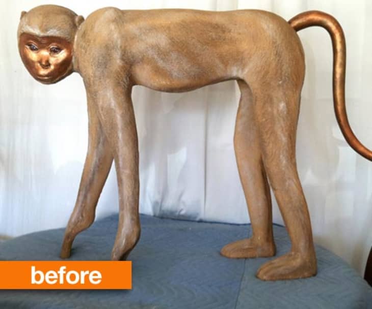
“Cut to this last summer when I made a trip out to the desert, and found the same style of monkey, sans base, in a thrift store. But this time it was in my price range, so she had to come home with me! She sat in my garage for six months, until I decided she had to be rehabbed, or tossed out.” A designer quarantine, as it were.
Enter a can of matte white spray paint, and voila: A thrift store find with the cachet of a handcarved plaster sculpture.
“Now,” Christian continues, “she will reside in my living room as my low budget homage to John Dickinson, until I get sick of looking at her, or my cleaning lady breaks her!”
Why do I love this “simple” little story, and why is it more than meets the eye, or rather, “spray paint meets the monkey”?
It proves that even a tony decorator can get down with a little quick-fix DIY. It shows that white, when used intentionally as a color, has great decorative potential. It demonstrates that paint finish (here, matte, to extend the chalky plaster illusion) and not just color, is an important consideration in any painting or DIY project. And it proves that a sense of humor most certainly has a place at home. Right next to, of course, the giant “plaster” monkey.
Tell Mr. May what you think of all this monkey business over on the original post at Maison21.
If you’re looking for a more genuine representation of the plaster menagerie of John Dickinson, check out the David Sutherland showroom in New York’s D&D Building.