
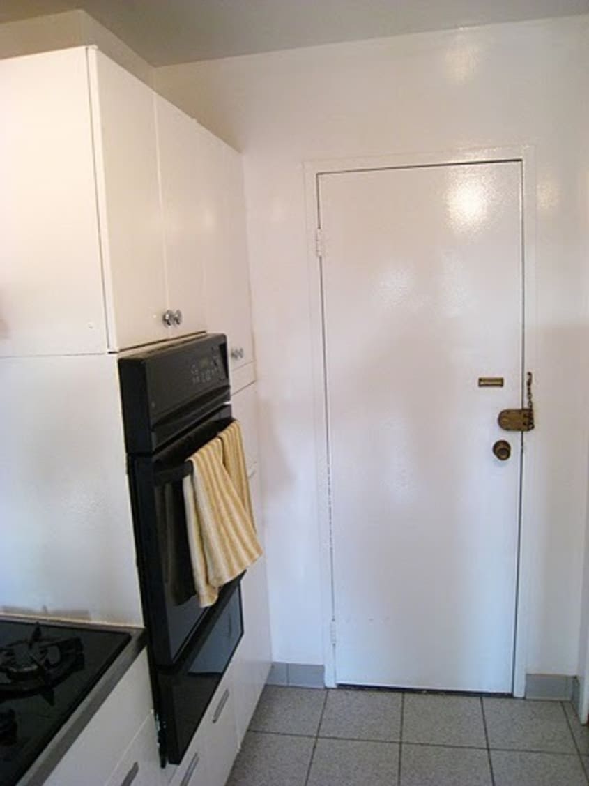
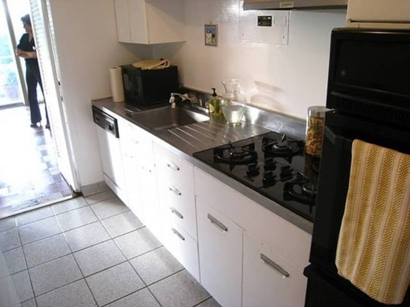
Before & After: A Travel Inspired Kitchen Renovation
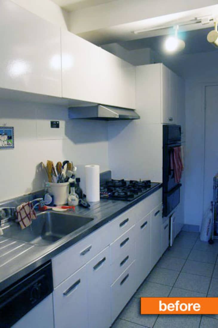
If there’s a leading trend, it’s embracing color, and that’s exactly what the talented crew at DC design firm Residents: Understood did with their clients Danielle and Peter. Using the young couple’s wanderlust as inspiration, R:U set about transforming sterile gloomy to bold global.

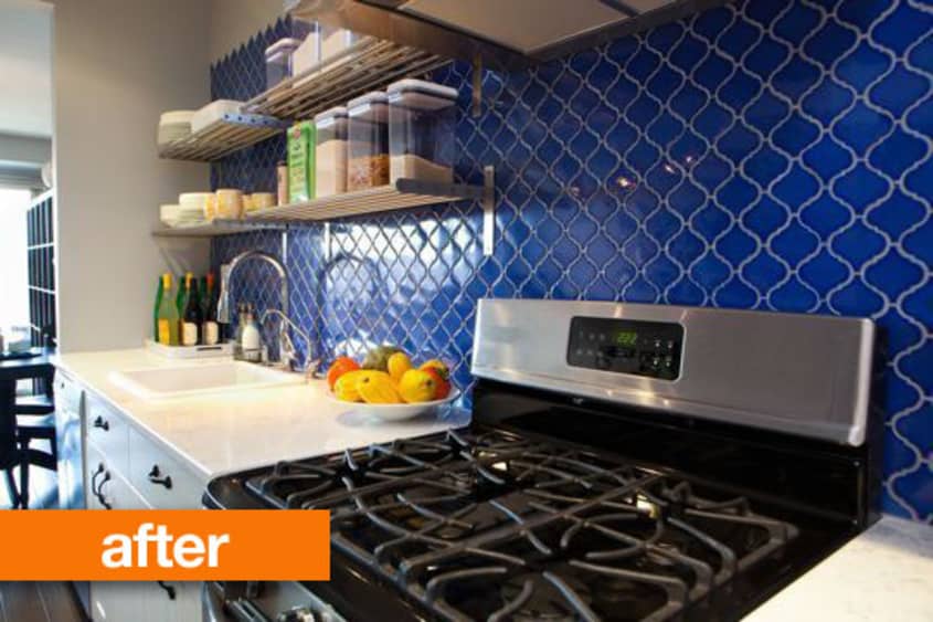
Given that Danielle and Peter met while studying in Europe, got engaged in Iceland, and will be married in Italy this fall, they wanted to make a home that suited their vibrant life together. R:U designer Kiera Kushlan explains that “the concept for Danielle and Peter’s kitchen came from our initial visit to their condo. We were immediately inspired by several of their favorite pieces. First, they had purchased a beautiful yellow Moorish style rug for the living room and both agreed it was a piece they loved the most in their apartment. While we were chatting about some of their traveling adventures, we came across an amazing picture of Danielle in front of a beautifully bold blue door in Tunisia. Those two elements really became the entire design inspiration for the renovation!”
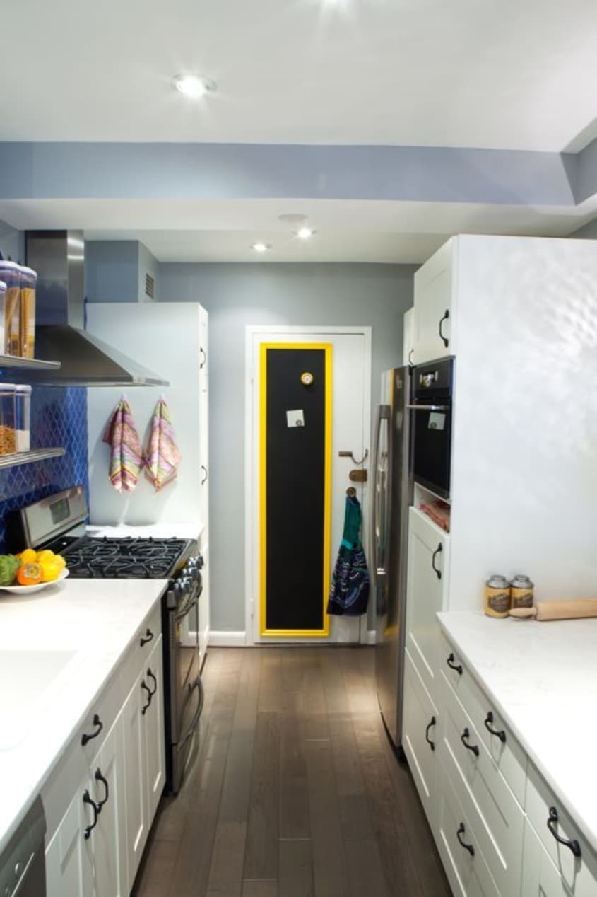
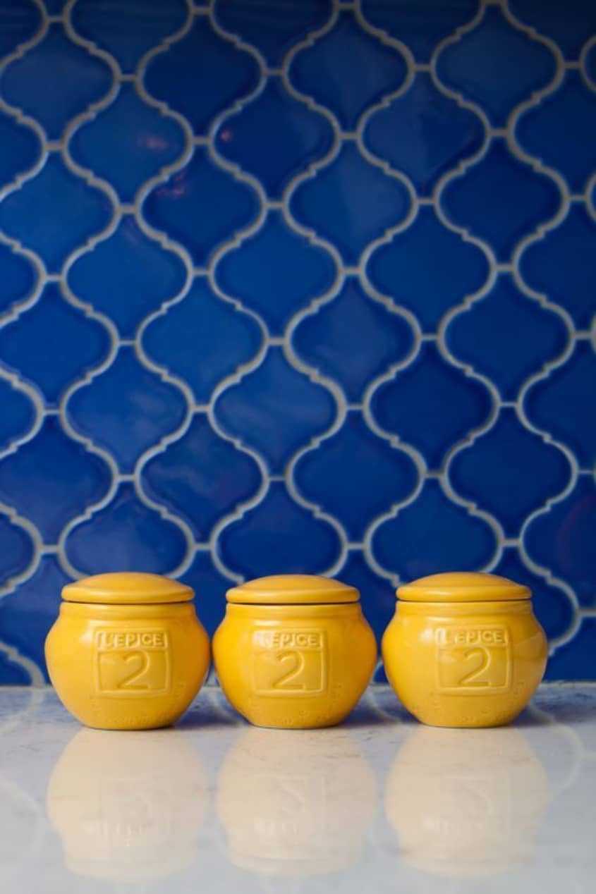
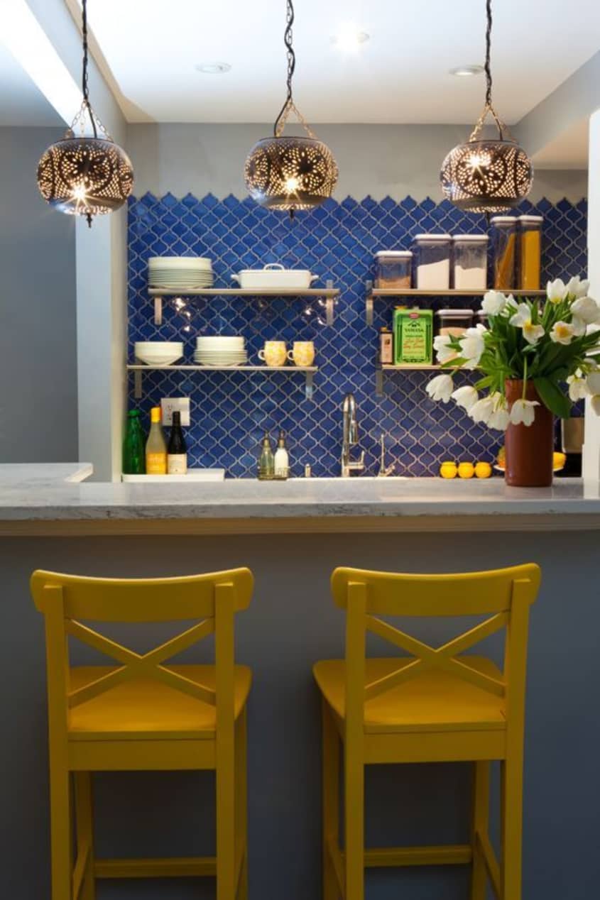
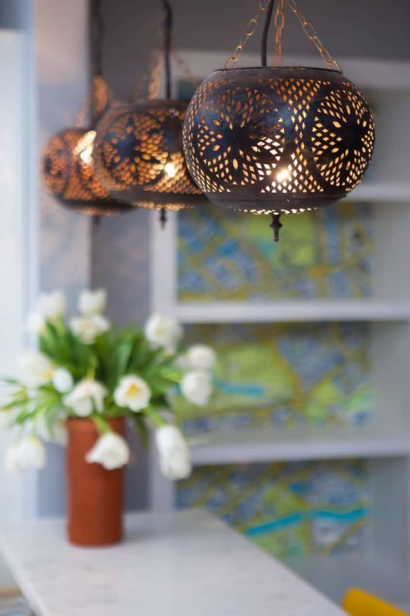
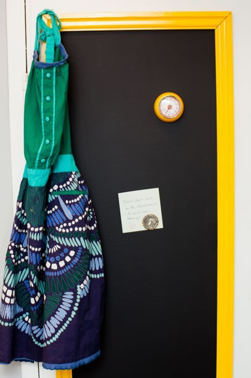
From there, they sourced inexpensive Morocco-inspired tile— featured last week in our Morocco roundup— and splurged on custom Moroccan pendant lights for over the bar. They contrasted the blue tile with bright yellow accents, like the DIY high gloss yellow barstools and framed chalkboard paint door. Aside from reworking the cabinetry and updating the appliances, other major game changers included replacing the dated vinyl tile with hardwoods that run throughout the rest of the condo for a seamless transition, and choosing oil-rubbed bronze hardware for the cabinetry.
To learn more about Residents: Understood, check out their website.
(Images: Kate Haus Photography)