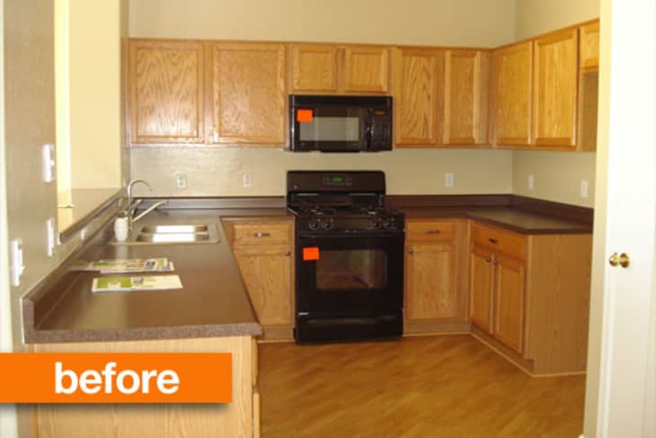
When Kalie and Travis moved into their house a year ago, they knew they had a lot of things to change to make it feel like home. Thrilled to finally have an outlet for their passion for decorating, they have been gradually implementing their big plans in their self-defined little house.

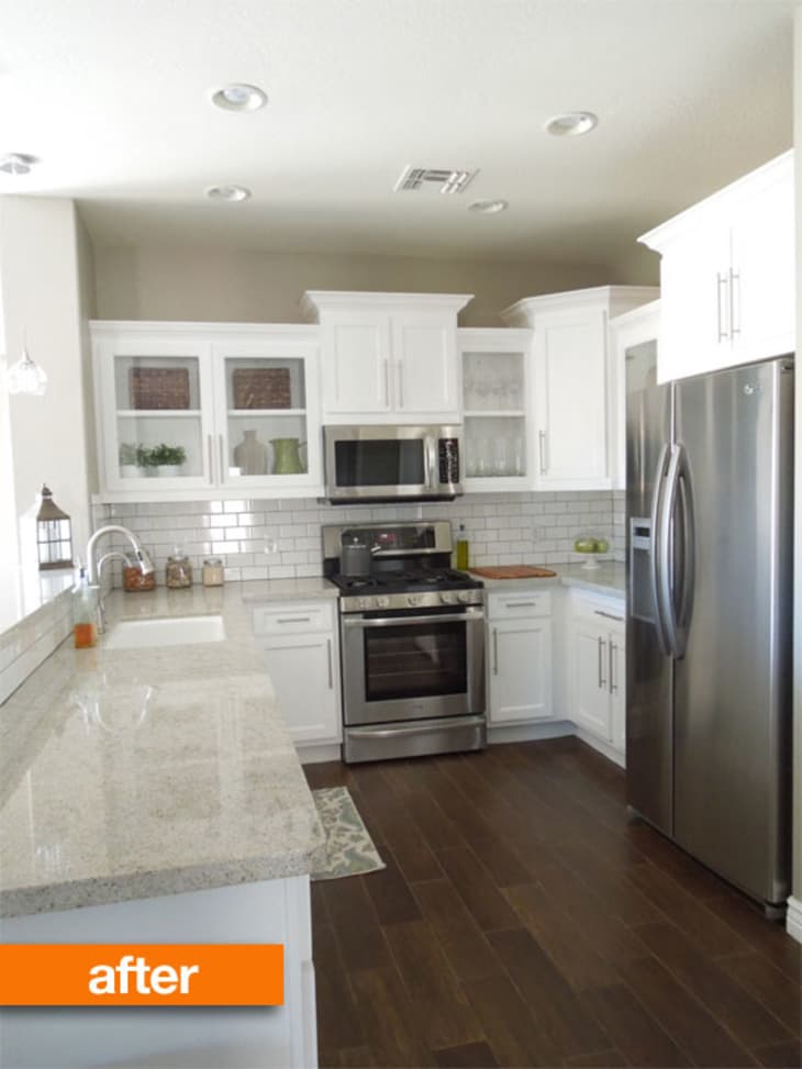
They changed out the light wood floors for dark, and installed new custom cabinets built by a friend. Stainless steel appliances, granite flooring counters and a subway tile backsplash all helped to transform this small kitchen into a better reflection of Kalie's vision. Her favorite part? The new spot resistant faucet that her plumber husband was able to pick up with a $50 discount!
See More: Little House Big Plans: Kitchen Reveal
(Images: Kalie/Little House Big Plans)


Z2 iPod Dock and Wi...
granite flooring?
Love the counters, backsplash, and floors. Having trouble understanding the uneven cabinets and huge molding. I assume there was a reason the cabinets don't go to the ceiling?
It looks great. I like the high contrast of the floor (porcelain tile?) and the white cabinets.
I love everything about your new kitchen, countertop choice, floor choice..cabinet choice. i too wish yourr upper cabinets were touching the ceiling.
looks great, curious what the cost was?
It's so interesting to see remodels like this. The new kitchen looks fabulous, but I keep thinking about "what I would have done" instead. Which is good, because it gives me ideas for when my time comes for a kitchen remodel :)
wow looks really great. Bright, shiny. Great work!
Very nice redo. I didn't think the flooring in the "before" picture needed to be replaced, but I'm guessing it was laminate? If it was real wood, I would have left it, it had a cool contrast and a "against the grain" feel. I too don't get the large molding on the top of the cabinets. If I couldn't, or decided not to go to the ceiling, I wouldn't draw attention to the huge, hunkering gap. Other than that, I love the clean new lines, especially the subway title back-splash (always a sucker for that!!).
I love the cabinets now. They look custom, vs. builder grade. Cabinets to the ceiling aren't necessary at all unless you actually need the storage. I much prefer how you handled it.
This is interesting to me, as I work for a builder. Our kitchens actually look far more like the after than they do the before...
Have to agree with the few others – since you got custom cabinets, why not take them all the way up? Especially since the ceilings aren't that tall. Now you get an area on top of the cabinets that gets gross and dusty. And it's a smaller kitchen, so more storage never hurts.
Personally not a fan of the huge molding and different ehight cabinets, but the chunky molding would have looked great...if the cabs were all the way up!
Love the flooring, little confused of what it actually is made out of, guessing it's tile? Or maybe it's wood, but the writer made a mistake. I like your granite counters, even though normally not a fan of granite! Hmmh, they don't actually look like granite, look more like recycled glass.
Okay, now I'm really confused!
Apart from the awkwardness of the top of the cabinets, I think this was a job well done! So crisp and clean and fresh. And beyond builder grade, for sure!
The write up says they have a "passion for decorating." To me, that doesn't qualify as "decorating." It's an entirely new kitchen, i.e., construction. Custom cabinets, recessed lighting, new flooring. Every single thing appears to have been removed and replaced. Wonderful if they can afford it, but I certainly hope they recycled. I didn't like the original cabinets either, but they don't appear to be that old. They would be great in someone's garage.
Definitely brought it into this decade -- good work!
It looks a lot better but those plants want to be let out of the glass cabinet before they suffocate! I get the cabinet tops - it's adding some interest to the room with the different heights. Please don't top 'em off with a) plants or b) baskets.
Another white kitchen-nicely done but still white.
I disagree with the comments about the cabinets having to go to the ceiling. Nothing makes a kitchen look smaller than filling it all the way to the ceiling with cabinets. That is part of the reason why shelving has become so popular.
Cute little redo, normally I'm not a huge fan of granite for granite's sake, but this slab is really gorgeous. I do have to agree with other posters - ceiling height cabinets would have been a plus, the molding is a tad overpowering for a relatively compact space.
@Duane Hill, totally disagree -- upper cabinets to the ceiling don't make a kitchen feel smaller, unless maybe they are a dark color. The unbroken vertical expanse of cupboard door actually makes the ceiling feel higher, particularly if your lighting fixtures are recessed cans or other flush varieties. (We have blond maple 42 inch Shaker style uppers and I'd never go back!) Shorter uppers create horizontal bands and THAT is a known device to make a room look wider and lower.
This kitchen is ok, but I'm kind of "meh" about all white and subway tiles -- hard to be enthusiastic. (However, it's only important that the owners are!)
What is the faucet?!?!?!?
I love the white. Its very calming and looks great with the stainless.
To me these cabinets look like they are only a step up from builder grade and I wonder what is "custom" about them? I am not seeing any built-ins or upgrades, in fact the boxes look identical to what was there before except for the corner unit on the upper.
I would have put a lazy susan in the right hand corner on the lowers and put a vertical pan rack for baking sheets between that and the stove. I also would have put an appliance garage between the upper corner unit and the lower. The molding is too overbearing and does not fit the look of the clean lines. I would have taken the uppers all the way up and put in a low-key molding.
I do love the subway tile.
We installed our 'starter' kitchen in a reno house last year.
I desperately wanted cabinets to reach ceiling, but it was a significant enough cost difference that it had to be shelved.
It is my 10 year plan. No compromises on real kitchen!
So many rude comments here! Why be so ungracious abut something the person is proud of? I think the remodel looks wonderful. The clean edge on the granite is nice to see (I've never liked the ogee edge or -- especially -- the rounded edge you see so often). Having the space open over the cabinets adds a feeling of space in a small kitchen and detracts from all the stuff going on on the ceiling.
I think you made a good choice with the wide planks on the floor, too. That diagonal flooring would get on my nerves.
Awesome job selecting the counter slabs...they look great.
I think it looks lovely and fresh! We recently redid our kitchen, too, with new counters and floors, and had our existing cabinets painted and also added trim to add height. I'm wondering if the owners only had a few cabinets changed and then painted everything over, as a great cost effective update. Nice job!
I wouldn't want cabinets all the way up to the ceiling because I'm too short to reach them without a ladder. I think it looks great.
Lovely changes! The direction of the floor in the original one was hurting my eyes.
Really? All the way up to the ceiling? So I would need a ladder to get up there every time? No thanks.
I like to put my wares where I can reach them immediately. I would never get cabinets that go all the way up to the ceiling; that's just not practical for me. People have reasons for NOT doing things!
I wish the cabinets went to the ceiling...that would have been AHMAZING, but its still a million times better. great work
I think it's beautiful, but I know from bitter experience that they will one day regret not taking those cabinets up to the ceiling.
Wow, what a difference. It looks fantastic.
Were the cabinets staged for the photo, or do you really store plants and devote a whole shelf to two pitchers? I'm willing to assume that the door on the right is a pantry, so maybe you have plenty of storage.
The joy of having cabinets that go all the way to the ceiling is that you can put stuff there that you don't use a lot but still need a place for. I have to agree that the short cabinets and chunky molding make those uppers seem small and complex and awkward.
There's no denying that the "after" is a huge step up but I can't help wondering if it will be someone else's dated "before" ten years from now.
Have to join the pile-on: the cabinets should go up to the ceiling. As they are, the cabinets look out of proportion, which is emphasized by the enormous moulding. And, no, it won't look better with baskets or fake foliage. There is ALWAYS a need for more storage, and the top tier is always useful for storing items that are used less frequently.
While the 'after' is certainly gorgeous (well done--really), and makes a lot of sense if you're planning on staying in this house for a very long time, I find myself for the second time this month wondering why a perfectly fine 'before' kitchen featured on AT had to be torn apart. I am a college grad struggling to make ends meet and the 'before' kitchen looks like a really nice kitchen to me, what with almost brand new appliances. Of course it's my choice to read AT and therefore see the occasional beautiful (but what I think is a not-really-needed) makeover. I do not take issue with people spending the money they have worked hard to earn- it is fantastic that you have created such a beautiful space for yourselves. I just can't help but echo the commenter above who said they hope some recycling happened. (Perhaps that would be a good/interesting tidbit of the story to include in these posts? What was the ultimate destination of the practically new cabinets, appliances, flooring, etc. in the 'before'?)
Aside from that, I disagree that the cabinets should have been raised to the top- I am of the opinion that it would have not let the space breathe as much. They look great as they are.
Wow, white cabinets, ss appliances, subway tile and granite countertops. They really thought out of the box on this one.
Did any of you actually follow the link?
Jukesgrrl: the recessed lighting and the lower cabinets are from the original build.
Sounds Delicious: the floor was cheap laminate, replaced by porcelain tiles.
MiklakMiklak: Kalie states in the link that, as a young newlywed, she DOESN'T have enough stuff to fill the cabinets, which explains the random items like fake plants and candles.
While I agree that the moulding seems too overstated for the size of the space, the new kitchen is a vast improvement over the soulless original, and it was achieved on a relatively low budget. In fact the only thing I saw that really offended me was her insistence on refering to her husband as "hubby".
nice
Love the choice of countertop and flooring and subway tile and the contrast between the darks and lights.
The only thing I don't like is the uneven heights of the cabinets, so I'm with the majority on that. I don't understand that at all and have never seen a kitchen with varying cabinet heights before, that I recall.
Either have them all going up to the ceiling (and I say this as someone who stands 5 feet tall, but I'm resigned to having stepladders in my life) OR have them all be lower, but all at the SAME height, and possibly put some baskets on top of them for storage, or maybe some pretty art pottery, ceramics, bowls, etc., something that looks like a cohesive collection and not clutter.
Improved and updated? Yes.
Creative? No.
I have to agree with the folks who said the cabinets should go all the way to the ceiling. The cabinets varying heights and the big chunky corner cabinet just looks disjointed. Even if you don't need the storage right now build your cabinets go all the way up to the ceiling to save you from having to clean the greasy gunk that settles on top of cabinets.
I really like the granite on the counter top and the fact that you curved the edge of the granite eliminating any sharp edges, this is so important for the safety of elderly and little kids who may fall.
I thought we were going to be shown a remake of the builder grade cabinets...this is just a kitchen remodel. Don't get it. Not creative, not recycled. Anyone can go and buy a new kitchen....
The before certainly is ugly, but it also appears to be brand new. Something bothers me about the idea of installing a brand new kitchen then ripping it out and installing another brand new kitchen.
The new one does feel cramped to me. It's the uneven cabinet heights and the mongo-huge refrigerator. What I like the best is all that expanse of granite countertop. Makes me want to run my hand along it and feel the smooth cool stone....
I don't get why people are getting huffy that they replaced the kitchen. They didn't like it. That's pretty much the only excuse you really need when contemplating a remodel, isn't it? When you have the funds for it, you don't actually need to just "live with" something you don't like. It's one of the luxuries of being in the first world. I do hope those materials and appliances were sold or recycled, but I don't blame them at all for changing the kitchen. Just because you thought it was fine doesn't mean others do, or should just keep something they don't like.
I thought the after was a good improvement. It's comfortable, the materials are better, and the room is brighter and lighter. I would have found a way to keep the appliances and integrate them, but to each his own.
Great job on the reno. I'm a fan of all-white kitchens. Your choice to go dark with the flooring was a nice touch. The contrast is stunning. That faucet was a steal and looks incredible, too!
To those who don't think the room looks smaller with full height cabinets, the reality is that they physically make the room volume smaller. The wall plane is pushed into the space 12" to 15" where you have upper cabinets. The cabinet can be an element hung from the wall (not engaging the ceiling) or it becomes the wall (engaging the ceiling).
The is basic geometry here.
We raised our cabinets 4", and then added molding to connect them with the ceiling. It does make the kitchen look bigger.
That said, I like what they've done here.
I like it, but it's a bit pedestrian now the whole subway tile, stainless and marble/granite tops. But again, I do like it and it looks really nice with the contrasting floor.
What's all this talk about what you should have done? Moot point people. Kitchen is finished after all! Looks great, what a difference!
I think it looks great, however I also think they could have kept the existing cabinets and repainted them. The other upgrades are nice though. I do like a white kitchen personally. I did take down my ancient crumbling ceiling high cabinets and replace them with ones that are not touching the ceiling and I regret it! The top of the cabinets get really greasy/dusty and I lost storage. I thought it would open up the space but I am not sure that it really does. I am now trying to figure out how to back fill that upper space. Sigh.
Who cares if the room would "look smaller" with full-height cabinets? That room has a pass-through that opens it up plenty, and it's not that tiny to begin with. You could do everything in your power to make it look small and that wouldn't actually affect your ability to move around, cook, exist, breathe air etc.
My 1954 kitchen has the original custom cabinets that go all the way up, and I love it even if that means I had 40+ cabinet doors to paint. I do have to have a little step stool to get to the highest cabinets, but I got used to it instantly, I use it all the time, and it's not a problem. So much better than my last kitchen, whose cabinets had the space above that inevitably became ugly unplanned open storage. Or the kitchen before that, which had a soffit over the cabinets, meaning no storage at all.
I love the after, but I am not so insistent on possessing my dream kitchen that I would get rid of a ton (literally) of stuff that seems perfectly functional and whose only crime is dowdiness. That "before" picture would be a lot of people's "after."
Lovely reno. Well done. Now I'd like to see MORE PICS reflecting the truth of this comment, "Thrilled to finally have an outlet for their passion for decorating...* As lovely as it it, it is still 'just another white kitchen' at this point. I want to see it IN ALL ITS GLORY after an injection of the homeowners' personalities. Forget about 'staging' photos, put the plants on the window sill where they belong & put something in those beautiful glass-fronted cabinets you love! Doesn't need to be dishes, just a place holder that makes you smile when you look at it. And while I'm at it, where's your kitchen towel? THESE are the things that make a house a home :)
@ blandwagon: It's a fact that the vast majority here do not follow links.
I think it's lovely. I don't understand all the comments about how it's unoriginal etc etc. If this is what the homeowner likes, then shouldn't they do what they like? Also, they live in Arizona... this look is not popular in Arizona or in most of the western states' tract homes, so when you put it in that context, it's not "generic" at all. This is a starter home, so you can't get all wacky with the finishes since you have to think about resale. I'd love to do something like this with my builder grade tract home brown/maple kitchen with faux granite countertops and linoleum floors (BF bought the house before I was in the picture), but alas, the funds are allocated to other things at the moment.
And yes, cabinets that go all the way to the ceiling DO cost more and don't really improve the look in a small kitchen with lower ceilings like this. I used to have them and I never even had anything on the top shelves since it was a pain to get things down from there.
Nice, but I don't like the varying height of the upper cabinets. I would have installed much taller uppers to take advantage of the vertical space.
Hey commenters, guess what? The kitchen ISN'T YOURS... annnnd IT'S ALREADY FINISHED. So please, spew your rude comments elsewhere on the interwebz.
It's beautiful and I'm very happy for the newlyweds! The cabinets are lovely just as they are. That granite slab is gorgeous! Great job :)
I think the kitchen looks lovely. All white is not my aesthetic, but it's not my kitchen either.
After reading all the comments re: the cabinets I don't see that anybody has made the point that maybe the homeowners purposely left space above the cabinets so that there would be room to display some things (not plants or baskets). In the house I recently moved out of, the cabinets didn't go to the ceiling and that left space enough for my collection of vintage pitchers. Perhaps the owners had this sort of thing in mind.
And by the way, this house was a foreclosure before they bought it (can tell by the green Homepath (Fannie Mae) fliers on the countertop in the before photo)... so it was given the "slap some lipstick on a pig" approach when it came to the "before". I work in foreclosures w/ Fannie Mae and they put in the cheapest possible materials and get the cheapest possible labor to do the work. So while it may look ok in the photos, chances are the work they did was not very high quality. The appliances are super cheap and are purchased at a steep discount from Whirlpool. The owners probably could sell them on Craigslist for more than the bank paid for them. Plus, black appliances would look horrible in that new white kitchen.
Yahoo article The Biggest Kitchen Design Mistakes
2. Cabinets That Fall Short of the Ceiling
"They collect dust and un-needed accessories," designer Joan Schindler says. In this Connecticut kitchen, cabinets are full height and create the maximum amount of storage, while glass fronts keeps the space feeling airy.
It is lovely but I agree with the few posters who feel that this sort of unnecessary remodeling is somehow offensive. Even more so when I suspect that half of the people doing these will give you a dirty look if you make the wrong choice on "paper or plastic" yet they have no qualms putting an entire serviceable kitchen in a dumpster. I'm not saying these folks didn't recycle or that they are greeniacs, just making the point that hypocrisy reigns.
WOW, some people can get really ugly about things!
The owner states that they kept the lower cabinets and only replaced the upper cabinets!
I am a fan of white cabinets, as opposed to yellow oak, but prefer more color in a kitchen. I do LOVE the counter tops! Also NOT a fan of stainless appliances. But then again, this isn't my kitchen. I think it is lovely and the owners should be extremely proud. I like the staggered cabinet height, it adds interest, and dislike cabinets that go all the way to the ceiling, unless you really need the space. I am of the opinion that you should go with what YOU like and not always worry about what will sell, unless of course you are just buying and flipping the house.
White kitchens....gets me evertime! Good Job!
I like your new kitchen. I really like your window over the sink! If I had that height on my kitchen cabinets I just know that my old vintage pitcher collection would steal the show! I hope you enjoy your kitchen for years to come. Congradulations!
Looks lovely. I can see that varying the heights and depth of the upper cabinets adds interest but it's NOT where I'd want to draw the eye. I had the same negative response to a friend's very $$$ remodel where they did the same but they love it, as I'm sure the owners here do, too.
I own a townhouse with the same original cabinets and am seeking less drastic ways to update so the title, "Upgrading a builder's grade kitchen," did make me expect an upgrade rather than the wholesale replacement of almost everything shown here.
I'm not going to comment on the design choices, but I do think it's misrepresenting this project to position it as a way to upgrade a builder-grade kitchen. It's a complete remodel.
I have never been so disappointed in AT. This writer doesn't include any details about the materials used and doesn't even mention that the owner used the original lower cabinets! This home owner is getting negetive comments here about not reusing her old cabinets, when she did just that. This is an upgrade folks, not a complete gut job AT has led everyone to believe.
Now, to the homeowner, wonderful job! With ten+ foot ceilings, ceiling height upper cabinets would have looked weird. I think the varied height of the uppers looks nice and adds interest. I love some of the green pieces you have in the space. I would love to see some green milk glass cannisters or bowls or something on the counter to add even more color. I especially love the tile floor. It looks gorgeous. Such an improvement over the original laminate.
Clicking over to their blog, they say that going all the way to the ceiling would be 5 foot cabinets and that they do not have enough stuff to fill what cabinets they have. So, they built to suit themselves (imagine!). If they decide to go with a cleaner line up there, maybe they could wall in a soffit?
I have alot of stuff that I would be happy to store up high and out of sight, even if I have to pull out a ladder to get to it when I do want it (pitchers, wedding china, specialized appliances). I am looking at my soffit above my short shelves and want to take a sledge hammer to them this instant! But that is me.
I do love that slab granite! As a geologist, I get tired of the term "granite" being used for every slab rock, but these might actually be granite!
Yes, it does look better but a more eco and budget friendly reno would have been more interesting. I also have issue with the cabinets. I think it is a waste of perfectly good storage space to not have them go up to the ceiling. It does look nice and bright but very sterile.
A beautiful kitchen, but it's NOT an 'upgrade' as promised by the title. It's a complete replacement of a builder's kitchen - new flooring, cabinets, counters, backsplash and appliances.
I think your new kitchen is fabulous and that you made excellent choices. Beautiful!
I think it is lovely but it looked like all those previous appliances and the cabinets were in good shape. Please, please tell me that they were donated.
I know that when we purchased our new appliances for our remodel, we could sign up for a recycling program and receive a $100 rebate.
I can't imagine this young couple would turn something like this down.
I LOVE this kitchen redo, particularly the way the cabinets were finished, which I think is quirky and interesting and fits well in the space. The downside? Now I'm desperately longing for granite countertops.
I really like it, despite the snobbish comments I’ve seen here. What’s wrong with white, if that's what you like & you’re the one living there. I'd take that kitchen in a heart beat.
Nice, except for the subway tiles. It always reminds me of dingy NYC subway stations I grew up staring at while waiting for my train. The back splash should have a contrast break from the white above and below.
Uh, I wish people would click on the link and actually look further before posting their rude comments. I think it is an awesome kitchen remodel. The bottom cabinets were left, they only changed the doors on those. The "uneven" top cabinets are not my style but I have seen it done plenty of times before and if people like it than so be it. Making the top cabinets go all the way to the ceiling would have looked ackward, the ceiling is too high and would have been way too high to reach anything up there. I love the choice of granite, which I am normally not a fan of, but I could consider it now after looking at the beautiful gray choice you have here. Nice job and I hope the rude comments are not taken to heart!
I think some people are confusing the words "rude" and "critical." Criticism is part of every design process I've been involved in. This is a design blog, so criticism is built in.
Hopefully the homeowners have the ego strength to stand behind their decisions and will continue to enjoy their kitchen. That doesn't mean that they couldn't learn from the experience and do things differently the next time.
I love love love it, but I don't like that there is so much wasted space above the cabinets.
I have learned something here today. Apparently it is possible to update an old kitchen merely by ripping out everything that used to be there and replacing it with new stuff.
amazing.
Very attractive kitchen, bright and clean looking. I, too find the short upper cupboards and chunky mouldings a bit discordant (and think the loss of storage is a bit of a waste).
I also wonder at the commenters who don't understand that --
1. Just because a comment isn't gushing approval doesn't mean it's "rude".
2. A reader's opinion isn't invalid because the construction is complete or the homeowners like the design.
Critical comments might give the homeowners ideas they like enough to implement in the future.
oi, too much white and grey!! and those cabinets should go to the ceiling. oh well. that floor is kickass, tho!