Name: Cameron Saless & Matthew Allard
Location: West Hollywood, California
Size: 1,600 square feet
Years lived in: One year
We vividly remember the day when we were forwarded pics of Matt and Cameron's home. We were in the midst of a frenzied loop of Facebook, GoFugYourself and Dlisted, when we immediately stopped what we were doing. Our eyes were drawn to the blend of beautiful modern pieces mixed with playful colors and a cozy touch that can't be beat. Needless to say, we quickly signed up to tour their home.
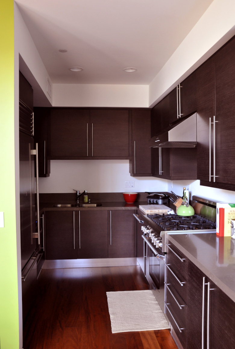
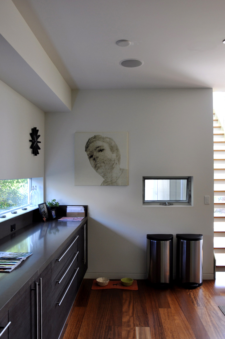
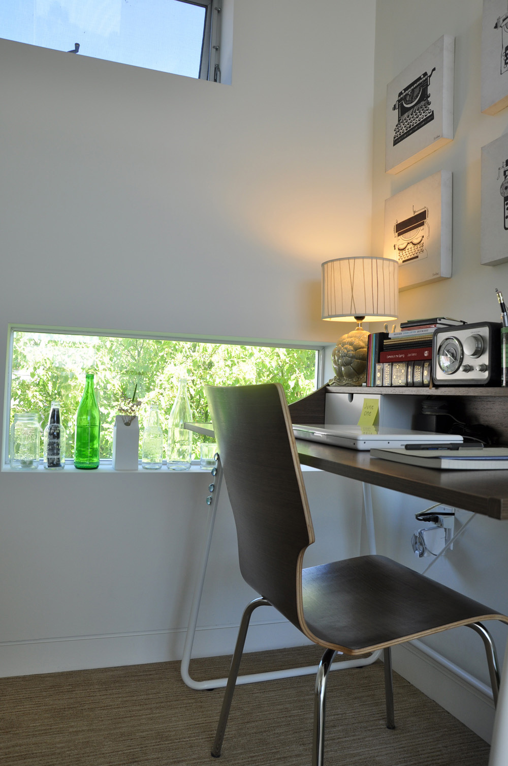
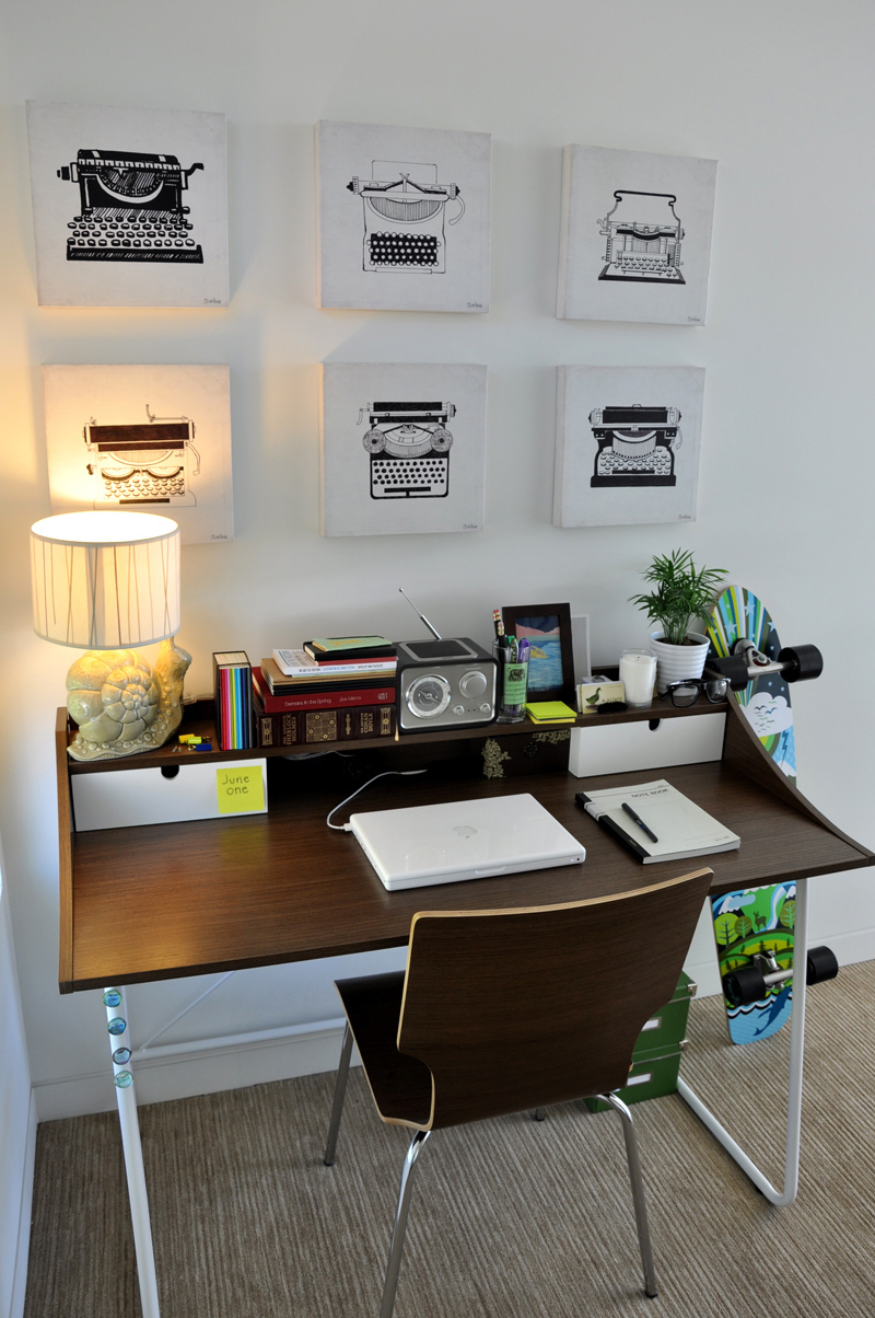
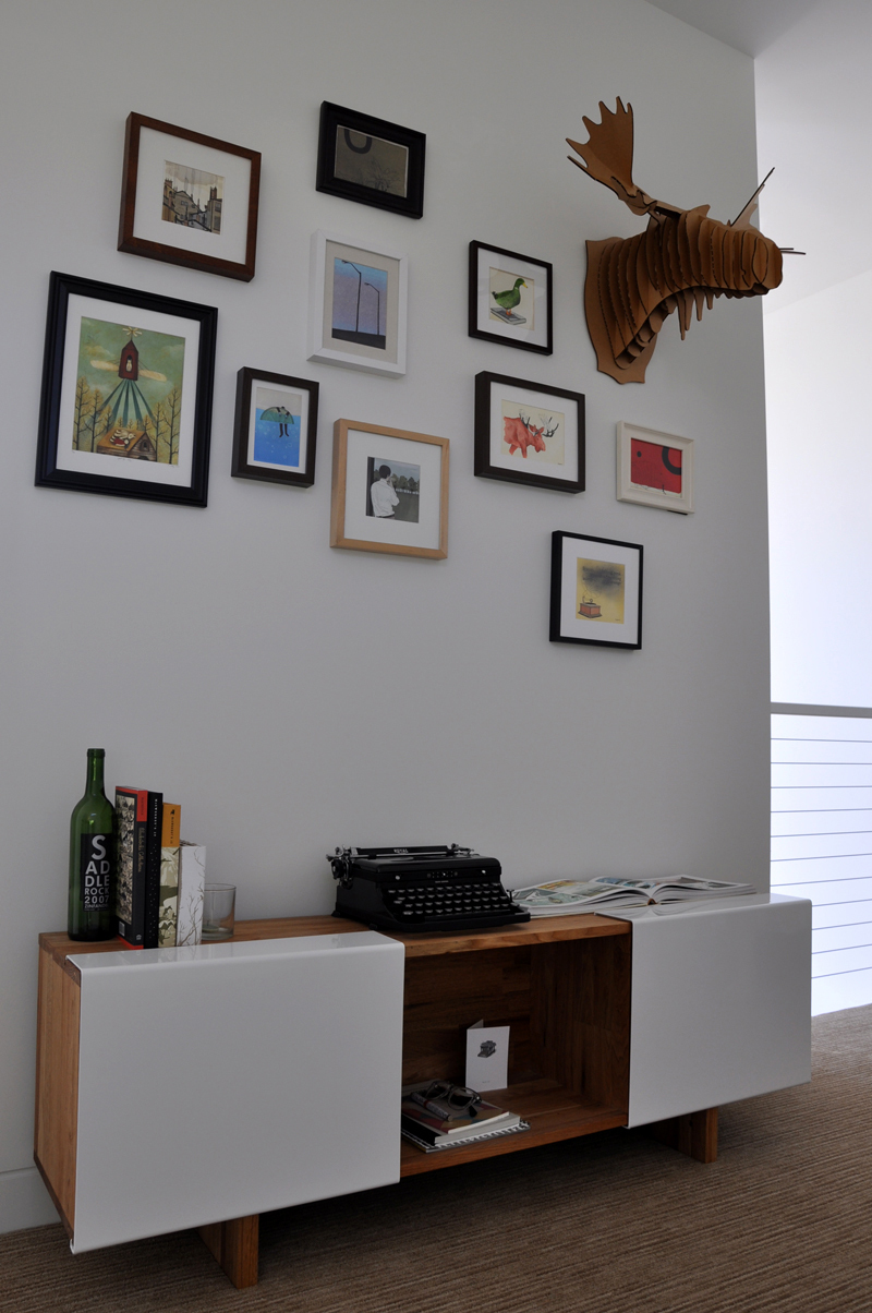
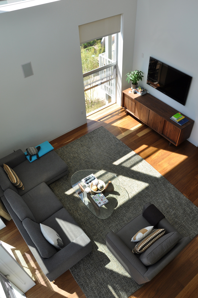
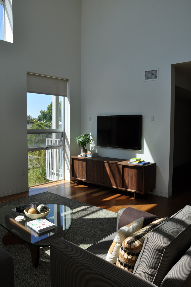
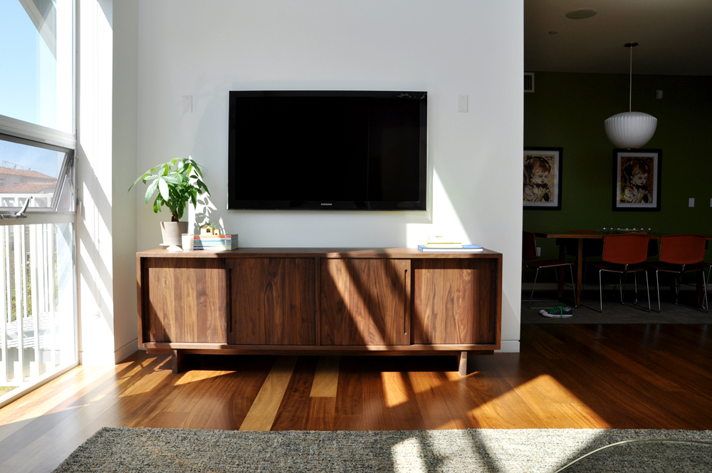
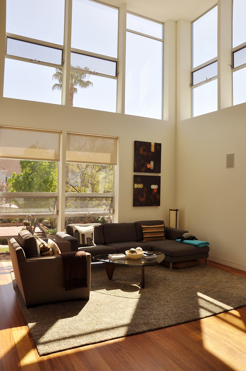
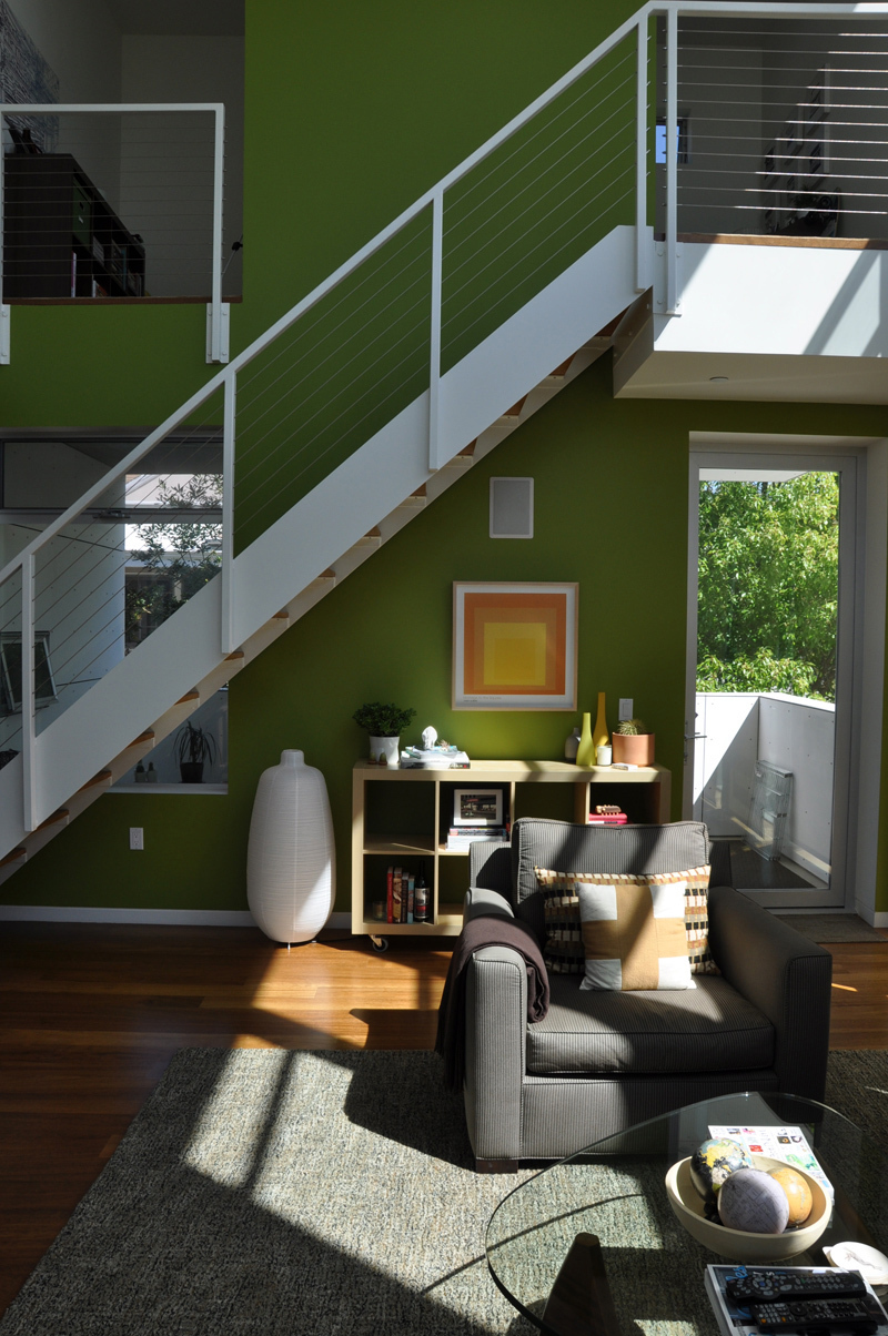
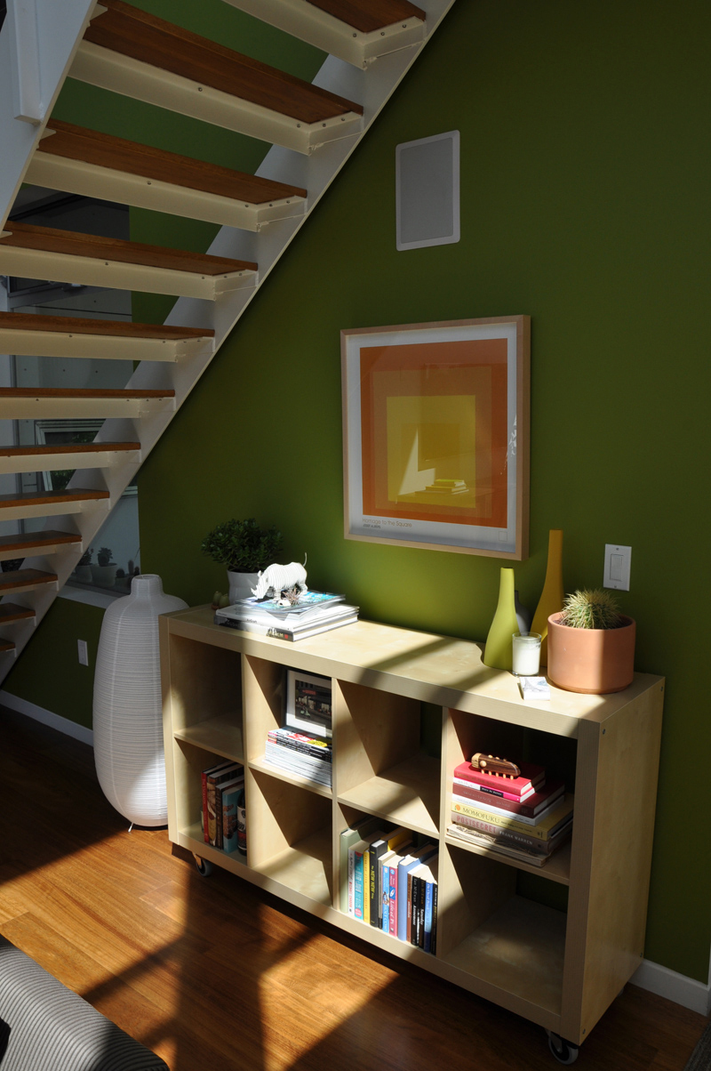
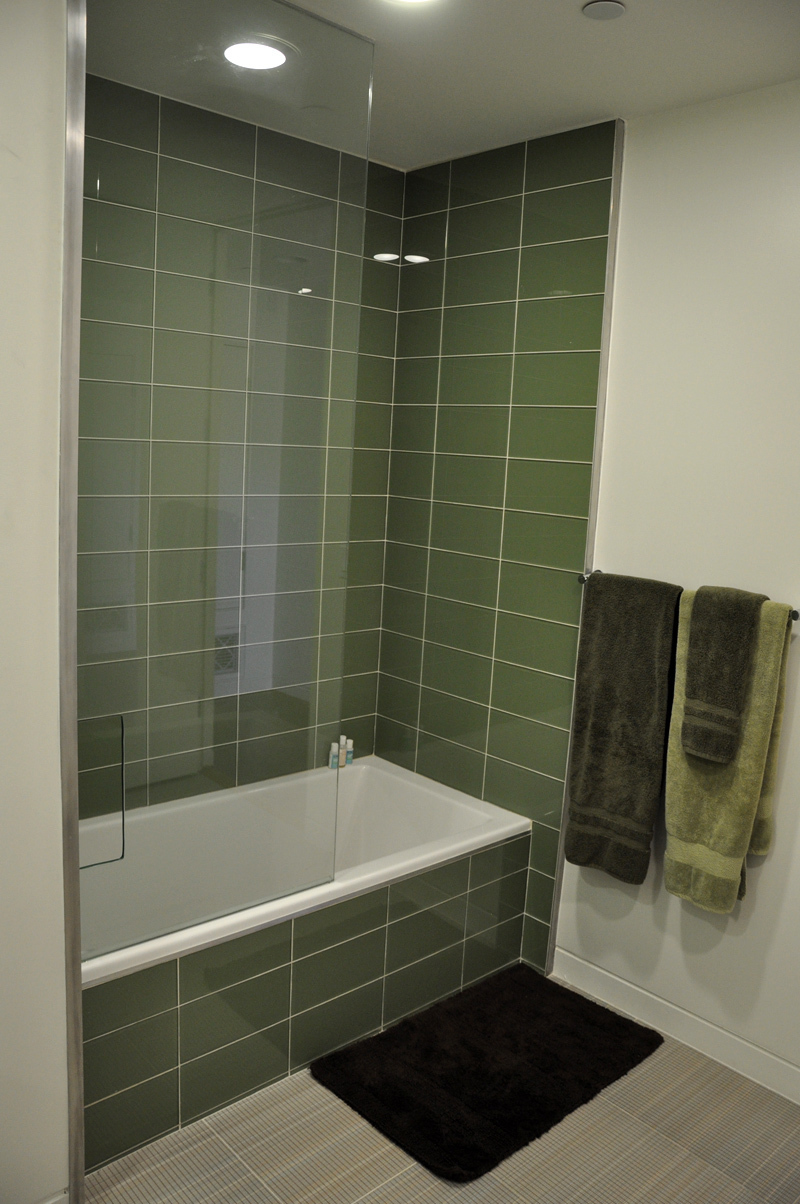
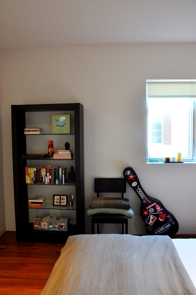
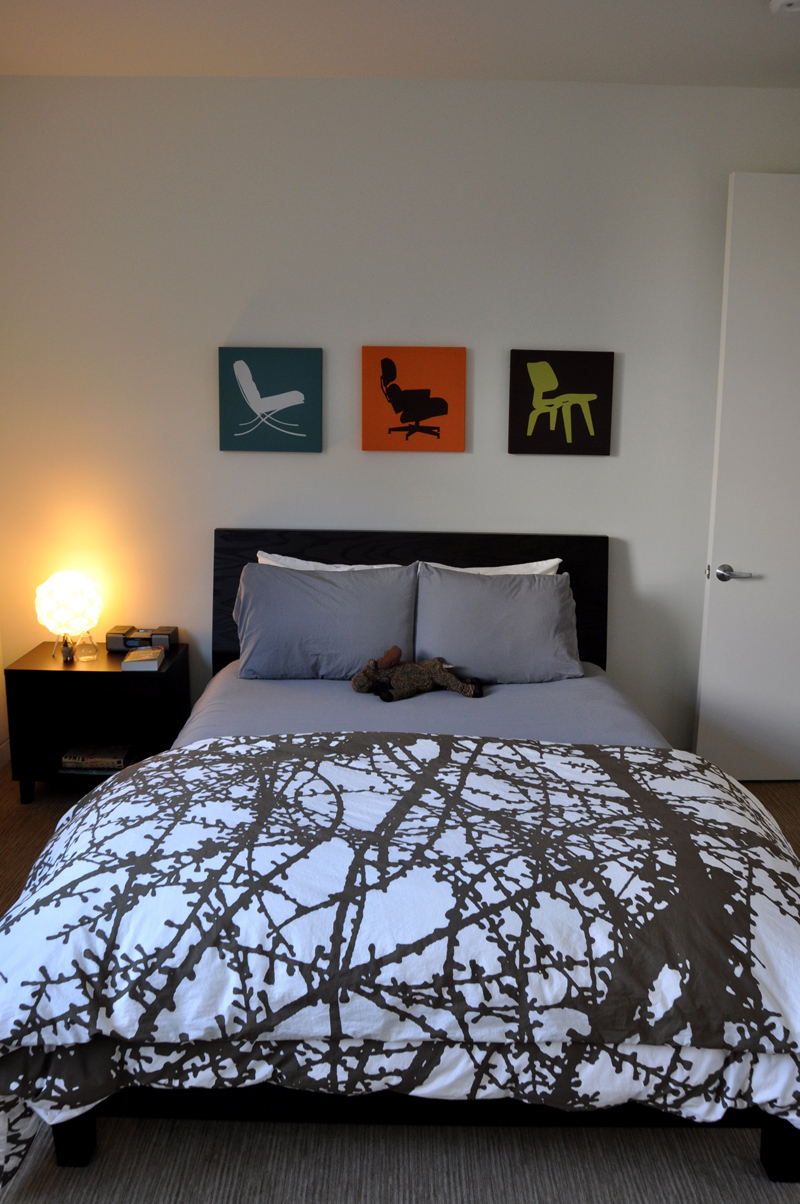
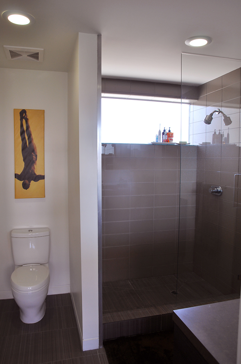
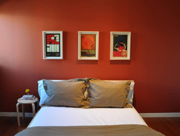
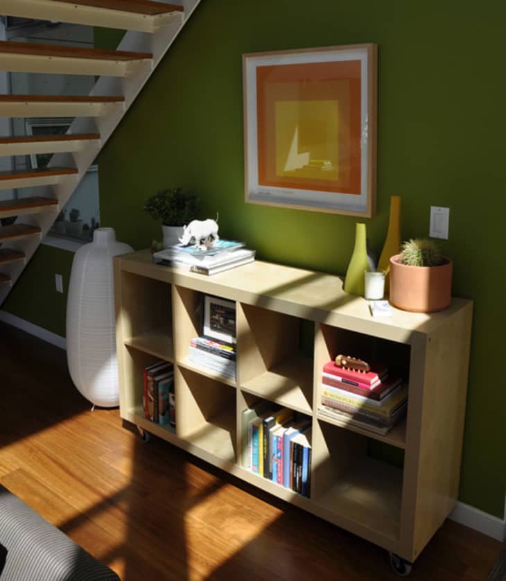
We're in love with many elements in Matt and Cameron's home, for starters — the living room ceiling. It goes on for miles but they've managed to make the space feel warm and welcoming. The ginormous windows lend a helping hand letting light fill the space and play an equal part in the home decor. And while they have lots of room to play with, Matt excels in creating vignettes full of amazing finds — such as his upstairs office and the area directly underneath the stairs.

Apartment Therapy Survey:
Our style: Cameron and I have different styles. We're constantly training them to be good friends and work together, though. They're learning! He leans toward minimalist/modern, and I guess I'd say my style is more vintage/handmade/bohemian.
Inspiration: A little bit of everything…Found items, pieces with a history or a backstory (even if I don't know it). Color! Objects that are earthy or natural, too, as I always choose wood over metal. Cameron is more inspired by modern, modern and, well, modern. Sleek, polished and simple.
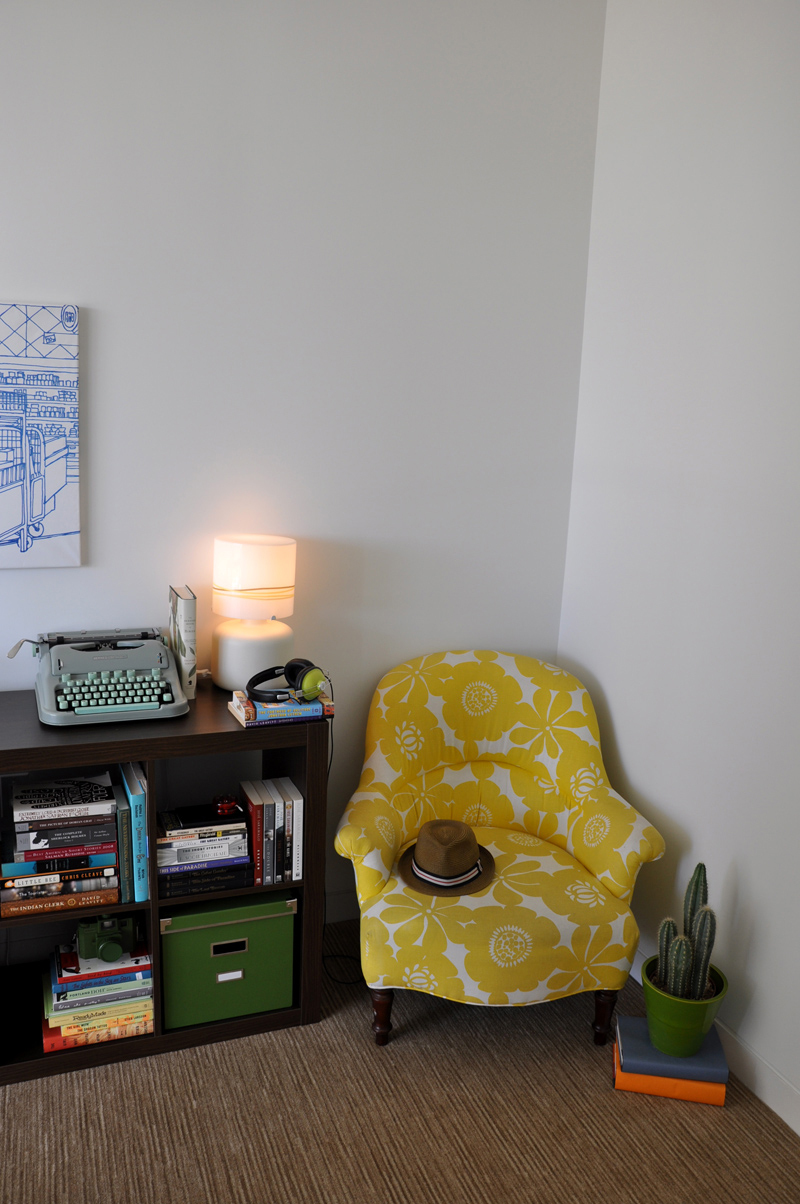
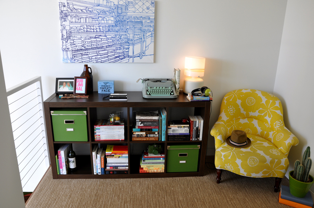
Favorite Element: The loft/office space overlooking the living room. It's my geeky getaway.
Biggest Challenge: Definitely...each other. Because we enjoy living together, but we also both care a great deal about our space reflecting our personalities. We want to respect each other's tastes — and when it comes to decor, it seems like we're at opposite ends of the spectrum. Merging the two and not creating a big ol' mess has been the biggest challenge. After that, we could both agree that we want it to feel like home, feel cozy. Making a cozy loft, with 20-foot ceilings, is definitely a challenge.
What Friends Say: "You get great light;" "I would kill someone for those ceilings;" and "If you ever need someone to house-sit..."
Biggest Embarrassment: Our patio has not gotten any love. Hopefully we can get creative out there before summer. I think I'm on herb garden round 12. No matter what I do, I kill our plants.
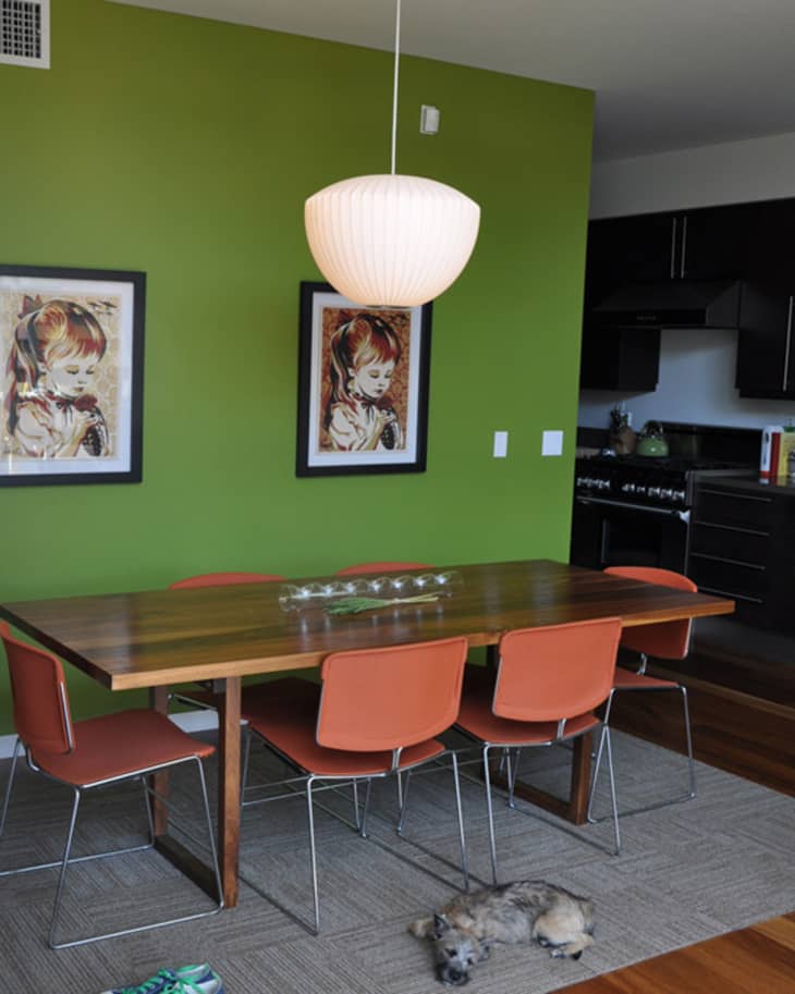
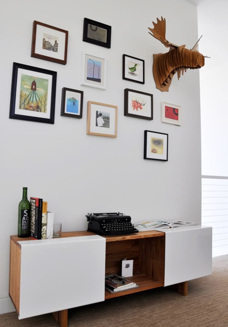
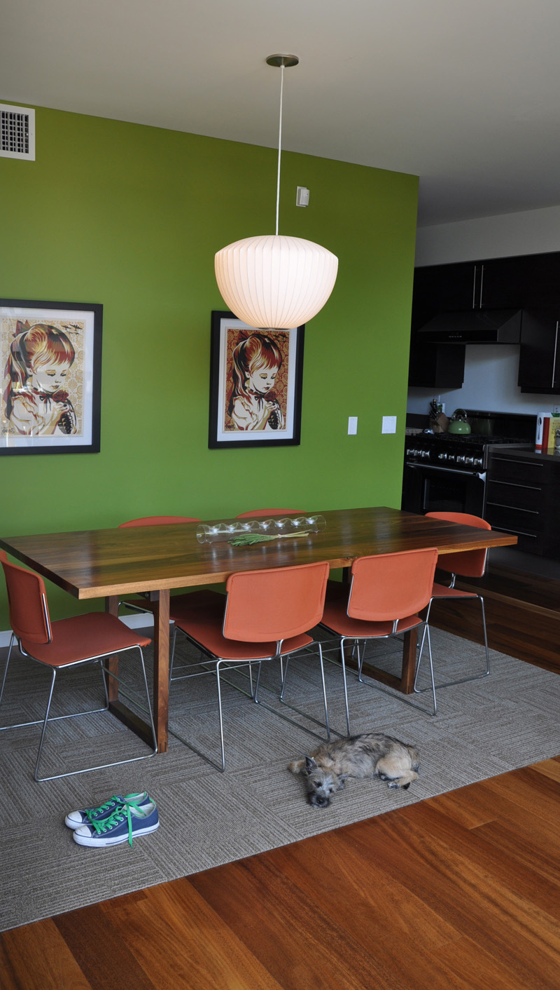
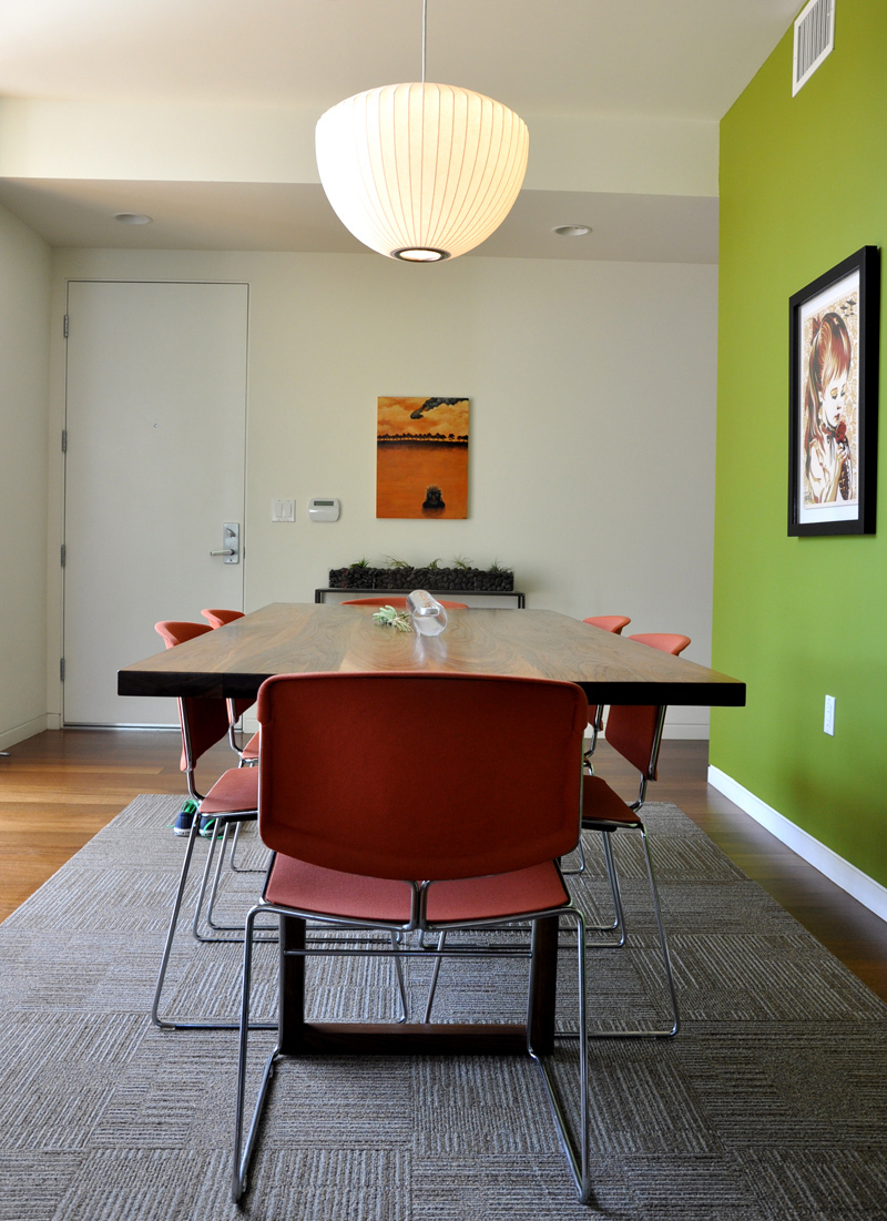
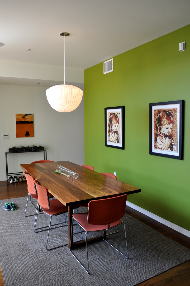
Proudest DIY: Discovering the potential of reupholstering the dining room chairs. Cameron loves those chairs. They're from the '40s and he dug them out of his aunt's garage and had them reworked. They were a great old find and, at the same time, still very modern. The arrangement of the Ian Dingman art mosaic (even though it seems everyone has art walls now) in the upstairs loft makes me really happy, too.
Biggest Indulgence: The Anders media cabinet from Room & Board.
Best advice: "Pick where you spend your money." Everything in your house should not cost top dollar. Splurge on the right items and cut-back on the others. Even on a tight budget, you can make your house look amazing by plunking money into the right, standout pieces.
Dream source: A mutant mix of flea markets, estate sales, Etsy, IKEA, Room & Board and Dwell.

Resources:
Appliances Thermador (Stove), Sub-Zero (Refrigerator), Kitchen-Aid (Microwave), LG (Washer/Dryer)
FurnitureDesign Within Reach (Sofa), Crate & Barrel (Armchair), Anthropologie (Yellow Armchair), CB2 (Desk), Modernica (Coffee Table/Eames Chair), IKEA (Bookshelves), Room & Board (Anders Media Cabinet), Bruce Marsh (dining table)
Accessories CB2 (Bedding, Throw Pillows), Unison Home (Duvet), ReForm School (Turtle Pillow), IKEA (Vases/Flowerpots), MyHouseParty.net (Air Plant Houses), Option-G Cole Gerst (Skateboard Deck) + other odds and ends from Harbinger, Heath Ceramics, Kelly Green, Anthropologie, Restoration Hardware, Target
Lighting Modernica, IKEA
Paint After checking on the paint colors, turns out Cameron actually had them custom-made from Benjamin Moore Regal with photos from magazines.
Rugs and Carpets H.D. Buttercup rug, FLOR
Beds IKEA, Crate & Barrel
Artwork Ian Dingman, Angela Black, Shepard Fairey, Josef Albers, Iso50, Andy Kehoe, Pottery Barn, Crate & Barrel, homemade canvas art

Thanks, Cameron and Matt!
Images: Beth Zeigler

Comments (51)
This is one of the best house tours on AT. The residents have managed to blend their different styles so beautifully.
Absolutely Perfect, and they're neighbors!
Man, all these apartments seem to use CB2 accents so thoughtfully.
Whenever I walk into that store it seems like an overload, but when used with restraint the effect is very impressive.
I love the typewriters.
that desk is just gorgeous. I also love the blue and white painting, and the rest of the house....
Wow. Love it! Would you mind sharing the bathroom flooring source? The one with the green tile.
My eyes are drawn to the *cutest* little dog in the world! Awwwww....
Love it! Beautiful paint color and love the furnishing. Love the airiness of the house.
Perfect, amazing space, that yellow chair! - i.hate.you.in.a.good.way
Nice Shepard Fairey offsets! I'm a big collector of his work. Did I see a Josh Keyes print in the hallway?
Good stuff!
Loving this tour. The overall effect is so cohesive and well executed. Domo! Cute dog, too.
Amazing, amazing. Love it!
Cameron and Matt's Bright & Chic Modern House Tour sounds like it could give Bill & Ted's Excellent Adventure a run for it's money. But, it is also jaw droppingly awesome. The never ending ceilings! The cozy upstairs loft! THE DOG! Gasp.
like everyone else, i love this place. great decision to paint one wall green and leave the other wall a lighter neutral color.
I agree. If ever there was an accent wall done right, that green wall is it!
Thank you so much for saying so! It took me two tries and a lot of sleepless nights to figure out the accent wall paint color. A year later I finally feel vindicated : )
- Cameron
Loving the style of this house... but I don't like
1) the big, white, empty wall in the living room (opposite the green wall). Would be nice to have a large minimalist painting or something.
2) spartan, white bedroom. Needs a little warmth, I think.
3) Artwork in the dining area -- two identical artwork is too much; one is too small for the wall though.
The huge windows are my favorite!
Love, love, love! I can't say there is one thing I dislike about this space. It just blends everything together perfectly.
Great job!
Laura
http://www.justalittlebit.net
Can anyone tell me about the art work of the little girl? I have that exact image on a tshirt, bought in Sydney, Australia!
There is not one thing that I'd change. Perfection!
I'd like to know the source of the bath flooring as well.
It is beautiful. I like the modern and the old together. Great color choices. I usually don't like dark wood in kitchens, but this is so modern it looks cool. I love the typewriters.
It is very minimalist. Most people have to much junk for this look. It is beautiful though.
It's very modern, hard-edged and surface-y, especially in the bathrooms, which could have been lifted from a hotel. I like things that are a bit banged up and evocative, and as such I'm not in love with this place.
Except for the snail lamp. That I love.
As most have noted the color choices are great - but especially your choice to have a lime accent wall plus peach chairs!!! So lush. I think this is a pretty rare color combo that people just don't exploit enough. Thanks for the inspiration!
Love the sense of humor everywhere! Love the dining room chairs! If I were going to change or add or subtract anything, maybe I would give it a dash of punk ...
There are no rough edges. It needs some jagged rusty metal, or a vintage sofa chainsawed in half ... I don't think that would disturb the peace at all; rather, it might underline all the serenity happening in every room. But maybe Cameron and Matt provide all of that and more when they are present ...
Mallard:
I have to say I am very impressed with your home--and please don't take this the wrong way, but it's not what I would imagine from such young guys. You and Cameron came up with some really great colors, furniture, artwork, accent pieces etc, etc. I like all of it.
And THANK YOU for putting down the toilet seats!! Seriously.
P.S. Ninja is a cutie--lucky girl.
It's funny to me that the merging of the two different styles -- modern with bohemian/vintage -- is how I would probably describe my own house/style but, my translation of that is very, very different. That's pretty cool to me.
I love the staircase. My favorite thing about this tour, though, is the very honest interview and the admission of difficulties! Finally someone I can relate to! Thank you.
enough of the cardboard moose
yeah i too love the green painted wall.
love the green wall, yellow chair, and blue and white art piece!
But, the dining room just doesn't say four hour dinners with friends laughing and loving.
Where'd you find the modern chair silkscreens/paintings/prints/whatever?
The artwork is from shepard fairey
obeygiant.com you'll find other screens and prints there too.
I think their two styles merge beautifully! I especially love the dining area and the lofted office (that yellow chair looks like the perfect reading spot!).
Great apartment - love the use of color and modern accessories. Where did you get the bookcase on wheels under the stairs? It's a great use of space.
Oh my!!! This apartment is by far one of the best I've seen. Everything seems to fall right into place!
Great job!
PEANUTS11,
I believe it's an Ikea EXPEDIT on casters(they sell the casters as well). I too thought that was a great use of the space.
Hi everyone,
This is Matt. We wanted to say thanks for all of the really sweet comments as well as the constructive criticisms, and we also wanted to answer some of the questions that have been asked so far. Here goes!
@simsima — I love Josh Keyes' work but we don't own any. I think the piece you're talking about is the one next to our front door. Not sure? That painting is by Andy Kehoe.
@bedouin — Others already got it right. The artwork in the dining room is by Shepard Fairey. It's called "War By Numbers." They are limited-edition prints, but, as @ComfortSeeker mentioned, they are not actually identical. Close. The backgrounds differ.
@walkerke — The chair artwork above our bed we found online at Design Public.
@PEANUTS11 — @modernguy is right. The bookshelf on casters is from IKEA. They sell the casters separately and you have to do it yourself, but it's a quick job.
The bathroom floor that several people have asked about is a mystery. Sorry! It was placed there when the building was built. We're trying to track down the information because we get asked about it a lot. I can say it's water absorbent though, which is nice with a shower that isn't fully enclosed.
A few comments about the blue and white painting upstairs. It's not actually a painting. It was a Zero 7 poster for their single "Distractions." I loved the image, but wanted to take it beyond my college apartment days, so I pulled it over a canvas and staple-gunned it in back. Wipe a layer of Mod-Podge over it to protect the paper and you're all set. Same process was used for the artwork in the kitchen of the dude's face (that's Everything But The Girl's poster for their single "Tempermental") and the yellow diving man artwork in the master bath (The Sundays' "Cry").
Thanks again for all of the kind words and questions!
Love the Bruce Marsh table. You are so luck to have one of his pieces! We have one in our home as well. We were fortunate to meet Bruce on a trip to NYC and was able to place an order with him. He is such a nice guy and his craftsmanship is top notch.
Thanks Modernguy - definitely is from IKEA - turned sidewise and with the casters. Love it. I'm going home to measure my apartment to see if it fits.
Love, love, love. Clean, modern, airy, bright, cozy, quirky, and fun. Gorgeous and inspiring. Thank you for sharing your home!
Hi guys - this is a great place to visit and it must be a great place to live. I typed on one of those Royal typewriters many years ago (long before electric typewriters or computers). Just loved everything, great job.
My favorite thing is the diving man in the bathroom. Brilliant!
Beautiful home. Beautiful collection of art. Love all the typewriters.
The light is image #15 says it all. It makes me want to stretch out in that sunlight. LOVE this tour! Great converging of styles! LOVE the typewriters, the snail lamp and the artwork! Very well done boys!
How about the line drawing artwork above the half bookshelf with the typewriter? Where did you get it/who is the artist?
Oh wait, was this the Zero 7 poster you were referring to?
@niabassett - That was the Zero 7 poster, yes. :)
STOP THE PRESSES!
Where did that snail lamp come from? I NEED it.
love your space!
@chicelectic - It's an Anthropologie find from a few years back. They also had an owl in a similar style, but I thought the snail was more unique.
Your place took my breath away.
I love the feel of this house and the dining room and kitchen have most interesting and original colors. I also love the artwork. Would love to see it in person!
Beautiful, modern space! Thank you for sharing it with us :)