
Guy & Jennifer’s Contemporary California Modern Home
Name: Guy and Jennifer Genis
Location: Sherman Oaks, California
Size: 3500 square feet
Years lived in: 6 years — Own
Guy and Jennifer, plus their son and daughter, all live in a bright and airy home in Sherman Oaks. The house lends its roots to California mid century modern architecture, but with the design savvy of designer Bryan Wark the Genis’s brought in a mix of traditional and Hollywood Regency design.

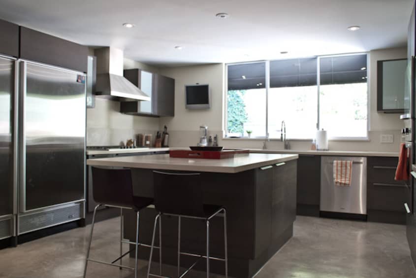
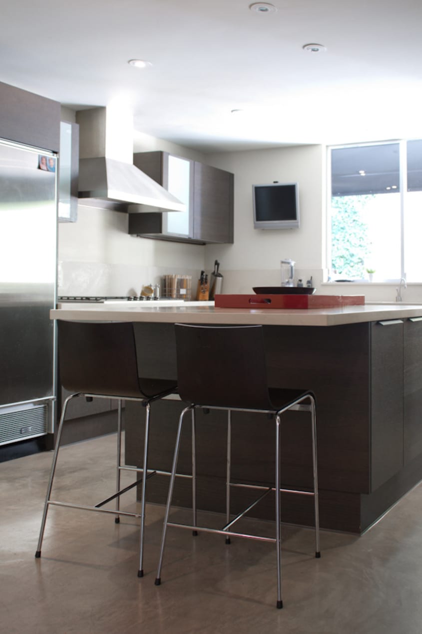
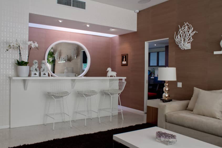
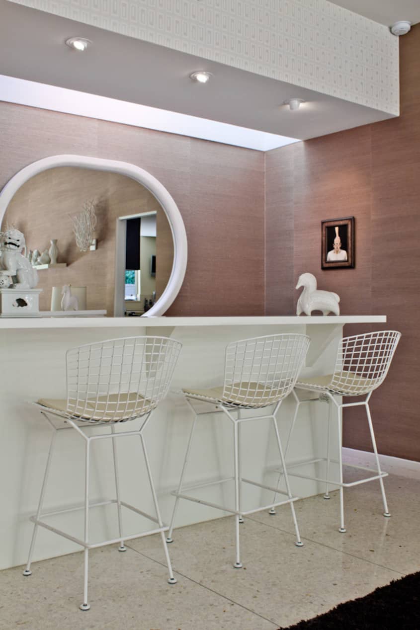

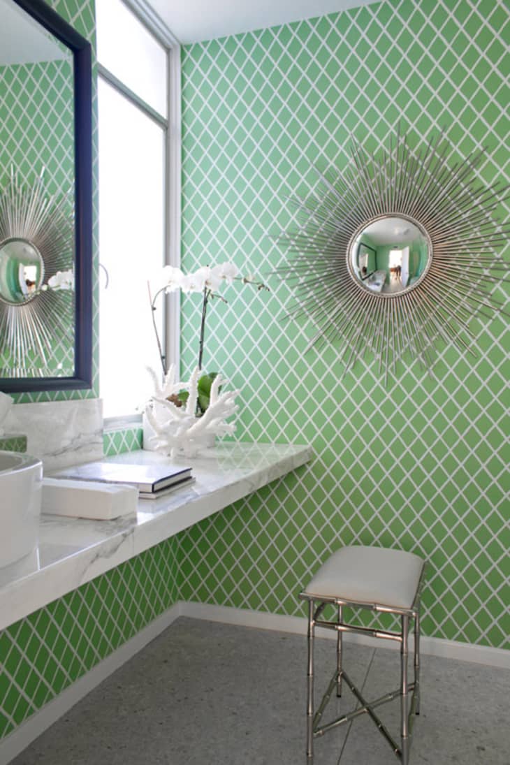
A home of this size could easily go in one direction or the other: completely cold and stark, or jam-packed with too much furniture in every nook and cranny. The awe-inspiring nature of this house is that they have brought in two distinct styles — Mid Century Modern and Hollywood Regency. Giving each room its own voice with colors, textures and decor, in my opinion this home was outfitted for luxury and comfort. As he admired the nature of the open floorplan in the living spaces, Bryan custom designed specific pieces for the room. Comfort and entertaining being the key of this family of four, Guy explains what was most essential in the design process — “A great room and kitchen is essential for entertaining. Our great room is the family room that is also a bar. It is meant for lounging and facing in all directions. “
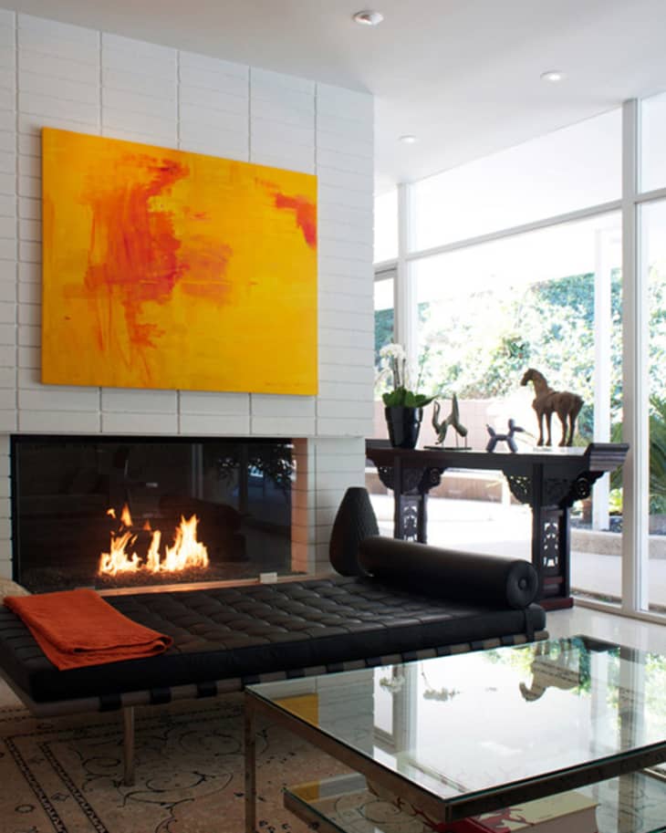
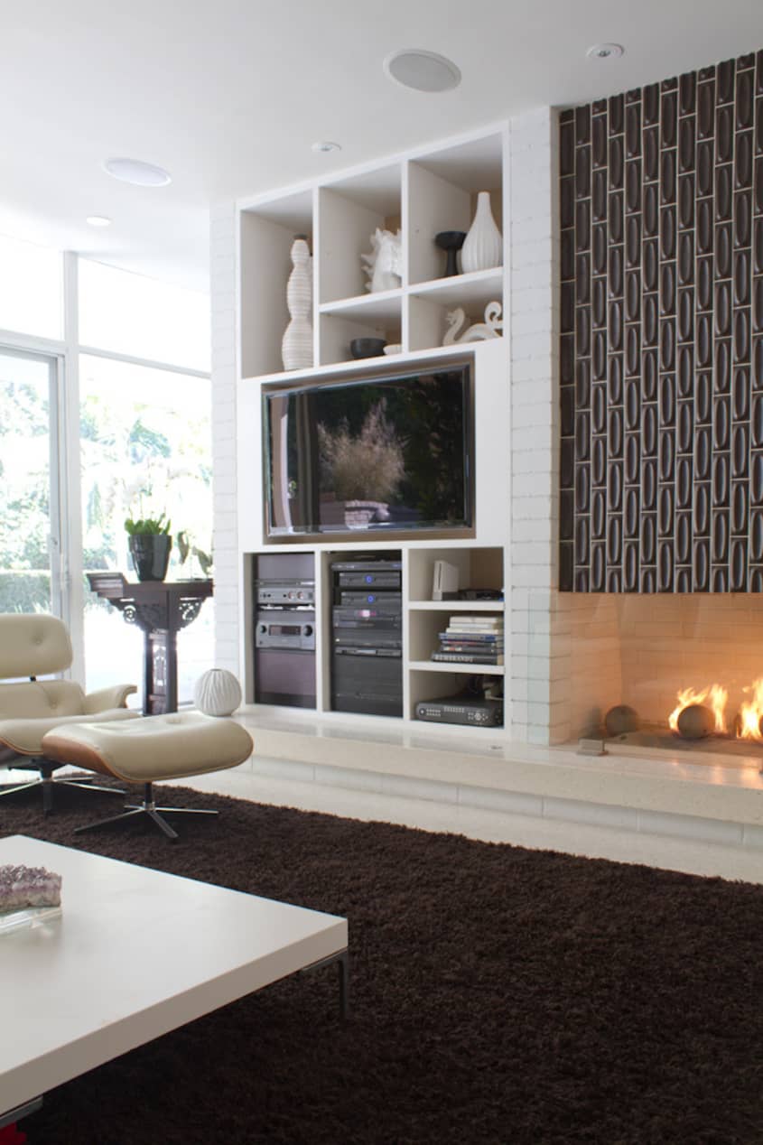
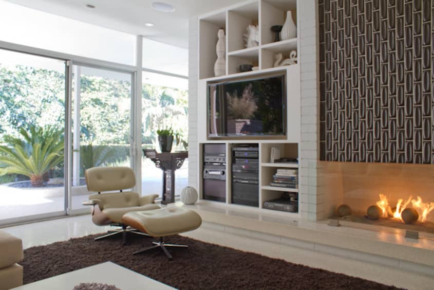
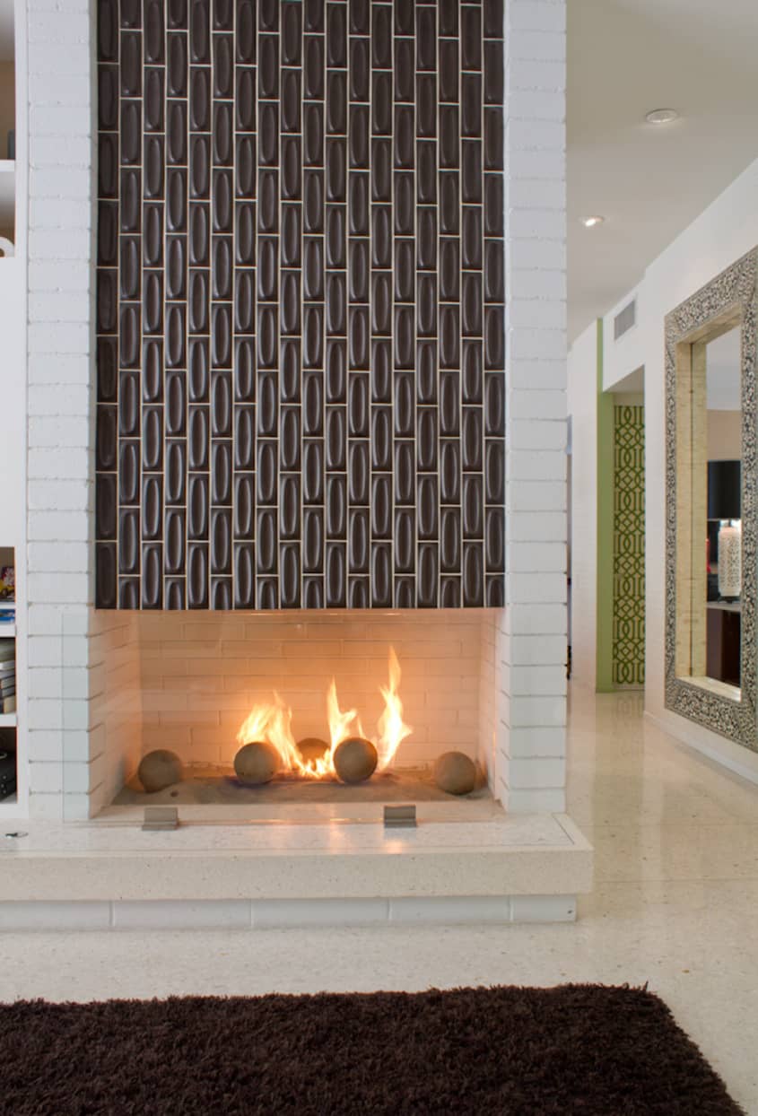
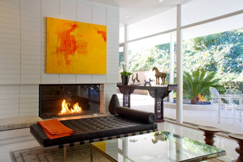
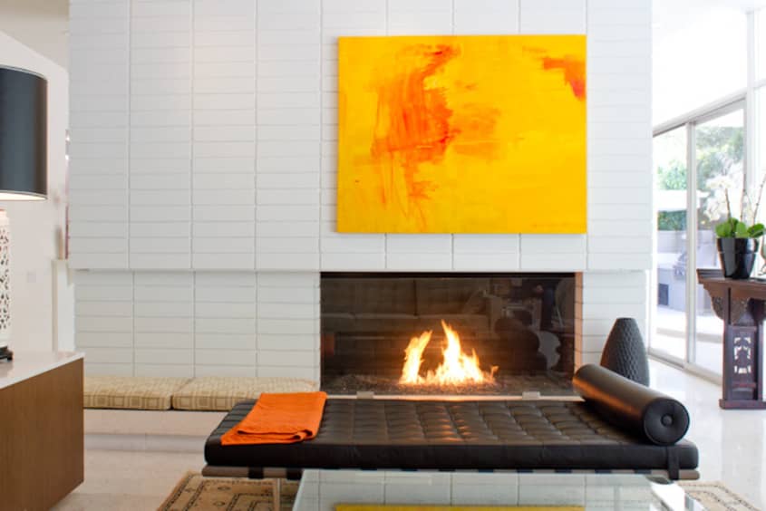
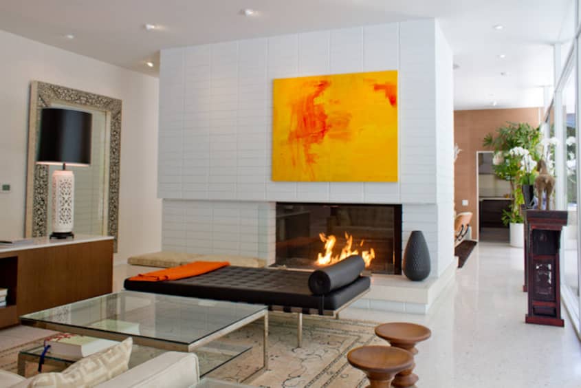
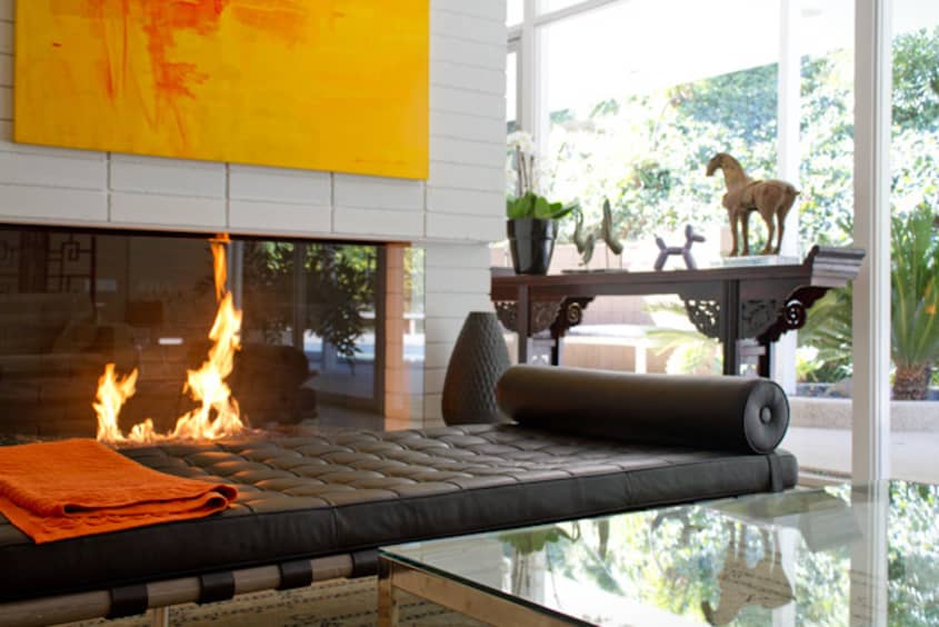
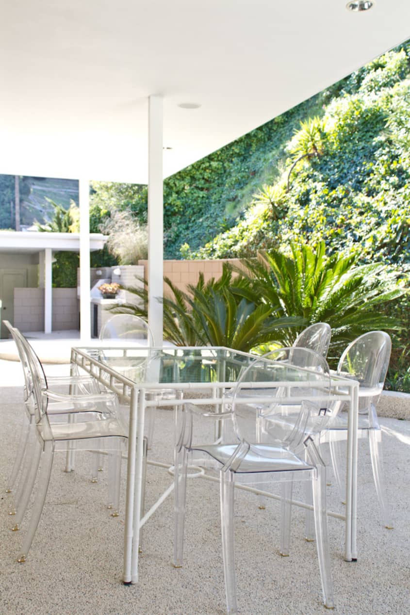
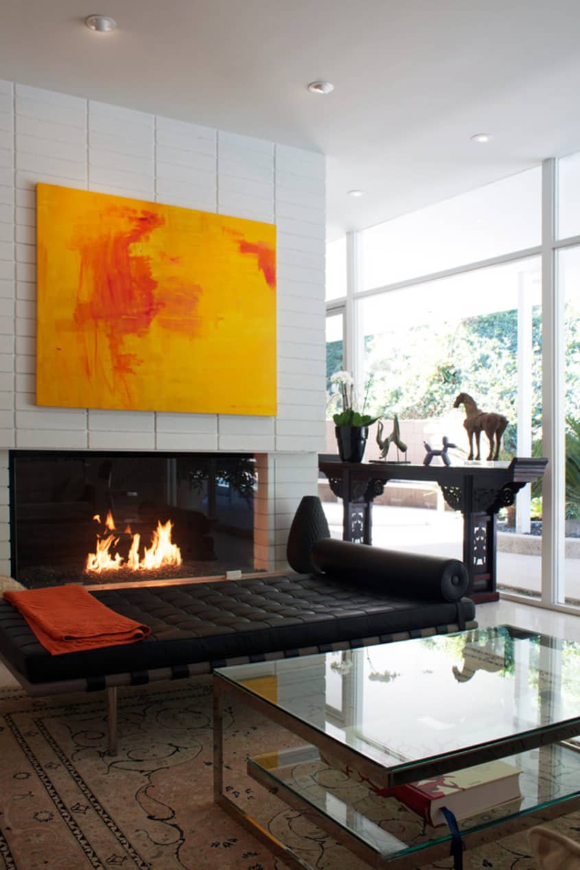
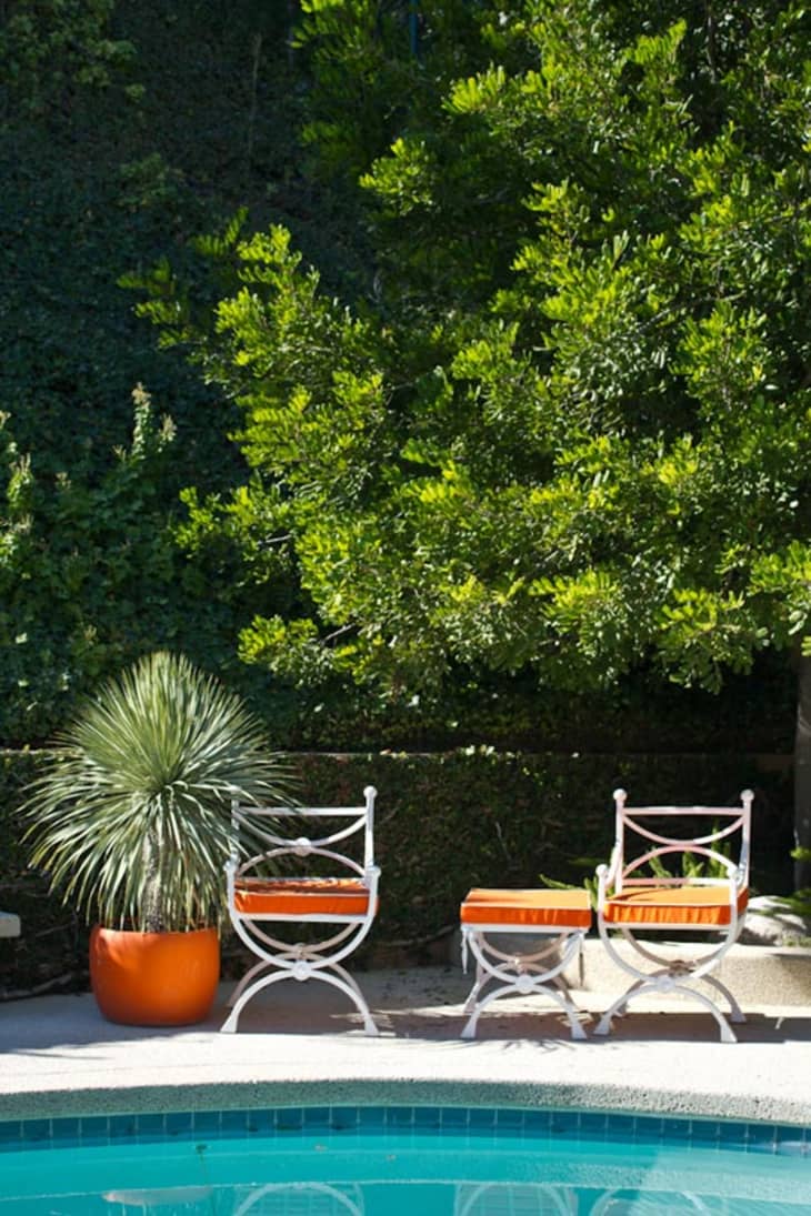
Lucky enough to own a home that backs up to a hill of luscious greenery, the family takes full advantage of the yard and fully functionality of each room. “We are nestled next to a mountain and most of the time it is very quiet. There is a tranquility of living on a non through street. The most significant element of our home is the two sided fireplace. It anchors both the living and family rooms and is the perfect backdrop to both rooms. The hearth is great for perching and warming ourselves by the fire or conversing with friends.”
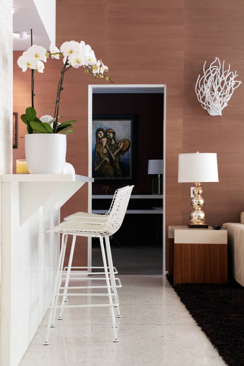
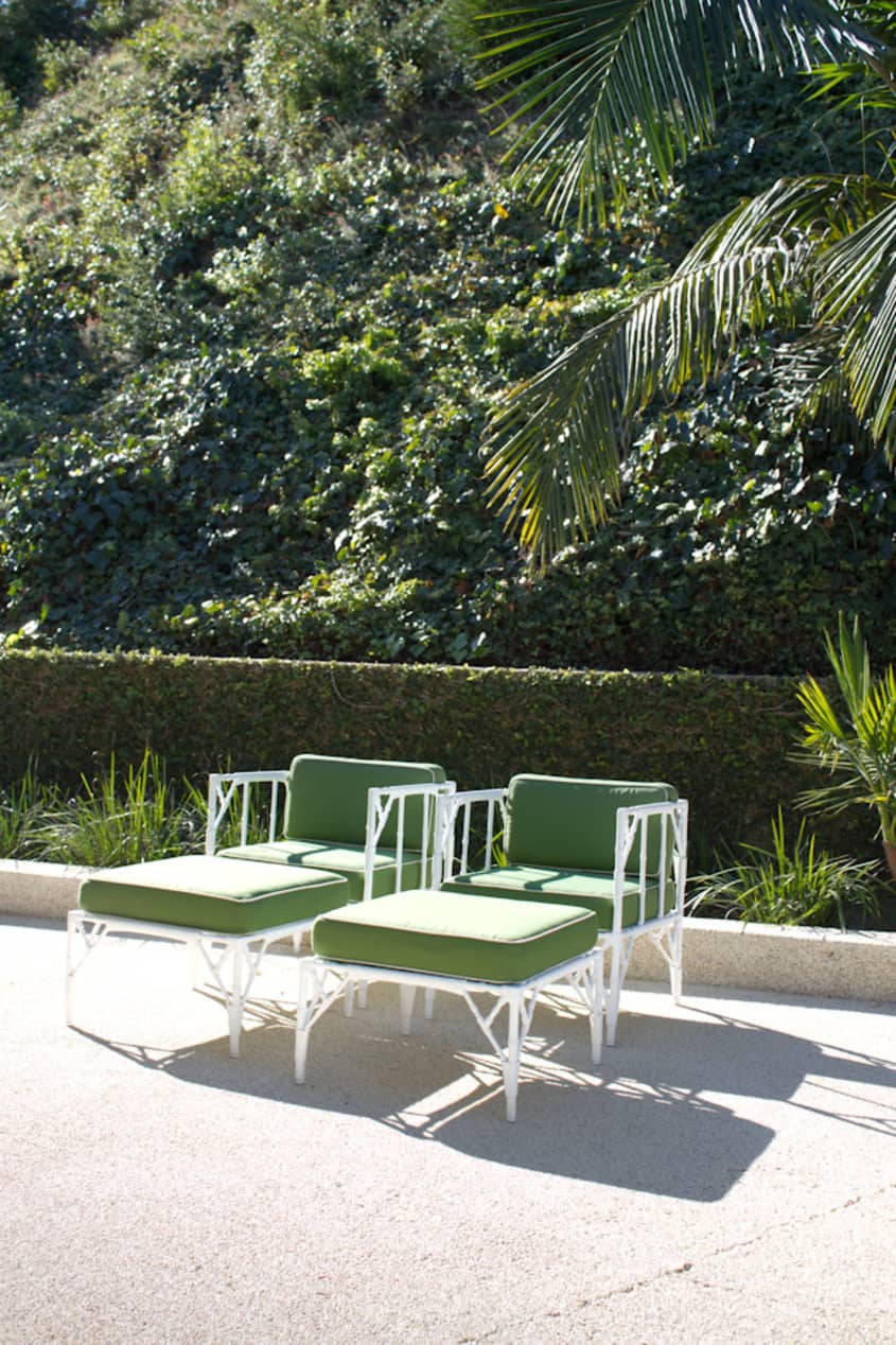
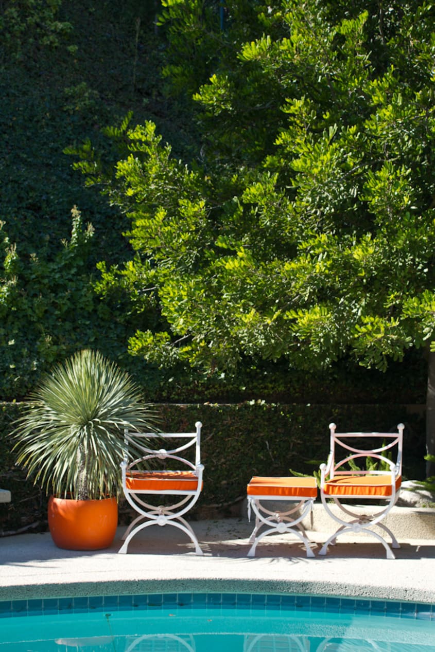
I’m always interested to see how certain homes follow Mid Century and Hollywood Regency and how the homeowners put their spin on it. “I am the Founder & CEO of Eventmakers, a global event production company and my world is filled with travel, design, negotiations and a very hectic schedule. My home is designed as a place to unwind and get away from the pressures of work and be with my family. It is designed with creature comforts in mind. the colors are a palette of whites, creams, chocolate browns and in certain parts of the house slashes of color like green and orange just as you would find them in nature.”

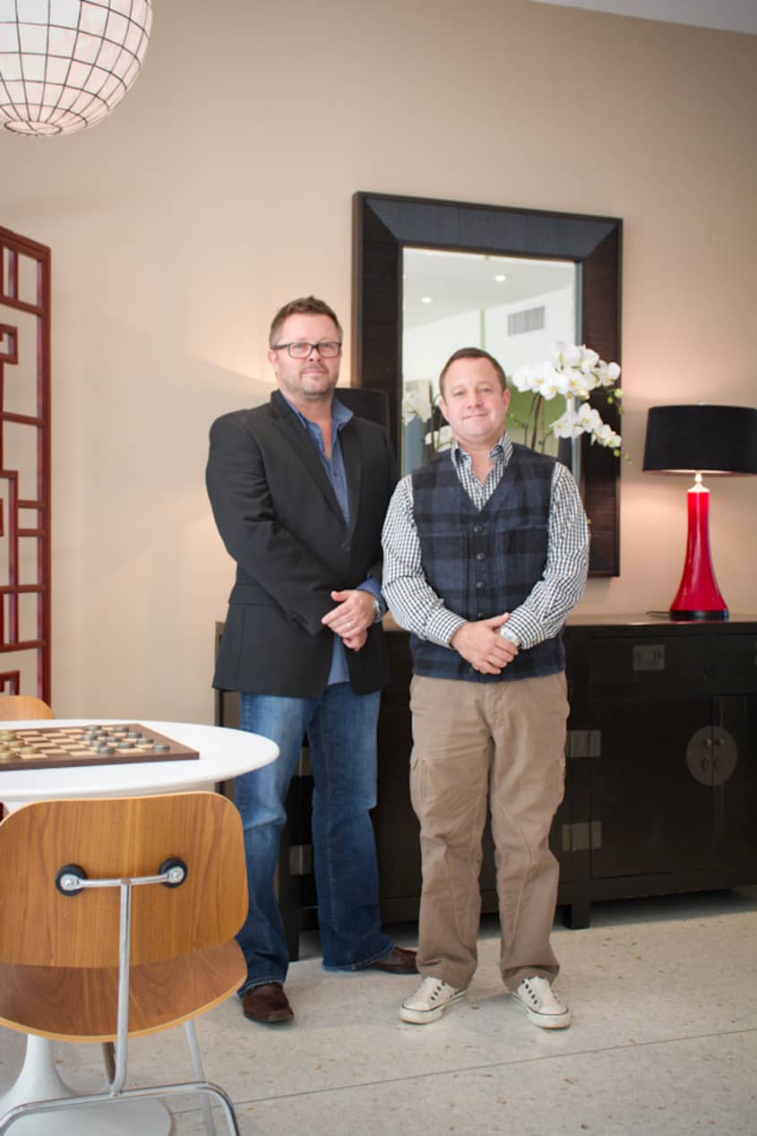
Designer Bryan Wark and home owner Guy Genis
Our Style: California Comfortable/ Mid Century Modern made contemporary
Inspiration: I grew up spending weekends with my family in Palm Springs where my parents owned a mid century modern home. I have many fond memories of that home. When I saw this house the bones and floor plan of the home we’re very similar. I knew this was for me.
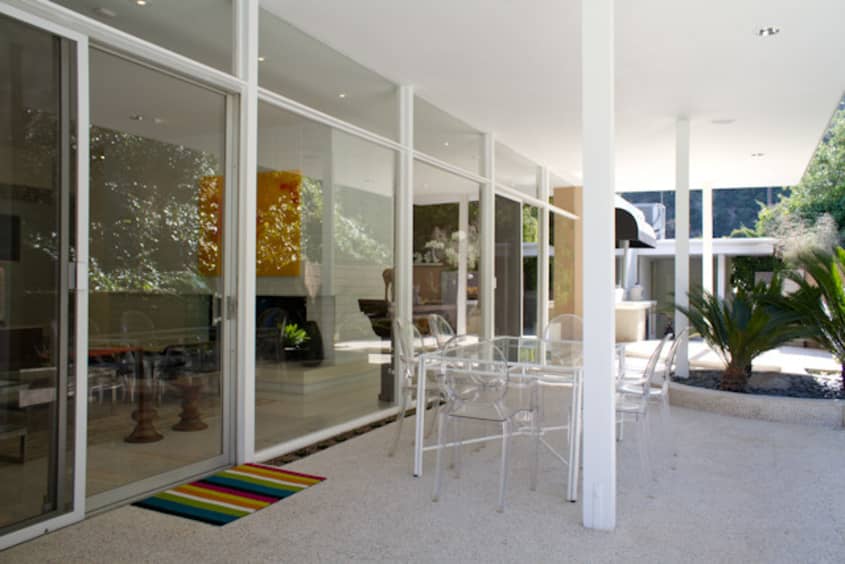
Favorite Element: my favorite element is the expansive walls of glass facing the back patio and pool. Two main support walls of the family and living rooms extend through the glass walls to the outside blurring the interior with the exterior.
Biggest Challenge: The biggest challenge was to restrain ourselves by adding too much decor elements to the design. It is refreshing to embrace the negative space whether it is a bare wall or floor space. less is clearly more.
What Friends Say: Friends are always surprised when they first walk through the front door. The scale of our home is impressive with 12 foot ceilings in the living room and family room.
Biggest Indulgence: sitting at the bar with friends drinking amazing wines and sampling great cheese.
Best Advice: don’t ever play your own contractor. I did the contracting for our home as I figured if I could produce an event I could plan a home remodel. The money I planned to save on hiring a contactor was spent twice over on rescheduling the subs due to scheduling mistakes. It is not as easy as it looks.
Dream Sources: Bryan Wark designs furniture
(Console, coffee table and sofa)
Heath Ceramics fireplace yields
Donald Lavin for coral sconces
Kneedler Fauchet Kelly Werstler
Donald Kaufman Paint
John Watson Lighting Design
Resources of Note:
PAINT & COLORS
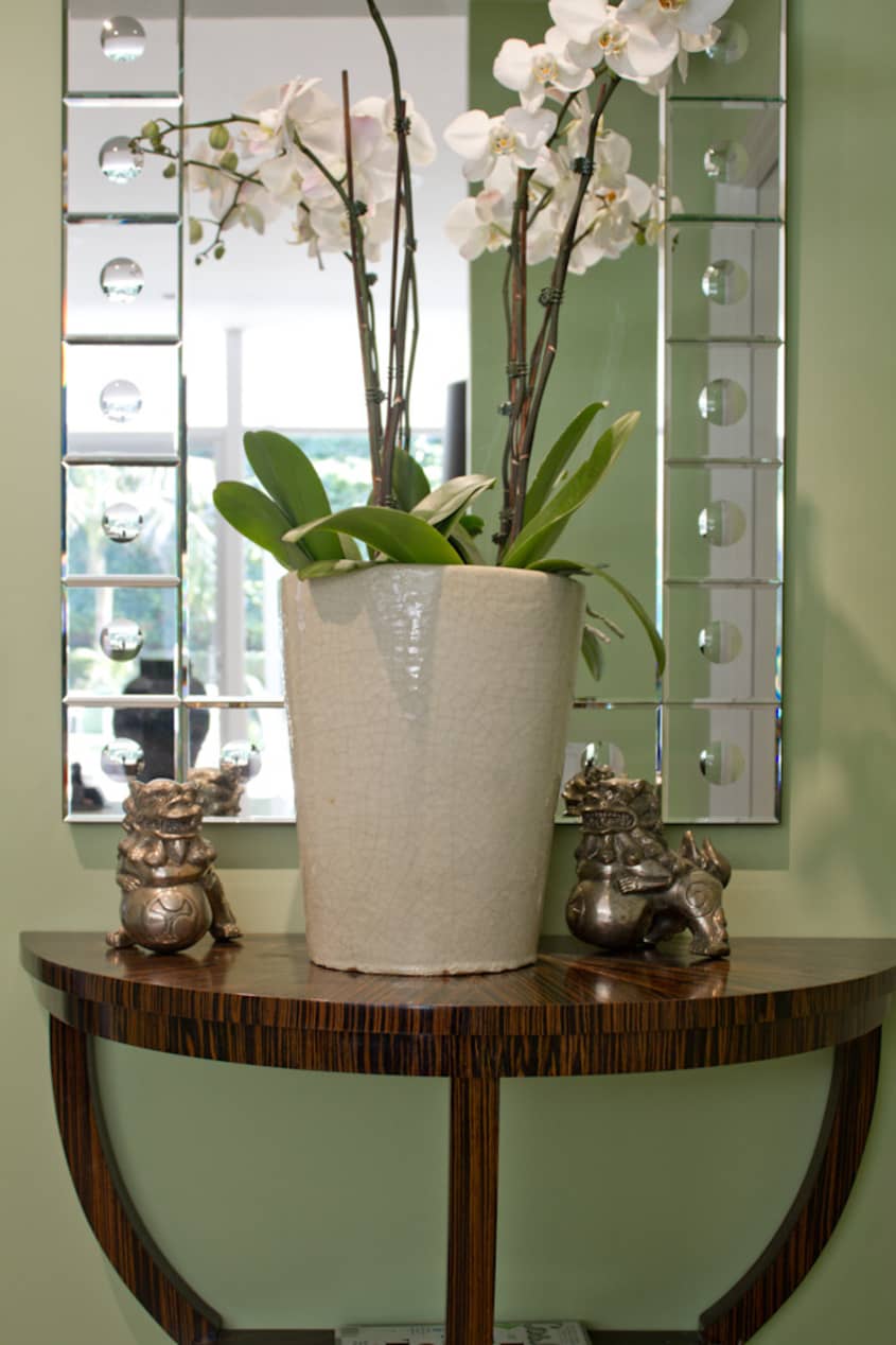
ENTRY
-
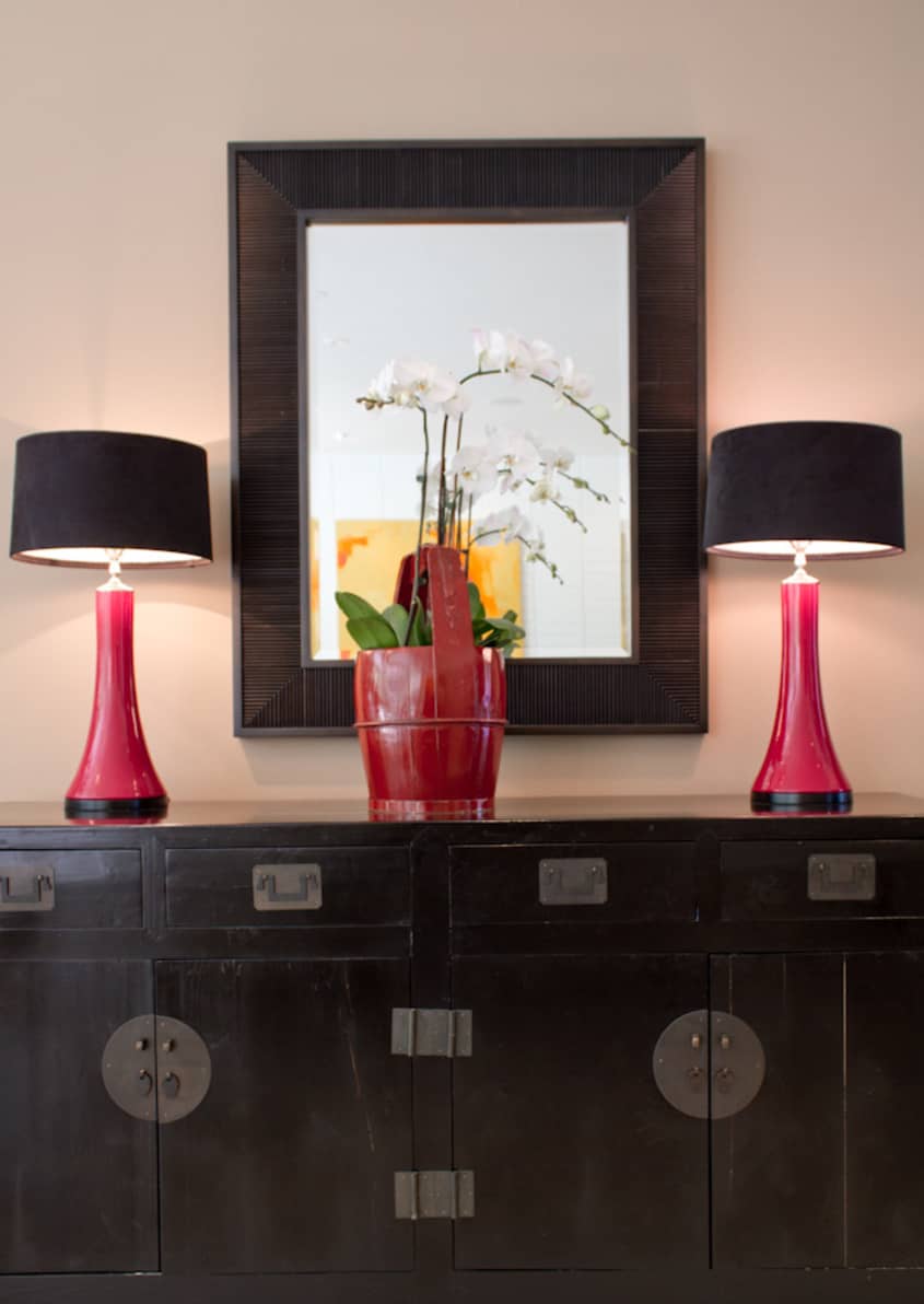
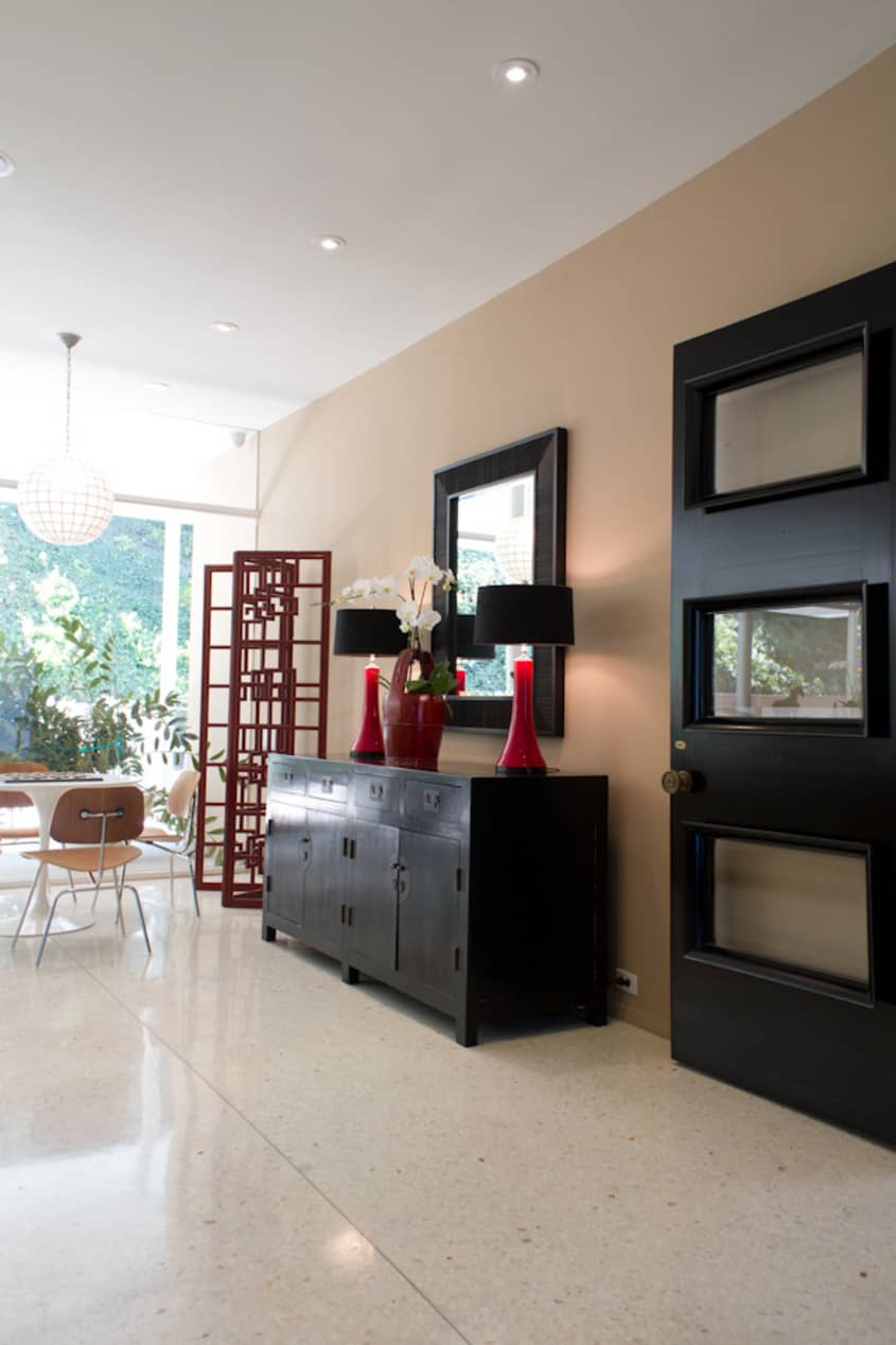
• The black Chinese credenza is an antique & the red lamps & mirror are from Plantation on La Brea.
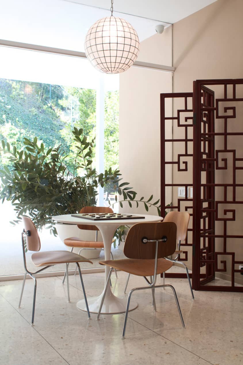
• The white round pedestal table is the tulip table by Saarinen & the chairs are Eames’ walnut lounge chairs. Both are from Jules Seltzer & Assoc. on Beverly Blvd.
• The round globe pendant light is made from Capiz shells & came from Out Of Asia.
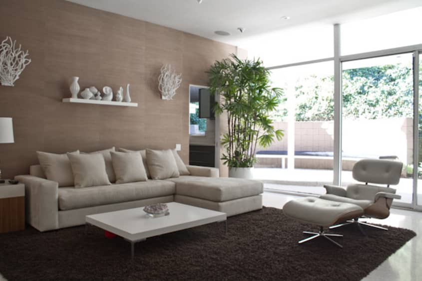
LIVING ROOM
-
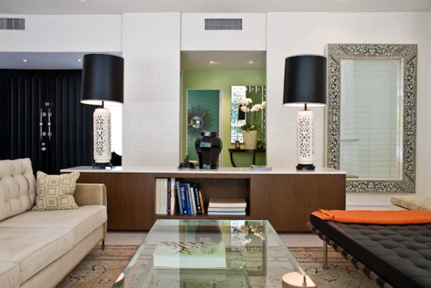
• The sofa is custom by Bryan Wark Designs, Inc. It’s covered in chocolate Mohair from Robert Allen.
• The coffee table is also custom by Bryan Wark Designs, Inc. & is available through Mecox Gardens on La Cienega.
• The Credenza is Bryan Wark Designs, Inc. its zebrawood & white Caesarstone
• The Lamps are 1950s Italian Majolica from Twentieth on Beverly Blvd.
• The large black & white mirror is ebony & bone inlay from India & was purchased at Charles Jacobsen in Los Angeles.
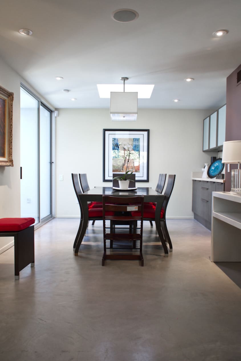
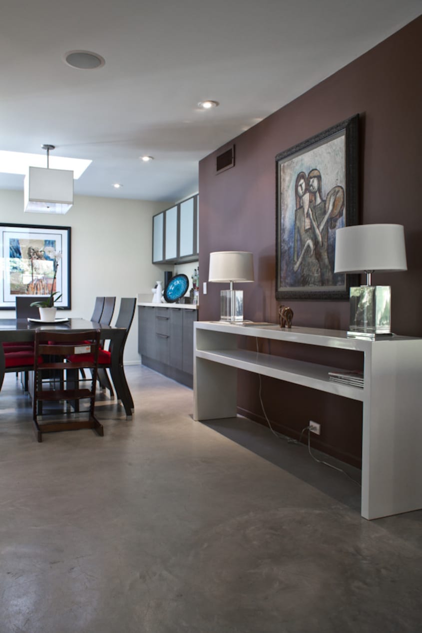
DINING ROOM
-
• The cabinets in the kitchen & dining room are all made of Wenge & are Pedini.
BEDROOM
-
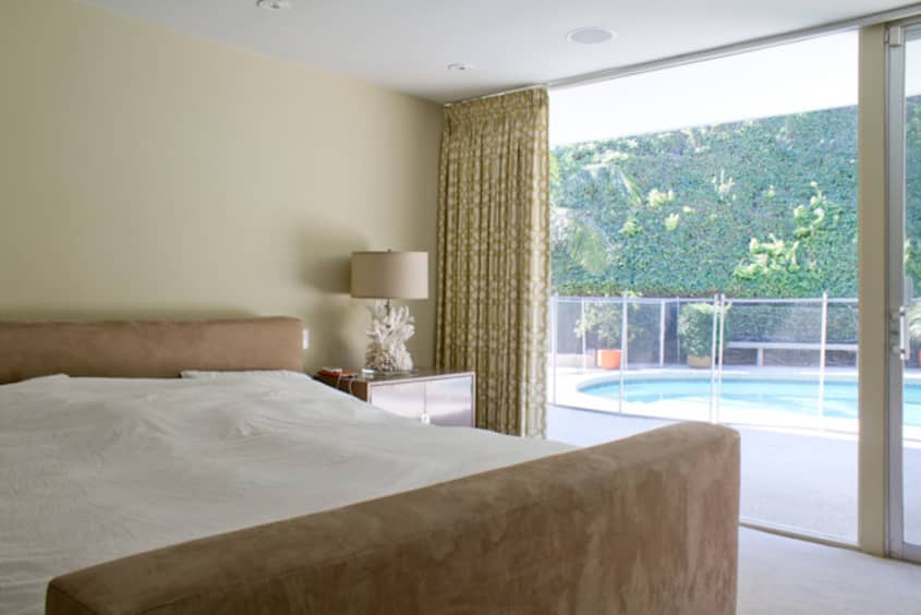
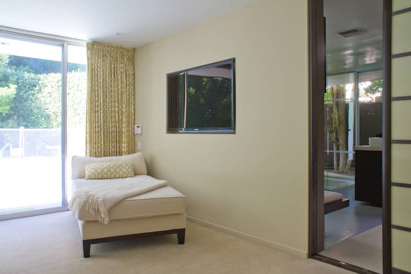
• Master bedroom drapery fabric is Kelly Wearstler’s Imperial Trellis in citrine by Schumacher.
Thanks, Guy and Jennifer!
Interior Designer: Bryan Wark
Images: Bethany Nauert
• HOUSE TOUR ARCHIVE Check out past house tours here
• Interested in sharing your home with Apartment Therapy? Contact the editors through our House Tour Submission Form.
• Are you a designer/architect/decorator interested in sharing a residential project with Apartment Therapy readers? Contact the editors through our Professional Submission Form.