
Jenny & Collin’s Bold Mix of Books & Media
Names: Jenny Carlson, a Ph.D. candidate in anthropology at the University of Texas and an improviser with Damned Avalanche, and Collin Cannaday, a multimedia content producer who runs a podcast, “You Should Be Watching.”
Location: Allandale Neighborhood — Austin, Texas
Size: 800 square feet
Years lived in: 1 year — rent
Jenny and her boyfriend Collin are like most of us: they love a home with built-in personality and charm. But when Jenny moved into Collin’s affordable, close-to-lots-of-things but not quite overrun-with-style apartment a year ago, she knew they’d have to work to create a charming home and fit their book, art and media collections into a tiny space. We found their solutions simple, affordable, accessible and a great combination of two distinct personalities.

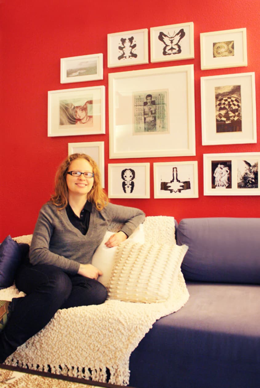
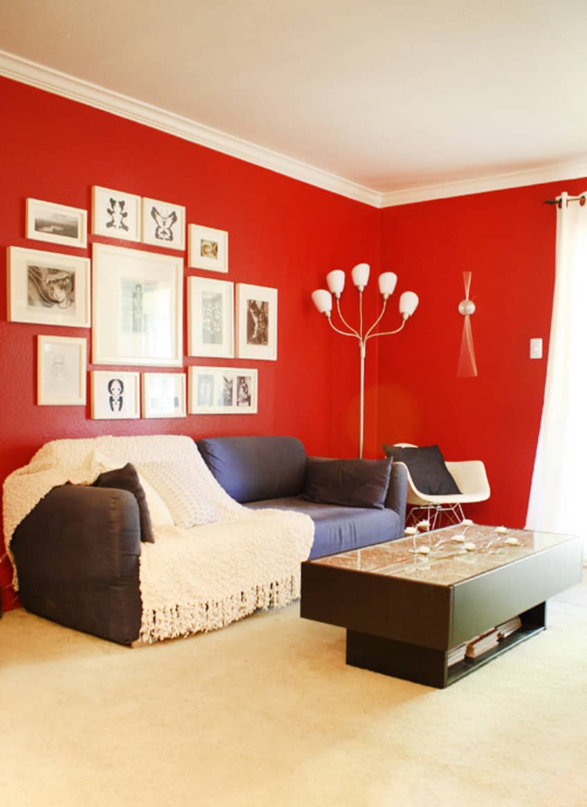
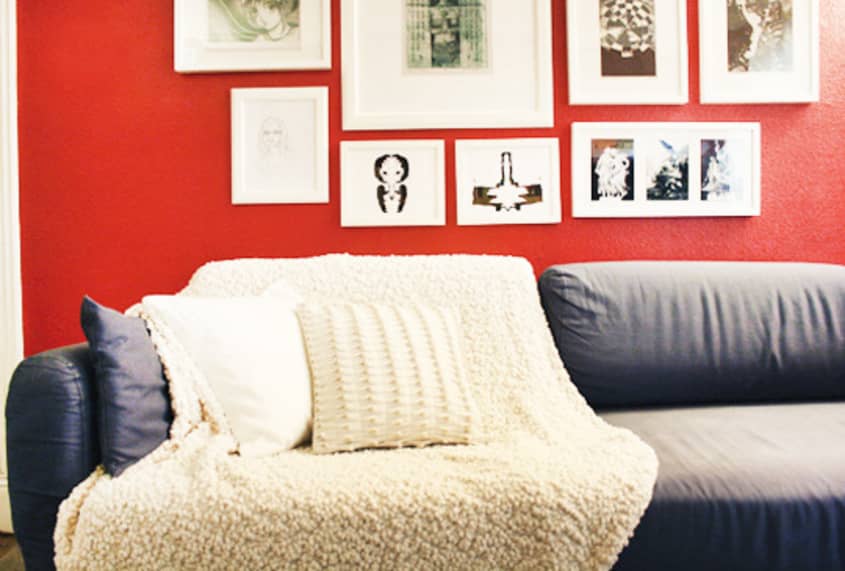


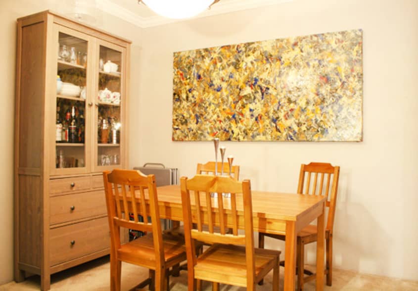
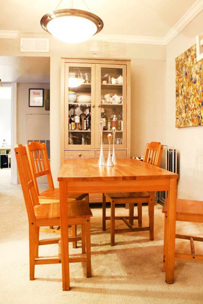


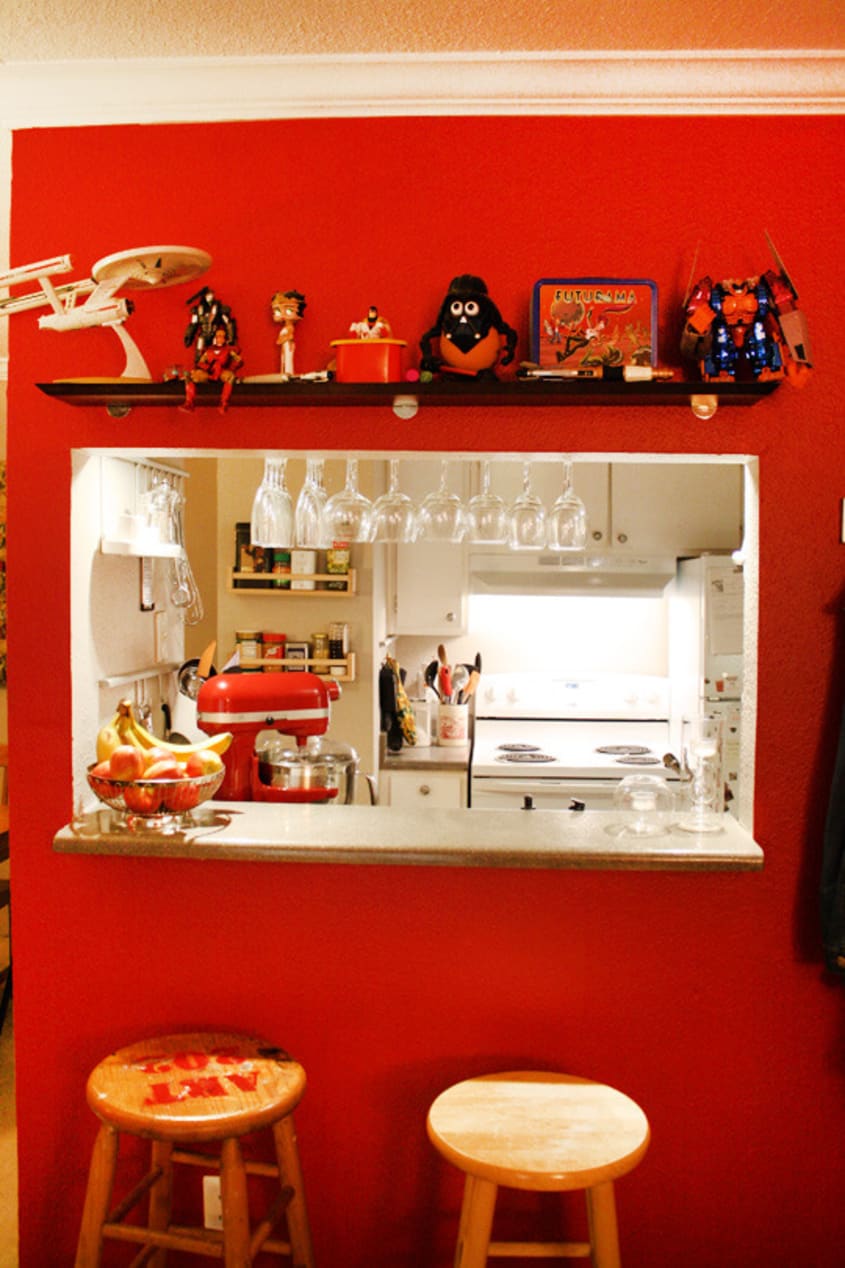


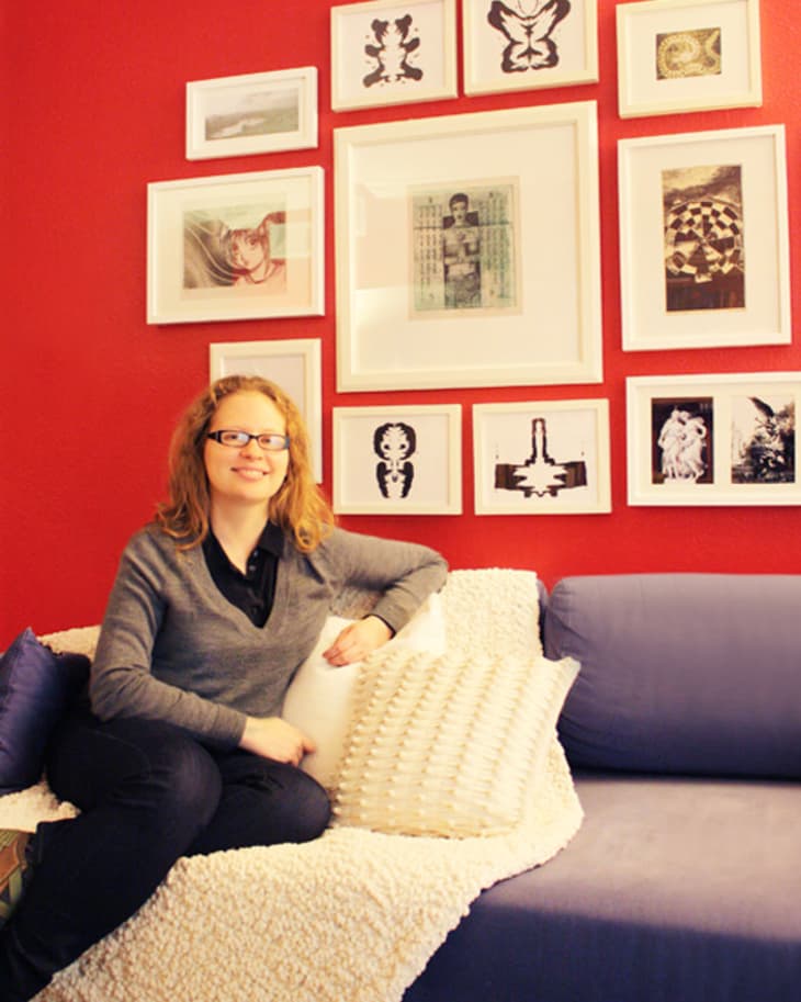
Jenny started with a red color from an old apartment she loved, painting the living room a bold, rich crimson that immediately brightened the whole place up and also became an excellent backdrop for all the colorful accessories and books in the space. Next came organizational solutions in the kitchen—a pot rack takeover of the laundry closet, under-cabinet lighting, barware storage, a spice rack and more—to help fit in their culinary hobbies (Collin’s homemade pizzas are legendary in Austin). Another challenge was making both of their furniture fit in the small apartment as well as coordinate. The dining room was kept simple with a soft, neutral palette, which we think balances the strong red living room nicely and lets the large piece of art by local artist Arthur Simone really take center stage.
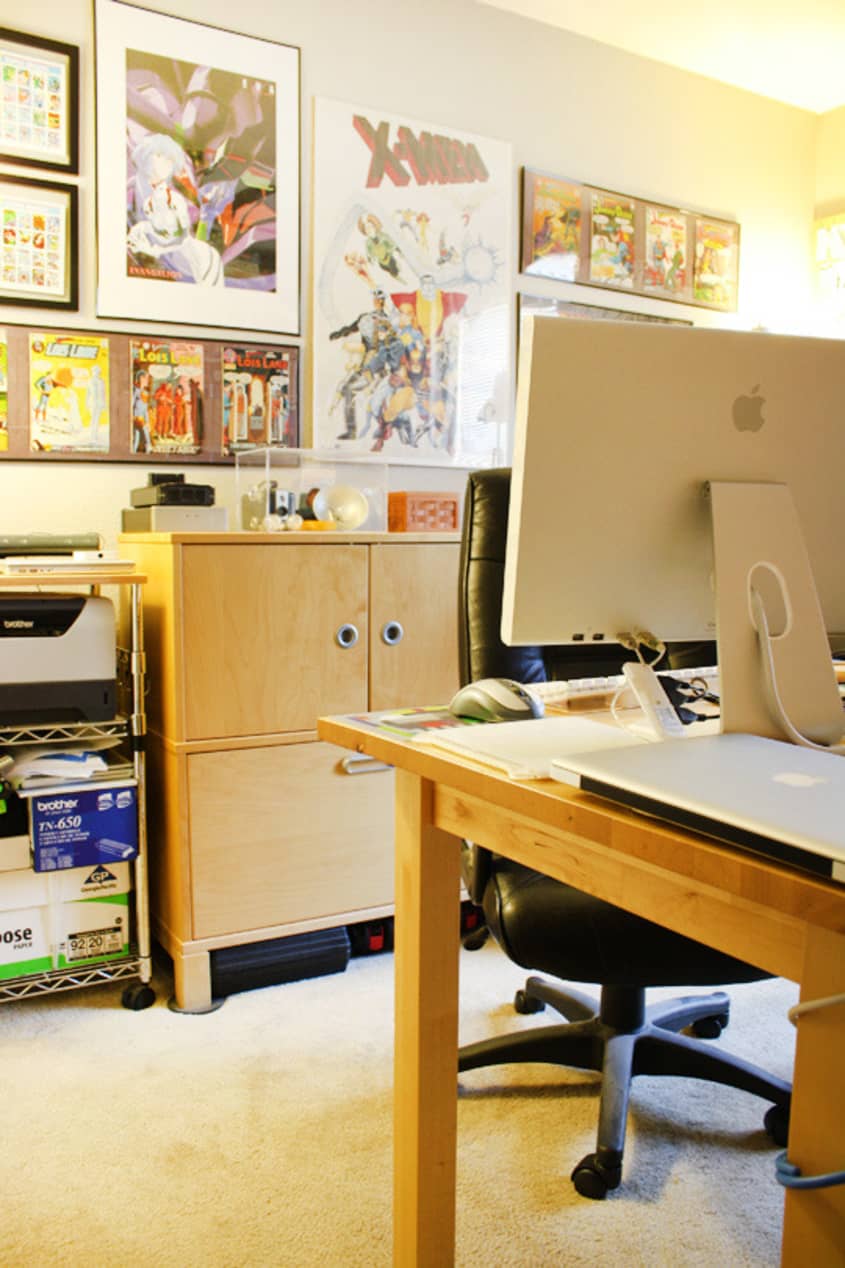
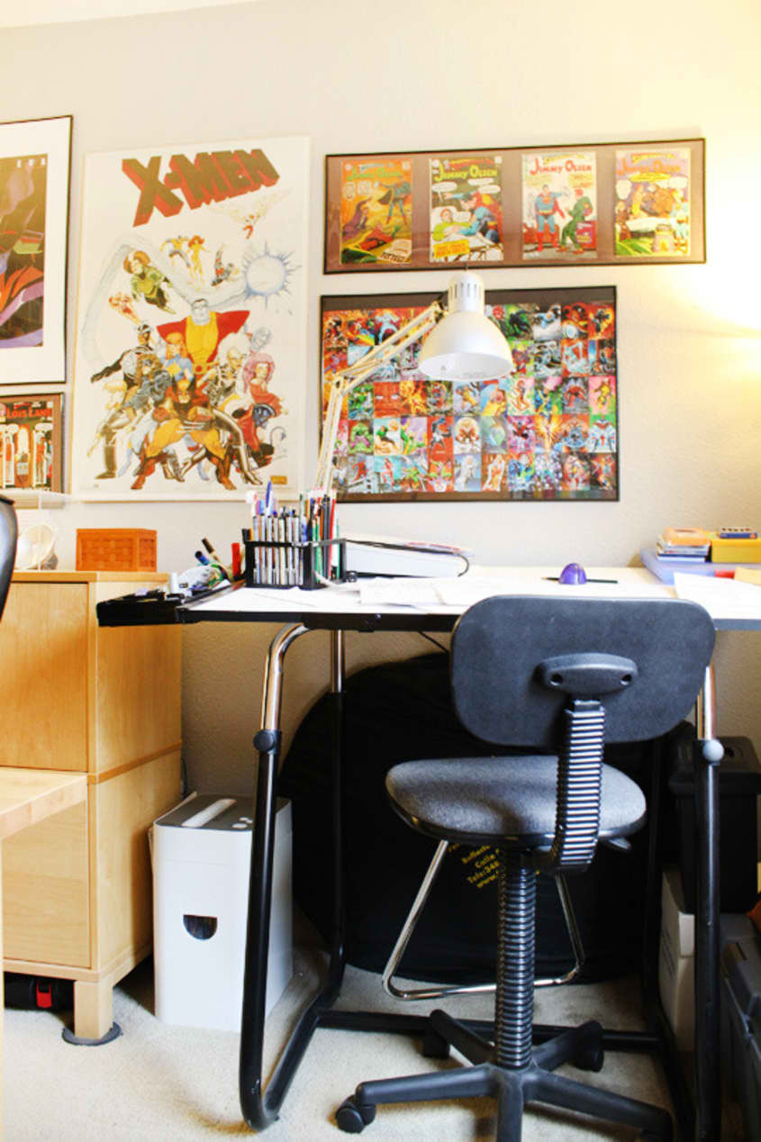
Collin’s office and podcast recording studio is, as many tech lovers will commiserate with, always a challenge to keep organized, especially when it comes to wires. Though definitely visually busy, we enjoyed the feel of the space and could really sense the motivation and creativity that take place in there.
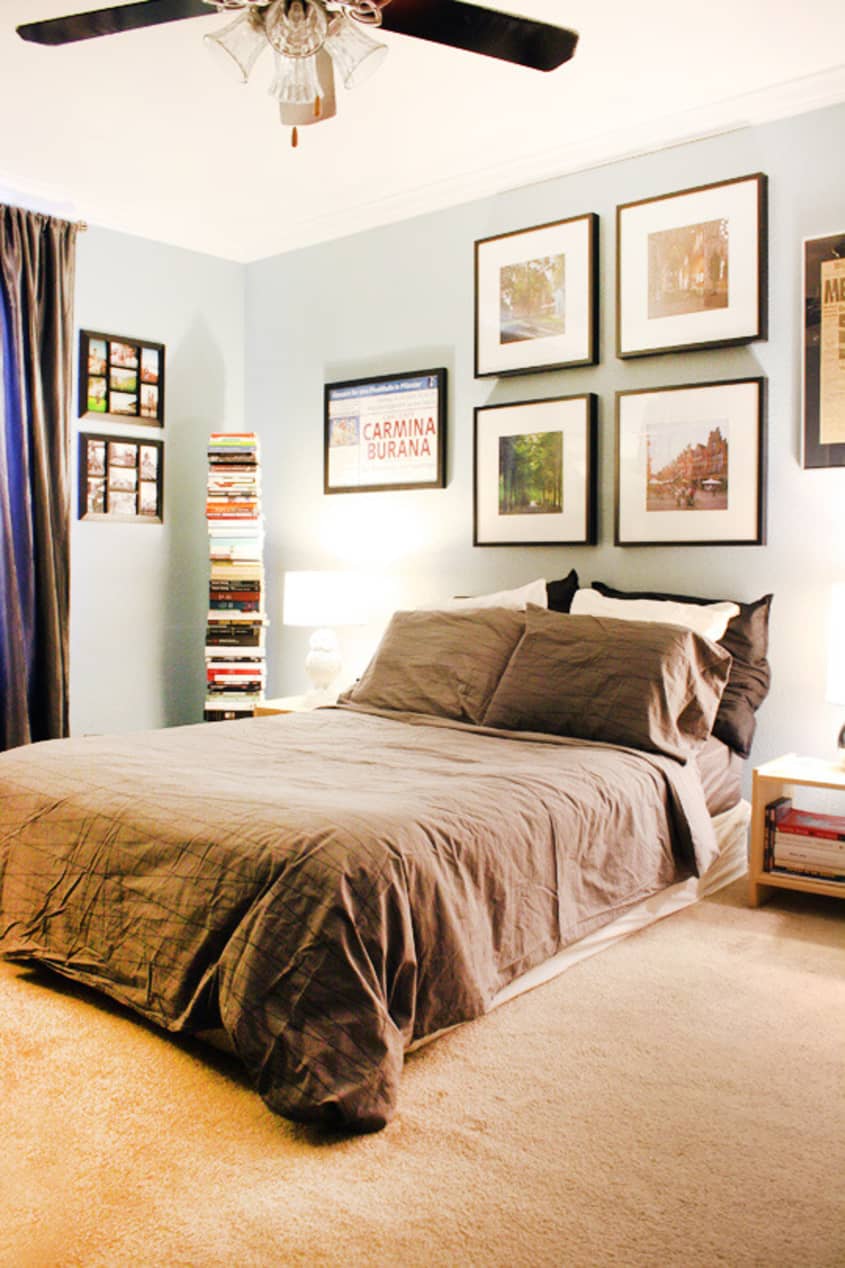
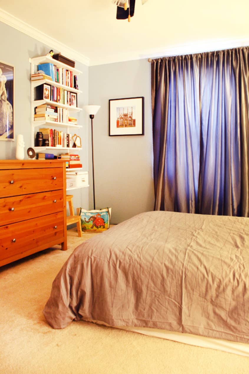
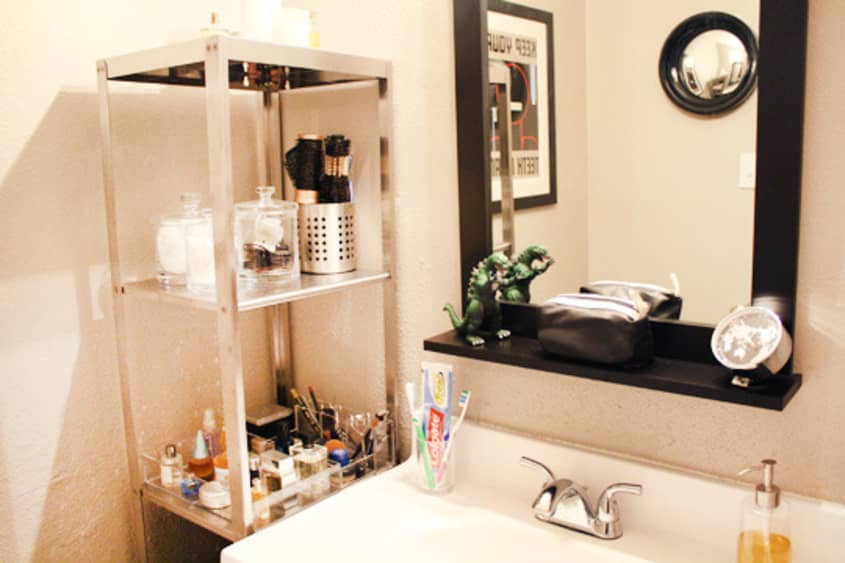
The bedroom is soft and airy, featuring a lovely grayish blue. Jenny and Collin did an excellent job again, mixing and matching furniture pieces, keeping what’s needed and getting creative with what was left. An avid traveler (Jenny actually just recently returned from living in Germany for over a year), the bedroom sports a mixture of meaningful, framed art and more books, making the whole bedroom seem cozy. In the bathroom more fun art plus an adorable Godzilla statue prove even a tiny, cookie-cutter apartment bathroom can have personality. Though not a dream apartment for either of them, with plans to find something with a little more inherent charm, their place is great inspiration for those who live in rental places and tend to put decorating off, thinking they’ll wait until the next place.

Apartment Therapy Survey:
Our Style: Modern with a few classics thrown in. We’re both big pop culture aficionados with a lot of collectibles scattered around the house, but we try to keep the kitsch at a minimum.
Inspiration: European apartments we’ve lived in and visited, from airy sunlit apartments in Germany and The Netherlands to the compact comforts of London’s LuxPod–Old World spaces with modern décor. Funky stores along the Herengracht and the Kerkstraat in Amsterdam, vintage and modern fusions in Shoreditch.
Favorite Element: The user-friendliness of our kitchen. Also, the red walls in the living room provide a great contrast to the dining area, and make the kitchen look like a jewel box.
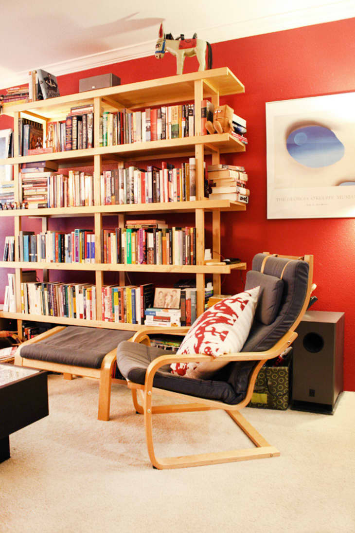
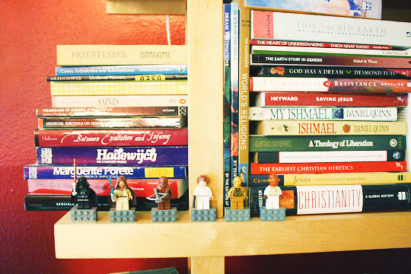
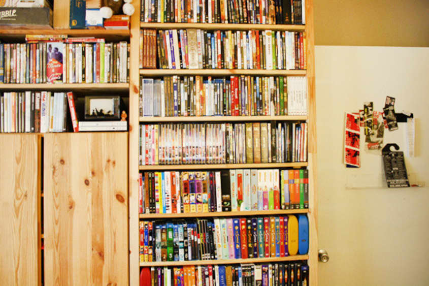
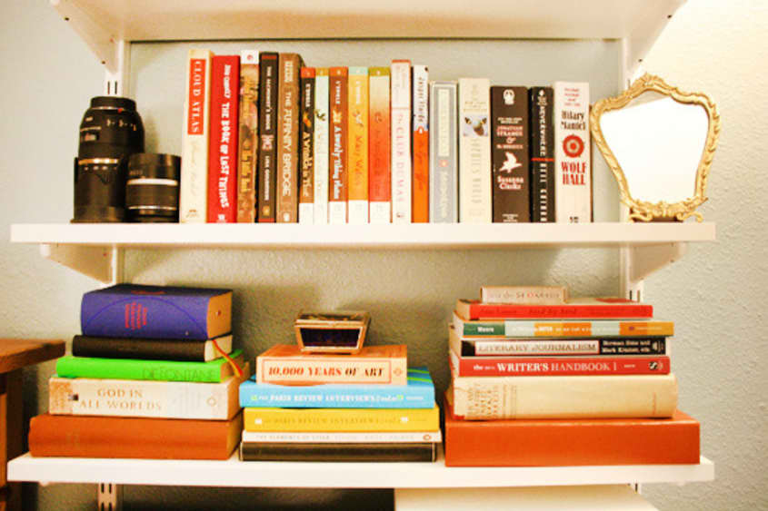
Biggest Challenge: Storage space. Jenny is a graduate student in anthropology so we have a ton of books and file boxes for Jenny’s research, and Collin works in media so we have hundreds of DVDs, as well as lights and audio equipment that he uses to record the podcast, shoot comedy sketches and produce webseries. We even have a collapsible green screen in the office! So we’re constantly struggling to keep clutter at bay.
What Friends Say: They didn’t realize how much you could do with a rental!
Biggest Embarrassment: The tacky A/C vent in our hallway. It’s a dust magnet and an eyesore we haven’t managed to transform into something more palatable.
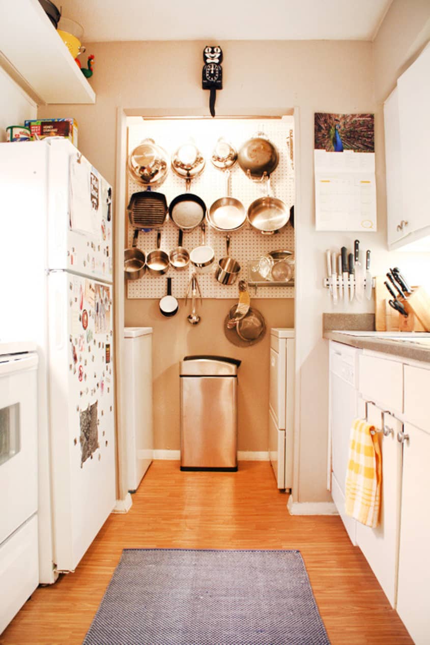
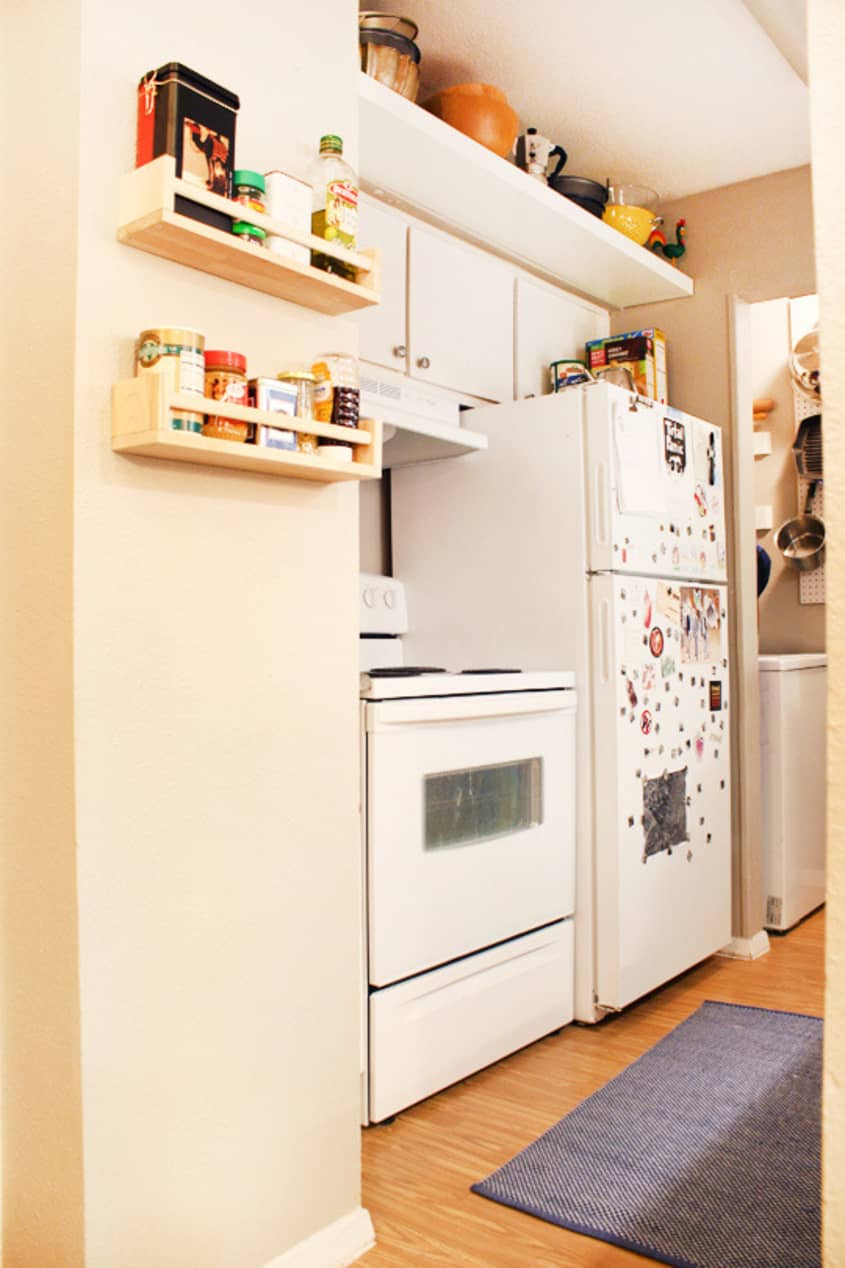
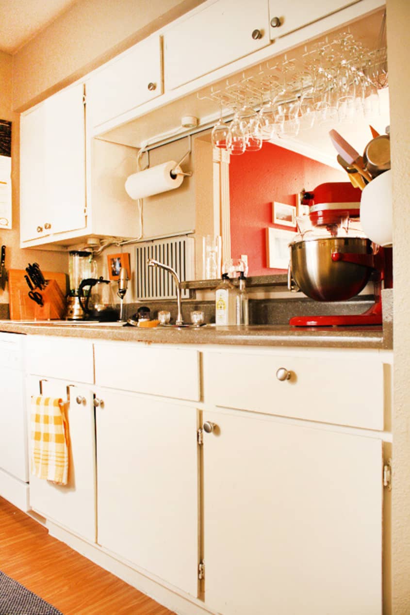
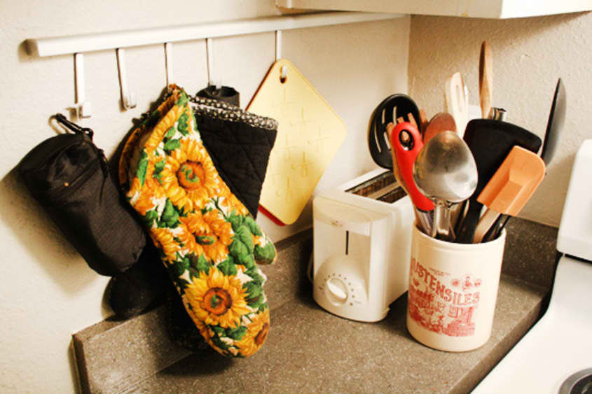
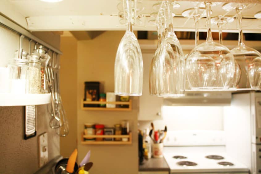
Proudest DIY: Our kitchen had next to no storage space when Jenny moved in. We used Ikea’s Asker system to hang most the utensils we use everyday within easy reach, and hung our stemware on racks to save cabinet space for spices and dry goods. Collin put a shelf above the kitchen cabinets, and we installed additional shelves and a pegboard in the laundry alcove. The only source of lighting aside from the stove lamp was an ultraviolet fixture on the ceiling, so we bought some small lights from Ikea and installed them under the counter to create more ambiance (the wires hang down in a few places, but the overall effect makes it worth it in our eyes!). People who saw the space before and after almost can’t believe it’s the same apartment.
Biggest Indulgence: Kitchenware.
Best Advice: Work with what you have. No matter how small or seemingly unworkable, your space has possibilities. It’s important to let go of what worked in prior homes–Jenny’s last place had hardwood floors, vaulted ceilings and tons of natural light, so we had a whole different set of options there—and focus on what will make your space comfortable and stylish. And never hesitate to paint and install hardware in a rental if your lease allows it—it’s well worth the time it takes, even if you don’t plan on staying there for more than a year or two.
Dream Sources: Moooi, Ligne Roset, Architectural Artifacts, Mitchell Gold + Bob Williams, Bang & Olufsen.

Resources of Note:
APPLIANCES
-
• Williams Sonoma
• Crate and Barrel
HARDWARE
-
• Lowe’s
• Breed & Co
• Ikea
• The Container Store
FURNITURE
-
• Living on a student’s budget, a ton of our stuff comes from Ikea
• The Modernica rocker is from IF&D (now closed)
• The Sapien bookshelf from Design Within Reach
ACCESSORIES
-
• Red and white ikat-pattern pillow by Deborah Main purchased at Aviary
• Other throw pillows from West Elm and BoConcept
• The papier-mâché donkey in the living room and other small pieces are from shops in Mexico
• The wooden flowers and animals in the bedroom were made by friends in Germany
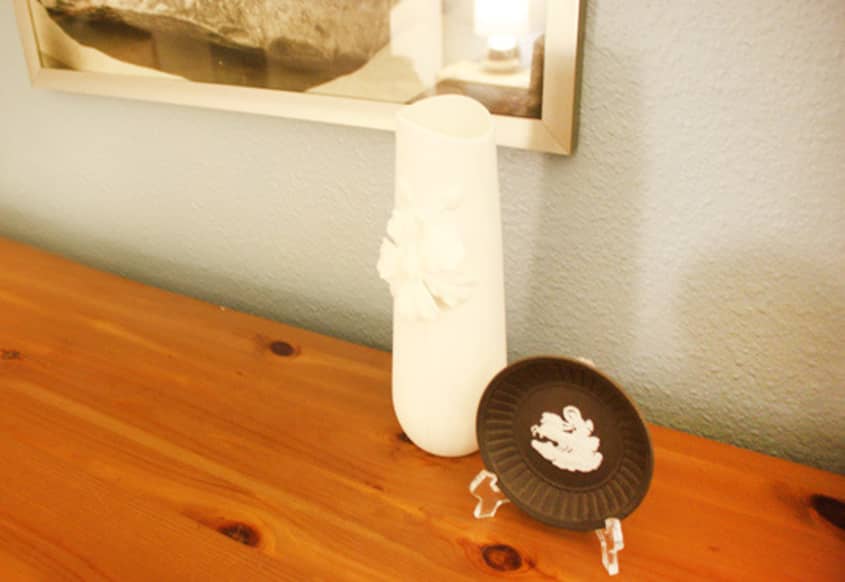
• Some vintage pieces like the small mirror in the bedroom are from our families
• Picture frames from the Pottery Barn and Pottery Barn Kids, Ikea, and Crate and Barrel
• Additional accessories from Crate and Barrel, West Elm and Anthropologie
LIGHTING
-
• Bedside lamps from West Elm
• Other lamps from Ikea, Target and Bed Bath and Beyond
RUGS & CARPET
-
• Crate and Barrel outlet
• Target
BEDS
ARTWORK
-
• Original art by Collin
• Mixed-media abstract in the dining area by Arthur Simone
• Collages by Marta Bacon
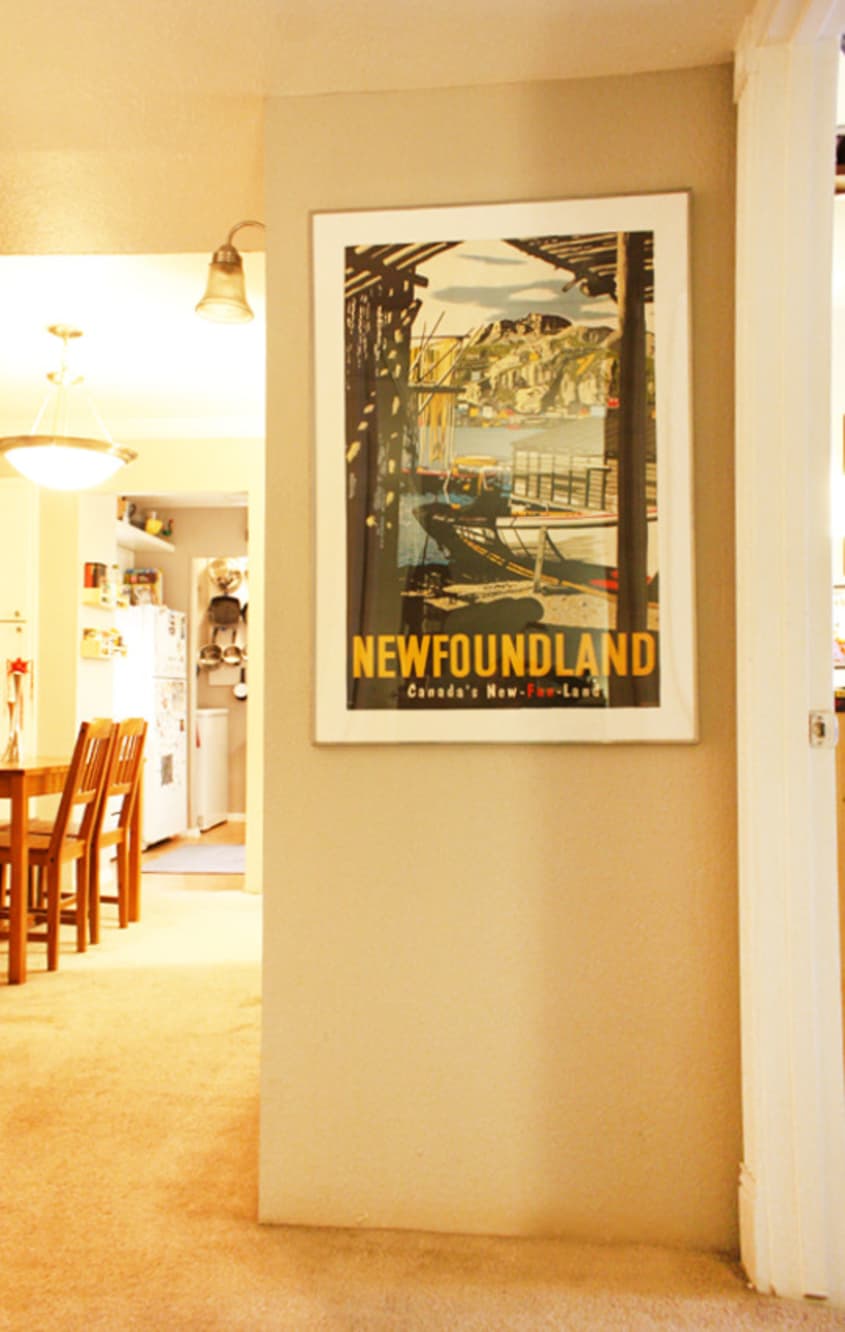
• We picked up a lot of the posters on our travels
• Newfoundland poster in the hallway is from Jenny’s grandmother, who spent several years there
PAINT
-
• Living Room Sherwin Williams Positive Red
• Bedroom in Sherwin Williams Resolute Blue mix

Thanks, Jenny & Collin!
Images: Adrienne Breaux
• HOUSE TOUR ARCHIVE Check out past house tours here
• Interested in sharing your home with Apartment Therapy? Contact the editors through our House Tour Submission Form.
• Are you a designer/architect/decorator interested in sharing a residential project with Apartment Therapy readers? Contact the editors through our Professional Submission Form.