Name: Jenn Ski
Location: Bedford, New Hampshire
Size: 2,400 square feet
Years lived in: 2½ years — owned
Who else lives there: My husband Al and cat Floyd
The mid-century modern aesthetic gets lots of air play here on Apartment Therapy and seems to be the coveted style among hipsters. This interior design style which often includes sparse furnishings and straight lines is often austere. These less than cozy designs are cleverly mused about on the site

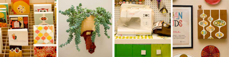
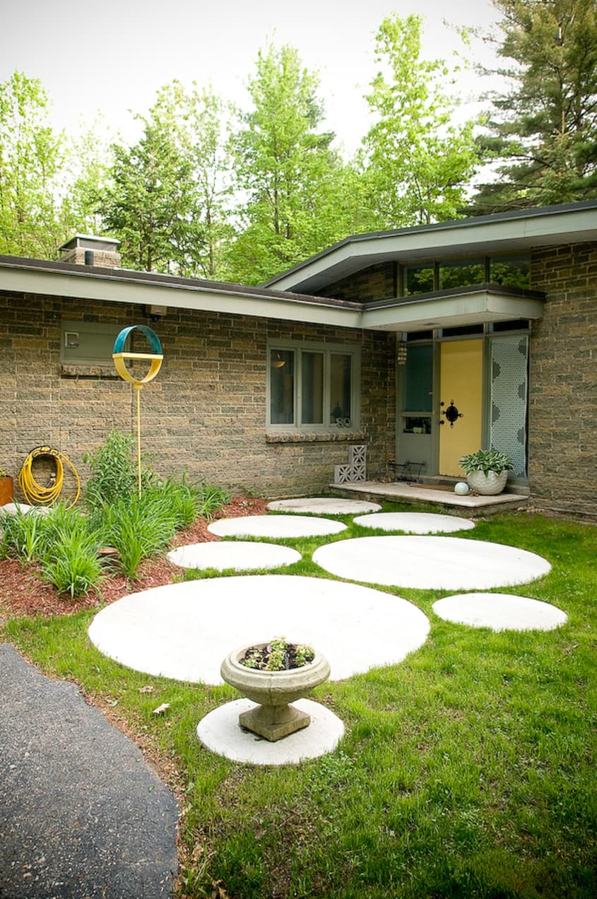
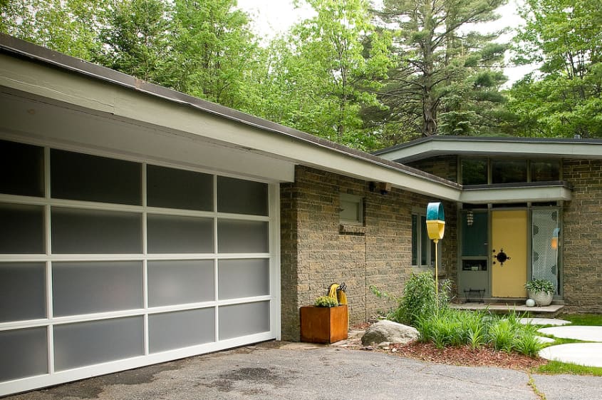
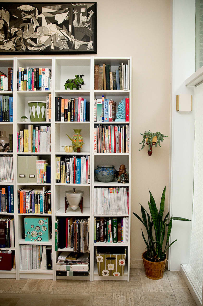
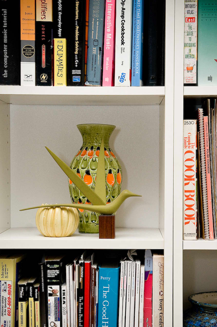
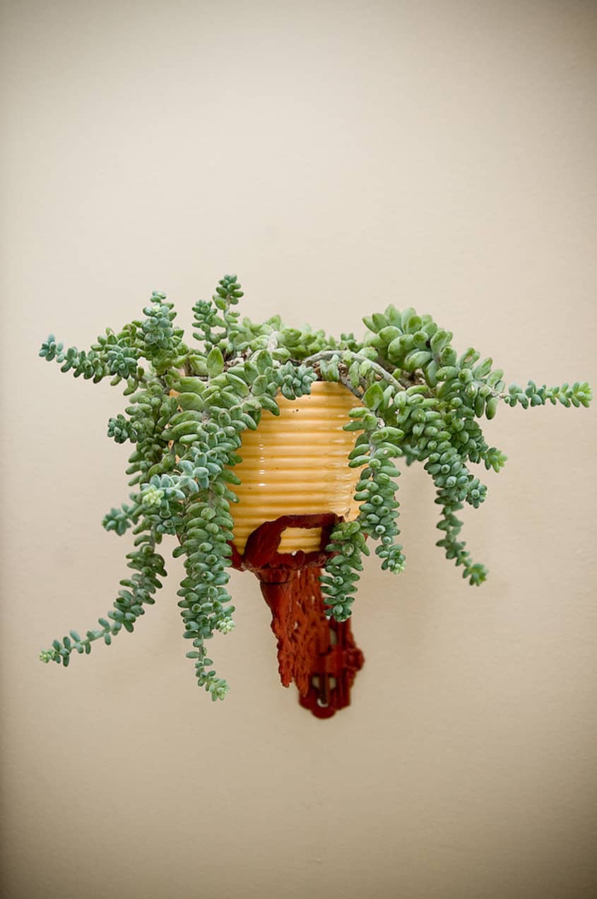
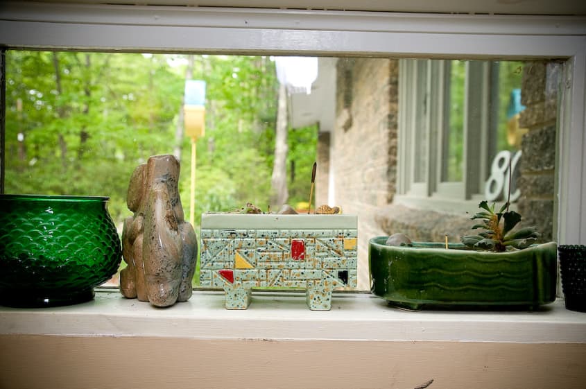
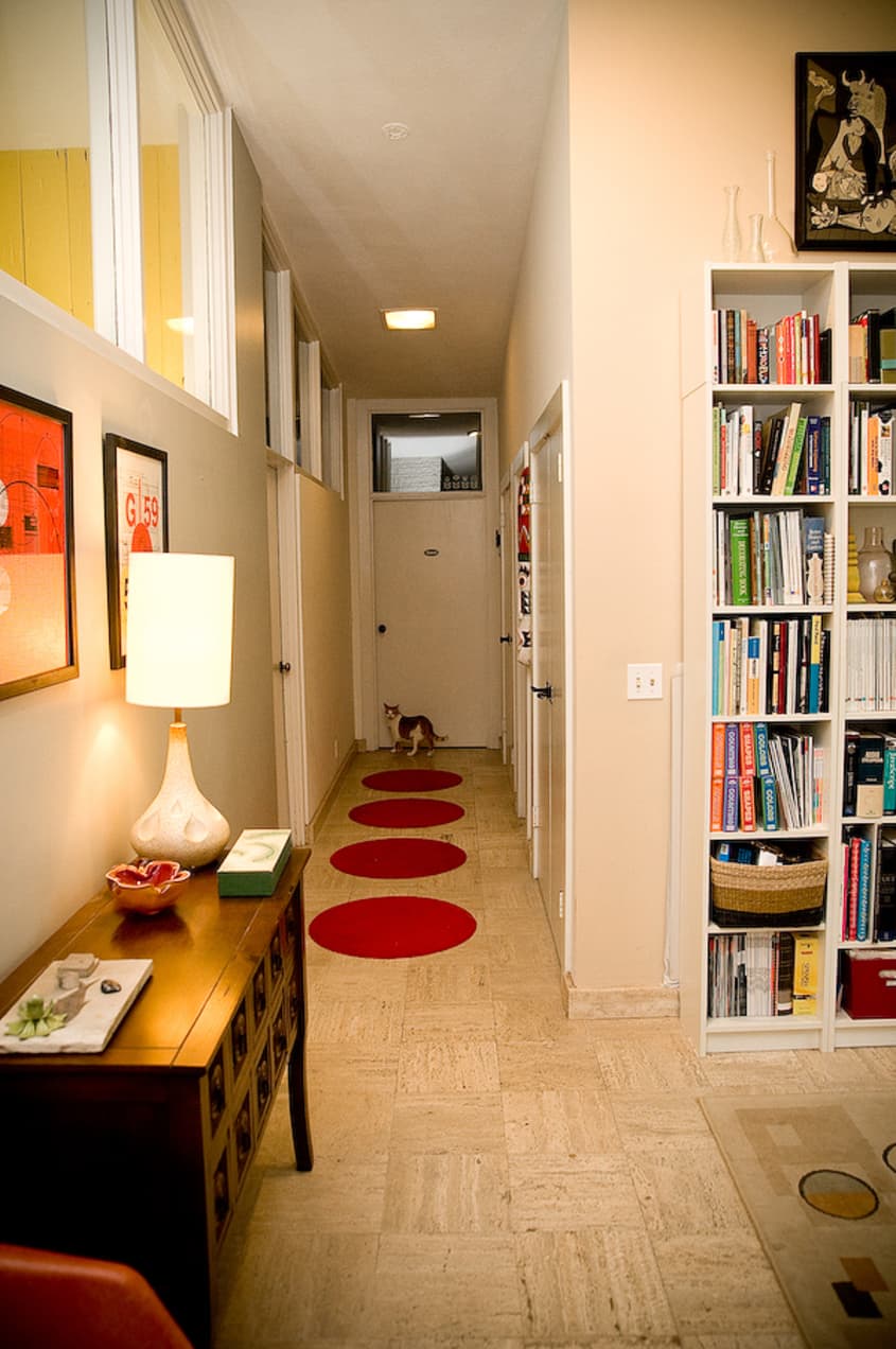
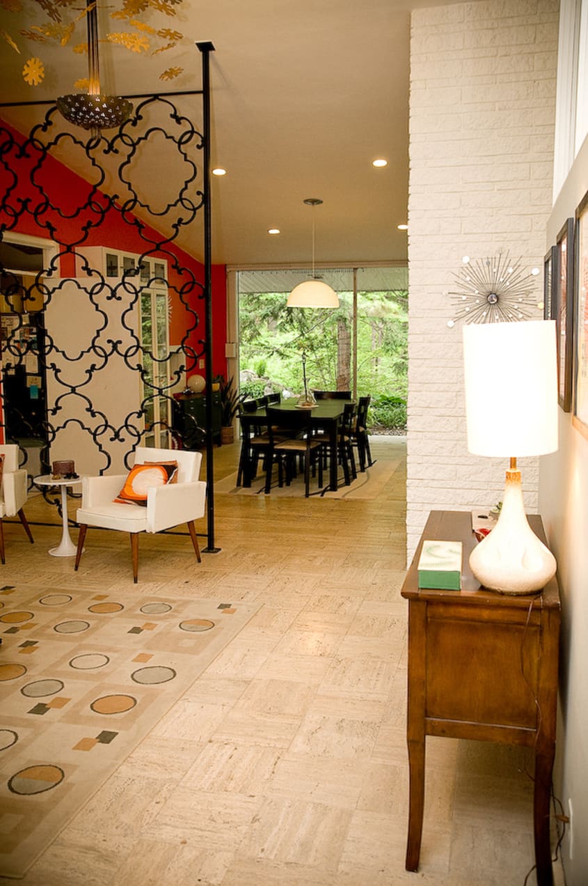
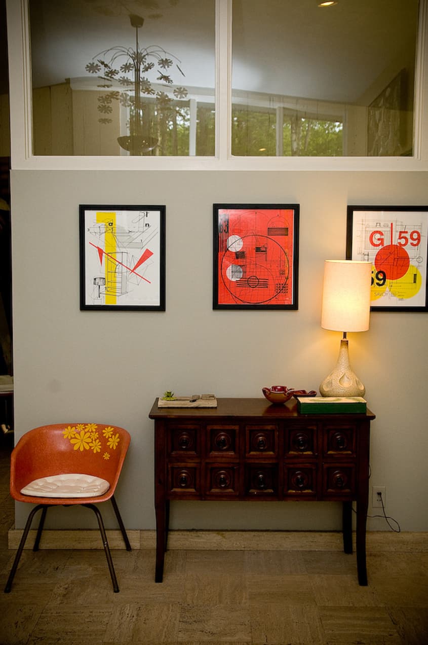
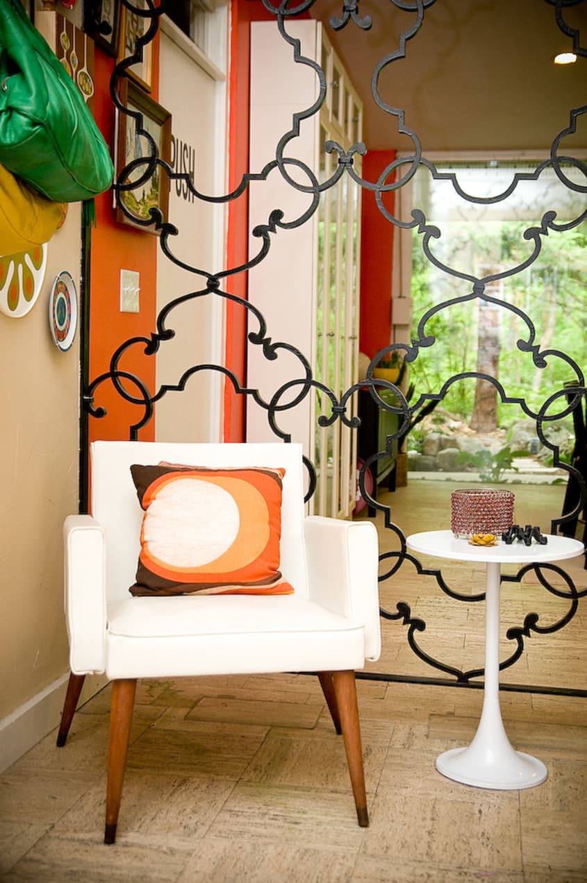
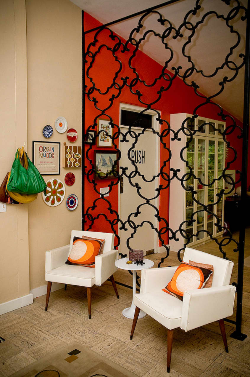
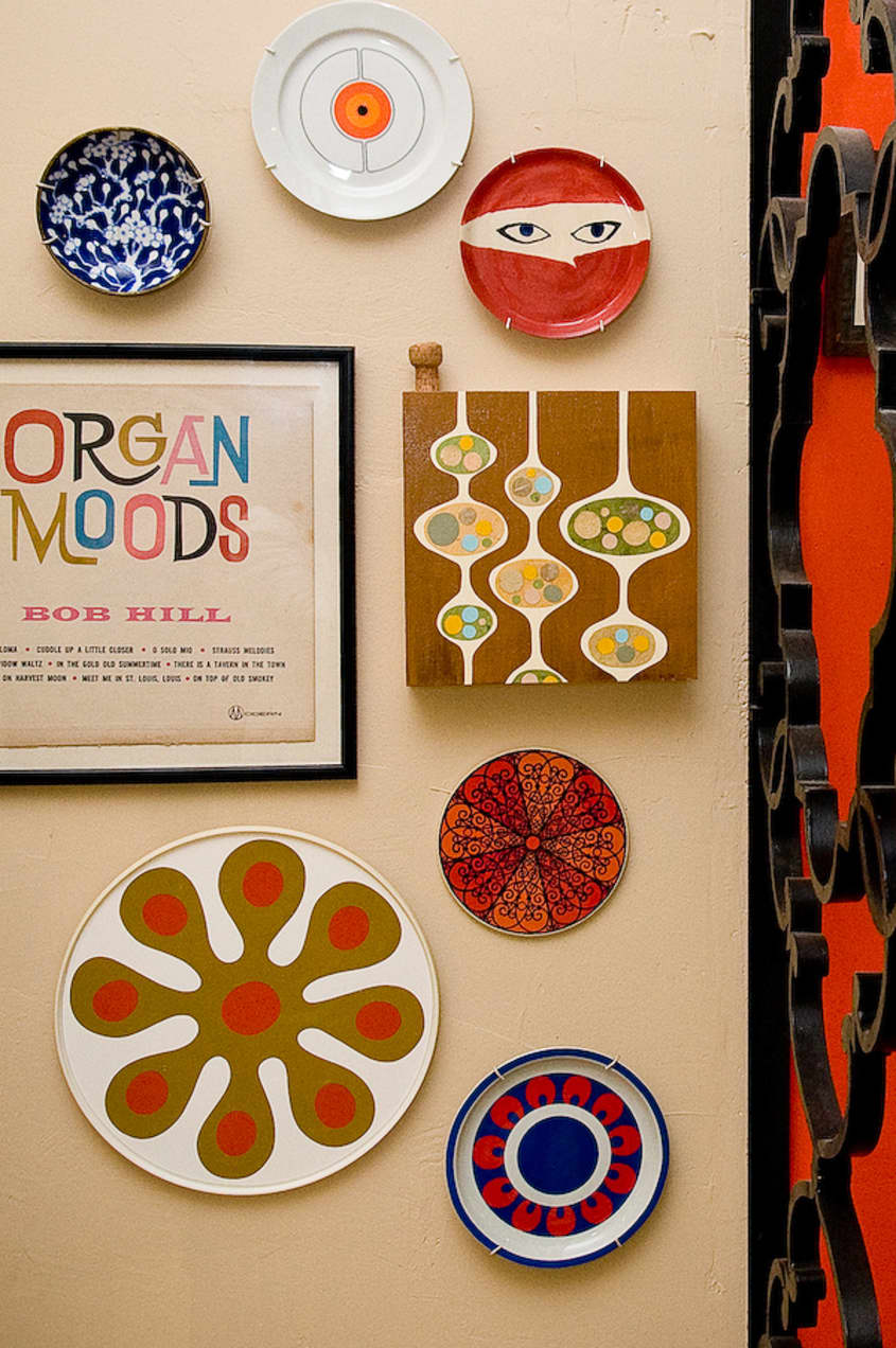
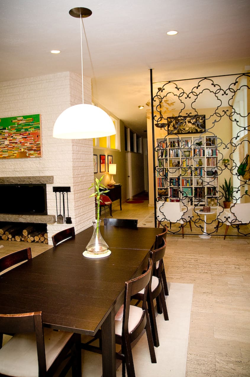
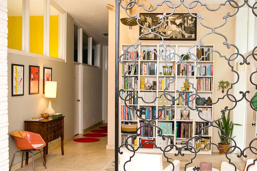
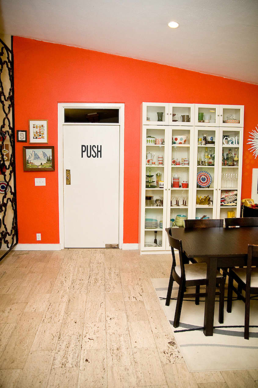
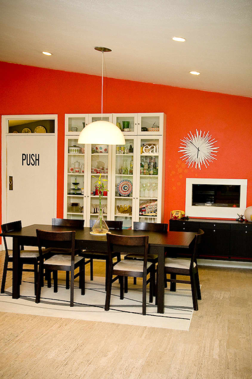
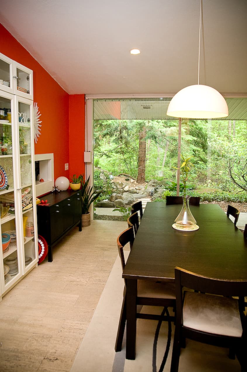
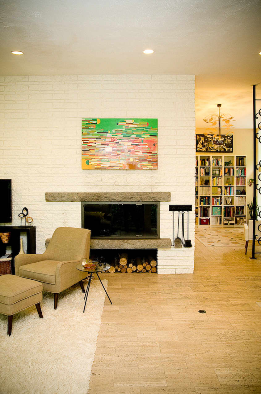
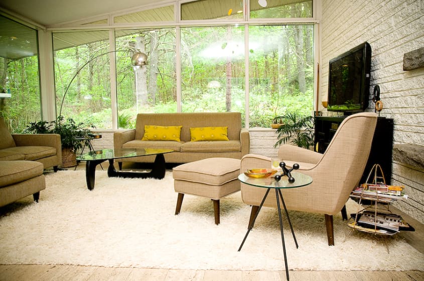
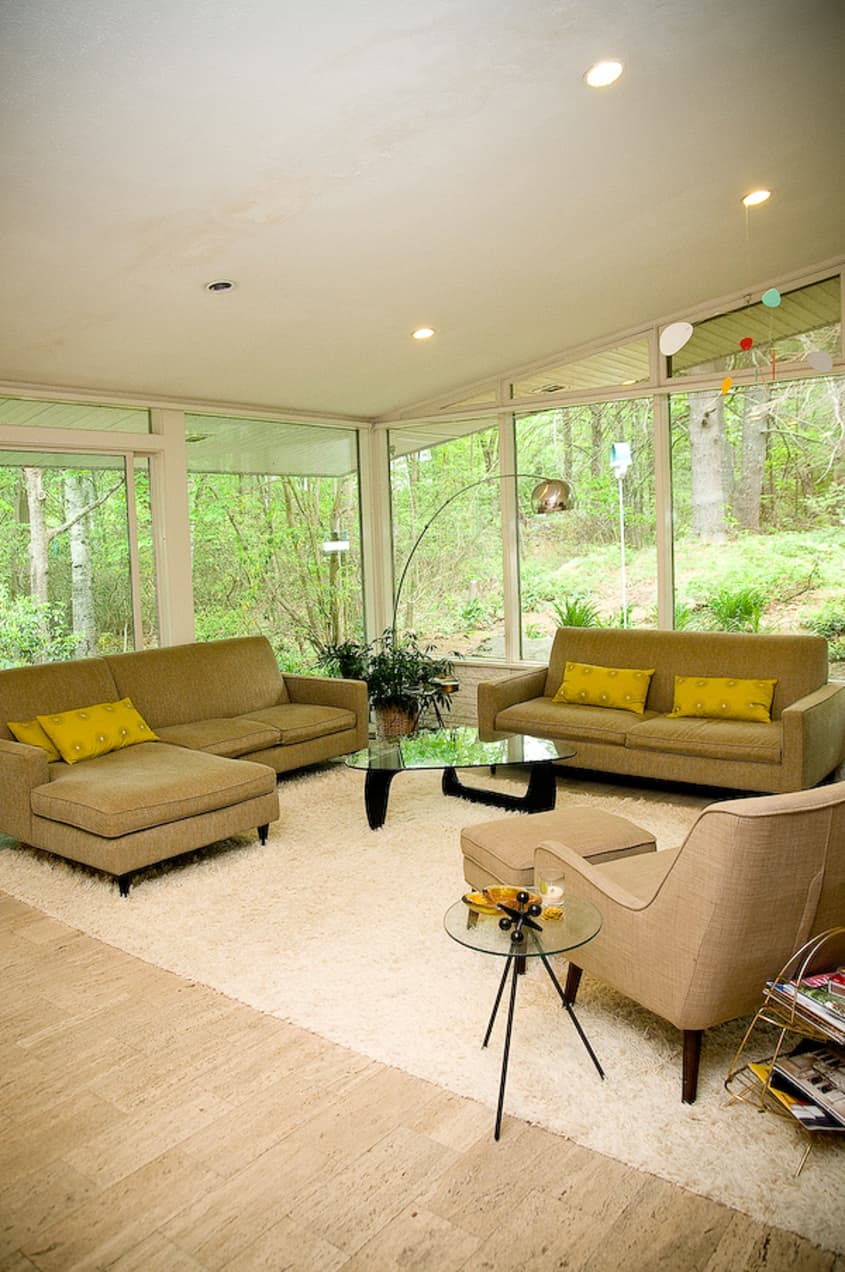
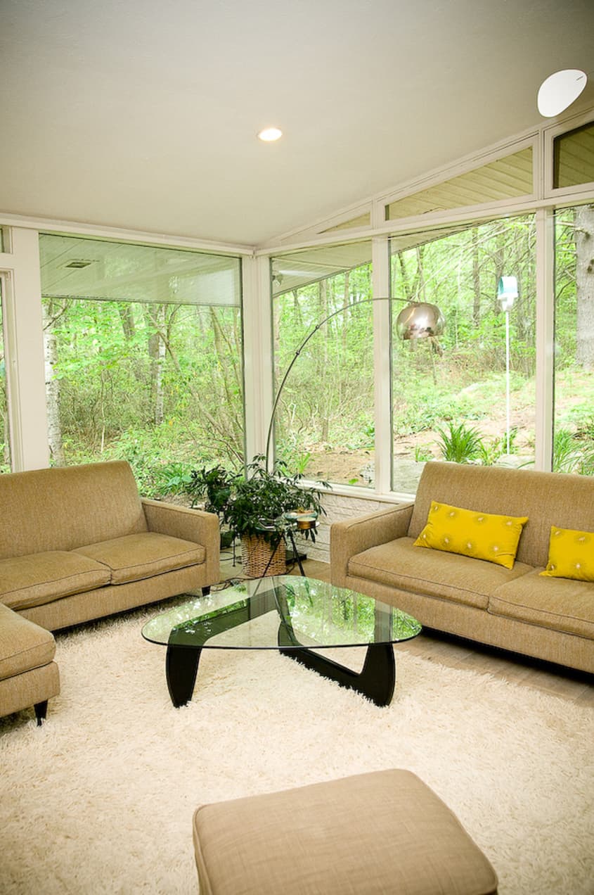
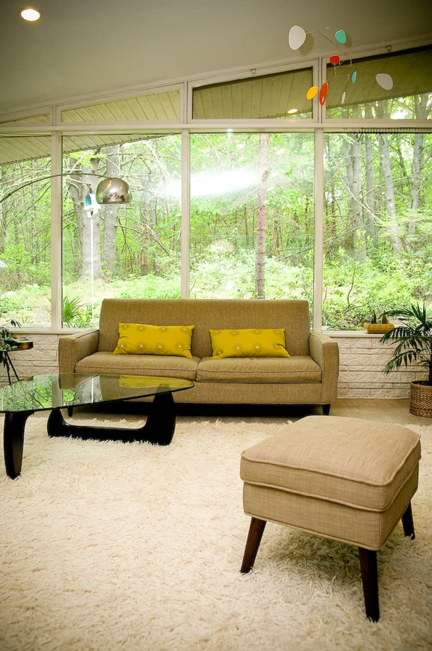
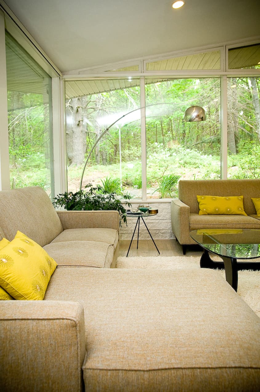
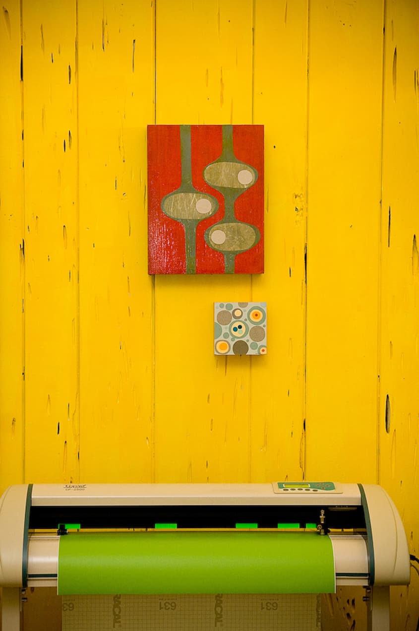
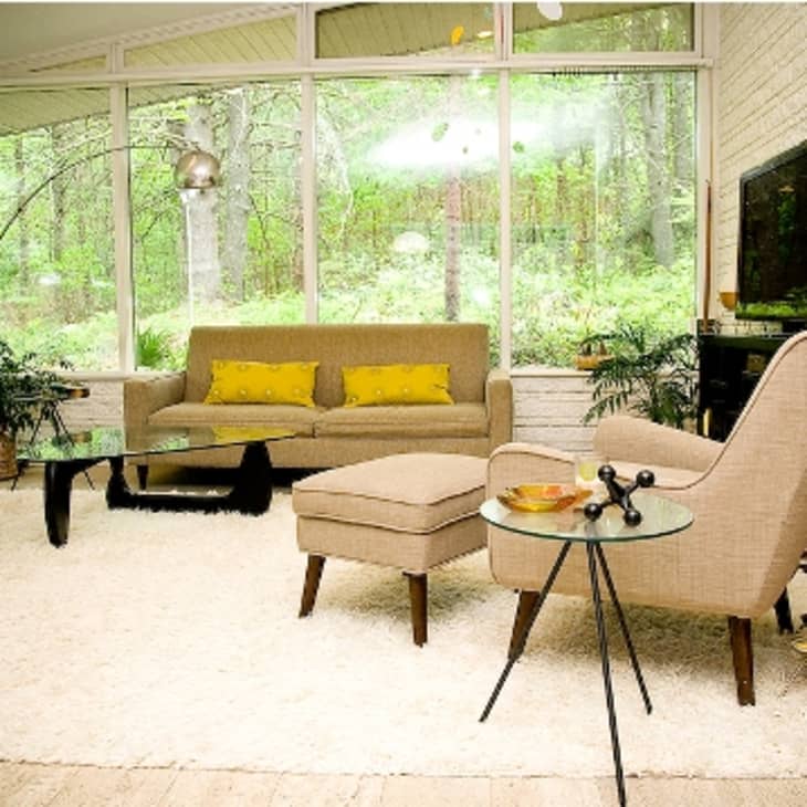
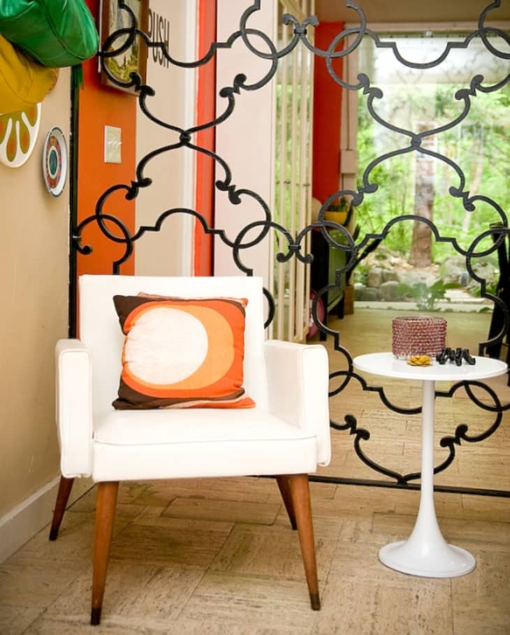
Built in 1951 by a student of Frank Lloyd Wright, Jenn's home boasts all of the definitive mid century modern elements: simple lines, lofty ceilings, walls of windows to bring the outside in, and a single story, open floor plan. However, just like her vibrant, colorful artwork, Jenn adds heaps of warmth with large area rugs, plants, collections of colorful vessels and server-ware, accent walls, and unexpected pops of color using throw pillows. Her aesthetic is well defined and everything in her home has been collected as part of the same story.
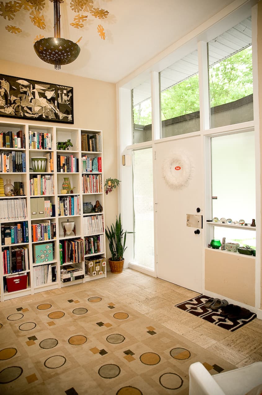
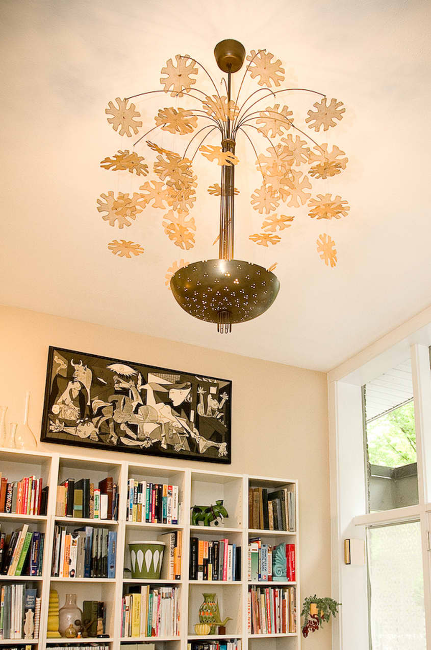
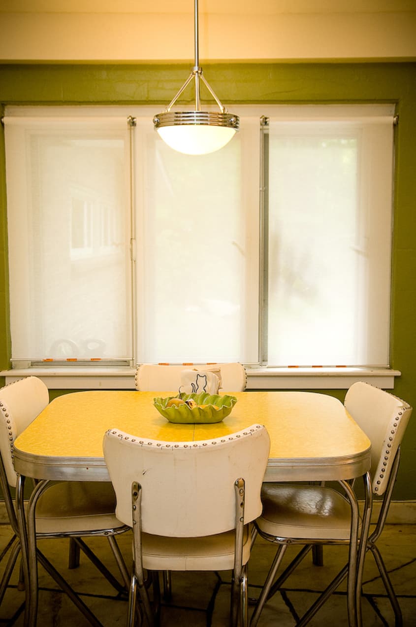
Jenn moved to New Hampshire for this house, so clearly she knows what she's looking for. The previous owners operated a stone quarry and the house is outfitted with travertine floors and unique polished white rock in the kitchen which extends out into the patio. They also left a very unusual chandelier in the entryway which blends well with her decor. Many of the home's elements look contemporary and as Jenn pointed out, the house which was built 60 years ago, must have been built as a house of the future. The fireplace, the flooring, and the electronic box to open and close the curtains in the dining room are all original.
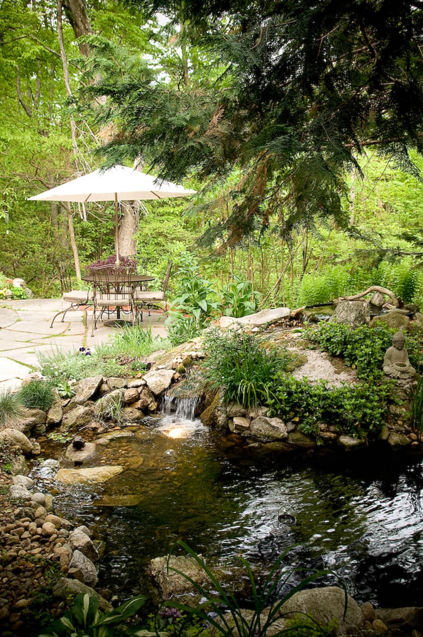
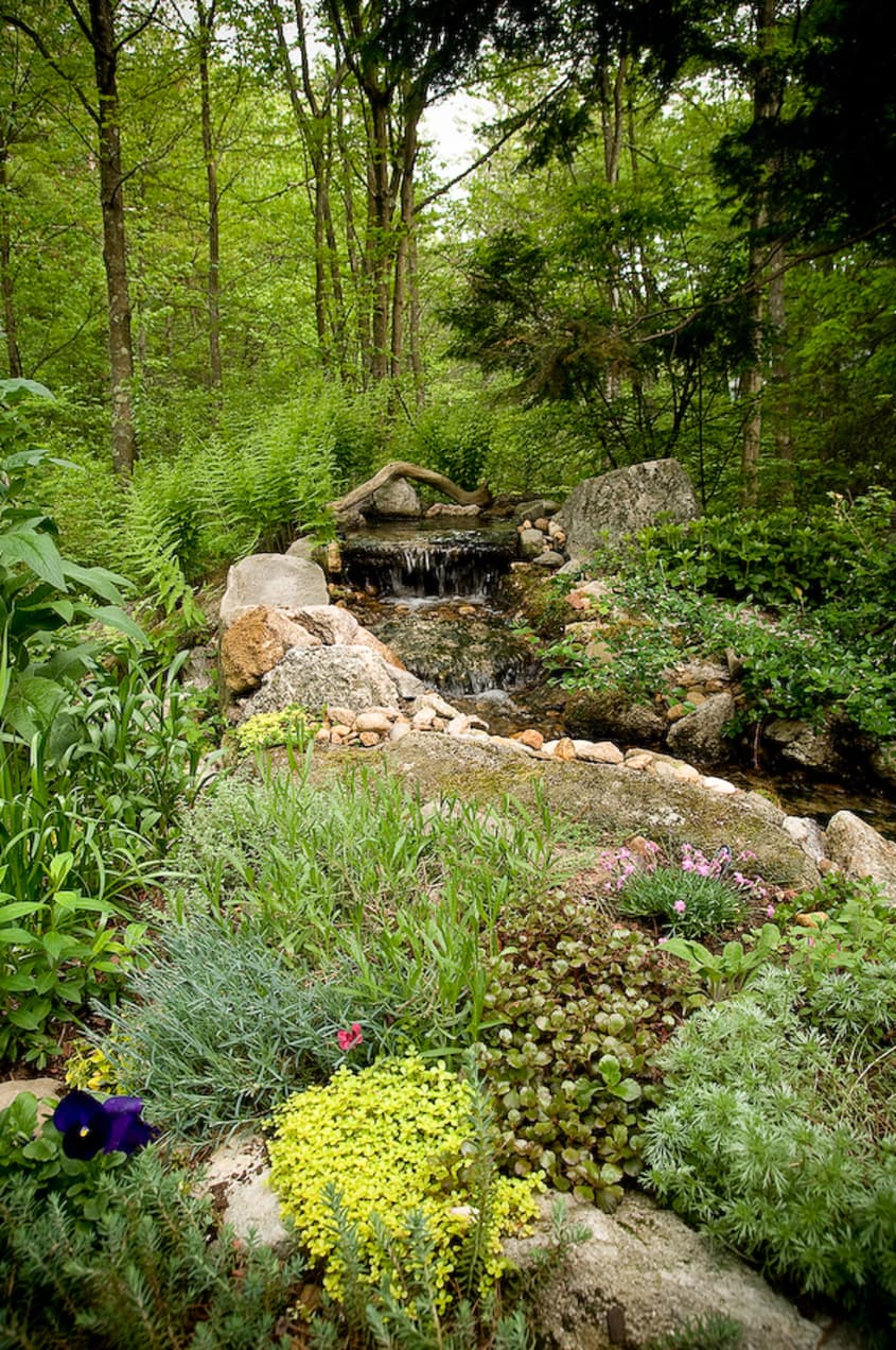
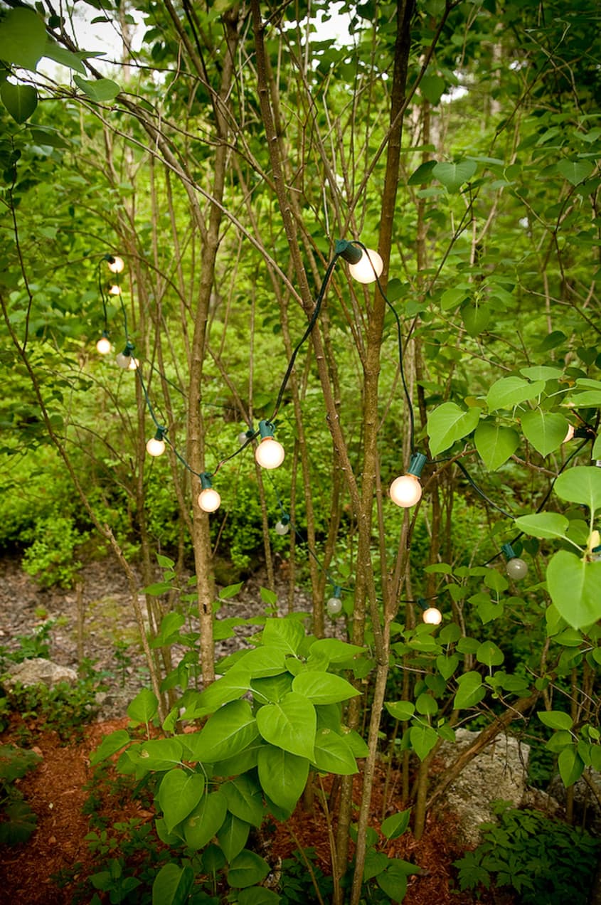
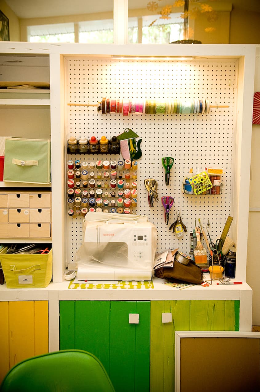
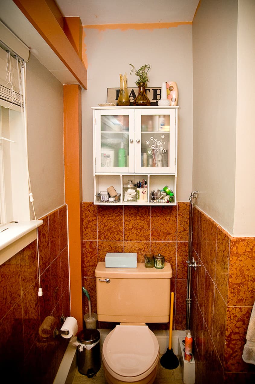
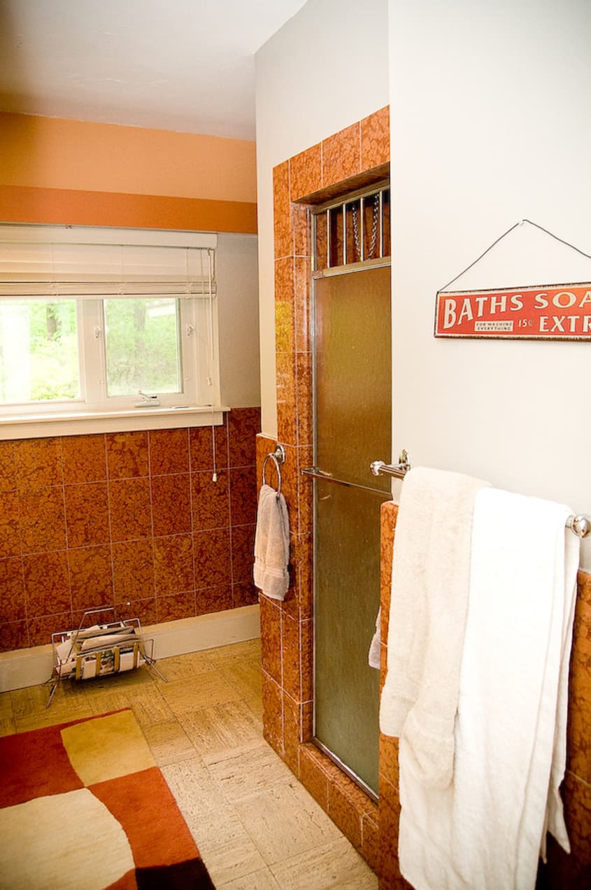
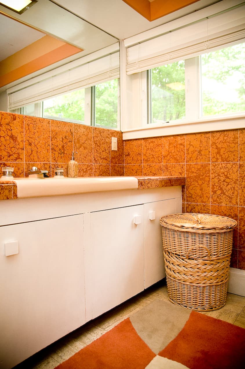
Her DIY successes are numerous starting with the circular stepping stones in the front courtyard. She and her husband used wacky wood to mold asymmetrical circles and hired a cement company to fill them in. Now that it is Spring she has been turning her attention to her yard. As most home owners feel, there is lots more work to be done which is why we share with you the main living areas only. She plans to completely redesign the kitchen, finish the bathroom, and work on the bedrooms and her studio more. Until then, enjoy all of the exciting and wonderful things she has done to date.

Apartment Therapy Survey:
Our style: Modern, Mid-century, Eclectic
What is your greatest inspiration? The house itself. It has been changing me. I find that my art and my decorating style are matching the style of the home. I am also inspired by 50's and 60's design.
Favorite Element: What sold me was the windows in the hallway and, well, all the windows. They made it feel so open. I always wanted to live in a modern style loft but still wanted privacy and space. This was perfect for me.
Biggest Challenge: When we first moved in the front yard was a big mess of overgrown bushes. The whole property doesn't have any grass and I thought it would be nice to have a little patch of green. After removing a dozen or so huge stumps we finally have a green lawn and you can actually see the house now.
Biggest Embarrassment:I still have a lot of work that needs to be done in the kitchen and in my office. I heard from a neighbor that the kitchen used to have metal cabinets but they were removed because they were worn and rusty. It broke my heart to hear that.
Proudest DIY:The concrete circle walkway! We built the forms out of wacky wood and hired a company to pour the concrete.
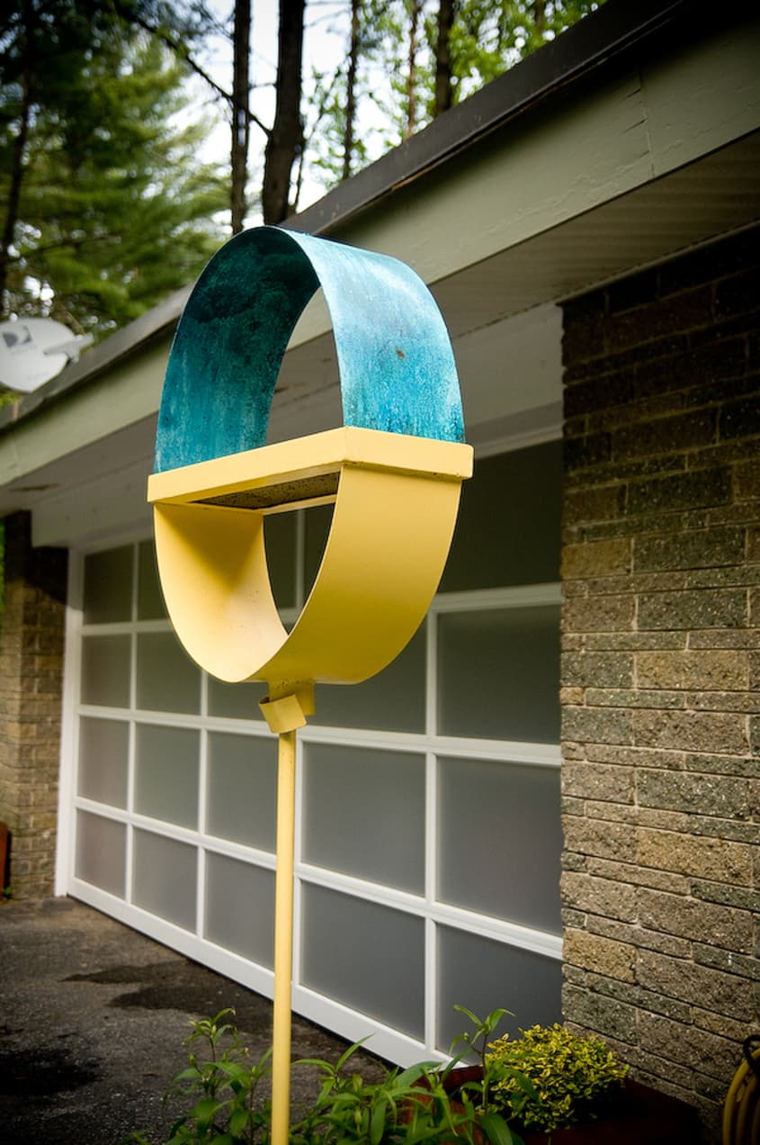
Biggest Indulgence: We purchased Lenox sofas from Room & Board and we had an Avante garage door installed. The garage was previously a car port. I don't really like to spend much on furniture; I mostly shop on Craigslist. I got my Noguchi coffee table for $60 and the vintage Arco lamp for $25.

Resources:
Furniture: Craiglist and Room & Board
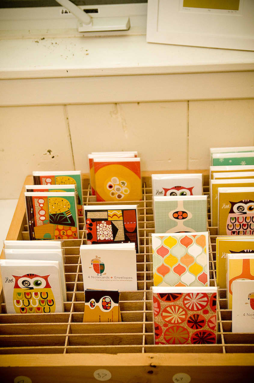
Artwork: Jenn Ski
Garage Door: Avante
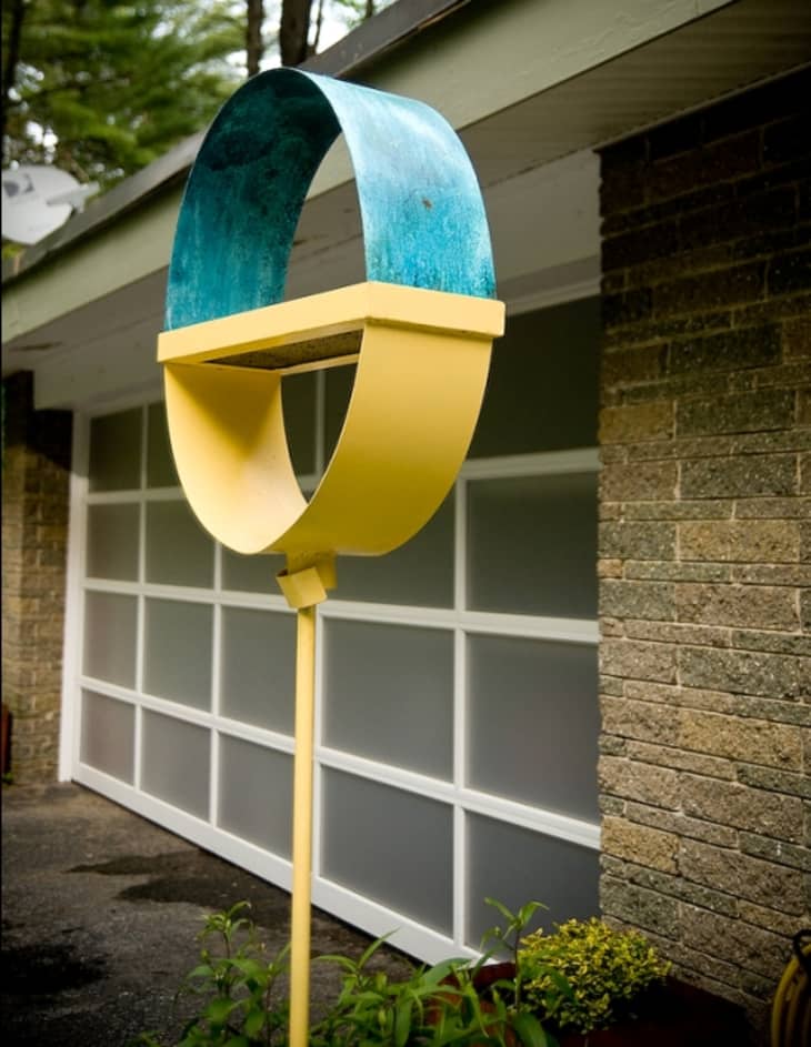
Outdoor sculptures: Joe Papendick

Thanks, Jen and Al!
Images: Violet Marsh Photography


Shaw's Original Fir...
"The mid-century modern aesthetic gets lots of air play here on Apartment Therapy and seems to be the coveted style among hipsters." And believe me, whenever you share with us a home that appears to be from some other period than the 1950's-60's, I am grateful. Note from a new commenter but faithful reader: I always look forward to the variety you guys can offer, so please, keep it up! AT gives some of THE BEST information and inspiration all around, but sometimes when I see these house tours I feel like it's Groundhog Day. But I am sure I am a lone wolf on this one, so I'll go quietly off into the site now...
Is that a diecutter in your artroom? If so what brand are you using? I've been hunting for a good one for years.
I love the flow from one room to another. The building definitely has a Wright influence. The great room looks like a great place for a hanging mobile like one of these: http://artinhighplaces.blogspot.com/
(maybe I see one in the corner?)
Beautiful home! Thanks for sharing!
Beautiful house, nicely decorated, the only thing.. in the bathroom where the toilet seat is, it looks a bit cluttered. Other than that good job
Oh, I think ther are good reasons why MCM is such a coveted style, even by us non-hipsters. This house is one example. Beautifully done, Jenn.
Love the circles :)
love the house and choice of colors! also, tanya is one of the best photographers on AT, i always look forward to her posts!
@MsDonnaGirl,
May I howl with you? You are not the only wolf! I do like the fact that most of the furniture had another life before finding Jenn on CL.
AT, remember that variety is the spice!
MsDonnaGirl - I agree. Our home combines mid century modern with a French provincial look (so often replicated by various 'shabby chic' enthusiasts, to varying degrees of success) and I love coming here to see the different looks for ideas on how to integrate the two even more. I LOVE curve of the armchair because it reminds me just a bit of the provincial lines that I enjoy.
This house has such good bones, I can't imagine that the kitchen is really so bad that a coat of paint and perhaps new hardware, counters, lighting and appliances wouldn't be enough to spiff up the place?
Mid-C Frank is filled with envy!
The living room is sublime.
Love the self-promotional ad for his mobiles from artinhighplaces disguised as an innocent blog comment.
These seem to be a more frequent occurrence on the site. Can't they be tamed somehow?
I've admired Jen's art for quite some time- it's great to see her house. I can see why she moved for it- gorgeous.
There is so much to love here...that circular walk way, the entry light fixture, the black room divider, the windows, the entire living room...amazing. I know you're working on the kitchen, but, from what I can see, I'd blow out that orange wall and open it all up...but that's just me.
Fantabulous home!!
The living room is sensational...all those windows and beautiful view of greenery, and the fireplace... ahhh. I also liked the peach toilet. But I was hoping for more photos of Floyd.
The huge windows in the living room and the views are fantastic.
Other than that, everything else is boring... and the orange wall color is atrocious.
Jenn Ski! I knew I recognized your name! I work at innovative kids, and we published your books! LOVE your artwork for the Soft Shapes series -- really charming. We just had all the front covers hanging up on the conference room wall for a meeting, and they looked so great -- eye-catching, and fresh. : ) The farm animals in "Animals" and the blue bird in "Counting" just crack me up. For anybody interested, they're the second row on this link: http://www.shopatron.com/products/category/231.0.1.1.5941.0.0.0.0?pg=4
Drat. I'm a regular AT reader, and was psyched to see a name I recognized... and excited that name was an illustrator whose work I'd just helped to publish. After I posted, I saw the post about self promotion.... and now *I'll* just sound like a terrible self-promoter myself. : ( Didn't mean to. If anything, I wanted to just congratulate Jenn on her books. Nice work!
I would live in the back yard if I could! I've always wanted a koi pond and yours is wonderful and so natural looking. Overall it's an enchanting and very welcoming home. You are lucky ducks!
Don't feel bad ljbmonkey. You were just excited to see something you can relate to, as was I, and wanted to share that with people who may not have otherwise known where to look.
Wow, that's what walls of windows are meant for.
i am swooning over this home. it reminds me why i love MCM so much--it's warm, but clean. i especially liked the fireplace detail; how the wood is cleverly stacked from underneath. and i loved the wrought iron room divider. can't wait to see follow-up photos of rooms that have yet to be finished.
I have been a fan of Jenn's art for a while now and have some of it hanging in my own home. And as a nearly lifelong resident of southern NH, I was so surprised to see a FLR style house in this area. I love it and Jenn's done an amazing job of decorating it (and truly is the master of great finds on Craig's list).
"now *I'll* just sound like a terrible self-promoter myself. : ("
Personally, I liked the links in both posts. I enjoy relevant self-promotion because I often find something new from it. And if people don't want to click the links, then they don't have to.
Also, cool space!
Yes, the home is nice but I'll share the same sentiment of some of the other posters in saying it is a bit too similar to other homes showcased on this site. I think once something is labeled as "hipster" is ceases to be, isn't that the rule?
You say you are an artist, I would expect a bit more creativity and less following in the foot steps of everyone else these days.
I do want to reiterate that it is a nice home, you did a good job with it. You did a better job than I could have.
Cheers!
*drools* Exactly what I want for my next home. (If only my condo was worth it... :-\...)
I bought some of her prints from Etsy last year! I love them!
I'm in the jealous group!
2 questions:
Who made/makes the living room chair & ottoman?
What is wacky wood?
I love the direct use of textures & patterns in this space...
Lindsay
www.adesignstory.com
I was fully prepared to love this home...yet didn't. The walls of windows are amazing, as is being able to see the fabulous backyard - but the decor of the house fell flat to me. It seemed cluttered and random. The bones of the house are great, just not my cup of tea with design, I guess.
I'd change states for this house, too. And I've just gotta say that I am so, so glad Jenn Ski bought it instead of someone who'd have gutted it and turn it into a cookie-cutter blob because It'sTheirHouseAndTheyCanDoWhateverTheyWantWithIt.
Great progress so far. Can't wait to see the finished product.
While I too am a little tired of the MCM interiors featured on AT, I must admit I feel a little differently about this tour. It not only has to do with the home, but even more the choice of MCM pieces. I appreciate how this house tour doesn't look like they went down a checklist of MCM pieces to acquire for validation. Don't get me wrong, early MCM (Bauhaus) is my favorite design period, but not a fan of seeing Eames Rockers with crocheted granny pillows on then.
@jonnifer --
You're not the only one - I was disappointed with much of the decor too.
The Big-Box bookcases and generic brown dining set just don't live up to the great real-estate - and the way the furniture in the living room ignores/turns its back on the fireplace is sad.
I have to admit I get tired of the repetition of Mid-Century design not only here but all over the internet and television.
However, this house is GORGEOUS GORGEOUS GORGEOUS!
I hope that when Jenn gets done with the kitchen she will share it as well because I am dying to see it!
it's wacky wood!
"Bending plywood, also known as Flexply, Wacky Wood and Wiggle wood"
http://www.packardforestproducts.com/bending_plywood.html
and it's concrete! not cement!
Oh my god that room divider!
MsDonnasGirl, you aren't the only one. ; )
When I see a lovely house tour like this, I'm thankful that I am not out there competing against everyone who's into the mid century thing at the flea market.
Lovely use of color in this home.
my dream house
Love the house, not the decor. Too much stuff, and it does looks so hipster. It's too "cute", kitschy, ironic (PUSH door, etc). All those items on the walls, surfaces, etc break up the open flow of the house and make it look like someone spends too much time on Etsy and can't say no to a thrift "find". I hate how a lot of MCM-ers miss the fact that it was the minimal, understated look that brought it to popularity. Agree that some of the furniture is dull, dining set, buffet in the hall, some of the chairs. A house like this begs for the classics. Not a fan of the artwork in the house, either. It all has that craft project look, which is why I guess I like the prints of her work better than the originals. I think the living room is going in the right direction. Outdoor looks nice, but the patio furniture does not fit at all. At least the bones of the house were left, and bad paint colors (and there were a few) can be changed, so that the next owner can do the house up with a bit more class.
We all have such different ideas of what's perfect-- (and I do love our differences of opinion) but my two cents say this is lovely and livable. Really incredible place.
Perfectly decorated or managed house. Nice sharing.
Business Radio
Eh
...but those WINDOWS!
@jonnifer: It fell flat for me, too. I found the living room... really, really beige. I like MCM well enough, but for some reason the decor in this home just didn't coalesce for me.
On the plus side, the yard is gorgeous and I do like the concrete circles - very creative and whimsical.
This has to be one of the best house tours I've seen in this blog! Every room is adorable! I've always dreamed of an all-glass windowed living room. Have to bookmark this.
McDonald said it ALL!
Overall, very nice. The living room, though, is the standout here, in my opinion. I also like the photos of the home's exterior.
Hmm...regarding all the self-promoting plugs/comments. I don't see anything wrong with it (ie, you want to leave your website/blog/whatever if it relates to the area of home design or the post in general...) And I think it's perfectly fine to mention that you make retro mobiles or publish books by a well-known artist on AT...
BUT...what is with all the office 2007 links? That's completely unrelated to this house tour and a waste of space and the split second it took me to ponder what this person was thinking. And now I've gone and wasted more of my time commenting on these unnecessary links...awhile back I noticed a similar comment posted (by someone different) that was just a huge bunch of links to products not related to the post. This is NOT an advertising space ppl. It's a community where we can all talk about what we like
By the way I do LOVE this home...there are some things I would do different to suite my own tastes (different odds and ends being displayed, maybe different colors on accent walls...little stuff for the most part) but overall I LOVE how Jenn's style comes through in her home!
Also...I couldn't agree more about just finding furniture via ebay, flea markets, etc...it's so expensive nowadays when you buy new- especially if you want something MCM or similar. But of course sometimes that R&B splurge is required :-)
I was curious where do you go to find your vintage noguchi table and arco lamp so cheap...?! Everywhere I've seen even the old designer (and non-designer versions) stuff is more than just 40-60 bucks. It's a pretty hot style so even the thrift shops know to mark up this stuff. I've never found deals that cheap! Either way - it's inspirational to hear these deals do exist somewhere. It's like a little ray of hope. lol ;-)
Great house, Jen! Congrats for not drabbing it out like so many others have done with houses of this period.
As for MCM house tours, I don't think I've seen enough really good ones on here. I can't wait to see what this homeowner does with the kitchen, so I do hope there's a part 2 (same photographer, please!)
That might be my most favorite living room...ever.
I love this home. So stylish. And I agree with TheoJ. I think what makes this home different--and better--than the Unhappy Hipsters stuff is that this homeowner injected a lot of personal details into the space--on top of the classic MCM stuff. So many homes featured in magazines--and sometimes here--look like a Garanimals version of interior design. "I've got the Eames chair, the Naguchi table, the Arco lamp... " True style is unique, not just picking items out of the DWR catalog.
Beautiful house, looking wonderful from outside.
It takes time to 'tweak' such a style. Painting all of the interior walls (except bathrooms) would be the correct - and simplest - thing to do.
Thanks for sharing.
Painting them white, that is ... :)
Stunning!!
I like the point J-Team made about the difference between this and the Unhappy Hipster stuff. This house looks like a space that someone could (and actually does) live in, not just a work of art for a photo-shoot.
http://artinhighplaces.blogspot.com/
What Ikea rugs did she sew together?
Love Jenn's artwork and blog. Really nice to get a tour of her home! I'm drooling over the living room...so gorgeous!
I think that personal objects are fine, and that a bare look is not the best for a lived-in feel, but take some care in selecting meaningful and tasteful objects. All this ironic, kitsch, cute, over-done stuff looks like what is . . Tacky in an otherwise classic home.
Instead of 10 $5 Etsy/Flea Market trinkets, take the $50 and go to a local ceramic studio, talk with the artist, and get a piece that speaks to you. And don't surround it with junk.
you are a lucky ducky to be living in this house!
i love it!
I love the circles and I adore the room divider but I feel as if the livingroom belongs to a different house. all the rooms are in the MCM spirit but they still look so much different than the beige zen living room.
Jenn, I have the same couch from Room and Board and your cushions look worse than mine. I just contacted them recently and they are going to replace the foam cores and I suggest you do the same. Btw, your house is beautiful!
Fabulous house- very inspiring!
Modern with the twist. Beautiful. Love the reading area. And that garden, oh dear, is like heaven.
This house has a lot of potential and they have done some great things with it already. Things I loved:
- Walkway in the front
- The travertine plank flooring (wish the whole house has the plank instead of squares too)
- Chandelier in the entryway - so unique and gorgeous.
- The color on the walls! (Sorry EAM I totally have to disagree about painting the walls white, I would do more color not less).
- The backyard (although the patio could use some weeding, the stream is amazing).
- The living room is perfection in my book. Love everything about it.
- The ninja plate. Nuff said.
Somethings I would want edit if I were consulting on the design:
- The orange and salmon bathroom, I hate to say it but that color combo has always made me cringe. Rather then going white or peach on the walls - why not emphasize that crazy (good) orange tile (I am guessing it is some type of stone via the previous owners) by painting the surrounding walls a darker color (darker orange, red or brown). It would make the orange tile really pop and give the space a strong direction.
- I would take a little bit of an editing eye to amount of stuff sitting on surfaces. I think when a space has so many interesting things on the walls the eye wants a cleaner space below. For example, in the little seating area in front of the screen I would take all but one of the objects off the table because it distracts from the great plates and art hanging above.
- The screen/room divider - dare I say it? I would paint it! And not just one color, multiple, maybe orange yellow and red? If it didn't work you could always repaint it black, but I think that painting it different colors would really go with the playfulness of the rest of the space.
- Lastly, continuing with my theme of emphasizing existing elements and adding color - I would paint the ceiling (and only the ceiling) in that front room with the bookcases and amazing chandelier. A really saturated orange would go with the rest of the house (same color as the dining room wall?) and it would put that light fixture front and center.
Oh dear god, put the paintbrush down. Red Orange Yellow?! I see a migraine coming.
It bothers me that MSdonnaGirl used this lovely home as a stage for her complaints about MCM; I want to put her in a time machine and send her back to 1992 when everyone was calling avacado "puke green" and just leave her there ... in a hunter green and mauve nightmare. I applaude Jenn for putting her work in progress out there, especially showing us her toilet. That was gutsy. As usual, I'm going to complain about the Ikea (or Ikea clone) square bookshelves. So many wonderful vintage wall unit shelves are out there ... Otherwise, I adore this place. Love the art above the fireplace ... Nice home.
Jenn - I've been an admirer of your house for a while now - congratulations on the AT feature! The garden is looking fabulous. I know I've already said this once before.. but... if you ever decide to replace the foyer pendant light please think of me!! It would go to a loving home down here in Australia :)
For the record, I am not really an MCM fan either, but enjoy seeing it along with other styles here. I think Jenn has done a great job with this house and it sounds like within a reasonable budget. I love the circles in the yard, fun and practical design. Love that you kept all the 'right' parts of the house intact. Can't wait to see what you do with the kitchen, please share when you are ready.
It's the bones of the house and the setting that are the stars here. You could throw almost any Ikea and Target stuff into a place like this and it would still look reasonably good. (As is evident here...) The owner chose a wonderful house, and respected its style. I really dislike these half-home tours, though. It feels like we got to see one-third of it and it seems self-serving of the owner. Why can't AT just wait until it can go inot the whole house, especially if there are so many people who responded to your call for house-tour submissions?
Love the living room, everything else seems a bit too cluttered for me. Outside of the house is perfect as well.
The outside space and views from living room windows are fabulous. A more colourful rug in this space would look good.
Love this home (and the house itself)!
I don't think it's standard MCM at all (because, even-though I like the style, I do find them a bit boring every now and then)!! This is not just a house, it's a real home!!!! And how gutsy to show the bathroom not yet completely finished! A home is always a work in progress!
Thank you for sharing and letting us take a look! Love to see more!!!
What is up with all the complaints about clutter? This place seems edited quite well to me. As usual, I can't manage to live that way, but I certainly admire it.
And other than the painful reality that I, myself, am midcentury design, I love the look you've pulled together.
It looks like the sets from my favorite 60's movies, and not in a bad way. I always wanted to move onto one of those, wear tight ski pants and tight sweaters, put my hair into a French twist and flirt with the leading men of the day
i love it, jenn. especially those amazing concrete circles; they are inspired. lynn-anne
oh, and the wrought iron divider with the window wall behind - gorgeous.
beautiful!
Oh, Ooooo. I admire and envy you so much. Your home is beautiful. You have achieved such a nice balance of exuberance and restraint with the combination of your home's modern architecture and furnishings paired with fun and colorful accents. It just seems like such a relaxing and invigorating place to come home to. Love it.
Does anyone know a source for the glass end table in the living room? I love that!!!
Why do we take these house tours so seriously? It's the woman's own house. It's her personal style. She clearly adores her home and can have as many tchotchke's as she wants. It's an adorable home, regardless of genre. I happen to love 60s architecture, but in truth, I respond enthusiastically to any home with joy emanating from it -- and this is one such home.
I love this style of architecture. My grandfather lives in Massachusetts and his house is extremely similar to this with the walls of windows looking onto forest. I always love visiting his house, it is such a nice, natural style of home.
One of my favorite house tours ever--and such a surprise that such cool house is in the suburban Manchester, home of many McMansions. Beautiful job on the work you've done, and good luck with the rest!
Great house, love the garage door.
LOVE Jenn Ski's house (and her blog and her art!) I agree that the living room needs more color, but as she said, it's a work in progress. As for the fact that there is a "big box" dining room table, have you priced or tried to find vintage dining tables? Outrageous and very rare! And new ones from anywhere but the Big Blue Box that seat large numbers of people run into the thousands. We have a huge dining room and like to entertain and I'm pretty sure that our table is the same as Jenn's (Bjursta from IKEA, right?)
Someday I'd love to have a vintage table and I'm sure Jenn would too, but sometimes we have to do our best with what we can find.
i almost didn't click to see the rest of the tour photos because citrus yellow, green, and orange is not my thing. but i'm glad i clicked anyway, because that lush paradise right outside your door IS my thing!! what a fabulous view!
and GREAT choice painting over the orange with gray in the bathroom!
also, did i miss it, or were bedrooms part of this tour?
kindly,
vintagedress.etsy.com
I actually like the fact that the table isn't vintage.
Ok, here's the thing....I love the house itself. And I hesitated commenting because I hate to bag on someone's personal space. And I don't even really intend to do that. I just feel like one of the big problems with MCM homes like this is that the house itself is so spectacular that 1) it's hard to live up to the house itself and 2) people often overdo things in order to try to live up to the house itself.
Also, the pioneers of MCM and the Lloyd Wright student probably would be horrified to see all these MCM homes with the same darn furniture from the same era all over. They were visionaries and the whole idea of MCM was new and innovative. So what kills me when I see these great MCM houses is that somehow it's almost like they are loved to death by their owners/decorators. It's a great style that misses the point when it's taken too literally and the true spirit of MCM is to experiment and not fill the house with vintage pieces. That's my rant.
And, for the record, I thought the living room was the best part of this home. I thought the quiet colors in there really showed off the amazing architecture and the green outdoors to their best. I could live in that room.
Love it all! My dream come true! I so could live in that house. If I may ask the source for the white bookcase? Was it custom made or from a store? We've been looking for something like this forever.While not MCM, it would be perfect in our apartment.
I love the house, but let's face facts - it's a hipsters paradise. I am not a fan of the Eames-ish pillows or the color scheme, but my tastes aren't important. It is a well-edited and obviously a lot of thought went into planning everything.
Love the living area, period.
An Amazing house, the living room is awsome, patio is stunning and everysingle corner is great.:))
I think this home is great. I love FLW inspirations. Was anyone else bothered by the burnt out light bulb in the living room?
womens ski pants
love the garage door.
I absolutely love this home. The decor is so right for the architecture of the house, which speaks for itself. Love the organic feel of the garden, love the calm serenity of the living room, and love the flow of the home. well done Jen! I am a fledgling lover of this period...have a mid century modest home featured on retrorenovation.com., and my personal taste is YOUR house,,,and after that transistional. thank you for sharing!!!!
PS....
I love the "love the house youre in" moto no matter what home youre in. :)
I am in love with this home! Every last detail looks so personal and carefully picked out. The only thing I am having trouble with liking is the paint job above the toilet. It doesn't look as purposeful as it does messy and/or they were too lazy to finish.