Name: Lindsay & Jeremy
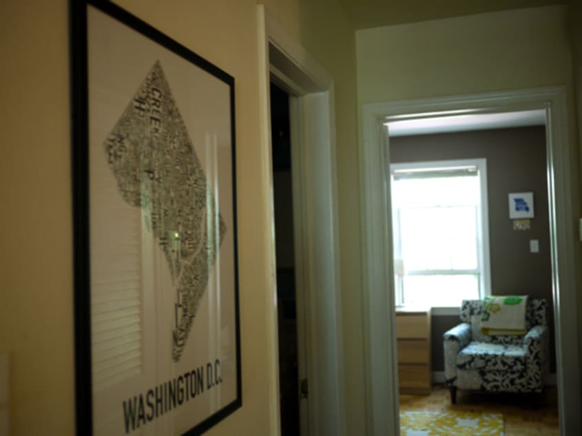
Location: Capitol Hill — Washington, DC
Size: 700 square feet
Years lived in: 1
As anyone who’s ever lived with a significant other can tell you, there’s an art to compromise. When Lindsay and Jeremy moved in together four years ago, they found themselves confronted with the challenge of creating a space that reflected their mutual interests (books, movies, music) without losing sight of their individual aesthetics (geek chic for him, granny chic for her).
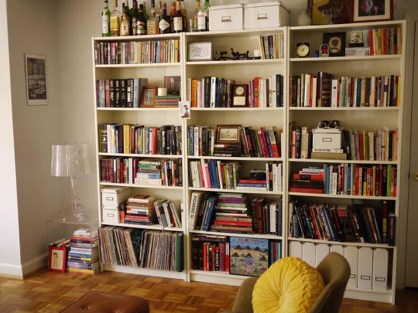
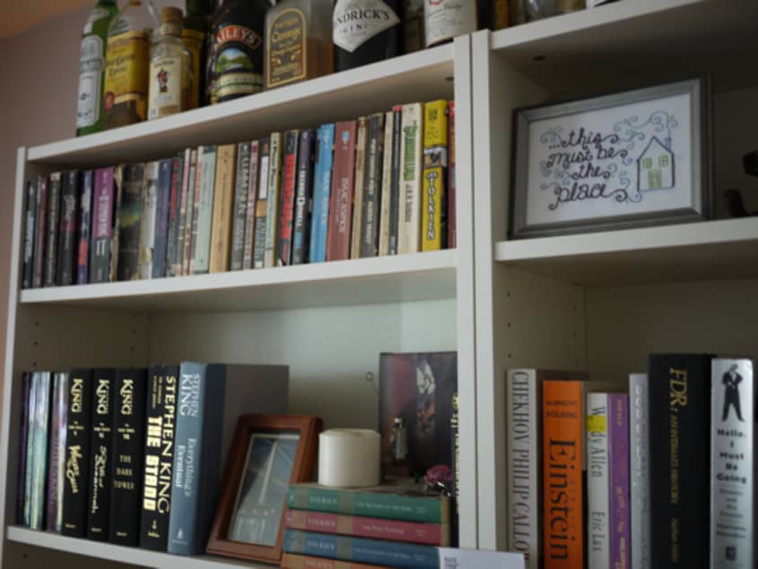
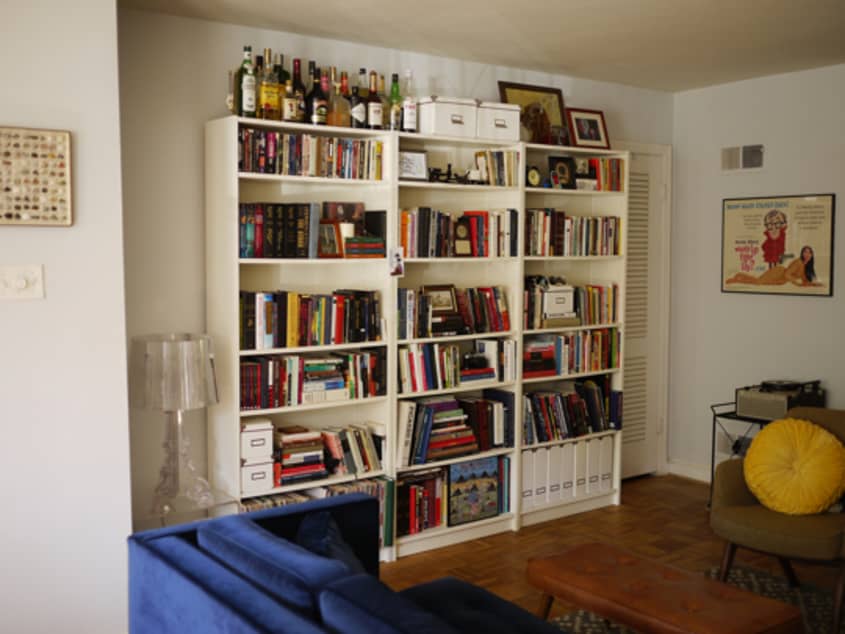
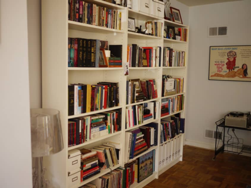
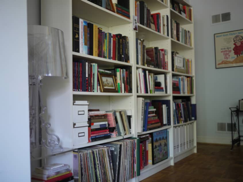
Most of their belongings came together naturally, but when it came to the more contentious items, they decided to meet each other halfway. Jeremy gave up his Search for Spock poster in exchange for control of arranging the bookshelf. Lindsay was allowed to keep her collection of old records as long as Jeremy could display his action figures. The result of these negotiations is a seamlessly merged apartment that makes guests feel instantly connected to the couple. Walking through the space, you can’t help but feel like you’ve known them forever.
Apartment Therapy Survey:
Our Style: Somewhere between Don Draper and Dorothy Draper. I like a good mix of clean, simple lines with bold, over-the-top accents. I’d put stripes and chintz on every surface if I could, but Jeremy wouldn’t feel at home in a space like that. As a compromise, I’ve toned down some of my more outrageous tendencies.
Inspiration: I don’t think I was aware of it until fairly recently, but most of my design inspiration comes from my grandparents. When I look at the things I’ve been drawn to over the years, they were design elements that were used in their homes. After coming to this realization, I’ve found myself seeking out items that remind me of them. It’s been very satisfying to see these things come together with things that reflect my personal aesthetic interests. And, like a lot of other design-minded people, I gather a lot of inspiration from blogs and magazines.
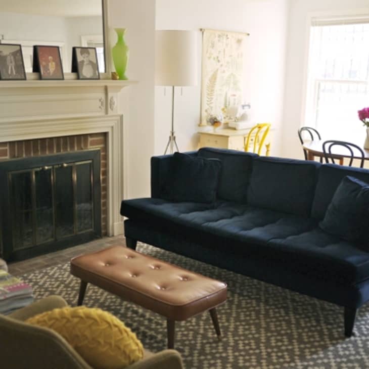
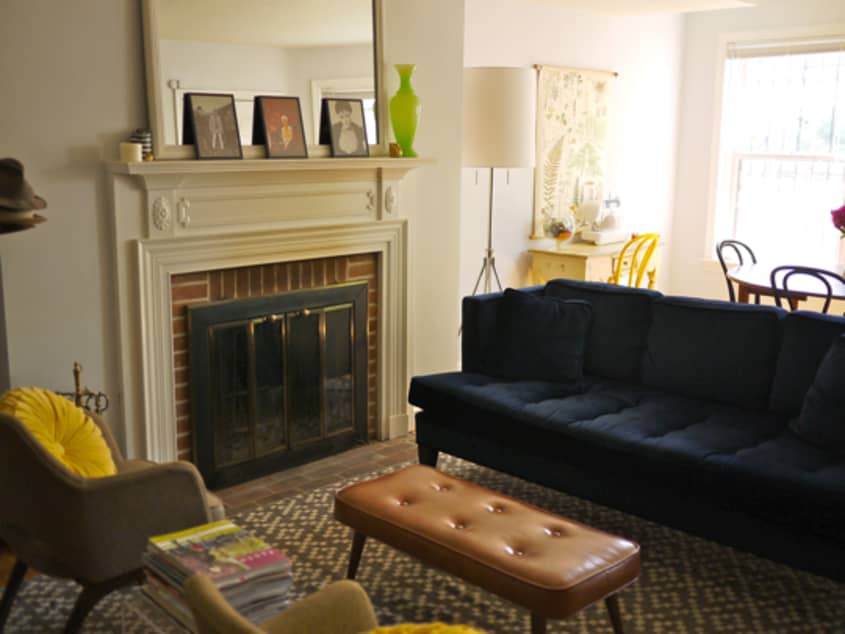
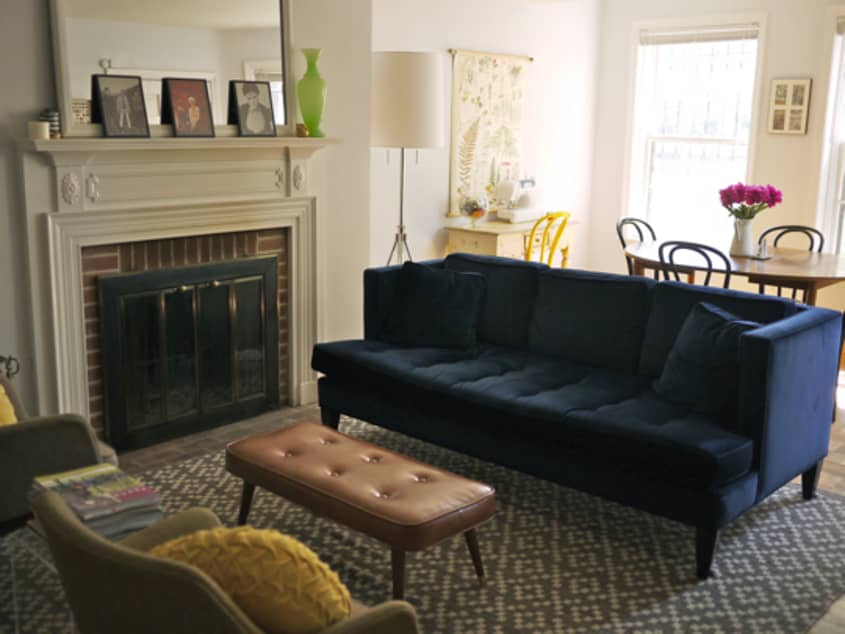
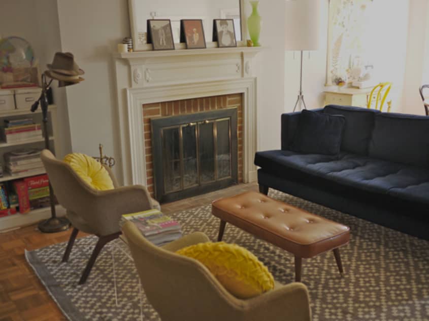
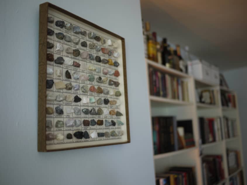
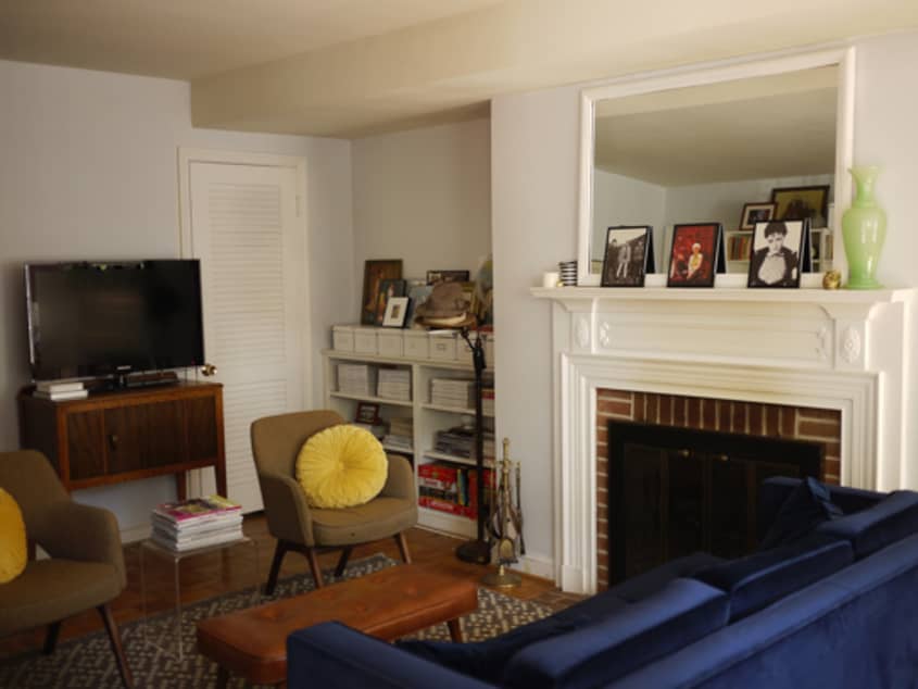
Favorite Element: The working fire place and the original artwork.
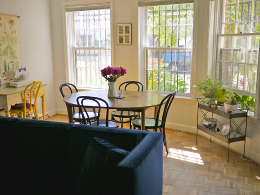
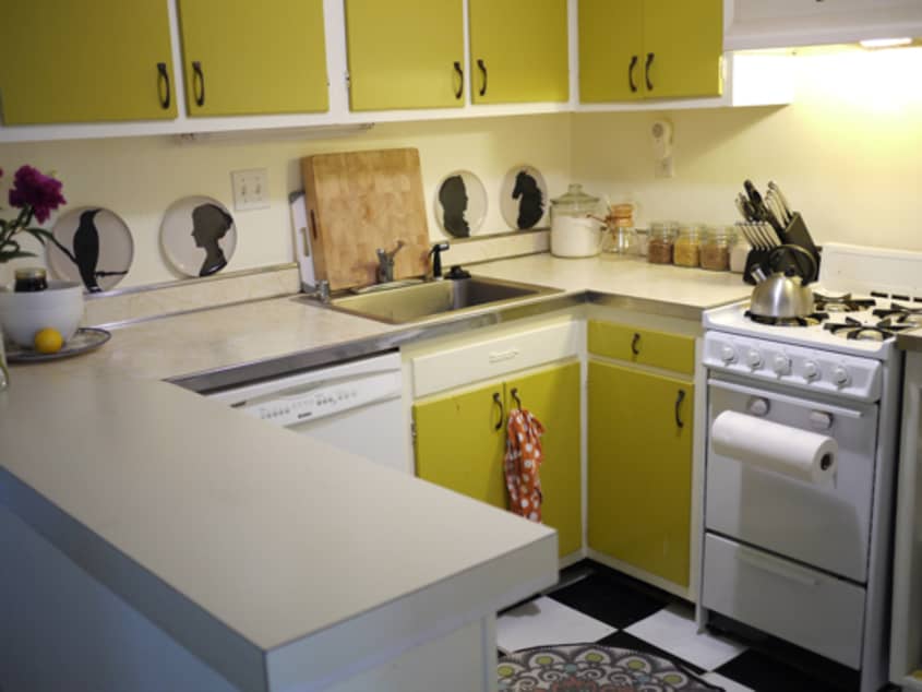
Biggest Challenge: Lighting (both natural and artificial). Because we live in the lower unit of a long, narrow rowhouse, we only get natural light at the ends of our apartment. There is also very little overhead lighting, and floor lamps aren’t always the most visually-appealing solution. I’m always in search of lighting alternatives that don’t require rewiring or permanent alteration.
What Friends Say: People often comment that we’ve done a good job of making a space that visually represents our relationship. That, and they want to know about our sofa.
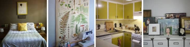
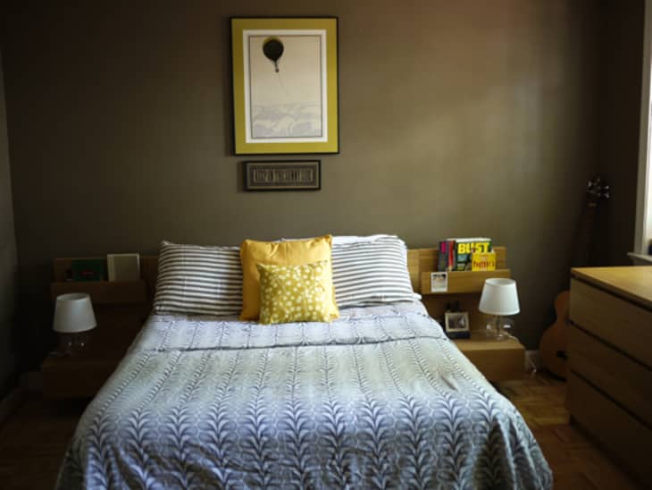
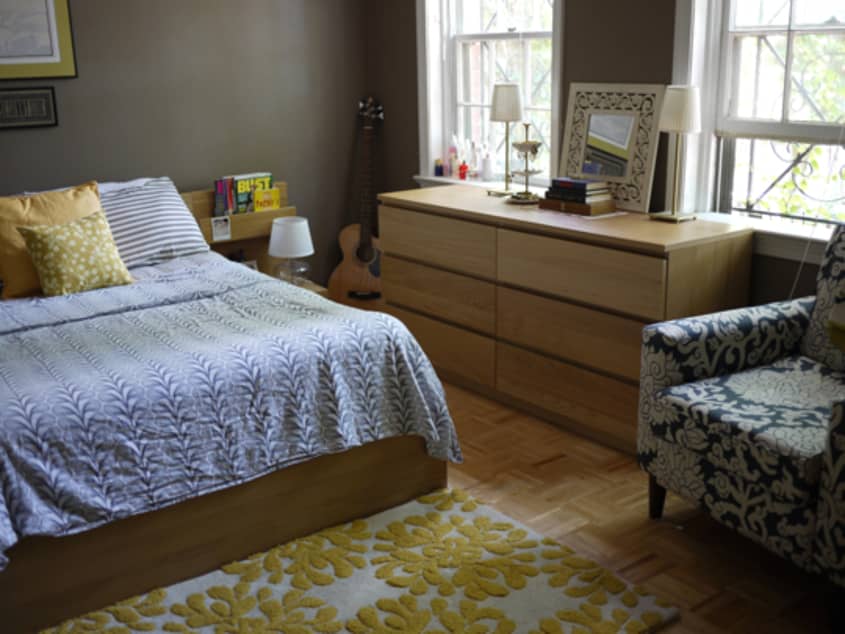
Biggest Embarrassment: Probably the bedroom. It was painted this color when we moved in, and we just haven’t gotten around to redoing it.
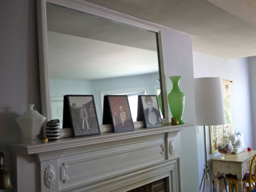
Proudest DIY: I wanted to create a natural looking “extension” to the mantle by adding a mirror to it. I found a cheap mirror that I painted the same color as the mantle and mounted it on the wall above the fireplace.
Biggest Indulgence: Either the sofa or the Kartell Bougie lamp. I saved up for several months to buy each of these things.
Best Advice: "Just buy things that you like and find a way to work them into your home. Ask questions later.”
Dream Sources: International flea markets, 1st Dibs, Monument in San Francisco, Midwestern thrift stores, Anthropologie.
Resources of Note:
PAINT & COLORS
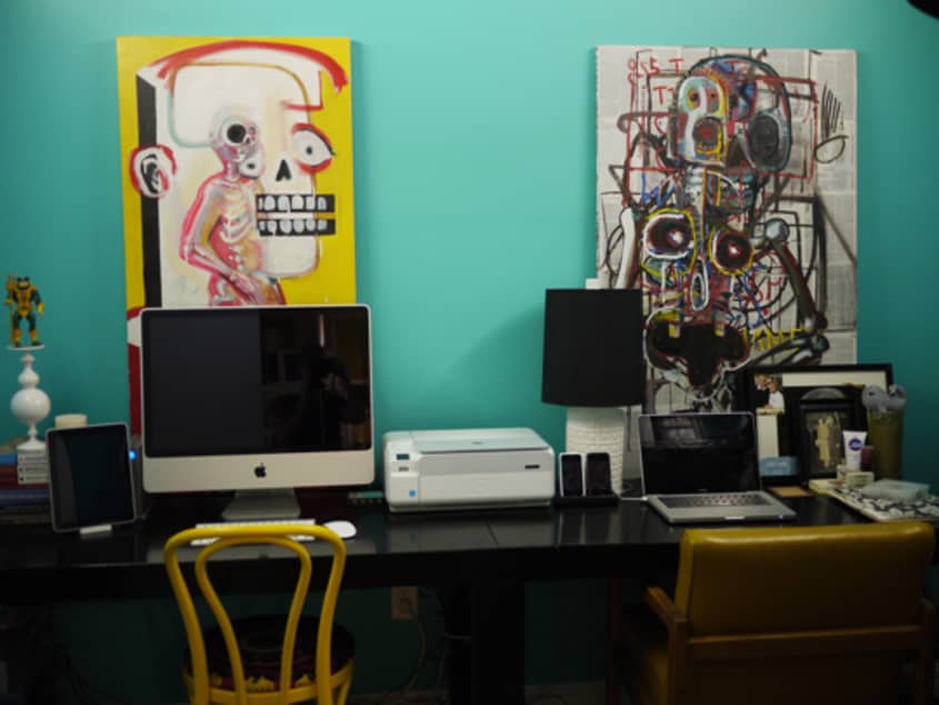
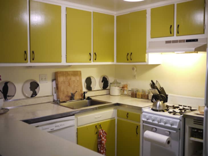
The only paint jobs we were responsible for were the living room walls (Benjamin Moore Iced Cube Silver) and the paint in the office (Benjamin Moore Poolside Blue). The rest of the paint was here when we moved in.
FURNITURE
• Sofa: Room and Board
• Saarinen-style Side Chairs: Craigslist
• TV Stand: Craigslist
• Dining Table: Craigslist
• Chairs: Kurt Peterson
• Ottoman/bench: Ebay
• Shelving: Ikea
• Record Table: Etsy
• Office Desks: Overstock
• Office Chairs: Craigslist
• Bedroom Set: Ikea Malm
• Bedroom Chair: Urban Outfitters
ACCESSORIES
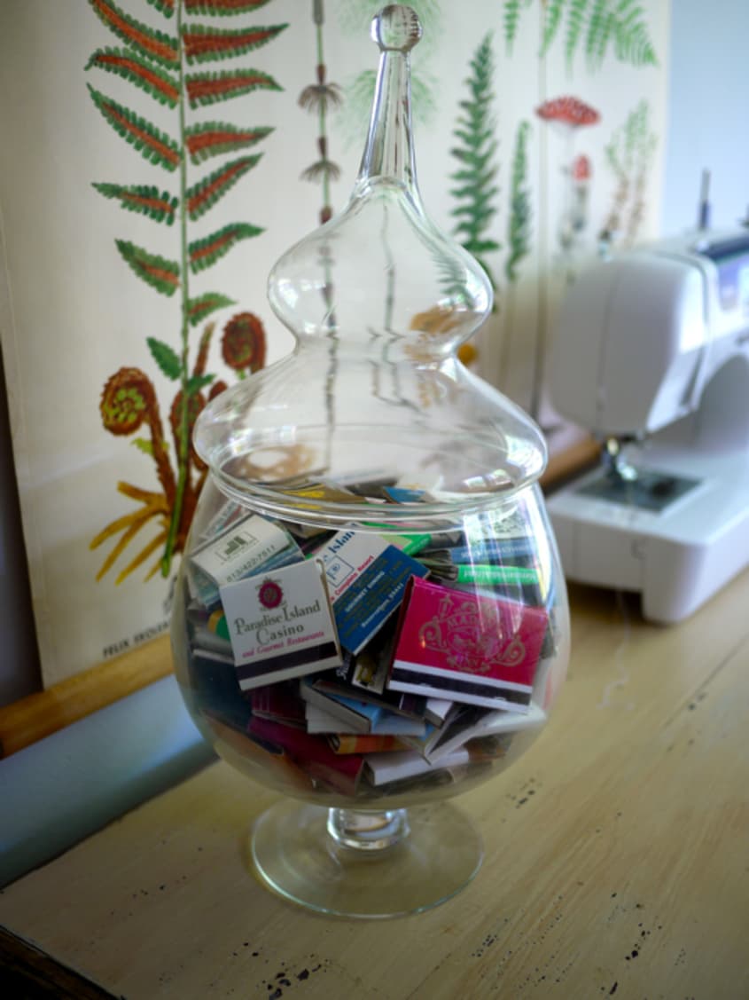
I acquire most of these things from thrift stores, Ebay, or Etsy. The jade vase and the glass display of vintage matchbooks were my grandparents (and as such, they are my most cherished items).
LIGHTING
West Elm (floor lamp in living room), Hive Modern (Kartell Bougie lamp), Crate and Barrel (office lamp), Ikea (bedroom lamps)
BEDDING
Dwell Studio sheets, Ikea duvet cover, throw pillow from Peony Lane on Etsy.
RUGS
Nate Berkus for HSN (living room rug), Urban Outfitters (kitchen rug), and Anthropologie (bedroom rug)
ARTWORK
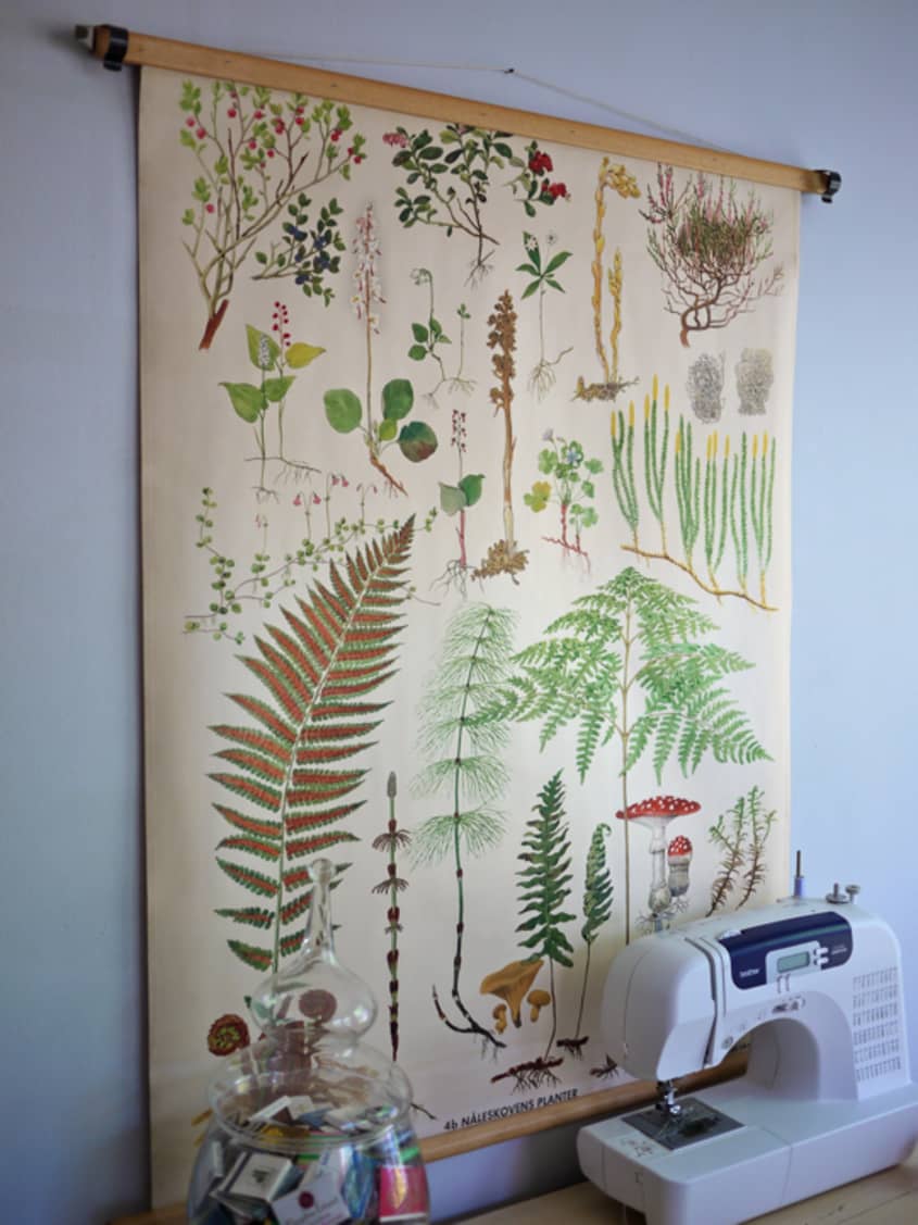
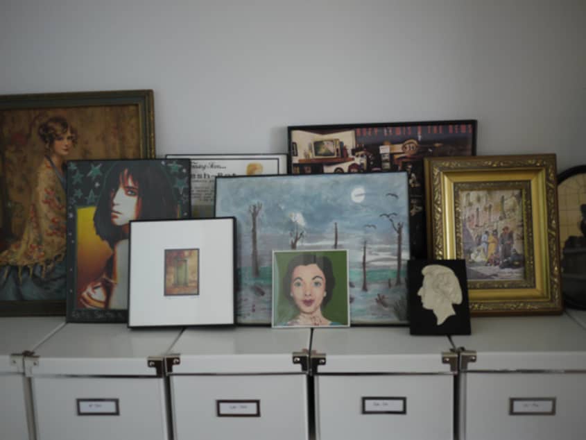
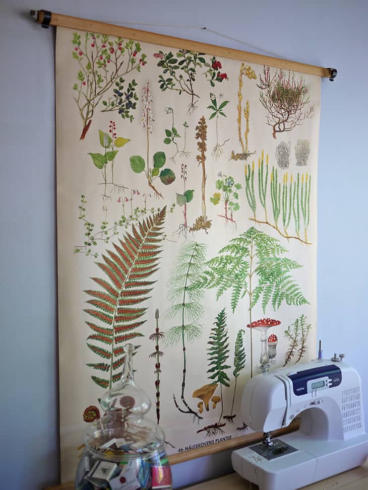
Owning original art is something I have always been very into, so I have a lot of it. Jeremy’s grandmother is an artist, so we have a lot of things from her. The artwork in the office is by our dear friend, Kevin Lawler. The Woody Allen print in the living room is Jeremy’s (he says he bought it from a record store in Newport News, VA that’s no longer open). The Washington, DC print is from Ork Posters. I also have a lot of pieces from Etsy sellers, including Farfalla, Claudia Varosio, Bees and Trees, Yee Haw, and Erasoul.
-Lindsay Wood
Images: Lindsay Wood
• HOUSE TOUR ARCHIVE Check out past house tours here
• Interested in sharing your home with Apartment Therapy? Contact the editors through our House Tour Submission Form.
• Are you a designer/architect/decorator interested in sharing a residential project with Apartment Therapy readers? Contact the editors through our Professional Submission Form.


Comments (67)
I considered getting that same couch, but opted for something a bit more neutral ;) I am totally jealous of how amazing it looks in your home! I also really like how your home looks lived in - and the living room arrangement.
Beautiful.
I am having a really hard time stacking frames like they have here--thanks for the inspiration!
Also: LOVE the print over the bed!
This is amazing-- I love the way that you've set up your living room.
Where did you find the fern wallhanging over the sewing machine?
Thanks.
lovely! such a great compromise :)
and yes, where is the art above the bed from? it's so great!!
This is a very charming home, and I can understand the fuss about your sofa: it's stunning.
The way you've used so many different colors and patterns is awesome! Cozy without feeling overwhelming. Gorgeous place!
love the apartment. hate that i saw basically the same photos over and over again. same room, slightly different angle.
made for a pretty boring photo tour, though the house was lovely. would have been happy to see the bathroom.
maybe some editing down of the photos to include would have helped it not seem so monotonous.
I really like this space. Is it really only 700 sq feet and lacking light? It looks so open illuminated! I love how comfortable and attainable it seems. It's so unpretentious and fun.
Since this is an audition post, I will say that I like the laid back, friendly writing.
what luck to get such a tastefully painted kitchen!
Love how everything is so functional, yet doesn't seem cluttered!
I love it! tasteful and original, but at the same time inviting and fun. Also, nice work merging your stuff. Trying to merge different styles and preferences isn't easy to say the least. Good work!
Nice work! I was especially interested in the "Ice Cube" living room paint color as I need cooling colors for walls in Hawaii. Couldn't always see it well, but the close-ups conveyed it. Whatever you paid for the acrylic? glass? lamp was worth it. It's smashing.
This is a beautiful home, but like aprilheartsaaron said: same pictures over and over. Moving slightly to the right or left does NOT offer new insights into an interior. I would rather see less pictures and more variety.
Great sofa.
nice... but i think the lucite lamp belongs in the bedroom
LOVE THE SOFA
Great sofa, and also the balloon print in the bedroom. It would be great to know where you got that from!
What a completely beautiful home! This is what I would love my place to look like, but I lack your fabulous eye. I really like how you incorporated a variety of colors and styles without making the place seem busy or schizophrenic. Everything just works together nicely.
Nice! I just bought those same organizational boxes from IKEA this past weekend on a jaunt to L.A. My husband and I smuggled them back in our suitcase! (We don't have one in the Nashville area.)
I agree about the comments about multiple shots not bringing as much to the plate, but I admit to a voracious appetite for any and all images of this kind of couple-style-blending. My husband and I are trying to balance my love of color and die-hard modern/vintage aesthetic with his geek organizational prowess and paraphernalia.
I'm in love. This seems like an old school apartment therapy post: a place that looks lived in, with books that look read, with some gorgeous pieces, on a normal person's budget.
The combined living/ dinning area makes me want to come over for a dinner party. The space looks so light and beautiful I was surprised to read this as a challenge. Kitchen is functional and eye catching. (My friend has your exact DC kitchen and she needs your same redo.) Though, I don't get the paper towel roll jutting into the space.
This is the only guest post I have read recently where I couldn't guess immediately that it was a guest. The writing style fits right in. Didn't even notice until I read the comments that it was a guest post. He or she should be hired!
Lindsay, what you said about drawing inspiration from one's grandparents is true for me too. You have a lovely home.
http://lavalotti.wordpress.com/
please get rid of the sofa. It's making me drool.
so, i hate to be the broken record: but the sofa is so lovely. Which Room and Board sofa IS it?
Great use of color! The neutral palette with pops of color really works in a small space. Love the citron.
I love the way that you've worked together both of your styles and still managed to have a charming and cozy environment. Very inspiring and would love to see what you do with the room that you've yet to paint!
Now for the most important question, how do you reach the liquor ? Unless I moved it all to the plant stand by the window, I would need a step-stool which is not a good combo with liquor!
Nicely written, I liked the concrete explanations of how the two merged their stuff. Usually the how-to merge examples are vague.
I, on the other hand, loved the photos. I enjoyed being able to look at different angles, allowing me to see how things worked in the small areas. Amazingly put together, organized, unique and a great story....very detailed and makes me wish I was half as talented! Thanks!
I'm trying to figure out what to do with the bedroom when I move in to my boyfriend's condo. He has the same bed frame and side tables. I like the way you raised the mattress. How did you do it?? Does it slide out or is it raised only slightly inside the bedframe with some sort of risers? http://hopelesschest.blogspot.com
this makes me want to display more of my collections -- the pictures and sunglasses in particular look great without feeling like clutter.
My husband and I have never found a unique way to combine our two tastes. Your apartment is inspirational and unique. We both really love the artwork, the use of color in each of the spaces, and especially the cozy feel of the apartment as a whole. The photographs have given me a lot to think about for my own space. Thanks so much for the ideas!
I love all the yellow. Especially with the navy blue sofa. It's really tastefully done.
Another drooling sofa-lover here. Any idea which model that is? I'm not seeing it on Room and Board's website....
What a beautiful home. It's immaculately decorated, but still looks cozy and lived in. I love your use of color and different styles. You've done a great job of meshing your personalities and styles and it really comes out in your unique design aesthetic.
I love this place so much I put a whole post on my blog about it... http://bit.ly/aAgSUu
How are the boxes that are beneath the artwork being held? Are they just stacked neatly or is there a piece of furniture below them?
The whole place looks very comfortable and interesting -- great work!
I am stealing so many elements of this! We are constantly trying to balance our dueling preferences.
I weigh in on the side of loving all the photos. I love being able to see the small details of what makes a design work.
Fantastic living room - And I am definitely excited about the gemstone collection.
Add me to the chorus of people who love the sofa and the whole place in general. It really felt like an old school AT post. I, too, did not realize it was a guest post till reading the comments.
My one complaint is that I spaced out in the middle of the tour and had to start over. I think the photography/photo editing could have been tighter.
But overall, great tour! I was especially impressed with the bold paint color of the office. It really made the art on the walls sing. How inspirational. I also found the bedroom color very calm and peaceful. So many delightful things to look at, without it feeling cluttered... I could go on and on with my praise.
Yes, the couch is fabulous! I like the way everything blends together but doesn't match perfectly, that's very hard to achieve. Looks like you did a lot with a little. Very old school AT. I love the touches of yellow in the different rooms (I did my place the same way!). And, you can't go wrong with dwell studio sheets. They always make a bedroom look chic. The blog is well written and the photos are excellent. I'm glad Thorndale seems to like it too. She was pretty mean to the other guest poster.
The sofa's deep blue color really pops and looks absolutely beautiful in your home. Also, I love that the his and her silhouettes in the kitchen are paired with an animal's. So quirky!
Great post! Cute place, nice writing, and I'll say it, too: it reminded me of all that I started to like AT for in the first place. I also especially appreciated the bookcases, with someone's *real* books on them! ("Hey, look-- biographies! Of people I might actually read about!") And as an extra bonus, the photos of the kitchen have actually given me some answers for my own small kitchen, which I have been trying to figure out for months, so thanks! :D
I think maybe grannie chic won. I like the headboard with book shelves. Thanks for the tour.
Your place is gorgeous and comfortable looking at the same time - not too precious, but very stylish! I cherish so many items I got from my grandmother so I love the "granny chic" idea.
Yes, do tell...where is the fern print over the sewing machine from? Great home. I've loved reading the prior comments, ALL are so positive and supportive. Very refreshing and you deserve all the accolades.
First let me say, you have a lovely home. I love the print above the bed!
I have this sofa too, but in a different color (Lichen). It's awesome! It's called the "Hutton" from Room & Board. The color of the one in the photo is Indigo, it's the 75" single-cushion sofa. (There are 4 different sizes in the drop-down menu)
http://www.roomandboard.com/rnb/product/detail.do?productGroup=19348&catalog=filter&menuCatalog=room&menuSubcategory=201198
My question is, what size are those custom pillows with the same Indigo fabric? 21" or 16" square pillows? I would like to get some to match my sofa and those would be the perfect size!
http://www.roomandboard.com/rnb/product/detail.do?productGroupKey=CST_PILLOW_AFAF&customType=pillow&weeksOut=3&swatchLink=fabric&customMessage=pillows&showPricingButton
I've been dying for a navy blue, velvet-y sofa! I havent been able to find exactly what I was looking for until now! I'm so saving up for that sofa too :)
You have a very cute home!
Thanks for the feedback, everyone! To those of you who had questions:
-The educational plant chart came from Farfalla Shop on Etsy
-The couch is The Hutton from Room and Board (I looked back through my order to see what size cushions I ordered, but the order summary doesn’t specify. I’m pretty sure I got the 16” cushions, though.)
-Believe it or not, the print in the bedroom is from art.com. They actually have some really interesting prints and reasonable custom framing prices.
-I have a conveniently located stool to access the booze
-We raised the bed by using a box spring under the mattress (I don’t think
-The artwork is just sitting on top of the boxes (luckily, we don’t need to access the items in the boxes very often.)
Such a great color and textures. Like a kid in a glass shop, I just want to touch everything, but without breaking anything. You really have an eye for highlighting the complexities of your palate without over burdening your home with junk. I'm inspired to go home now, be bold and kill the blandness I live in.
You all did a fabulous job! I love love love the sofa and your fun mix of all the furniture! And the painted kitchen cabinets are great too!
I came back to the tour three times because I love it so much! There's so much love and fun all mixed up together. I dislike interiors that take themselves too seriously. Adore the ebay buttoned ottoman, what a find! I'd love to know where you sourced the mustard circular cushions.
I also think there's no need to change the hue in the bedroom, the bedding and print and a great contrast. It's got that Mad Men moodiness too. Thanks for the tour.
love all the yellow AND your advice to buy now, think about where to put it later. it's certainly worked for you guys.
I absolutely love your space. It is charming and cozy and you did a great job at blending the old with the new.
Like everyone else, I love the sofa! It was a great color choice for the room!
Have to scratch my head about adults who collect monster action figures. Also I am not digging grandmas kitchen. Not a fan of doors one color & the frames another. Why is there one drawer unpainted?
was that a stuffed narwhal in the office? very cute!
I've been lusting over the Hutton sofa for awhile, and that color is just amazing. How comfortable do you find it to be? Also, LOVE the narwal! Is that an Etsy find? Too cute.
I've come back yet again because this is such a fantastic post. Two things I noticed this time around and I love:
1. I think it is great that the one drawer is not painted in the kitchen.
2. CommaVictim? Could you have a better name? I think not.
thorndale, your place looks nice. it has a nice 1960's feel to it, which is very chic these days.
although, i don't get the concept. what exactly was merged? it looks like some old vinyls, a matchbook collection, and a bunch of old liquor bottles. actually, the desk is the only obvious example that someone else lives there.
that school cafeteria dining table desparately needs a runner to add continuity of color in the dining area. well, i take that back... there is no color in the dining area. i think the living room sofa and chairs should be rotated counterclockwise so the backs of the chairs face the fireplace rather than the tv. i like watching tv with the front of my face, not the back. beautiful mantle. i also love the bookcases; you can instantly fool someone into thinking you're smart with a bookcase like that ;). the color of the cabinets in the kitchen is hideous. i don't know if you have the choice of painting them, but i would if i could. i don't know if the color doesn't come through in the photos, but it looks like rotten mustard to me. the bedroom is tastefully done, however, the brown walls with the yellow rug, blue chair, blue bedding, and light wood color on the floors and dresser don't mix well. it's just too much. i would do a dark laquer on the bed and dresser for a warmer feel with that mix of blue and brown (which i have in my bedroom) and maybe move the rug elsewhere in the apartment.
lastly, your artwork is odd as well. very chic and hipster in the living room and then startling and abrasive in the office. do you work with dead people?
anyway, i like the overall feel. just a few odd things here and there. but that's your style and i respect it.
From the place I sort of like yellow round cushions, dining chairs and.. letters on the fridge.. yyy... that would be it...
boring pictures
that print over the sewing table is amazing! i can't decide if it makes me want to get crafty or go out and forage something :)
Congrats on being able to merge your stuff. Can you tell me how to do this? I want a mix of Anthropologie and DWR. My husband agrees but winces at the idea of any Anthro-looking piece on its own. It's frustrating. Anyway, you've done a great job.
Why are you embarassed at the bedroom wall color? I love it.
I don't like that you put the Kartell lamp where it is. Looks like an afterthought. Seems inconveniently located.
Of course I love the sofa. But even more, I love the sofa with the rug with the fireplace. The sofa on its own is alright, but your combo is super awesome.
Here's to Ebay, Craigslist, and IKEA! I don't know how I would have furnished my home without them. (But for everyone who's not shopping Ebay or Craigslist, don't bother. I don't need any more competition.)
I like the Tiger Lily poster.
Lindsay,
Your apartment looks fabulous it seems like a really awesome space and you have just the right amount of eclecticism without looking junky or overwhelming. I also think that you did a great job of working with what was existing in the apartment, ie paint colors.
I would love to hear more from you as I think your style and love of thrifting / creative shopping would be a lovely addition to Apartment Therapy DC! We would all be so lucky to get your inside scoops!
I like the light airy paint colors in the living areas and the cozy colors in the bedroom and office.
Excellent post. The writing style definitely compliments your living arrangement... and vice versa.
Oh man, such a success. This is the kind of thing I aspire to. It looks so organic and effortless, but your deranged balance of colors makes each element sing with its own pleasing voice. I think I'm most impressed by the selection of the living room RUG. The cool temperature is JUST RIGHT to set off the warmth of the brick and the ottoman, and the pattern is JUST strong enough to anchor the room and play off the fireplace brickwork.
The flow is MASTERfuly done too... the little eating space behind the sofa looks so inviting and easy to get to, and I love how those two chairs have their backs to the TV. It says, "Yes that's all well and good, but first come here and let's CHAT!". I also appreciate how the height of the poster to the left of the TV lifts the eye and stretches out that back wall. What wonderful work.
I even like the kitchen paint job, which might have felt self-conscious or contrived. A few of the knickknacks ARE too trendy for me (cuckoo clock), but overall, this place makes my heart glow. What a dream.
Ms. Wood clearly has not only a knack for design creativity but a gifted pen as well. Kudos!
Bedroom is great, I love it !!!
Your home has great personality!
I've been thinking about getting the Bougie lamp and your sofa is heaven... just what I for inspiration since I'm searching for the perfect sofa right now. Do you find it as comfortable as it appears?
P.S. Your sofa is velvet, isn't it? Where did you find the fabric? I had a lovely down and feather lavender sofa made and sadly, I'm going to have to sell it. I have a beautiful Siamese who loves to use the cushions to nap. I have to keep pet blankets all over it or the kitty hair sticks like glue. Velvet and cats aren't a match made in heaven. I wish I'd given it more thought. But, here I am... yet again, falling for another beautiful velvet sofa!
I also love some of your art work and photographs. Would you like to come over and help me decorate my own place? ;)
Where oh Where did you get the couch??!?!?!??!