
Raina & Robert’s Modern Farmhouse Makeover
Name: Raina Kattleson of A Stylist’s Life & Robert Butscher, an architect
Location: Hudson Valley — New York, NY
Size: 1200 square feet
Years lived in: Bought 1 ½ years ago — spent 15 months renovating and now rent it out.
The popularity of makeover shows, before and afters, and rags-to-riches stories points to our continued fascination with those who have the gift to see the potential in something. It’s not a gift everyone has. But Raina Kattleson of A Stylist’s Life is one of the lucky ones.

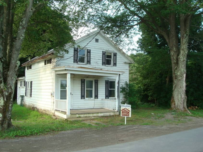
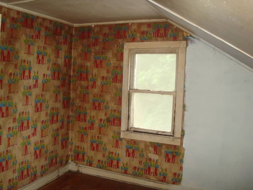
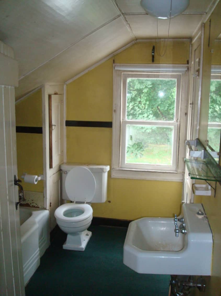
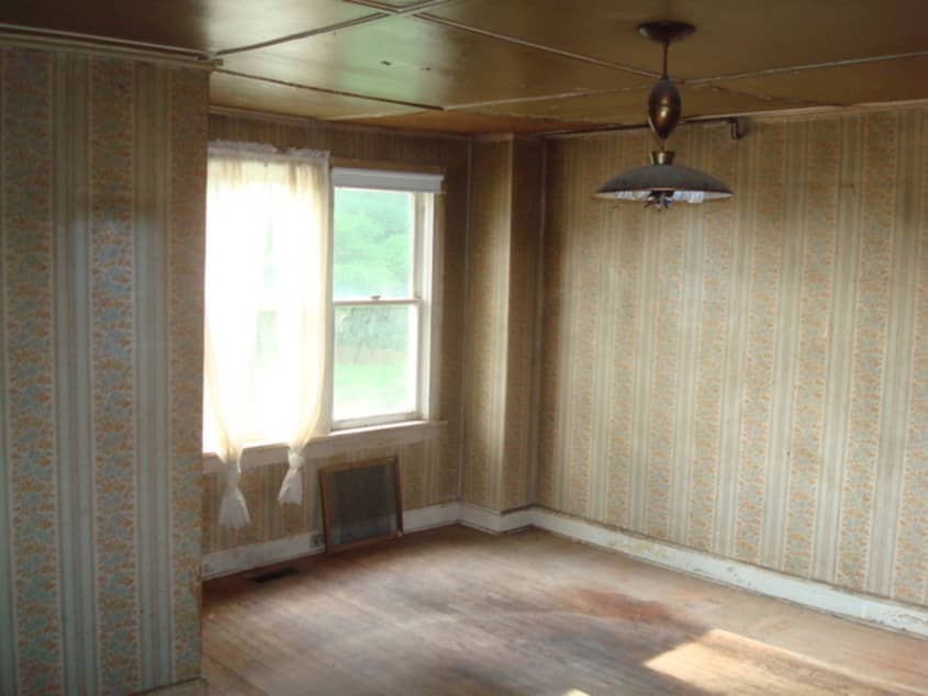
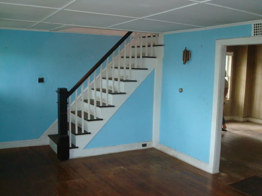
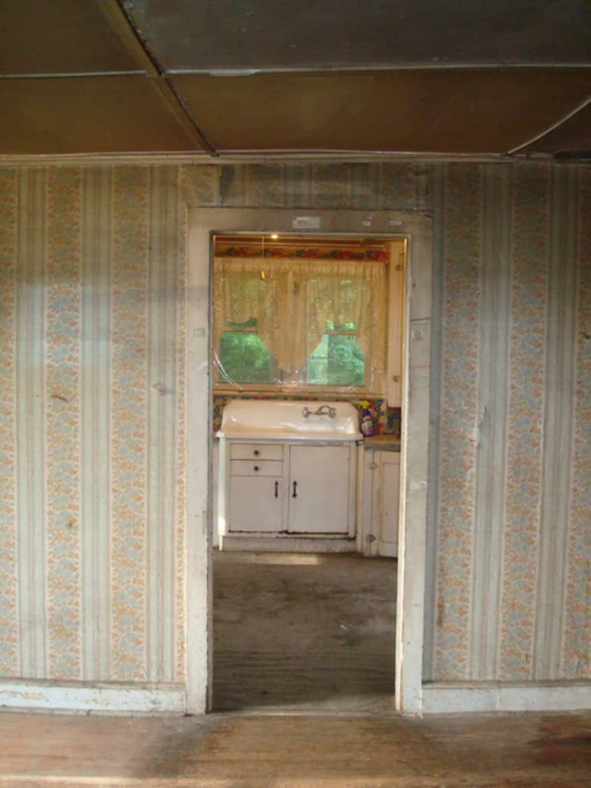
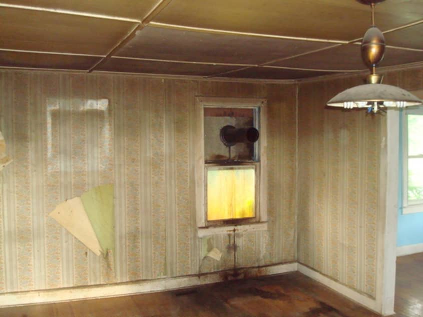
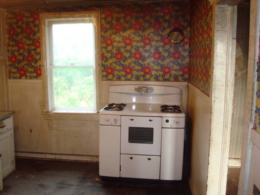
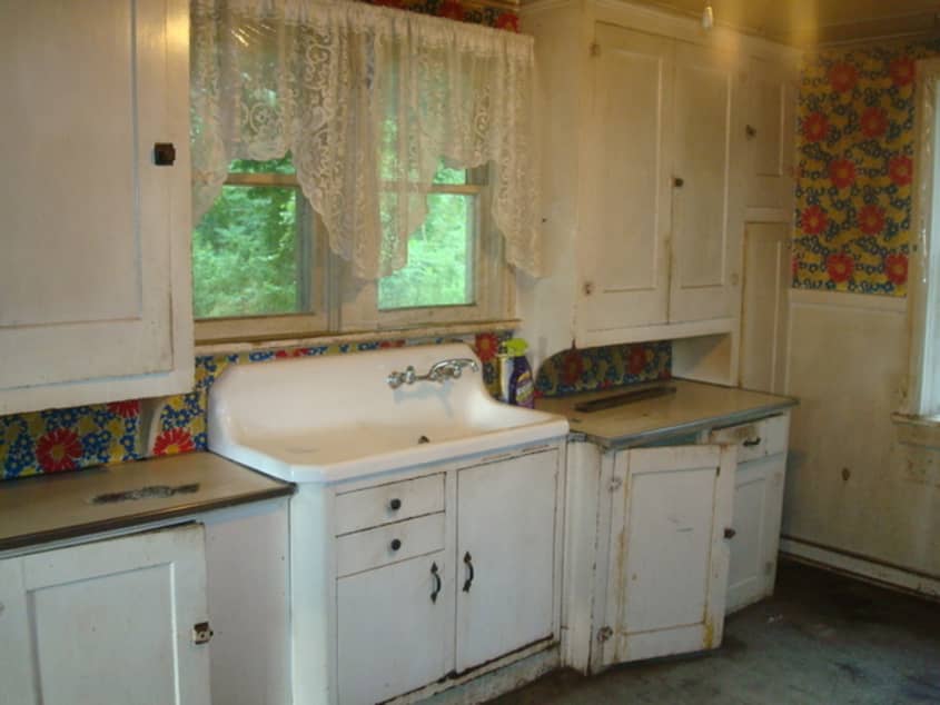
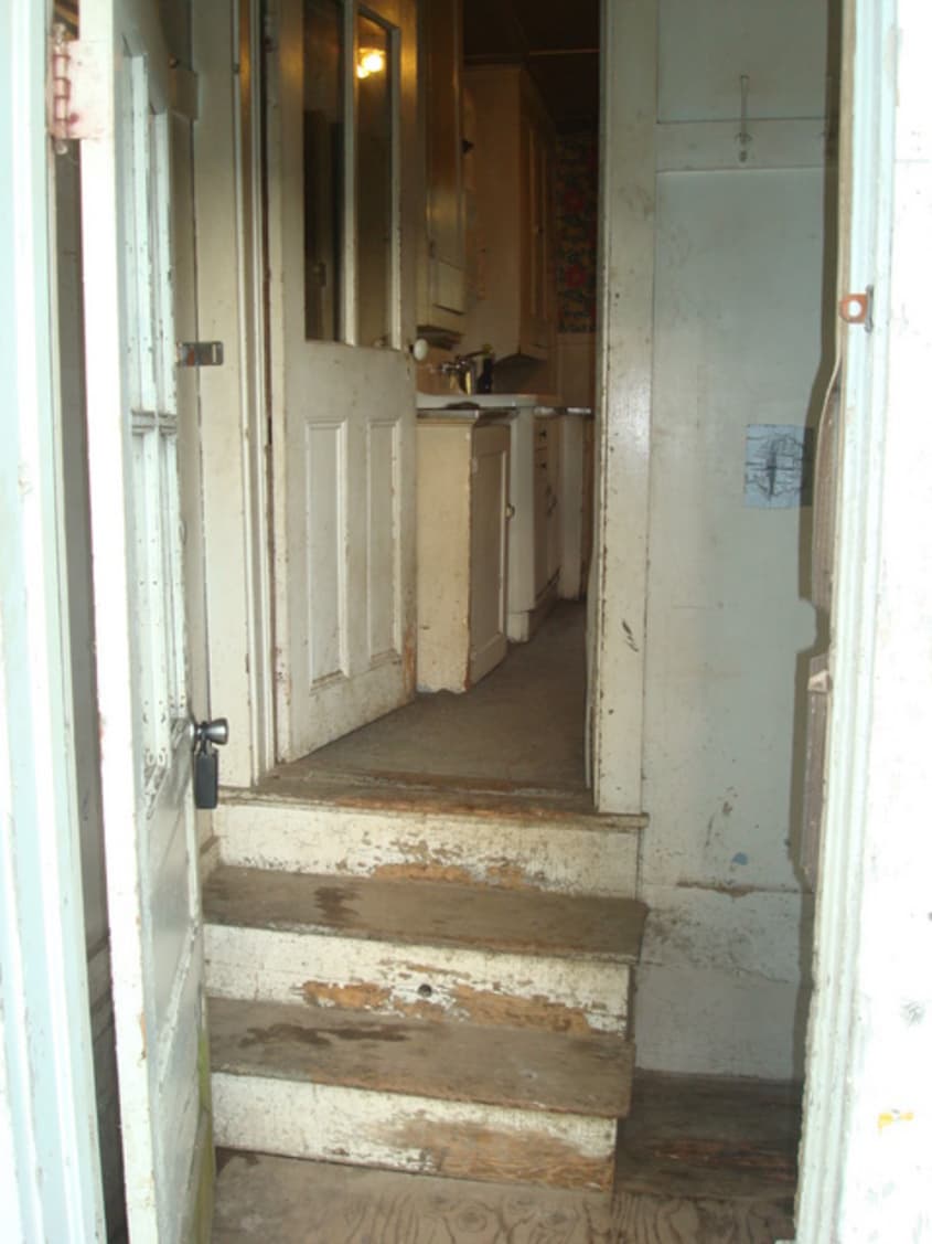


The farmhouse she transformed was nothing much to look at when she and her husband first saw it. Most people would’ve passed it by…and did. She had to call the real estate agent to ask to see it. And, in fact, the real estate agent admits now that she wouldn’t have shown it if she knew how bad it was. But Raina was undaunted by the task ahead. As she herself puts, she could “see through the scary to what it could be”. Luckily she has a husband that trusts her!
Of course, it helps that Raina’s a designer and stylist and that her husband is an architect. Even so, the task was daunting, but a certain naive optomism propelled them forward.
Because this was designed to be a rental property, keeping costs down was a big priority. But, as is often the case, restrictions, whether of time or of money, are the optimum cauldron for cooking up creative solutions. Stripped down to its beautiful bones, the result is an open and inviting farmhouse that surprises and delights with its hints of color and unexpected DIY solutions. That tried and true mix of Ikea and flea market finds forms the backbone of the design; choice items sourced from a few favorite places round out an appealing look. So appealing that not only are we sharing the pictures here on Apartment Therapy, but some of the afters can also be seen in Rue, and the “how to” for the lamp’s cord can be seen on Design*Sponge, both testaments to Raina’s skill and vision.
Lessons learned? Don’t be swayed by cosmetics. Ugly paint, scruffy landscaping, chipped fixtures, and outdated tiles can be transformed or replaced. The opposite is also true; don’t be blinded by fancy or expensive details. Look, instead, for the things that matter: a location near the things that are important to you, whether that’s good schools or easy access to the subway that deposits you right outside your office; a layout that moves you easily from one room to another; solidly built walls; and, water pressure that promises an invigorating shower!
Moral of the story? Teach yourself to “see through the scary” and you will be justly rewarded.
We’re curious: ask yourself, when looking through the “befores” of this house — do you think you would have seen this home’s potential?
Apartment Therapy Survey:
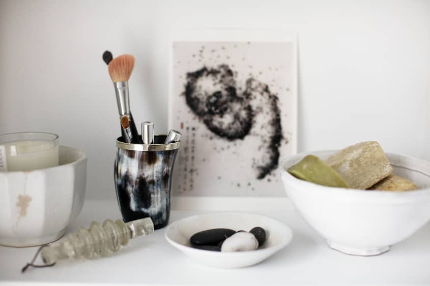
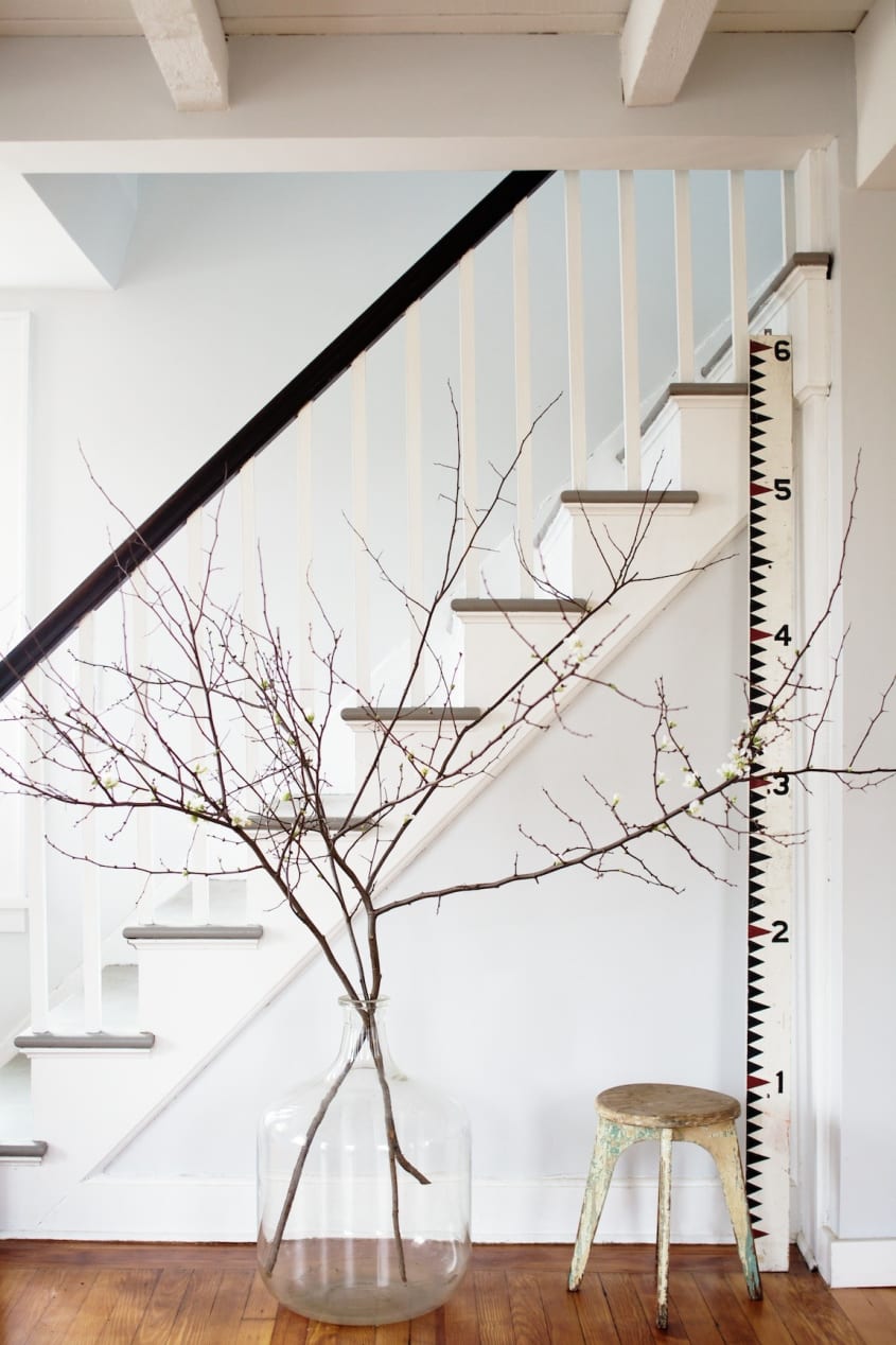
My/Our Style: Simple farmhouse modern with hits of color. I wanted the house to have a sophisticated, calm feel that was reflective of the home’s natural setting.
Inspiration: The bones of the house really inspired the design. It was crying out to be a simple, open, and sunny space. Once the remodeling was the way we wanted it to be, the design followed organically. Bringing in simple clean lined pieces was a natural fit. A few hits of color kept it lively.
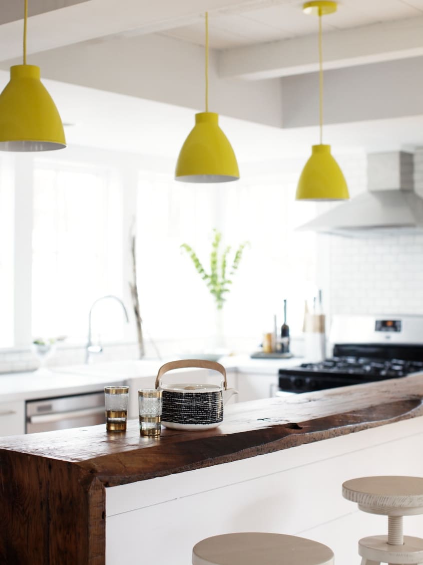
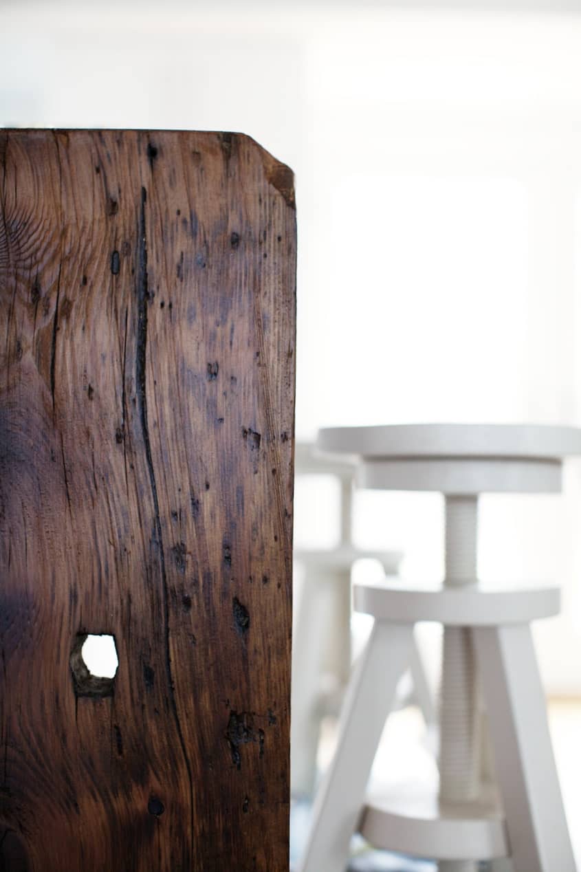
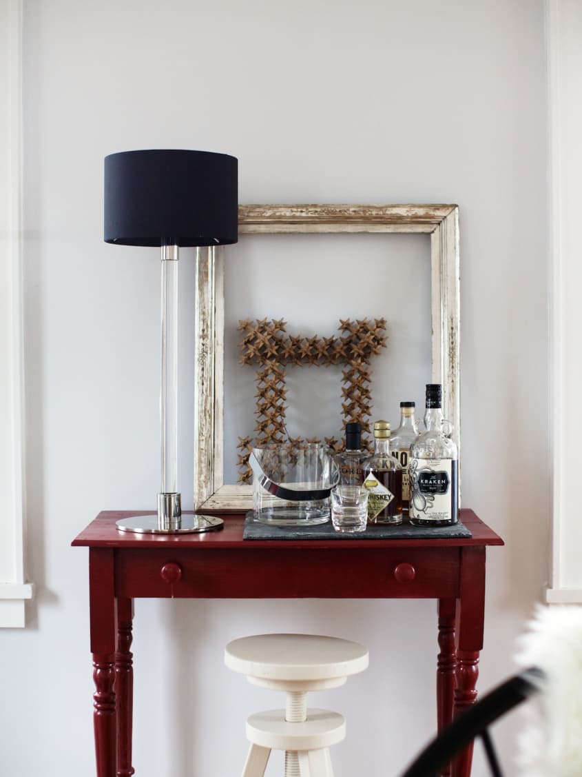
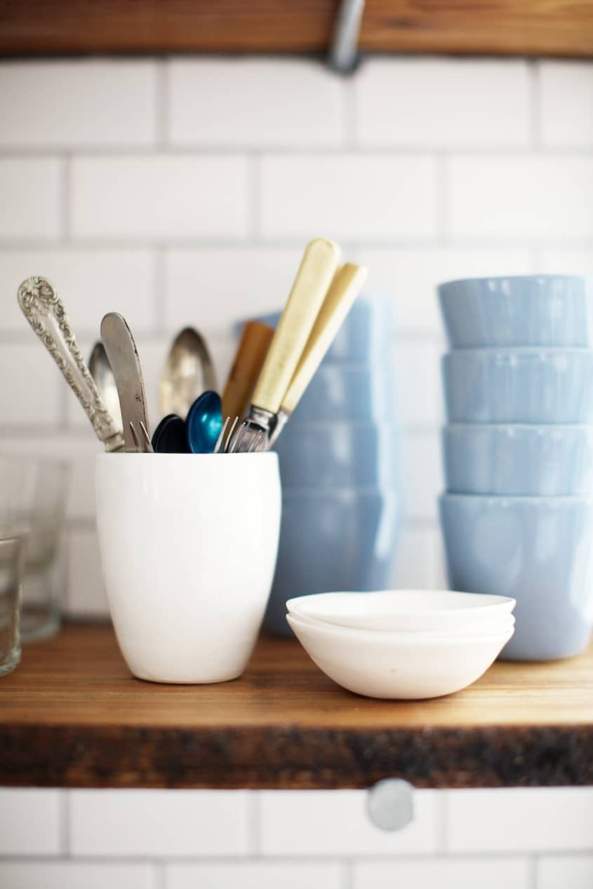
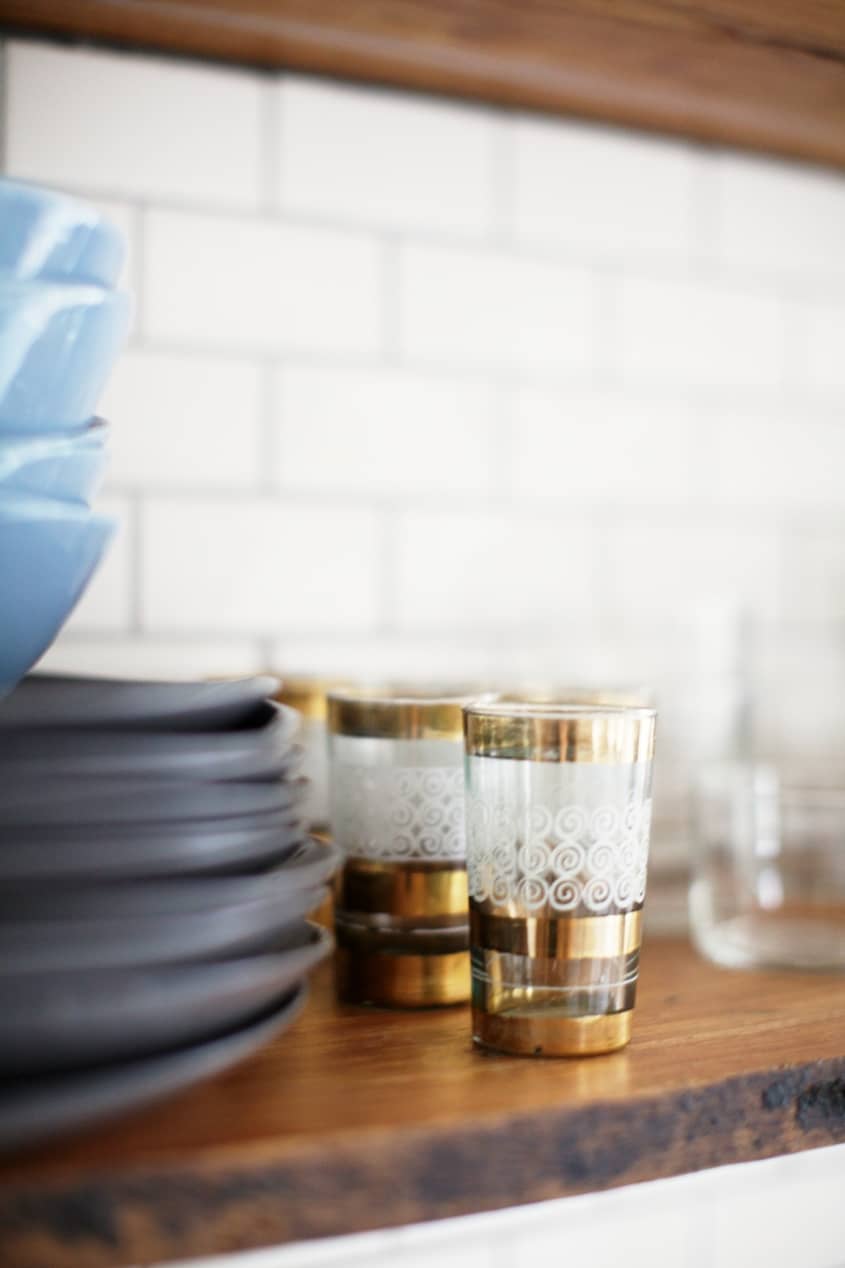
Favorite Element: The vintage rustic wood shelves and bar.
Biggest Challenge: We knew from the start that this was going to be a rental, so we worked extra hard to keep the costs down and that factored into the design of the home. We often struggled with how much versus how little to do to make it a house we loved and yet keep costs manageable. There are places we won and places we lost cost-wise, but in the end it was all worth it.
What Friends Say: Everyone is amazed at the transformation. The real estate agent that showed it to me apologized and told me she wouldn’t have shown it if she knew how bad it was. Meanwhile, I was on the phone to my husband telling him we should buy it. I could see through the scary to what it could be.
Biggest Embarrassment: I have to say that we are pretty happy with the way things turned out. It would have been great to finish it about 6 months earlier, but that seems to be the nature of these projects.
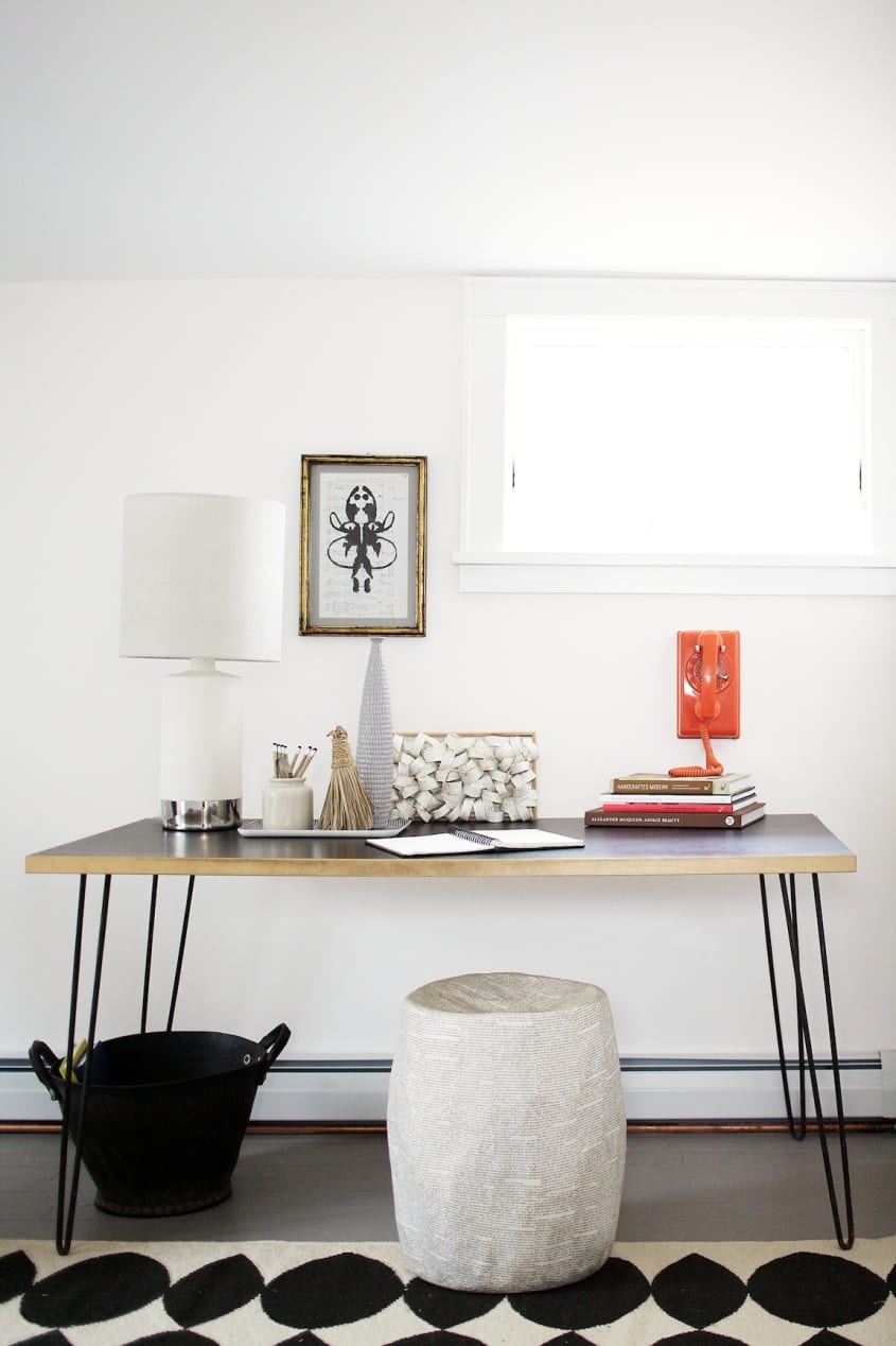
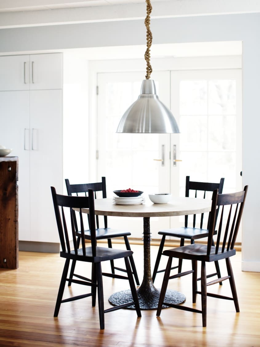
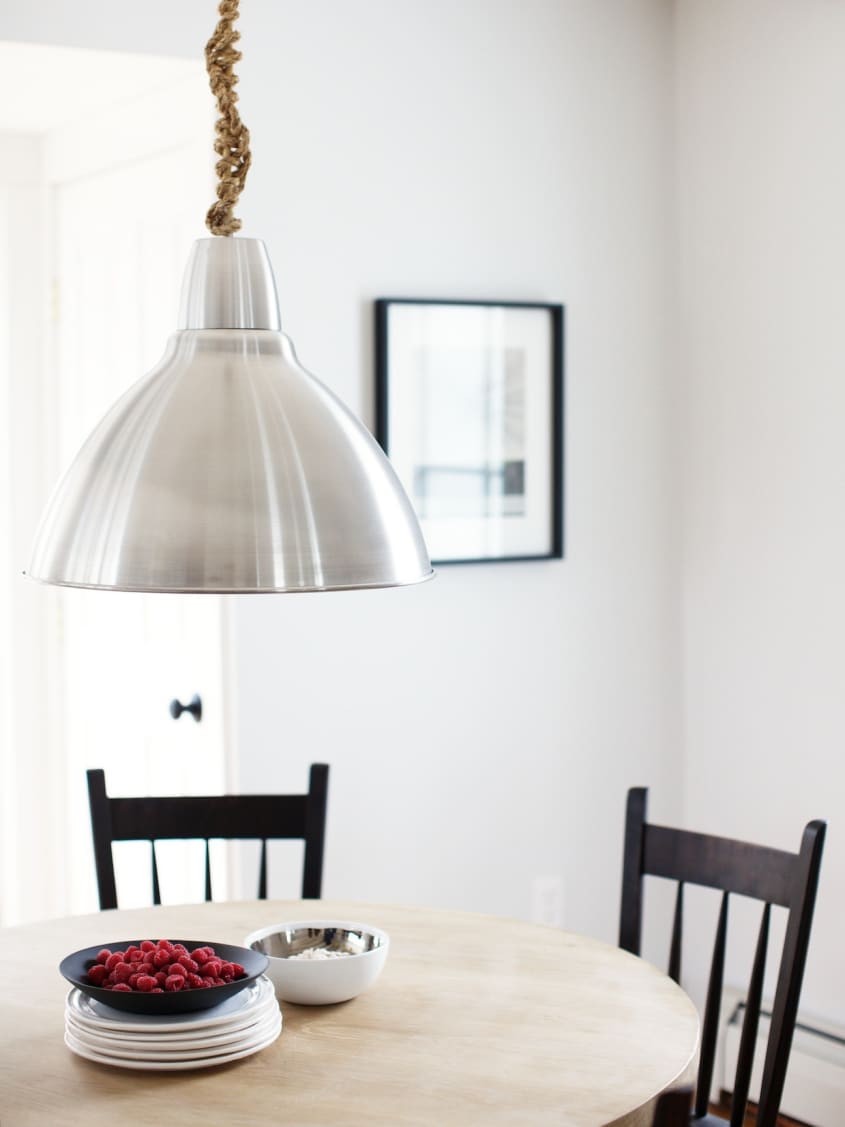
Proudest DIY: The knotted lamp cord on the dining room light.
Biggest Indulgence: The vintage wood bar. Kind of crazy for a rental!
Best Advice: Don’t sweat the small stuff. Easier said then done!
Dream Sources: Just about any flea market anywhere in the world and, when I can’t make it there, ABC Home is a pretty good second.
Resources of Note:
PAINT & COLORS
-
• Benjamin Moore for all interior walls and exterior siding
• Living room/dining room – Pearl River #871
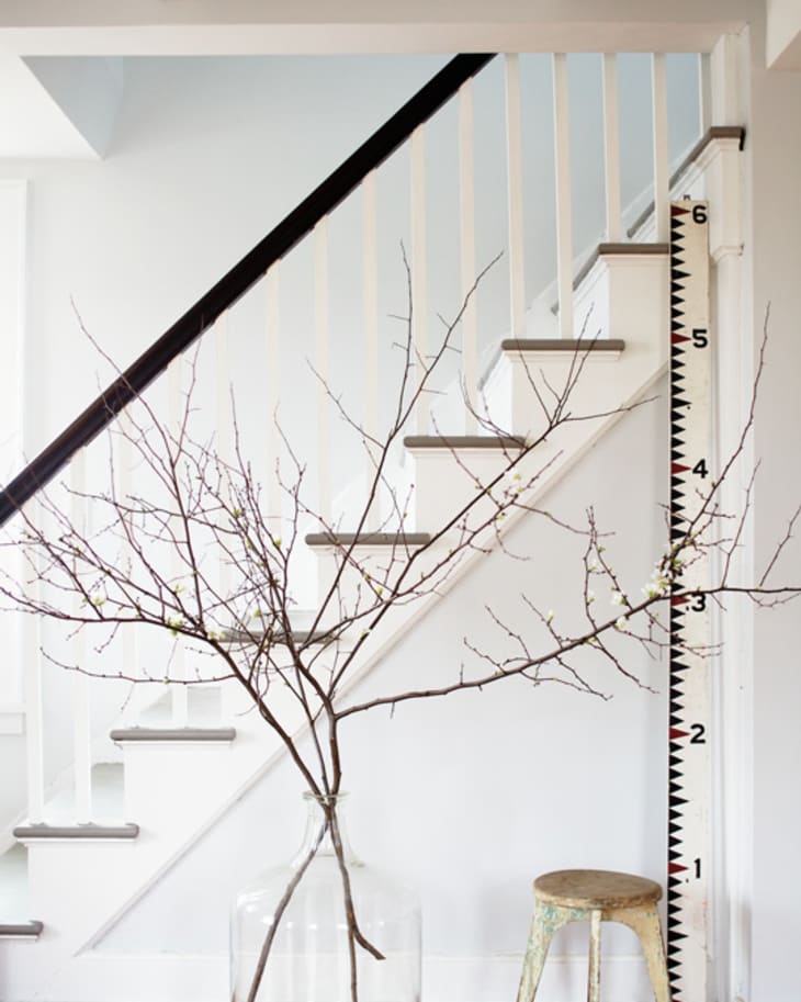
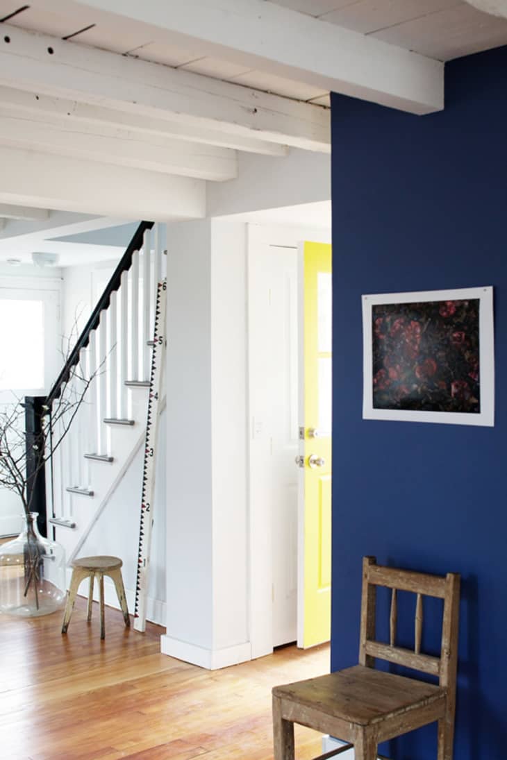
• Blue wall – Blue Heron #832
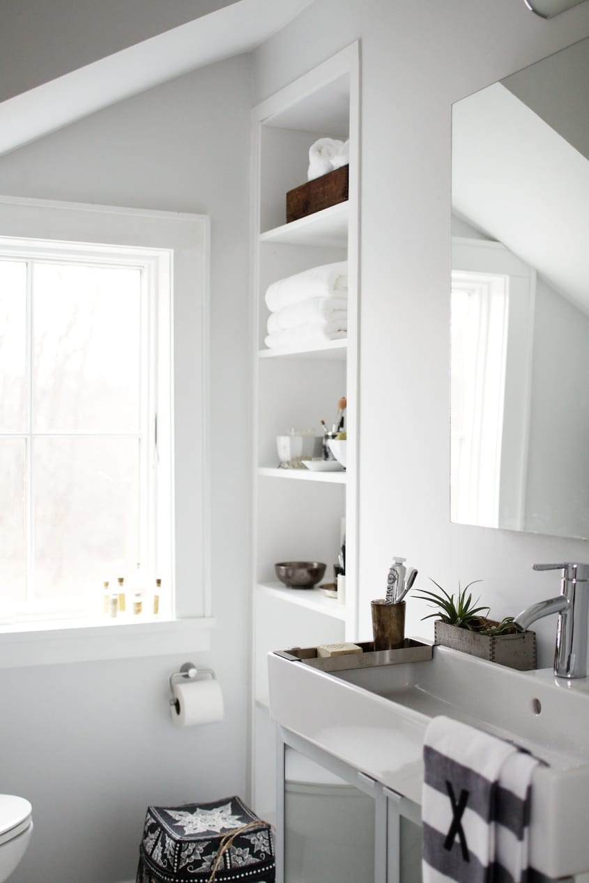
• Bathroom – Mountainscape #870
• Office – Atrium White
• Trim – Super White
• Exterior doors – Hudson Paint: One Hundred Parties #1062
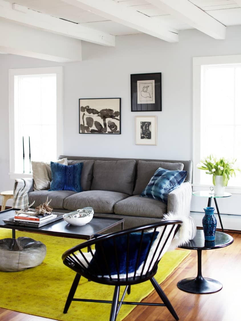
LIVING ROOM
-
• Couch: Hammertown Barn
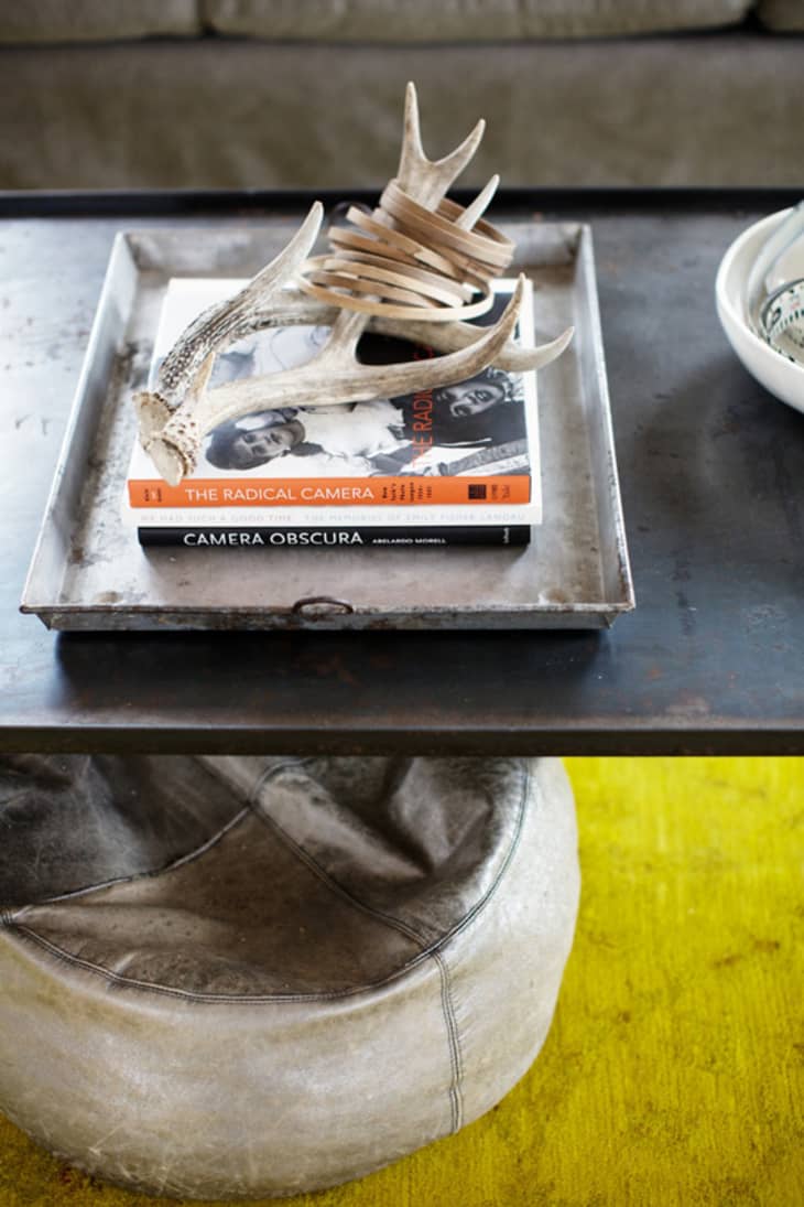
• Coffee table: Custom design
• Chair: West Elm
• Glass side table: Bungalow 5
• Rug: ABC Home
DINING ROOM
-
• Dining table: Ochre
• Dining chairs: Sawkille
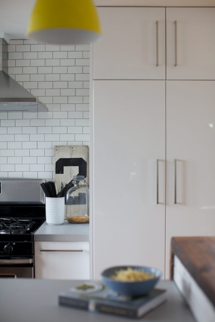
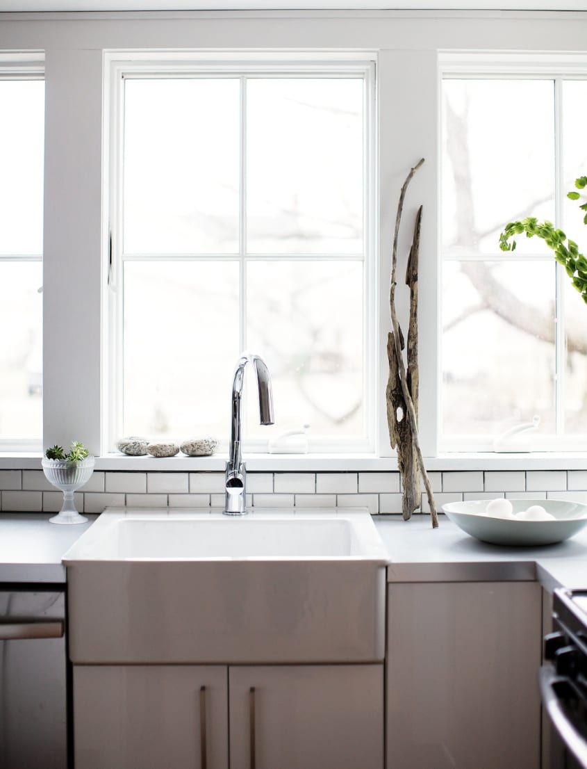
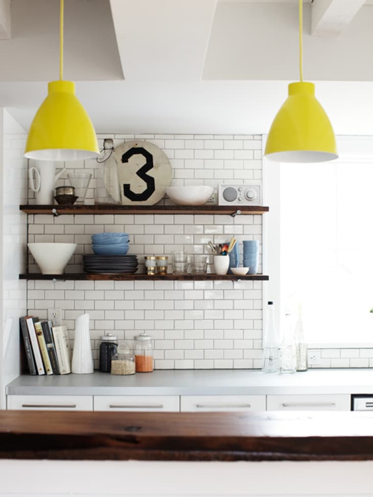
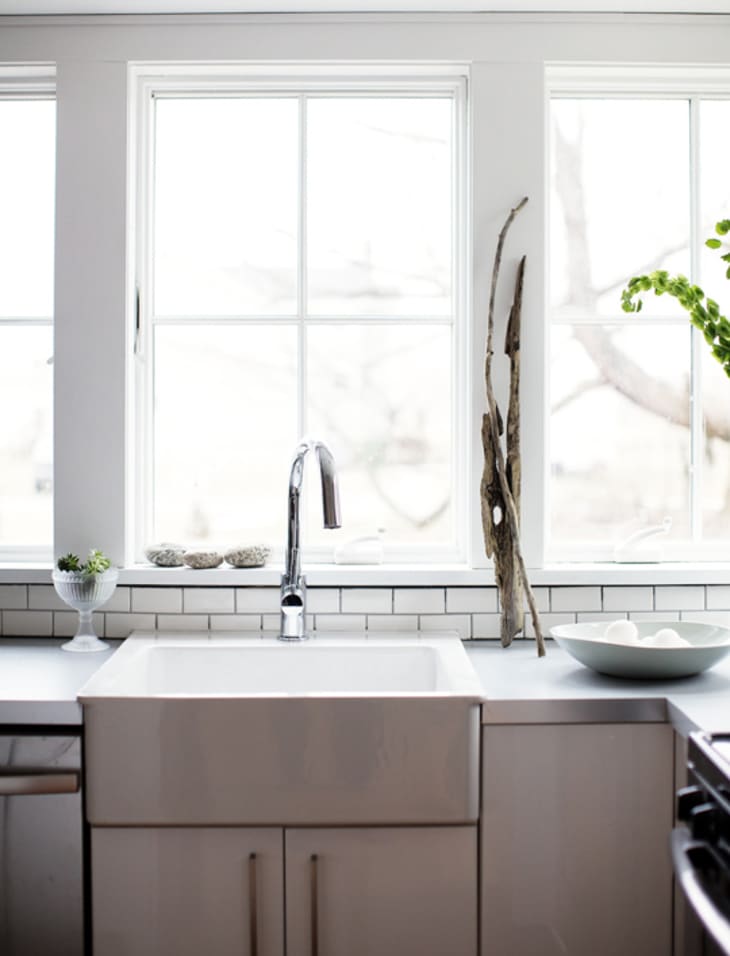
KITCHEN
-
• Appliances: Whirpool
• Hardward: Schlage
• Kitchen Faucet: Brizio
• Subway tile: Lowe’s
• Cabinets and counter: Ikea
BEDROOM
OFFICE
-
• Desktop: Ikea with vintage hairpin legs
• Stool: Canvas
• Rug: Dwell Studio
ARTWORK
-
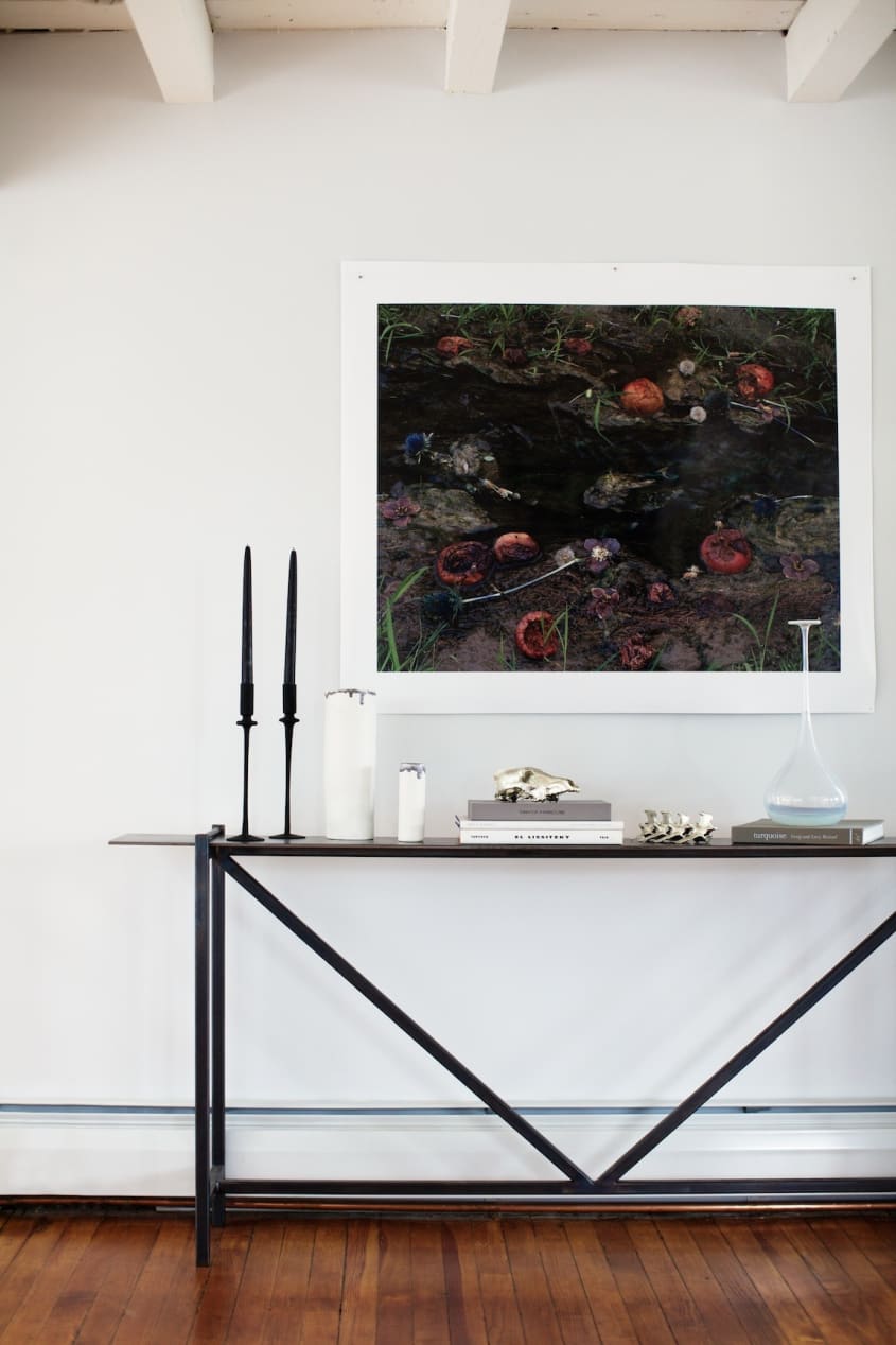
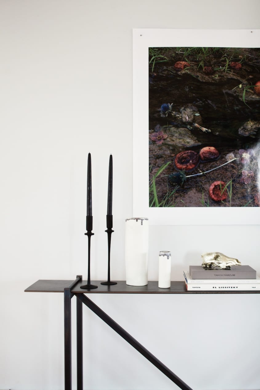
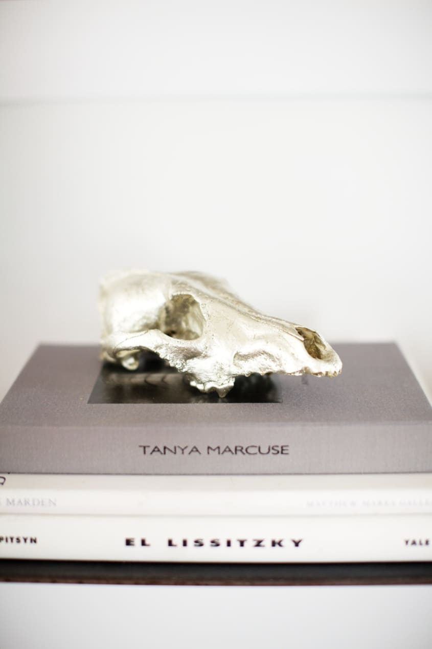
• Tanya Marcuse
• Ancil Chasteen
• Michele Varian
To see more pictures, including some of the before and afters paired together, click here.
Thanks, Raina and Robert!
(Images: Befores by Raina Kattleson; Afters by Emily Johnston Anderson)
• HOUSE TOUR ARCHIVE: Check out past house tours here.
• Interested in sharing your home with Apartment Therapy? Contact the editors through our House Tour Submission Form.
• Are you a designer/architect/decorator interested in sharing a residential project with Apartment Therapy readers? Contact the editors through our Professional Submission Form.