
Steph & Phil’s Reimagined Victorian
Name: Phil and Steph Dickinson
Location: NorthWest — Portland, Oregon
Size: 3,500 square feet
Years lived in: 3 — owned
Phil, Steph and their children Stan and Mary lived in this daring modern Victorian home that they designed themselves with imagination and style to spare. Their quirky British sensibilities and strong DIY ethic are visible in each and every room. This home is one of the most striking I’ve ever gotten to photograph, first for Portland Monthly magazine (you may recall this sneak peek) and now for a full tour here.

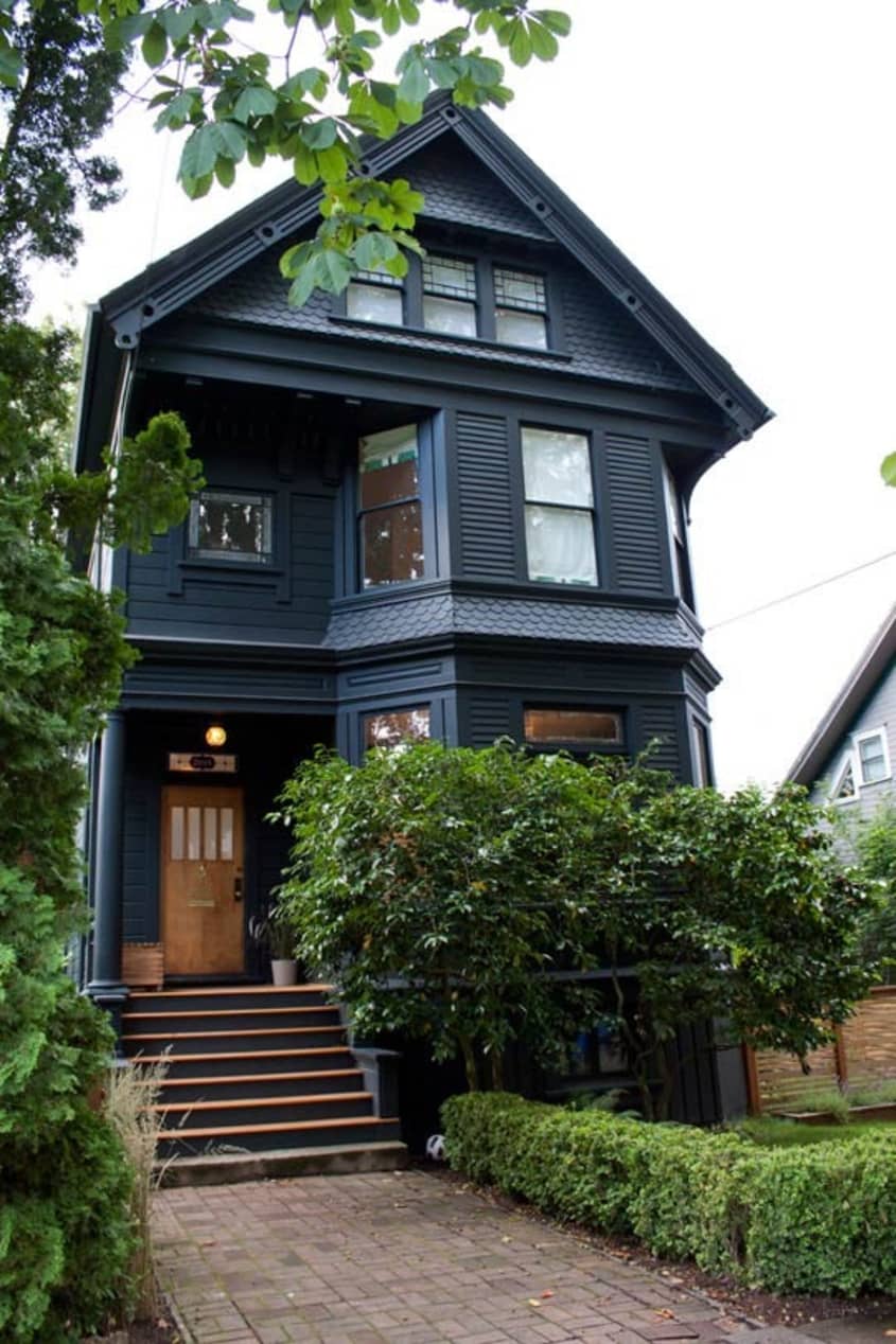


Steph and Phil are British transplants who found themselves for a three year period in Portland, Oregon. They wanted a quiet neighborhood near good schools for their elementary-school aged kids. The turn of the century Victorian home at the end of a quiet street in tree-lined NorthWest Portland suited them perfectly. Steph worked with local designers, VanillaWood and set about to transform the tired-looking house into a home. What transpired was a whirlwind reconstruction, accomplished in three phases. Now that they finally finished, they got the opportunity to move back to England (the house is sold if you are curious).
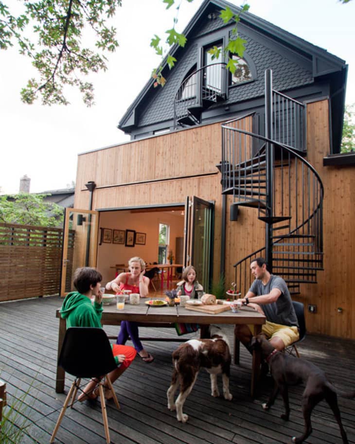
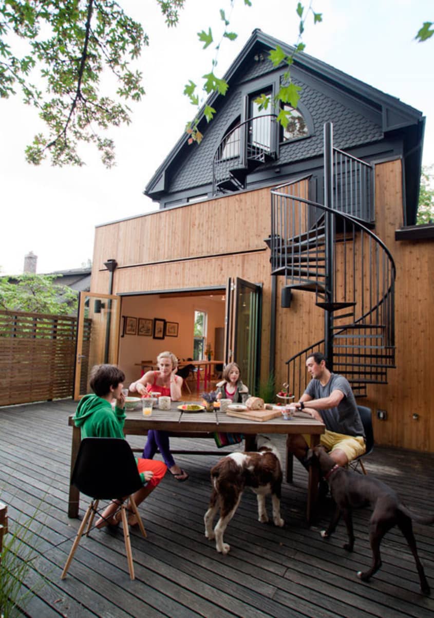
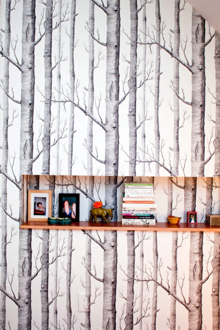
The light and opened floor plan of the dining room/kitchen are remarkable. The large doors and adjacent porch allow for a lot of indoors/outdoors living where the kids can play with the dogs or chickens. The downstairs bathroom is lined with the pages of an Ornotholgy book and a stuffed crow perches on the sink — such humorous touches and creative uses of materials lurk around every corner here. This place is interesting, edgy and modern while being cozy and family oriented; with comfortable, tough furniture and delicate flourishes co-existing in a unique harmony. Say what you will about this home, I believe it to be a lovely reflection of the families’ heart and soul. This place is alive with fun and style!
Apartment Therapy Survey:
Our Style:
Random Eclectic
Inspiration:
European modern Victorian conversions . . . Just because it’s old doesn’t mean you have to live in a museum . . . or obliterate the soul of your house.
Favorite Element:
The open-plan living space we have made the first/ground floor into. It works really well summer or winter and is so adaptable we could never get bored. I love the picture-frame cupboards that I currently have some 50s repro wallpaper in . . . You can change the whole mood of the room just by changing the paper to photos or kids art or whatever.
Biggest Challenge:
Finding decent and affordable modern light fittings — there is a lot of bad lighting design out there!
What Friends Say:
When are you leaving so we can move in?
Biggest Embarrassment:
When I realized what a s&#@ I sounded when I asked our contractors if they had ever been in a stately home. I was trying to explain how I wanted the ‘secret study’ door to work (like the kind of thing you see painted into walls in big estate houses). Phil fell about laughing and the contractors just looked at me like I was a brainless moron…. which is pretty much how I felt.
Proudest DIY:
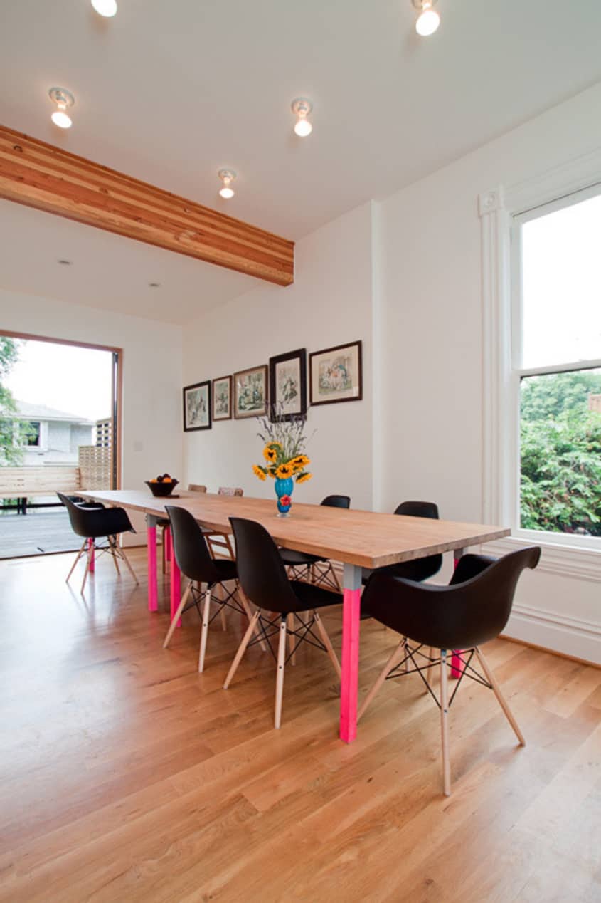
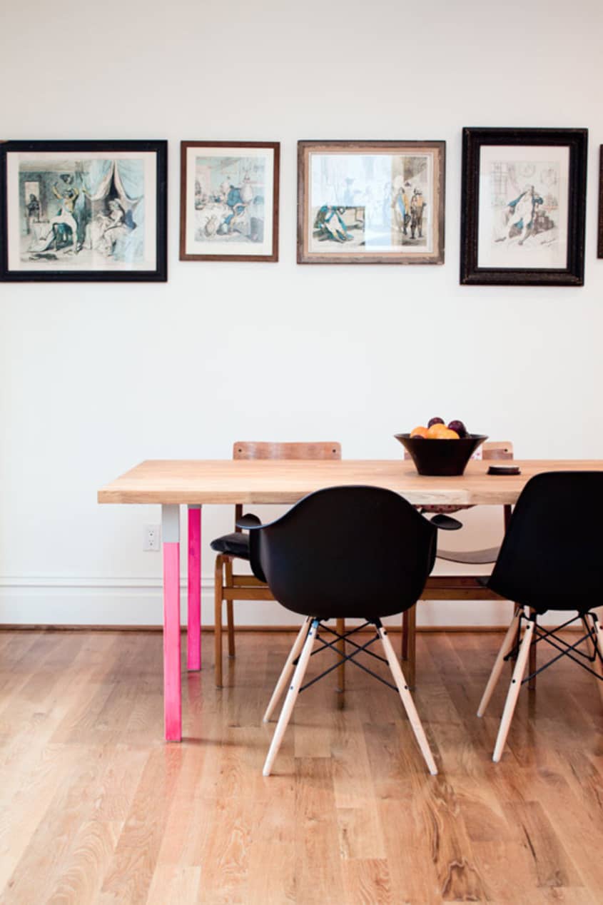
The bird book wallpaper in the bath room. I couldn’t believe it when I stumbled on the book in Powells — the illustrations are exquisite. Also, our Ikea composite dining table — we have been looking for years for a table we liked that was stylish, clean lined, family friendly, reasonably priced, big enough to accommodate our friends for dinner and also where our piles of home projects and kids artwork and homework can build up in piles and there still be room for me to sit down and work at my laptop whilst not feeling overwhelmed by junk. Phil built it in a couple of days, painted the desk legs flouro pink and each table only cost around $300 in total. Bargain.
Biggest Indulgence:
The fixtures and fittings. We would never skimp on those. Also, the fold back doors which were horrendously expensive (but worth every penny) and the custom made spirals — they were so unbelievably expensive but are a stunning feature.
Best Advice:
I collect images from mags for months before we start a project and build up mood boards for each area. I always have far too many ideas and am extremely indecisive and this process really helps me narrow them down. Use a limited color palette, at least initially — you can always add in more adventures touches later. Generally, I would say take your time — we always let our projects evolve over time from us and around the objects we like.
Dream Sources:
Le Couilles Du Chien, Goldborne Road. Skandium. Poltrano frau. Manufactum. The cities of Paris and Naples.

Resources of Note:
LIVING ROOM
-
• Mustard Yellow armchairs:
Anthropologie
• Taxidermy: Paxton Gate
• Pillows: Johnathan Adler
• Artwork: The Dickinson Family (mainly)
• Blankets: Pendleton
• Large skull artwork: Simon Perriton
• Convex Mirror: Mitchell Gold + Bob Williams
DINING ROOM
-
• Picture frame cupboards: Ikea
• Wallpaper in picture frame cupboards: Dandelion Clocks by Sanderson
• Dining room table: solid oak worktop and natural wood desk legs painted flouro: Ikea
• 18th century Prints by James Gilray and frames from The Horse Stables at Camden Market
• chairs: Eames
KITCHEN
BEDROOMS
-
• wall stickers in Stan’s room:
Domestic.fr.
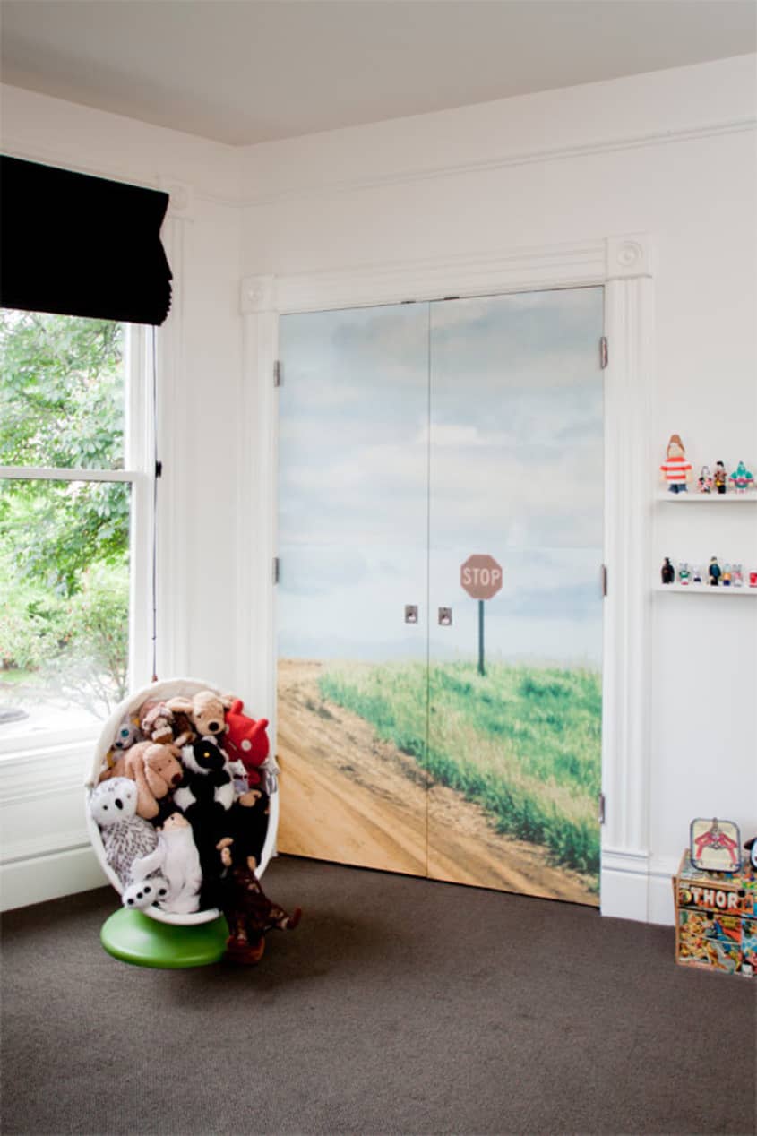
• wall poster on closet door – Urban Outfitters
• Mary’s blind material: Ikea.
• wall stickers in Mary’s room: Domestic.fr
• Mary’s bed: Ikea
• Mary’s rug: Habitat, UK
MASTER BEDROOM
-
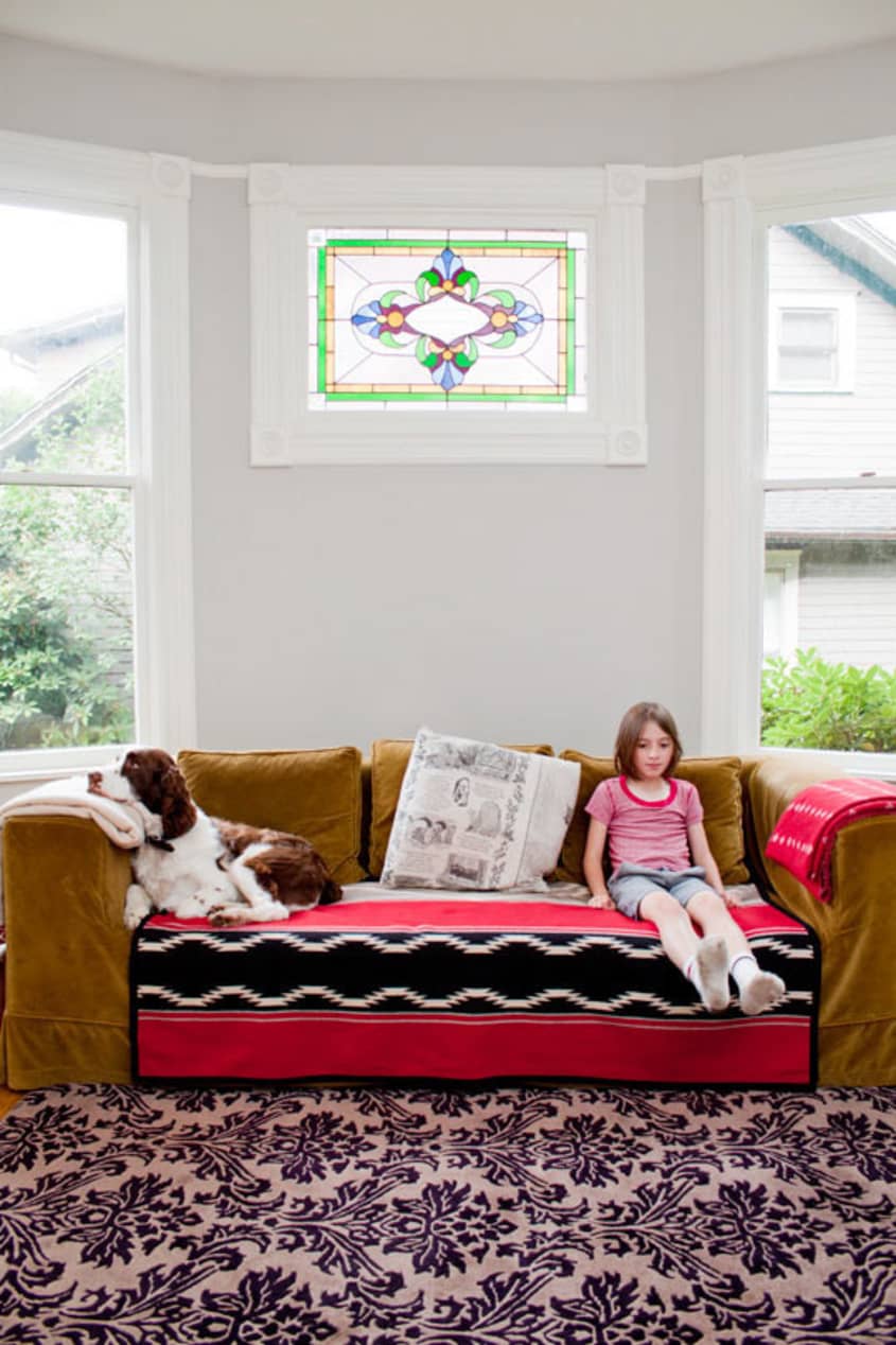
• olive green sofa:
Crate and Barrel
• bedding: Anthropologie
• wallpaper: Cole and Son
• tiger rug: Manor, Portland
• Hessian sack pouffe: Manor, Portland
• Green Moroccan slippers: Goldborne Road, London
• bedside lights: The Conran Shop
• painting and print: Gillian Carnegie
• ‘Love’ sign: V&A museum
BATHROOM
-
• chandelier: Urban Outfitters
• wallpaper: Cowparsley by Cole and Son
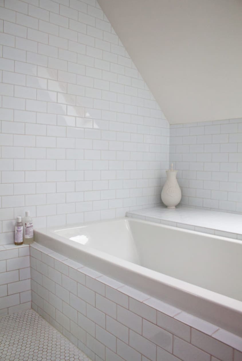
• flooring: Mr Plywood, Portland
• Shower units and bath faucets (throughout): Hansgrohe
Thanks, Steph and Phil!
Images: Leela Cyd Ross
Originally published 1.16.12 – JL
• HOUSE TOUR ARCHIVE Check out past house tours here
• Interested in sharing your home with Apartment Therapy? Contact the editors through our House Tour Submission Form.
• Are you a designer/architect/decorator interested in sharing a residential project with Apartment Therapy readers? Contact the editors through our Professional Submission Form.