
What Colors Go With Beige? Try These 17 Design Ideas
Beige may get a bad rap for seeming snoozy (though we’re here to argue that beige is making a comeback), but there’s more than meets the eye with this underrated hue. This do-it-all neutral color has the power to complement a wide array of colors, which makes it a perfect choice for walls or furniture. But what are the colors that go with beige? Turns out, the combinations are just about limitless.
Read on for a few of our favorite ways to decorate with this somewhat polarizing color and consider it proof that beige, in fact, isn’t boring.

Tips for Decorating With Beige
“Beige can be both fresh and earthy, depending on the depth of color and how it’s mixed into a color scheme or decorating palette,” according to Maria Killam, color expert and founder of The Killam Colour System. “Right now, beige is the perfect neutral to warm up all the gray, black, and white spaces we’ve been creating for a decade or two.”
Killam is a decorator, stylist, and “educator on all things color” — here are some tips for decorating with beige from a bonafide expert:
- It’s all about the undertones: “If you are dealing with beige walls, tile, countertops, carpet, or furniture, the most important thing to know is how to identify the specific undertone of beige you’re working with so you don’t introduce clashing neutrals,” says Killam, who says all beige will look “sort of gold/brown at first glance.”
- Incorporate layers: “The next important step is to layer in a pretty accent color pulled from decor already in the room: a patterned area rug or piece of art, for example,” she says.
- ‘A neutral is never just a neutral:’ “Beige can be beautiful and versatile, but remember that a neutral is never just a neutral,” warns Killam. “Neutrals are characterized by subtle variation, and you need to know how to coordinate them so that they look right and harmonious in your room.”
Check out Maria’s blog, Colour Me Happy, for more color pairing advice.
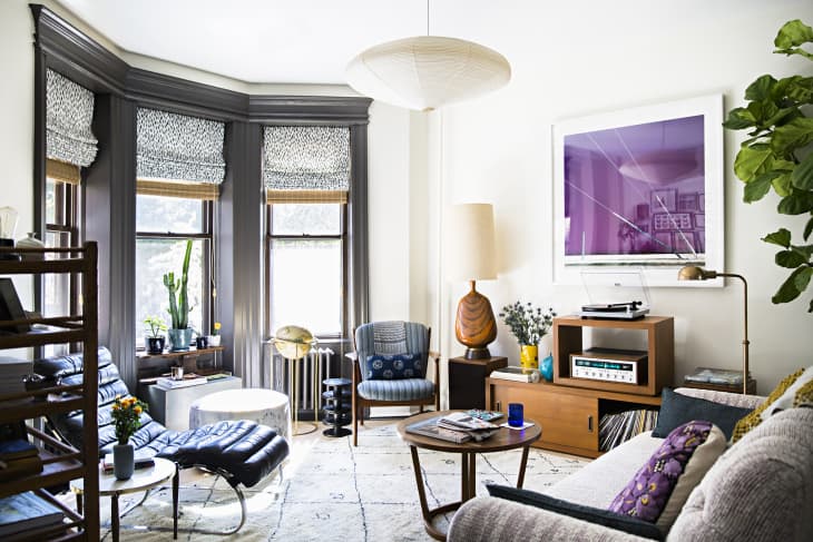
1. Beige + Gray
Soft neutrals, like pale gray and light beige, create a wonderfully serene environment when paired together. Just take the living room in this calming Brooklyn apartment, for example.
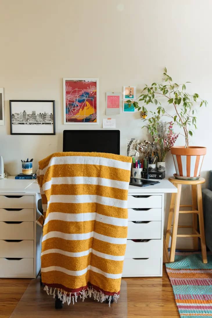
2. Beige + Yellow
Worried about beige walls being boring? A bold yellow accessory, like the white- and mustard-striped throw blanket in this California apartment, is an easy (and cozy) way to add a sunny pop of color.
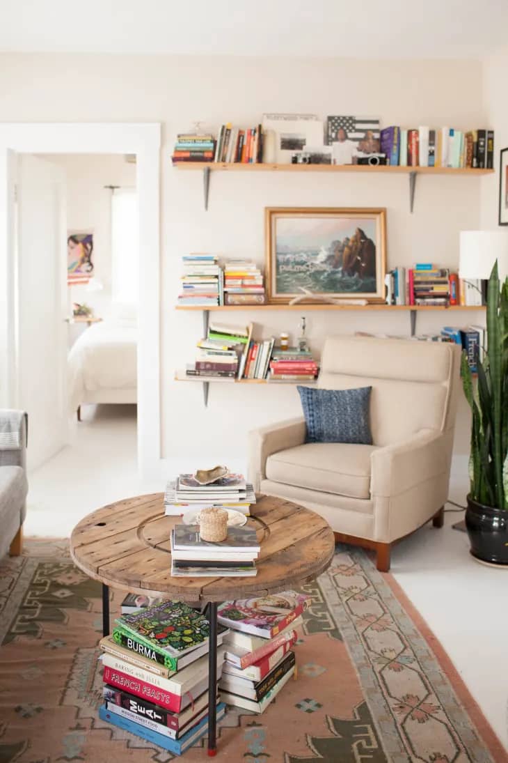
3. Beige + Beige
A monochrome beige moment, when done correctly, can be surprisingly stylish. This Scandi-inspired Oakland apartment features a beige armchair and beige walls, but colorful bookshelves make it anything but boring.
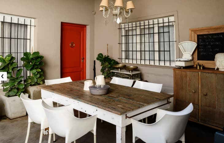
4. Beige + Red
Take a cue from the owners of this cozy Buenos Aires home: Make a bold statement in a beige-walled room with a burst of bright red.
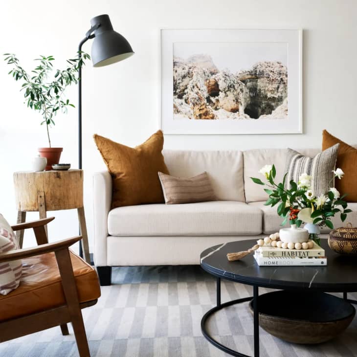
5. Beige + Rust
A warm neutral like beige, when paired with another warm shade (like rust or burnt orange), is the epitome of coziness. Need proof? Take a look at the welcoming set-up in this Toronto rental.
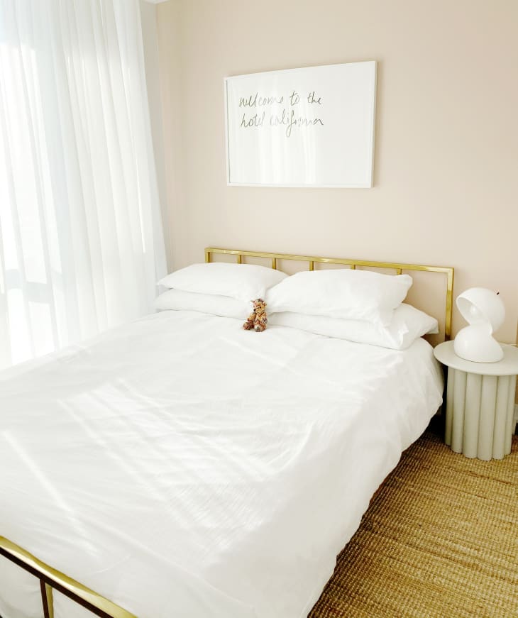
6. Beige + Gold
Gold accents are a great way to make your decor pop against a beige background, like the headboard in this peaceful bedroom in Quebec.
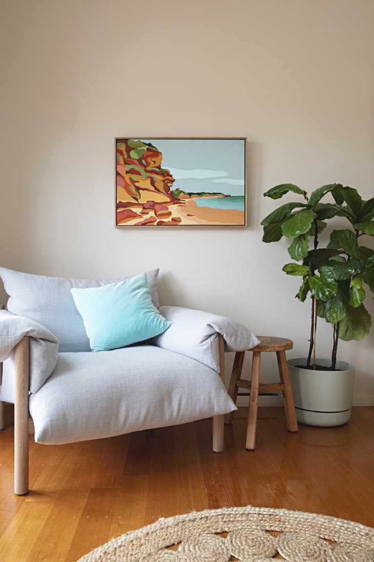
7. Beige + Teal
Playful teal adds a dose of fun to the otherwise neutral vibe of this beige sitting area, and it’s reflected in both the pillow and the art on the wall. If you’re looking for colors that go with beige for a youthful space, like a teen’s room, teal is a great option to consider.
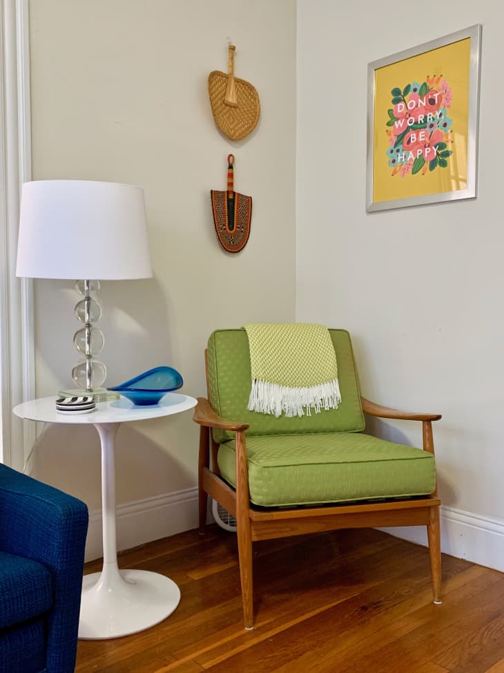
8. Beige + Lime Green
We love how a funky lime green chair adds a playful vibe to this beige room in a Massachusetts condo. Some shades of green can be grouped into the neutral family, but we think lime green certainly counts as one of the colors that go with beige.
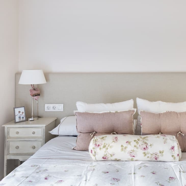
9. Beige + Dusty Pink
Dusty rose pillows and a dainty floral pattern pair well in this Barcelona bedroom. Let this room be proof that beige and pink can hang together and become fast friends in an interior, especially if you want a room to have a soft, subtle feel.

10. Beige + Forest Green
Given the fact that green and beige can both be found in nature, they often make for a foolproof combo and quite an inspired palette. In this compact powder room, the beige framed mirror and cabinet doors offset the deep green walls, preventing the small space from feeling too dark or overbearing.
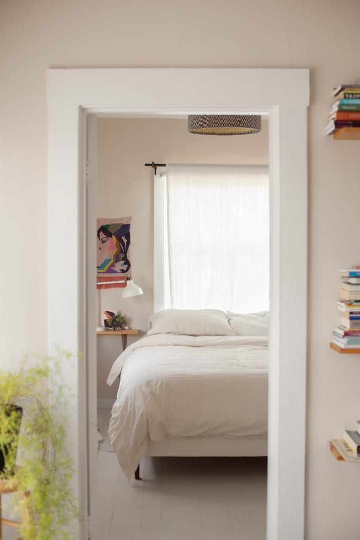
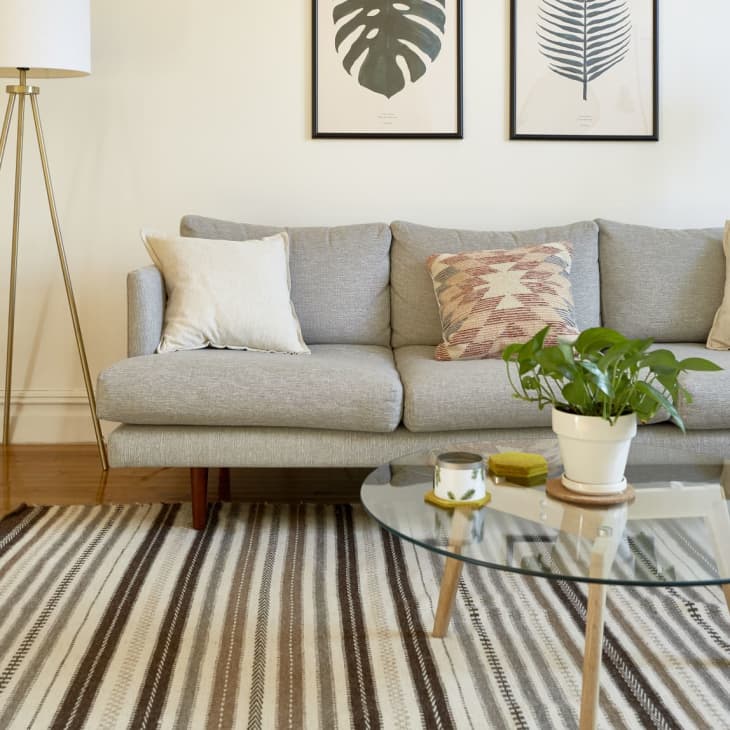
11. Beige + White
Consider beige and white a super neutral but still dynamic duo. Take a cue from this Cali home and offset beige walls with high-gloss white molding. That little bit of contrast in tone and finish will allow your wall color to truly shine. You can keep the overall look of the room mostly monochrome, which is perfect for a quiet sleep space.
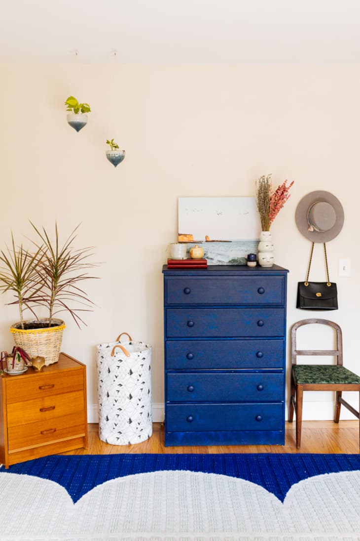
12. Beige + Blue
Feeling bold? Bring in a captivating hue, like this striking cobalt dresser, and couple it with a patterned rug in a matching tone. These two decorative moves will be more than enough to add a bright splash of personality to a room, regardless of how simple and understated the rest of your decor may be.
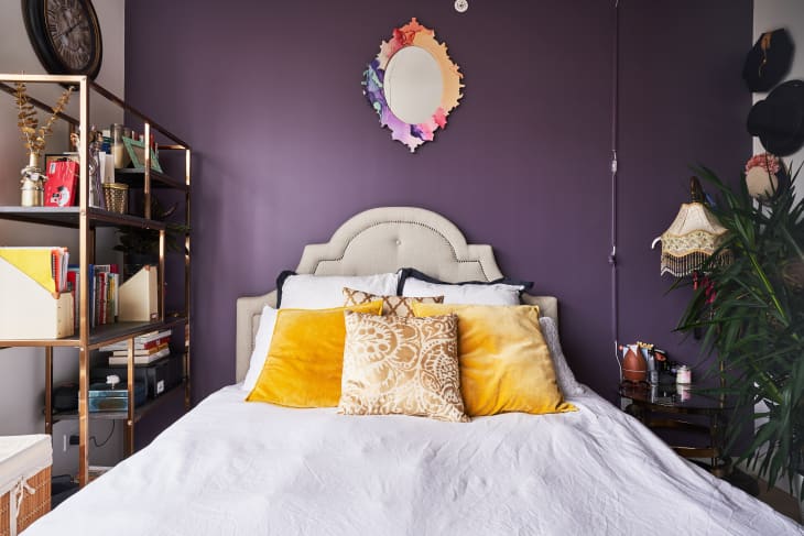
13. Beige + Purple
Yes, purple is one of the colors that go with beige! A daring shade of purple sets the backdrop for the softer decorative elements of this regal bedroom. The beige headboard, in particular, stands out as the undeniable focal point of the room, especially when paired with bright yellow velvet pillows.
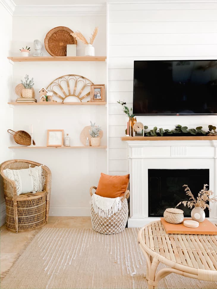
14. Beige + Orange
Less is more with this warm, welcoming shade pairing, and its overall effect is anything but subtle. If you’re working with a room that’s otherwise heavy on the neutrals, an accent piece or two — think throw pillows, a coffee table tray, or a vase — in a vibrant, earthy shade has the power to completely spice up the rest of the room.
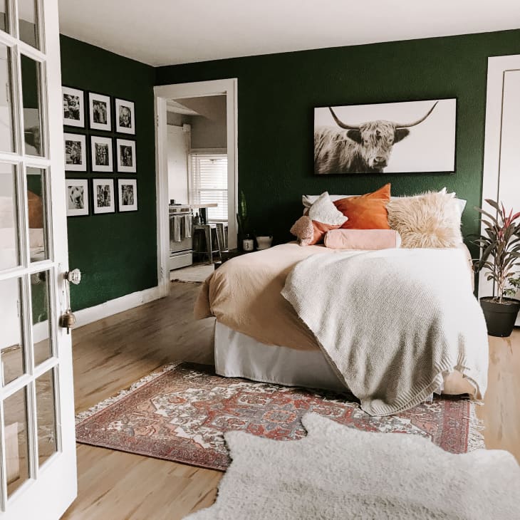
15. Beige + Green + Blush
A beige duvet, coupled with orange and blush decorative textiles, inspires a muted, dreamy color scheme for this bed, while bold green walls offer a high-contrast backdrop. Sepia tone artwork plays well with the beiges strewn about the space.
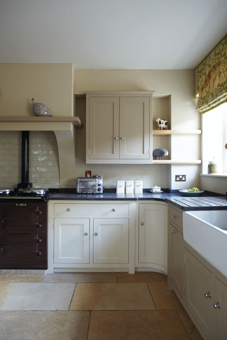
16. Beige + Black + White
Modern meets natural in this neutral kitchen, where milky, muted shades take center stage. Bold black counters flip the script on a traditional kitchen, while the white and beige combo of cabinets shake up the typical all white scheme without going too far astray.
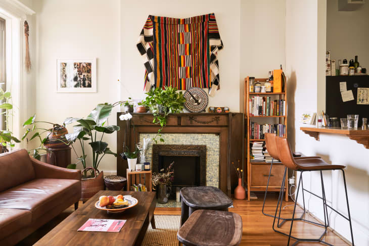
17. Beige + Brown
Consider this room proof that there is no such thing as too much brown. The space builds on its light beige walls with a mix of various browns. The wood trimmed fireplace, tan leather sofa, leather barstools, and wooden benches all play well together decoratively, while the pops of green from the houseplants introduce another hue, albeit complementary, to the scheme. You don’t have to worry about matching wood tones or browns perfectly, especially if beige is your backdrop. This shade literally goes with almost everything.