
Emily Schuman’s Modern Rustic Home
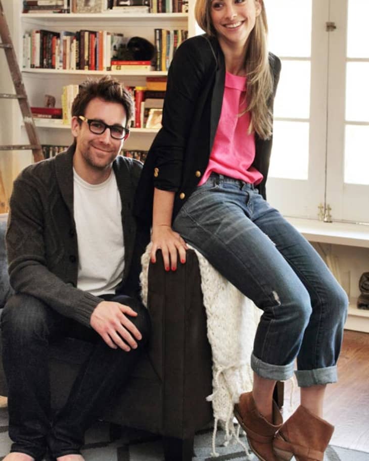
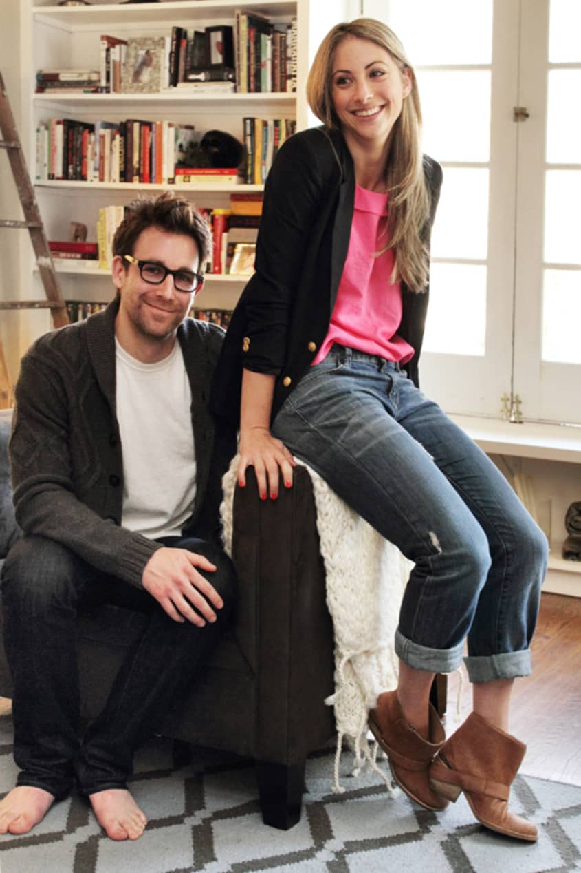
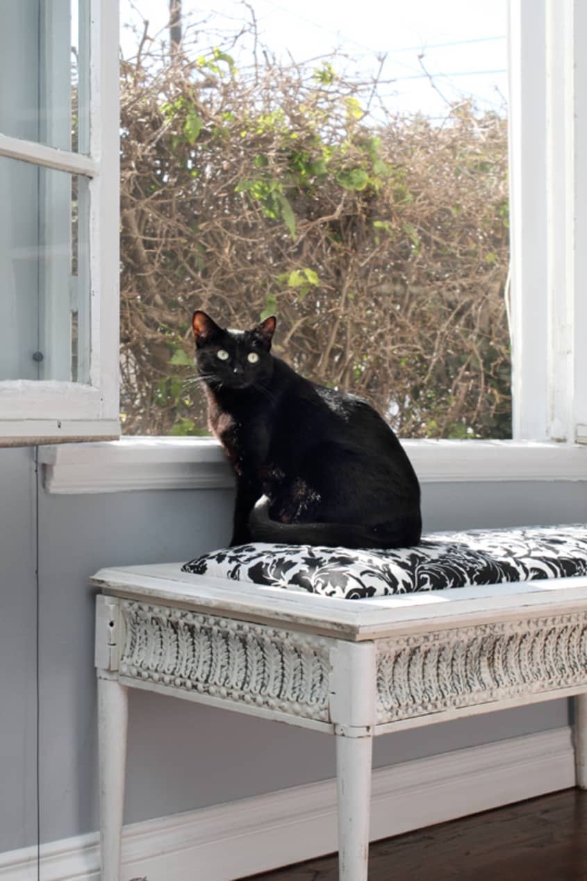
Name: Emily Schuman, Geoffrey Fuller and their kitty Luna
Location: Carthay Square — Los Angeles, California
Size: 1,800 square feet (3 Bedrooms + 2 Bathroms)
Years lived in: 4 months — rent
Emily and her fiance Geoffrey, just recently moved into their new home in Carthay Square. Known for her popular fashion and lifestyle blog Cupcakes and Cashmere, Emily’s home is just what you’d expect — it’s warm, rich with color and ultra stylish. Only a place that houses such a feminine and yet modern office, could attribute such great inspiration to the blogosphere!


Emily began her career at Condè Nast, working for both Teen Vogue and Domino magazines (in sales). More recently in the past couple of years she designed a bag in collaboration with Coach, and styled and modeled for Forever 21. Last year she won “Best Fashion Blog” in 2010’s Bloggies and has been nominated again this year. With a blog that gets more than 6.3 million page views a month, she keeps a full time schedule bringing us click after click of lovely ideas in the world of fashion, food and lifestyle.
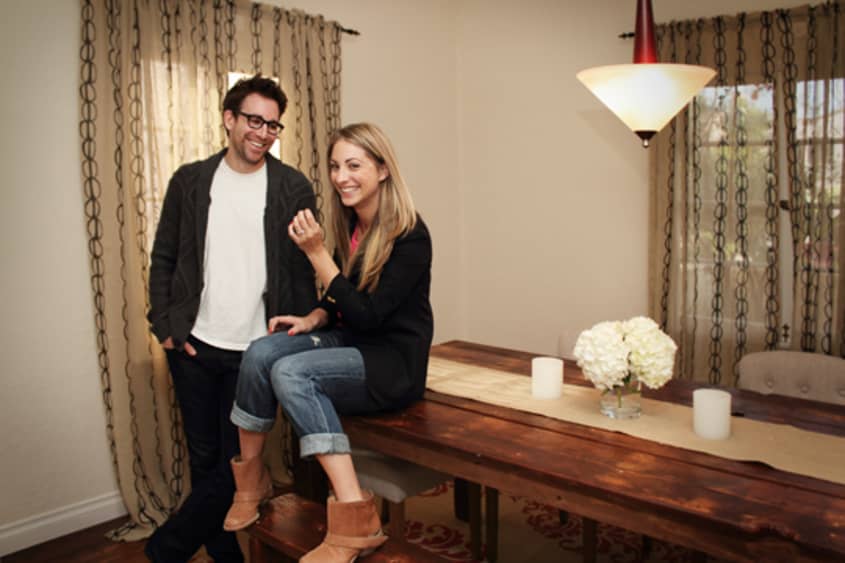
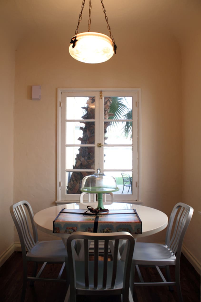
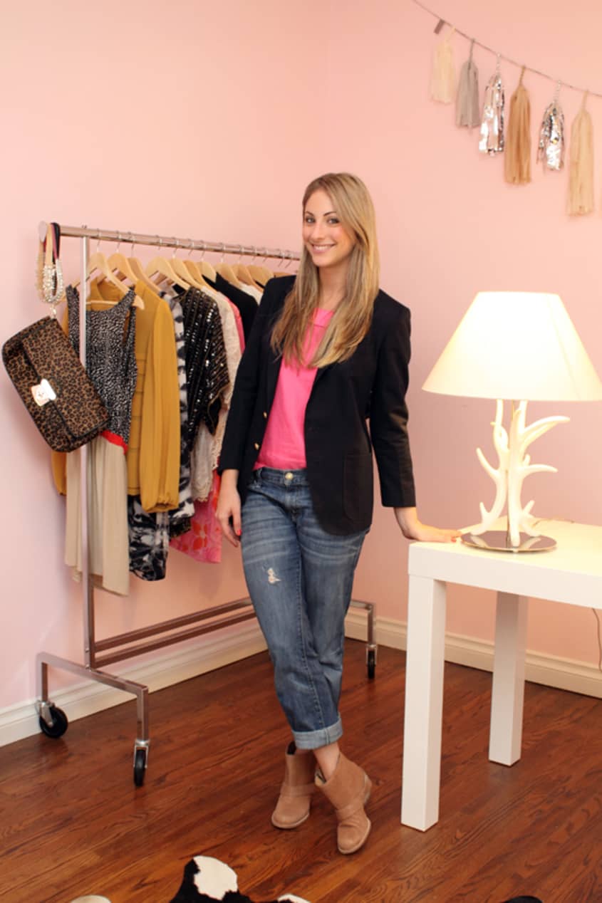
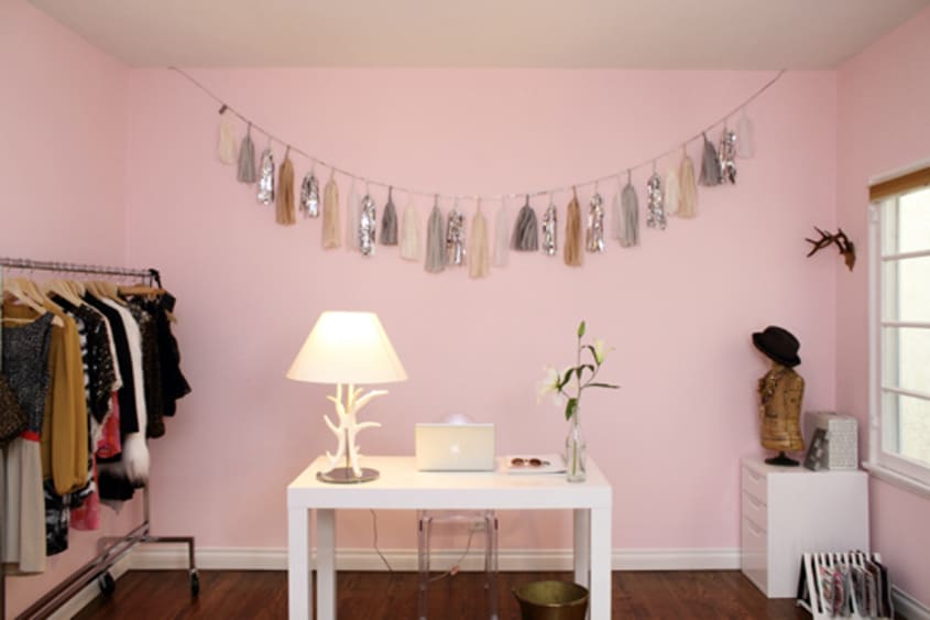
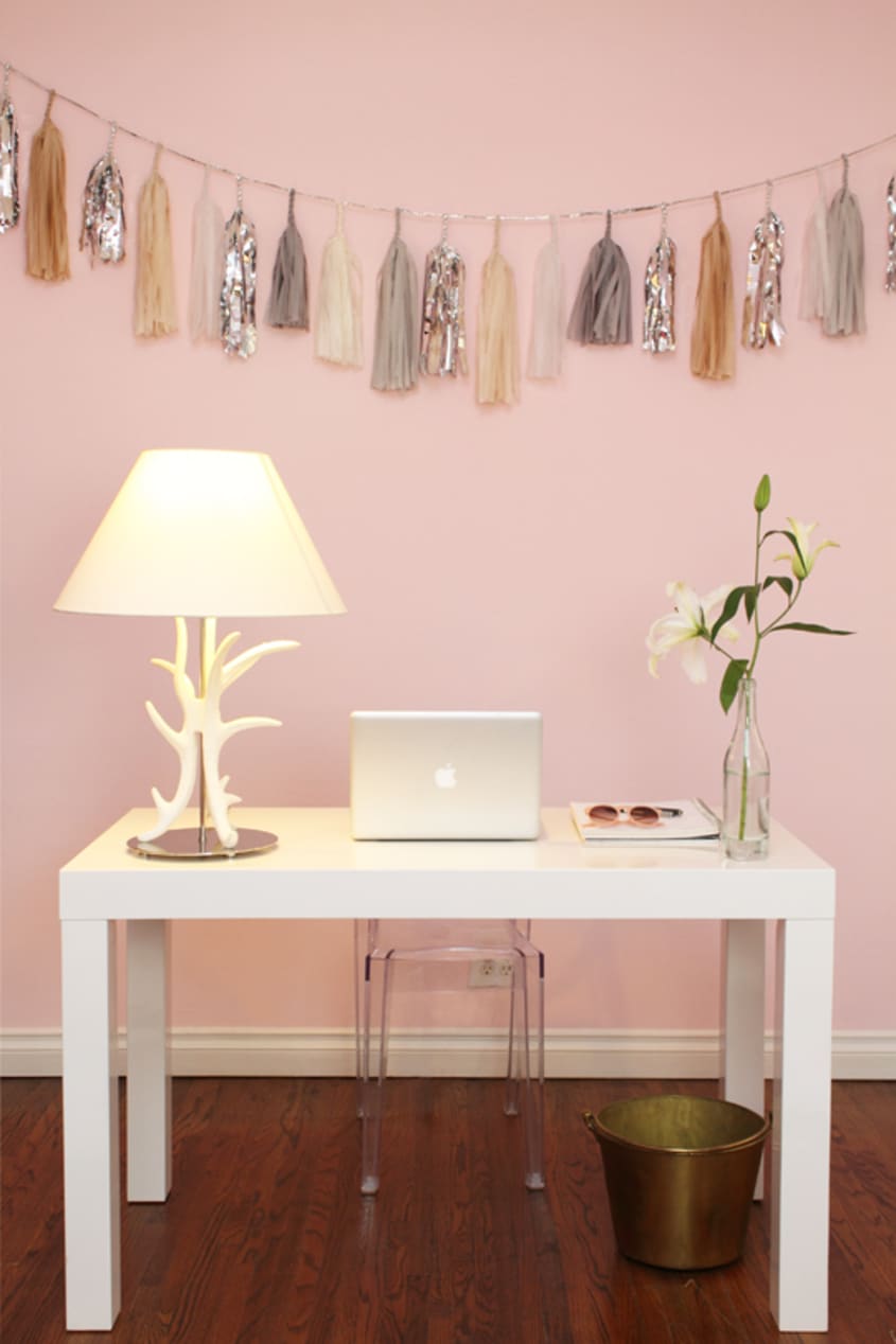
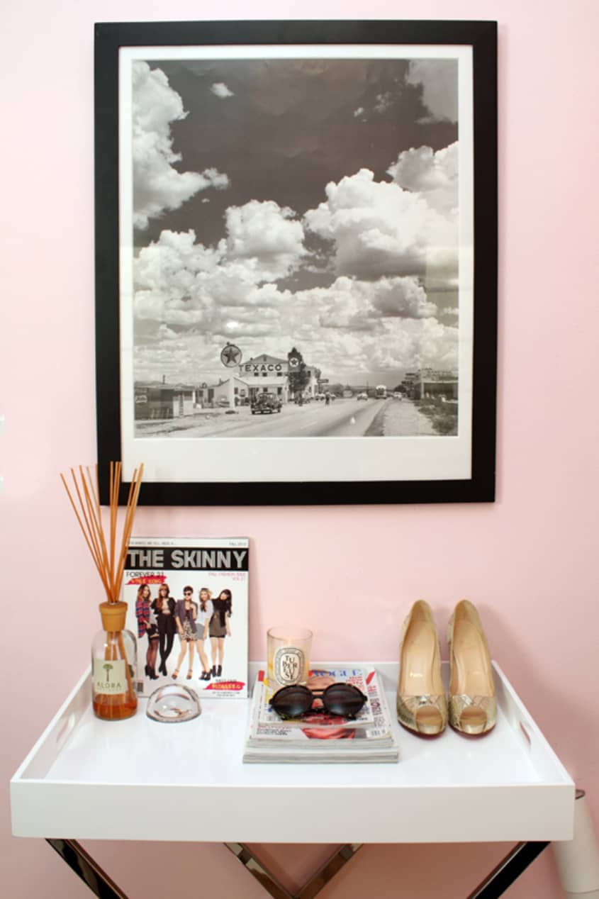
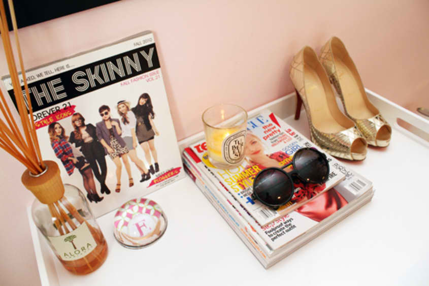
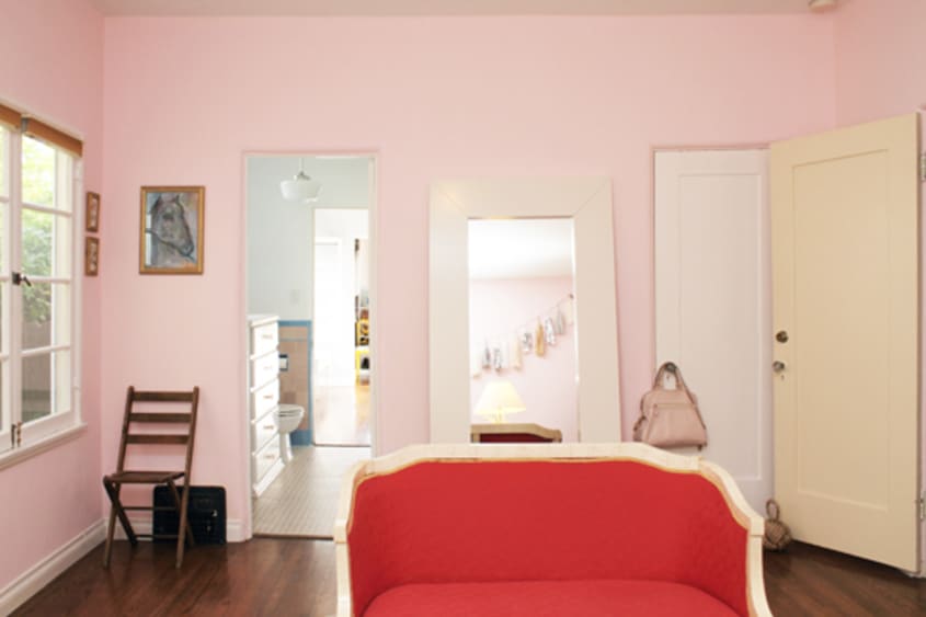
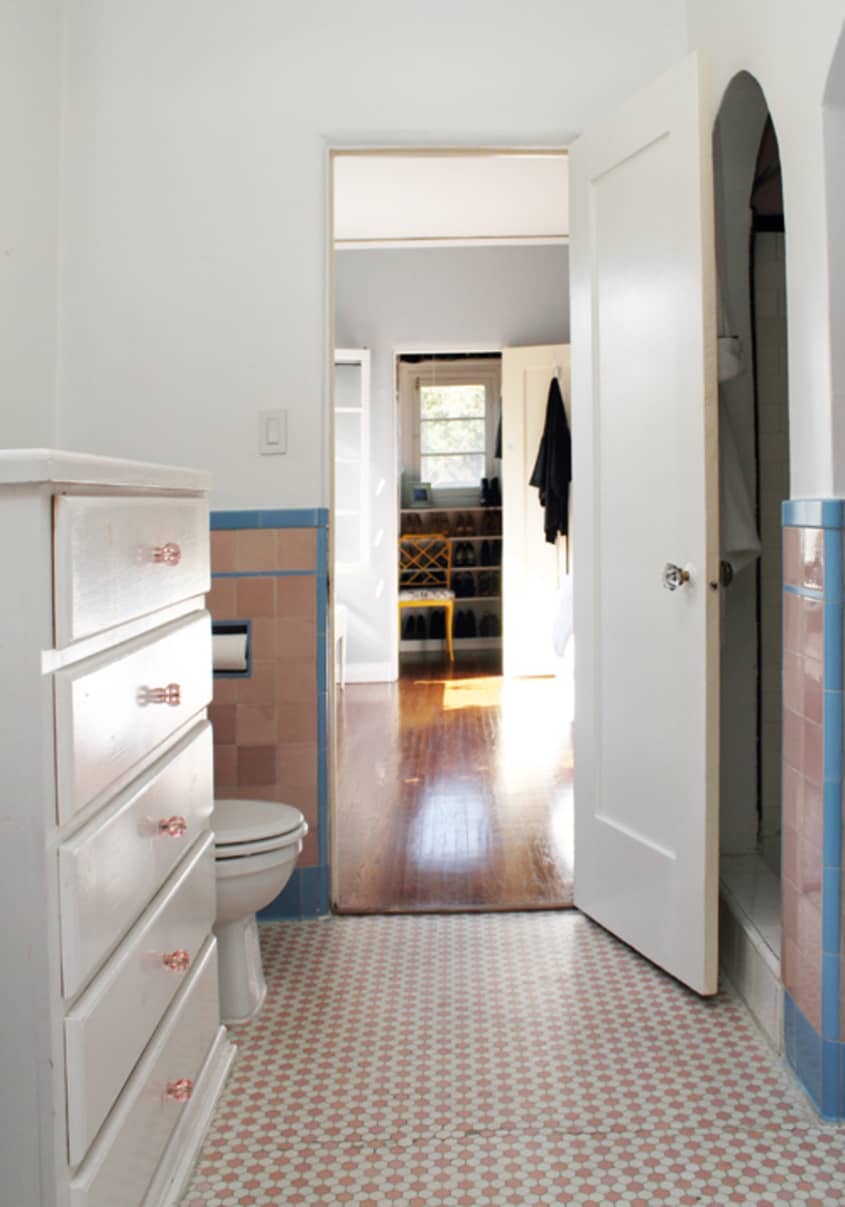
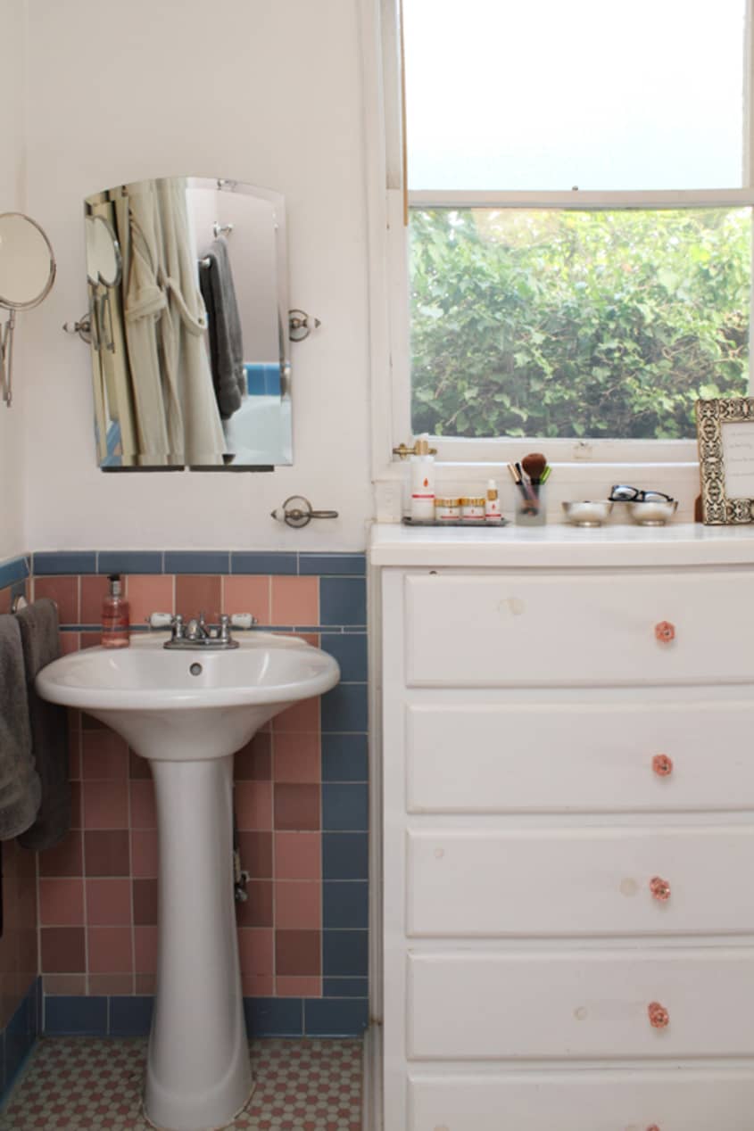
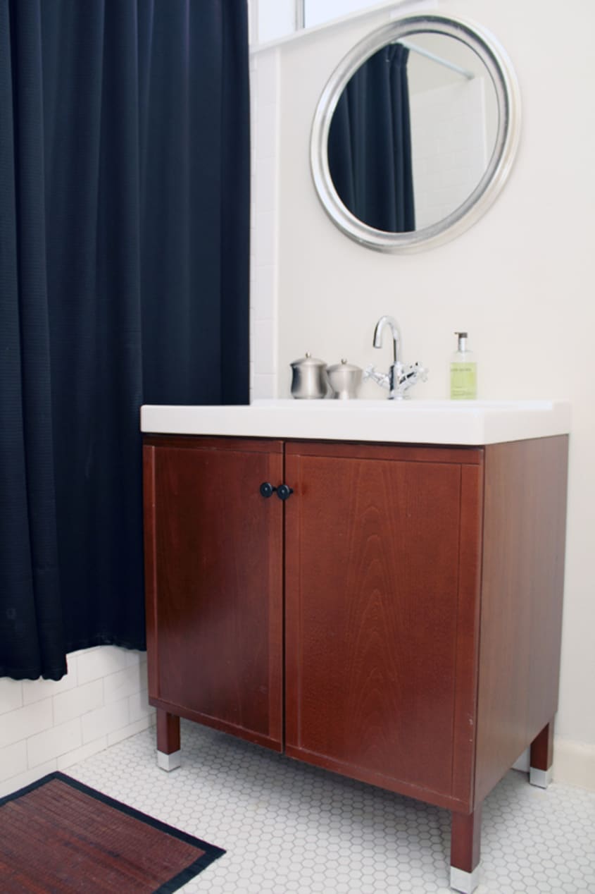
Geoffrey and Emily only moved into their new home four months ago — just in time to get engaged this past December. Their spacious apartment offers ample room for dinner parties, cocktail soirees and Emily’s custom office. The office is decorated in sleek white lacquer, accented in gold, with “unapolgetically pink” walls and a gifted pair of Art Deco-inspired Louboutins. Their living room is stacked high with books and an abundance of art and collectibles. Also I found it quite charming that they have both a formal dining room and a breakfast nook. They note one of the challenges they faced was trying to decorate both masculine and feminine — which I believe they achieved very nicely. With one the guest room and bathroom still undergoing renovation, their new home is a place where friends and family to come stay a while.
On a quick side note, while photographing the fashionista in her office, she told me she wore pink for the photoshoot — “because it’s for Valentines Day”. So cute! Enjoy!
Apartment Therapy Survey:
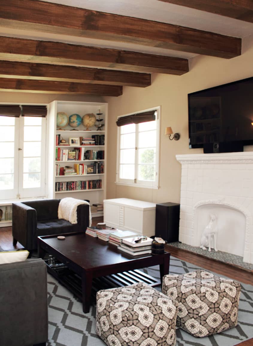
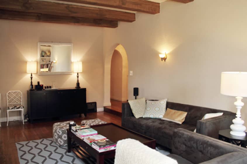
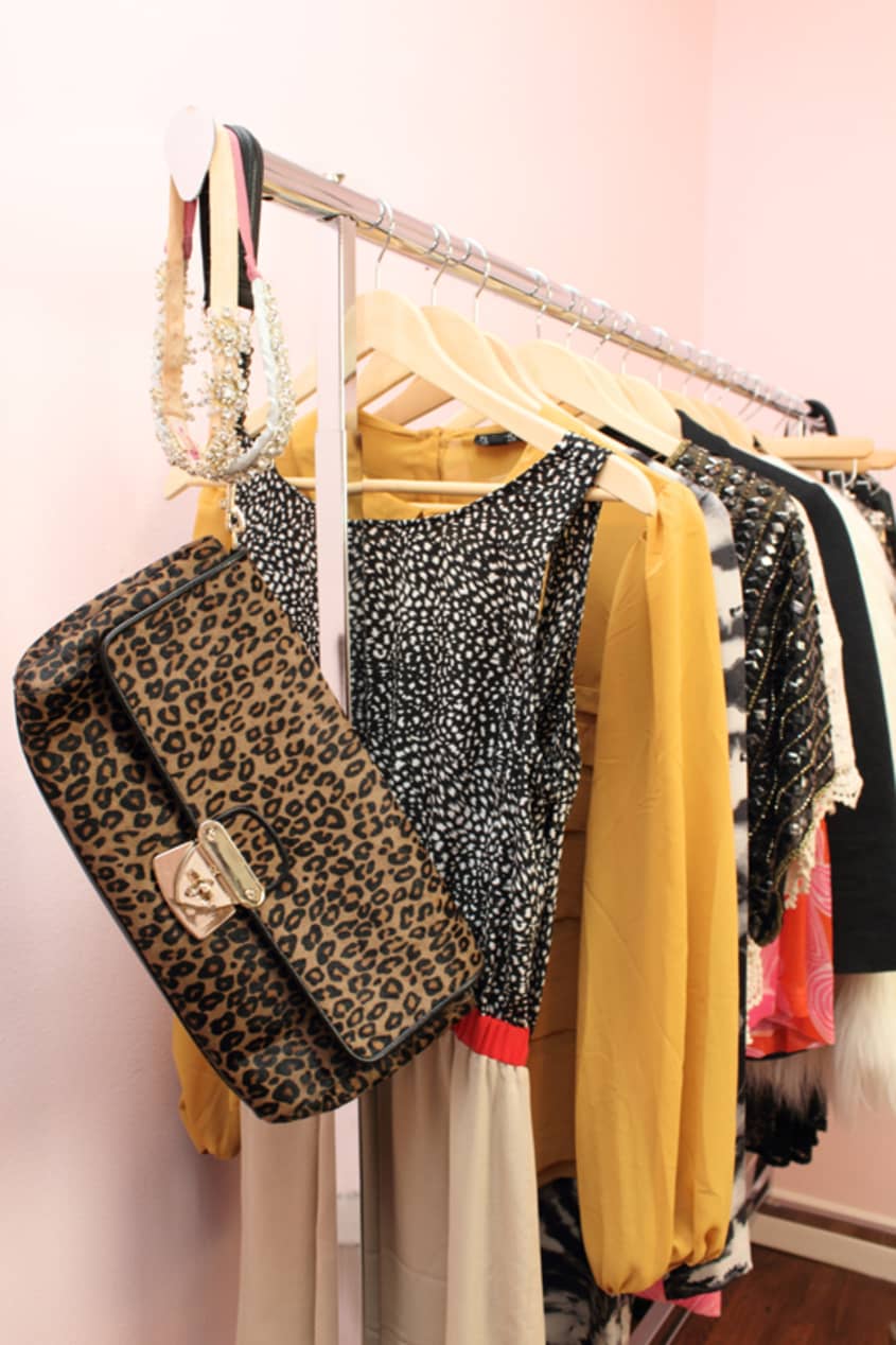
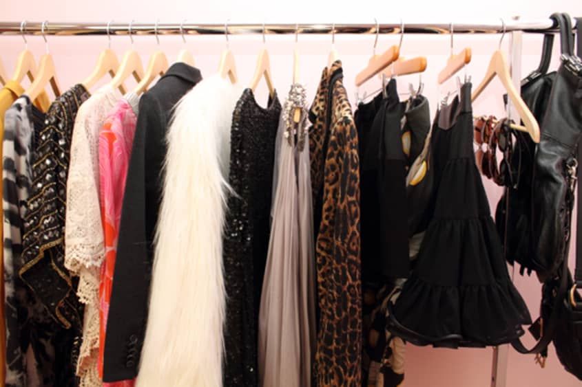
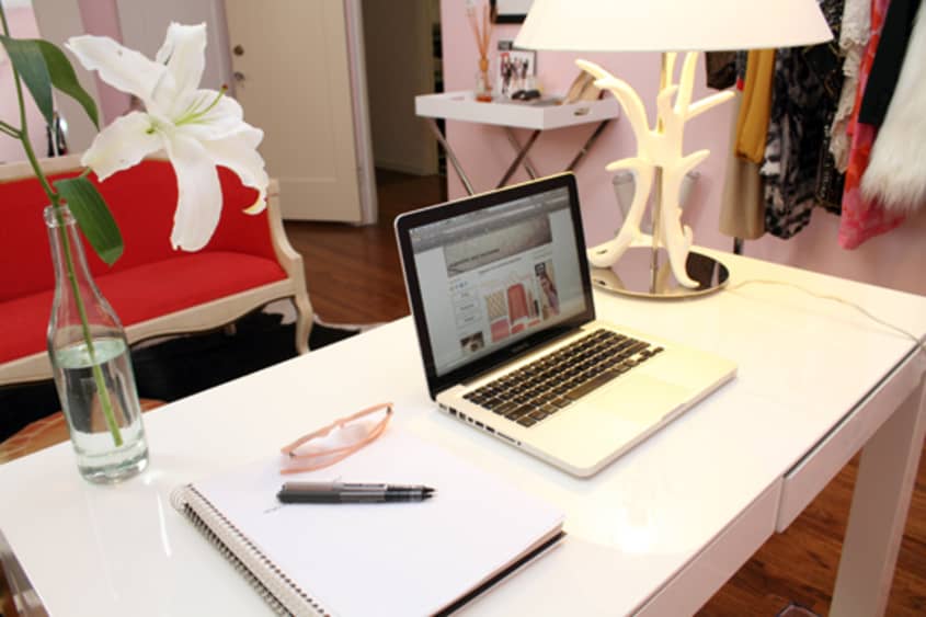
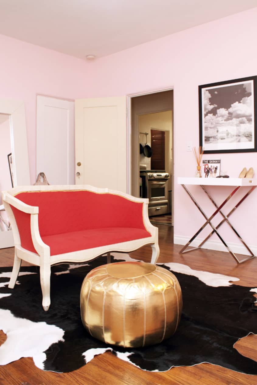
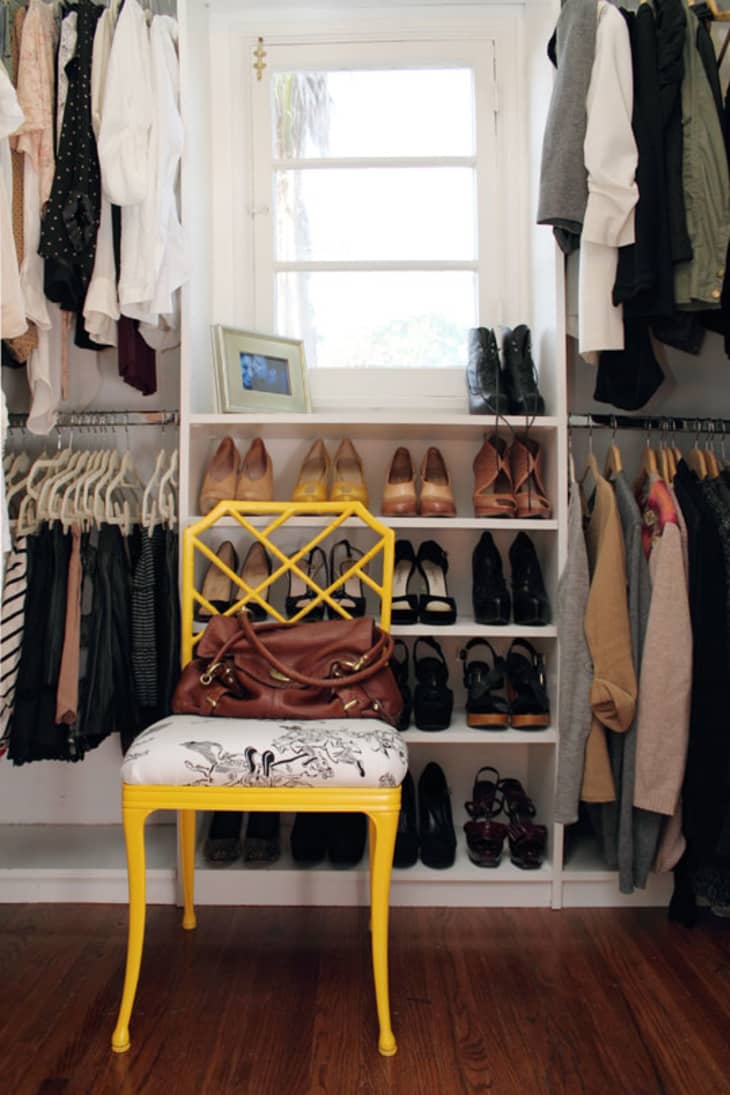
Our Style: Modern rustic with a vintage twist. We spend a lot of time at home, so it’s really important that our place reflects both of our styles. The living room, with the exposed beams, old fireplace, built-in bookshelves and flat screen TV, has a very masculine feel; like an old study you’d have seen years ago. On the other hand, my office has a decidedly feminine vibe, with unapologetically pink walls, a red settee and a clothing rack filled with my current favorite finds. I think the balance is what makes our place feel like home and why we spend so much time here!
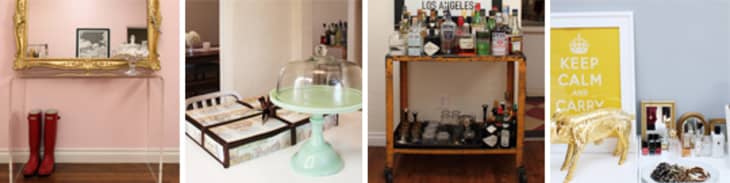
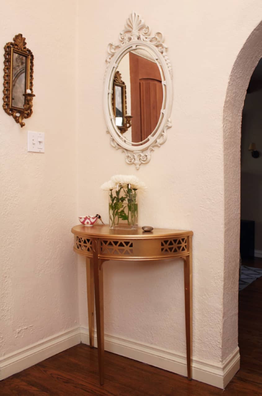
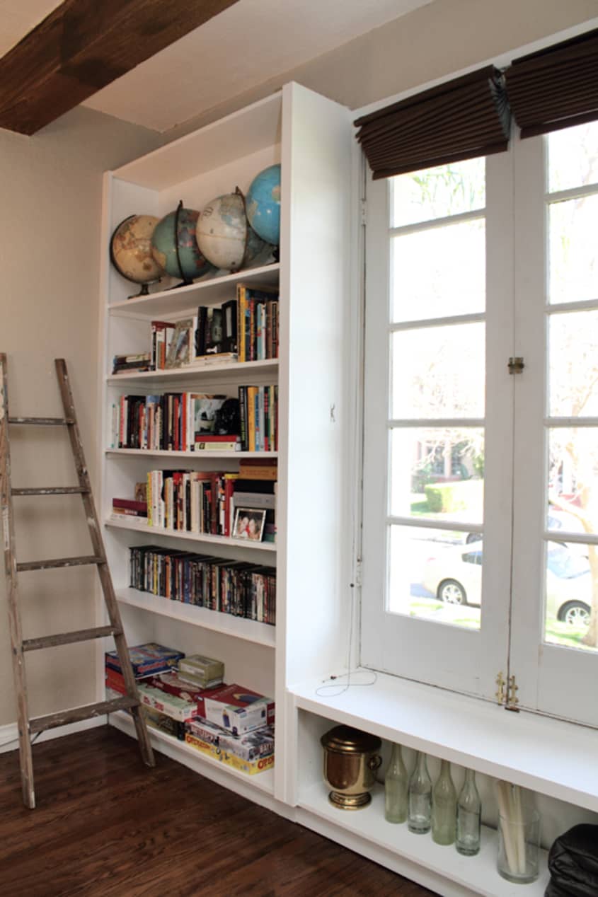
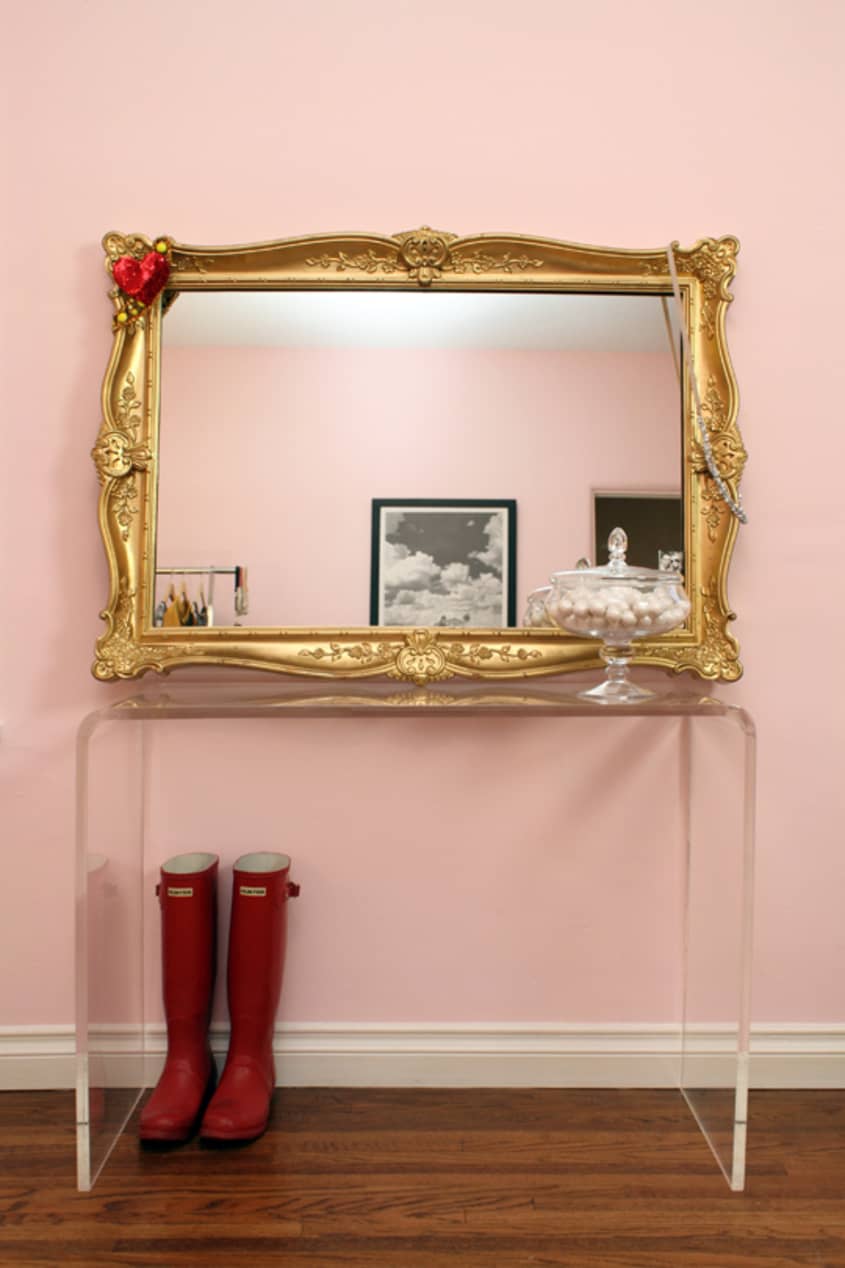
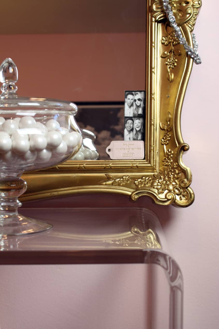
Inspiration: I look for inspiration everywhere, but most frequently at the Melrose Trading Post flea market. I go most Sundays, with a giant cup of coffee, and just walk through the aisles to see what inspires me. I’ve found all sorts of hidden gems there, like the Hellenic bust in our entryway, the gold mirror in my office and my collection of vintage globes. I like knowing that I’m finding little treasures for our place that feel unique and special and give each room character.
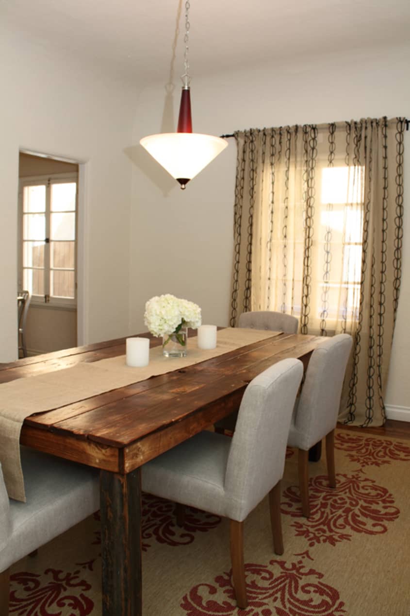
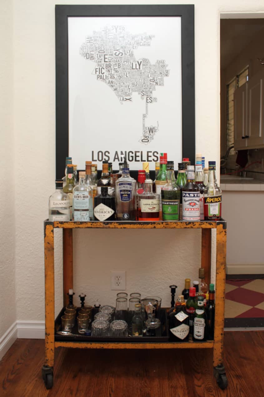
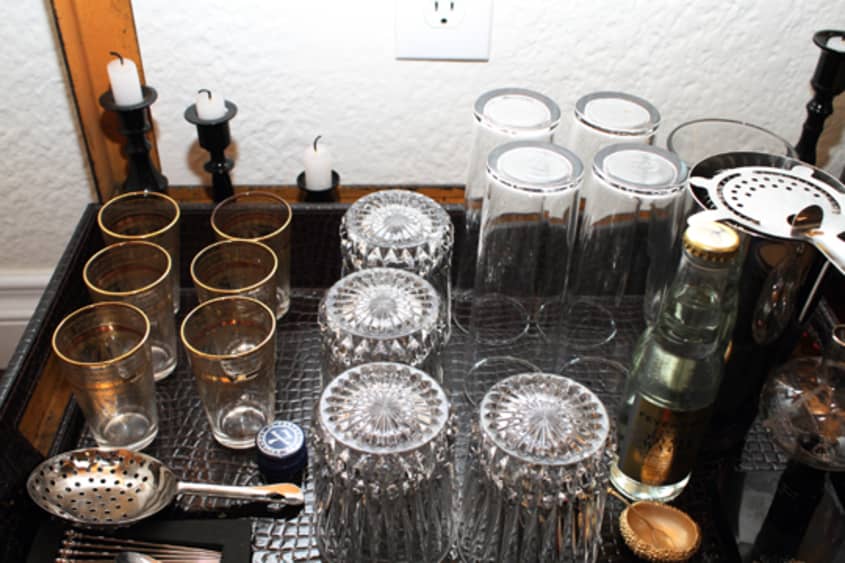
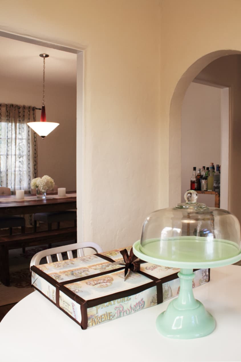
Favorite Element: The antique science cart that we transformed into our bar. It’s a great piece on its own, but it looks even better when its filled with beautiful bottles and glassware. It’s such an unexpected piece, with its rusty yellow coloring, but it adds such great dimension to our dining room. Plus, it’s one of the first things you see when people come over, so it’s customary for our friends to request a cocktail pretty much upon their arrival.
Biggest Challenge: The hallway. It’s really really long. In fact, when we first moved in, we considered hosting a bowling night because it could easily double as an alley. My biggest complaint is that it’s going to take a really long time until it feels complete. We’ve bought some art, but until we’ve really got a good collection going, anything that we put up is going to look sparse in that large space.
What Friends Say: It’s like their home away from home. I think our friends were just as relieved as we were to find a bigger space. Since we entertain a lot, it was important to find a place that accommodated a big group and made people feel like they were at home, the minute they walked in the door.
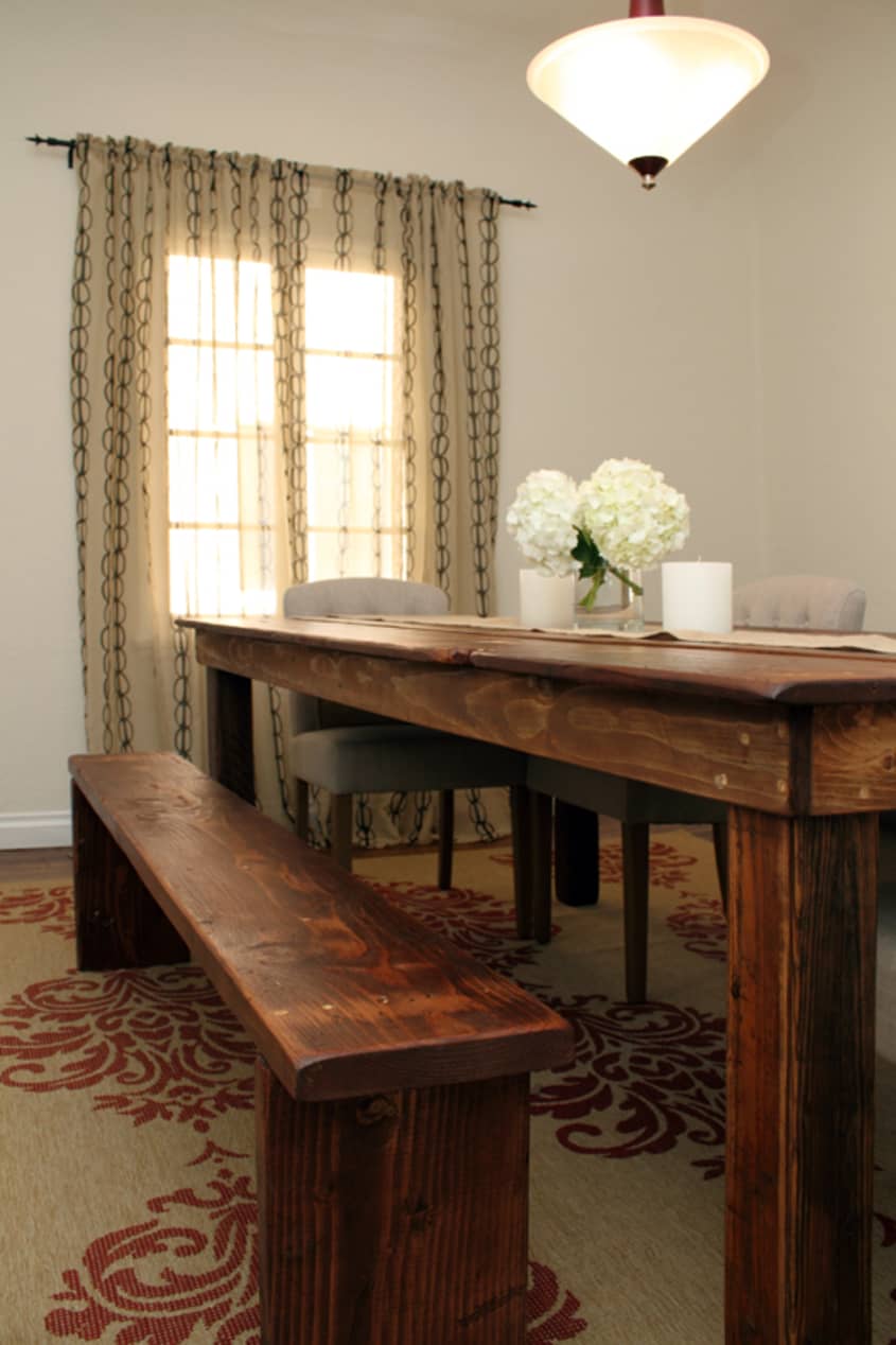
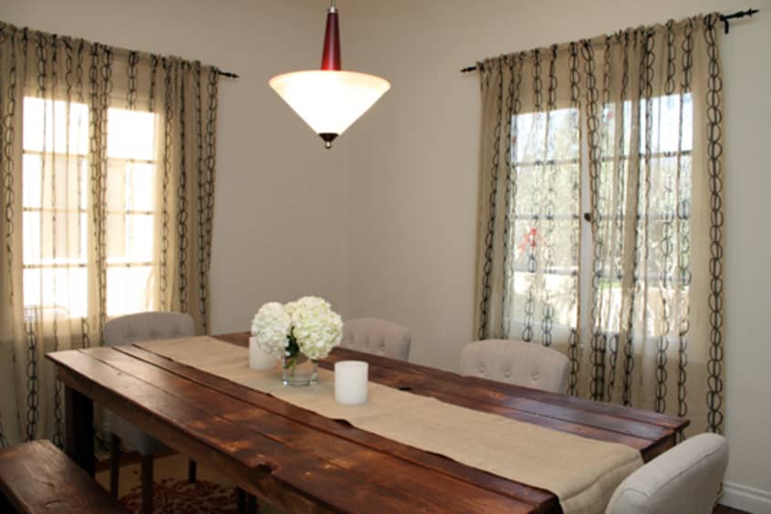
Biggest Embarrassment: The chandelier in the dining room. It has a terrible 80’s feel, which really doesn’t fit in our place, especially with the magenta/frosted glass. I can’t wait until I find a replacement that complements our table and adds a beautiful glowing light for when we host dinner parties.
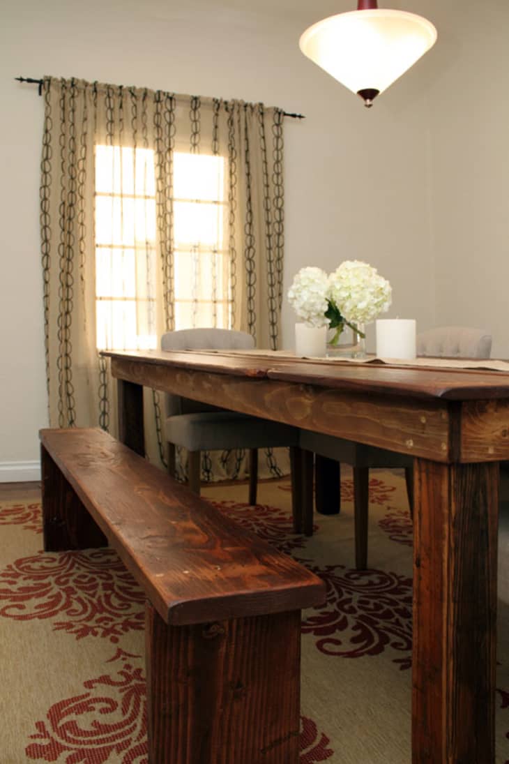
Proudest DIY: Though it wasn’t exactly a DIY, we did have our dining room table custom made, for practically nothing. My fiance and I went to a lumber yard and picked out a bunch of reclaimed wood and had it made especially for us. The size and shape is just what we wanted and there are all of these imperfections that make it feel very rustic and organic. We also had a bench made, which adds a really fun element anytime you sit down at the table…it just feels relaxed and carefree, which I love.
Biggest Indulgence: Our charcoal gray sofa and chair. I found them at Z Gallerie and while I’m usually not a fan of things matching, they just went together too perfectly not to buy them both. They were expensive, but so worth the investment. Since we have a big living room, we needed a pretty sizable sofa and one that people weren’t afraid to sit on. While I love the idea of a white couch, it’s just not reasonable, given our propensity to watch movies with a pint of Haagen Dazs between us.
Best Advice: Always keep your place within ten minutes of being “guest ready.” Our place isn’t perpetually immaculate, but we try to make sure that it’s never to the point that it takes more than a few minutes to pull it together for company. This means not leaving our stuff around, keeping the kitchen stocked with a few basics (cheese, crackers, olives) and having a full bar.
Dream Sources: Herman Miller, DWR, Dwell and Jayson Home & Garden.
Resources of Note:
PAINT & COLORS
-
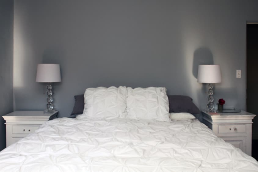
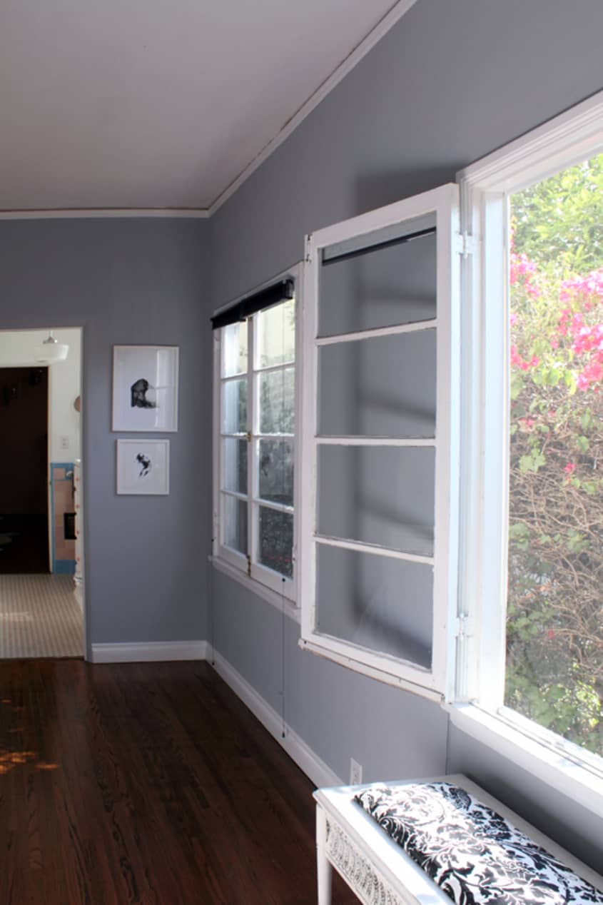
• Bedroom Gray: Benjamin Moore
“Pelican Gray”
• Office Pink: Benjamin Moore “Romantic Pink”
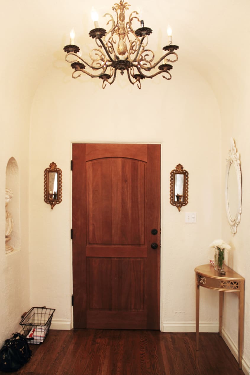
ENTRY
-
• Candle sconces: vintage
• Hellenic Bust: vintage
• Table (spray painted gold): vintage
• Mirror: vintage
• Basket: vintage
• Vase: IKEA
LIVING ROOM
-
• Couch + Chair: Z Gallerie
• Console: Crate & Barrel
• Mirror: vintage
• Chairs (painted and recovered): vintage
• Rug: West Elm
• Poufs: Gilt Groupe
• Pillows: Room Service and West Elm
• Coffee Table: Z Gallerie
• Black Lamps: Gilt Groupe
• White Lamp: Z Gallerie
• Side Table: West Elm
• Trunk: Vintage
DINING ROOM
-
• Bar cart: vintage
• LA Poster: orkposters.com
• Table + Bench: Custom made
• Chairs: HD Buttercup
• Rug: Overstock.com
• Curtains: IKEA
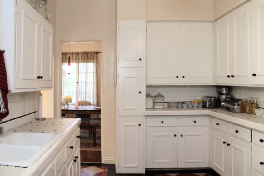
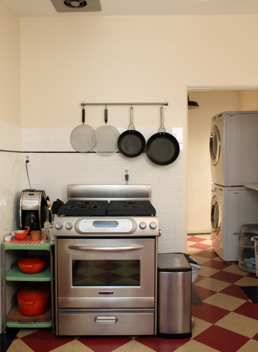
KITCHEN
-
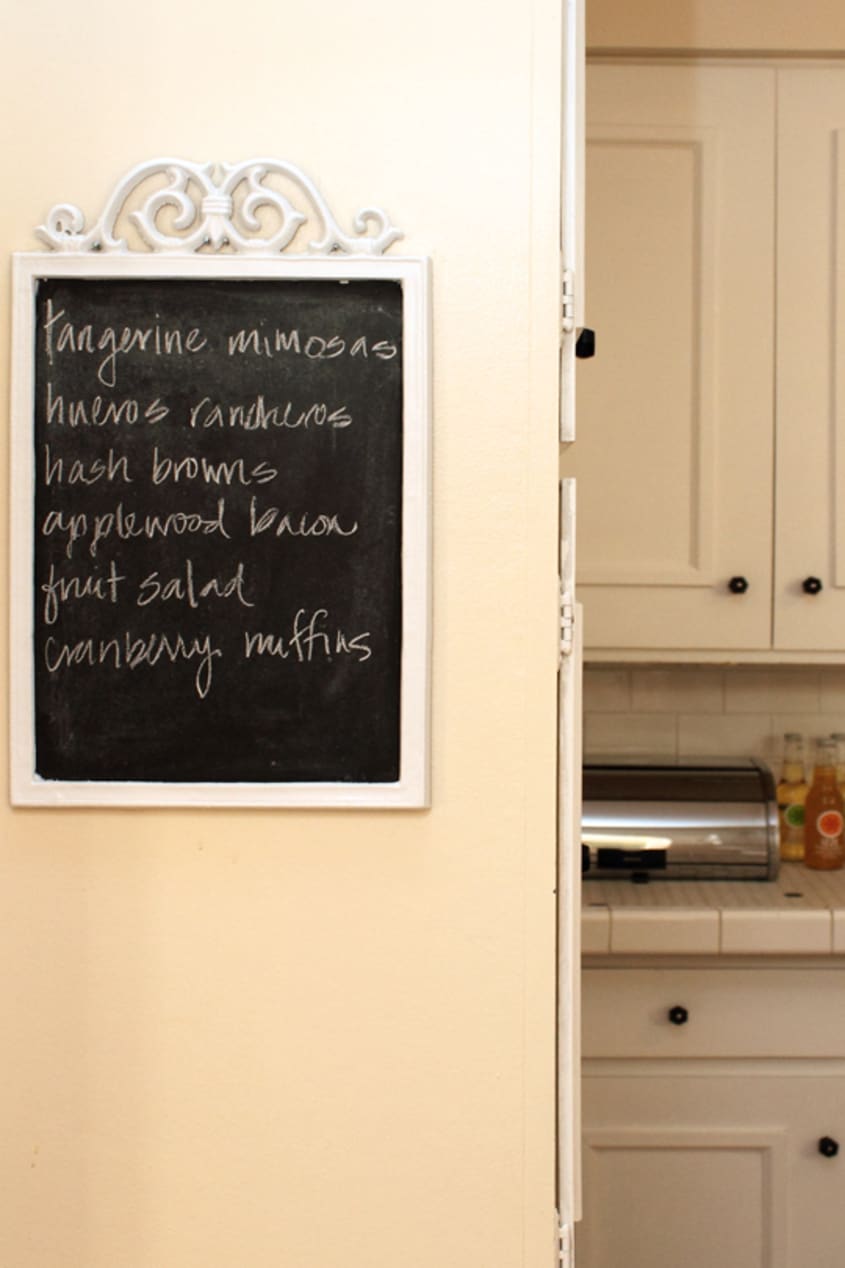
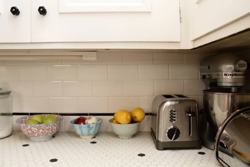
• Chalkboard: DIY+ Vintage
• Bowls: Anthropologie
• Bread box: Crate & Barrel
• Steel cups: IKEA
• Green cart: vintage
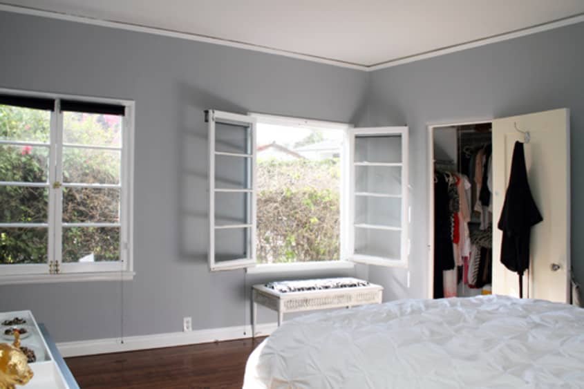
MASTER BEDROOM
-
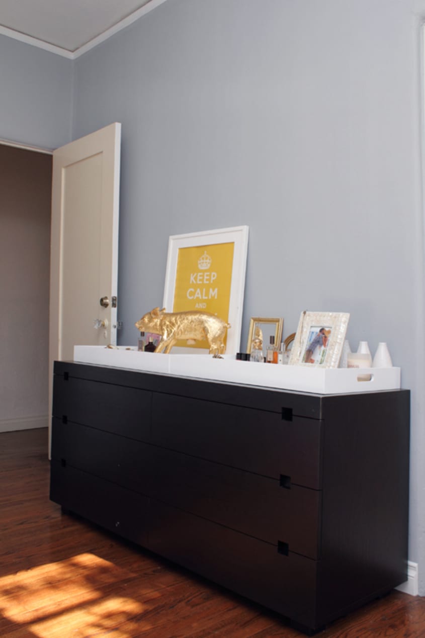
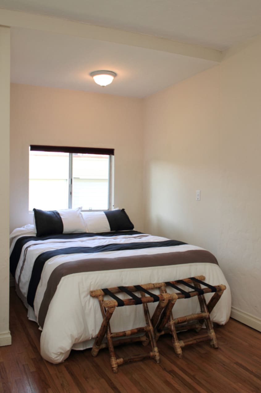
• Bedding: West Elm
• Dresser: West Elm
• Lacquered Trays: West Elm
• Prints: Etsy
• Bench: vintage
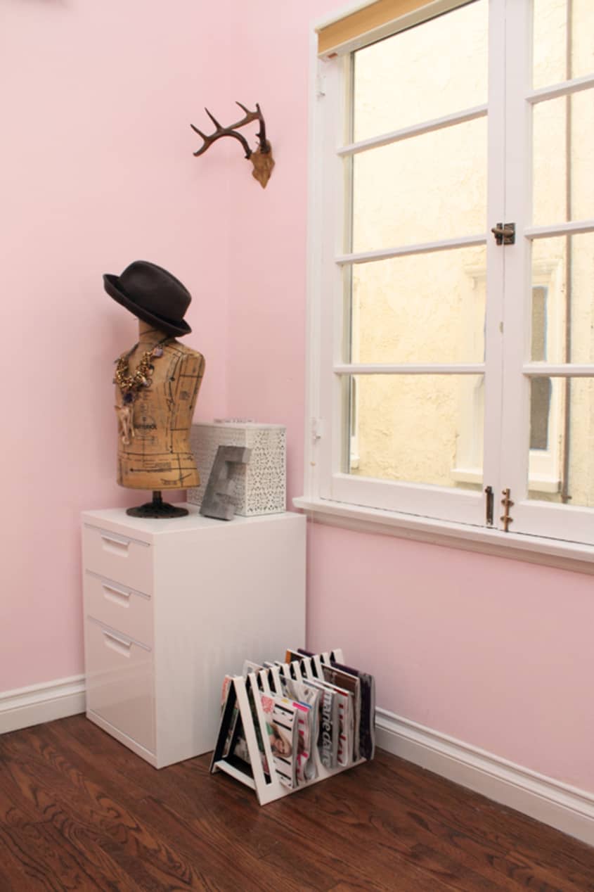
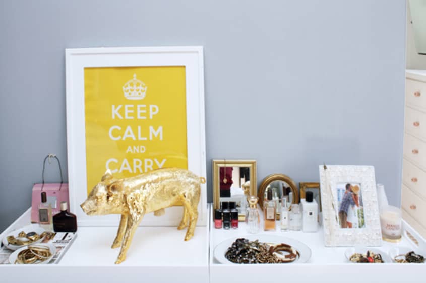
EMILY’S OFFICE
-
• Garland: ConfettiSystem.com
• Desk: West Elm
• Lamp: West Elm
• Butler tray: West Elm
• Clear console: CB2
• Gold mirror: vintage
• White mirror: IKEA
• Red settee: vintage
• Filing cabinet: CB2
• Mannequin: vintage
• Clothing Rack: Amazon
• Rug: IKEA
• Prints: Etsy
• Wooden chair: vintage

Thanks, Emily & Geoff!
Images: Bethany Nauert
• HOUSE TOUR ARCHIVE Check out past house tours here
• Interested in sharing your home with Apartment Therapy? Contact the editors through our House Tour Submission Form.
• Are you a designer/architect/decorator interested in sharing a residential project with Apartment Therapy readers? Contact the editors through our Professional Submission Form.