
Warm vs Cool Colors: What Are They and What’s the Best Way to Use Them?
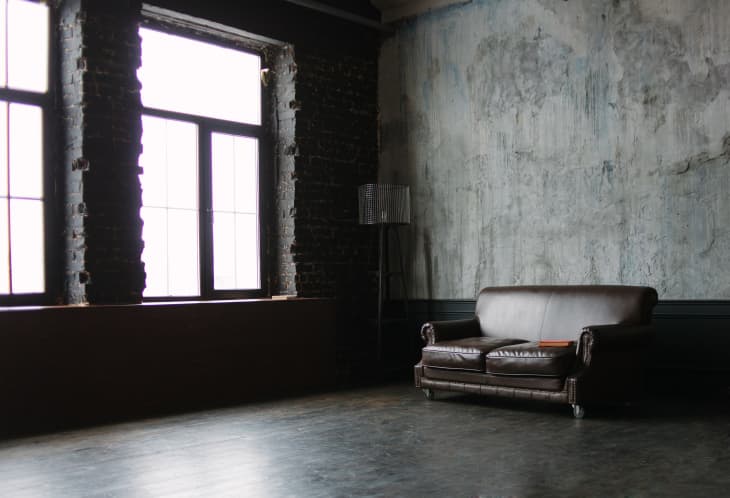
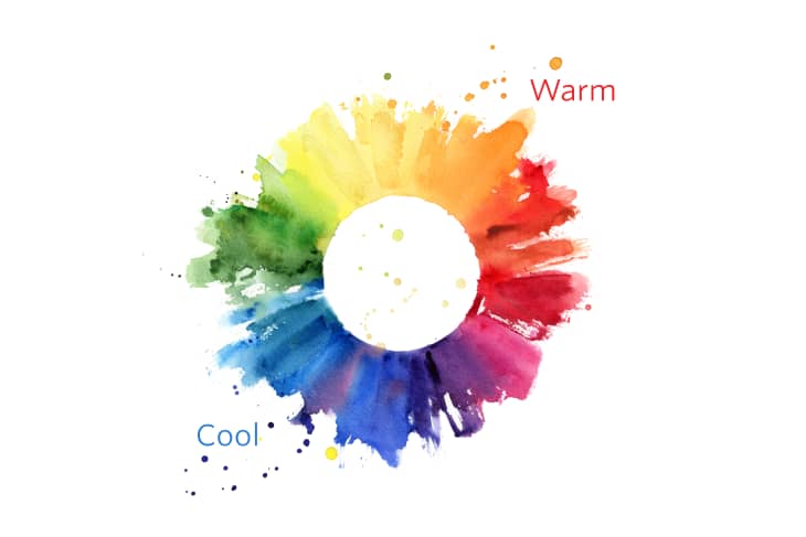
The interior palette is roughly divided into two groups of color: warm and cool colors. Reds, yellows, oranges and beige are warm. Blues, greens and grays are cool. If you look at the color wheel, warm colors are on one side of the wheel, and the cools reside on the other. Where they meet, they mix, forming some hybrids, like green and purple. Those colors can be warmer or cooler depending on their mix. For example, lime green has a lot of yellow in it and is thus a warm color, whereas a Kelly green has more blue in it and therefore runs cool.
Here are the main things to know about warm vs. cool colors:
- Warm colors evoke feelings of warmth and heat
- Cool colors evoke feelings of soothing and calm
- Black, white and neutral colors are neither warm nor cool
- Understanding warm vs cool colors can assist with interior design choices
How to Use Warm and Cool Colors in Your Home
Wondering whether to incorporate warm vs cool colors in a specific space in your home? We’ve got plenty of guidance below.
Warm colors are stimulating; use them in social rooms
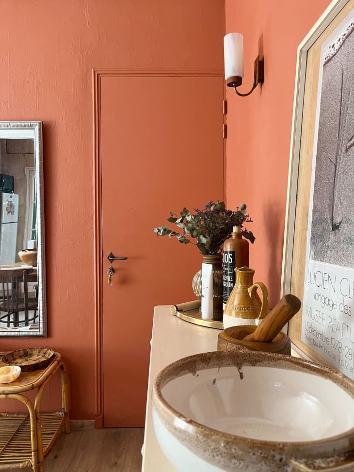
The reds, oranges, yellows and all the off-whites that sit on the warm side of the color wheel possess all the qualities of warmth, reminding us of fire, heat and passion. Check out the use of a terra cotta hue in the Provence apartment shown above.
This is the reason red is the most successful color in our consumer society and found in such icons as Coca-Cola, Ferrari, and red lipstick. Where else do you see warm colors? Fast food restaurants and baseball teams with fiery characters, like the Boston Red Sox.
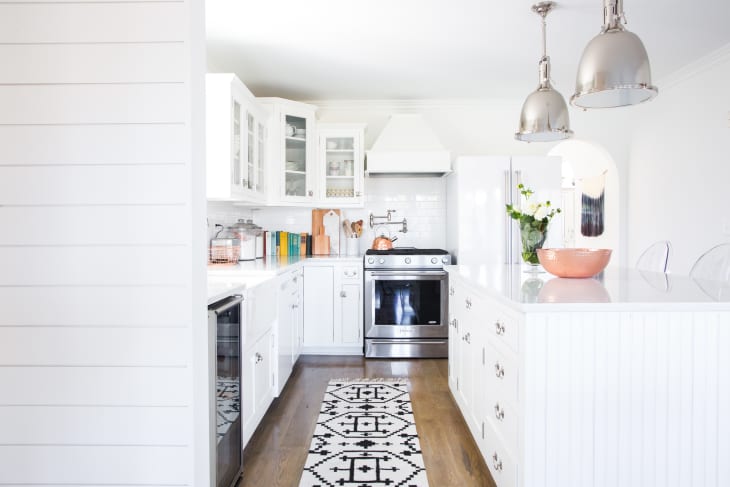
Warm colors are therefore best in social rooms of your house, such as the living room, dining room and kitchen. They will stimulate and encourage warm, social behavior.
Cool colors are calming: use them in private rooms
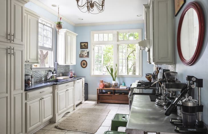
The blue side of the spectrum, along with browns and grays and the cool off-whites, possess all the qualities of coolness in their ability to calm our emotions and focus our thoughts, like this pretty New Orleans kitchen. While our heart may crave warmth, our head craves coolness in order to do its best work. This is why the cool blues are the most popular in the business community and represent powerful icons like IBM, General Motors and JP Morgan Chase .
These colors are also widely represented in men’s business suits and shirts, as well as police uniforms. And if the Boston Red Sox are wild men with their red and white uniforms, beards and long hair, now you know why the Yankees are considered gentlemen in their short hair and blue pinstripes.
Cool colors are therefore best in the rooms where concentration and calmness are most important and where privacy is more of a concern such as the office, nursery, and the bathroom.
What about the bedroom? A “red light district” is called that for a reason, and most people don’t want that much excitement in their home bedroom each night, so cool colors here too are the best choice. Cool colors promote a calm, restful sleep.
Black and White: Warm or Cool?
Though black and white do not count as colors, per se, they do have warm and cool properties. White has a cooling effect, while black tends to feel more warm. Surprised by this? Think about how white can help cool down a room in a hot climate.
Remember that when you paint a room white, you may want to incorporate pops of bright color or some other warmth element to make it physically comfortable. On the flip side, black is instantly warm and needs to be used sparingly so that it doesn’t overwhelm. A little black in a room will go a long way.
Are Neutral Colors Warm or Cool?
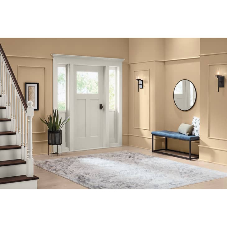
Neutral colors are super flexible. These colors are the workhorses of the paint world, expertly blending into just about any situation. Since all colors blend to make brown, neutrals cover a dizzyingly vast landscape of browns that run from the warm, red brown of milk chocolate, to the cooler taupes and stone colors, and finally to the light beige off- whites.
Neutrals are rarely exciting in their own right, but they can be incredibly sophisticated when paired properly and with a starring color in their midst. I recommend getting to love the wide array of neutral colors and using them liberally as a base for any room alongside a color you love.
The Dos and Don’ts of Warm vs Cool Colors
With all this in mind, when you design a room, it’s best to decide in advance the aesthetic you’re going for, then stick to it, but don’t be afraid to experiment too! Here are some design dos and don’ts to use as reference.
- Don’t paint your kitchen green (cool) when you have a terracotta floor (warm) and gold finish hardware (warm). Instead, opt for a pleasing yellow or ivory hue.
- Don’t put down a blue carpet (cool) in your living room if you have brown couches and off white walls (warm). Rather, go with a beautiful burgundy patterned rug.
- Don’t mix warm and cool palettes unless you want your room to be purposefully funky, offbeat, or after a much more sophisticated style.
- Follow the 80/20 rule when using warm vs cool colors: use strong colors sparingly to punctuate a room, not define it. A great rule of thumb is to use 80% neutral colors and 20% strong colors.