
A 1924 Sears Kit Kitchen Finally Got the Vintage Glow-Up It Deserved
Sometimes kitchen renovations really come down to the need for a better layout. That was the case for Carli Otero and her family, the proud owners of a charming 1924 Sears kit home in the D.C. metro area. “We fell in love with this house for its vintage cottage charm,” says Otero. And while the before kitchen was “sweet,” according to Otero, updates were necessary for improved flow and modern function.
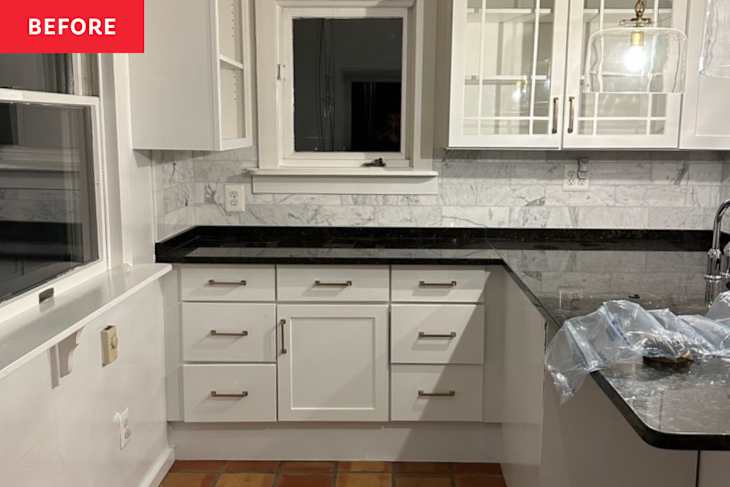
“The kitchen sat at the back of the house with large south-facing windows,” says Otero. “A peninsula toward the back blocked the traffic flow, and there was no true eat-in space — just counter stools in the kitchen and a separate, adjoining dining room.”


She had always envisioned the kitchen as central for everyday living and entertaining. So the biggest renovation goal was just that: turning a cook space that felt like an afterthought into a true family gathering spot.
“We wanted a kitchen that felt like the heart of the home — beautiful, functional, and full of storage,” says Otero. “It was important to us that it flowed seamlessly with the rest of the house and had a warmth that made people want to gather there. We also wanted to weave in a bit more vintage character so it felt true to the home’s original charm.”


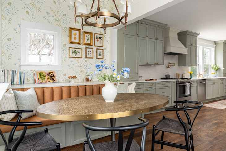
To accomplish this vision, Otero and her husband, Alex, enlisted E Norton of Norton Interiors to completely overhaul the space. The very late ’90s/early 2000s white cabinetry and black granite counters had to go in favor of a more period-appropriate, cottagey look. “My one non-negotiable was the color palette — I knew I wanted sage cabinets with brass accents,” says Otero. “It feels warm, homey, and perfectly in tune with the character of the house.”
Long before finishes were selected, though, Norton whipped up a few different floor plans, and the couple chose the one that involved knocking down the wall between the current kitchen and dining room to create a larger footprint. This plan, which would also create a sightline from the front door to the back of the home, had total buy-in from the couple, which isn’t always the case, according to their designer. “Clients may resist moving walls, but showing how a new layout improves flow can transform a house into a functional home, especially when space is limited,” says Norton.
For Otero, it came down to just that, but the old home’s bones were also top of mind. “We wanted to honor the home’s character, so we avoided a full open concept, but we did want a more functional layout with more space and storage for our growing family,” says Otero. “Opening the wall also brought in even more natural light from the kitchen’s south-facing windows.”
Making this new layout come to life essentially involved swapping zones in the cook space. “The ‘working’ side of the kitchen (fridge, sink, etc.) now occupies the old dining room, while the “eat-in” area sits where the kitchen used to be,” adds Otero.

Otero sent her Pinterest boards to Norton so they could get on the same page aesthetically. Then it all came down to budget — the designer laid out the options, picks were made, and products were ordered.
The couple had previously lived in a much smaller apartment, so they were very ready to have a place for everything — and everything in its place. That involved splurging on custom Shaker-style cabinetry from Kitchen Craft painted in Benjamin Moore’s Oil Cloth (CSP-760) and a custom cream shade (the brass hardware is from Top Knobs). “To maximize storage, we focused on functionality — most of our lower cabinets are drawers, which make everything easier to access,” says Otero.

One of her favorite features of both the cabinetry and the kitchen? The pair of full-height china cabinets at either end of the kitchen, which span from countertop to ceiling. “They offer more storage than standard uppers — one hides our small appliances, and the other is dedicated to toddler snacks,” says Otero. “We also took the cabinetry all the way to the ceiling to take advantage of every inch.”
According to Otero, the floors were the second biggest investment. “We had to repair joists and address uneven spots throughout the first floor,” she says. “So we made the repairs, replaced the existing flooring with white oak, and stained them a rich walnut.” This darker finish really grounds the space and makes it feel warm and cozy.


With the cabinetry and flooring in place, the next order of business was the countertops and appliances. The couple settled on a lovely Quartz Calacatta Prado, which mimics the look of marble but is much easier to maintain, thanks to the way it’s made and sealed. “Extending the counter the full length of the kitchen, even if it was to manage the bulkhead condition, was the best decision,” says Norton. “Surface space is gold for any young family.” It’s also given Otero the perfect spot for cookbooks and sweets behind the banquette.
The Oteros were able to reuse some of the appliances from the original kitchen — namely, the dishwasher and range. All new lighting was selected from Visual Comfort, including the pendants and Ralph Lauren’s Katie Chandelier with leather accents.


Beyond the cabinetry and the new island, which is where couple’s toddler eats most of her meals, the pièce de résistance of the space has to be the banquette area. “We added a custom tufted leather banquette, which has become one of our favorite features,” says Otero. “It’s cozy, inviting, and maximizes seating — [it’s] so comfortable that guests have been known to nap there!”
Turns out this area also functions as a way to conceal an issue that arose during demo. “When the team began removing the peninsula, they discovered a framed-out section from the walk-out basement jutting into the kitchen,” says Otero. “Removing it would have reduced the headroom on the basement walkout stairs. So instead, E cleverly reworked the floor plan so the banquette fit perfectly over it, disguising it completely.”
Otero and Norton styled the banquette with pillows for a pop of pattern and coziness. A Four Hands table and chairs from Wayfair round out this casual-chic dining area. The star of the show, though? Sanderson’s Summer Harvest wallpaper, which pairs so well with the new kitchen wall color, Sherwin-Williams’ Snowbound (SW-7004). Flea market–found vintage book illustrations, framed by Framebridge, hang throughout this area on the walls.

The renovation took about four to five months, but now the Oteros spend so much time in their cook space. It’s truly the family’s favorite spot and was worth the wait.
“I love that it’s really the heart of our home — cozy, warm, and totally livable but still super functional,” says Otero. “Honestly, it’s even got me cooking a bit more… who knew a pretty kitchen could be so motivating?”
Design Defined
Never miss the style inspo and recommendations you crave with Design Defined. Follow along each week as our Home Director Danielle shares the best style advice, latest trends, and popular decor finds you just can't miss.