Before and After: An ’80s Bachelor Pad Gets a New Minimal, Modern Kitchen

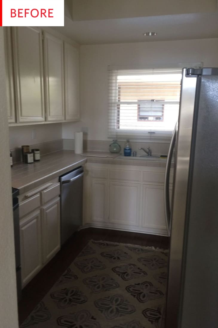
This ’80s kitchen had ample cabinet space, a dishwashing sink, and wonderfully high ceilings—but the rest of it needed some major work. One excellent interior designer to the rescue…
Before we admire the kitchen today, let’s take a step back and learn more about what it look liked before—and its owner:
Drew is a bachelor living in Santa Monica. We were introduced by a mutual friend whose home I also helped design. He bought this condo a few years ago and loved it because of its proximity to the beach, but didn’t feel that the interiors were a reflection of his personality.
The kitchen probably hadn’t been touched since the ’80s, and despite the unit’s west-facing windows, several of the rooms remained dark because of unnecessary walls and partitions. This was particularly true in the kitchen and master bath, where we ended up removing walls. In the kitchen, we opened up the wall underneath the stairs to let in more light and make the space feel more connected with the rest of the unit.
This is so well done. We see subway tiles pretty often, of course, but this rich navy gives them a whole new look—and it’s a color that looks amazing with wood, black, and white. When you’re adding a major colorful element to a room, it can be hard to find the right hue to work with all the other finishes, and in my book dark blue is almost always a winner. The black espresso cabinets look nice but do a good job of fading into the background along with the appliances, allowing the gorgeous marble countertops, glowing wood floors, and luscious tiles to be the stars.
Jennifer Wallenstein of Homepolish created this kitchen for a client who prefers minimal, contemporary design—and totally nailed it. The wooden shelves provide a link with the floor while also providing a display space for beauty and personality, and everything else is beautifully functional, meaning that the client can keep the room as bare or as styled as he wants.
It’s rare that we see a black fridge in a renovation, what with stainless refrigerators being all the rage right now—and it’s nice to see how great it looks with the black cabinets. The little nook above the refrigerator is another example of Jennifer creating an opportunity for Drew to display things he loves without cluttering the counters.
These shelves look nice styled as they are, but they would still look great holding a set of wine glasses or dishes, if Drew ever needed them to provide actual storage. They could even be used to store and display his decidedly not-minimal dishware:
Drew was drawn to pretty minimal and contemporary spaces during the inspiration phase, but also knew he wanted the overall end result to still feel warm and inviting. He actually surprised me a bit when he wanted to go with indigo backsplash tile in the kitchen in order to complement some Talavera-style tableware he has.Thank you, Jennifer Wallenstein of Homepolish!
