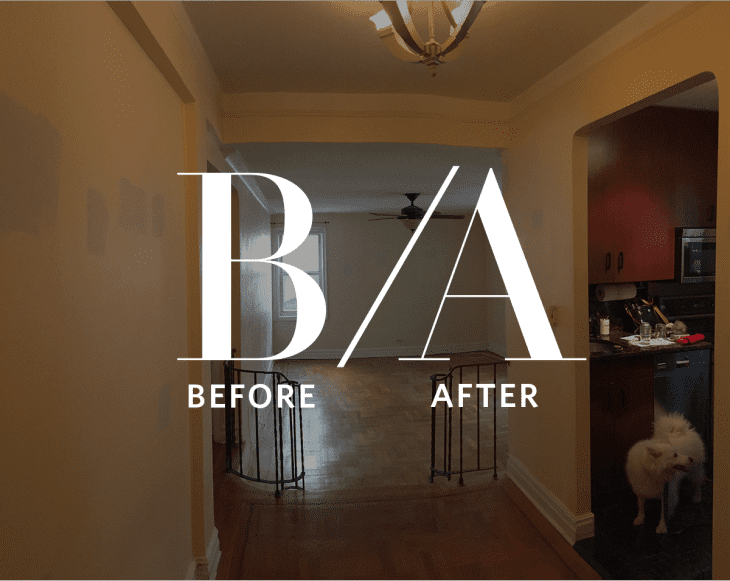
Before & After: From an Awfully Awkward Floorplan to a Seriously Sophisticated Space

Eric and Joel’s new apartment in Prospect Heights had a lot going for it: generously sized rooms, lots of light, proximity to dog parks. What it didn’t have going for it: an incredibly awkward floorplan where a closed-off kitchen adjoined a mostly useless ‘dining foyer’ — an orphaned bit of space that was too wide to be called a hallway and too narrow for anything else. Besides renovating their kitchen, the couple also wanted to do something about this strange setup.
In addition to the awkward floorplan, there were some cosmetic issues: odd color choices, and an early-2000s renovation that retrofitted the kitchen with dark, heavy-looking cabinetry. The kitchen walls, painted a metallic silver, had actual glitter in them. Clearly the apartment had a lot of potential — but there was definitely major room for improvement.
In a lot of renovations of older apartments, homeowners choose to tear down the walls between the living room and kitchen. But in this case, Joel and Eric, guided by their designers Casey and Kumar, chose to keep the kitchen as a separate room, to preserve the apartment’s existing proportions. (In addition, they were warned by their contractor that multiple water pipes running through this wall would make removing it difficult and expensive.) They did elect to tear down the wall separating the kitchen from the old hallway/dining foyer, which gives the kitchen a more open feel and allows it to expand while preserving its identity as a separate space.
A clever trick that Casey came up with for expanding the kitchen was to wrap the kitchen countertop around the wall separating the kitchen from the living room. On the living room side, the countertop has storage below and shelves above: on the kitchen side, Joel and Eric gain a few extra feet of work space. The expanded countertop, which is right next to the dining table, also makes a great buffet space for parties.
The kitchen itself is a nice little symphony of different tones, neutral but not at all boring. The lower cabinets are white oak, with a Caesarstone countertop in a concrete finish, and the upper cabinets are white, excepting the ones immediately above the refrigerator, which are black for an extra bit of contrast. The refrigerator is new, but Joel and Eric chose to keep the existing dishwasher and stove.
Throughout the apartment, little changes contribute to the space’s new streamlined, modern feel. A couple of wall-mounted shelves add a little interest to the long entrance hallway, and squaring off the steps between the kitchen and living room (and removing the iron railings) gives the transition a much cleaner look.
The kitchen has a new, lighter wood floor, and the flooring throughout the apartment was stripped and re-finished to match the tone of the flooring in the kitchen. It’s a whole-apartment renovation that takes into account both functionality and style — the perfect update to bring this 1920s-era space into the 21st century.
Want to see more of Joel and Eric’s renovation? You can read all about the transformation of their bathroom here.
Joel and Eric found their contractor on Sweeten, a free service matching homeowners with local general contractors. You can read more about the project, see more photos, and find sources on the Sweeten blog.
