Before and After: A Cramped ‘80s Kitchen Gets Upgraded to First Class

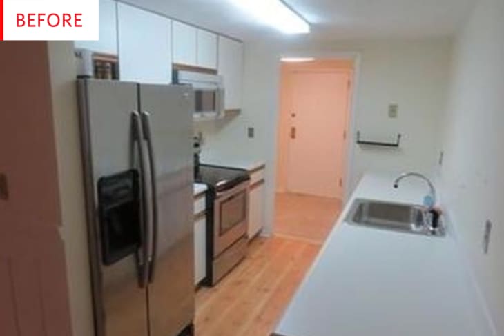
This kitchen was last renovated in the 1980s, when the building, a turn-of-the-century Masonic Hall in South Boston, was first converted into residential lofts. With laminate counters and the ubiquitous melamine-and-oak cabinets of the era, “It had the typical 1980s aesthetic,” says designer Sarah Scales.
Not to mention an institutional sterile whiteness and fluorescent overhead light – egads! (And you thought track lighting was obtrusive.)
The space presented problems beyond the cosmetic. “Because it was once a community building, beams and various structures created odd spaces and challenges,” Scales says. “The kitchen’s ceiling is a mere seven feet tall, and venting and plumbing couldn’t venture far from its existing locations – making space planning and appliance selection difficult.” Scales kept the counters white in her overhaul, using durable quartz surfaces, but that’s about as much homage as she would pay to the old kitchen. Here’s what it looks like now:
With seven-foot ceilings bearing down, Scales removed the wall that once separated the galley kitchen from the living room to open up the floor plan and ease the claustrophobia. In its place, she put a prep island with downdraft range and breakfast bar, adorned by mid-century-look stools from Overstock.com and pendant lights from West Elm hanging overhead.
Along the main wall, a symmetrical design bookends the sink area with a large refrigerator on one side, a pantry on the other, and oversized white subway tiles (4″ x 12″ instead of the usual 3″ x 6″) in the middle. Three slim, white upper cabinets “add contrast to the otherwise walnut kitchen,” Scales says, and simple stainless hardware keeps the look clean.
Scales used the same walnut – with a slimmer quartz countertop – for the cabinets and floating shelves in the adjacent dining area for continuity. The black of the round, ebonized-wood Room & Board table “relates back to the oil-rubbed bronze pendants in the kitchen and also is a nice contrast with all of the walnut,” she says.
Thank you, Sarah!
